22 Breakfast Corner Ideas That Feel Cozy and Practical
Most breakfast corners get designed as an afterthought — a small table shoved into the kitchen corner once everything else is placed. That is exactly the wrong approach, and the rooms that feel genuinely lived-in and warm are the ones where the morning nook was considered from the beginning. Breakfast corner ideas work best when they solve two things at once: the need for a real gathering place and the need to actually fit into the space available. This is a list of 22 specific ideas that do both, without pretending the solution is always a matching set from a furniture catalogue.
1. Built-In Banquette with Under-Seat Storage
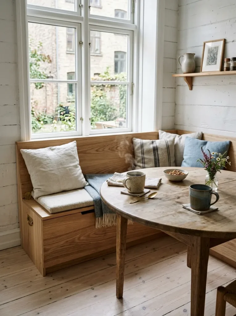
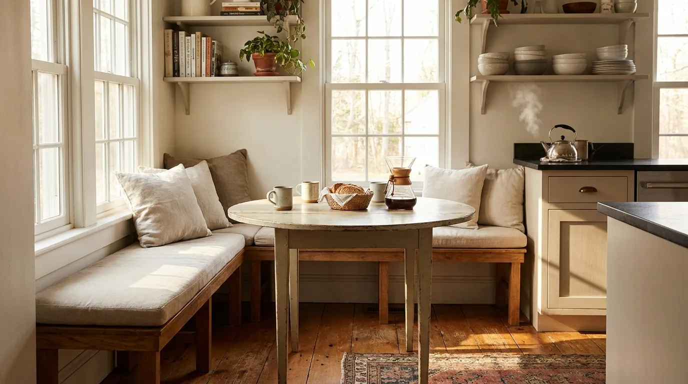
A built-in banquette is the decision that changes everything about a breakfast corner, and storage underneath is the reason it stays useful rather than becoming a decorative liability. The seat depth should be between 48 and 54 centimetres to accommodate adults comfortably without pushing the table so far into the room that it blocks traffic. The lift-top hinge mechanism is far superior to drawer fronts in this application — drawers require clearance that eats into the corner, and hinged lids give you full access to a clean, undivided compartment.
The cushion matters more than most people give it credit for. A 10-centimetre foam cushion with a removable slipcover in a wipe-clean fabric like coated linen or performance velvet is the configuration that survives daily use. The banquette frame itself should be solid timber or MDF with hardwood edging — not hollow-core construction, which deflects underfoot over time and sounds hollow when the children climb on it, which they will.
2. Round Bistro Table for a Compact Morning Corner
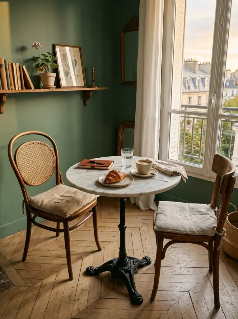
Square tables waste corner space in a way that feels wasteful once you notice it — the two unused corners become dead zones where crumbs accumulate and phones get lost. A round table with a diameter between 75 and 90 centimetres seats two comfortably and four at a push, and the absence of corners means traffic flows around it naturally. This is the configuration that makes a compact morning corner feel considered rather than compromised.
The base matters as much as the top. A single pedestal base in cast iron or solid turned oak keeps the floor clear for feet and chairs without the four-leg version that creates a perpetual obstacle course. For the surface, a honed Calacatta marble or a sealed solid timber like smoked oak read as properly invested without requiring the upkeep people imagine.
3. Window Seat Breakfast Corner with Morning Light
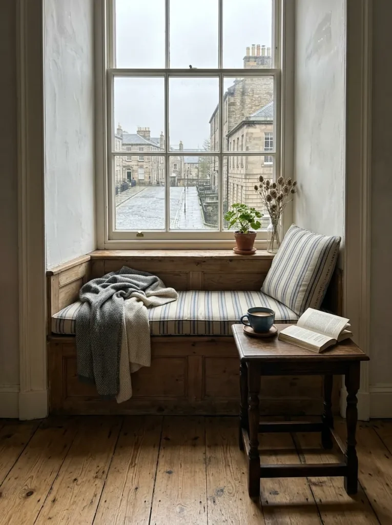
Building the breakfast corner into a window seat is one of those ideas that rewards commitment. The seat depth needs to reach at least 45 centimetres for the cushion to be useful, and if the window sill sits below 75 centimetres from the floor, the table height needs to be adjusted down accordingly — a standard 75-centimetre dining table will feel too tall. A custom table at 68 to 70 centimetres solves this without compromise.
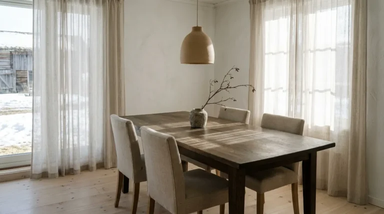
The lighting situation here is already solved by architecture, which is the point. Morning light through a window that faces east or southeast turns this corner into the most sought-after seat in the house between 7am and 10am. Sheer linen curtains rather than blinds preserve the light while softening glare — that is the practical detail most window seat guides skip.
4. Café-Style Pendant Lighting Over the Breakfast Table
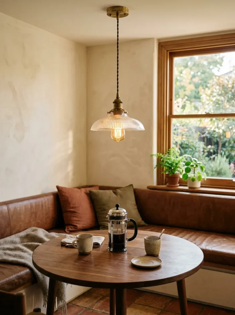
The pendant light is where most breakfast corners fail. Either it is too high — at ceiling height, contributing nothing — or it is a recessed downlight pointed at the table like an interrogation. A pendant hung 70 to 80 centimetres above the table surface creates a pool of warm light that makes the entire corner feel intentional. One pendant is usually the right answer. Two creates symmetry that works better over a rectangular table than a round one.
The bulb temperature matters: 2700 Kelvin is the specification that reads as warm and residential. Anything cooler and the corner starts to feel clinical. Unlacquered brass or aged bronze fixtures develop a patina over time that gets better, not worse, which is more than can be said for chrome in a kitchen environment.
5. Corner Bench with Cushions and Throw Pillows
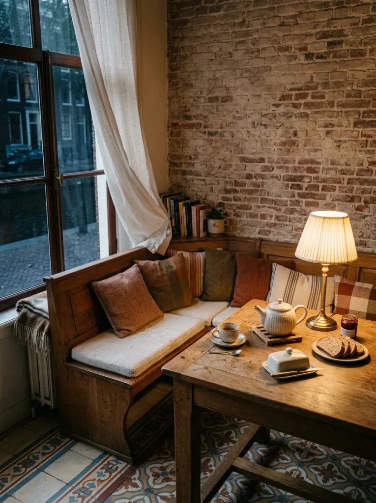
The L-shaped corner bench is the most spatially efficient configuration available for a breakfast corner and the most frequently ruined by the wrong cushion choice. The base cushion needs to be at least 8 centimetres thick to be comfortable over a long breakfast — anything thinner and the timber beneath makes itself known by around twenty minutes in. Performance fabric that resists moisture and fading is a genuine requirement here, not an upsell.
Throw pillows against the back wall are not decorative extras. They solve the problem of the corner bench being set against a hard wall — people lean back, which without cushioning becomes uncomfortable quickly. Keep them to one size and two tones within the same colour family. Three different sizes and four different patterns is the styling outcome that dates fastest.
6. Cozy Breakfast Nook with Shiplap Accent Wall
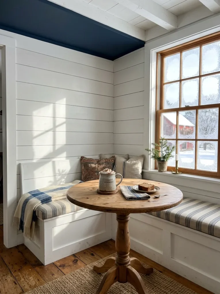
Shiplap behind a breakfast nook creates a visual boundary that tells the room where the dining zone begins — which matters in open plan spaces where the breakfast corner would otherwise dissolve into the kitchen. The boards should run horizontally and be painted in a tone at least two shades deeper than the surrounding walls. The contrast does the work.
The depth of the nook itself is what shiplap enhances, not what it creates. If there is no architectural recess, the accent wall still reads well, but pairing it with a pendant and overhead storage on either side of the wall makes the corner feel genuinely recessed even when it is not. Paint the ceiling of that zone the same tone as the shiplap and the effect doubles.
7. Breakfast Corner Ideas with Open Shelving Above
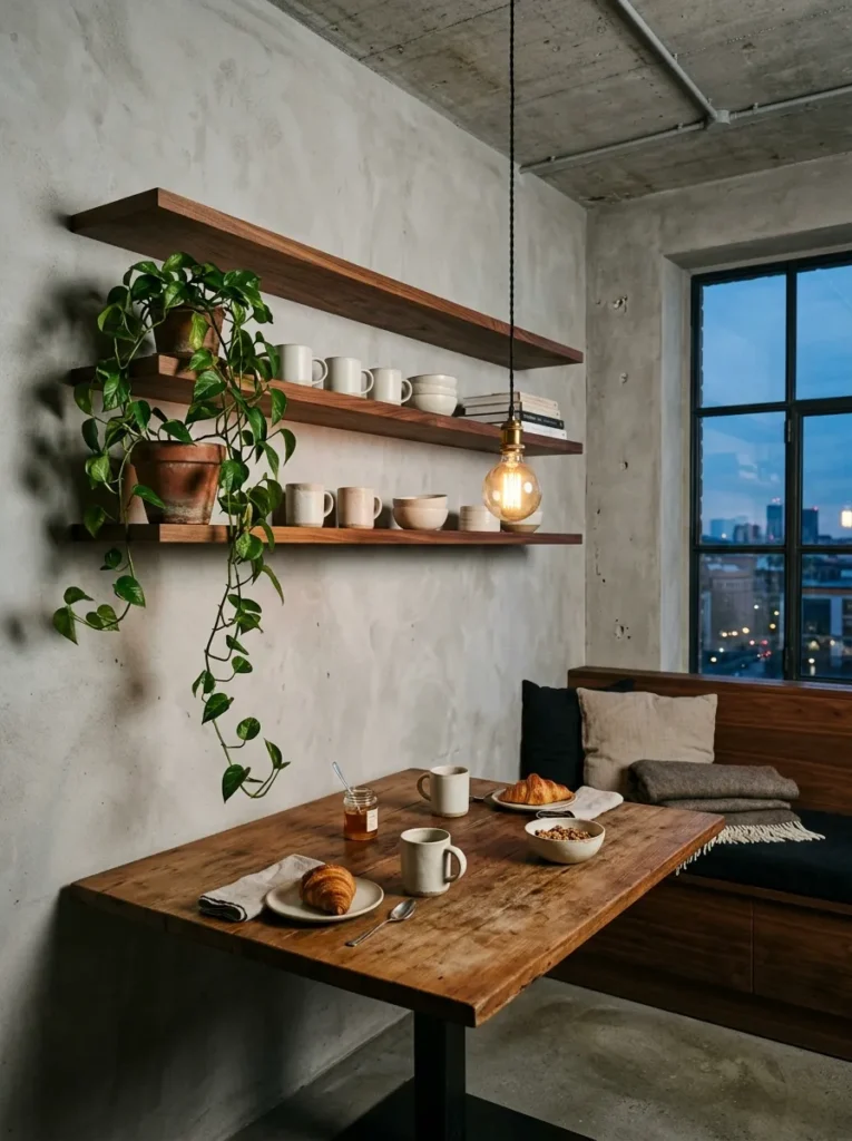
Open shelving above the breakfast corner earns its place when it solves storage that would otherwise appear on the countertop. The shelves should sit at least 45 centimetres above the seat height — lower than that and people hit their heads, which ends the romance of the corner arrangement quickly. Solid timber floating shelves in oiled oak or walnut look significantly better than bracket-and-board systems in this location.
What goes on the shelves matters more than the shelves themselves. Matching sets of ceramics, a few cookbooks, a plant in a simple terracotta pot: that is the version that photographs and lives well simultaneously. Seventeen mismatched mugs and a collection of takeaway menus is the version that makes the corner feel chaotic rather than curated, and it is what most corners become within six months.
8. Banquette Seating with Patterned Upholstery
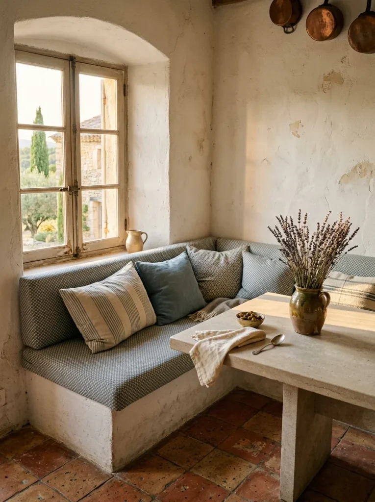
Patterned upholstery on banquette seating is one of those decisions that looks either brilliantly considered or immediately regrettable depending entirely on what pattern is chosen and at what scale. A small geometric repeat in two tones reads as intentional. A large repeat in four colours reads as a decision made in a showroom under different lighting. The banquette is the largest textile surface in the corner — its scale means even a subtle pattern has significant presence.
Linen or a linen-cotton blend withstands heavy use better than velvet in a kitchen-adjacent location. The pattern should contain at least one tone already present elsewhere in the room — the table surface, the flooring, the wall colour — or it will look selected in isolation, which it was.
9. Small Breakfast Corner with a Pedestal Table
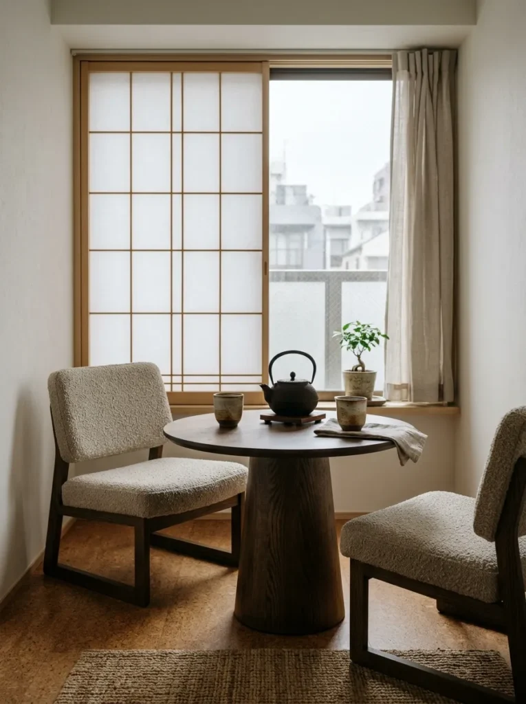
Pedestal tables are underused in small breakfast corners and the reason is always the same: people default to the four-leg version because it looks more familiar in a furniture showroom. The pedestal version is categorically better in a confined space. No legs interrupting the seating positions, no crossbar to catch feet on, no corner leg to navigate around. The pedestal base simply solves problems the four-leg version cannot.
For a corner fitting two people, a pedestal table at 70 centimetres diameter with a 4-centimetre solid surface — smoked oak, honed basalt, or sealed terrazzo — is the specification that works. Any smaller and the surface becomes impractical. Any larger and you have lost the compact quality that makes a small morning nook feel intimate rather than just small.
10. Breakfast Corner with Built-In Bookshelf Surround
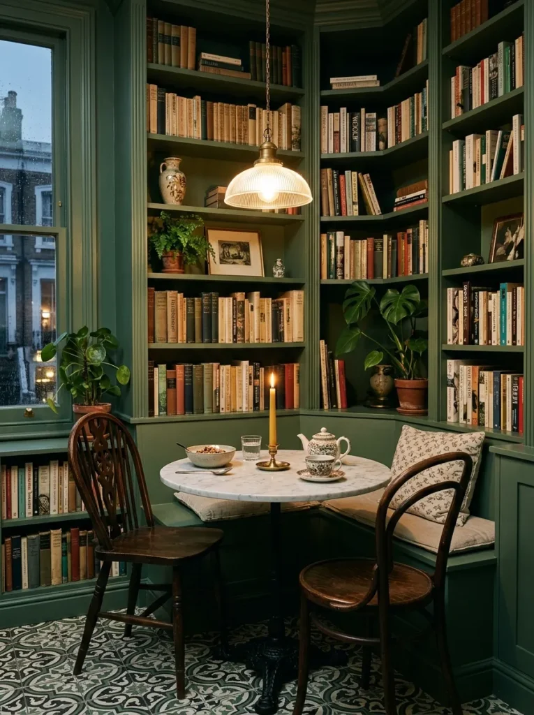
Surrounding the breakfast corner with built-in bookshelves is the move that converts a functional eating area into an actual room within a room, and the impact is significant. The shelves on either side of the table create enclosure without walls. The ceiling above the zone should be treated differently — a pendant light, a different paint tone, or even a simple timber beam — to reinforce the sense that this is a distinct place.
The books themselves are not incidental. A mix of spines — some facing out, some arranged by colour, some with objects placed in front — reads far better than a uniform row. Leave the bottom shelf free or use it for baskets, because low shelves in a seating zone at knee height are awkward to reach anyway.
11. Cozy Dining Nook with Arched Alcove Detail

An arched alcove takes a breakfast corner from pleasant to architectural, and the detail is achievable without major structural work. A plasterboard arch over an existing alcove — or even just above the banquette back — adds a gesture that elevates the entire corner. The key measurement: the arch should spring from a height of at least 200 centimetres to avoid the low-clearance effect that makes it feel like a cave rather than a feature.
The paint inside the arch should contrast with the surrounding walls. Paint the interior of the arch a full shade deeper than everything else. The depth of that tone — even in a pale, warm palette — creates a shadow effect that reads on camera and in person as a genuinely designed detail rather than an afterthought.
12. Breakfast Nook with Upholstered Chairs Instead of a Bench
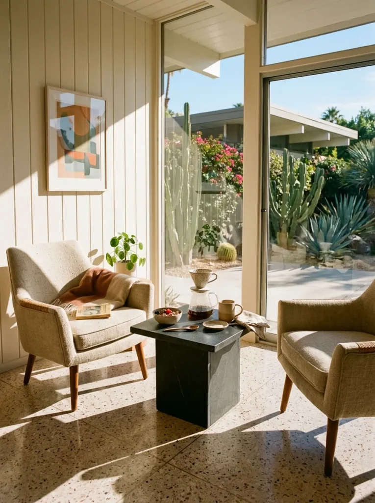
The bench is not always the right answer, and pretending otherwise is how breakfast corners end up comfortable for the Instagram photograph and uncomfortable for an actual Tuesday morning. Individual upholstered chairs give each person at the table the ability to adjust their position, lean back independently, and move without disturbing the person beside them. For households where people eat at different times and linger over coffee, chairs work better than a shared bench in almost every scenario.
The chairs for a breakfast corner should be slightly lower than a standard dining chair — 43 to 44 centimetres seat height rather than the standard 46 — to allow elbow clearance at a lower table that sits closer to the corner’s cocooning quality. A natural linen or performance cotton in a warm neutral is the fabric that survives breakfast over the long term.
13. Breakfast Corner Ideas with Woven or Rattan Accents
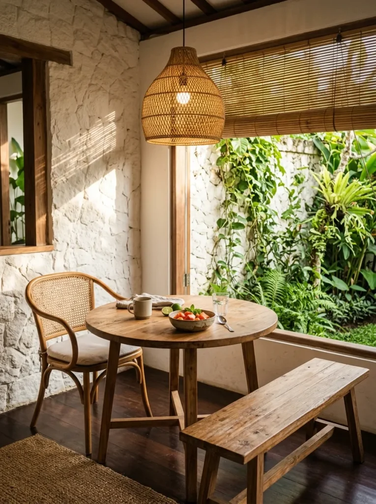
Rattan and woven elements bring texture into a breakfast corner in a way that painted surfaces and upholstery alone cannot achieve. A rattan pendant above the table, a woven seat pad on a timber bench, or a rattan-back chair beside a more substantial upholstered piece — any of these adds the tactile dimension that makes a corner feel layered rather than assembled from a single collection.
The mistake most people make with rattan is buying the full matching set: pendant, chairs, side table, placemats, and tray, all from the same range. The matching set is always the safer choice and almost never the better one. One woven element against heavier furniture is the contrast that creates interest. A full set of matching rattan reads as a theme, not a decision.
14. Breakfast Corner with a Banquette and Mismatched Chairs
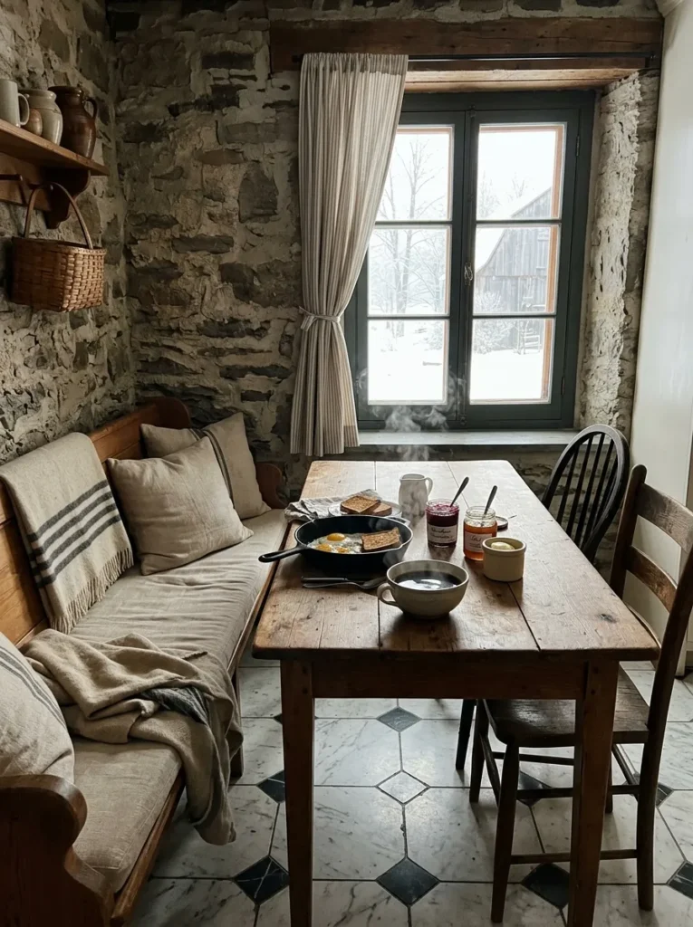
A built-in banquette on one side with mismatched chairs on the other is the configuration that most closely replicates the feeling of a neighbourhood café, which is not a coincidence — it is because that combination works. The banquette provides the permanent, upholstered backdrop and the storage. The chairs provide flexibility. Different people can choose their seat, chairs can be moved for cleaning, and guests who arrive unexpectedly can pull another chair from elsewhere in the room.
For the chairs to read as deliberately mismatched rather than accidental, they should share at least one characteristic: material, finish, leg style, or height. Two chairs in different shapes but the same timber finish. Two chairs in different materials but the same leg colour. The single shared element is what separates an intentional mix from a furniture graveyard.
15. Minimalist Breakfast Corner with Clean Lines
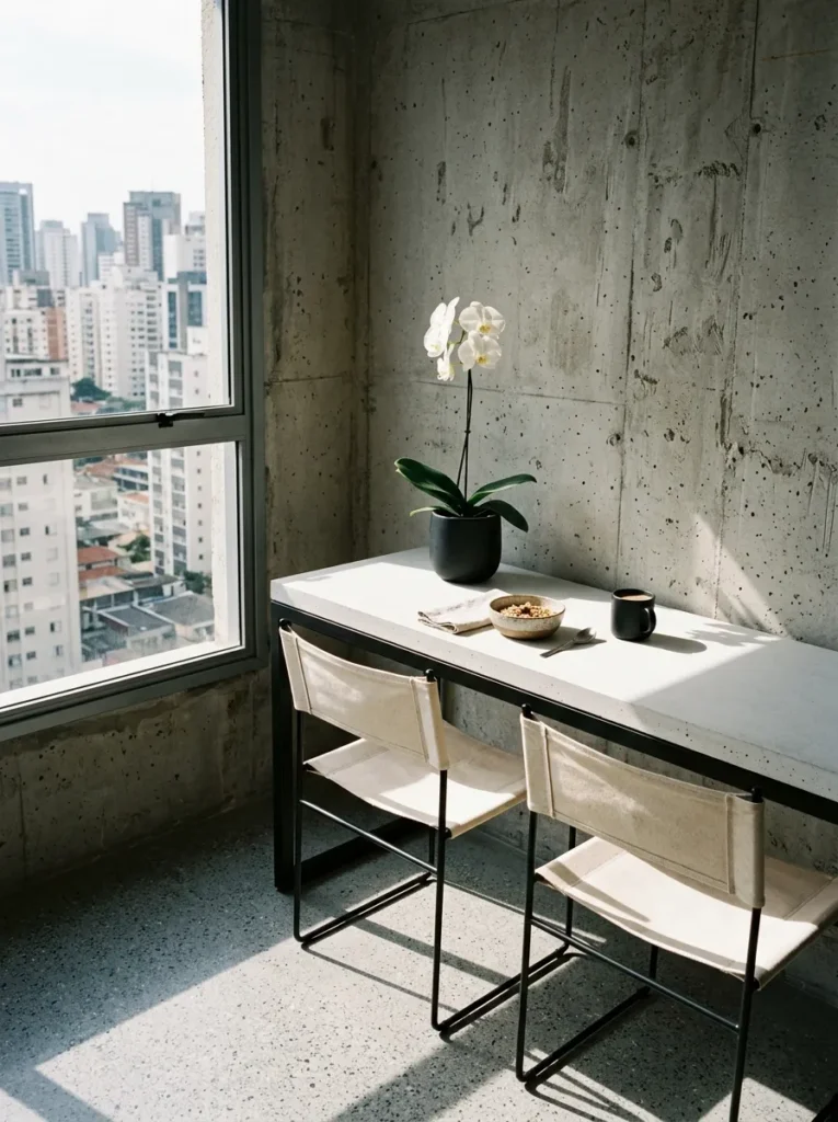
Minimalism in a breakfast corner is frequently attempted and rarely achieved, because it requires not adding less but editing more ruthlessly. The table surface should be a single material with no visible joins. The seating should have no visible fixings. The wall behind should have no art, no shelving, and no visible hardware. Everything not essential to the function of sitting and eating should be elsewhere. That is a harder standard than most minimalist breakfast corner guides admit.
The materials carry all the weight here. Honed white concrete, matte black powder-coated steel, unbleached cotton canvas: these are the surface choices that hold up without decoration. One plant — a single stem orchid or a small sculptural cactus — is the one concession that all minimalist interiors make, and not just for aesthetics.
16. Breakfast Corner with a Chalkboard or Pinboard Wall
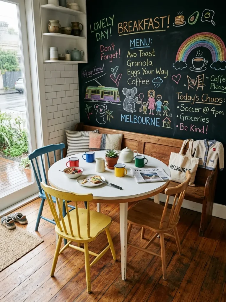
A chalkboard wall behind the breakfast corner solves a real problem that nobody talks about in home design content: where does the family communicate in a house where nobody reads the group chat? A chalkboard here — painted with proper chalkboard paint, not the vinyl decal version which peels — becomes a weekly menu board, a reminder wall, a children’s drawing surface, and a visual anchor for the corner simultaneously.
The wall should be at least 90 centimetres wide and extend from the top of the seat back to the ceiling, which is typically around 90 centimetres of chalkboard surface. Use a fine chalk pen for permanent text and soft chalk for the daily changing content. The chalk dust settles onto the seat cushion below, which is the practical detail this idea requires you to accept before committing.
17. Corner Breakfast Nook with Wallpaper Feature Wall
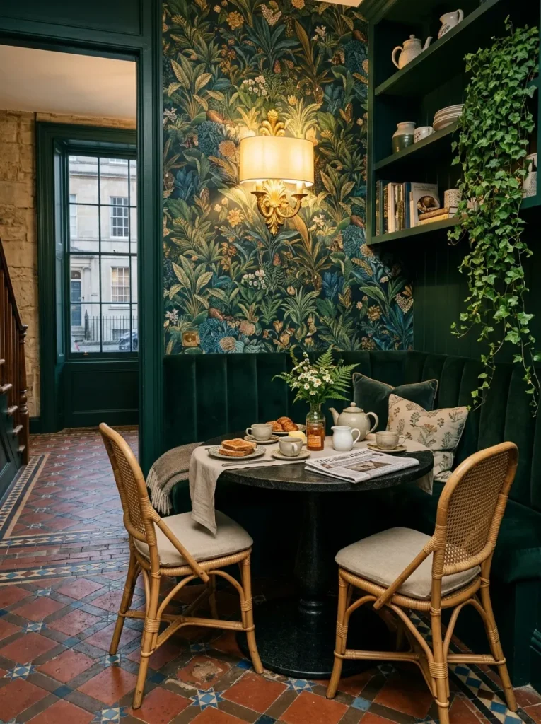
Wallpaper in a breakfast corner works because the corner contains the pattern in a way that prevents it from overwhelming the room. A bold print that would be too aggressive across an entire kitchen is perfectly proportioned behind a banquette. The rule that almost no guide states clearly: the wallpaper should appear on the back wall of the corner only, not wrapping around onto the adjacent wall. The single plane of pattern is the version that photographs and reads well in person.
Paper with a vinyl coating or a fabric-backed wallpaper is the correct specification for a kitchen-adjacent space — humidity and steam will lift a standard wallpaper within a year. Paste-the-wall rather than paste-the-paper application makes re-hanging or replacement significantly easier when the time comes, and the time always comes.
18. Breakfast Corner with Plants and Greenery
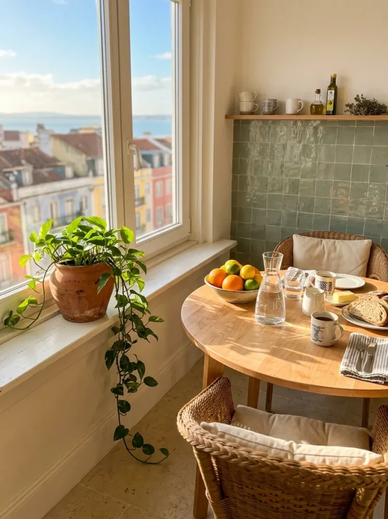
Plants do something in a breakfast corner that no other element can: they make the space feel alive in the literal rather than the interior design sense. Morning light makes plants a visible, daily presence in a way that a plant in a darker corner of the room never achieves. A trailing pothos or a compact monstera deliciosa on the windowsill beside the table is the version that thrives without intensive maintenance.
The planter matters as much as the plant. A handmade terracotta pot with a saucer, or a glazed stoneware planter in a tone that connects to the colour palette of the corner, reads as considered. A plastic nursery pot does not. This is not snobbery — it is about whether the plant integrates or just occupies space, and that difference is visible in every photograph.
19. Breakfast Corner with a Built-In Seating Nook and Table
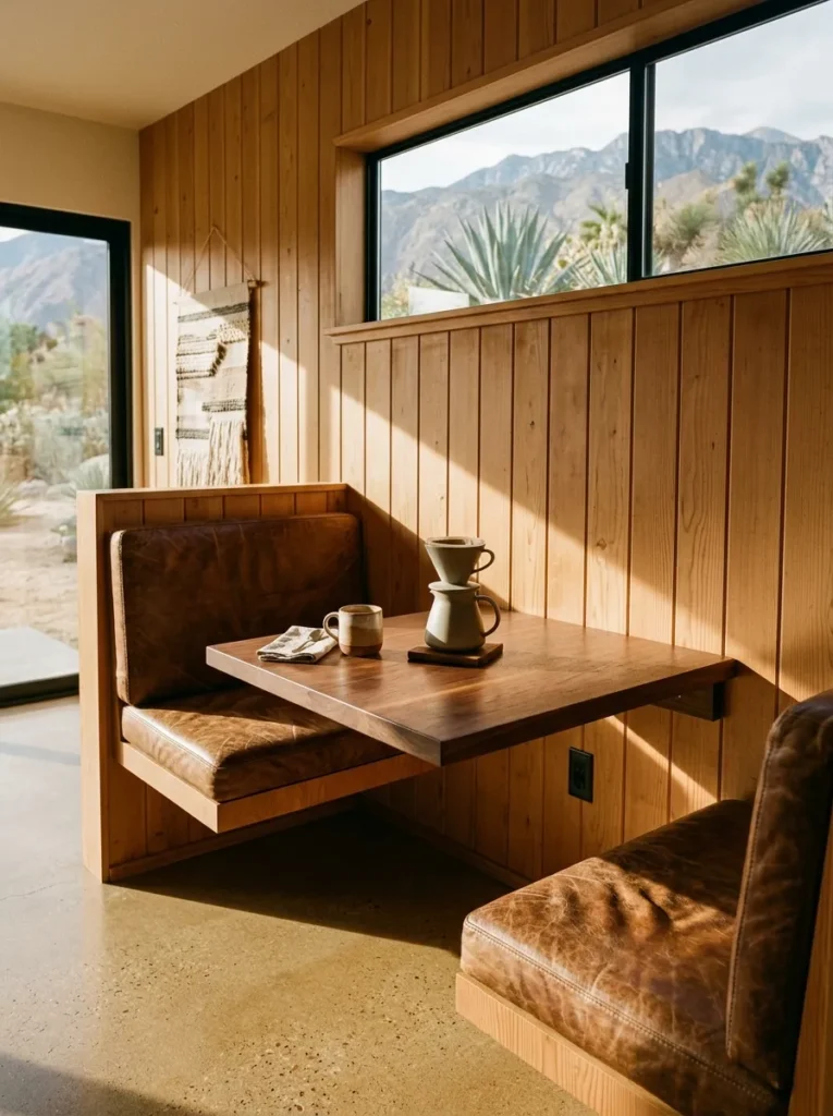
A fully custom built-in seating nook with an integrated table is the most architecturally serious version of a breakfast corner, and it is also the version most likely to still feel right in fifteen years. The integration of seat and table into one continuous joinery piece creates a visual coherence that furniture arrangements can approach but never quite reach. The table should cantilever from the wall or be supported by a single central leg — four legs within a built-in nook create a clearance problem that nobody remembers to solve until after installation.
Dimensions for a two-person built-in: seat height 45 centimetres, seat depth 50 centimetres, table height 72 centimetres, minimum table surface 75 centimetres wide by 60 centimetres deep. These numbers are specific because the joinery manufacturer will ask for them, and guessing produces a nook that looks right and sits wrong.
20. Industrial-Style Breakfast Corner with Metal Accents
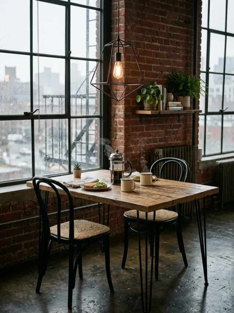
Metal in a breakfast corner reads as industrial when the scale is heavy and as refined when it is fine. The difference between a breakfast corner that feels like a converted warehouse and one that feels like a considered home is almost always in the weight of the metal elements. Hairpin legs on the table at 10 millimetre diameter, a thin matte black frame on the pendant shade, an aged steel base on the chairs — these are the fine-scale metal accents that reference industrial without committing to it.
The key counterpoint is warmth. Raw timber, woven textiles, and ceramics are what stop an industrial breakfast corner from feeling cold. The metal does the structural and visual work; everything else provides the human-scale texture. Without at least two warm material counterpoints, the metal reads as a design decision made for photographs rather than mornings.
21. Breakfast Corner with a Gallery Wall Behind the Seating
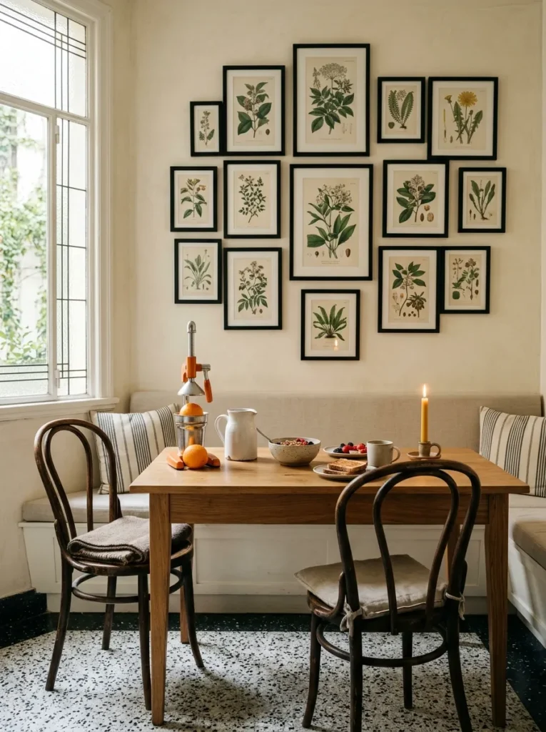
A gallery wall behind a breakfast bench is the idea that requires the most restraint to execute well. The prints should be framed in one or at most two frame styles — one black and one natural wood, for instance — and the arrangement should be tighter than feels comfortable, with gaps of 5 to 8 centimetres between frames. The instinct to spread prints across a wider area is the instinct that turns a gallery wall into a scattering.
Art at eye level while seated is at a different height than art at eye level while standing. The lowest print in the arrangement should sit at approximately 130 centimetres from the floor — which is roughly eye level for someone seated — not the conventional 145 to 150 centimetres that works for a standing viewer. This single adjustment makes the gallery wall feel like it was designed for the seat rather than placed on the wall first.
22. The Breakfast Corner with Nothing Extra
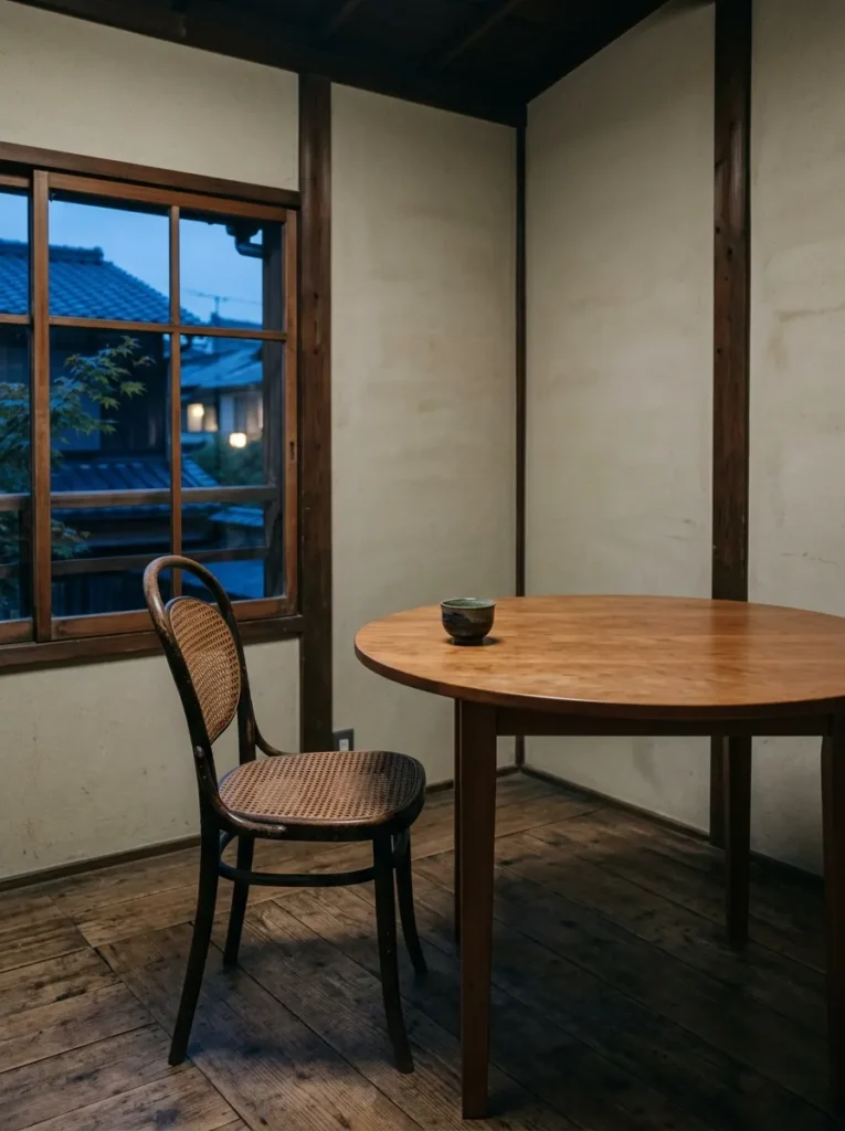
The final idea is the one that contradicts several of the preceding twenty-one: the breakfast corner that has been deliberately left alone. No gallery wall. No wallpaper. No open shelving. Just a good table, a comfortable seat, and a source of light. The restraint is not a failure of imagination — it is the outcome of a specific decision that most people never arrive at because they keep adding rather than stopping.
The rooms that age best are the ones where the designer — or the homeowner — knew when to stop. A round table in a warm timber, a window with nothing on the sill, two chairs with no cushions needed because the chair itself is right: this is the breakfast corner that looks as good in ten years as it does today. Everything else is optional, and knowing that is the most useful piece of design advice this entire list can offer.
Final Thoughts
The best breakfast corner ideas share one quality: they make the morning feel less rushed. Start with the seat — banquette, bench, or chair — because comfort determines whether the corner actually gets used. From there, the lighting and the surface follow. It does not need to be large. Some of the most atmospheric morning corners are the smallest ones, where proximity creates the feeling of enclosure rather than constraint. One thing most people discover too late: the corner that photographs beautifully and the corner that actually works every morning at 7am are almost always the same corner, and it is always the one that was designed with function first.
Save these breakfast corner ideas for your next kitchen or dining room refresh.