21 Luxury Dining Room Ideas That Feel Sophisticated
A luxury dining room earns that word through restraint as much as richness. The best ones aren’t the loudest spaces in the house — they’re the most considered, where every material, every light source, and every surface has been chosen on purpose rather than added for effect. These 21 luxury dining room ideas focus on the details that separate a genuinely elevated space from one that simply looks expensive in photos: scale, lighting layers, material contrast, and the kind of styling that holds up to actual dinner parties, not just empty staging shots.
Each idea explains exactly what it is, why it reads as sophisticated rather than showy, and how to bring it into a real room without overspending or overcrowding the space. Some require structural changes, like a coffered ceiling or built-in cabinetry. Others are as simple as switching a tablecloth for a runner or adding a second light source at a different height. Whether you’re designing a dining room from scratch or refining one piece at a time, you’ll find ideas here that scale to your actual budget and your actual home.
1. A Statement Chandelier: The Anchor of Any Luxury Dining Room
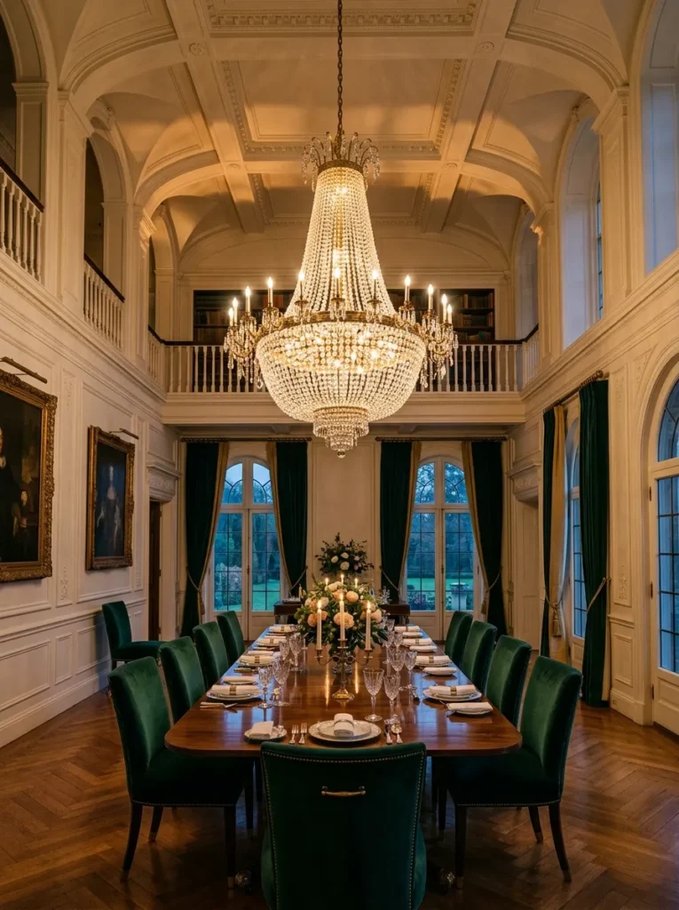
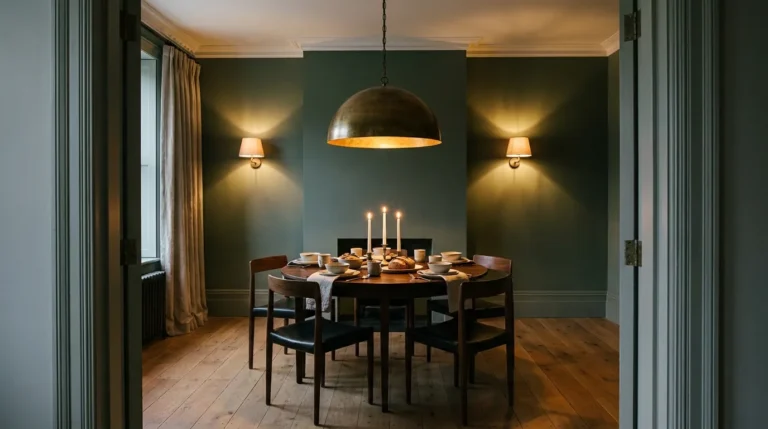
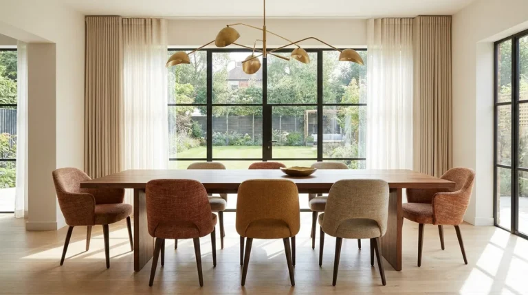
Most dining rooms underuse their chandelier, hanging something sized for a much smaller room simply because it was the safe choice. A luxury dining room calls for a fixture sized to the room’s volume, not just the table beneath it — as a general guide, the fixture’s diameter should roughly match half the table’s width, and it should hang low enough to feel intimate without blocking sightlines across the table. This idea works in any ceiling height of eight feet or more, since the real driver of luxury here is proportion, not how tall the room happens to be.
2. Upholstered Wall Paneling for Acoustic and Visual Softness
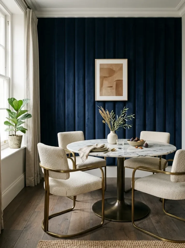
Upholstered wall paneling does something paint and wallpaper can’t: it absorbs sound, which matters more in a dining room than almost any other room in the house, given how much hard, reflective surface area a typical table and chair set already contributes. Channel-tufted or box-tufted paneling in a rich velvet or boucle softens both the acoustics and the visual hardness of a room full of wood, glass, and stone. Reserve it for a single wall, almost always the one a buffet or banquette sits against, so the texture has somewhere to anchor rather than wrapping the entire room in fabric.
3. A Polished Stone or Mirrored Dining Table as the Room’s Reflective Core
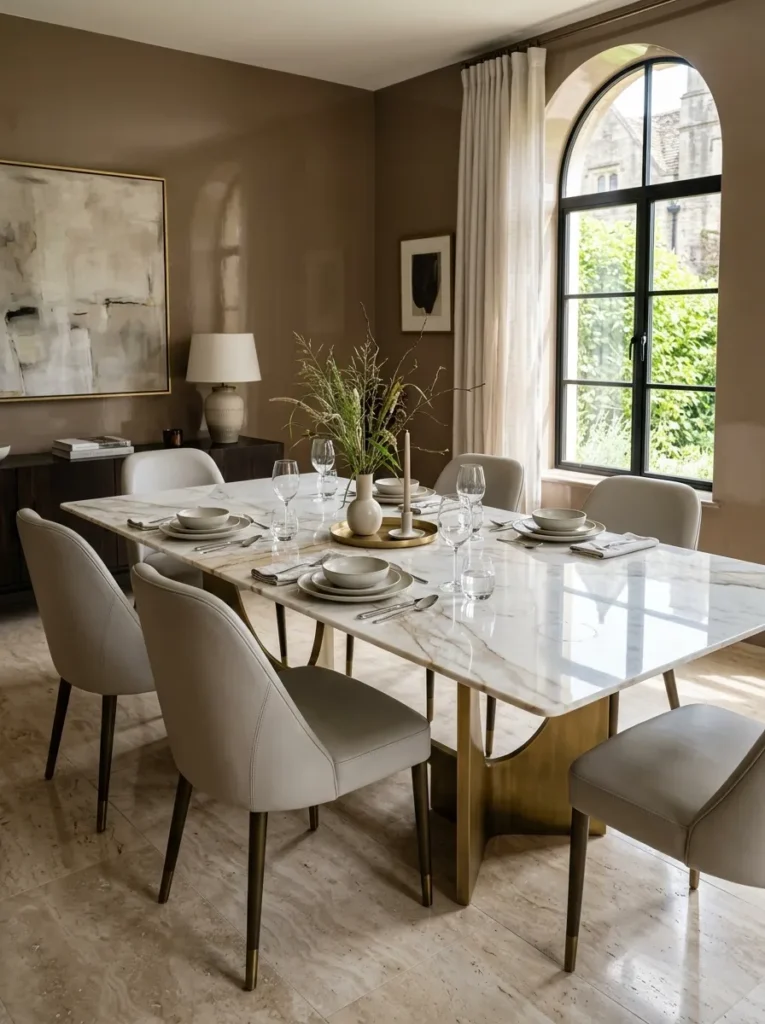
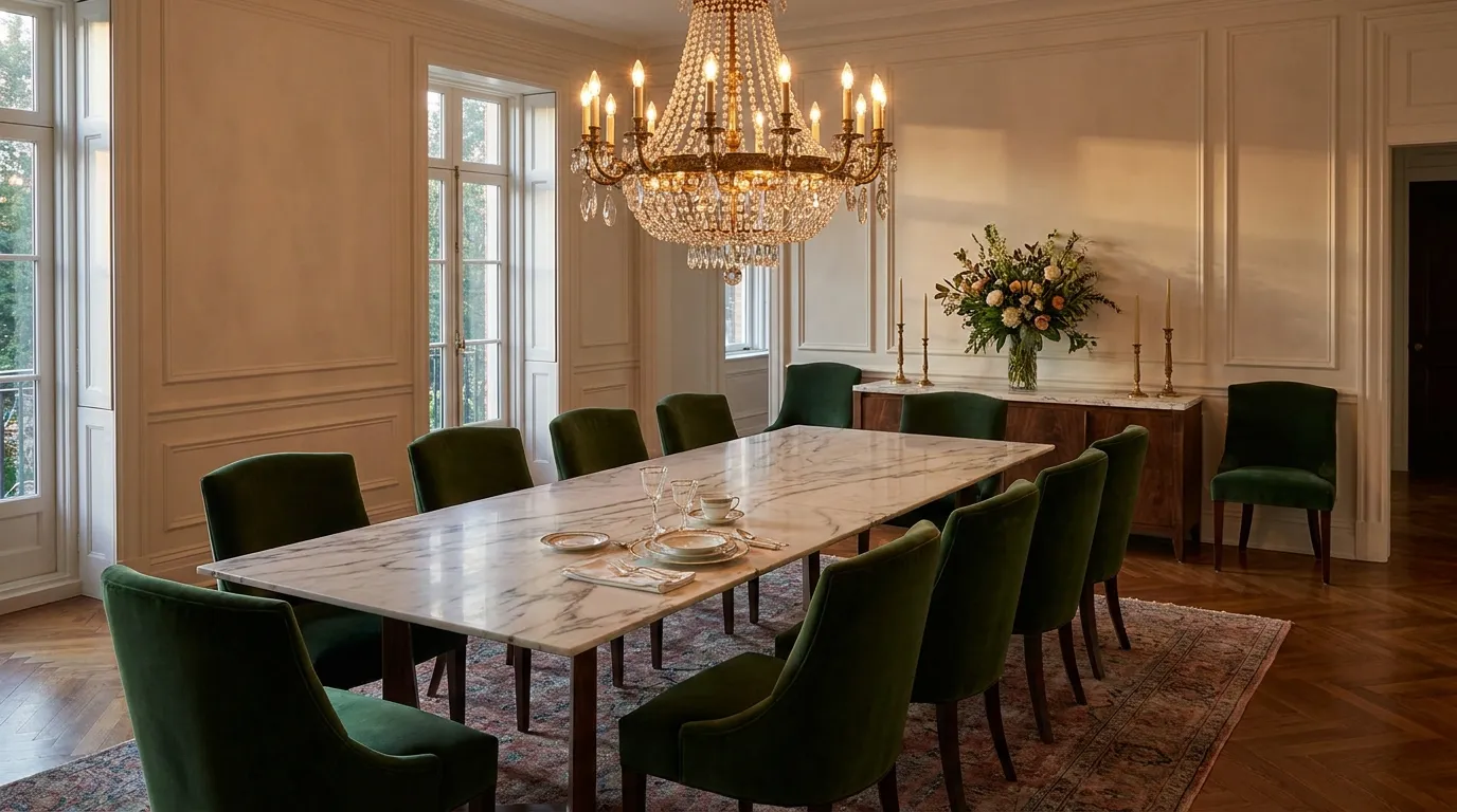
A polished stone or mirrored table top multiplies whatever light source sits above it, doubling the visual impact of a chandelier or pendant without adding a second fixture. Book-matched marble, where two slabs are cut and mirrored to create a symmetrical vein pattern down the table’s center, reads as deliberately luxurious in a way a single uninterrupted slab doesn’t quite achieve. The tradeoff is maintenance — polished stone shows water rings and fingerprints far more readily than a matte or wood finish, so this idea suits households willing to wipe the table after every use rather than let it air dry.
4. Velvet Upholstered Dining Chairs for Tactile Comfort
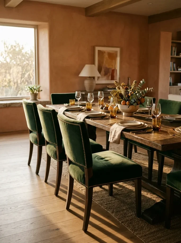
Hard wood or metal dining chairs photograph well but rarely get used for longer than a quick meal, while velvet upholstery invites people to actually linger at the table, which is the entire point of a dining room built for entertaining. Choose a performance velvet over a delicate one if the room sees regular use, since modern performance fabrics now replicate the depth and sheen of true velvet while resisting stains. Brass nailhead trim along the seat edge adds a small luxury detail that catches light without requiring an entirely new chair silhouette.
5. A Built-In Banquette with Tailored, Fitted Cushions
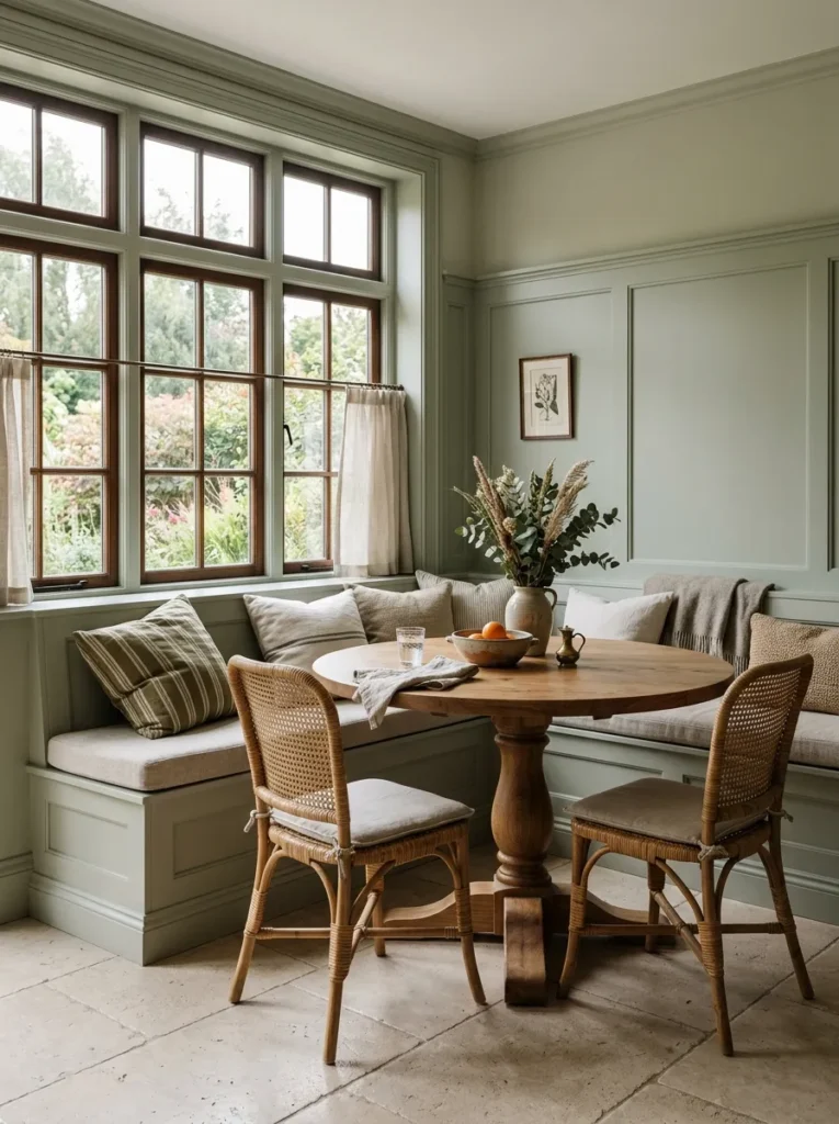
A built-in banquette with cushions fitted precisely to the millwork reads as custom in a way a row of standalone chairs never will, since the seating becomes architecture rather than furniture. This idea works especially well in awkward corners or window-heavy walls where standard chairs would have to navigate around radiators or low sills. Commission the cushions from an upholsterer who measures the bench in person rather than ordering standard sizes online — even a half-inch gap between cushion and millwork undercuts the built-in look this idea depends on.
6. A Coffered or Tray Ceiling for Architectural Depth
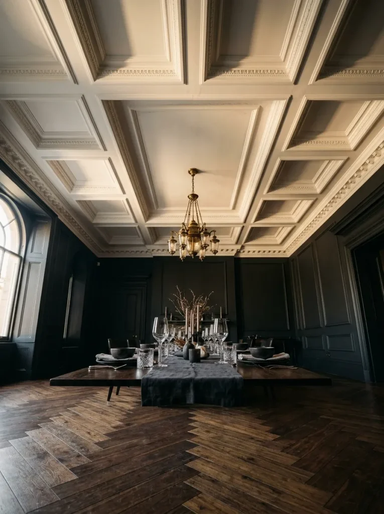
A coffered or tray ceiling gives a dining room a sense of architectural intention that flat drywall simply can’t replicate, breaking the ceiling plane into a grid of recessed panels that catches light and shadow differently throughout the day. Painting the coffers a contrasting tone from the walls — white panels against a dark wall color, for instance — sharpens the geometry and makes the ceiling read as a deliberate feature rather than an afterthought. This idea requires real construction rather than a paint trick, so it suits a renovation or new build more than a quick refresh, but it’s one of the few changes here that permanently raises a room’s perceived formality.
7. A Marble-Top Sideboard for Serving and Display
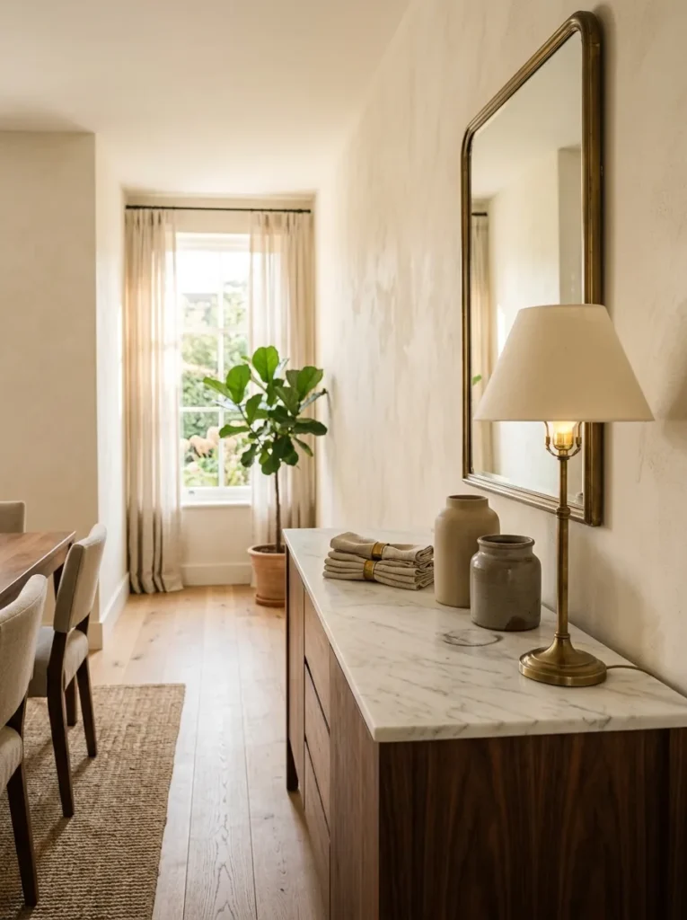
A marble-top sideboard solves the practical problem every dining room eventually runs into — somewhere to land serving dishes, extra glassware, or a course between the kitchen and the table — while doing it with a material that elevates rather than competes with the room. Choose a stone with movement in the veining over a flat, uniform slab, since the visual interest is part of what separates this from a basic wood buffet. Style the top with no more than three or four objects of varying height; a sideboard crowded edge to edge undercuts the same restraint that makes the room feel considered rather than staged.
8. Floor-Length Layered Drapery with Substantial Hardware
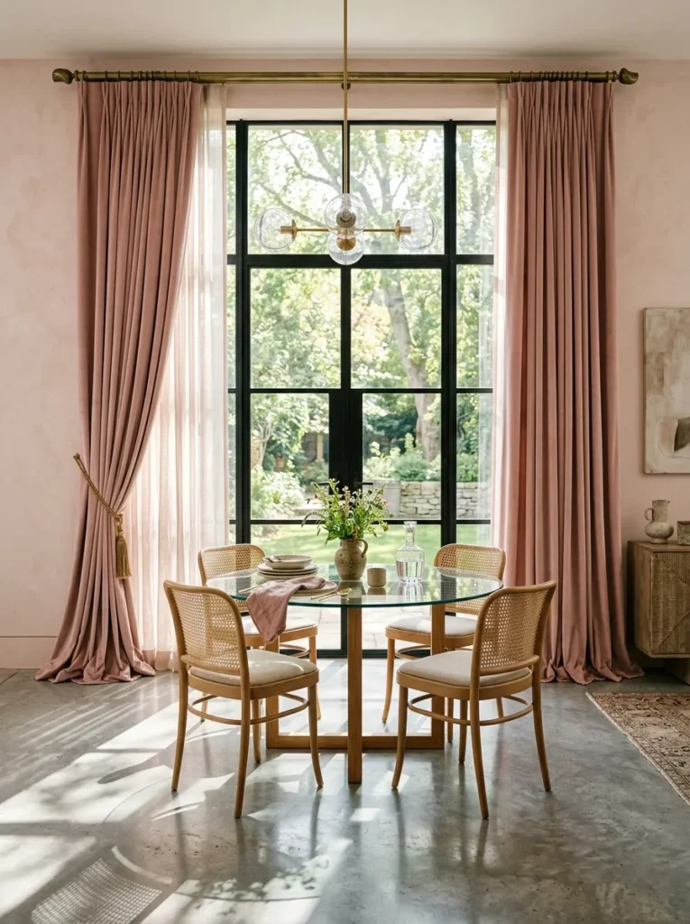
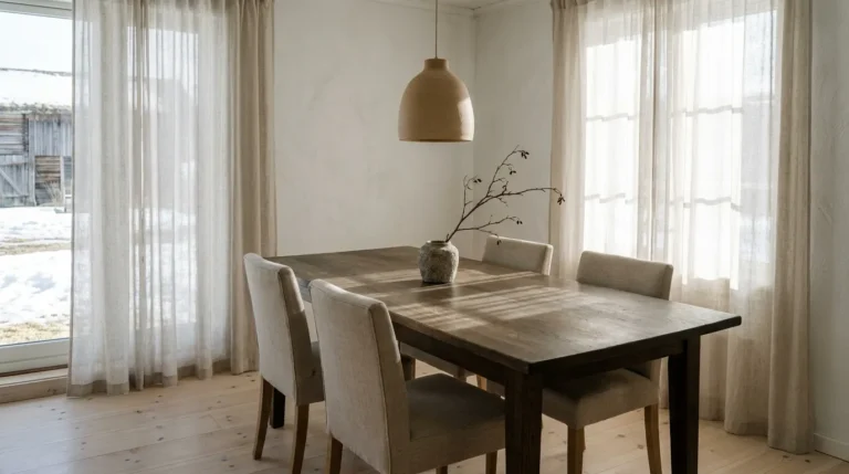
Drapery hung close to the ceiling on substantial hardware, rather than mounted directly above a window frame on a thin standard rod, is one of the most reliable ways to make a dining room feel taller and more considered without touching the architecture. Layer a sheer panel beneath a heavier drape so the window still filters daylight even when the outer panels are closed, and let the fabric puddle slightly at the floor rather than stopping precisely at the sill — that extra half-inch of fabric is a small, deliberate signal of luxury that a hemmed-to-the-floor panel doesn’t send.
9. An Oversized Painting: A Simple Luxury Dining Room Focal Point
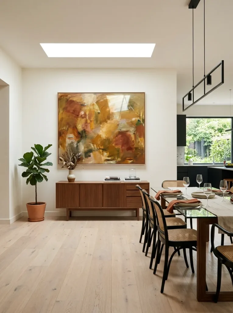
A single oversized painting, scaled to fill most of the wall above a buffet or console, does more for a dining room’s sophistication than a gallery wall of smaller pieces ever could, since the scale alone signals confidence and intention. Choose artwork with color that echoes one accent already in the room — a rug, a chair fabric, a vase — rather than introducing an entirely new palette the rest of the space has to catch up to. This idea works best when the painting is the room’s only major art statement; competing for attention with a second large piece elsewhere in the room dilutes the impact of both.
10. A Built-In China Cabinet with Interior Lighting
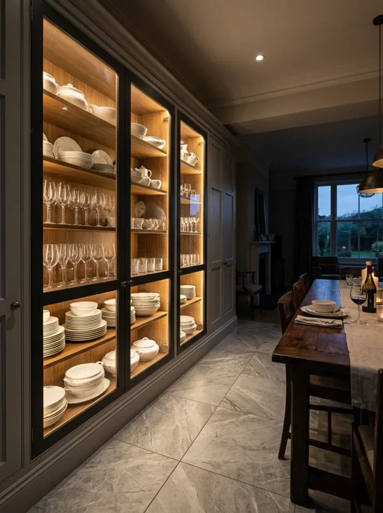
Interior lighting is the detail that separates a builder-grade china cabinet from one that reads as genuinely luxurious, since warm, low LED strips inside the cabinet turn stacked dinnerware and stemware into a lit display rather than just stored inventory behind glass. Position the lighting along the top of each shelf rather than only at the cabinet’s crown, so every level of the cabinet glows evenly instead of fading into shadow toward the bottom. This idea pairs naturally with open or glass-front doors rather than solid wood ones, since the entire point is letting the collection be seen.
11. A Hand-Knotted Area Rug Anchoring the Table
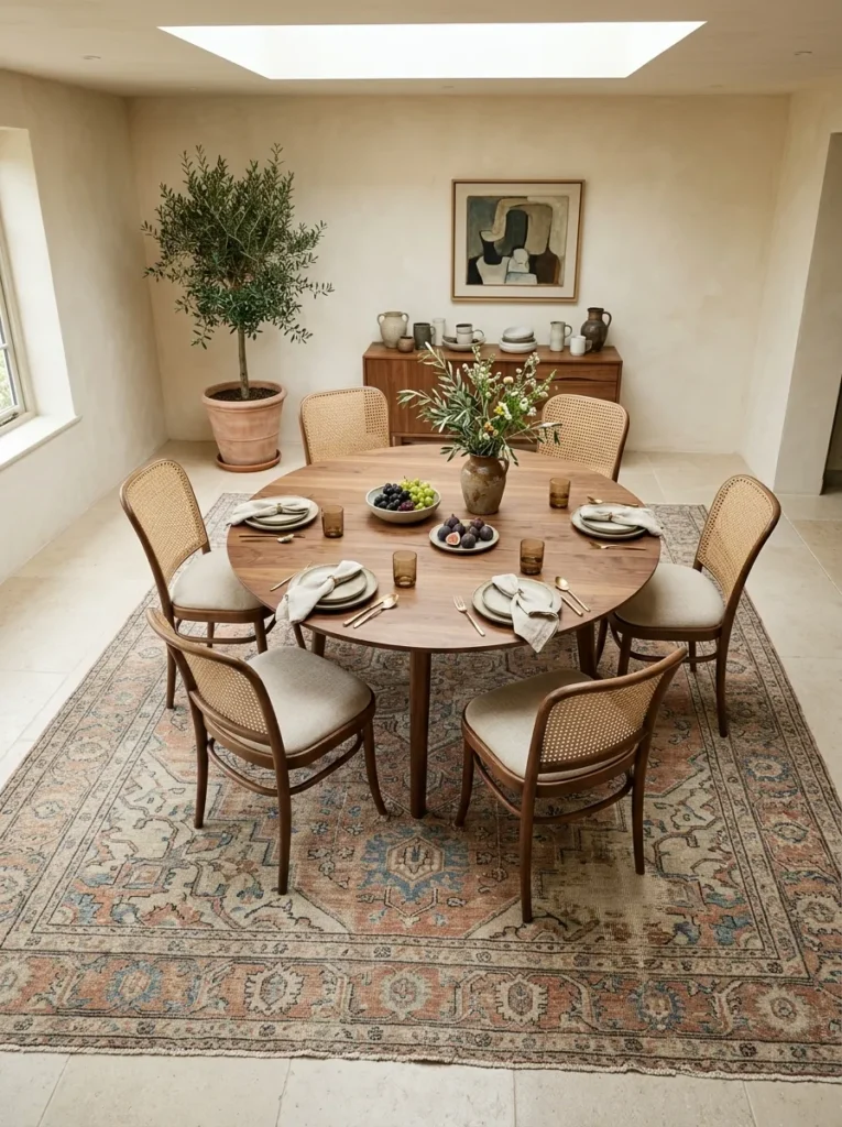
A hand-knotted rug brings a level of texture and craftsmanship underfoot that a machine-made rug, however well-designed, can’t fully replicate, and the slight irregularities in a true hand-knotted piece are part of what reads as luxury rather than mass production. Size the rug to extend at least twenty-four inches beyond the table’s edge on all sides, so chairs stay fully on the rug even when pulled out, which is one of the most common sizing mistakes in dining room rug selection. A slightly faded, vintage-inspired pattern also hides wear better over years of regular use than a crisp, high-contrast new design.
12. Wall Sconces Flanking a Mirror or Artwork
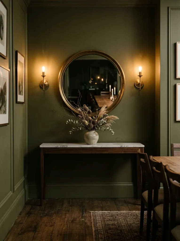
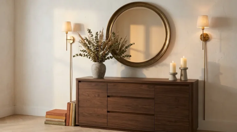
Overhead lighting alone leaves a dining room feeling flat once the sun goes down, and a pair of wall sconces flanking a mirror or piece of art adds a second light layer at eye level that softens the harsher shadows a single chandelier casts from above. The symmetry of flanking sconces also reinforces the kind of formal balance that reads as considered rather than accidental. Dim them lower than the chandelier during dinner specifically, since the goal is ambient warmth around the room’s edges, not competing brightness with the fixture above the table.
13. A Built-In Wet Bar Nook for Entertaining
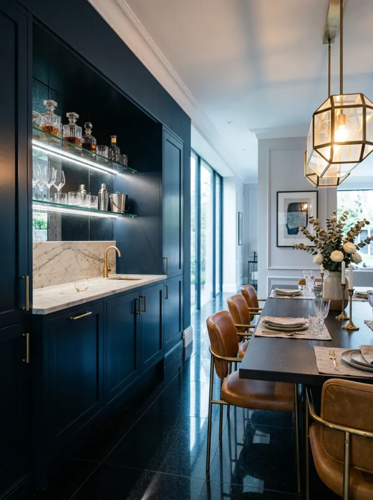
A built-in wet bar nook gives a dining room a dedicated zone for entertaining that doesn’t require carrying drinks back and forth from the kitchen all evening, which matters more than most people expect once a dinner party actually gets underway. Glass shelving lit from beneath turns the bottles and glassware into part of the room’s ambient lighting rather than just storage, echoing the same display logic as a lit china cabinet but with a more social, active function. This idea suits dining rooms with at least one full uninterrupted wall, since a cramped or narrow nook undercuts the relaxed, hosting-forward feel it’s meant to create.
14. Metallic or Botanical Print Wallpaper for Pattern Without Clutter
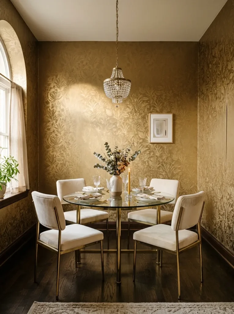
A metallic or botanical print wallpaper introduces pattern and shimmer into a dining room without relying on busy accessories to do the same job, since the wall itself becomes the room’s primary decorative layer. Choose a paper with a tonal, repeating botanical motif over a high-contrast graphic print, since the goal is texture and depth rather than a pattern that competes with artwork or table styling. This idea works particularly well in smaller dining rooms specifically, where a fully wrapped wallpaper application reads as intentional and immersive rather than overwhelming, the way it might in a much larger open space.
15. A Mixed-Material Table Base Combining Brass, Stone, and Wood
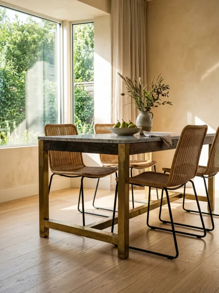
Mixing three distinct materials in a single table base — typically brass, stone, and wood — creates visual richness that a single-material piece can’t achieve on its own, since each material catches and reflects light differently throughout the day. The key to making this work without looking busy is committing to one material as dominant and treating the other two as accents; a brass-dominant base with small stone and wood inset details reads more intentional than three materials given equal visual weight. This idea suits a room that’s otherwise fairly restrained in its palette, since the table itself is already doing significant visual work.
16. An Antique Credenza Repurposed for Dining Room Storage
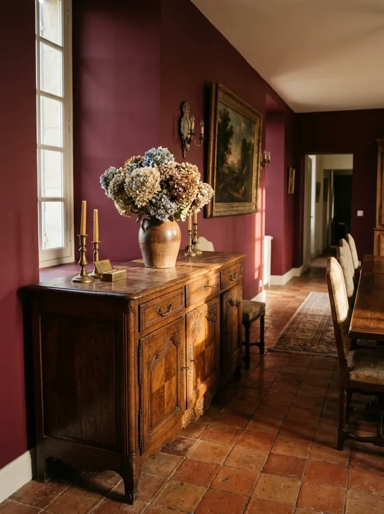
An antique credenza brings a layer of history into a dining room that new furniture, however well-made, simply can’t replicate, and the slight wear on real antique hardware and wood is part of what makes the piece feel collected rather than purchased to match a showroom set. Look for pieces with consistent original hardware throughout rather than replaced or mismatched pulls, since that detail signals authenticity at a glance. This idea works well as a counterpoint to an otherwise modern room, since the contrast between old and new furniture often reads as more sophisticated than an entirely matched-era space.
17. A Curated Tablescape as a Standing Styling System
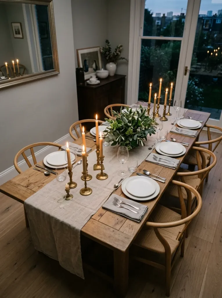
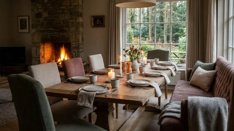
A dining table styled with intention even when no one’s eating at it turns the table itself into a piece of standing decor rather than a blank surface waiting for use. Vary candlestick heights rather than lining up a uniform row, and choose a runner over a full tablecloth so the wood or stone tabletop still shows through as part of the material story. This idea costs very little relative to almost everything else on this list, since it relies on objects most dining rooms already own — it’s the arrangement, not the inventory, that does the work.
18. Recessed Picture Lighting for Gallery-Style Art Display
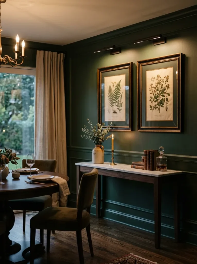
Recessed or surface-mounted picture lighting gives artwork museum-quality presentation that ambient room light alone never achieves, casting a focused, even wash across the piece rather than letting it fade into whatever light happens to reach that wall. This detail matters most in dining rooms that double as the home’s primary art display space, since dinner guests spend far more time facing the walls than they do in most other rooms of the house. Choose a warm color temperature close to 2700K for the picture lights specifically, since cooler light tends to wash out warm tones in oil paintings and aged frames.
19. A Decorative Ceiling Medallion Beneath the Chandelier
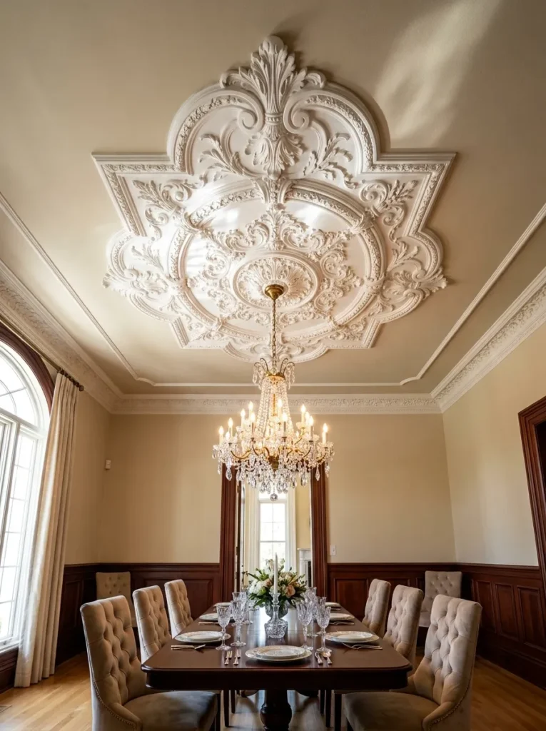
A ceiling medallion gives a chandelier a proper architectural frame instead of letting the fixture hang from a plain, unadorned ceiling point, and the relief pattern catches light in a way that adds detail to a part of the room most people never think to decorate. Choose a medallion scaled to roughly match the chandelier’s canopy width, since an undersized medallion looks like an afterthought and an oversized one can overwhelm a lower ceiling. This idea pairs naturally with traditional or transitional dining rooms specifically, since the ornate detailing reads as out of place against a starkly modern, minimalist room.
20. A Floor-to-Ceiling Glass Cabinet for Wine or China Display
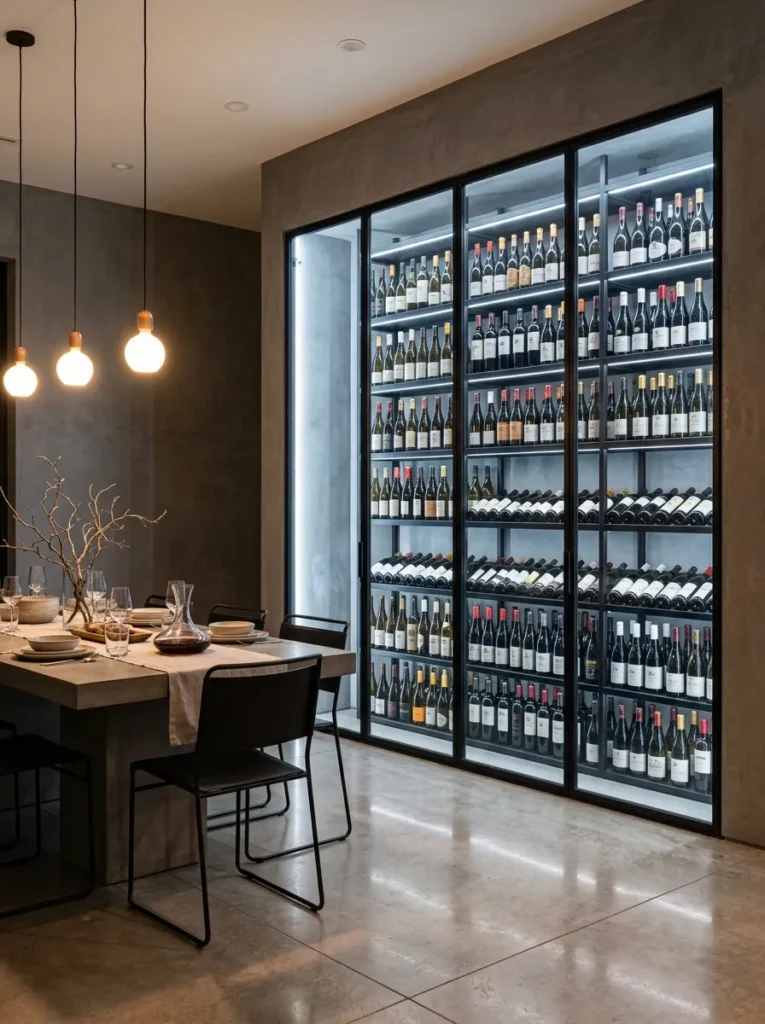
A floor-to-ceiling glass cabinet turns an entire wall into a lit display, whether for a wine collection or fine china, and the sheer scale of it makes a much stronger statement than a single cabinet or rack ever could. This idea suits open or double-height dining rooms specifically, since the full vertical impact gets lost in a standard eight-foot ceiling. Climate considerations matter here too if it’s housing wine specifically — confirm the cabinet includes temperature regulation rather than just glass doors and lighting, since direct light and heat fluctuation will damage a collection faster than no display at all.
21. A Symmetrical Layout Anchored by an Architectural Focal Point
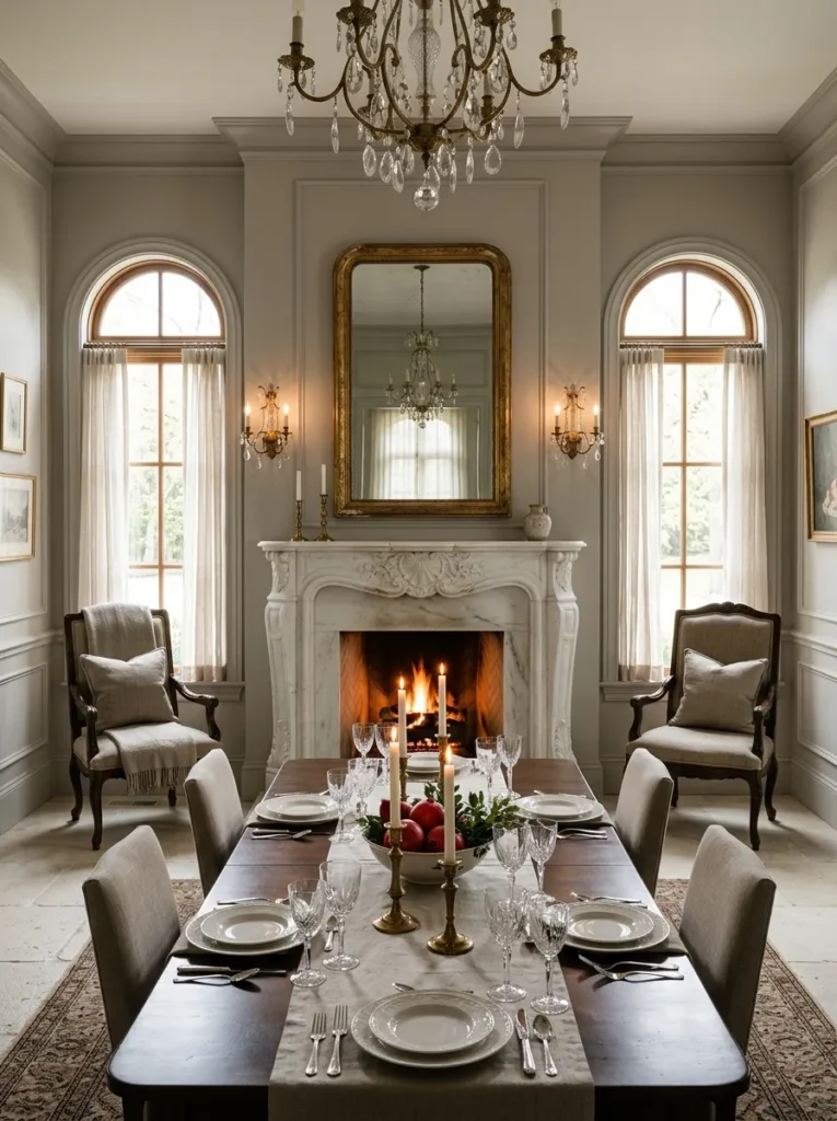
Arranging a dining room with strict symmetry around a single architectural focal point, whether a fireplace, a large window, or a built-in cabinet, creates a sense of formality and calm that an asymmetrical layout rarely achieves, even when the asymmetrical version uses nicer individual pieces. Matching pairs on either side of the focal point — sconces, chairs, artwork — reinforce the balance rather than introducing variation that pulls the eye away from center. This idea works best as the very first decision in a dining room’s layout, since retrofitting symmetry around furniture chosen for other reasons rarely lines up as cleanly as planning around it from the start.
Final Thoughts on Designing a Sophisticated Dining Room
The most convincing luxury dining room ideas all share a quiet confidence — they don’t rely on one expensive showpiece doing all the work, but on several considered layers of light, material, and scale working together. A chandelier sized correctly for the room, a table that reflects it, chairs upholstered in something worth touching, and one focal point the rest of the room defers to: that combination does more than any single splurge purchase ever could. Pick a handful of ideas that match your room’s existing architecture rather than trying to layer all 21 into one space at once.
If there’s one instinct worth resisting, it’s filling every surface the moment a space feels finished. The sideboard with three objects instead of twelve, the wall with one painting instead of a gallery, the table styled simply rather than maximally — that restraint is usually what separates a dining room that reads as sophisticated from one that just reads as expensive.
Save this guide to your Pinterest board so you can revisit these luxury dining room ideas whenever you’re ready to elevate your own space.