20 Sage Green Bathroom Ideas That Bring Nature Indoors
Sage green has earned a permanent place in bathroom design — not because it follows a trend but because it addresses something most bathroom palettes miss: the quality of being genuinely calming without being cold. White bathrooms are clean but can read as clinical. Grey bathrooms are sophisticated but can feel heavy. Sage green is warm enough to feel welcoming, muted enough to feel restful, and botanical enough to feel like the room has a point of view.
The challenge is that sage green isn’t a single color. It spans a spectrum from cool grey-green (closer to eucalyptus) to warm olive-green (closer to dried herbs) to dusty blue-green (closer to sea glass), and the undertone determines how it reads in the specific light conditions of your bathroom. A sage that photographs beautifully in a north-facing bathroom with cool natural light can look muddy in a warm-lit south-facing room — and vice versa.
These 20 sage green bathroom ideas address the full range of applications: tile, paint, vanities, accessories, and complete room directions that commit to sage green as the bathroom’s primary color story. Each idea includes practical guidance on undertone selection, material pairings, hardware finishes, and how the color behaves at different light levels throughout the day.
Whether you’re planning a full renovation or looking for lower-commitment ways to introduce sage green into an existing bathroom, the ideas here cover the spectrum from a single painted vanity to a fully color-drenched room where sage defines every surface.
1. Sage Green Limewash Walls for Organic Depth
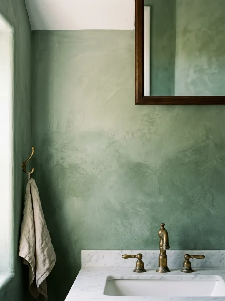
Sage green in a limewash finish — rather than flat paint or a standard emulsion — creates a wall surface with genuine visual depth. The limewash technique produces natural tonal variation across the wall: slightly lighter near the ceiling where the application is thinner, richer and more saturated at mid-height, with the inherent mottled quality of the lime-based finish creating surface movement that a flat paint doesn’t provide.
In a bathroom, this surface movement changes with the light. Under morning natural light, the limewash sage reads as fresh and slightly luminous. Under warm artificial evening light, it deepens toward an earthy olive tone. The shifting quality of the surface is precisely what makes limewash particularly suited to a bathroom, where the lighting conditions change dramatically between early morning and late evening use.
The practical requirement: in a bathroom with a shower, limewash paint should be applied only to walls that don’t receive direct water splash. Modern limewash formulations can handle bathroom humidity in a well-ventilated space, but sustained water contact will damage even sealed limewash over time. Confine the limewash to walls away from the shower zone or seal it with an appropriate clear topcoat.
2. Full Color-Drench — Walls, Ceiling, and Trim in the Same Sage

Painting the walls, ceiling, and trim (baseboards, door casing, window sill) all in the same sage green creates a color-drenched bathroom that reads as a complete, architectural decision rather than a painted room. The color surrounds the space rather than appearing on some surfaces and not others, which creates a more immersive and considered quality than walls-only painting.
The color-drench approach is particularly effective in small bathrooms where the standard approach — white ceiling, white trim, colored walls — fragments the room visually. When all surfaces share the same color, the eye doesn’t register where one surface ends and another begins, and the room reads as larger and more resolved than it does with four different tones competing across its surfaces.
The specific sage tone should be tested in the bathroom’s actual light before committing. What reads as sage in a paint store may read as more grey-green or more yellow-green in the bathroom’s specific light conditions. Apply a large test patch — at least 12 by 12 inches — on two different walls and observe it at multiple times of day, under both natural and artificial light, before finalizing.
3. Sage Green Subway Tile in a Running Bond Pattern

Sage green glazed ceramic subway tile in a traditional running bond (brick) layout is one of the most accessible ways to introduce sage green to a bathroom because it allows the tile to carry the color while keeping the grout, fixtures, and fittings in more neutral territory. The tile’s glaze creates a slight reflectivity that keeps the sage from reading as heavy in a smaller bathroom.
The grout color is the decision that most affects the tile wall’s final character. A white or off-white grout creates a crisp, defined grid that makes each tile legible individually — the pattern reads as a grid of sage green tiles. A grout in a warm grey or a sage-adjacent tone (slightly darker than the tile) creates a more continuous surface where the grout joins read as subtle variations rather than strong pattern lines.
Sage green subway tile suits shower surrounds, full bathroom walls, and kitchen backsplashes alike. In the bathroom, it pairs naturally with warm natural wood vanities, aged brass hardware, and cream or white fixtures that provide enough contrast without competing with the tile’s color.
4. Large-Format Sage Green Porcelain Tile

Large-format sage green porcelain tile — in formats of 24 by 48 inches or larger — creates a bathroom wall surface with fewer grout lines, more continuous color coverage, and a more contemporary, minimalist quality than standard subway or mosaic tile. The reduced number of grout lines at this scale creates a more restful surface, particularly on a shower wall where multiple tile sizes can create visual busyness.
The large format also amplifies the color’s effect. A shower enclosure tiled floor-to-ceiling in 24-by-48-inch sage green porcelain creates a genuinely immersive sage green experience — the color wraps the showering zone and creates a cocoon-like quality that smaller tiles don’t provide at the same scale.
In a bathroom with dark ambient light or a north-facing window, large-format sage green tile can read as heavy. In that context, pairing the sage tile with white or very light grout, bright fixtures, and generous mirror coverage helps the room maintain adequate visual lightness.
5. Sage Green Zellige or Handmade Tile for Character

Zellige tile — the North African handmade ceramic tile with natural color variation, irregular surfaces, and a crackled glaze — in a sage green palette brings a craft quality to the bathroom that machine-produced tiles can’t replicate. Because each zellige tile is hand-formed and hand-glazed, no two tiles are identical, and the variation across the tiled surface creates depth and movement that reads as genuinely artisanal.
Sage green zellige reads differently from sage green porcelain: the zellige’s irregular surface catches light from multiple angles, creating a dynamic quality where different tiles appear lighter or darker depending on their orientation and the light direction. This is particularly effective in a bathroom with directional natural light, where the zellige surface shifts visibly through the day.
The practical consideration: zellige tile requires a specific installation approach. The irregular tile thickness (typically varying by 1 to 3mm between tiles) requires a skilled installer who can set each tile carefully to create a relatively flat surface. Inexperienced installation of zellige can result in a noticeably uneven surface that undermines the material’s handmade appeal rather than celebrating it.
6. Sage Green Shiplap or Beadboard Paneling

Sage green paint applied to shiplap or beadboard paneling on the bathroom walls — particularly on the lower half below a chair rail — creates a distinctly cottage, farmhouse, or coastal character that flat paint on drywall doesn’t achieve. The paneling’s horizontal lines (shiplap) or vertical grooves (beadboard) add texture to the color, creating surface interest that changes with light direction.
The sage green on paneling suits a bathroom where the design direction is relaxed and informal — a guest bathroom, a children’s bathroom, or a beach house bathroom where the goal is warmth and character rather than contemporary refinement. In a very formal or contemporary bathroom, paneling reads as a style conflict rather than a complement.
The paint finish on bathroom paneling should be semi-gloss or satin for moisture resistance. The paneling itself should be primed with a moisture-resistant primer before painting, and any gaps between individual boards should be caulked before painting to prevent moisture infiltration behind the paneling over time.
7. A Sage Green Vanity in a White Bathroom

A sage green painted vanity — the bathroom’s single colored element against otherwise white or very light surroundings — is the lowest-commitment sage green bathroom idea and often one of the most visually effective. The vanity becomes the room’s focal point and color statement without requiring any tile work, wall painting, or permanent architectural modification.
The vanity’s paint finish requires special attention for bathroom use. Cabinet-grade paint or a two-part polyurethane finish applied over a properly primed surface handles the humidity, cleaning frequency, and daily physical contact that a bathroom vanity receives. Standard wall paint on a vanity will chip, mark, and deteriorate within months of daily use regardless of how carefully it’s applied.
Hardware finish is the complementary decision that most affects the sage vanity’s overall character. Aged brass or unlacquered brass on sage green reads as warm and organic — the most popular pairing. Matte black reads as more contemporary and graphic. Brushed nickel reads as cooler and more transitional. All three work; the choice should reflect the bathroom’s overall fixture and faucet direction.
8. A Sage Green Floating Vanity for a Modern Bathroom

A floating wall-mounted vanity in sage green — no legs, mounted directly to the wall with the floor visible beneath — creates a more contemporary expression of the sage vanity idea than a floor-standing piece. The clean line beneath the floating cabinet, the visible floor running continuously underneath, and the minimal hardware (push-to-open or integrated J-pull) give the sage color a modern, furniture-quality presentation.
The floating format amplifies the sage color’s effect because the cabinet’s face is the most prominent visible surface in the bathroom — there’s no base, no legs, and no toe-kick detail to draw the eye away from the color. The entire visual weight of the vanity is carried by the painted face.
A floating sage vanity pairs particularly well with a large frameless mirror that spans the full width of the vanity wall — the mirror doubles the visual impact of the sage by reflecting it across the room, and the frameless format keeps the focus on the color rather than the mirror’s frame.
9. Sage Green and White with Aged Brass Hardware
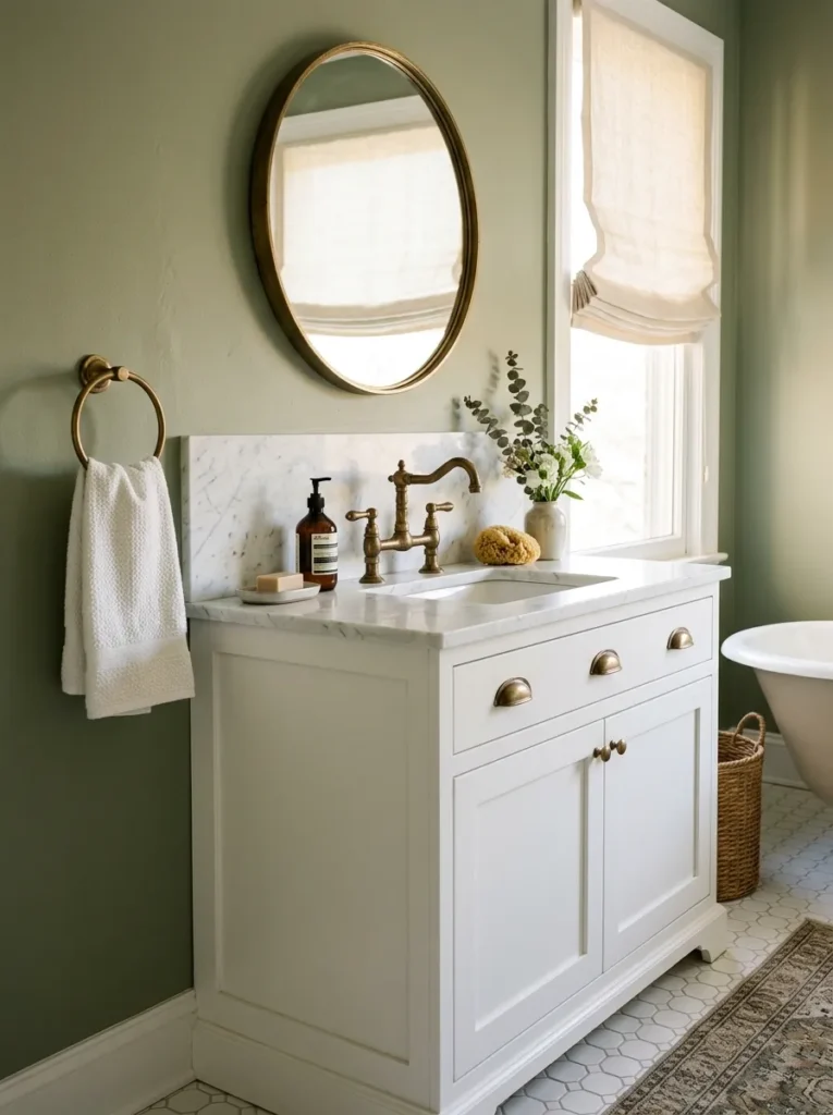
Sage green, white, and aged brass is the material combination that appears most consistently in well-styled sage green bathrooms — and for good reason. The three elements are harmonically related: sage’s warm-grey-green reads as organic and slightly aged, white provides the clean contrast that prevents sage from reading as heavy or muddy, and aged brass has exactly the warm, slightly patinated quality that suits both the sage and the white without competing with either.
The white in this combination should be slightly warm rather than cool — a warm ivory or an off-white rather than a stark brilliant white. Cool white against sage can make the sage read as more grey and less green, which flattens the color’s character. A warm white or a cream white allows the sage to read as more distinctly green and more botanical.
Aged brass appears at the hardware level: faucets, towel bars, cabinet pulls, shower fixtures. The brass doesn’t need to be identical across all these elements — slight variation in the brass’s level of warmth or patina between different fixtures reads as collected rather than mismatched, as long as all the brass elements are in the same warm-metal family.
10. Sage Green Tile with White Grout for a Fresh, Defined Look

Where a sage-adjacent grout color creates a continuous surface (Idea 3), white grout with sage green tile creates a crisp, graphic result where the tile grid is clearly legible and the contrast between sage tile and white grout reads as clean and deliberate. The white grout prevents the sage color from feeling heavy by introducing regular white lines that visually lighten the overall surface.
This combination reads as particularly fresh and contemporary when the tile format is simple — subway tile, square tile, or large-format tile — where the grid pattern created by the white grout is clean and regular. Complex tile shapes (hexagons, fish-scale tiles, geometric patterns) create a busier grout grid, which can compete with the white-grout contrast effect rather than enhancing it.
The maintenance reality: white grout on a shower wall requires more consistent cleaning than a grey or sage-adjacent grout. Mineral deposits, soap scum, and mildew read more visibly against white grout than against a tinted grout. A penetrating grout sealer applied after installation and reapplied annually reduces the cleaning burden significantly.
11. Sage Green with Natural Wood for an Organic, Spa Feel

The combination of sage green with natural wood — oak, walnut, or teak in a bathroom context — creates the most spa-like, nature-adjacent bathroom aesthetic available without requiring unusual materials or complex renovation. The sage reads as botanical; the natural wood reads as grounded and warm; together they create a bathroom that feels connected to the natural world in a way that harder, more industrial materials don’t.
The wood in this combination needs to be properly sealed for bathroom use. A wood vanity, a wooden bath mat platform, a teak shower bench, or wood-look porcelain tile all bring the wood quality into the bathroom at different levels of commitment and at different maintenance requirements. Genuine wood in a wet bathroom zone requires a marine-grade or bathroom-specific seal to prevent warping and mildew.
The sage and wood combination reads best when the wood tones are in a warm register — honey oak, warm walnut, or teak’s natural golden-brown — rather than cooler or greyed wood tones, which can make the sage shift toward a cooler, less organic reading.
12. Sage Green Walls with Warm Walnut Accents

Sage green paint on the walls paired with warm walnut in the vanity, the mirror frame, and the floating shelf creates a bathroom that reads as warm and resolved rather than simply green. The walnut’s depth and richness grounds the lighter sage color, preventing it from reading as flat or insubstantial on a large wall area.
The material hierarchy matters for this combination. The sage is the wall color — the backdrop. The walnut is the furniture and accent level. If the sage appears at too many layers (sage tile, sage paint, sage accessories simultaneously), the color loses its contrast and the room reads as monotonous. If the walnut appears at too many layers (walnut floors, walnut vanity, walnut ceiling beams, walnut accessories), the room reads as too dark despite the sage’s lightness. The two should be in balance — one dominant color, one dominant warm material, and white or neutral fixtures connecting the two.
13. A Sage Green Shower Enclosure with a Clear Glass Door

A shower enclosure tiled entirely in sage green — walls and possibly the floor in a slightly different sage-adjacent tile — with a clear glass frameless door creates a dedicated sage zone within the bathroom. From outside the shower, the sage enclosure reads as a contained color statement; from inside the shower, the sage surrounds the bather completely.
The clear glass door is the detail that determines whether this reads as a designed shower or simply a colored shower. A framed or semi-frameless door in chrome or white aluminum draws attention to the frame and reduces the sense of the sage zone as a continuous, immersive element. A frameless glass door maintains the visual continuity of the sage-tiled interior visible through the glass even when the shower is not in use.
The shower floor tile in this configuration should either be a smaller sage-adjacent mosaic (which provides slip resistance through the increased grout lines that standard tiles don’t provide) or a contrasting lighter tile that prevents the all-sage interior from reading as too dark.
14. Sage Green Towels and Textiles as a Low-Commitment Introduction

For bathrooms where repainting, retiling, or replacing the vanity is not possible — rental situations, limited budgets, or simply wanting to test the color before committing — sage green towels, bath mats, and textile accessories introduce the color at a surface level that’s fully reversible. A set of sage green bath towels, a sage hand towel, and a sage bath mat on a neutral bathroom floor creates an immediately different color impression without touching a wall.
The textile quality matters for this approach to read as intentional rather than decorative. A set of waffle-weave sage green towels in a consistent tone (all the same shade of sage, not a mix of different green tones) reads as chosen. A random assortment of different green towels reads as whatever happened to be available.
This approach is most effective in bathrooms that are already neutral — white or light grey tile, white fixtures, minimal existing color — where the sage textiles can be the room’s primary color decision rather than one of several competing colors.
15. Sage Green Ceramic Accessories and Soap Dispensers

A collection of sage green ceramic bathroom accessories — a soap pump in sage ceramic, a matching toothbrush holder, a soap dish, and a small ceramic tray — creates a coherent color moment at counter level without requiring any permanent changes. In a white or neutral bathroom, sage green ceramics on the vanity countertop read as a deliberate styling decision rather than a color accent.
The ceramic quality determines whether this reads as considered or cheap. A handthrown ceramic soap dispenser in a matte sage glaze reads as craft-quality and considered. A machine-produced plastic dispenser painted sage reads as practical. The difference is visible at close range, which is exactly the range at which bathroom countertop accessories are observed.
Keeping the ceramic accessories in the same tonal register — all in the same muted sage rather than a mix of sage, olive, and hunter green — creates the visual coherence that makes a small accessory collection read as a decision rather than an accumulation.
16. A Sage Green Roman Shade or Curtain for a Bathroom Window
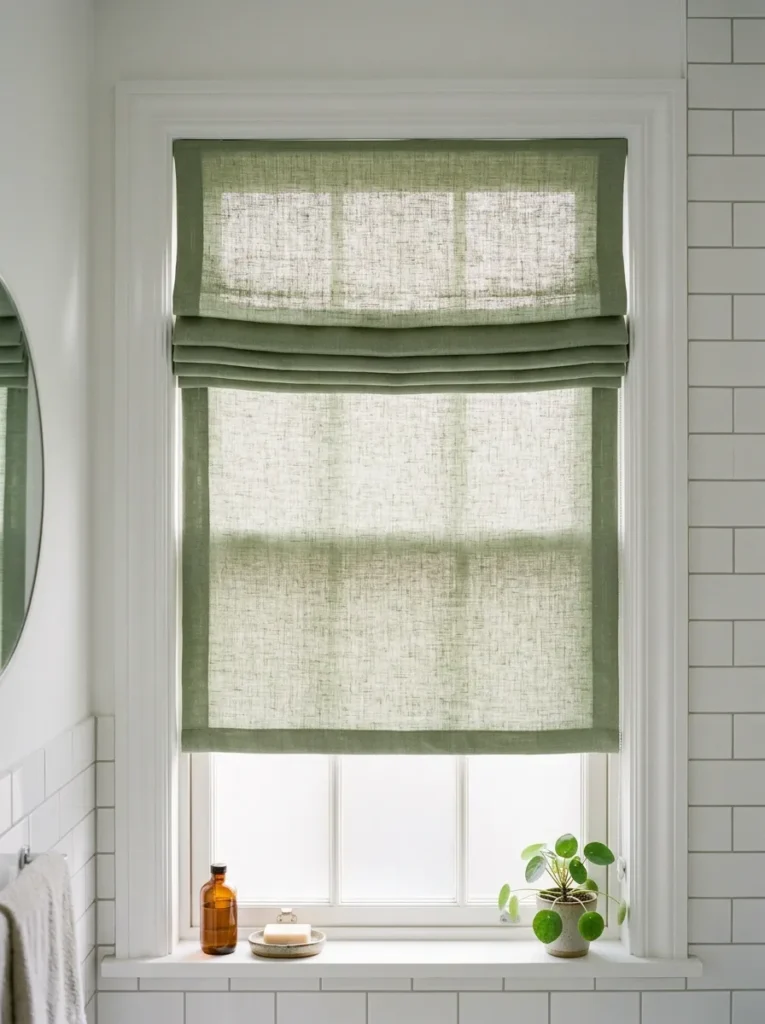
A sage green Roman shade or a pair of simple linen curtain panels in a sage tone on the bathroom window introduces the color at the window level — which is particularly effective in a bathroom where the window is a significant architectural element and where the treatment is visible both from inside the bathroom and (at a softer level) from outside through the glass.
Bathroom window treatments need to handle moisture, steam, and regular washing. A Roman shade in a washable linen or a performance cotton suits bathroom conditions better than a delicate fabric that requires dry-cleaning. The shade should be mounted inside the window frame for a neater appearance and should be raised fully when the bathroom is in use to prevent the fabric from absorbing steam.
In a bathroom that’s otherwise neutral, a sage Roman shade at the window creates a focused color note that’s more contained than a painted wall — it’s the right approach for a bathroom where you want the sage color effect without committing to a permanent change.
17. A Sage Green Accent Wall Behind the Vanity

A single accent wall in sage green — behind the vanity and mirror only, with the remaining three bathroom walls in white or a very light neutral — creates a focused color moment that reads as a deliberate architectural decision. The sage wall frames the vanity area from across the bathroom, making it the room’s clear focal point.
This is a lower-commitment version of the full sage bathroom because it involves only one wall — typically the smoothest and most accessible wall in the bathroom. The painting prep is limited to one surface, which reduces both the labor and the paint required.
The accent wall reads most effectively when the sage is clearly different from the white or neutral of the adjacent walls. A sage that’s too close in tone to a warm off-white reads as a failed attempt to paint one wall a different color rather than a deliberate accent. The sage should be distinctly identifiable as green from the doorway — a saturated, clear sage rather than a very pale, washed-out version of the color.
18. Sage Green Mosaic Floor Tile for a Grounded Color Accent
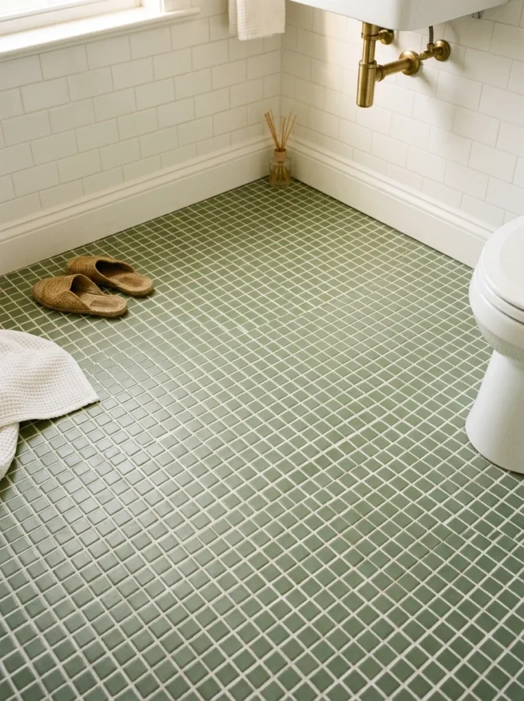
Sage green mosaic tile on the bathroom floor — rather than the walls — creates a color accent at the most foundational level of the room. Looking down at a sage green mosaic floor in an otherwise white bathroom creates a gentle botanical quality at the foot level, and the mosaic’s small tile format creates a richly textured surface that read as considerably more interesting than a plain colored floor tile.
The mosaic format also provides practical advantages on a bathroom floor: the increased number of grout lines (relative to large-format tile) creates a non-slip texture that suits a wet floor. A polished large-format sage green tile on a bathroom floor would require careful slip resistance treatment; a mosaic is naturally more slip-resistant because of the grout network.
The wall tile and floor tile relationship in this configuration should be complementary but clearly differentiated: white or very light grey wall tile with sage green mosaic floor reads as a deliberate two-tone decision. Sage green wall tile with sage green floor mosaic in a similar tone can read as a failed attempt at matching rather than a considered pairing.
19. Sage Green with Black Accents for a Graphic Contemporary Look
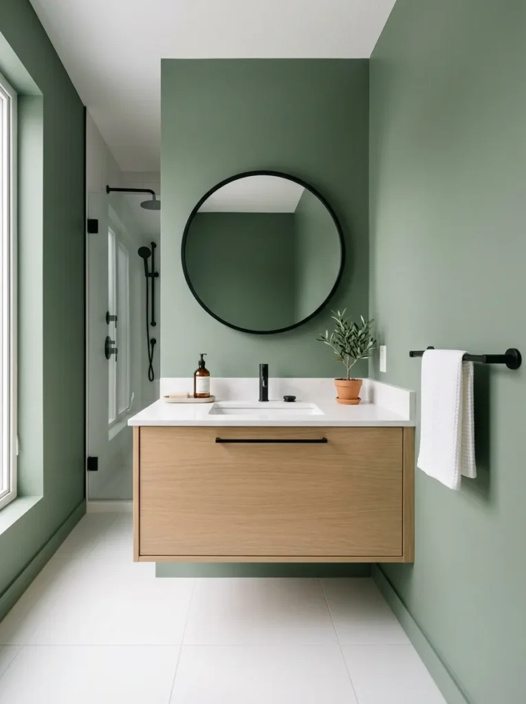
Sage green and matte black is a more contemporary and graphic pairing than sage with aged brass. The matte black fixture, towel bar, mirror frame, and cabinet hardware against a sage green wall or vanity creates a strong material contrast that reads as designed rather than soft. The pairing suits bathrooms where the design direction is clearly contemporary — minimal, clean-lined, and without the organic softness that the sage-and-brass combination projects.
The specific sage tone in this pairing should lean slightly toward a cooler, more grey-green register rather than a warm, olive-leaning sage. The cooler sage creates a sharper, more graphic contrast with matte black than a warm olive-green, which can read as murky against black rather than distinctly contrasting.
One element that should be avoided in the sage-and-black combination: warm or amber-toned woods. A walnut vanity with matte black hardware in a sage bathroom creates three competing material stories simultaneously — the botanical sage, the warm wood, and the graphic black. In a sage-and-black bathroom, lighter, cooler-toned wood (white oak, ash, or white-painted furniture) suits the palette better.
20. A Full Sage Green Bathroom — Tile, Paint, Vanity, and Accessories

A bathroom where sage green appears at every level — sage green wall tile in the shower, sage green paint on the walls outside the shower, a sage green painted vanity, sage green towels, and sage green ceramic accessories — creates the most immersive and committed sage green bathroom possible. Everything is sage; the variation is in the material and the tone rather than the color.
The key to making a full sage bathroom work rather than overwhelm is tonal variation. All the sage elements should be in related but not identical tones — a slightly warmer sage on the walls, a slightly cooler sage on the tile, a slightly darker sage on the vanity — so the eye registers variation and interest rather than a single color applied uniformly to every surface. Visual monotony comes from identical tones at every level; visual richness comes from related tones at different levels.
White fixtures are non-negotiable in a fully sage bathroom. A white sink, a white toilet, and white or warm cream bathtub provide the visual relief that prevents the sage from feeling overwhelming. The white fixtures read as clean, functional clarity against the botanical richness of the sage — exactly the contrast the room needs to maintain a sense of calm rather than saturation.
Choosing the Right Sage Green for Your Bathroom
Before selecting a sage green paint or tile, understanding the color’s undertone prevents the most common sage bathroom mistake — the color that photographs beautifully online but reads differently in your specific light conditions.
Warm sage (olive undertone): Reads as golden-green in warm light, earthy and botanical. Suits south- and west-facing bathrooms with warm natural light. Pairs well with aged brass, warm wood, and cream. Can read as yellow-brown in a cool-light bathroom.
Cool sage (grey-green or eucalyptus undertone): Reads as fresh and slightly silvery. Suits north- and east-facing bathrooms with cool natural light. Pairs well with matte black, brushed nickel, and white. Can read as cold in a warm-light bathroom.
Neutral sage (balanced grey-green): The most versatile undertone, reads as neither warm nor cool in most lighting conditions. The safest choice for bathrooms with mixed or uncertain light.
The testing rule: Apply a 12-by-12-inch paint patch on two walls (or a sample tile in three sizes) and observe under morning light, afternoon light, and evening artificial light before committing. No online photograph or paint chip accurately represents how a color will read in your specific bathroom’s light.
Final Thoughts
Sage green earns its reputation in bathroom design because it resolves a genuine tension: the need for a bathroom to feel clean and the desire for it to feel warm. It occupies the specific territory between the two that most colors can’t reach — muted enough to feel restful, green enough to feel alive, warm enough to feel welcoming.
If you’re choosing where to introduce sage green with the least commitment, Ideas 7 and 14 — the painted vanity and the sage green textile collection — are the most reversible starting points. Both can be changed without touching the tile or the architecture, and both create a genuine sage green impression in a neutral bathroom.
For bathrooms where a more committed direction is possible, Ideas 1, 5, and 20 — the limewash wall, the zellige tile, and the full sage bathroom — create the most distinctive and photographically rich results. All three require more planning and investment, but each delivers a bathroom that reads as genuinely designed rather than simply decorated.
Test the undertone before committing to any painted or tiled surface. Save the ideas that suit your bathroom’s light, size, and renovation scope, and return to the undertone guide before finalizing any color selection.