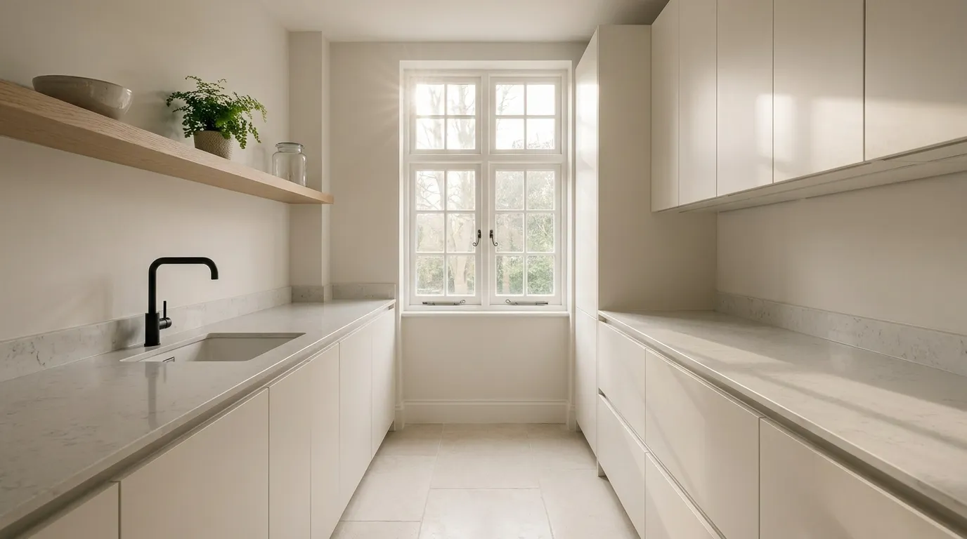
20 Minimal Kitchen Ideas That Feel Calm, Modern, and Genuinely Livable
Minimalism in a kitchen is harder to pull off than it sounds. Unlike a bedroom, where you can strip things back to a bed and a lamp and call it done, a kitchen is a working room — it holds appliances, utensils, food, and the accumulated evidence of daily life. The challenge isn’t decoration. It’s editing: deciding what stays visible, what disappears, and how to make the space feel intentional rather than sparse or sterile.
These 20 ideas span materials, finishes, storage approaches, lighting, layout decisions, and styling details. Some require a renovation; many don’t. The goal is a kitchen that feels calm to cook in, easy to maintain, and visually coherent without becoming cold or impractical.
1. Choose One Material and Commit to It
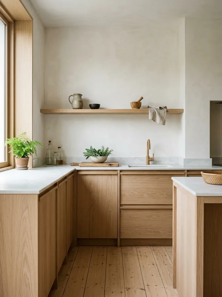
The easiest way to make a kitchen feel chaotic is to use too many competing surfaces. A minimal kitchen typically anchors around one dominant material — matte stone, pale timber, concrete, or limewash plaster — and lets everything else recede. This doesn’t mean the space lacks depth; it means the depth comes from light, shadow, and texture within a single material family rather than from visual contrast between five different ones.
In practical terms: if your countertop is white quartz, your cabinetry should agree with it tonally, not fight it. If you love raw oak, let it run across both the cabinets and a floating shelf rather than pairing it with four other wood tones. The restraint is the point.
2. Handleless Cabinets with Push-to-Open Mechanisms
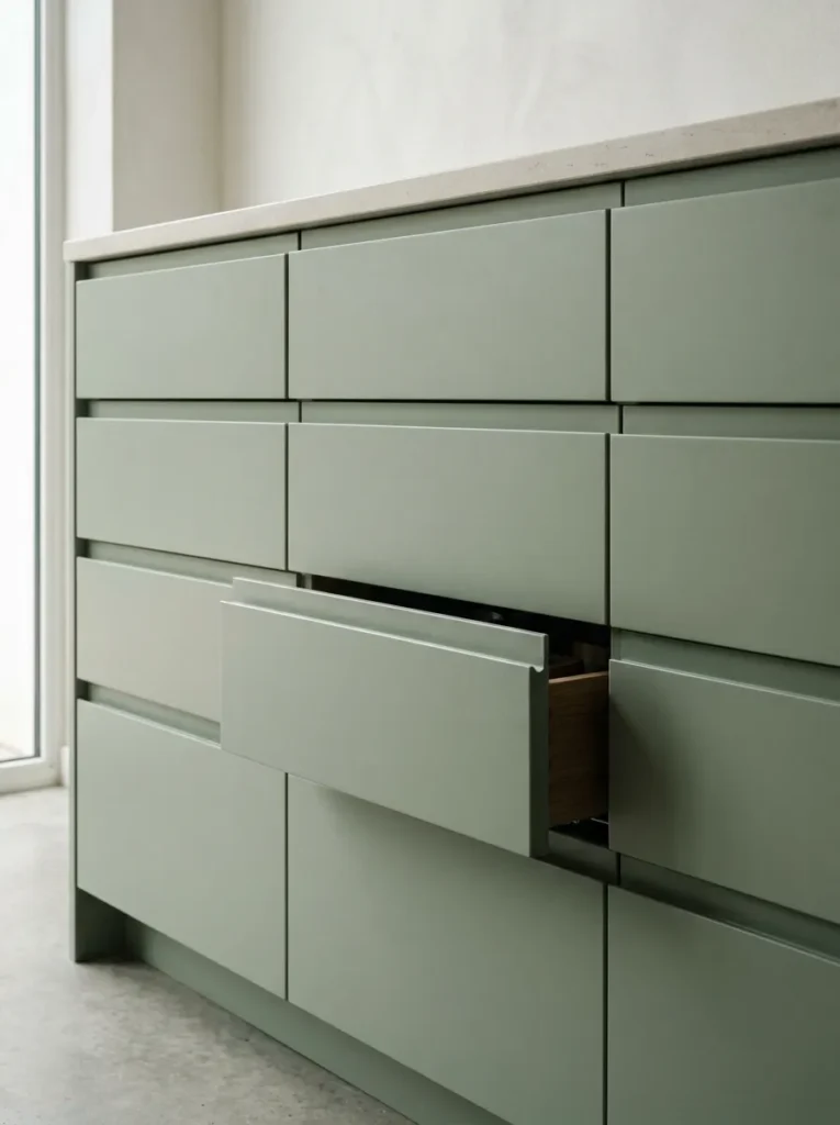
Hardware is one of the first things the eye picks up in a kitchen. Even beautiful cabinetry can look busy if it’s lined with bar pulls or cup handles across every door and drawer. Handleless cabinetry — either with a routed finger groove or a push-to-open mechanism — removes that visual rhythm entirely, leaving a clean plane of cabinet fronts.
The practical trade-off is worth knowing: push-to-open mechanisms require precise installation and can feel slightly less intuitive than handles, especially on heavy drawer banks. Finger-pull channels are more forgiving and can be retrofitted into some existing cabinets by a joiner. If you love a handle and don’t want to give it up, consider choosing one minimal profile — a thin, flush-mounted pull in brushed steel or unlacquered brass — and using it consistently throughout.
3. A Single Unbroken Countertop Run
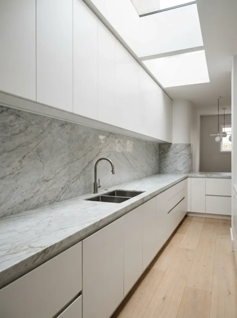
Countertop joints interrupt the eye. Where budget and layout allow, running the counter as a single uninterrupted slab — wrapping a corner, continuing past the sink, extending into a breakfast bar — creates a sense of visual completeness that can’t be achieved with multiple butted sections. Waterfall countertops, where the stone continues vertically down the side of the island, carry this principle even further.
This works especially well in galley kitchens, where a continuous run along one wall emphasizes the length rather than fragmenting it. In L-shaped or U-shaped layouts, consider having your stone supplier miter the corner joint rather than butt it, which reduces the visual break considerably.
4. Integrate the Appliances
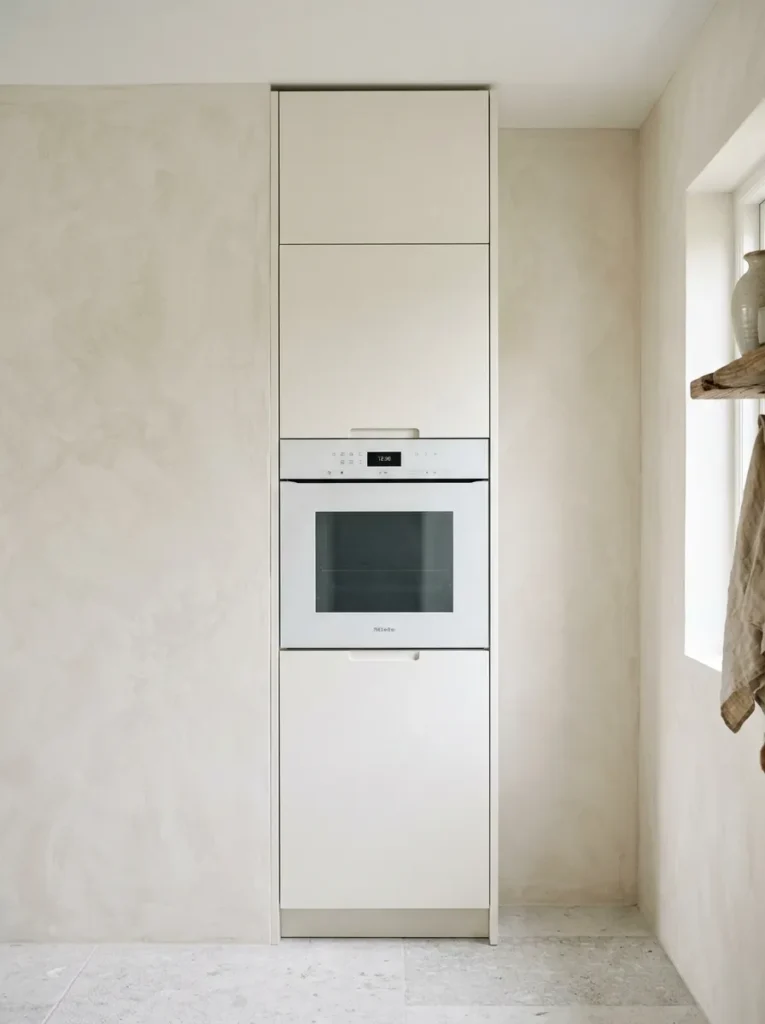
Nothing interrupts a minimal kitchen faster than appliances in five different finishes — stainless steel fridge next to a black microwave next to a white kettle on the counter. Integration means panels that match the cabinetry concealing the fridge and dishwasher, an oven set flush within a tower unit, and countertop appliances either stored away or chosen in a single consistent finish.
Full integration requires planning at the renovation stage. But even in an existing kitchen, editing the counter — storing the blender, moving the toaster into a deep drawer, choosing a sleek kettle that matches the tap finish — reduces visual noise without touching a single cabinet. Appliance garages (a section of countertop behind a retractable or tambour-style door) are a good middle option for frequently used items you can’t entirely hide.
5. Limewash or Plaster Walls Instead of a Tile Splashback
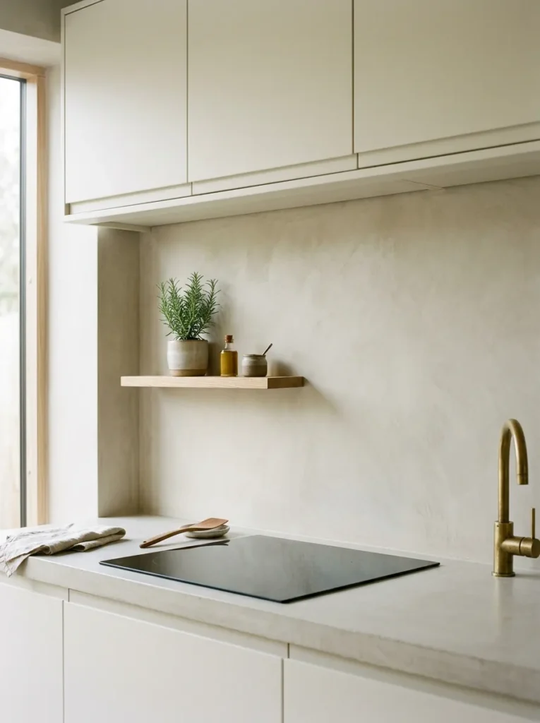
Most kitchens default to a tiled splashback, and tiles can look beautiful — but they also add pattern, grout lines, and another material to the mix. If your cooking habits don’t produce heavy splashing, limewash or microcement applied directly to the wall behind the hob and counter creates an unbroken surface that reads as calm and tactile without the visual grid of tiles.
Microcement is sealed and moisture-resistant, making it more practical than standard limewash in areas directly behind the hob. Neither option is as easy to replace as tiles if you want a change, so they suit committed minimal aesthetics better than indecisive ones. In rental kitchens, large-format peel-and-stick panels in a limewash or concrete effect can approximate the look without permanence.
6. Deeply Recessed Upper Shelves Instead of Wall Cabinets
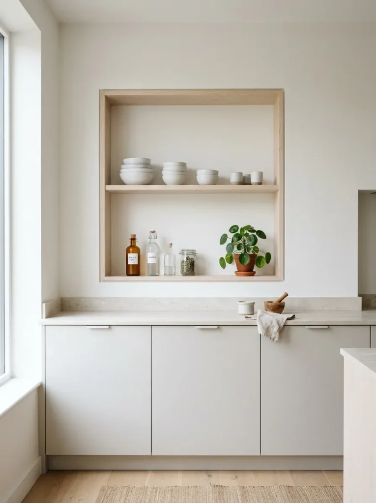
Removing upper wall cabinets is one of the most transformative changes you can make in a kitchen that feels heavy or enclosed — but it creates a genuine storage problem if you don’t plan the replacement carefully. One solution that avoids the styled-open-shelving look (which requires constant curation) is a single deep recess cut into the wall, fitted with a continuous shelf or two, and either left open or fitted with a simple sliding panel.
This works best on non-load-bearing walls in kitchens with good storage elsewhere. The recess keeps frequently used items accessible without projecting into the room visually. If removing wall cabinets entirely is impractical, replacing some with open shelves — but only one or two runs, not the entire kitchen — still opens the upper walls considerably.
7. A Neutral Palette Built from Two Tones, Not One
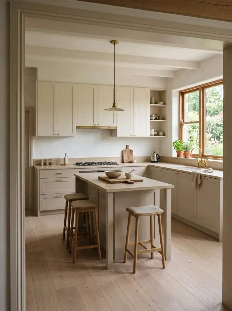
All-white kitchens can look cold and unforgiving, especially under overhead lighting. All-grey kitchens can feel flat. The minimal kitchens that photograph well and feel good to use are usually built from two tones — one lighter, one marginally deeper — that share the same undertone family.
A practical example: warm white uppers with a soft clay or greige on the lower cabinets, both pulling warm rather than cool. Or pale sage throughout, with a slightly deeper sage-green island. The two-tone approach adds depth without introducing contrast, which keeps the overall impression calm. What to avoid: pairing warm whites with cool greys, or using a cooler tone on the island to “make it pop” — the pop usually fights the quiet you were trying to create.
8. Flush-Mounted Lighting in the Ceiling
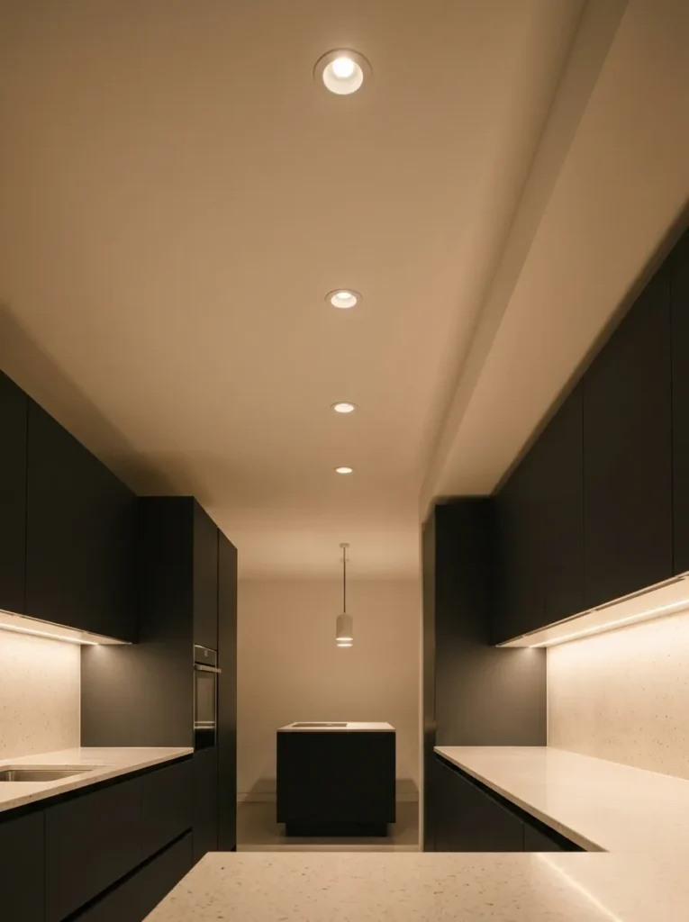
Pendant clusters and oversized statement lights above an island work beautifully in some kitchens, but they add visual complexity — cords, canopies, multiple glass or metal forms at eye level. If the goal is quiet, consider flush or semi-flush ceiling fixtures, or recessed lighting distributed evenly, with under-cabinet LEDs for task work.
For island or peninsula spaces where downlighting matters, a single pendant in a simple geometric form — a sphere, a cone, a cylinder — in one material does the job with less visual noise than a cluster. The key is avoiding mixed finishes: if your tap is brushed brass, the pendant should agree. One exception to the minimal-light rule is if a sculptural pendant is genuinely the centrepiece — in which case it earns its complexity by being the one bold decision.
9. Handle-Free, Frame-Free Oven Doors
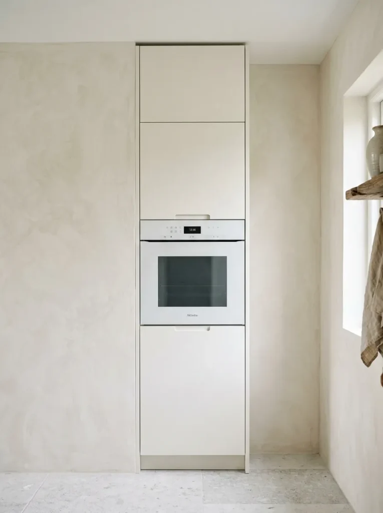
Built-in ovens often come with visible frames, handles, and stacked control panels that break the cabinet line. In a minimal kitchen, choosing an oven that sits flush within its surrounding cabinetry — without a projecting handle or a thick frame — maintains the smooth plane of the cabinet fronts. Some manufacturers offer flush-handle or recessed-handle options specifically for this purpose.
If replacing the oven isn’t an option, a simple visual fix is to align the oven in a tower unit where the surrounding cabinet doors have the same profile, so the oven reads as part of the vertical stack rather than interrupting it. Hiding the control panel behind a cover strip when not in use (available as an aftermarket addition for some brands) is another option.
10. A Single Floating Island with No Upper Storage
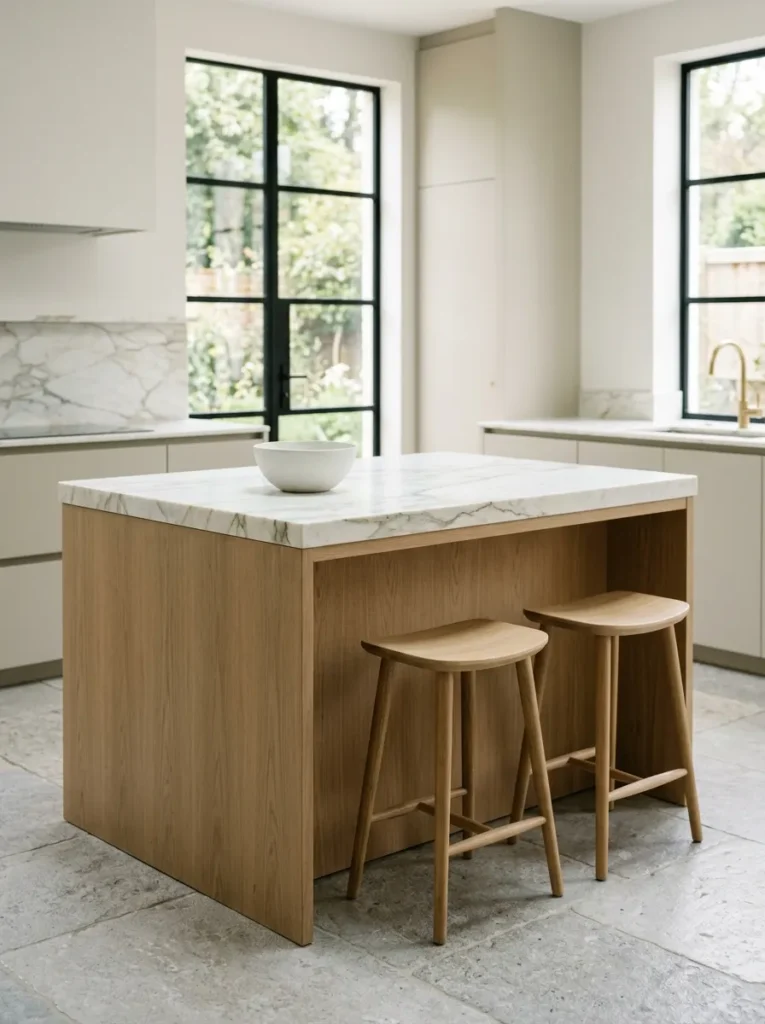
Islands are often designed to do everything — lower cabinets, upper open shelves, hanging pot racks, integrated seating, wine storage. This multi-function approach can make the island the most visually complicated element in the room. A minimal island does one or two things well: counter space, lower storage, and seating. The surface stays clear. The base reads as a single solid form rather than a furniture assembly.
The proportions matter. An island that’s too large for the kitchen creates circulation problems — leave at least 90–100cm of clear walking space on each accessible side. An island that’s too narrow doesn’t justify the visual interruption it creates. In smaller kitchens, a rolling prep table or a fixed peninsula attached to the wall often solves the same problems with less visual weight.
11. Fluted Glass in Upper Cabinet Doors
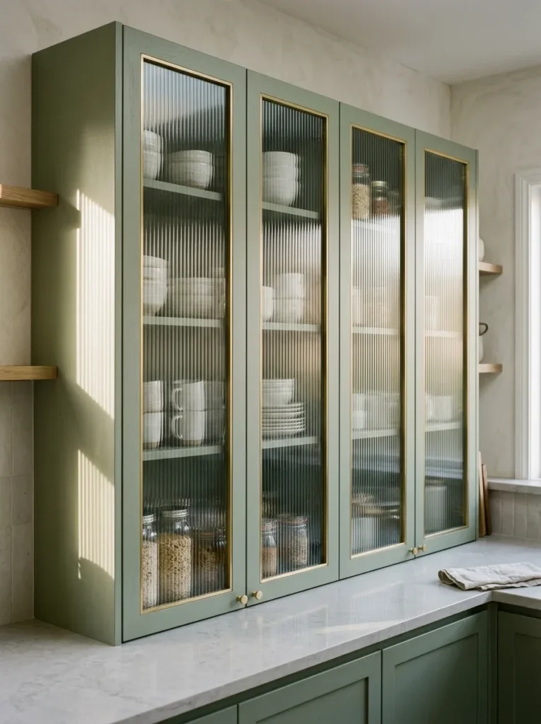
If removing upper cabinets entirely isn’t viable — because you need the storage or because the kitchen came with them — swapping solid doors for fluted or reeded glass is a meaningful alternative. The glass softens what’s inside without making it fully visible, which means imperfect shelf arrangements don’t become the room’s focal point. The ribbed surface also catches light in a way that adds some texture to an otherwise flat run of cabinetry.
This is a relatively affordable upgrade in an existing kitchen: a joiner can often reuse the existing cabinet frames and simply replace the door fronts. Choose clear fluted glass over tinted or frosted for the most light-forward result. The style suits kitchens leaning Japandi, Scandi, or soft contemporary.
12. A Concrete or Terrazzo Island Base (Rather Than Matching Cabinetry)
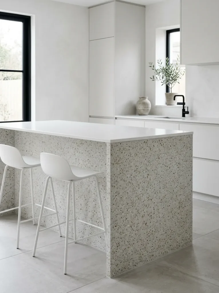
One deliberate contrast in an otherwise minimal kitchen draws the eye and prevents the room from feeling monotone — but the contrast needs to be in material or texture, not color. A poured concrete island base or a terrazzo-clad island base in the same tonal family as the surrounding cabinetry adds visual interest through surface character rather than chromatic difference.
This approach suits kitchens where the cabinetry is smooth matte and the island provides the room’s one textural moment. It also ages well: concrete and terrazzo are durable and develop a patina rather than showing wear. The trade-off is cost and permanence — these are not weekend DIY projects, and they don’t come undone easily if you change your mind.
13. A Continuous Splashback That Runs Behind and Under the Upper Cabinets
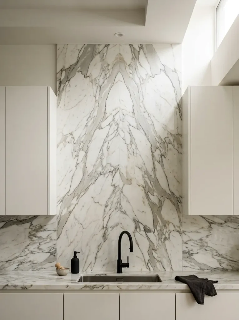
Where tiles or stone are used as a splashback, most kitchens stop the material at the underside of the upper cabinets. Running the same material from the counter surface up the wall and continuing it even behind the lower section of the upper cabinets — where it’s partially visible — creates an unbroken horizontal band that ties the room together visually.
This is particularly effective with large-format stone slabs, where the veining or texture continues across the whole span rather than repeating in smaller tile sections. In terms of installation, it requires coordinating between the countertop fabricator and the wall tiling contractor to ensure the same slab material is used consistently. Not inexpensive, but among the most cohesive-looking options in a minimal kitchen.
14. Low-Profile Bar Stools at Island Height
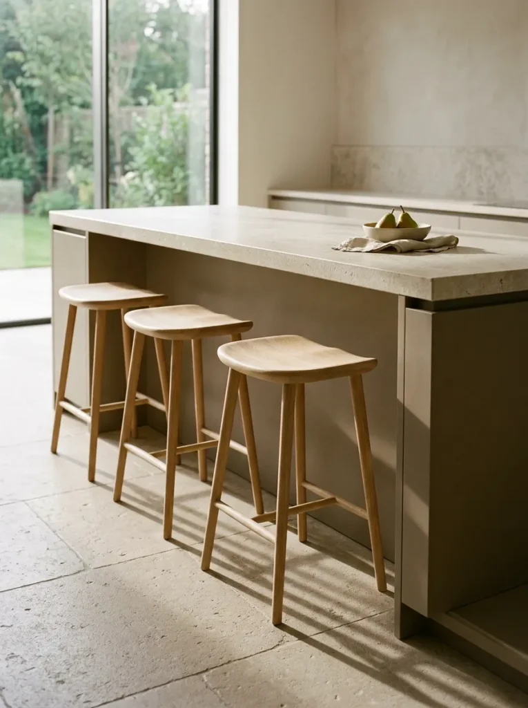
Seating at a kitchen island is practical, but standard bar stools with backs, cushions, and decorative legs can easily become the noisiest-looking element in a calm kitchen. Low-profile counter stools — ideally without backs, or with a very simple backrest — in a material that either matches the island or recedes visually (pale oak, white oak, matte black) keep the seating from demanding attention.
The rule about backless stools is that they’re less comfortable for extended sitting. If the island is used primarily for breakfast or quick meals, they work. For longer use, a low-back stool with a simple silhouette (think a gentle curve rather than a designed form) is the minimal compromise. Avoid stools with upholstered seats in patterned fabrics — even subtle patterns read loudly in an otherwise plain space.
15. Matte Black Tap as the Room’s Only Bold Finish
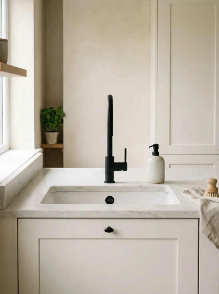
In an otherwise neutral kitchen, a single finish decision can carry the room’s character: a matte black tap chosen against pale stone or white cabinetry reads as deliberate rather than decorated. The key is that it stays singular — the tap, the drain cover, and perhaps the cabinet handles if any are used, all in the same finish, and nothing else competing.
Matte black is low-maintenance compared to polished or unlacquered metals, which show fingerprints and require polishing. It suits kitchens with a slightly contemporary or industrial lean. For a warmer minimal aesthetic, brushed brass or satin nickel used with the same singularity works equally well. What doesn’t work: three different metal finishes in the same room, even if each one is beautiful individually.
16. Recessed Toe Kicks That Disappear
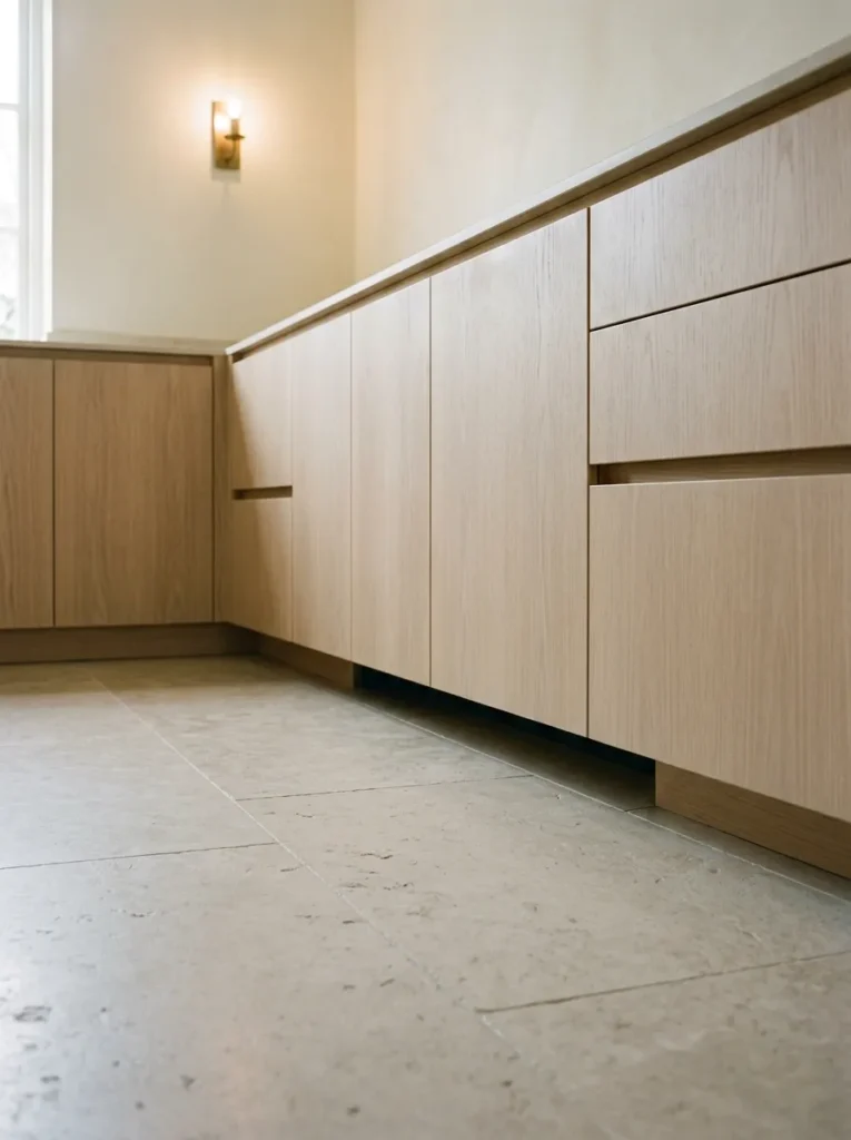
Toe kicks — the small panel between the bottom of the base cabinet and the floor — are usually either painted to match the cabinets or left in a contrasting color. In a minimal kitchen, recessing the toe kick so that it sits further back than the cabinet front creates the impression that the cabinets float slightly above the floor. Combined with a continuous floor material (no threshold strips, no transition pieces), the base units appear lighter and less anchored.
LED strip lighting inside the recessed toe kick achieves the floating effect more dramatically, though this reads more contemporary than minimal in the traditional sense. In some kitchens, particularly those with solid wood floors, the recessed toe kick also makes floor cleaning easier by giving the mop or vacuum cleaner access to the edge.
17. A Concealed Pantry Wall
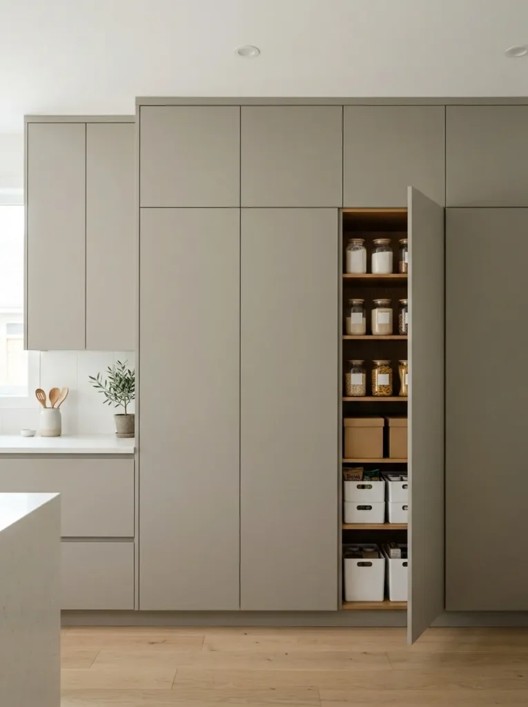
Rather than spreading food storage across multiple visible shelves and cluttered countertop areas, a concealed pantry — a section of cabinetry floor-to-ceiling that closes completely behind flat or handleless doors — consolidates storage into one architectural plane. When the doors are closed, the wall reads as a continuous surface rather than storage. When they open, everything is accessible and organized.
This requires planning: the pantry wall works best when it occupies an entire wall or a full section of wall between structural elements. In kitchens where a full pantry wall isn’t feasible, a concealed larder unit (a tall single pantry cabinet) achieves a scaled-down version of the same effect. The goal in both cases is that storage disappears when not in use, rather than becoming the room’s ambient texture.
18. Warm Timber Floating Shelf as a Styling Surface (Not a Storage Solution)
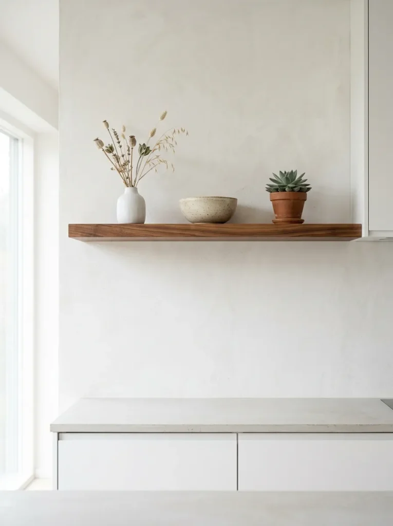
Open shelves in kitchens often become cluttered over time because they’re treated as overflow storage. One floating shelf — or two at most — positioned deliberately and treated as a styling surface rather than a storage solution performs a different function: it gives the kitchen a place for three or four considered objects (a ceramic, a small plant, a glass jar of grains) without creating a gallery wall of accumulated things.
The timber choice matters: pale ash or white oak suits a Scandi or contemporary minimal aesthetic; darker walnut suits an earthier, moodier palette. The depth of the shelf affects what it can hold — a 25cm shelf works for styling; a 35cm shelf starts to become storage. Keep the depth shallow if your goal is decoration rather than function, since a deeper shelf invites stacking.
19. Polished or Honed Stone That Reflects Rather Than Absorbs
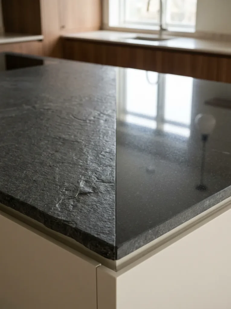
Surface finish changes how light moves through a kitchen. Honed stone (matte) absorbs light and makes a room feel grounded and quiet. Polished stone reflects light and makes a kitchen feel larger and brighter — but it shows fingerprints and water marks more readily, which can conflict with the calm appearance a minimal aesthetic is meant to create.
For countertops that get daily use, honed or leathered finishes are often more practical in matte kitchens. For the splashback or island cladding — surfaces that are touched less frequently — a polished finish can add dimension without the maintenance burden. A useful middle option is a satin finish, which has some reflectivity without the full gloss of a polished surface. The choice between finishes should be made in the actual kitchen light, with samples, rather than from a showroom display.
20. Considered Negative Space: Leave Some Surfaces Empty
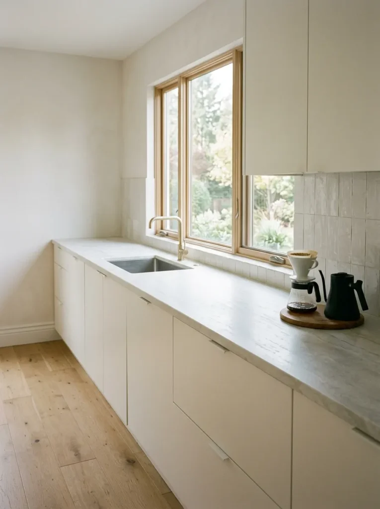
The final element of a minimal kitchen isn’t an object you add — it’s a decision about what you remove. A countertop with one coffee maker and two clear inches of empty space on either side reads completely differently from a countertop lined with appliances, jars, cookbooks, and an accumulated assortment of daily objects. The empty space is the design.
This doesn’t require a large kitchen. In small kitchens, considered negative space matters more, not less. Start by identifying the countertop’s primary work zone — the stretch where food is actually prepared — and clearing it entirely. Move appliances that aren’t used daily into storage. Put jars and dry goods inside cabinets rather than on show. What remains can be chosen and placed deliberately rather than accumulated. The calm a minimal kitchen creates depends more on this kind of editing than on any single material or fixture decision.
How to Use These Ideas Without Overdoing It
Not every idea here belongs in the same kitchen. In fact, trying to implement all twenty would almost certainly produce a result that feels more designed-to-death than calm.
Start with the decisions that have the longest-lasting effect — the material palette, the appliance integration, and the storage plan — before spending time or money on surface-level changes. These foundational choices create the conditions for minimalism; the styling and fixture decisions support them.
The most common mistake in minimal kitchens isn’t choosing the wrong materials. It’s resolving every visual decision at the same level of restraint so the room feels institutional rather than lived-in. One deliberate contrast — a timber shelf against plaster, a matte black tap in an otherwise pale room, a single textured surface — gives the eye somewhere to rest without fracturing the overall quiet. Restraint isn’t emptiness. It’s knowing exactly what to leave in.
If you’re renting or working with an existing kitchen, concentrate on ideas 14, 15, 18, and 20 — these require no structural changes and produce the most immediate visual shift. If you’re planning a renovation, make ideas 1, 4, 7, and 17 the foundation of your brief before making any decorative decisions.
Final Thoughts
A calm, minimal kitchen is less about a specific style and more about a consistent logic — one material family, one finish decision, one clear storage strategy — applied steadily through the room. You don’t need to achieve it all at once, and you don’t need a renovation budget to make meaningful progress.
Pick the one idea from this list that addresses your kitchen’s most persistent frustration: too much visual noise, not enough clear surface, appliances in competing finishes, upper cabinets that make the room feel heavy. Start there. Minimal design rewards incremental, deliberate decisions more than wholesale changes, and a kitchen that’s edited by 30% usually looks and feels 70% calmer.
If any of these ideas are worth saving for your planning process, bookmark this guide or pin the images that match your specific direction — it’s the kind of reference that gets more useful the closer you get to actually making decisions.