20 Small Kitchen Ideas That Feel Stylish and Functional
Most small kitchen advice starts from a place of apology — here’s how to make it less bad, how to disguise the size, how to trick the eye into forgetting the constraints. That framing is wrong from the start. The best small kitchens in the world are not successful because they hide their dimensions. They are successful because every decision was made with intention. These small kitchen ideas aren’t about workarounds. They’re about understanding what a compact kitchen actually makes possible — which, it turns out, is quite a lot — and making design choices that are specific, honest, and quietly confident.
1. Pull the Upper Cabinets All the Way to the Ceiling
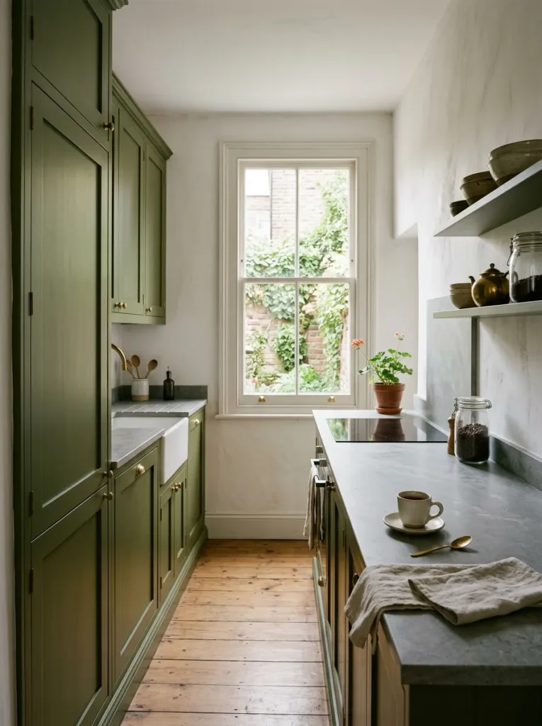
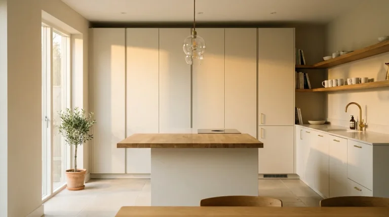
The gap between your upper cabinets and the ceiling is not neutral space. It is active visual noise — a dead zone that breaks up the wall, cuts the room height in half, and fills with dust. Most kitchens have it because it’s cheaper to stop the cabinets at a standard height. It is one of the clearest signals that a kitchen hasn’t been properly thought through.
Taking cabinets to ceiling height solves three problems at once: it dramatically increases storage, it makes the room feel taller, and it gives the kitchen a custom, intentional quality that off-the-shelf installations rarely achieve. The upper section doesn’t need to be everyday-accessible storage — it’s the right place for seasonal items, large serving pieces, and things you use twice a year. A simple step stool handles the rest.
If budget is tight and a full replacement isn’t possible, adding a shallow cabinet run above your existing units achieves the same visual effect. It doesn’t need to be deep. Fifteen centimetres of depth is enough to store flat objects and more than enough to close off that space completely.
2. Choose Open Shelving for One Wall Only
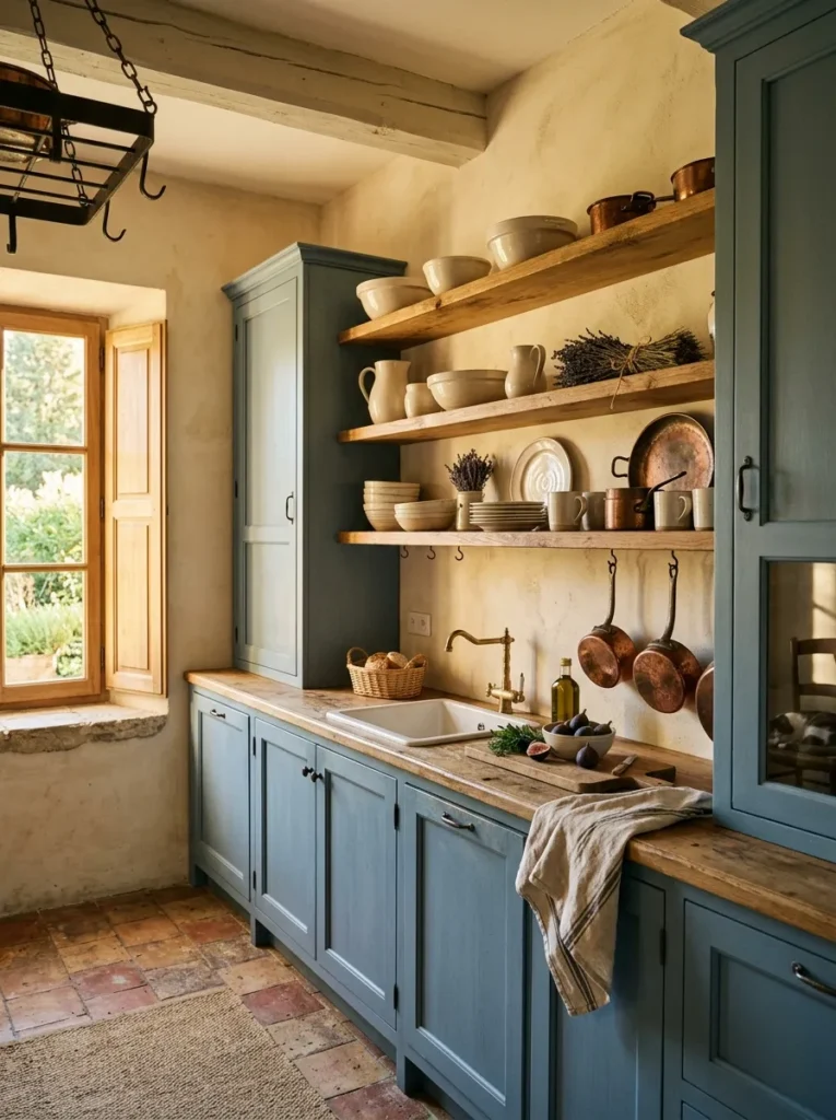
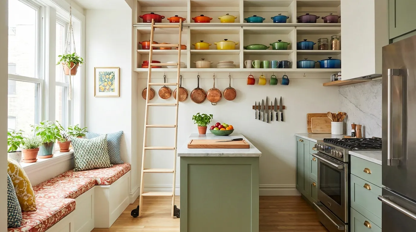
Open shelving is either the best decision you’ll make in a small kitchen design or the one you’ll spend the next three years regretting, and the difference comes down entirely to discipline. A full kitchen of open shelves requires military-level curation. One wall of open shelves, combined with closed storage everywhere else? That’s a completely different proposition.
Used selectively, open shelves do something closed cabinets cannot: they show depth. They give the eye somewhere to travel, they let you introduce texture, colour, and irregularity into what is otherwise a very flat surface. The rule is to keep everyday items — the things you actually reach for daily — on the open shelves, and move everything you don’t want to look at behind closed doors. This is harder than it sounds, for obvious reasons, but the discipline of editing down to what belongs on display tends to also improve how the kitchen functions.
Keep shelving brackets visible and considered. Slim unlacquered brass brackets against painted plaster, or raw steel against white tile, read as deliberate. Concealed brackets work too, but they require more precision to install correctly. Either way, the shelf itself should be at least 30 centimetres deep and made from solid timber rather than veneered board — the edge difference is significant.
3. Install a Single Oversized Pendant, Not a Row of Smaller Ones
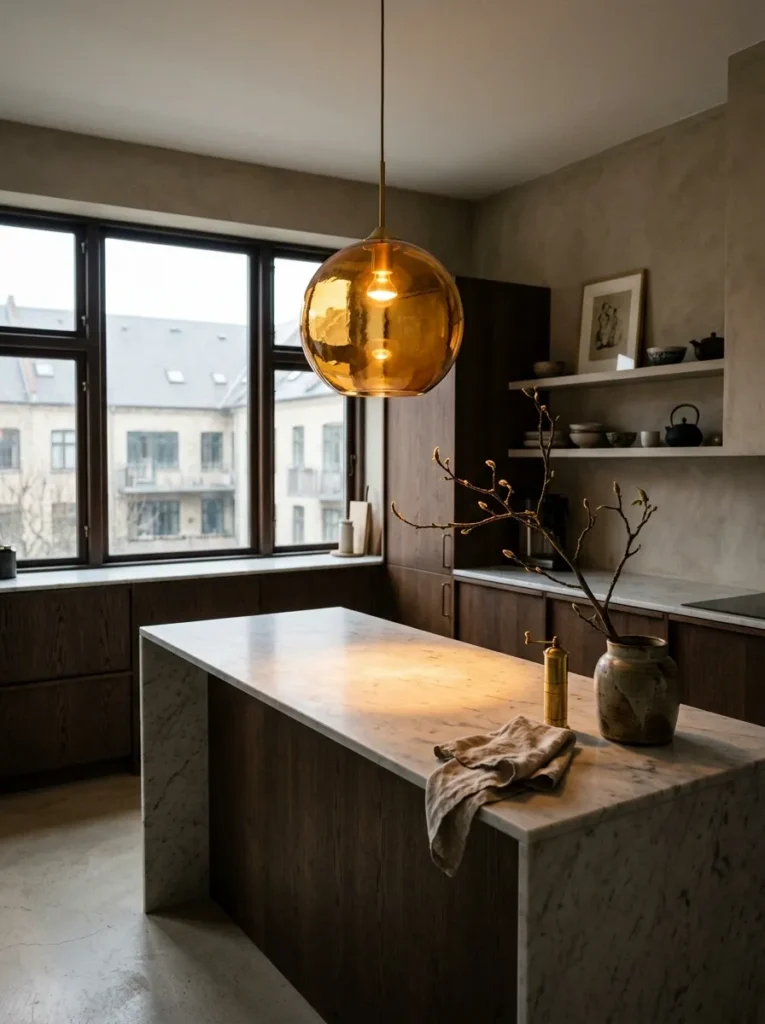
Pendant lighting over a kitchen island or dining peninsula is one of those decisions that most people get exactly backwards. The assumption is that a small kitchen needs small-scale lighting — that a large pendant will overwhelm the space. In reality, one properly scaled pendant reads as a confident design choice. Three small pendants in a row reads as compromise, and compromise is the one thing that makes a small kitchen feel smaller.
The pendant should sit between 70 and 80 centimetres above the surface it’s lighting. Higher than that and you lose the warmth and intimacy it’s supposed to create. Lower and it becomes an obstacle. The shade itself should be a material that earns attention — hand-blown amber glass, ribbed opal, woven rattan sealed to kitchen standards, or smoked bronze metal. Something that justifies the choice rather than just filling a functional requirement.
4. Use a Continuous Countertop Across Every Surface
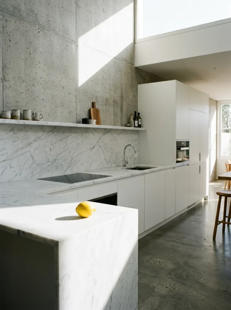
The number of times a countertop changes material in a small kitchen is directly proportional to how chaotic it looks. A section of butcher block here, a tile splashback there, a different stone on the island — each transition is a visual break, and in a small kitchen design, visual breaks add up fast.
A continuous countertop — the same material, the same tone, running across all horizontal surfaces — creates a calm, unified baseline that makes the whole kitchen read as larger and more resolved. It doesn’t have to be expensive. Honed concrete, quartz, or even a high-quality laminate that runs consistently will outperform a kitchen with four different surface choices every time. If you love contrast, use it vertically — a dark tile splashback against a pale counter — rather than interrupting the horizontal plane.
5. Mount Your Extractor Fan Inside a Bespoke Hood
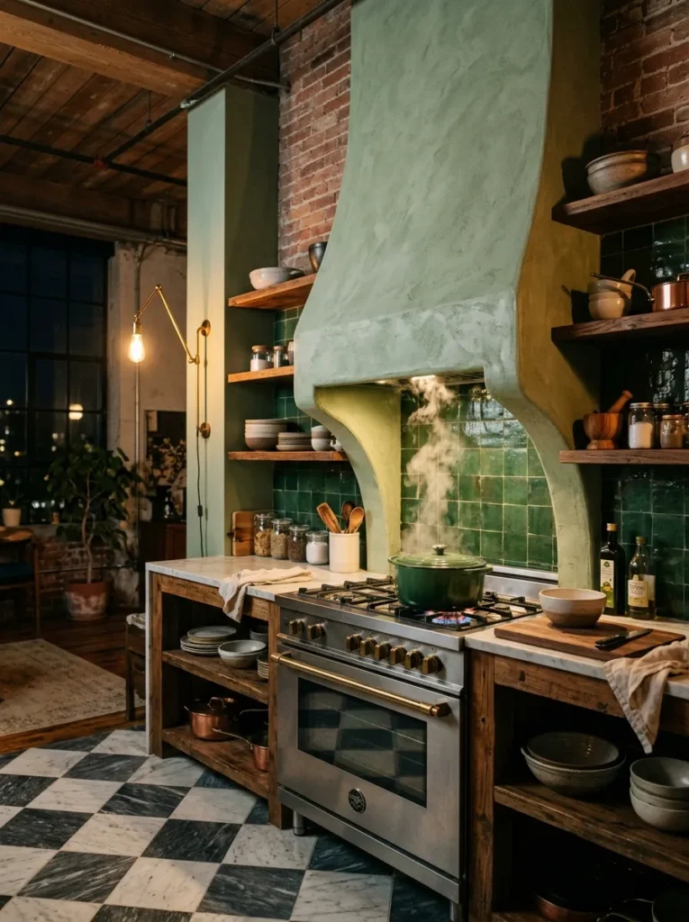
A stainless steel chimney extractor on a ceiling track is one of the most jarring things you can put in a small kitchen. It announces itself as an appliance rather than becoming part of the room. In a larger kitchen, the range can absorb this. In a compact one, that cylinder of metal dominates everything around it.
Building a bespoke hood out of painted MDF, plaster, or timber — with the actual extractor mechanism concealed inside — transforms the extraction from an appliance into an architectural feature. It becomes part of the wall, part of the composition. Painted to match the cabinetry or treated as a different accent element, a custom hood is one of the highest-impact single changes you can make to a kitchen’s overall feel. The cost of the millwork is generally modest compared to what it delivers.
6. Go Floor-to-Floor with Your Splashback Tile
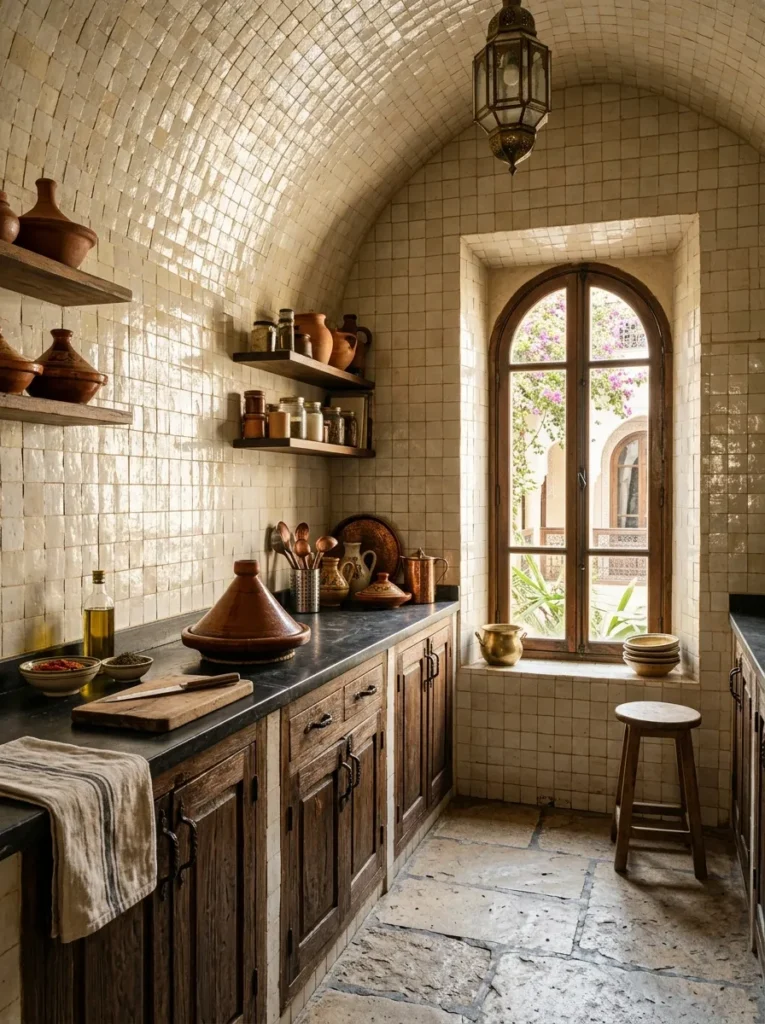
The standard splashback runs between the counter and the bottom of the upper cabinets. It’s the safe, conventional choice, which means it’s also the boring one. Running tile from the countertop all the way to the ceiling — eliminating the painted plaster zone entirely — changes the character of the whole room.
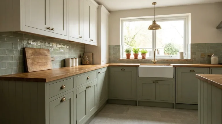
Full-height tile makes the wall feel intentional. It removes a transition that is otherwise visually middling, and it creates a backdrop that reads as design rather than default. Zellige tile in a warm ivory or sage works particularly well because the variation in each handmade piece gives the wall texture and depth without adding pattern. Large-format tiles in a matte stone finish work differently — quieter, more continuous. The choice depends on whether you want warmth or calm, but both outperform the half-splashback by considerable distance.
7. Keep Your Small Kitchen Colour Palette to Two Tones Maximum
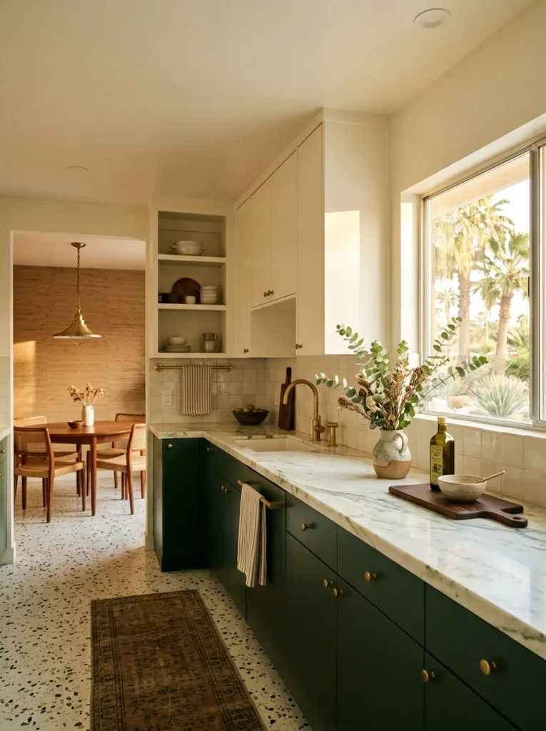
There are kitchens with five different colours across the cabinetry, walls, trim, island, and ceiling, and they are exhausting to be in. The logic of each individual colour choice may be sound. The cumulative effect is visual clutter, and visual clutter is the enemy of small spaces.
Two tones — genuinely two — applied consistently and without exception creates the kind of coherence that makes a small kitchen feel like it was designed as a whole rather than assembled from separate decisions. The most effective combinations are one very light tone (the walls, upper cabinets, ceiling) and one darker grounding tone (lower cabinets, island, or the floor). This doesn’t mean the kitchen has to be minimal or cold. White plaster walls with deep forest green lower cabinets, or warm linen uppers with a terracotta brick floor — the two-tone rule is about restraint in number, not in character.
8. Replace Standard Cabinet Hardware with Something You’d Actually Notice
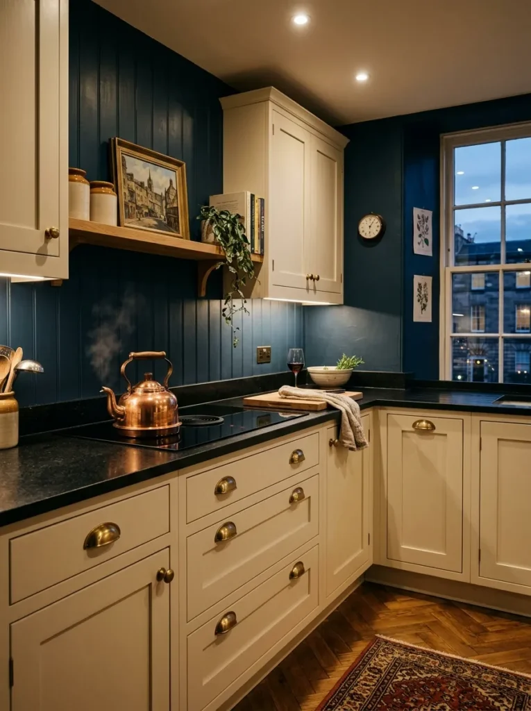
Most kitchens have the hardware that came with the cabinets. It is the equivalent of wearing the shoes you found in the box — technically functional, essentially invisible. The moment you replace standard bar pulls or cup handles with something considered — solid unlacquered brass, aged bronze, ceramic knobs, hand-forged iron — the cabinets stop being backdrop and start being part of the design.
In a small kitchen, this matters more than it would in a large one, because there are fewer surfaces to create interest. Hardware is working harder. A run of cabinets with beautiful, specific hardware reads as a finished kitchen. The same cabinets with the stock pulls reads as a rental.
9. Invest in a Single Statement Material Rather Than Several Decent Ones
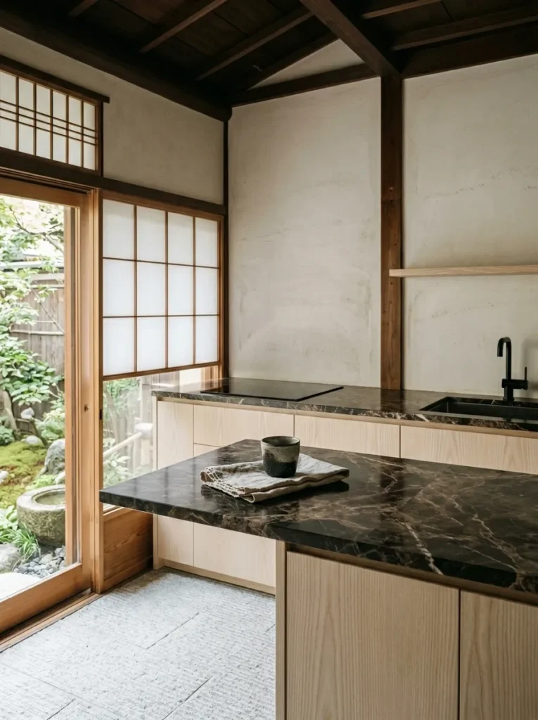
The matching-set approach to kitchen materials — where the countertop, the splashback, the island, and the cabinet edges are all from the same sample board — is always the safer choice and almost never the better one. It produces kitchens that look like kitchen showrooms: coherent, competent, completely forgettable.
A small kitchen with one genuinely beautiful material — a slab of honed Calacatta marble used only for the countertop, or handmade Moroccan tile covering just one wall, or a rare timber veneer on the island base only — reads with a confidence that a kitchen full of coordinated mid-range materials simply cannot achieve. The constraint of a small space actually helps here: you need less of it.
10. Install Drawers Instead of Base Cabinet Doors
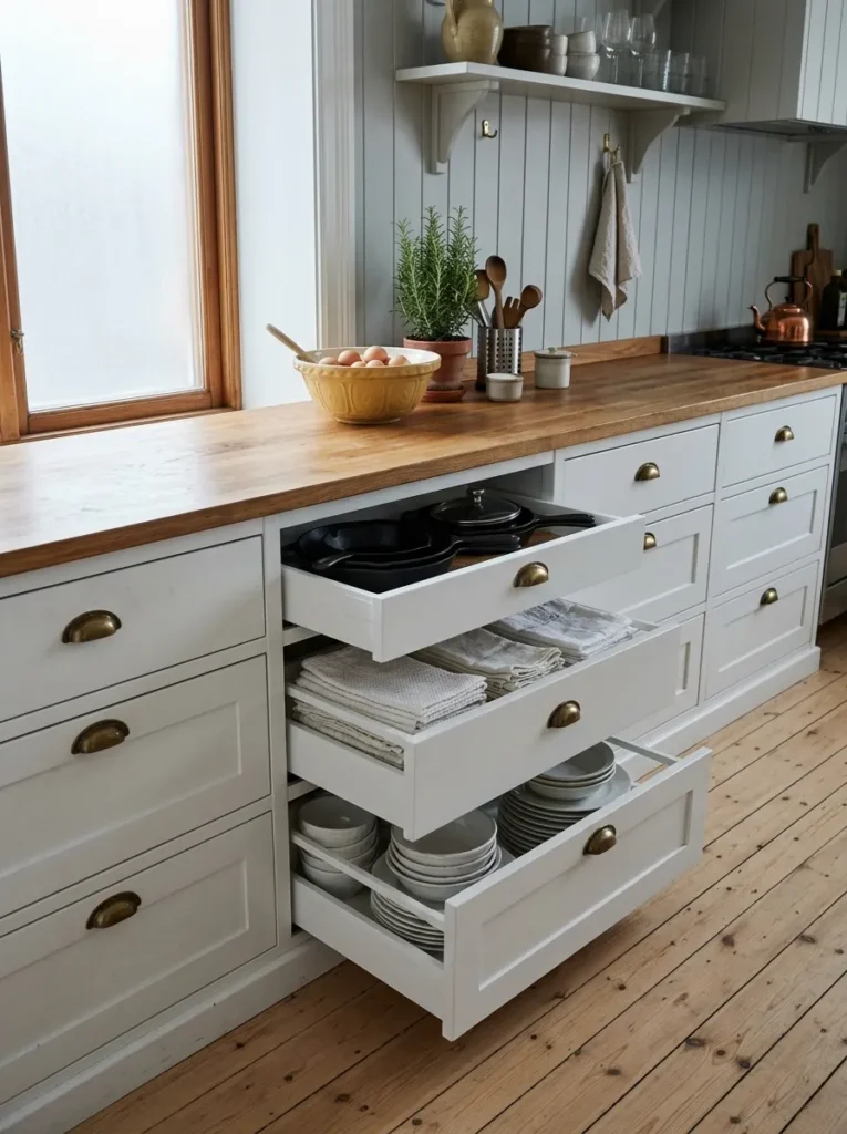
Base cabinets with doors are a 1970s storage solution that most kitchens have inherited by default. You open the door, crouch down, and reach to the back to find whatever is behind everything else. In a small kitchen, this is not just inconvenient — it means you consistently underuse the storage you have, which means you feel more constrained than you actually are.
Deep drawers — three stacked drawers where a door cabinet would otherwise sit — give you full access to everything in the cabinet at eye level, from standing height. Pots, pans, dry goods, crockery: all of it becomes visible and reachable. The conversion is not complicated, and the difference in daily kitchen function is significant enough that most people who make it wonder how they tolerated the alternative.
11. Treat Your Kitchen Island as a Table, Not an Afterthought
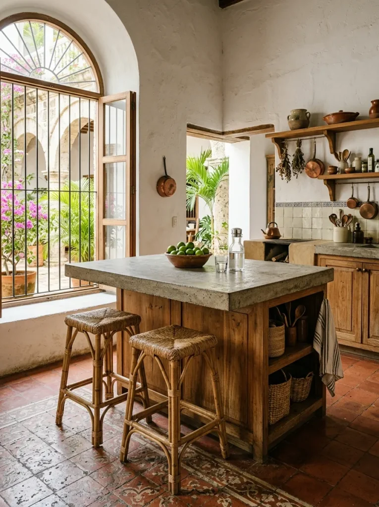
In small kitchens, the island is often the last decision — a freestanding block purchased to add counter space and storage, positioned wherever it fits. This approach produces islands that are slightly too large, slightly too small, in the wrong material, or in the wrong position. The kitchen then works around the island rather than with it.
The better framing is to think of the island as a table first. What height do you actually want to work at? Do you want to eat at it, and if so, at what height — counter stool height or standard dining height? Sizing the island at 90 centimetres high with a 25-centimetre overhang on the seating side creates a surface that works for prep, for plating, and for two people eating breakfast, without requiring special stools or an awkward lean. The material matters too: a different countertop on the island than the perimeter is one of the few cases where contrast earns its place.
12. Use Integrated Appliances Wherever the Budget Allows
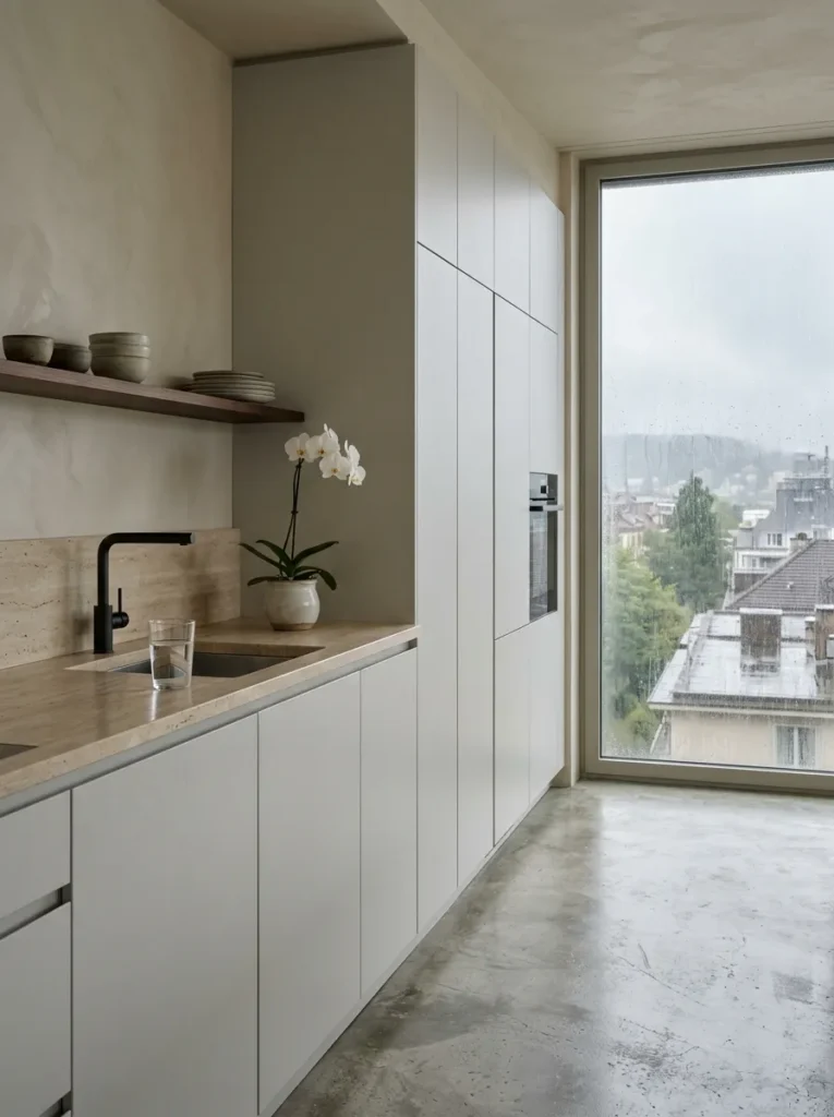
A freestanding fridge, a freestanding dishwasher, and a freestanding oven in a small kitchen are three separate visual elements competing for attention. Integrated appliances — hidden behind panel doors that match the cabinetry — reduce the kitchen to its essential components: surfaces, storage, and light. The appliances disappear.
This is not a luxury decision. Panel-ready appliances exist across a wide range of price points, and the visual return on even a partial integration — hiding just the fridge and dishwasher — is immediate. If a full integration isn’t possible, a consistent appliance finish (all stainless, or all black, or all white) is the next best move. Mixed finishes in a small kitchen are the fastest way to make a considered space feel unresolved.
13. Put Your Lighting on a Dimmer — Every Circuit
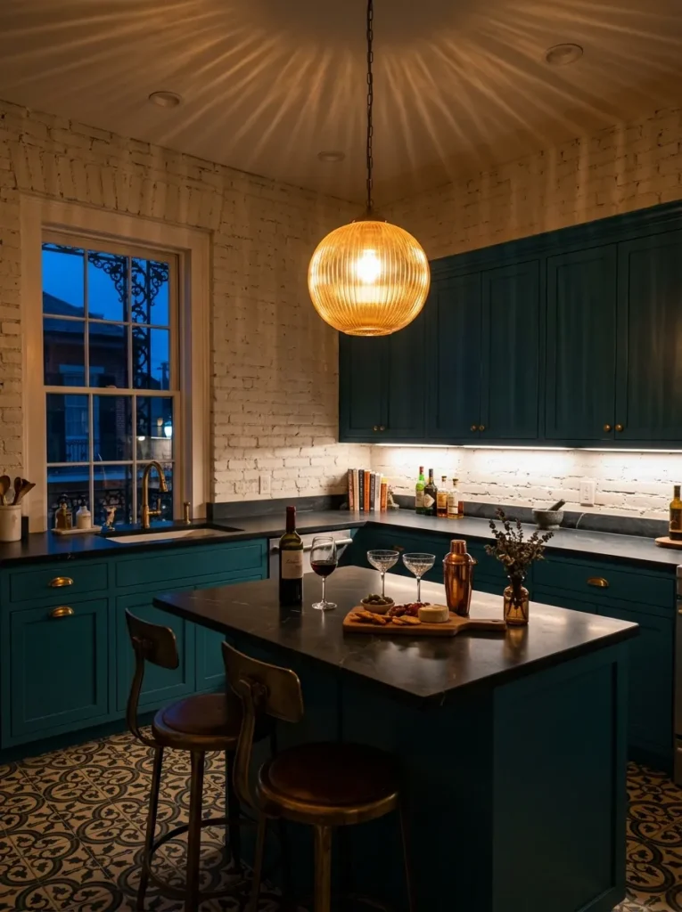
Kitchen lighting is almost always designed for one condition: bright and functional. It is optimised for chopping and reading labels, and it is genuinely useful for those things. It is also the reason most kitchens feel like operating theatres the moment you stop cooking and start eating. The kitchen becomes the least relaxing room in the house, and not because of the cooking.
Putting every circuit — task lighting, under-cabinet strips, pendants, ceiling downlights — on individual dimmers costs almost nothing at installation stage and makes the kitchen feel completely different in the evening. Dimmed pendants with under-cabinet lighting off, or just a single lamp on the counter, produces a warmth and intimacy that no amount of carefully chosen tile can create if the lighting is fixed at full brightness.
14. Run the Same Floor Tile Into the Adjacent Room
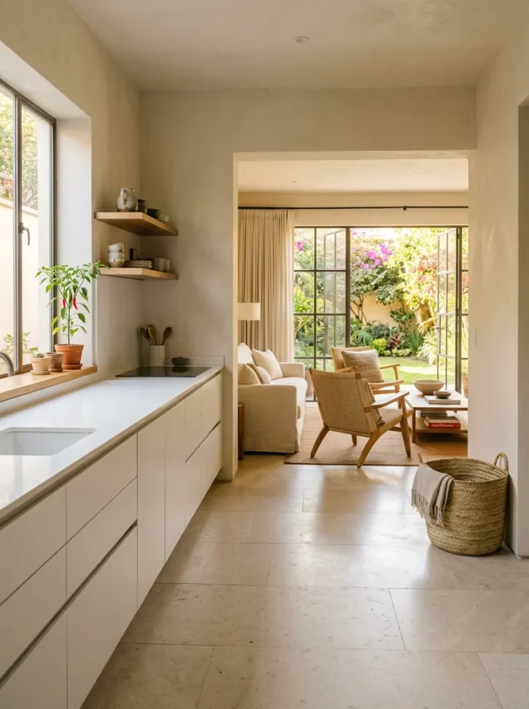
The line where the kitchen floor meets the hallway or living room floor is a border that says “here the kitchen ends.” It breaks the visual flow, makes both spaces read smaller, and draws attention to transitions rather than spaces. The fix is simple and surprisingly powerful: run the same floor material continuously across both rooms.
Wide-format porcelain in a warm stone finish, or pale oak engineered timber — whichever material you choose, the absence of a floor transition makes the kitchen feel like part of a larger, more considered space rather than a room with a defined and emphasised boundary. This works best when the kitchen and the adjacent area are open-plan or semi-open-plan, but even in kitchens with a doorway, the continuous floor seen from the threshold creates a depth that a hard border eliminates.
15. Add a Pot Rail to the Wall Above the Hob
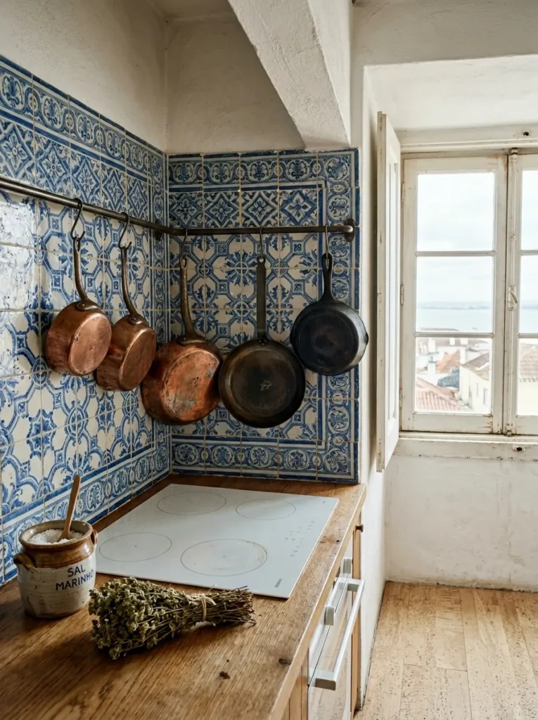
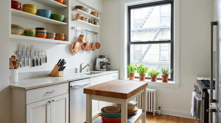
The average small kitchen loses enormous amounts of cabinet space to cookware storage — the pots, pans, and lids that are used frequently but take up disproportionate room. Mounting a horizontal rail or a simple steel rod across the wall above the hob and hanging the most-used pans from it removes that storage burden entirely from the cabinets and creates a section of the kitchen that looks genuinely lived-in.
This is not the same as the cluttered look of a disorganised kitchen. A considered collection of cast iron, carbon steel, and copper pans on a simple rail, combined with a few hooks for utensils, creates a kitchen that looks like it belongs to someone who actually cooks. The key is the rail itself — welded steel, unlacquered brass tube, or simple oak dowel — rather than the chrome carousel units that manage to look cheap at any price point.
16. Make the Sink a Design Decision, Not a Default
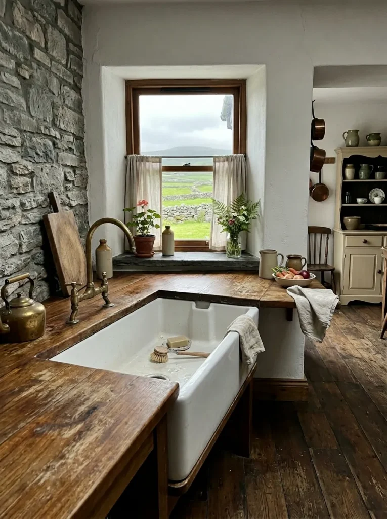
The sink is the most-used fixture in the kitchen, and it is almost universally chosen last and least considered. The standard stainless undermount or drop-in is specified because it exists, ships quickly, and works fine. It also has exactly zero visual presence. In a small kitchen where every element is in close proximity to every other element, a sink that looks like an afterthought affects the whole room.
A large single-basin fireclay sink in matte white, a hand-hammered copper sink, or a cast iron farmhouse sink positioned under the window and given architectural weight — each of these makes the kitchen look like someone made a decision. That quality of decision-making is what distinguishes a kitchen that photographs well and feels satisfying to use from one that is merely adequate. Pair it with a tap in an unlacquered or aged finish and the sink area becomes the focal point it should always have been.
17. Paint the Ceiling the Same Colour as the Walls
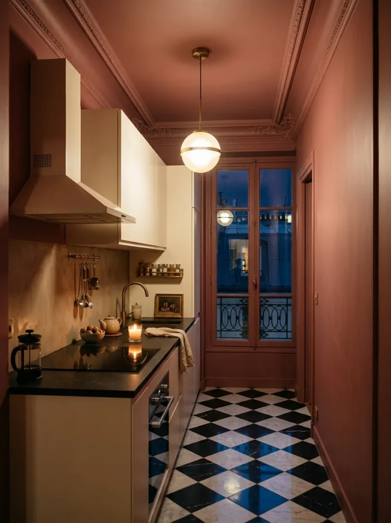
The white ceiling is not a neutral choice. It is a choice with a specific visual effect: it creates a lid. It draws a hard line at the top of the room and contains the walls beneath it. In a small kitchen, that lid makes the ceiling feel lower and the room feel more compressed than it actually is.
Painting the ceiling the same colour as the walls — or even one or two tones deeper — removes the lid. The eye doesn’t catch at the junction and stop there; it moves through the room without a hard interrupt. Rooms painted ceiling-to-floor in a single tone consistently feel larger than their dimensions because the boundaries become ambiguous. In a deep sage or dusty plaster pink, a small kitchen painted this way becomes quietly enveloping rather than conspicuously small.
18. Keep the Window Clear
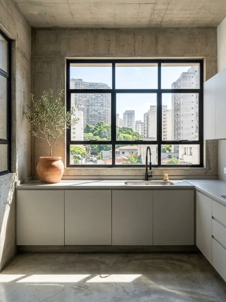
Every small kitchen with a window above the sink has a decision to make about what goes in that window space. The answer is: as little as possible, and ideally nothing. No valance, no roller blind pulled halfway down, no collection of herb pots across the sill, no shelf of oils and sauces in front of the glass.
Natural light is the single most valuable asset a small kitchen has. Blocking it with objects, however charming those objects are individually, reduces the kitchen’s best resource. A clean window — properly cleaned, with a minimum window treatment that clears the glass entirely when not in use — does more for the feel of a small kitchen than any other zero-cost decision you can make. If privacy is a concern, frosted glass or a café curtain that covers only the lower third solves the problem without sacrificing the light above.
19. Give the Toe Kick a Colour or Material
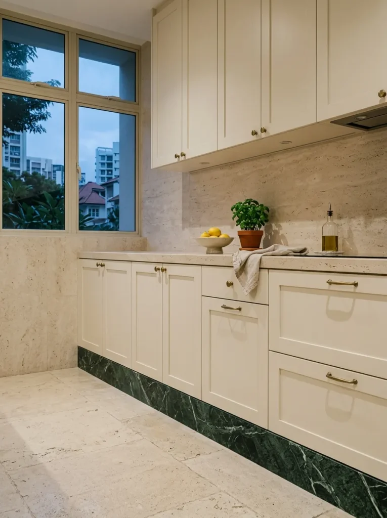
The toe kick — the recessed panel at the base of the cabinetry, between the floor and the cabinet doors — is almost always the same colour as the cabinetry or, worse, an afterthought in black. It sits at the lowest visual register of the kitchen and most designers ignore it entirely. That’s the wrong instinct.
Painting the toe kick in a contrasting tone, cladding it in a thin strip of marble, or running a continuous strip of unlacquered brass along its face gives the kitchen a finished, grounded quality that is entirely disproportionate to how simple the change is. The kitchen appears to sit on something, rather than simply terminating at the floor. It’s the kind of detail that people notice in photographs before they can articulate what they’re looking at — and that makes it one of the most Pinterest-friendly decisions in this entire list.
20. Stop Adding Things
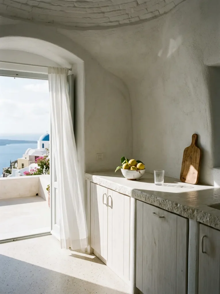
The impulse, when a kitchen feels lacking, is to add. Another appliance on the counter. Another rack on the wall. Another set of canisters. Another piece of art above the cabinets. The result is a kitchen that is full but not resolved — a kitchen where the accumulated effort of improving it has become the problem.
The restraint-based version of a great small kitchen is harder to execute than the maximalist version, because it requires you to identify everything that is not earning its place and remove it. A kitchen with three things on the counter instead of eleven doesn’t just look better — it functions better. The surfaces are larger, the cleaning is easier, the visual noise disappears. The final and most useful thing you can do in a small kitchen is not to find something new to add. It is to look at everything already there and ask, honestly, what should go.
Final Thoughts
Small kitchen ideas are everywhere, but most of them are solving the wrong problem — they’re trying to make the kitchen look bigger rather than trying to make it work better. The two are related but not the same. A kitchen that works beautifully, with good light, clear surfaces, considered materials, and deliberate details, will feel spacious regardless of whether the square footage technically is. Start with the structural decisions: cabinet height, countertop continuity, and floor material. Those three choices set the baseline for everything else. Hardware, lighting, and colour can follow once the architecture of the space is resolved. And if you can only do one thing this week, pull everything off your counter and leave only what you use daily. The kitchen will look different immediately — and the space you uncover might be more convincing than anything you could have added.