21 Modern Kitchen Ideas That Feel Stylish and Timeless
Modern kitchen ideas have a way of looking identical to each other — the same waterfall island, the same matte black tap, the same five-minute checklist repeated across a hundred different blogs. The kitchens that actually hold up over time are built from more deliberate choices than that, the kind that consider material, proportion, and light rather than just trend. This article gathers twenty-one of those choices: specific, photographable decisions that make a modern kitchen feel genuinely stylish rather than simply current. Some are structural and worth planning before a renovation begins. Others are small enough to tackle this weekend. All of them are built to earn a permanent place in your kitchen rather than a temporary one in a single season’s mood board. If you’re chasing a modern kitchen that still feels like itself in ten years, these are the ideas to start with.
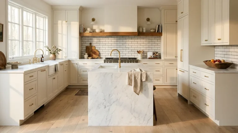
1. Choose a Waterfall Island Edge in Honed Stone Instead of Polished
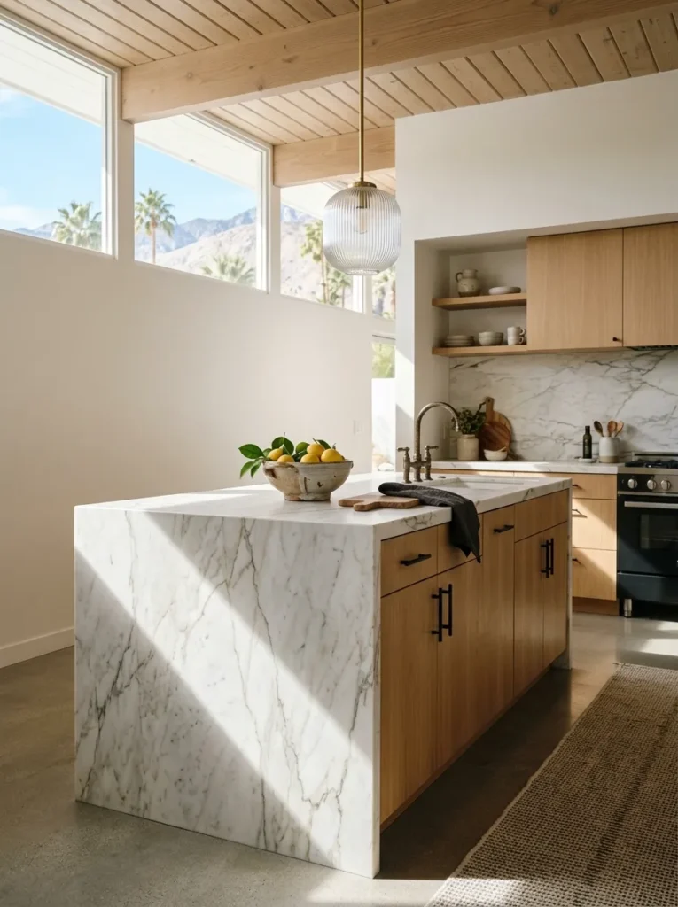
Polished stone reflects everything around it, including the kitchen’s own clutter, while a honed finish absorbs light instead of bouncing it back, which is why honed islands photograph so much calmer than polished ones. The waterfall edge itself reads as more architectural when the surface doesn’t compete with the room for attention. This works best in kitchens with strong natural light, where the honed texture can actually be appreciated up close, and it’s a decision best made at the fabrication stage, since converting a polished slab afterward requires re-honing the entire surface.
2. Install a Full-Height Pantry Wall Behind Hidden Panel Doors
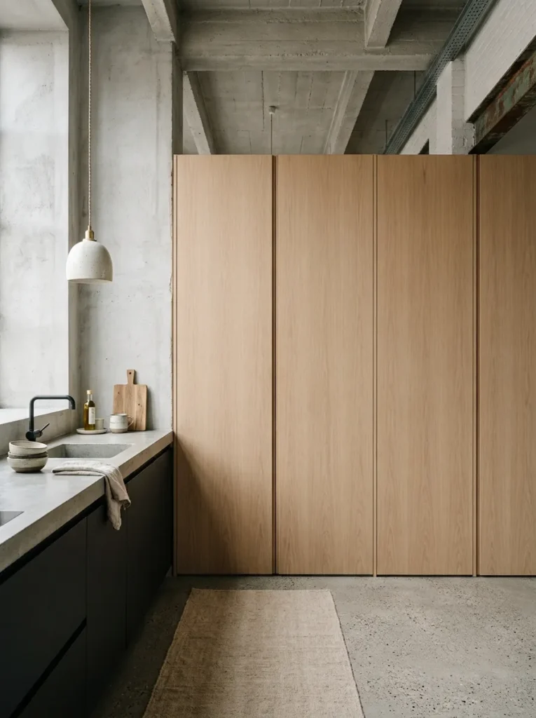
A pantry wall disguised as ordinary cabinetry solves the single biggest visual problem in a modern kitchen: the gap between how organized the inside actually is and how organized the kitchen appears from the doorway. Hidden panel doors with no visible hardware keep the wall reading as architecture rather than storage, which matters enormously in open-plan kitchens visible from the living area. This works best when planned during a full renovation, since retrofitting flush panel doors onto existing cabinet boxes rarely achieves the same seamless reveal line.
3. Use a Single Run of Unlacquered Brass Hardware Across All Cabinetry
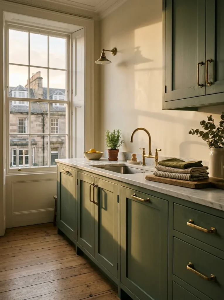
Lacquered brass is sealed to stay shiny forever, which sounds appealing until you realize it also means the hardware will look identical the day you move out as the day it was installed — no character, no evidence of a life lived in the kitchen. Unlacquered brass develops a genuine patina over months of use, darkening exactly where hands touch it most. This works best paired with a single saturated cabinet color that gives the aging brass real contrast to develop against.
4. Add a Secondary Prep Sink on the Island Separate From the Main Sink
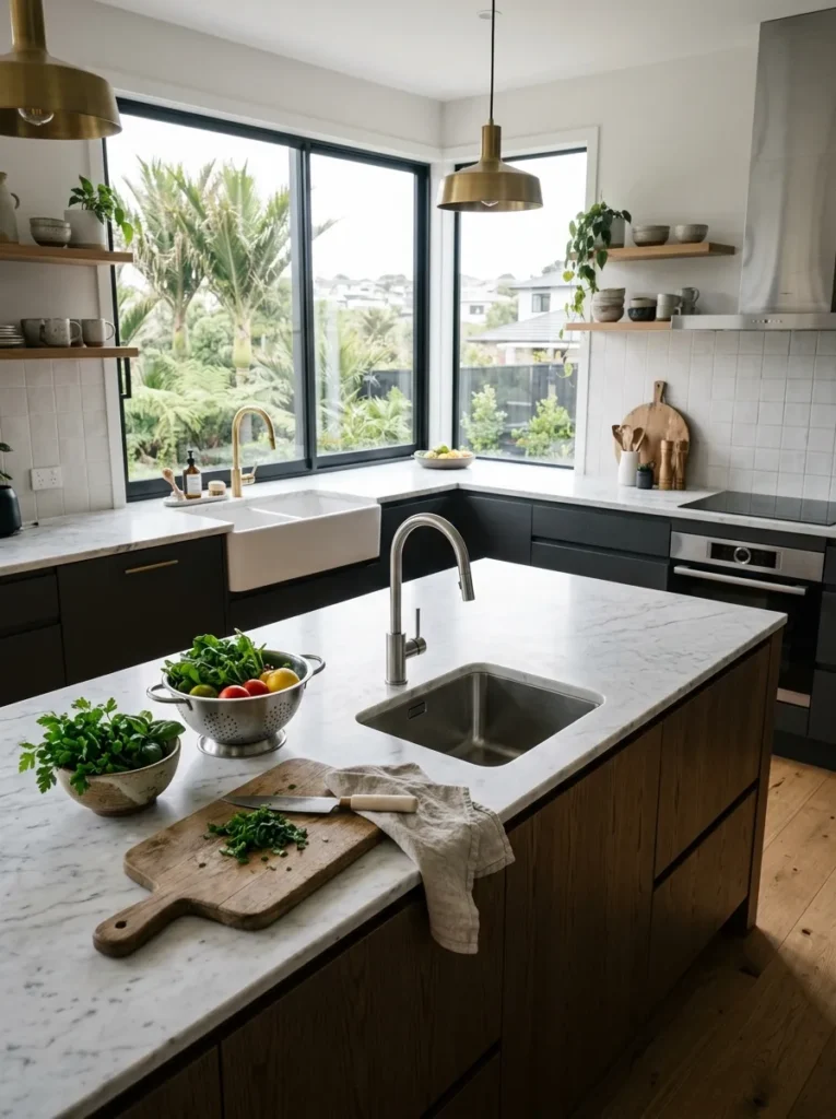
A single sink forces everyone in the kitchen to queue for the same six square feet of counter, regardless of how large the rest of the room is. A dedicated prep sink on the island lets one person wash vegetables while another fills a kettle at the main sink, which sounds minor until you’ve actually cooked a holiday meal with five people competing for the same tap. This works best in kitchens with islands at least 240 centimeters long, where there’s genuinely enough surface to dedicate part of it to a second water source.
5. Choose Fluted Glass Cabinet Fronts Over Clear Glass
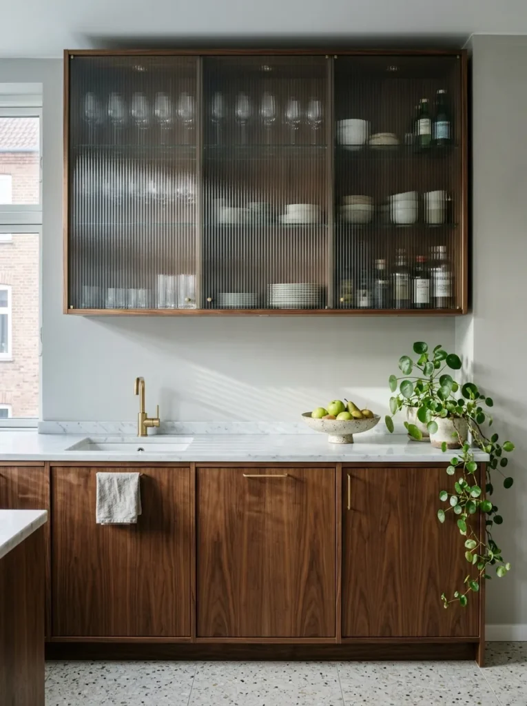
Clear glass cabinet fronts demand that everything behind them be perfectly arranged at all times, which is an unreasonable standard for a kitchen anyone actually cooks in. Fluted glass softens whatever’s behind it into texture and color rather than identifiable clutter, giving you the lightness of glass without the constant curation. This works particularly well on upper cabinets, where the diffused light it creates softens the entire upper half of the room.
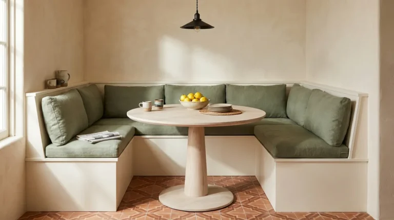
6. Build a Built-In Banquette Into an Awkward Kitchen Corner
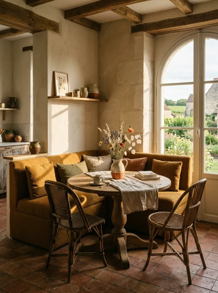
Every kitchen has at least one corner too awkward for standard cabinetry and too small for freestanding furniture, and a built-in banquette is usually the only thing that actually fits it well. Custom upholstered seating claims the full angle of the corner rather than leaving a gap, and it reads as considerably more intentional than a folding chair pushed into the same space. This works best in kitchens where the corner in question gets natural light, since banquette seating invites people to linger.
7. Use a Continuous Slab Backsplash Instead of Tile

Tile grout lines break up exactly the kind of dramatic natural veining that makes stone worth choosing in the first place, fragmenting a single continuous pattern into dozens of small disconnected tiles. A slab backsplash, especially one book-matched to mirror the same vein pattern across the seam, treats the wall behind the stove as a single uninterrupted surface. This works best with stone that has visible, dramatic movement, since a plain or uniform stone won’t justify the higher cost of slab over tile.
8. Choose a Statement Range Hood as the Kitchen’s Architectural Focal Point
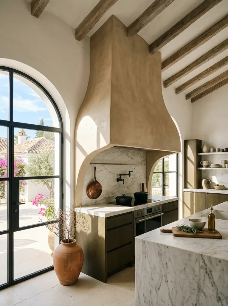
A standard stainless steel hood is functional and instantly forgettable, vanishing into the cabinetry around it. A sculptural plastered or curved hood, by contrast, behaves like a piece of architecture rather than an appliance, anchoring the entire cooking wall the way a fireplace anchors a living room. This works best in kitchens with ceiling heights above 280 centimeters, where there’s enough vertical room for the hood’s form to actually register as dramatic rather than cramped.
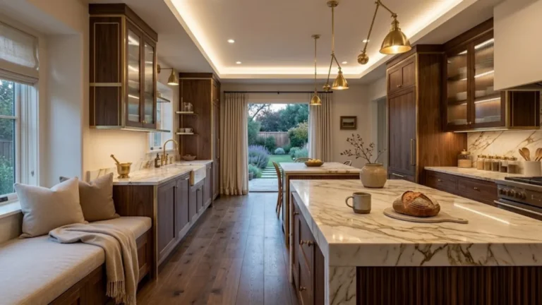
9. Layer Under-Cabinet, Pendant, and Toe-Kick Lighting Together
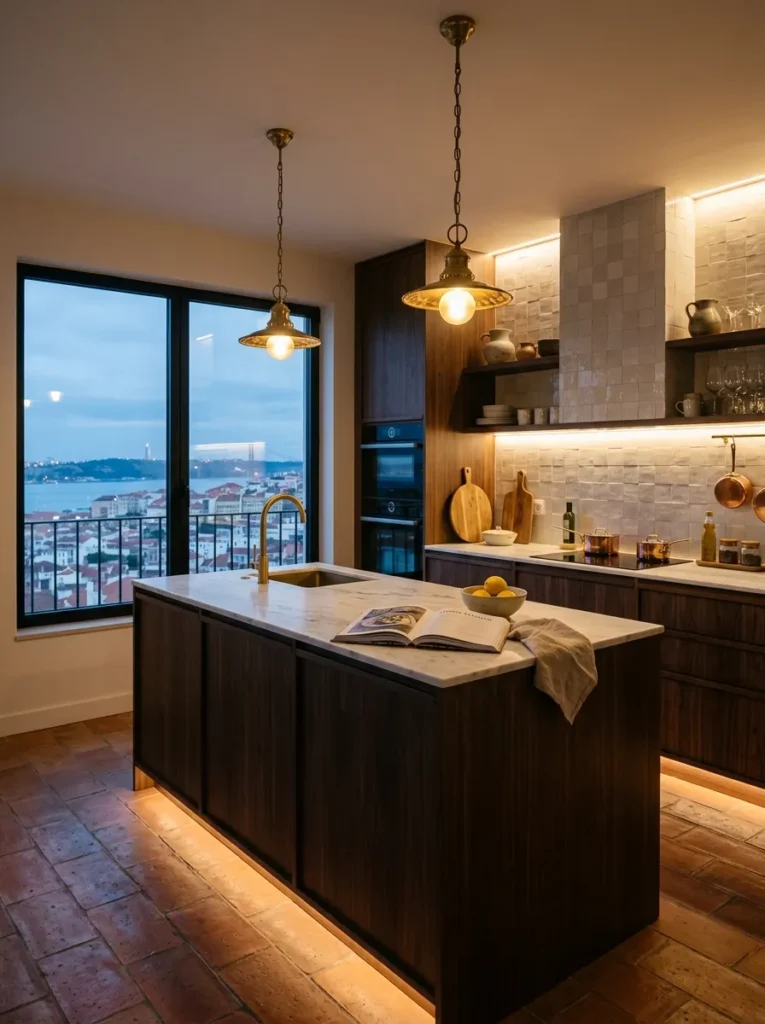
A single overhead fixture lights a kitchen the way a flashlight lights a room — functionally, but with no depth or atmosphere. Layering under-cabinet task lighting, pendant ambient lighting, and a low toe-kick glow creates three distinct planes of light at different heights, which is what actually makes a kitchen feel dimensional after dark rather than flatly lit. This matters most in kitchens used into the evening, where a single bright source can feel almost clinical by comparison.
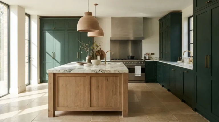
10. Choose a Modern Kitchen Color Palette Built Around One Saturated Tone
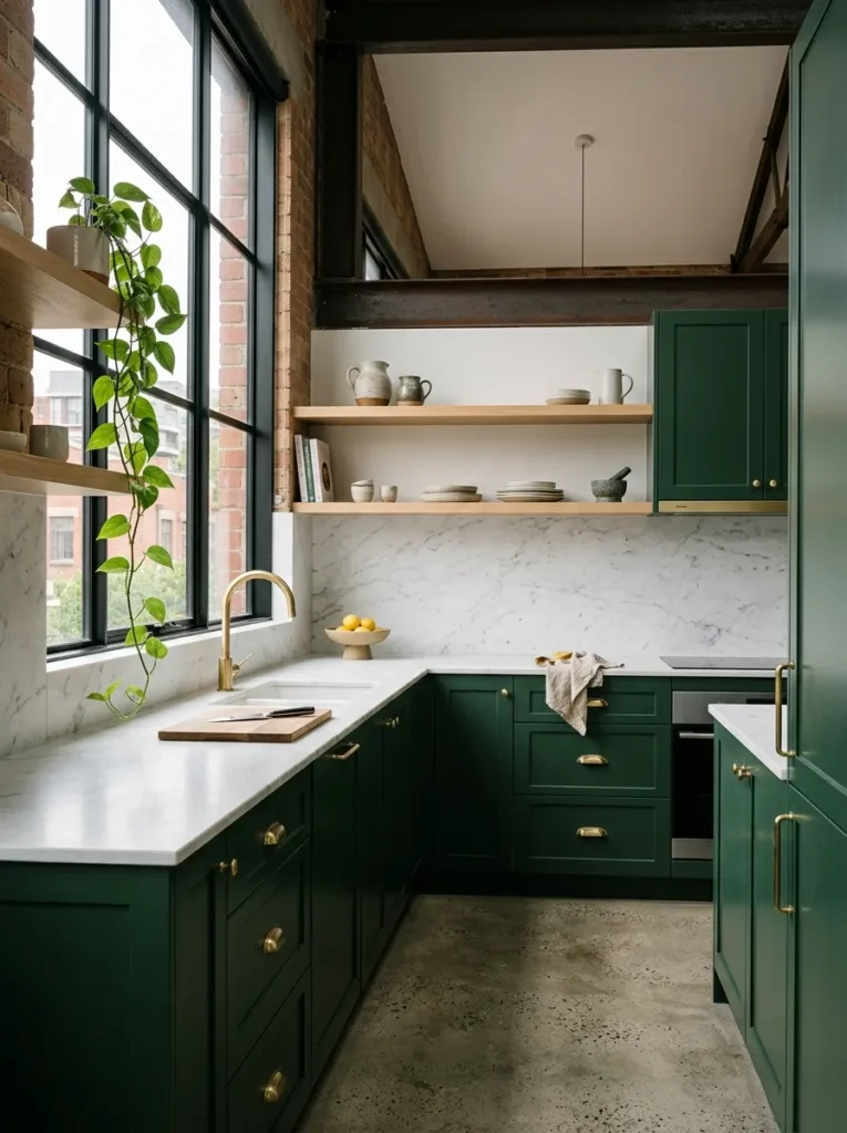
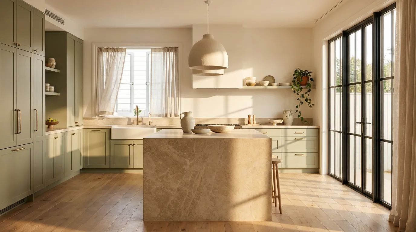
Most modern kitchen color advice defaults to white or grey because it’s safe, but a kitchen built around one confident saturated tone — forest green, deep navy, terracotta — reads as considerably more memorable and more clearly designed than another all-white room. The key is restraint everywhere else: one saturated tone needs pale countertops and simple hardware around it to avoid tipping into visual chaos. This works best when the saturated tone is applied to lower cabinetry only, leaving uppers and walls neutral to balance the weight.
11. Add an Integrated Wine or Beverage Wall Instead of a Standalone Fridge
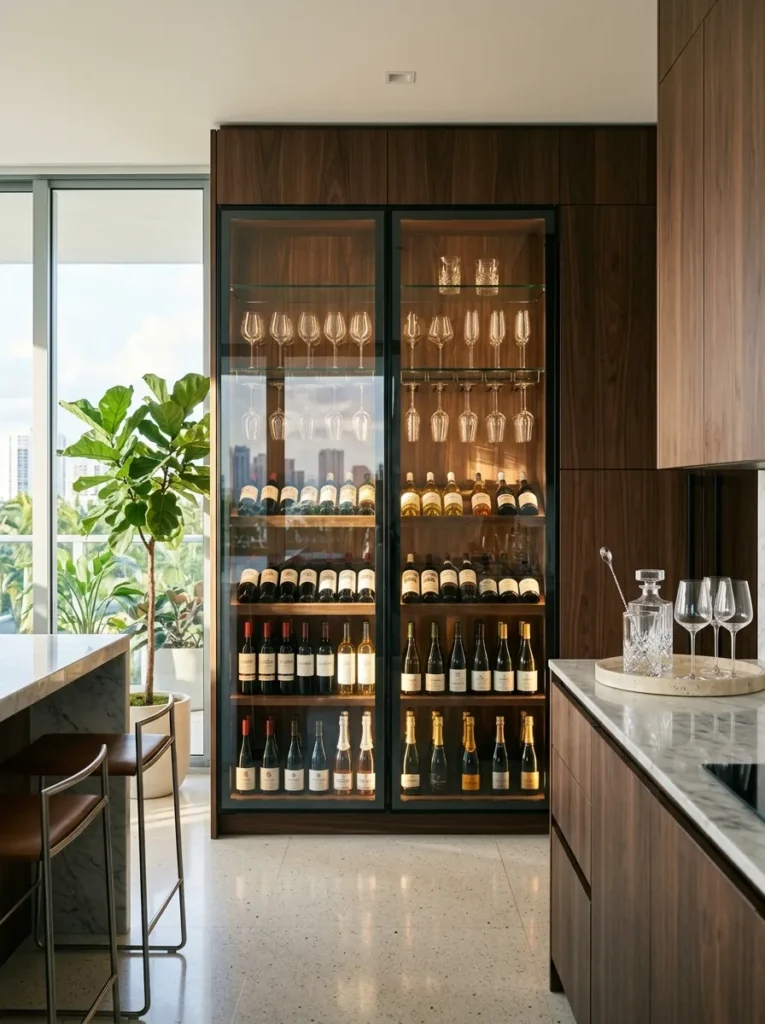
A standalone beverage fridge, however nice the brand, always looks like an appliance that was added rather than planned. An integrated beverage wall, built into the same cabinetry run as the rest of the kitchen, disappears into the architecture the way a refrigerator panel does, while still giving guests an obvious, attractive place to find a drink. This works best in kitchens that double as entertaining spaces, where guests need somewhere to self-serve without crowding the cook.
12. Choose Open Shelving on One Wall Only, Never the Full Kitchen
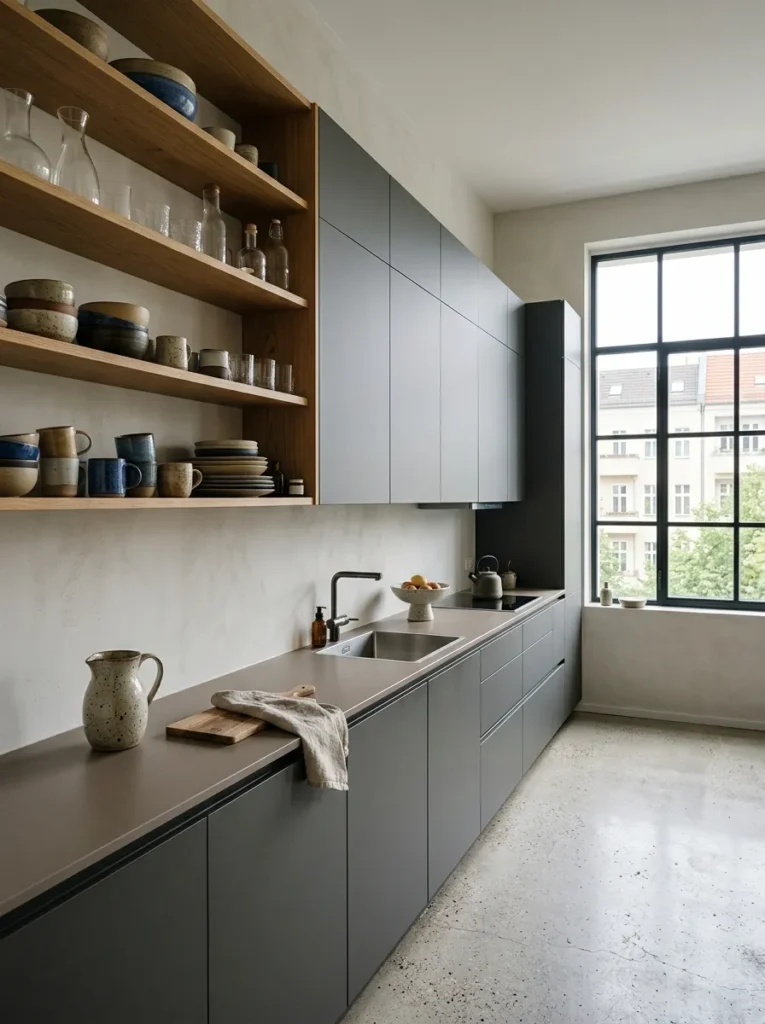
Open shelving across an entire kitchen turns every dish and box of pasta into a permanent design decision, which is exhausting to maintain and rarely looks as good in practice as it does in a single staged photograph. Limiting open shelving to one wall keeps the display curated and intentional while letting the rest of the kitchen’s actual mess live behind closed doors. This works best when the open wall is the one most visible from the main living space, giving guests the curated view while keeping daily clutter elsewhere.
13. Use a Honed Concrete Countertop for an Industrial-Modern Contrast
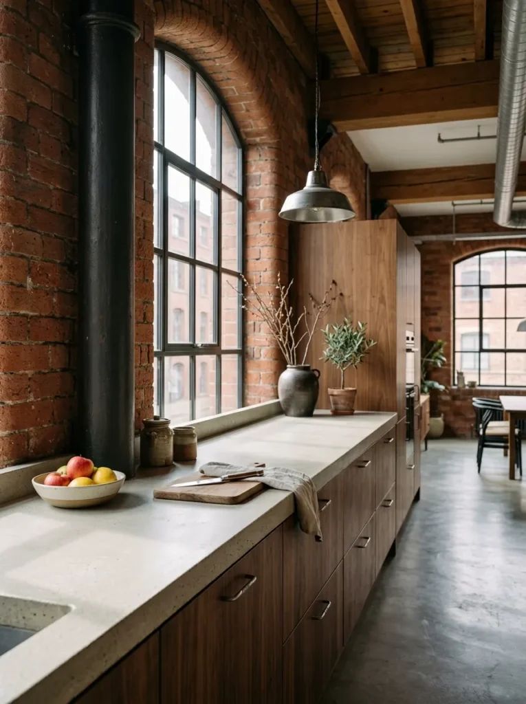
Concrete countertops get dismissed as cold, but honed rather than polished concrete actually reads as warm and tactile, especially against a wood cabinet tone. The material’s subtle aggregate texture and inevitable minor variation give it a handmade quality that a uniform engineered stone can’t replicate. This works best in genuinely industrial spaces — exposed brick, original steel, high ceilings — where concrete feels native to the architecture rather than imported as a trend.
14. Choose a Curved Kitchen Island Instead of a Rectangular One
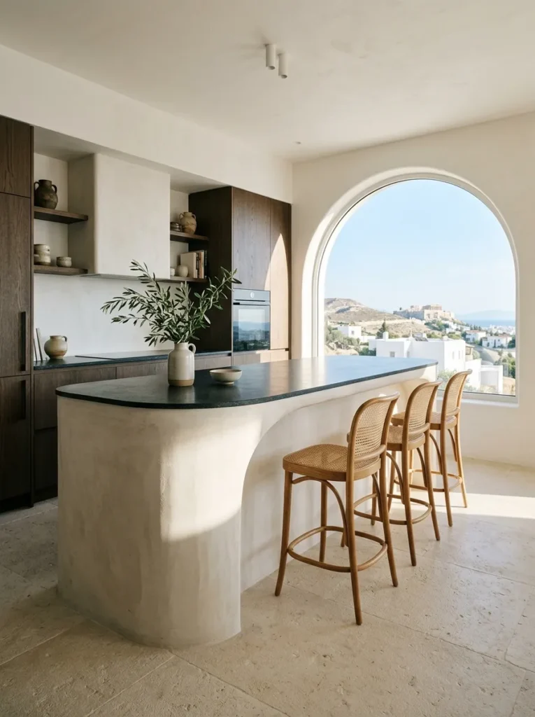
Every other surface in a typical kitchen is a straight line or a right angle — cabinets, counters, walls, appliances — and a curved island is often the only opportunity in the entire room to introduce a genuinely organic shape. The curve also softens traffic flow in a literal sense, since rounded corners are easier to walk around than sharp ones. This works best as the room’s single curved element; introducing curves elsewhere too tends to compete rather than complement.
15. Add a Built-In Coffee Station With Its Own Water Line
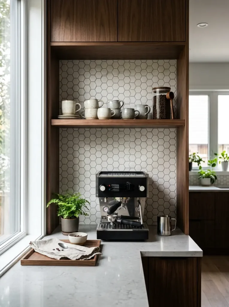
A countertop espresso machine with a visible cord and a water reservoir that needs refilling daily is a small but constant disruption to an otherwise clean kitchen. Plumbing a dedicated line to a built-in coffee niche removes both problems at once, and treating the space as its own designed moment — distinct tile, dedicated shelf — gives it presence rather than treating it as an afterthought squeezed onto the main counter. This is best planned during a full renovation, since adding a water line afterward usually means opening a wall.
16. Choose Furniture-Style Legs on a Kitchen Island Instead of a Solid Base
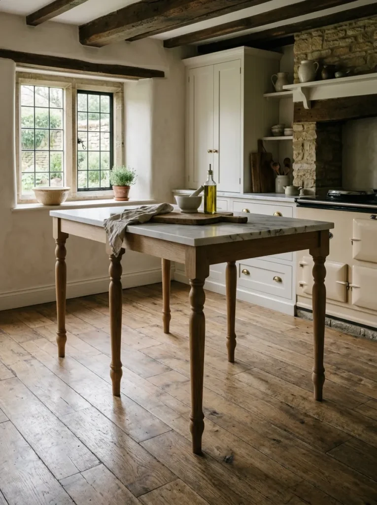
A solid cabinet base on an island reads as built-in storage, full stop, while slender furniture-style legs let the same piece read as a freestanding table that happens to also store things. The visual lightness this creates matters most in smaller kitchens, where a solid island base can make the whole room feel boxed in. This works best when paired with open shelving underneath rather than closed drawers, since closed cabinetry on slim legs creates an odd visual mismatch between delicate support and heavy storage.
17. Use a Single Oversized Pendant Instead of a Row of Matching Ones
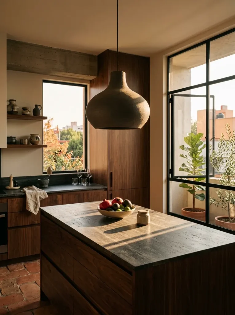
Three matching pendants in a row is the default island lighting solution, and it’s also become so common that it barely registers as a design decision anymore. A single oversized pendant, scaled deliberately larger than convention suggests, gives the island one confident focal point instead of three repetitive smaller ones. This works best over islands without a sink directly beneath the pendant’s position, since a single fixture needs to be centered over open counter space to read correctly.
18. Choose a Wood Ceiling Treatment to Add Warmth Above a Pale Kitchen
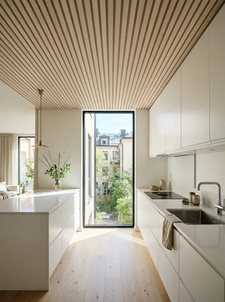
An all-white kitchen, however well executed, can start to feel sterile once every surface — walls, cabinets, ceiling — sits in the same flat tone. A wood slat ceiling introduces warmth and texture at the one plane most all-white kitchens leave completely untouched, and because it’s overhead rather than at eye level, it adds depth without competing with the cabinetry for attention. This works best in kitchens with ceilings at least 260 centimeters high, since lower ceilings make a slatted treatment feel heavy rather than textural.
19. Add a Window Above the Sink That Opens, Not Just a Fixed Pane
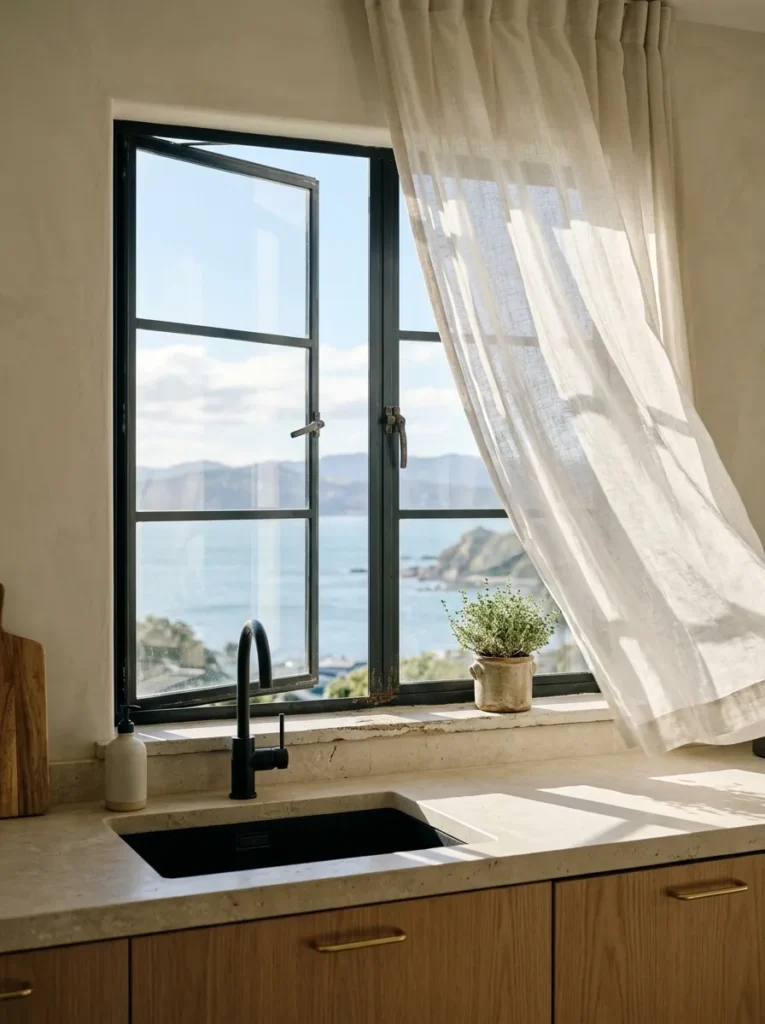
A fixed picture window above the sink looks identical to an operable one in a photograph, but it cannot do the one thing a kitchen window is actually supposed to do beyond looking nice: let cooking smells and steam out. Choosing a window that genuinely opens, even partially, makes a real functional difference every single time something is fried or boiled. This works best with a casement or awning style that cranks outward, since a sliding sash window above a sink often gets blocked by the faucet itself.
20. Choose Two Different Cabinet Finishes That Share One Connecting Material
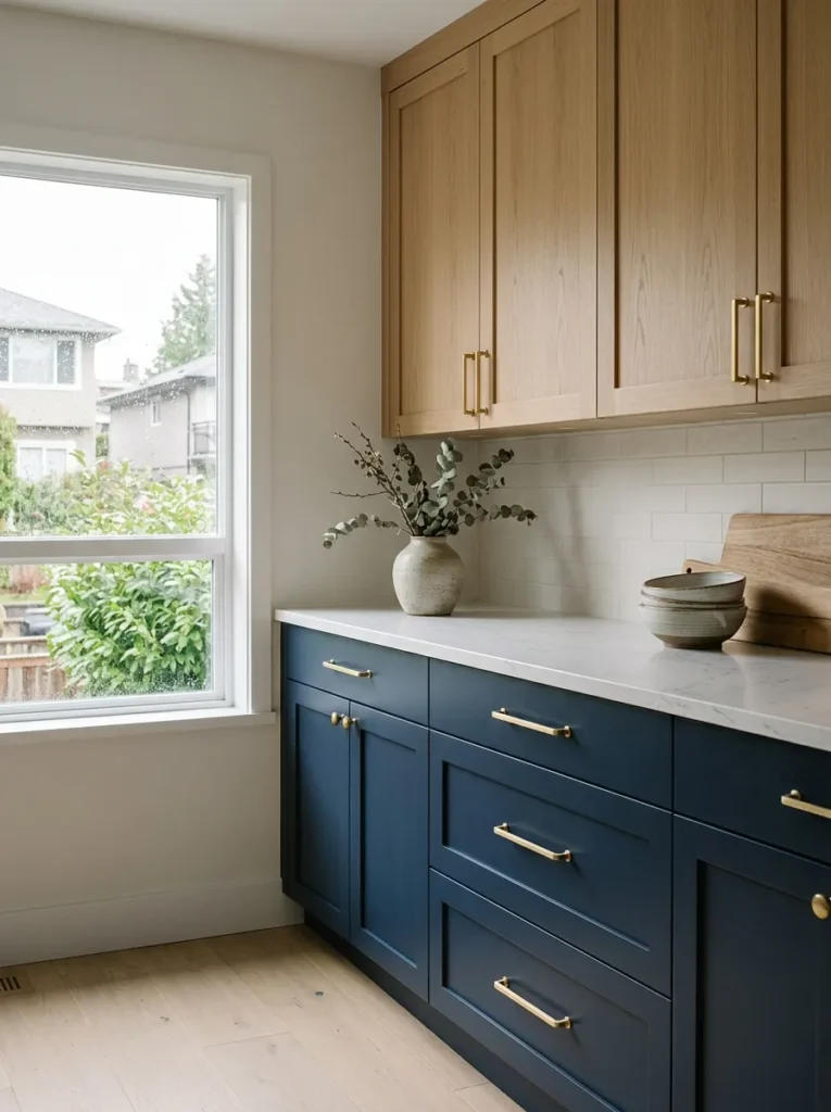
Two-tone cabinetry fails most often when the two finishes have nothing in common beyond proximity, leaving the kitchen feeling like two separate design decisions rather than one cohesive idea. Using the exact same hardware finish, in the same style, across both cabinet tones gives the eye a consistent thread to follow between the two colors. This works best when the contrast in tone is genuinely bold — navy and oak, charcoal and white — since a subtle two-tone scheme doesn’t need as much help unifying it.
21. Leave One Section of Counter Permanently Empty
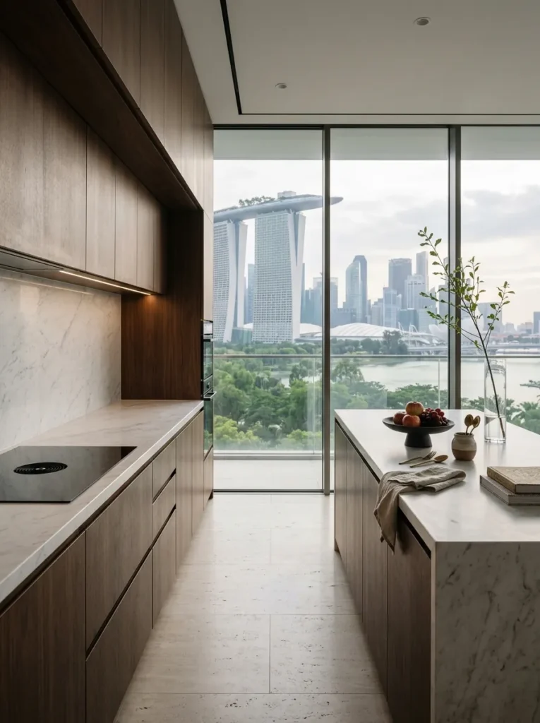
Every other idea on this list adds something to the kitchen. This one takes something away, and it’s the idea most modern kitchen articles are too nervous to include, since empty counter space doesn’t photograph as an obvious design decision the way a new backsplash does. Leaving one stretch of counter permanently clear, with nothing stored or styled on it, gives the entire kitchen visual room to breathe, and it makes everything else in the space look more deliberately chosen by comparison. This is less about any single material or finish and more about discipline: once the counter is built, the hardest part is simply not filling it.
Final Thoughts
Modern kitchen ideas tend to get reduced to a handful of repeated moves, but the kitchens that actually stay relevant are the ones built from specific, considered decisions like the twenty-one above rather than a checklist applied uniformly to every room. Start with whatever your kitchen currently lacks most clearly — light, warmth, storage, or simply restraint — rather than trying to apply all of them at once. A genuinely stylish and timeless modern kitchen isn’t one that follows every trend correctly. It’s one where every choice, from the waterfall edge to the empty stretch of counter, was actually made on purpose.
Loved these ideas? Save this post to your Pinterest board so you can come back to it next time you’re planning your dream modern kitchen!