18 Scandinavian Living Room Ideas That Feel Bright and Airy
Most articles about Scandinavian living room ideas show you the same five white rooms with a sheepskin thrown over a chair and call it a day. That’s not this. A genuinely bright, airy Scandinavian room isn’t about painting everything white and hoping for the best — it’s a series of specific decisions about light, material, and restraint that most people skip because they’re not as obvious as “add a plant.” This list is built around the choices that actually change how a room feels, not the ones that just photograph well for five seconds before you notice the room still feels flat. Some of these ideas are simple swaps. Others will mean rethinking a piece of furniture you’ve had for years. Either way, here’s what actually works.
1. Choose Whitewashed Oak Over Painted White Floors
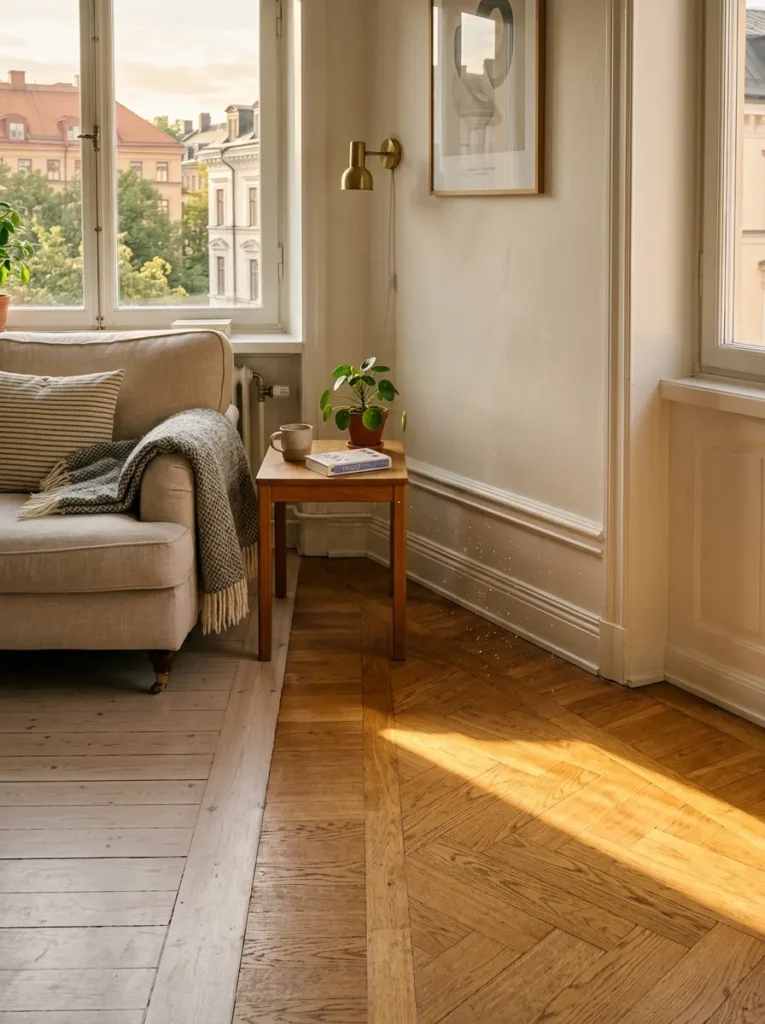
Painted floors chip, yellow, and show every scuff within a year — whitewashed oak doesn’t. The whitewashing process opens the grain just enough that you still see the wood underneath, which is the whole point. A floor that reads as “wood” rather than “white paint” gives the room warmth without sacrificing the light, airy quality everyone’s chasing. Go for a matte finish, not satin — a shine on a pale floor draws attention to every footprint and dust mote, which defeats the purpose entirely.
2. Layer Sheer Linen Under Heavier Drapery
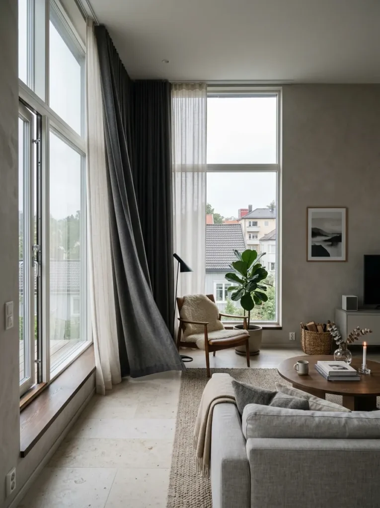
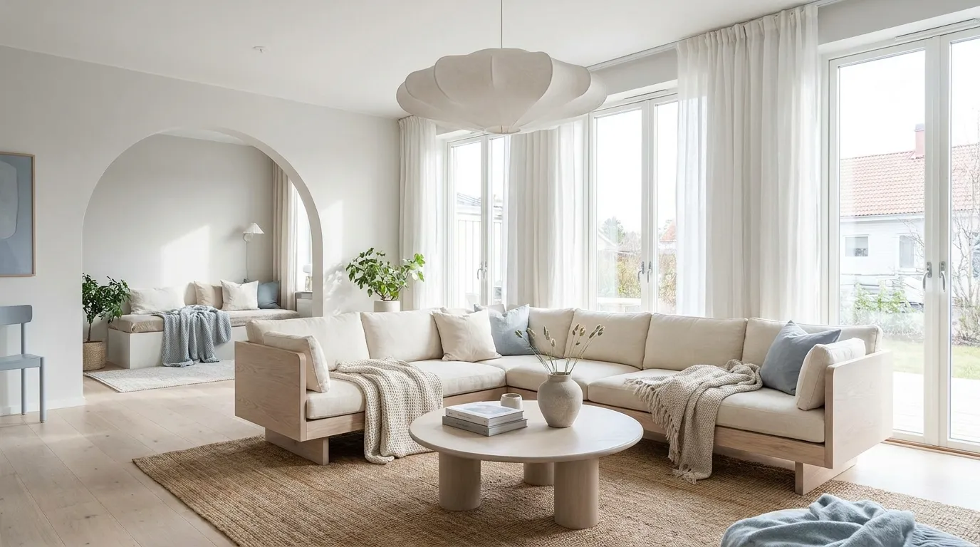
A single set of curtains is doing half a job. Sheer linen alone lets in too much unfiltered light and offers no privacy after dark; heavy drapery alone blocks the soft, diffused daylight that Scandinavian rooms are built around. Layer both on the same track — sheer against the glass, structured linen or wool outside it — and you get diffused daylight all day and the option to close things off completely at night. This is the decision most people skip because it costs more, and it’s also the decision that changes the entire feel of the room.
3. Commit to One Low-Slung Sofa, Not a Matching Set
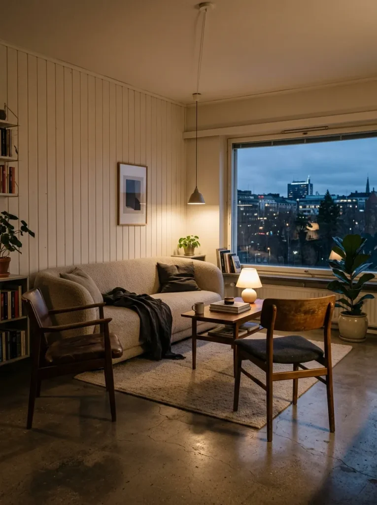
The matching three-piece sofa set is always the safer choice and almost never the better one. A single, low-profile sofa in bouclé or heavy linen — paired with two unmatched chairs instead of a matching loveseat — reads as considered rather than purchased as a bundle. Keep the arm height under 65 centimetres and the seat depth generous, around 95 centimetres, so it reads as lounge-worthy rather than formal. The mismatch is the point.
4. Paint Walls a Warm Off-White, Never Bright White
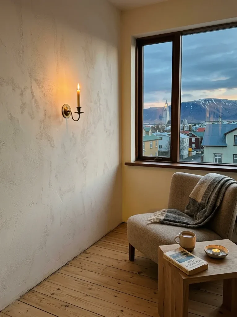
Bright white walls under Nordic light conditions go grey and cold, especially in rooms without direct southern exposure. A warm off-white with a hint of beige or the faintest yellow undertone reads as bright without turning clinical. This is a small decision on a paint chip and a massive one once it’s on four walls — test a large swatch and look at it at both 8am and 6pm before committing.
5. Install a Wood-Burning Stove as the Room’s Anchor
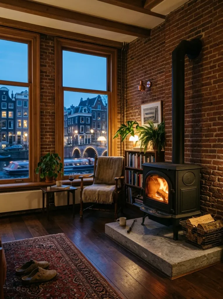
A fireplace does something a sofa arrangement never can: it gives the eye somewhere to land immediately. A freestanding cast-iron stove on a raised hearth of pale stone works harder than a built-in fireplace because it reads as an object, not a wall feature. Position seating around it rather than around a television, and the whole room reorganizes itself around warmth instead of screen time — which, for obvious reasons, changes how the space actually gets used.
6. Hang One Sculptural Pendant, Skip the Symmetry
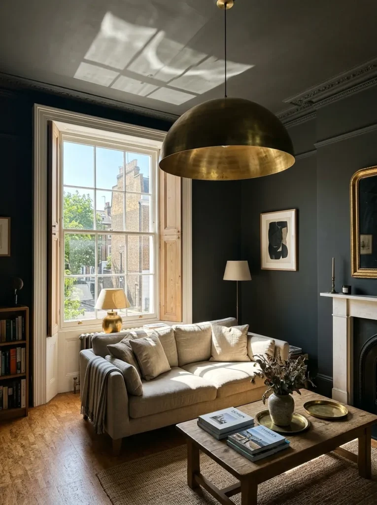
A single oversized pendant in blown glass or spun brass, hung slightly off-center over a seating cluster rather than dead center in the room, avoids the showroom look that symmetrical lighting always produces. Hang it so the base sits roughly 150 centimetres above the floor — low enough to feel intimate, high enough that nobody’s ducking around it. Most people center every light fixture in a room out of habit. Don’t.
7. Add Texture Through a Chunky Wool Throw, Not a Print
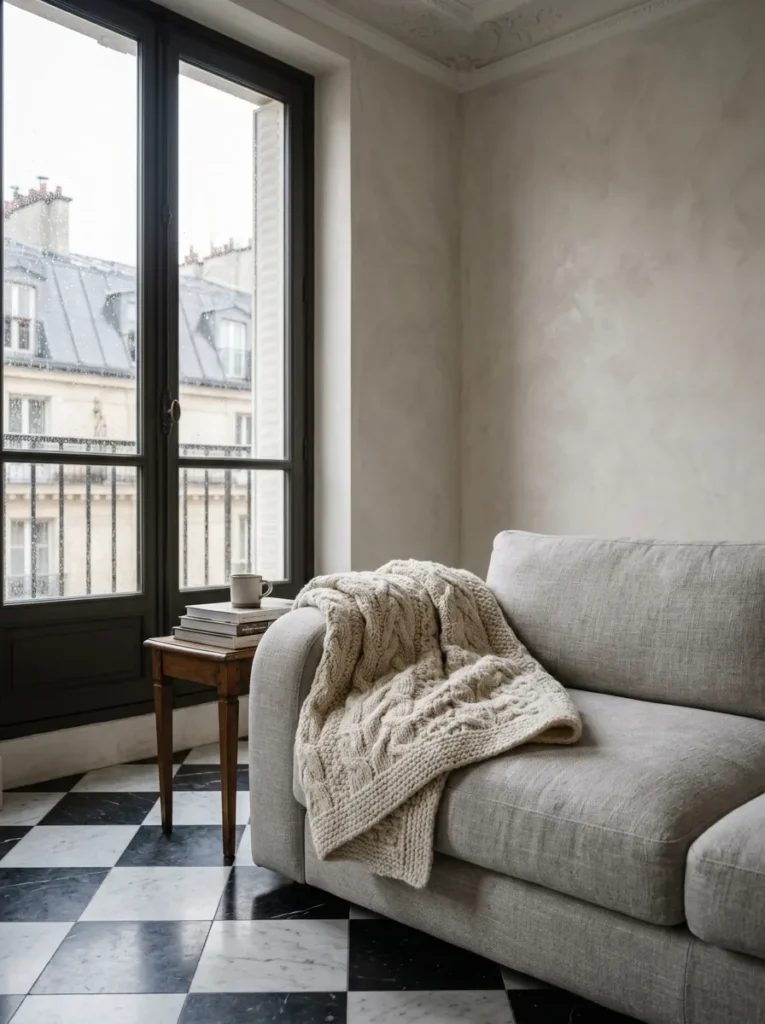
Pattern fights with the calm that a Scandinavian living room idea is supposed to deliver — texture doesn’t. A cable-knit or bouclé throw folded loosely over the arm of a sofa adds visual and physical warmth without introducing a competing color story. Choose one in undyed wool or a muted oatmeal tone rather than a bold contrast color. It should look grabbed, not styled.
8. Build Open Shelving With Deliberate Gaps
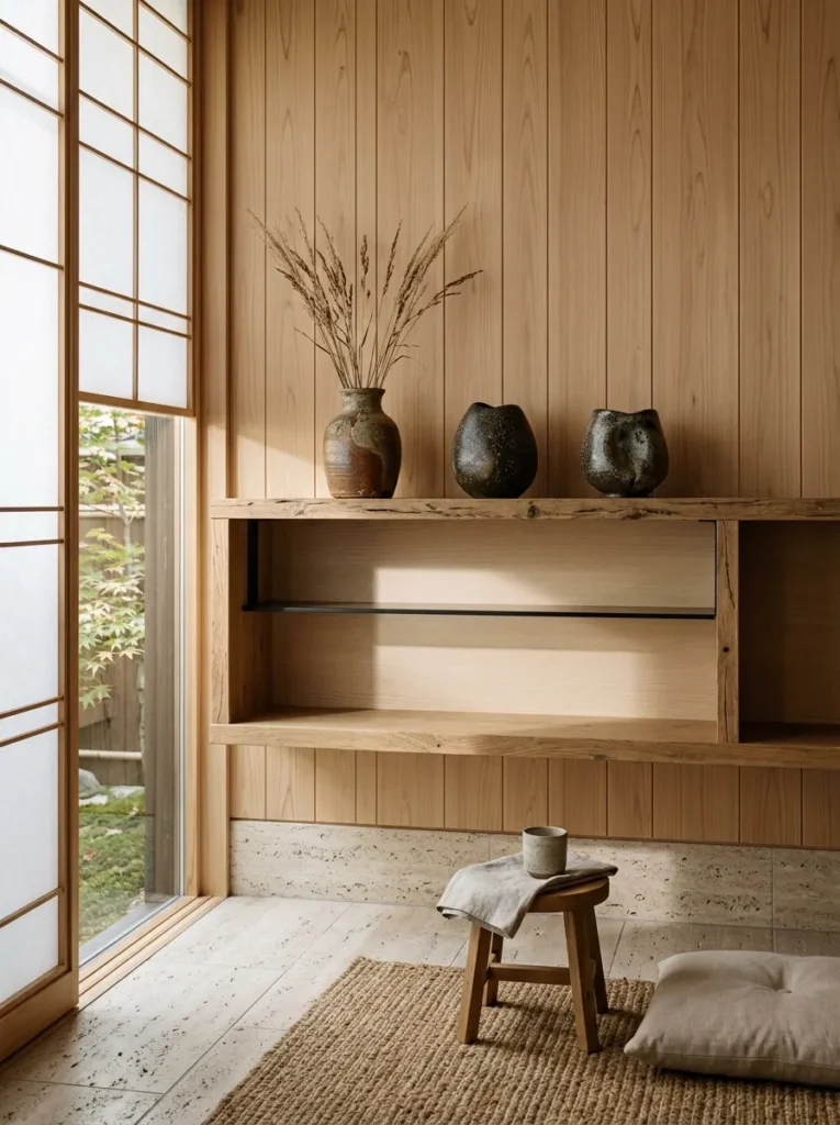
Fully loaded shelves read as storage. Shelving with visible negative space — one shelf holding three ceramic pieces, the next holding nothing but a single stack of books — reads as curated. Use raw or lightly oiled oak brackets rather than painted ones, and resist the urge to fill every inch. The empty space is doing as much work as the objects.
9. Hang a Large Unframed Mirror Opposite the Window
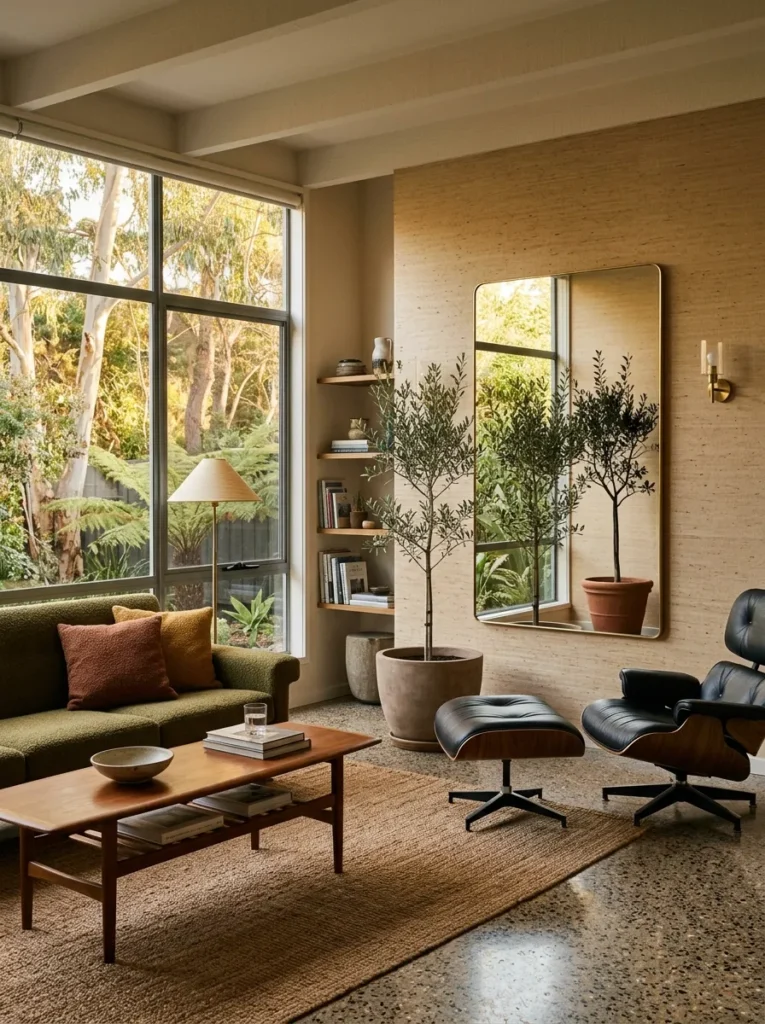
A mirror placed directly across from your main light source doubles the perceived daylight in the room, which is the single fastest way to make a small or dim space feel bright without touching the walls or the windows. Skip the ornate frame — an unframed or thin brass-edged mirror keeps the reflection itself the focus rather than the frame around it. This works especially well in rooms with only one window, though it’s worth doing regardless.
10. Pick One Muted Accent Color, Not a Palette
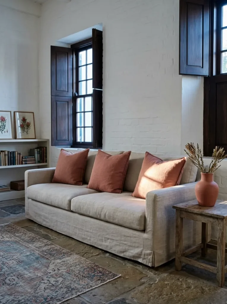
A dusty terracotta cushion, a single sage-green ceramic vase, one rust-colored throw — pick exactly one muted accent tone and repeat it two or three times across the room. Three competing accent colors is how a calm Scandinavian interior turns into a showroom catalogue page. Restraint here isn’t boring. It’s the difference between a room that feels edited and one that feels accumulated.
11. Hide Storage Behind Flush, Handleless Cabinetry
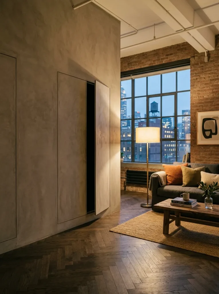
Visual clutter is the fastest way to undercut every other decision on this list. Handleless cabinetry in the same tone as the surrounding wall — push-to-open mechanisms, no visible hardware — lets storage disappear into the architecture instead of competing with it. This costs more than a standard cabinet run. It’s also the reason some rooms feel effortless and others feel like they’re constantly being tidied.
12. Layer a Flatwoven Rug Under a Smaller Wool One
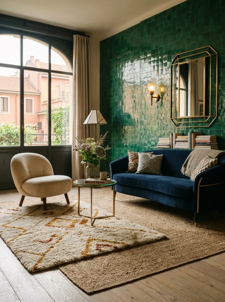
A single rug, however nice, reads as flat. Layering a wide, neutral flatwoven jute or wool rug under a smaller, plusher wool rug — offset rather than centered — adds depth to the floor plane the same way a throw adds depth to a sofa. Keep both in tonal neutrals; this is a texture decision, not a color one.
13. Choose One Statement Print in a Thin Black Frame
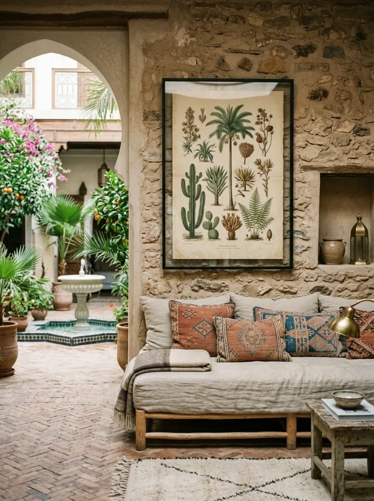
A gallery wall is a commitment most Scandinavian rooms don’t need. One large-scale print — a botanical study, an abstract line drawing, a black-and-white photograph — in a slim black or brass frame does more for the room than six smaller ones ever could. Scale matters more than content here. Go bigger than feels comfortable.
14. Bring In One Large-Leafed Plant, Not a Collection
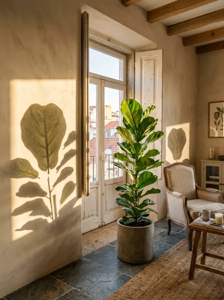
A fiddle-leaf fig or an olive tree in a plain terracotta or concrete pot introduces organic irregularity into a room that’s otherwise full of straight lines and flat surfaces. One large plant does this better than five small ones scattered on shelves, which just reads as clutter with leaves. Place it near — but not directly in front of — the main window, where the light will actually let it thrive.
15. Leave One Wall Completely Bare
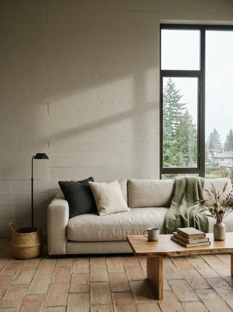
Every surface doesn’t need to earn its keep. Choosing one wall — often the one behind the sofa or opposite the main seating area — and leaving it entirely bare, just paint and light, gives the eye a place to rest. Most people fill every wall out of habit, then wonder why the room feels busy even when it’s tidy. It’s not the objects. It’s the absence of a pause.
16. Slipcover Furniture in Natural, Washable Linen
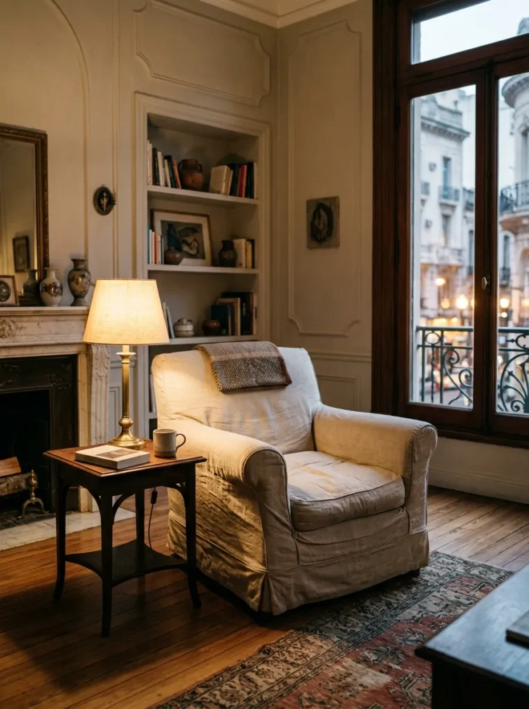
A slipcovered sofa or armchair in undyed linen does two things a fixed upholstery job doesn’t: it softens with every wash instead of wearing out, and it can be removed entirely and cleaned when life happens, which it will. The slight wrinkle and drape of linen is also part of the Scandinavian look specifically — a stiff, tailored slipcover defeats the purpose.
17. Replace Overhead Lighting With Three Floor Lamps
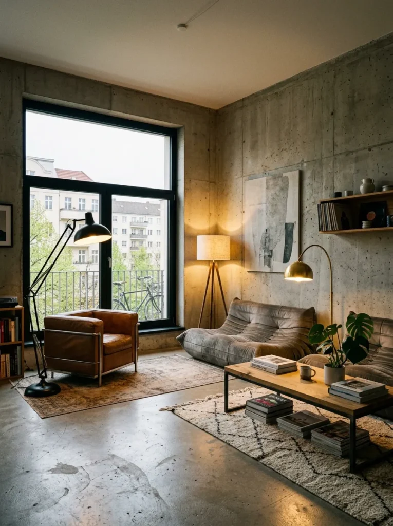
Overhead lighting flattens a room and makes every surface look the same distance from the eye. Three floor or table lamps at varying heights, fitted with warm 2700K bulbs, create pools of light and shadow that make a room feel larger and more layered after dark than any ceiling fixture could. Turn the overhead light off entirely some evenings and see what the room becomes.
18. Keep One Deliberately Imperfect, Non-Matching Piece
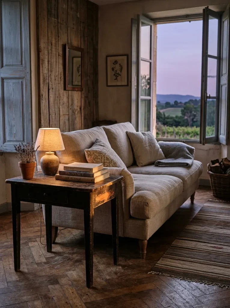
Here’s the one most lists won’t tell you: a room that’s too coordinated stops feeling like Scandinavian design and starts feeling like a showroom display, which is exactly the opposite of what this style is supposed to achieve. A single inherited armchair that doesn’t match anything, a scuffed vintage side table, a rug with a visible worn patch — one piece that clearly wasn’t chosen to coordinate is what convinces a visitor the room is actually lived in. Perfect consistency is the tell that a room was decorated rather than inhabited. Leave the seam showing.
Final Thoughts
You don’t need all eighteen of these at once, and trying to install every idea in a single weekend is how rooms end up feeling staged instead of calm. Start with light — the curtain layering and the mirror placement cost the least and change the most, which makes them the obvious first move. From there, work outward toward furniture and texture, and save the bare wall and the imperfect piece for last, since both require the confidence that comes from already having gotten the basics right. Good Scandinavian living room ideas aren’t really about following a formula; they’re about knowing which three or four decisions in a room matter more than the rest. Get those right, and the room does the rest of the work on its own.
Save these Scandinavian living room ideas for your next home refresh.