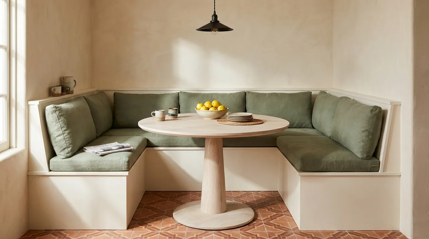
20 Breakfast Nook Ideas That Feel Cozy and Worth Lingering In
Most kitchens have a corner that does nothing useful. It holds a chair that migrates, a pile of unopened mail, or nothing at all. The breakfast nook is the answer to that corner — not just a table and two chairs, but a spot with enough visual intention and physical comfort that people actually want to sit there in the morning.
The challenge is that “breakfast nook” covers a lot of territory: a bay window alcove with built-in seating in a Victorian home, a 36-inch table wedged against an apartment wall, a garden-facing bench in a cottage kitchen. What makes any of them work has less to do with size or budget than with how well the furniture, layout, and styling suit the specific space. These ideas range from full built-ins to renter-friendly furniture arrangements, with enough practical context to help you figure out what will actually work in yours.
1. A Built-In L-Shaped Banquette with a Pedestal Table
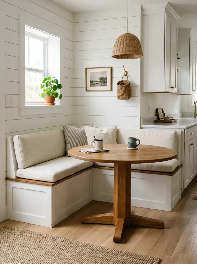
A banquette built into two walls is the most space-efficient breakfast nook arrangement that exists. Because the seating is flush against both walls with no chair legs to pull out, the same footprint that would fit a two-person table and chairs can comfortably seat four — sometimes five if the table is positioned close to the open end.
The pedestal table matters here. Four-legged tables create an obstacle course of crossing legs; a single central base lets everyone slide in from either side without negotiating around anyone. A round or oval top with a 42–48 inch diameter suits most L-banquettes well. Wider tables can make the inner corner seat feel trapped.
Build storage into the banquette bench boxes from the start if this is a renovation. The lift-top or drawer configurations that get added after the fact rarely close properly.
2. A Bay Window Seat Turned Full Nook
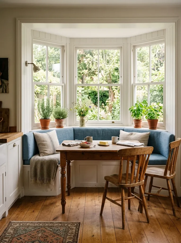
Bay windows create a natural alcove that most kitchens don’t have — when one exists, building a breakfast nook into it is almost always the right call. The window provides natural light from three directions, which makes even a modest table feel generous and open.
The key decision is whether to run seating along all three window panels or only the two angled sides, leaving the center open for chairs. Both work, but the all-bench version gives more seating capacity and turns the bay into a genuine destination. A long, low cushion across the width — typically 17–18 inches deep — needs at least 36 inches of clear table space in front to avoid the cramped feeling of sitting with your knees under the sill.
Storage beneath bay window benches is straightforward to build in and offsets the square footage the bay “uses.”
3. A Freestanding Corner Bench with a Square Table
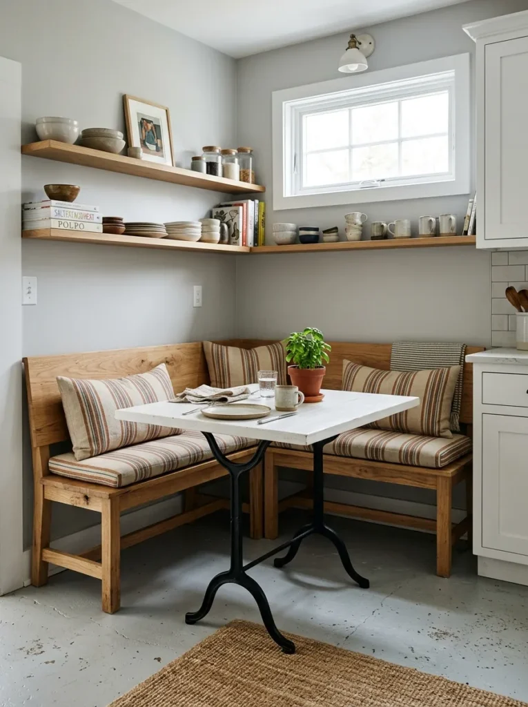
Not every breakfast nook needs construction. A freestanding corner bench — essentially two bench pieces angled into a corner — can be positioned and repositioned, which matters for renters or anyone who moves frequently.
The visual effect mimics a built-in banquette at a fraction of the cost and commitment. The structural difference is that freestanding benches tend to shift slightly over time, which can become annoying against a painted wall. A thin rubber furniture pad under each leg solves it.
A square table works better here than round because square corners allow both bench pieces to sit cleanly against the table edge. Keep the table to 36 inches square for a two-person nook, or 42 inches if the corner has enough room for comfortable passage on the open side.
4. A Round Table with Mismatched Chairs in a Small Kitchen
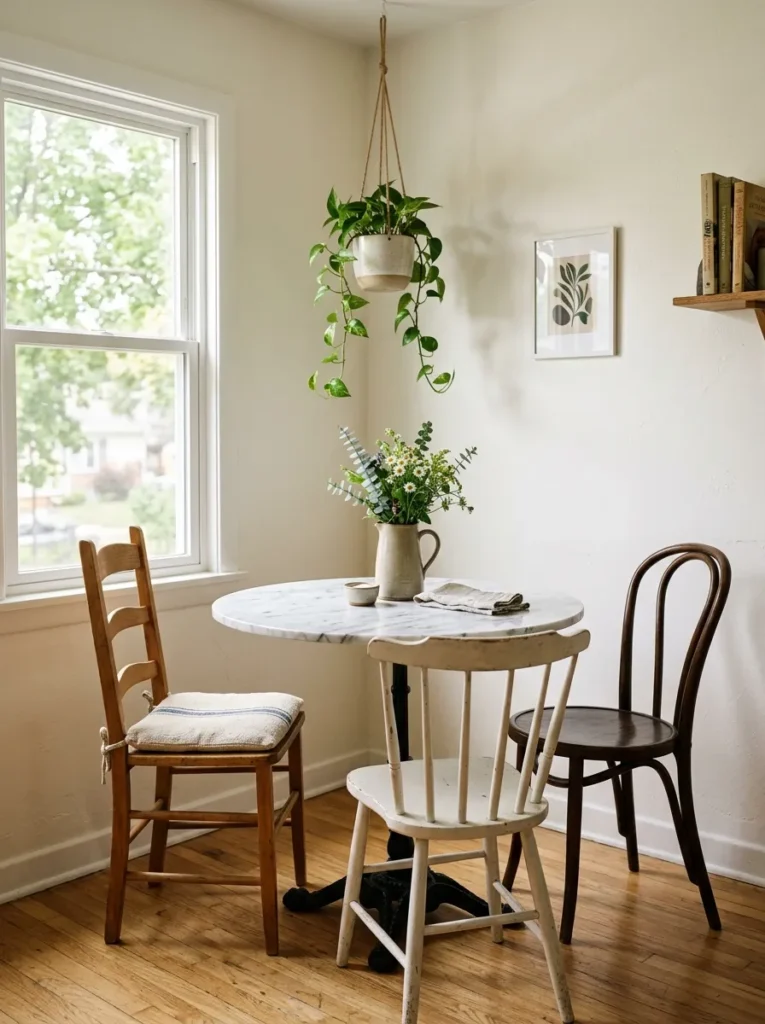
In a kitchen without a corner or alcove — just a stretch of wall — a small round table with two or three mismatched chairs can function as a breakfast nook without claiming much territory.
Round tables are particularly good here because there’s no awkward “head” of the table and no sharp corners to catch hips when squeezing past. A 30–36 inch diameter suits two people comfortably. Three chairs around a 36-inch table is genuinely tight; it works better when the third chair is pulled in only for occasional use.
The mismatched chair approach reads as collected and intentional rather than casual when the chairs share a consistent element — same leg finish, similar seat height, or a material that appears in at least two pieces. One upholstered chair among wood chairs is a common version that works well and provides a softer seat for longer mornings.
5. Wrap-Around Seating with a Farmhouse Trestle Table
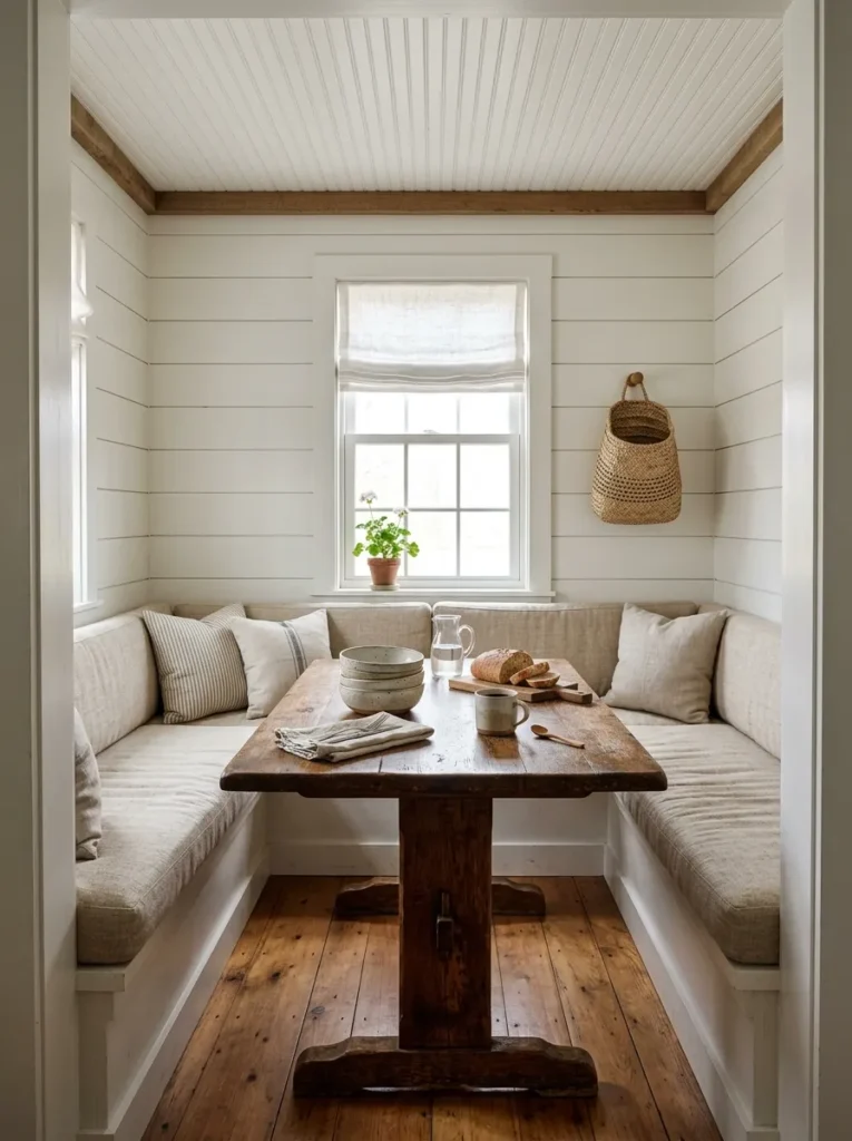
A U-shaped or near-U-shaped banquette surrounding three sides of a trestle table has more seating capacity than almost any other nook configuration. It also photographs well, which is part of why the farmhouse version — shiplap-backed benches, natural linen cushions, a worn wood trestle table — appears so often on home inspiration boards.
The practical question is whether the space has enough room on the open side for comfortable exit. A minimum of 36 inches between the open bench edge and any cabinet or island ensures people can leave without asking others to move. In tighter kitchens, closer to 30 inches is workable but becomes uncomfortable if anyone needs to exit frequently.
The trestle base suits this configuration because the cross-brace prevents the table from rocking while allowing knees and feet to move freely underneath — something a pedestal can’t always achieve with this many diners.
6. A Built-In Nook with Overhead Storage
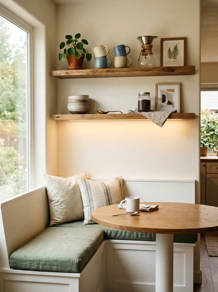
The most common complaint about breakfast nooks in small kitchens is that they consume space that could have held more cabinetry. Building open shelves or small upper cabinets directly above the banquette seating recovers some of that storage in a way that also frames the nook visually.
This works best when the shelving stays light — two or three open shelves rather than full upper cabinets, which would make the nook feel like a storage closet. Displayed items that see daily use (a small coffee station, a bowl for fruit, a candle and a plant) make the shelves feel intentional rather than overflow.
The structural consideration: upper shelves should clear seated head height with comfortable margin. Roughly 18–20 inches above where someone’s head rests when seated is the practical minimum to avoid anyone ducking when they stand.
7. A Dark-Painted Nook as a Visual Anchor
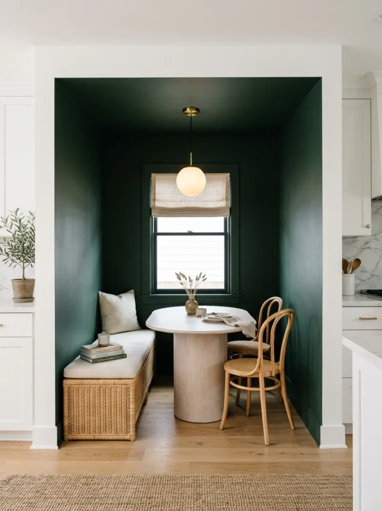
Painting the walls and ceiling of a breakfast nook alcove a deep color — forest green, navy, slate, near-black — while keeping the surrounding kitchen lighter creates a distinct enclosure effect that makes the nook feel like its own room within the room.
Dark color on three or four surfaces of a recess reads very differently than dark color on a flat wall. Because the eye perceives it as depth rather than expansion, even a small nook can feel richly contained rather than claustrophobic. Natural materials like rattan chairs, pale wood, or linen cushions offset the darkness without diluting it.
This is a commitment — repainting an alcove ceiling requires more care than a single wall. But it’s also one of the higher-impact changes available for the cost of a quart of paint, which makes it worth considering even for renters with permission to paint.
8. An Industrial Corner Nook with Metal Chairs and Raw Wood
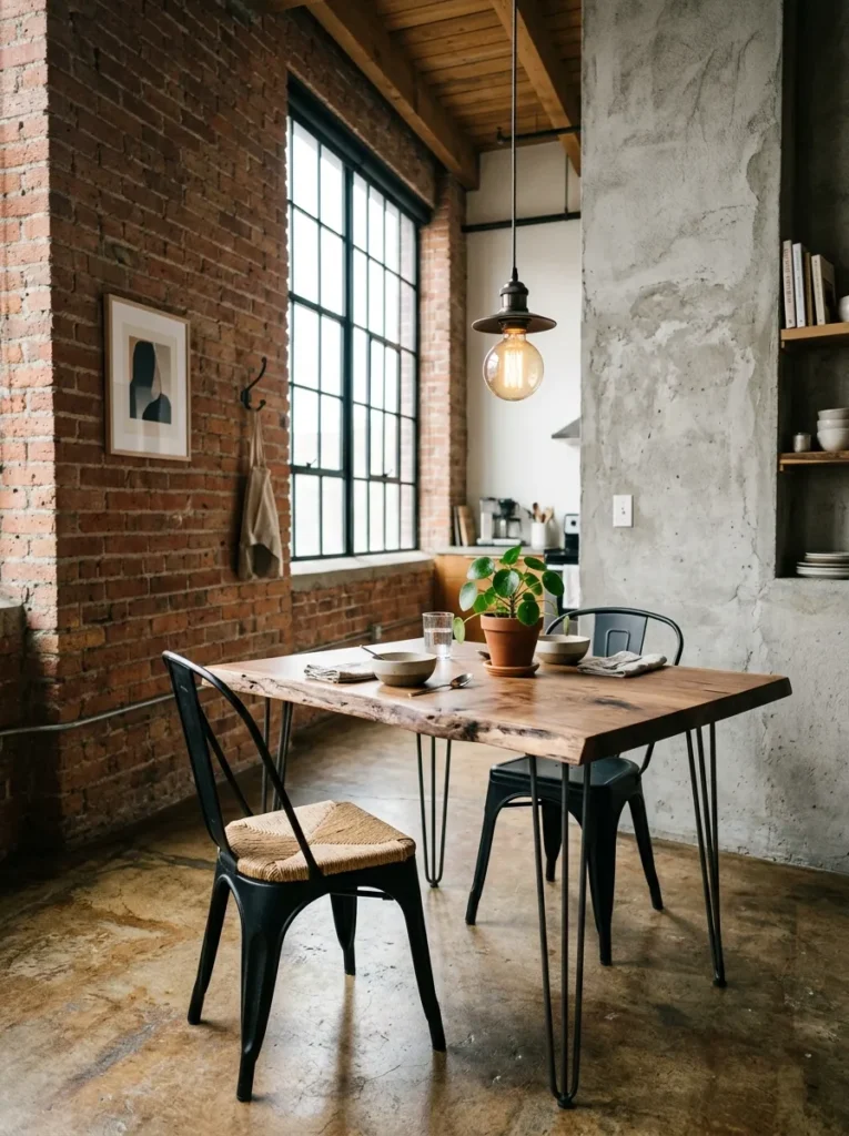
The combination of raw-edged or wire-brushed wood table, black metal bistro chairs or tolix-style side chairs, and exposed wall surfaces — brick, concrete, or a raw plaster finish — creates a nook that reads more café than kitchen. It suits loft apartments, urban homes, and any kitchen that leans industrial or eclectic.
Metal chairs are lighter than wood and easier to pull in and out, which is a practical advantage in tight spaces. They also don’t visually bulk up the way upholstered seating does, keeping the corner from looking heavy. The trade-off is that they offer no warmth for extended sitting — a seat cushion tied to the back rail of each chair addresses this while staying easy to remove.
One genuine risk with this aesthetic: without any soft textile, the overall effect can read as spare rather than cozy. A woven pendant light or a small plant in an aged terracotta pot introduces enough organic warmth to tip the balance.
9. A Banquette with Patterned Cushions as the Color Statement
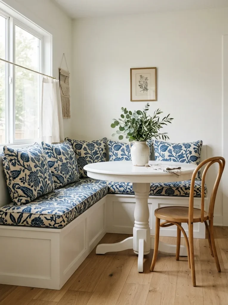
A white or off-white built-in banquette is clean and easy to repaint, but it also disappears into the background — which is fine if the table, light, or room provides sufficient visual interest, and less fine if the nook feels like an afterthought.
Cushions in a genuine pattern — a block-print stripe, a geometric, a botanical — can do the design work that the built-in structure itself doesn’t. The key is scale: a pattern that reads at arm’s length needs to be large enough that it doesn’t dissolve into visual noise from across the room. Small ditsy prints tend to look muddled in a nook, while medium or large-scale repeats hold up.
Because cushion covers are replaceable, this is also one of the more reversible styling decisions available. Using a pattern here can simplify choices elsewhere — a patterned cushion often means a simpler table and a quieter pendant.
10. A Breakfast Nook in Front of a Window Without Built-Ins
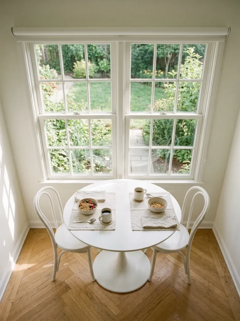
Not every window-adjacent nook requires construction. A small table pushed against a window wall with two chairs facing the glass is one of the simplest and most effective arrangements in a kitchen that doesn’t have an alcove.
The psychological draw of eating with light and a view in front of you is genuine — it transforms an ordinary table from “furniture placed here” to “a spot worth sitting at.” The positioning also means the window provides the backdrop in photos and makes the table feel connected to the exterior.
What this needs to work: a table proportioned to the window rather than undersized against it, and ideally no curtain panels that would block the sill at standing height. A shade that rolls up fully is a better choice here than panels.
11. Scandinavian Nook with White Walls, Wood, and Minimal Textiles
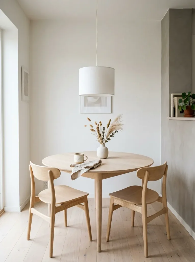
The Scandinavian approach to a breakfast nook tends to involve: pale wood table, bentwood or molded-plywood chairs, white or warm grey walls, and one or two carefully chosen details — a single ceramic vase, a wooden tray, a carefully folded linen napkin. The restraint is the point.
This aesthetic works well in kitchens that already read clean and contemporary, and it suits households that prefer easy maintenance over decorative layering. It’s also one of the most effective approaches for small nooks where adding more creates clutter faster than it creates warmth.
The visual risk is blandness — white walls and pale wood without any contrast or texture can feel washed out. A dark chair seat, a warm-toned rug under the table, or a single colored ceramic element prevents this without violating the aesthetic’s logic.
12. Upholstered Chairs with a Marble-Top Table
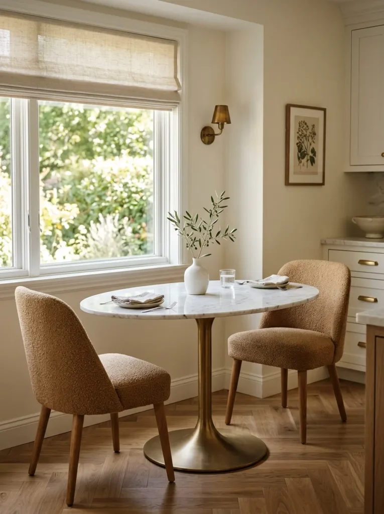
Upholstered dining chairs in a nook are common enough that they’re easy to underestimate. Used thoughtfully, though, they solve a real problem: most breakfast nooks are used for more than breakfast. If you work from home, read the paper, or take longer meals, cushioned seating changes the experience significantly.
Pairing upholstered chairs with a marble-top or marble-look table creates a morning-room quality that lifts a nook above functional to something with a bit of quiet luxury. The marble top is easy to wipe clean, which is relevant for a spot near cooking.
A practical note on upholstery: the kitchen environment means fabric chairs take spills and grease. Performance fabrics (tightly woven cotton-polyester blends, velvet that has been treated, or outdoor-grade woven fabrics that look residential) hold up better than natural linen or silk here. Chair covers or washable slipcovers are a reasonable alternative if the upholstery has already been chosen.
13. A Ceiling-Mounted Pendant Light as the Nook’s Anchor
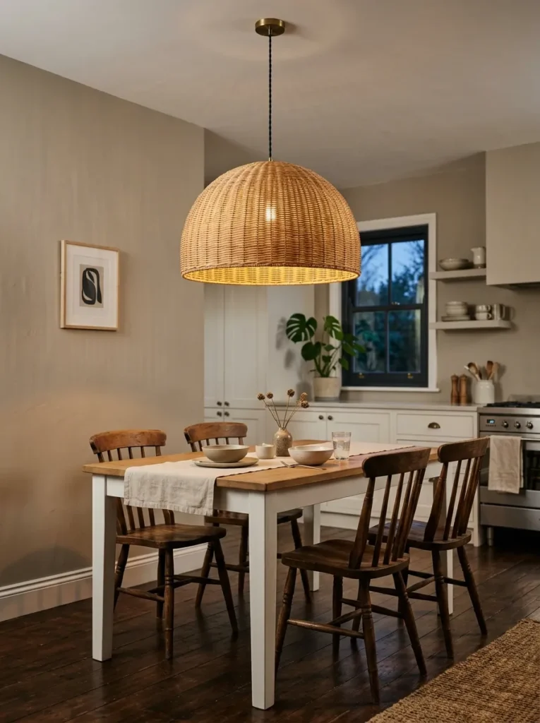
No single element distinguishes an intentional breakfast nook from a table-placed-near-a-window as clearly as a pendant light hung directly above the table. It declares that this spot is a destination.
The pendant should hang 30–34 inches above the table surface in a standard ceiling height. This positions the light at the right level to illuminate the table without obstructing sightlines across it. A lower placement looks more dramatic but risks glare and being in the way; higher diffuses too much.
Size matters more than most people expect. A small pendant over a large table looks like a mistake. The pendant’s diameter should be roughly one-third to one-half the table’s diameter (for round tables) or width (for rectangular). When in doubt, choose the next size up — pendants scale down in perception when installed.
14. A Boho Nook with Rattan Chairs, Macramé, and Warm Wood
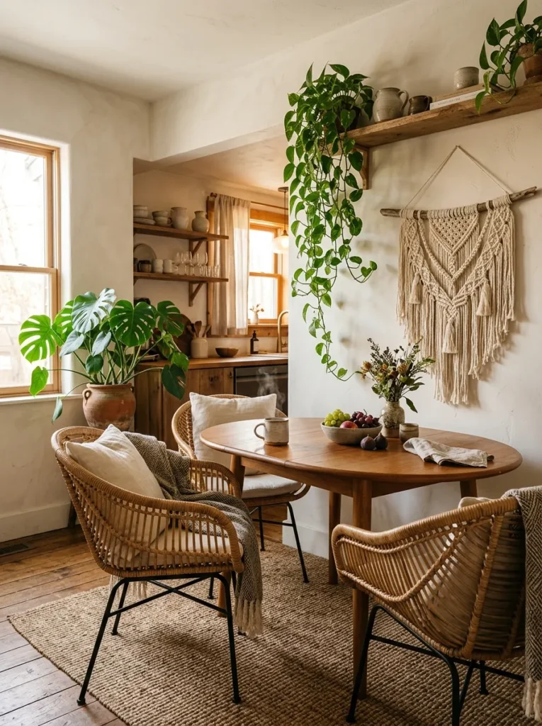
The bohemian breakfast nook leans into natural materials, layered textiles, and collected-over-time styling. Rattan or wicker chairs, a warm-toned wood table, a jute rug beneath, and something woven on the wall — macramé, a textile hanging, or a basket arrangement — create an environment that feels inherently informal and unhurried.
This approach is particularly effective for rooms with a lot of natural light and for kitchens that already have warm wood tones, exposed beam details, or plaster walls. In a kitchen that reads very contemporary or industrial, the boho nook can look like it arrived from a different house.
The layering is both the strength and the risk. Multiple natural textures together can tip into visual noise if they’re all the same tonal value. A contrast element — a dark-painted wall section, a matte black pendant, or a ceramic piece in a deeper color — keeps the eye from wandering without resolution.
15. A Kid-Friendly Built-In with Bench Storage and Wipeable Cushions
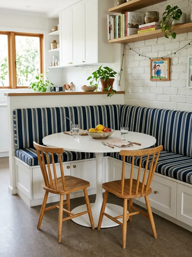
When a breakfast nook is used heavily by children, the aesthetic priorities shift. The built-in structure becomes partly about protecting the kitchen from the chaos of pulled-out chairs and navigated small bodies. A U-shaped or L-banquette with bench boxes underneath is easier for kids to climb into than chairs, requires no chair to be pushed in or out, and contains the mess at the table rather than distributing it across the room.
Cushion covers should be removable and machine washable, or the fabric should be genuinely wipeable — most cushion fabrics labeled “easy clean” are aspirational rather than accurate. Outdoor-grade Sunbrella fabric in an indoor colorway performs significantly better in high-mess environments than any fabric designed for interior use.
Bench storage in a kid-heavy nook is best used for items not needed daily — linens, seasonal items — rather than toys or art supplies, which create access conflicts at meal times.
16. A Japandi-Style Nook with Low Seating and Clean Lines
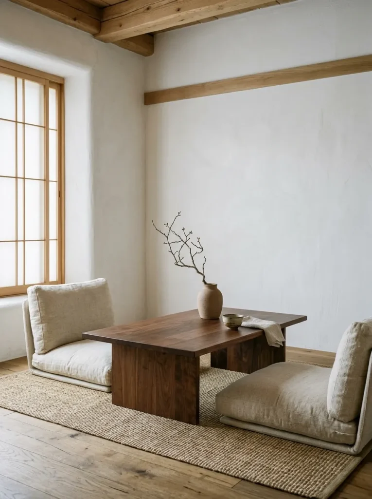
The Japandi aesthetic — a blend of Japanese minimalism and Scandinavian warmth — produces a breakfast nook that is quiet, grounded, and genuinely hard to make look cluttered. Key signatures are low-profile furniture, very limited decorative objects, natural materials in muted tones (pale ash, oiled walnut, unbleached cotton), and a strong negative space that is treated as a design choice rather than an absence.
Low seating in a nook requires a lower table height than standard (dining tables are typically 30 inches; pairing with 16–17 inch seating works proportionally but changes the comfortable reach to the table). Some Japandi nooks use floor seating entirely — cushions on a slightly raised tatami platform — which is genuine to the aesthetic but suits kitchens with enough clear floor space for safe movement around the seating.
For kitchens with conventional furniture, the Japandi approach mostly involves editing out rather than adding: fewer cushions, no centerpiece clutter, clean table edges, and a single considered detail rather than layered styling.
17. A Greenhouse-Style Nook with Abundant Planters
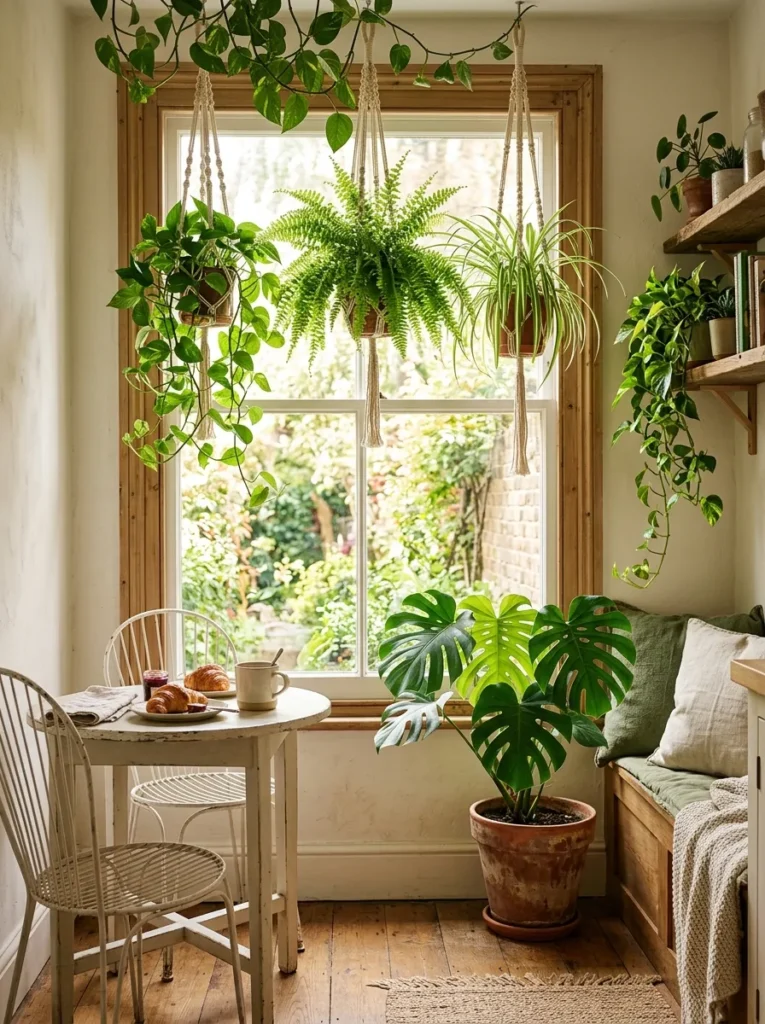
A nook positioned near a window with a south or east exposure has enough light to support a meaningful collection of plants, which changes the feeling of the space more dramatically than most other styling changes. Not a single plant on the table — a genuine layered arrangement, with hanging plants at window height, a large plant on the floor, trailing vines from a shelf, and small plants on the table ledge if the sill is wide enough.
This requires genuine commitment to plant maintenance, which is worth naming honestly. A neglected plant arrangement looks worse than no plants at all. If the household’s plant track record is mixed, choosing a collection of low-maintenance species — pothos, ZZ plants, snake plants, heartleaf philodendron — rather than aspirational tropicals makes the aesthetic sustainable.
The visual effect is most effective when the plants extend toward and partially frame the window rather than sitting on the table surface, which preserves the table for its actual use.
18. A Monochromatic Nook in a Warm Neutral
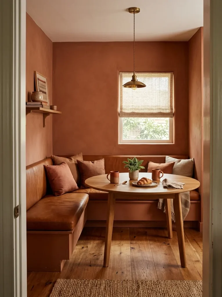
Choosing one warm neutral and using it across the banquette cushion, the table, and the wall behind creates a nook that reads as considered without appearing to try too hard. The tonal approach works because the eye reads it as a unified piece of the room rather than a collection of separate items.
Common effective combinations: terracotta walls with a cognac leather cushion and warm oak table; dusty rose with blush-painted trim and a bleached wood table; warm caramel with a camel-colored bouclé cushion and brass pendant.
The monochromatic strategy is less forgiving than it appears in photos. The material texture differences become the only visual interest, so the materials need to genuinely differ — matte wall, woven cushion, grain-visible wood — rather than being similarly smooth surfaces in the same hue.
19. A Convertible Nook with a Drop-Leaf Table
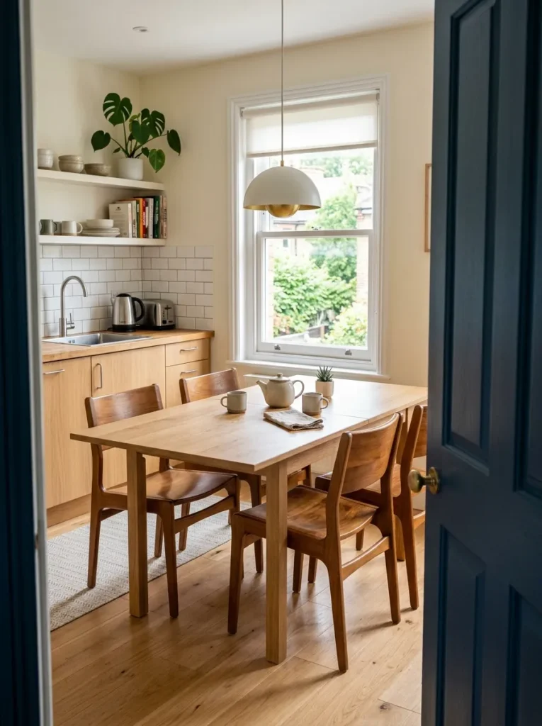
When a nook needs to serve different purposes throughout the week — breakfast for two most mornings, workspace on weekdays, seating for six on weekends — a drop-leaf table changes the equation. Leaves folded down, the table occupies significantly less space; leaves up, it can seat four comfortably and six in a pinch.
This is one of the few layout strategies that genuinely addresses the “I don’t have room for a proper nook” problem in small kitchens. The drop-leaf table has been given a reputation for looking dated, but contemporary versions in solid oak, painted white, or with tapered mid-century legs read as intentional vintage rather than grandmotherly.
The chairs matter in this configuration. Stackable or folding chairs that store elsewhere when not in use are the direct complement to a drop-leaf table — they allow the table’s flexibility to translate into actual floor space.
20. A Breakfast Bar Nook with Counter-Height Stools
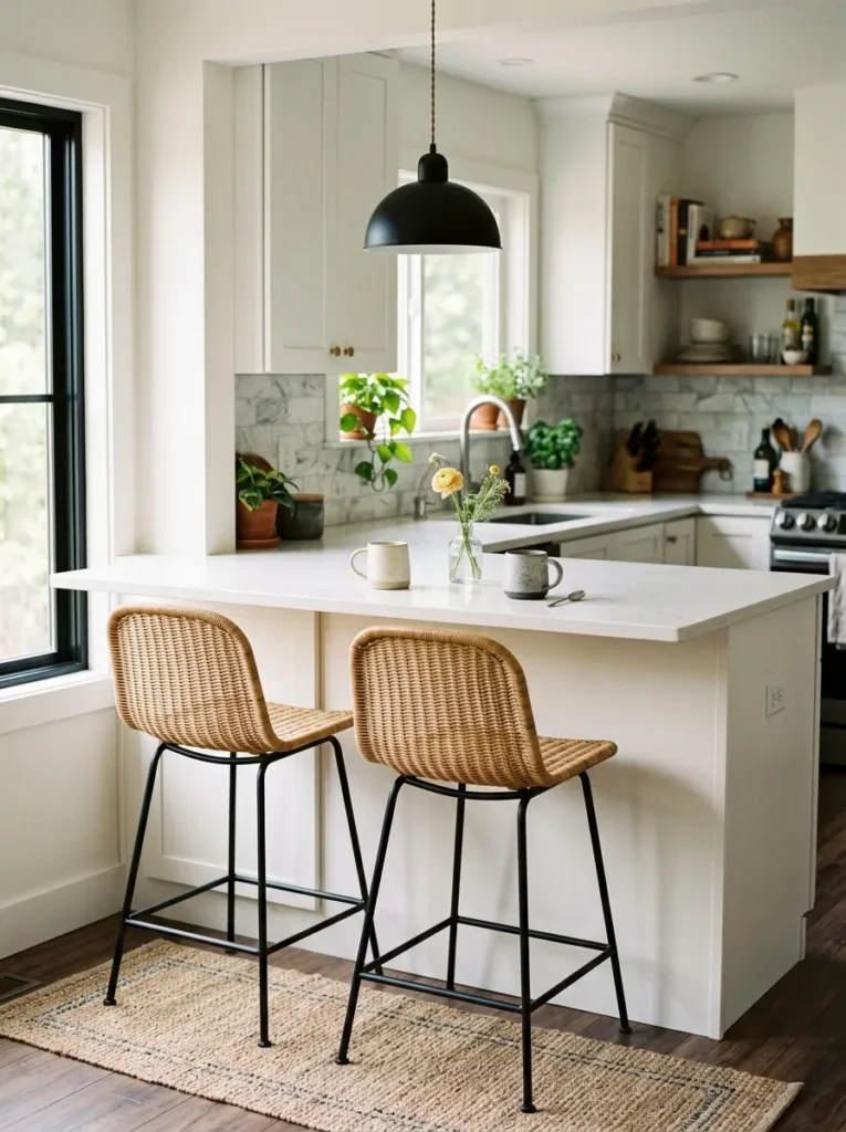
When a dedicated dining area isn’t possible, a stretch of counter — an island extension, a peninsula overhang, or a wall-mounted ledge — with a pair of counter-height stools functions as a breakfast nook equivalent. It’s a smaller footprint, suits a standing-kitchen workflow, and in open-plan apartments is often the most natural divider between kitchen and living space.
The distinction from a standard breakfast bar is intention: a rug under the stools, a pendant above the bar section, and a small curated surface detail (a bud vase, a fruit bowl, two good placemats) moves it from “where we eat when there’s no room to sit properly” to a spot that was planned. Counter-height stools with a back support more than backless stools for morning use, where people tend to linger longer.
This configuration suits one or two people well. For households that need to seat three or more, the breakfast bar becomes a compromise rather than a solution.
What to Figure Out Before You Buy Anything
Start with the clearance, not the furniture. The minimum for a comfortable walkway past a table with chairs pulled out is 36 inches. The minimum to squeeze through is closer to 24–28 inches. If your nook spot doesn’t have this clearance on at least one side, built-in banquette seating — which doesn’t need to be pulled out — is likely the more practical choice than freestanding chairs.
Decide on built-in vs. freestanding before anything else. A built-in banquette costs more upfront, usually requires a carpenter, and is permanent. But it uses space more efficiently, typically includes storage, and looks more resolved. Freestanding furniture is flexible and lower commitment, but often can’t achieve the same capacity in the same footprint. The right choice depends on how long you plan to stay and how much the nook space needs to work.
Scale the table to the number of people you actually seat daily, not the maximum you might host. A table sized for four people takes up significantly more space than one sized for two. If four-person meals at the nook happen twice a year, a two-person table with the occasional third chair makes more daily sense.
Consider the light direction. A nook facing a west window will be pleasant in the afternoon but glary in the morning for anyone facing the sun. If the best nook spot has problematic light direction, a good shade is part of the plan rather than an afterthought.
Final Thoughts
A good breakfast nook doesn’t need to be elaborate. The spaces that actually get used every day tend to have two things right: comfortable seating and adequate light. Start there before making decisions about paint colors or pendant styles.
If you’re working in a genuinely small kitchen and aren’t sure whether a nook is even possible, consider clearance and traffic flow before furniture. Sometimes the answer is a counter-height bar situation rather than a table. Sometimes the corner that looks unusable is actually perfect for a 36-inch round. The floor plan almost always has an answer — it’s often just not the most obvious one.
Save the ideas that suit your space and your actual household. A beautifully styled U-banquette with a farmhouse trestle table is compelling to look at, but it’s only a good idea if the scale works and your household has the mornings that make it worth the investment.
For more ideas or a closer look at what might work in your specific corner, save this guide and revisit it when you’re measuring.