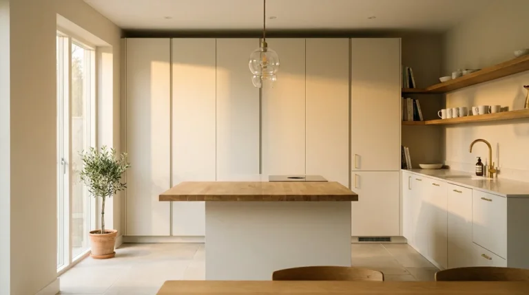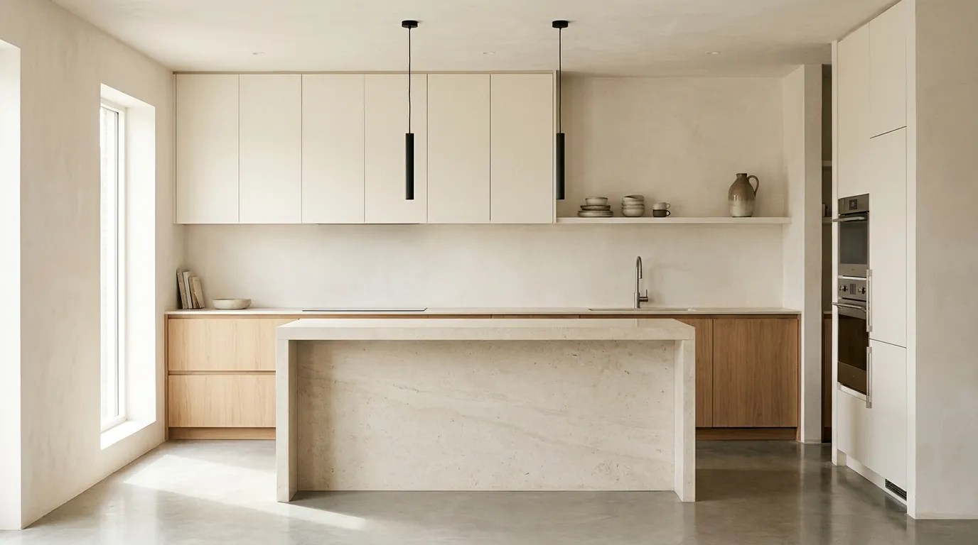
20 Contemporary Kitchen Ideas That Feel Sleek and Relaxed
Contemporary kitchens have a reputation for being cold. Glossy white cabinets, clinical lighting, and surfaces you’re afraid to touch. But that’s a dated version of the style — and it’s not what most people are actually looking for when they search for something contemporary.
The better version is warmer, more lived-in, and significantly less precious. It uses the same emphasis on clean lines and visual calm, but pairs it with natural materials, layered lighting, and color choices that make the room feel like somewhere you’d actually want to spend time.
These 20 ideas cover the full range — from major decisions like cabinet layout and island proportion to smaller choices like hardware finishes and shelf styling. Some ideas suit open-plan spaces; others solve specific problems in compact kitchens. The goal isn’t to use all of them at once. It’s to find the handful that match your space, your habits, and what you find genuinely beautiful.
1. Handleless Cabinets with a Push-to-Open Mechanism
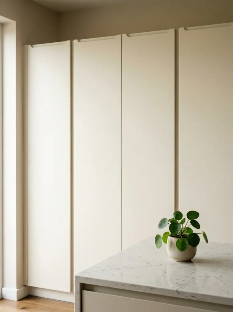
The most immediate visual shift in contemporary kitchen design is removing hardware. Handleless cabinets — either with integrated J-pull channels routed into the door edge, or with push-to-open mechanisms hidden behind the face — eliminate the visual interruption that pulls and knobs create across a cabinet run.
The practical difference between the two approaches matters. J-pull channels (a recessed groove along the top or side of each door) look clean but collect crumbs and grease near the hob. Push-to-open mechanisms are fully flat and easier to wipe, though they tend to click when opening, which some people find less satisfying. For a kitchen where tactile quality matters, a well-machined J-pull often wins.
One limitation worth knowing: handleless designs require cabinets with a consistent reveal (the gap between doors) and doors with enough rigidity not to flex when pushed. Cheaper cabinet carcasses sometimes fail here.
2. Warm White Walls Paired with Natural Wood Lower Cabinets
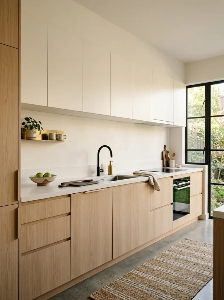
The two-tone kitchen has become the dominant look in contemporary design — but the pairing matters enormously. One combination that continues to work well is warm white upper cabinets (or painted walls left bare) against natural wood grain on the lowers. The wood grounds the room without heaviness, while the white keeps the upper zone open.
The key detail is undertone matching. A wood with strong orange tones will read as rustic against a cool, clean white. The pairing works best when the white has a slightly warm or neutral base — think linen white or warm stone rather than pure brilliant white — and the wood sits in the oak, ash, or walnut range rather than pine or cherry.
This combination also photographs exceptionally well in natural light, which is partly why it saturates Pinterest.
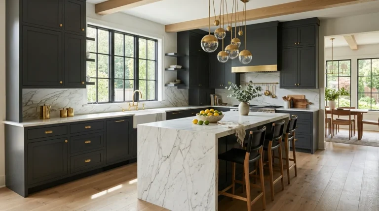
3. A Waterfall Island in Honed Stone
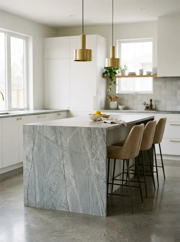
A kitchen island where the countertop material continues down the sides to the floor is called a waterfall edge. It reads as a single sculptural element rather than a countertop sitting on top of cabinetry, which gives the island more architectural presence without requiring you to change the island’s function at all.
The visual impact depends almost entirely on the stone or material. A dramatic marble with strong veining creates a statement. A quieter quartzite or honed limestone reads as more restrained. Honing (a matte rather than polished finish) is worth considering for practicality — it doesn’t show fingerprints or scratches the way polished stone does, though it’s more porous and needs sealing.
Scale is critical. Waterfall islands look proportionate when the countertop is at least 40mm thick. A thin laminate top with waterfall edges tends to look insubstantial.
4. Fluted Glass Upper Cabinets as a Texture Contrast
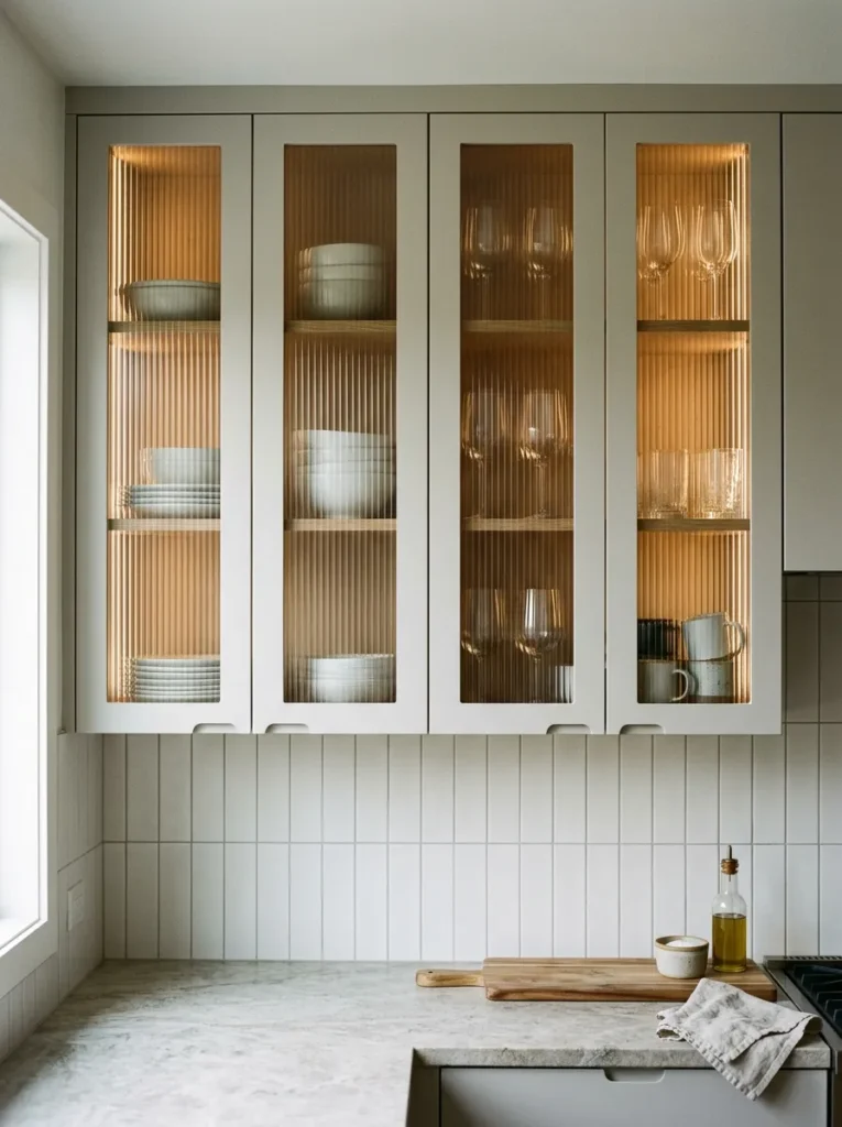
Fluted or reeded glass inserts in upper cabinet doors offer something that solid-front cabinetry doesn’t: a sense of depth and subtle texture without the maintenance of open shelving. The ribbed surface diffuses what’s inside, so the contents read as soft shapes rather than sharp objects. Mugs, glassware, and stacked plates become a visual pattern rather than visual clutter.
This works best in kitchens that are otherwise clean and surface-led, where the fluted glass provides the only real textural contrast. If the kitchen already has strong tile patterns, wood grain, and patterned stone, adding fluted glass can tip the room into visual busyness.
From a practical standpoint, fluted glass is easier to keep clean than clear glass — smudges and water marks are far less visible — which makes it better suited to a kitchen that’s actually used.
5. Concealed Extraction with a Seamless Ceiling Panel
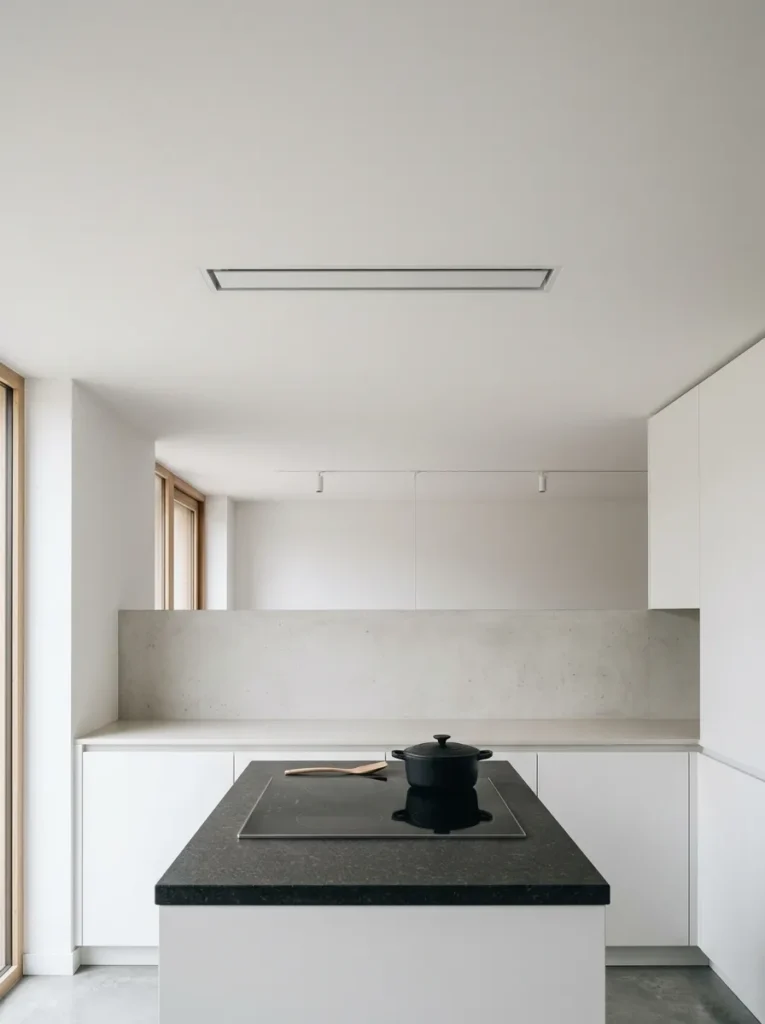
The extractor fan is one of the most architecturally disruptive elements in a kitchen. A large chimney hood or industrial-style range hood can define a kitchen’s entire visual character — which is fine if that’s what you want. But for a kitchen where visual calm is the priority, recessed ceiling extraction changes the ceiling plane from an obstacle into a clean surface.
Recessed ceiling extractors — sometimes called ceiling cassettes — pull air upward through a grille that sits flush with the ceiling. The motor and filtration sit above the ceiling void. They require enough ceiling depth for installation (typically around 250–300mm above the ceiling surface) and are easier to incorporate in new builds or full renovations than retrofits.
For renovations where ceiling depth is limited, a slimline hood built into the rear of an over-hob cabinet run can achieve a similar visual result at lower cost and complexity.
6. Limewash or Plaster-Effect Walls as a Soft Backdrop
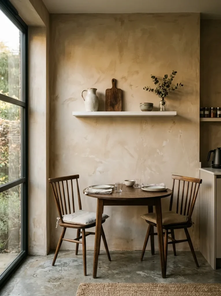
A kitchen with flat-painted walls and clean cabinets can read as slightly blank, especially in rooms with no architectural detail. Limewash paint or a plaster-effect finish adds a subtle surface movement that gives the walls depth without competing with the cabinets or the worktop.
Unlike wallpaper, limewash is applied directly to a primed wall and creates natural tonal variation — slightly lighter here, slightly cooler there — that changes with the direction of light. In kitchens, it works best on walls that don’t receive direct steam or heavy splashing, so it’s more suitable for a breakfast or dining end of a kitchen than the wall directly behind the hob.
Modern limewash formulations from paint brands are far more forgiving than traditional lime plaster, and most can be wiped down. For a contemporary kitchen, keeping the limewash in a muted warm or chalky tone — pale clay, aged white, warm greige — allows it to recede rather than compete.
7. A Tall Cabinet Run with Integrated Appliances
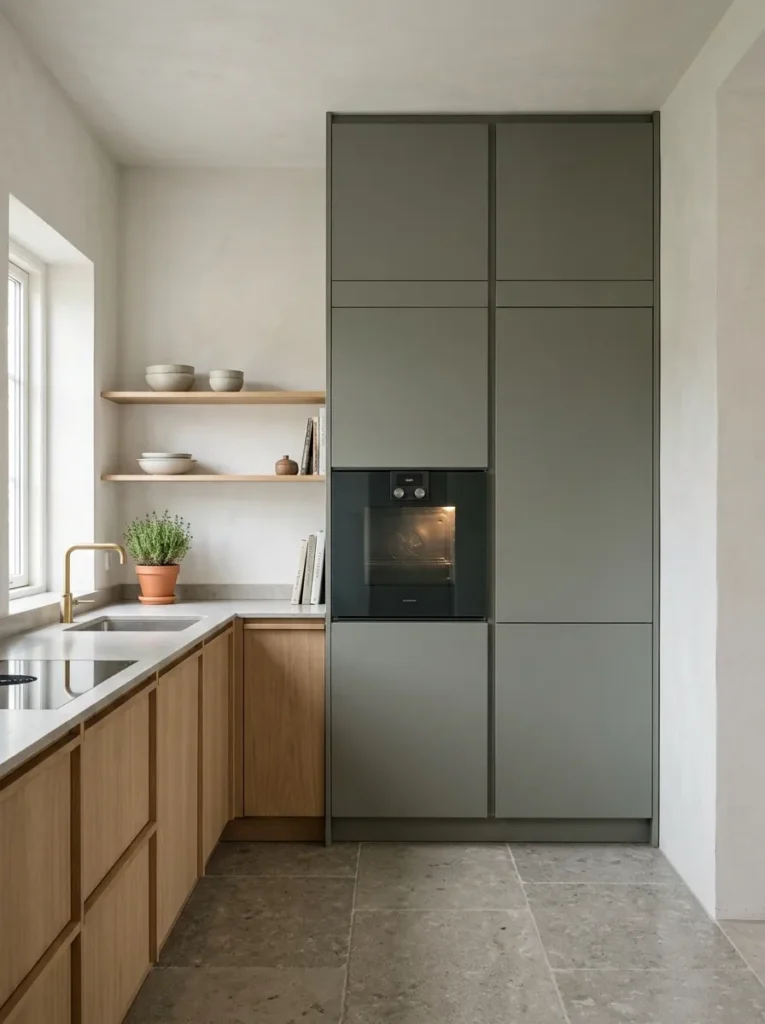
One of the most space-efficient decisions in a contemporary kitchen is replacing a broken-up run of base and wall cabinets with a full-height column — a floor-to-ceiling cabinet tower that integrates the refrigerator, oven, and microwave into a unified vertical panel.
The visual result is a wall of cabinets that reads as architectural rather than furniture. It removes the upper cabinet run from the main cooking and prep wall, which often opens up the sightline considerably, especially in open-plan spaces.
Practically, it requires careful planning. Integrated appliances need specific cabinet dimensions and ventilation allowances. The column works best anchored to one end of the kitchen or positioned on a return wall rather than dropped into the middle of a run. If you’re planning from scratch, getting this decision right early allows the rest of the layout to flow more naturally.
8. Polished Concrete Floors with Underfloor Heating
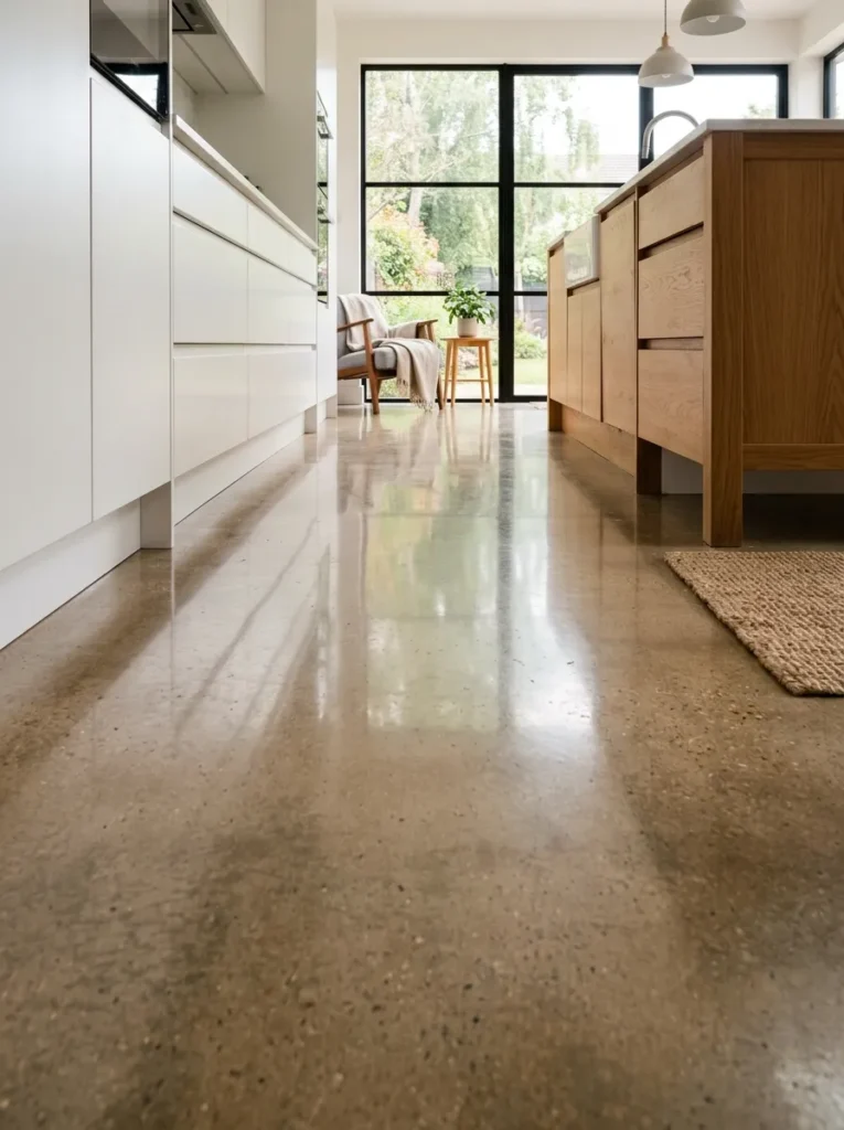
Concrete flooring in a kitchen reads as industrial in some contexts and genuinely architectural in others. The difference is usually finish and temperature. A highly polished concrete — burnished to a near-reflective surface — sits in a more refined bracket than a rough or matte poured floor.
The practical weakness of concrete in kitchens is thermal comfort and acoustic hardness. Underfloor heating addresses the first problem entirely; combined with concrete’s excellent heat retention, it creates a surface that’s warm to the touch for hours after the heating cycle ends. The acoustic issue is less solvable without softening the room with rugs and textiles elsewhere.
Sealing and maintenance matter. Kitchen concrete needs a penetrating sealer (not a surface coating, which chips) reapplied every few years and is susceptible to acidic spills if not wiped promptly. For kitchens that see heavy use, large-format porcelain with a concrete look is a lower-maintenance alternative that’s almost indistinguishable at a glance.
9. A Single Deep Shelf Instead of Upper Cabinets
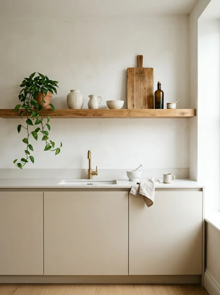
Removing all upper cabinets and replacing them with one deep shelf — typically 300–350mm deep rather than the usual 300mm — is a choice that divides kitchen designers, and for good reason. It creates a dramatically open, airy feel, but it trades closed storage for display storage.
The shelf works best in kitchens where the cook uses the same items regularly — ceramics, cutting boards, a few glasses, a coffee setup — so the shelf holds things with purpose rather than accumulating overflow. The shelf itself needs to be substantial: 50–60mm thick timber or stone shelf will read as intentional; a thin floating plank will read as temporary.
If storage is genuinely limited, this approach is better suited as a partial solution — removing uppers from one wall only while keeping full cabinets elsewhere.
10. Matte Black Fixtures Against Light Cabinetry
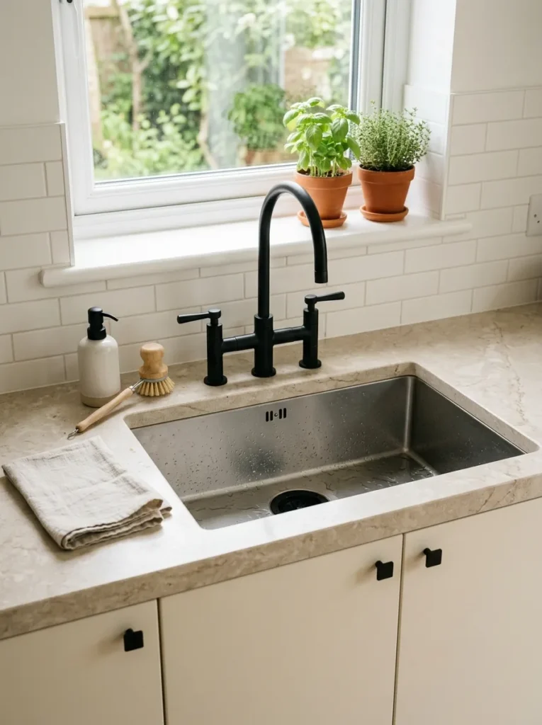
Matte black tap, waste cover, and cabinet hardware against light grey, cream, or white cabinets is a pairing that’s been popular long enough to feel established rather than trend-led. What keeps it working is the clarity of the contrast — the black sits decisively, without the ambiguity of brushed nickel or the formality of polished chrome.
One mistake is distributing the black too thinly across the kitchen — one tap and one handle per cabinet creates a spotted effect rather than a deliberate accent. The look works better when the black elements are clustered and cohesive: tap, waste, integrated bin handle, and cabinet hardware all in the same finish.
In smaller kitchens, a fully matte black tap as a single focal point against otherwise light and quiet surfaces can be more effective than distributing hardware throughout.
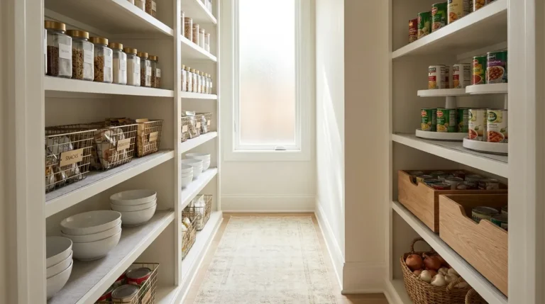
11. A Concealed Pantry Behind a Flush Door
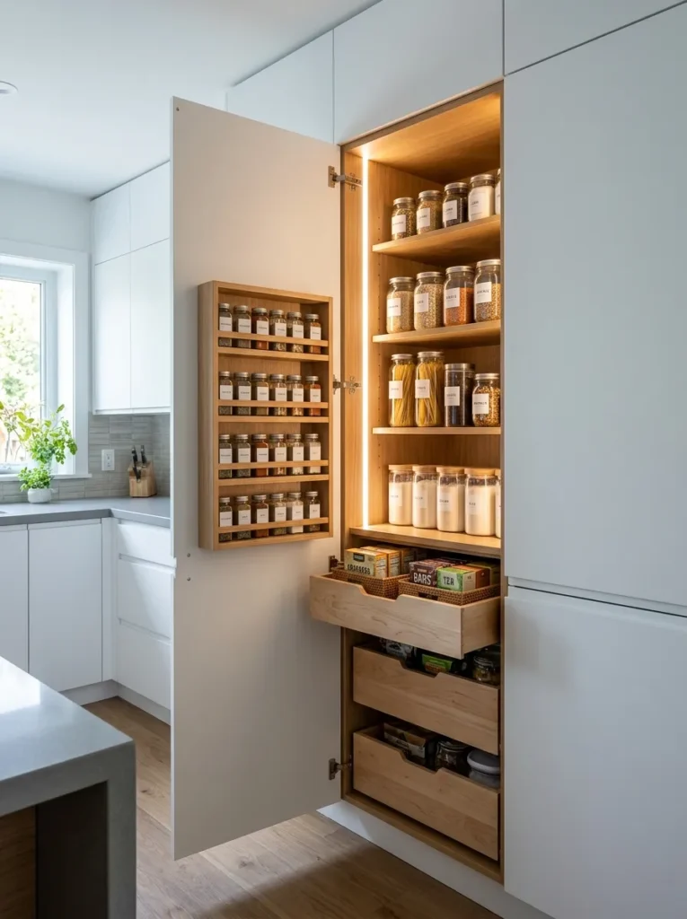
A full-height pantry cabinet that reads as a door flush to the surrounding cabinet run — with no visible frame and integrated push-to-open or a recessed pull — creates an architectural moment that feels considered rather than purely functional.
Behind the flush face, a well-organized pantry — with pull-out shelves, door-mounted racks, and good interior lighting — dramatically increases kitchen storage without adding visual complexity to the room. The door, when closed, is simply another surface in the cabinet run.
This approach suits kitchens where storage needs are real but the visual brief requires calm. It also pairs naturally with the handleless aesthetic from Idea 1. The main technical requirement is enough depth — a proper pantry cabinet needs at least 500–600mm from front to back — which can restrict its use in shallower kitchen configurations.
12. Smoked Oak Veneer Cabinets
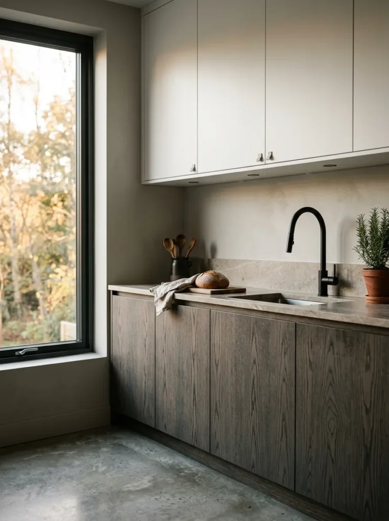
Where natural oak reads as warm and Nordic, smoked oak shifts toward something darker, richer, and slightly more European in character. The smoking process darkens the grain structure rather than applying a surface stain, which means the wood still shows its natural movement but in a palette that sits closer to grey-brown than honey.
Smoked oak works particularly well in kitchens with stone countertops — especially those in grey or taupe ranges — because it creates a warm-dark contrast to pale stone rather than the warm-warm pairing of natural oak against warm white. It can also push further toward an evening kitchen aesthetic: darker surfaces, ambient lighting, a room that feels different at 7pm than it does at noon.
The one caution is that smoked oak can read as heavy in very small kitchens with limited natural light. In those rooms, keeping smoked oak on the lower run only, with lighter lowers above, preserves some visual lift.
13. A Slim Pendant Over the Island as the Only Decorative Fixture
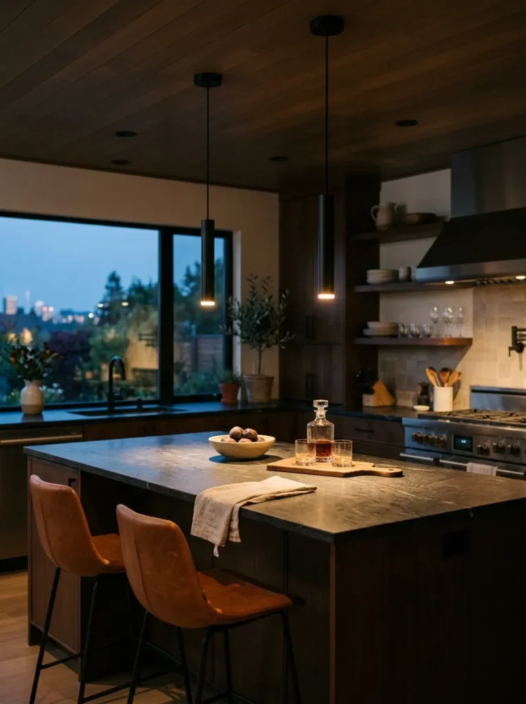
Contemporary kitchens often lean on recessed ceiling lighting to keep everything clean, but recessed lighting alone tends to flatten the room and remove the sense of different zones. A single pendant — or a pair of very slim pendants — over the island introduces a light source that’s at eye level when you’re seated at the island, which immediately makes the kitchen feel more like a place to gather.
The pendant type matters more here than in most rooms. A geometric metal pendant in a matte finish integrates well. A bulbous or heavily decorative pendant can introduce a competing style note. For a contemporary kitchen, a simple cylinder or cone in matte black, brass, or smoked glass usually sits most naturally.
Height placement: the bottom of the pendant should sit roughly 750–850mm above the countertop surface for standard island heights. Too low feels claustrophobic when working; too high reduces the layering benefit.
14. A Breakfast Bar Facing a Window
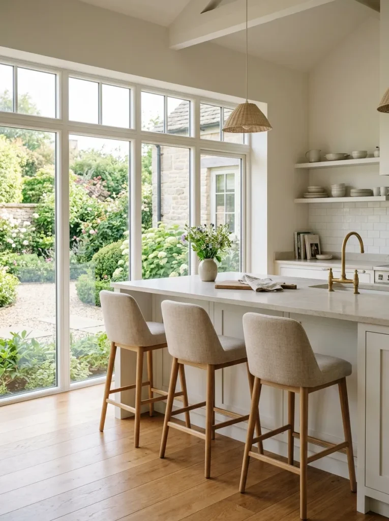
Positioning bar stools along one side of a peninsula or island that faces an exterior window shifts the energy of the kitchen considerably. Rather than a social seating area that faces into the room, this arrangement gives the person sitting there a view outward — morning light, a garden, a street — which makes the kitchen a more desirable place to sit for longer than just eating.
This requires layout planning rather than just furniture placement. The island or peninsula needs to be oriented parallel to the window wall rather than perpendicular to it. In open-plan spaces, this often means placing the island centrally rather than anchoring it to a wall.
One consideration: if the window receives strong east or west sun, adding an external shading solution (a simple blind or external louvres) prevents the seating from becoming uncomfortable at certain times of day.
15. Integrated LED Shelf Lighting in Niches
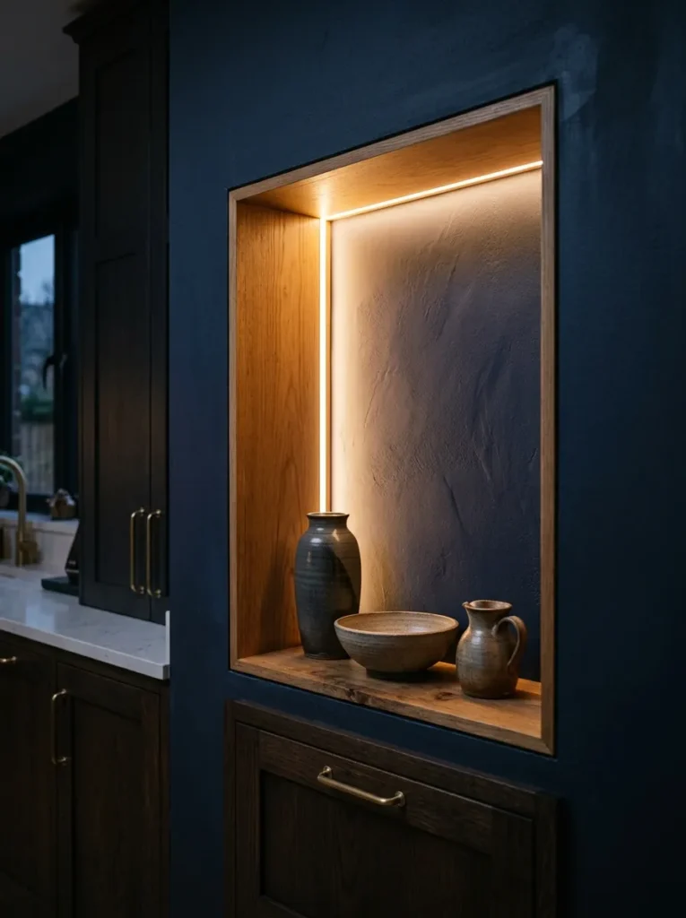
A recessed niche or alcove in a kitchen — whether in a splashback zone, a pantry wall, or a shelf above a counter — changes character entirely with integrated LED strip lighting. The light warms the materials inside the niche and creates a glow that softens the overall room lighting.
The placement of the LED matters. Lighting from the front edge of a shelf creates a theatrical glow visible from across the room. Lighting from the back of the niche bounces off the rear wall and creates a more diffuse, ambient effect. Most designers prefer the rear position for its subtlety.
Color temperature for kitchen shelving typically works best around 2700K–3000K — warmer than office or task lighting, closer to candlelight. Cooler LEDs (4000K+) read as clinical in a kitchen context and tend to make warm materials like wood or stone look flat.
16. A Stone Splashback Slab Instead of Tiles
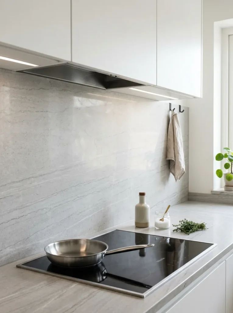
Replacing individual tiles with a single slab of stone — the same material as the worktop, or a complementary one — as a splashback creates a visual continuation that makes the counter-to-wall transition feel like one element rather than two. It reads as more expensive than it always is, partly because the grout lines are gone.
The functional advantage of a full slab splashback is easy cleaning: one uninterrupted surface with no grout joints to harbor cooking residue. The limitation is that natural stone behind a hob requires more careful maintenance than ceramic tile, particularly if the stone is porous. For that zone specifically, a polished rather than honed finish is more practical.
If a full stone slab is outside the budget, a large-format porcelain panel (often called a slab tile) achieves a near-identical visual result with less cost, lighter weight, and fewer sealing requirements.
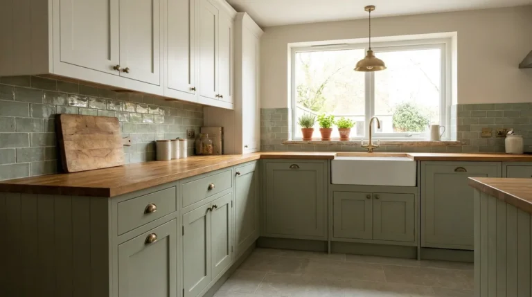
17. Sage Green Cabinets with Aged Brass Hardware
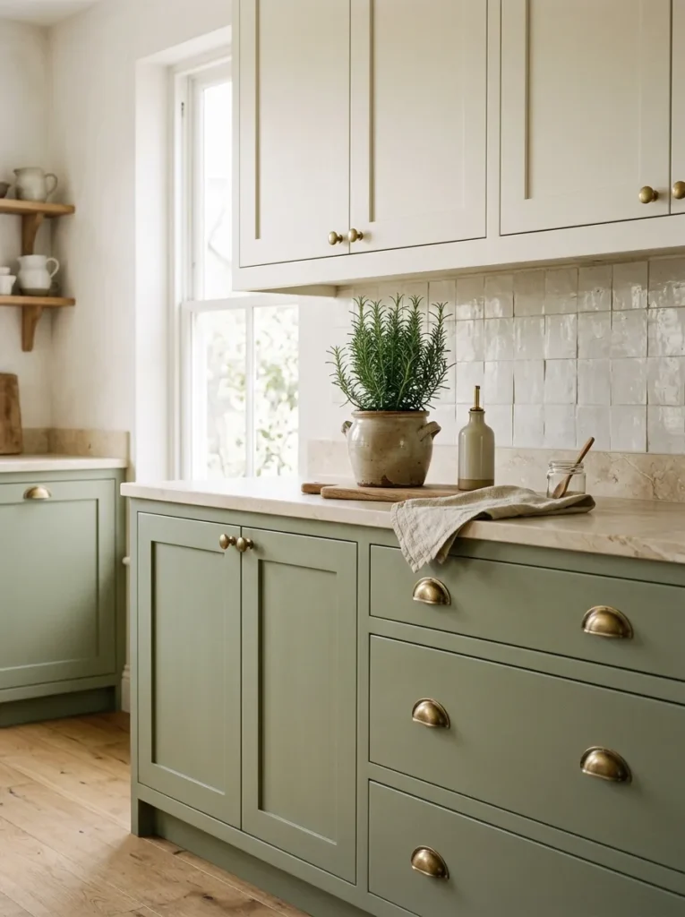
Sage green has moved decisively into the considered-classic category in kitchen design — neither as aggressively on-trend as it was a few years ago, nor outdated. Used on lower cabinets or on a kitchen island against white or off-white uppers, it reads as botanical without being overworked.
The hardware pairing that suits it best is aged brass — not polished brass, which can feel formal, and not matte black, which reads as too contrasting. Aged brass has enough warmth to echo the organic quality of the green without matching it too literally. Ceramics from a similar warm register — a cream or raw linen ceramic knob — are an alternative that softens the look further.
One practical note: sage green in kitchens photographs differently at different times of day. In cool north-facing light it can shift toward grey-green; in warm afternoon light it softens significantly. If colour consistency matters, check the paint or lacquer finish under the actual room’s lighting conditions before committing.
18. A Ribbed or Fluted Cabinet Front Panel on the Island
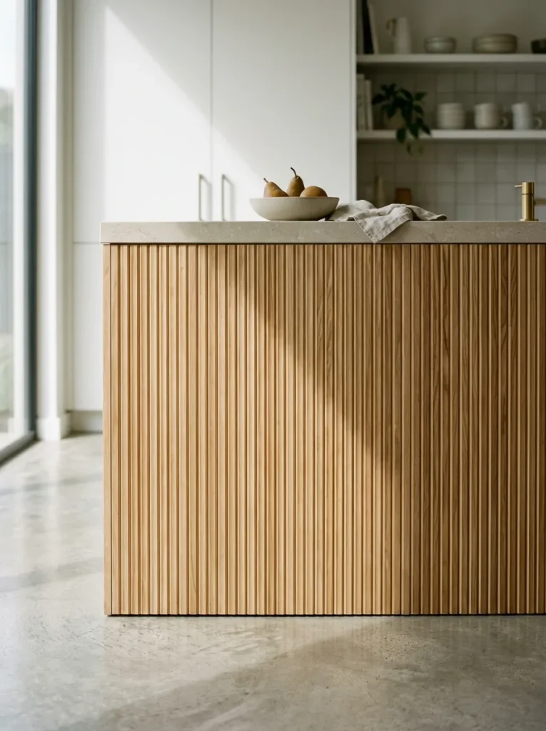
Adding textural relief to the island — through a fluted wood or lacquered panel on the island’s visible face — provides a visual anchor without changing the overall material palette. The vertical ribbing catches light differently as you move around the island, so it reads as active even when the surrounding room is visually quiet.
This works best when the island panel texture is the only applied texture in the room. If the kitchen already has a tile pattern, a fluted glass panel elsewhere, and patterned stone, adding a ribbed island front tips into excess.
The material can match or complement the cabinet finish. A fluted panel in the same lacquer color as the cabinets creates a subtle tone-on-tone effect. A fluted panel in a contrasting material — say, a natural ash fluted panel on a painted island — makes the island read as a distinct furniture piece rather than an extension of the run.
19. Open-Plan Kitchen with a Visual Zone Break
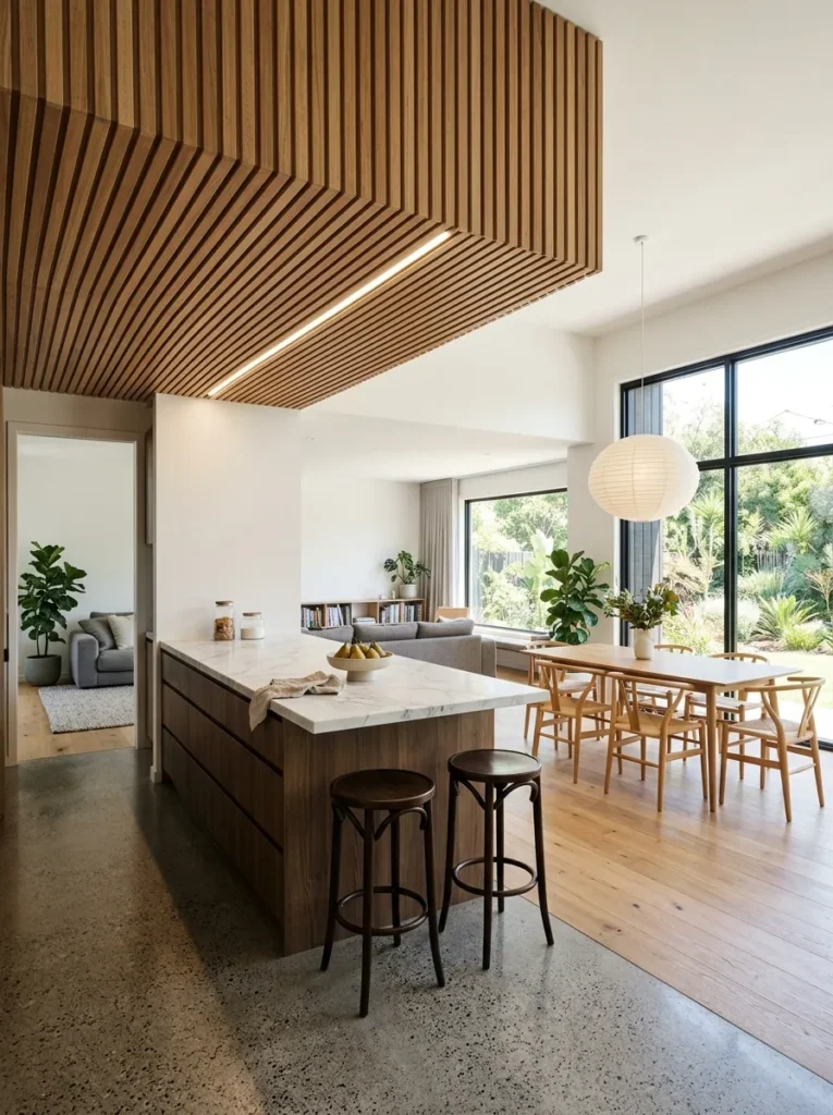
In open-plan spaces where the kitchen flows directly into a dining or living area, the most common problem is visual blur — the eye doesn’t know where the kitchen ends and the social space begins, which makes both areas feel less resolved.
A visual zone break can be achieved without a wall. A change in ceiling treatment — a lowered section, a timber batten ceiling above the kitchen, or a coffered detail — establishes a defined zone above the kitchen without enclosing it. A change in floor material at the threshold between kitchen and dining area has a similar effect.
Alternatively, the kitchen island itself can function as the dividing element, but this only works when the island is substantial enough in both scale and visual weight. A small island in a large open-plan room creates a floating object rather than a zone definition.
20. A Quiet Kitchen with Texture Instead of Color
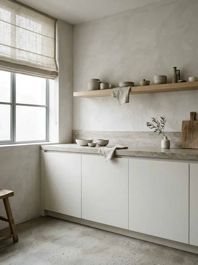
Not every contemporary kitchen needs a color story. Some of the most resolved kitchen interiors use an almost monochromatic palette — warm white, light grey, natural stone, pale timber — and find all their visual interest in texture and material variation rather than color contrast.
The risk with this approach is that it reads as unfinished or cold if the textures don’t have enough contrast between them. A pale kitchen that works uses multiple surface types: a matt lacquered cabinet door next to a brushed stone countertop next to a limewash wall next to a linen blind next to a polished concrete floor. Each surface has a different light behavior, and that variation carries the room visually.
The room works hardest here when natural light is good. In a north-facing or lower-ground-floor kitchen, this approach can feel dim unless supplemented with a considered artificial lighting plan across at least three layers: task lighting, ambient lighting, and accent.
How to Choose the Right Combination for Your Space
Twenty ideas is more than any single kitchen should absorb at once. The most coherent kitchens usually commit to two or three strong decisions — a distinctive material, a layout choice, a lighting approach — and let the remaining elements support those choices quietly.
Start with the decisions that are hardest to change: cabinet style, layout, floor material, and extraction type. These set the character of the room and constrain or enable everything else.
Let natural light guide the color and material palette. A south-facing kitchen with good morning light can carry darker or more saturated materials without feeling closed. A north-facing or smaller kitchen generally benefits from keeping surfaces lighter and introducing warmth through wood and textiles rather than through dark paint.
Be cautious about stacking textures. Fluted glass panels, ribbed island fronts, limewash walls, and patterned tile all compete for attention. In a small kitchen especially, one or two textural moments are usually more powerful than five.
Don’t treat the functional brief as secondary. A handleless kitchen is elegant until it doesn’t suit how you actually open cabinets. A waterfall island in honed stone is beautiful until you’re removing red wine from unsealed marble at midnight. Identify what you actually need the kitchen to do before deciding how you want it to look.
Final Thoughts
Contemporary kitchen design is less about following a specific style and more about editing carefully — removing what isn’t necessary, choosing materials with intention, and letting the room’s function and architecture guide the decisions that matter most.
If you’re starting from scratch, the layout and cabinet approach (ideas 1, 7, and 11) will shape everything else. If you’re working within an existing kitchen, lighting changes (13, 15) and surface updates (10, 16) offer the most impact with the least disruption.
The ideas here aren’t meant to be combined wholesale. Pick what resonates with your specific room and your actual habits, and be skeptical of any inspiration that works beautifully in a photographed kitchen but requires features — ceiling depth, window placement, architectural columns — that your space simply doesn’t have.
Save any ideas worth revisiting, and come back to the practical sections when you’re closer to making decisions. The best kitchens look considered because they were.