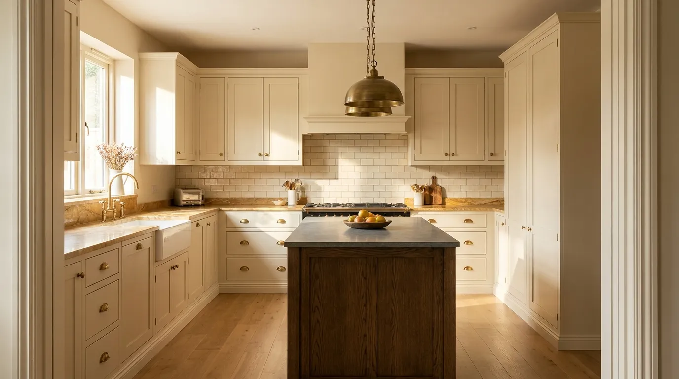
20 Beige Kitchen Ideas That Feel Warm Without Looking Dated
Beige has a reputation problem. For a long time, it was the default choice of developers who wanted to sell houses fast — not a considered palette decision. The result was a decade of flat, yellowish cabinetry and cream laminate that became the thing people couldn’t wait to rip out. That version of beige deserves its bad reputation.
The version worth considering now is different. Warm neutrals in a kitchen — rich creamy whites, soft sand tones, greige that reads as almost taupe — work because they age gracefully, catch warm light well, and let the materials around them carry character. The challenge is that beige requires more careful pairing than white, because undertones matter significantly: the wrong pairing doesn’t just look mismatched, it looks dirty. These beige kitchen ideas are organized to help with those decisions — which materials work together, which combinations to avoid, and how to introduce contrast so the result doesn’t read as a beige sea.
1. Warm Cream Shaker Cabinets with Unlacquered Brass Hardware
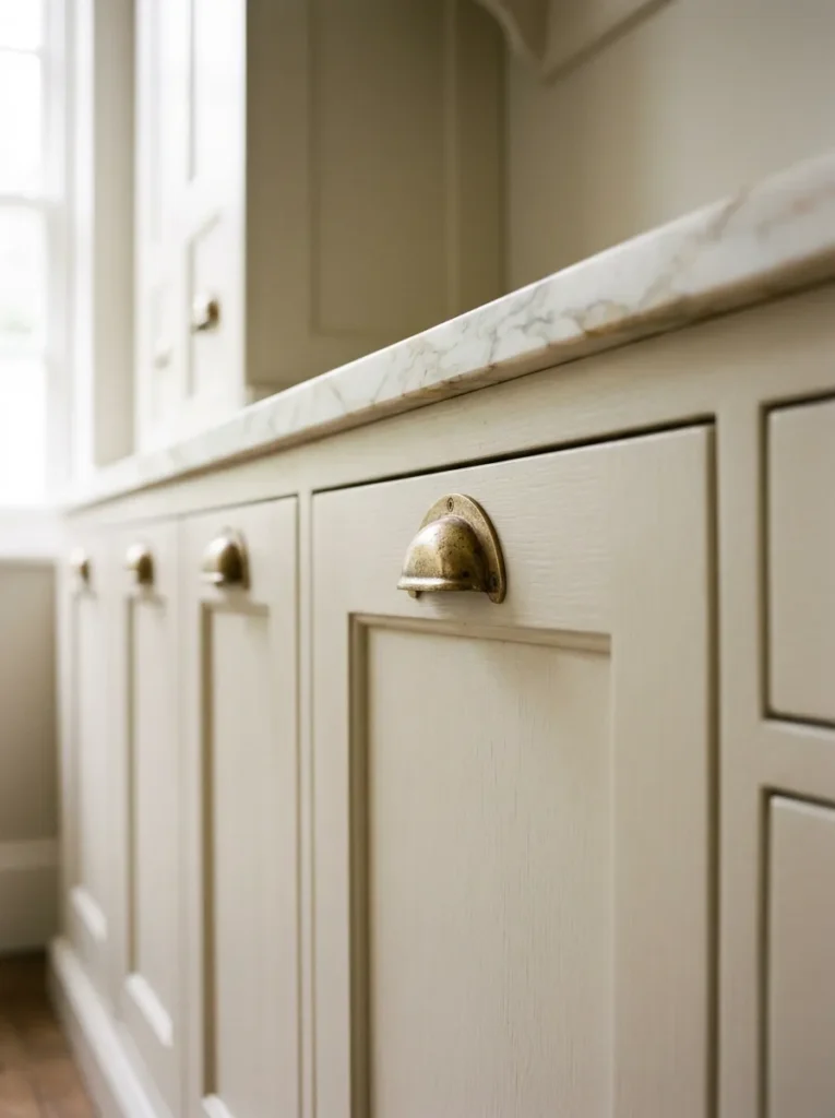
The shaker cabinet door profile — a recessed flat panel within a frame — is one of the most versatile cabinet styles available because it reads as both traditional and contemporary depending on the hardware and material it’s paired with. In a warm cream or off-white beige finish, shaker cabinets become the neutral architecture of the room, allowing the hardware choice to carry the personality.
Unlacquered brass is particularly effective here because it tarnishes and develops a patina over time, which aligns with the warm, organic quality a beige kitchen tends toward. Polished chrome or satin nickel in the same setting reads cooler and more contemporary than the cream finish can support — the contrast is the wrong direction. The brass should appear in at least three places (cabinet pulls, faucet, light fixture) for it to read as a material choice rather than a random accent.
2. Greige Flat-Front Cabinets for a Modern Take on Warm Neutral
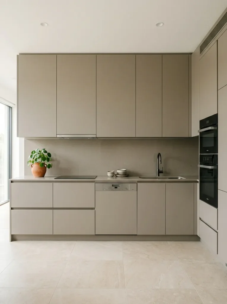
Greige — the blend of grey and beige that reads as neither — is the contemporary version of beige in kitchen cabinetry. It works best in a flat-front or handle-free door profile, where the matte or satin finish does the visual work that shaker detailing would do in a more traditional kitchen.
The range of greige varies significantly by brand and finish. Some lean visibly grey in north-facing or cool-light kitchens and only read as beige in warmer light. Before committing, always view a cabinet sample in the actual kitchen, not in a showroom under different lighting conditions. A greige that appears balanced in a well-lit showroom can read strongly grey in a kitchen with limited natural light — which may or may not be the intended effect.
3. Beige Cabinets Below with White Uppers for Visual Lift
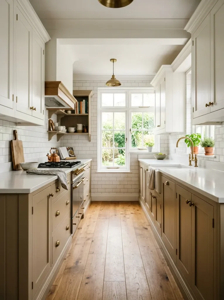
Two-tone kitchen cabinets — where the lower cabinets use a different finish than the upper — have become common enough to feel established rather than experimental. In a beige kitchen, pairing warmer beige or sand-toned lower cabinets with white or bright cream upper cabinets solves a specific visual problem: lower cabinets in a darker or warmer neutral can feel grounding in the right proportions, but if the upper cabinets match, the wall plane between them and above them can feel heavy.
White uppers lift the eye toward the ceiling and create contrast between the working zone and the wall zone. The undertone relationship between the two cabinet colors matters: a warm cream on the upper with a cool greige on the lower will look discordant because their undertones conflict. Both should lean the same direction — both warm, or both with neutral undertones.
4. A Beige Zellige or Handmade Tile Backsplash
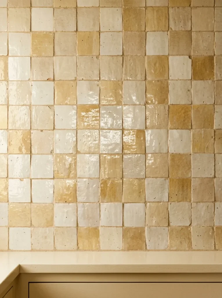
Zellige tile — the hand-cut, hand-glazed Moroccan ceramic with natural variation in surface and tone — has become one of the most effective backsplash choices in a warm kitchen because each tile reflects light slightly differently. A zellige in cream, warm white, or sand reads as beige at a distance and reveals its tonal range and texture up close. The material has handmade quality without being overtly rustic.
The surface variation is both the aesthetic appeal and the maintenance reality: zellige is not flat or sealed in the way that commercial tile is, and it requires sealing to resist grease in a kitchen context. Grout color matters considerably in a zellige installation — a bright white grout can cut the warmth of the tile; a sand or cream grout lets the tile surface read as continuous. Many zellige installations use minimal grout lines to maximize the tile surface’s visual continuity.
5. A Warm Stone or Travertine Countertop
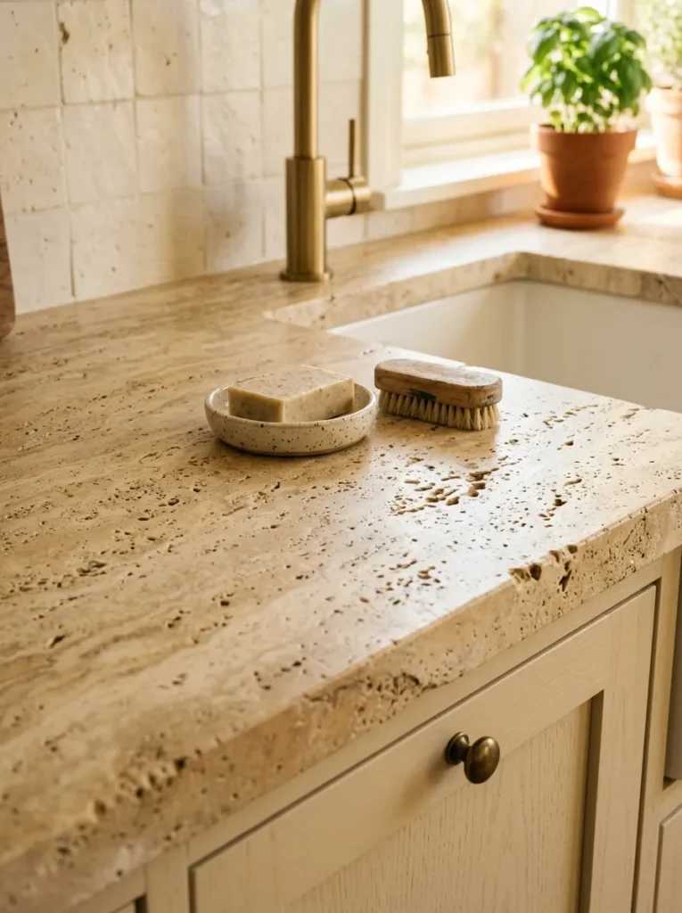
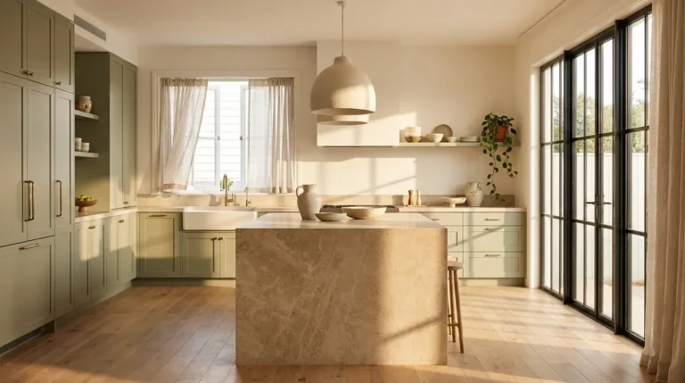
Travertine and other warm-toned natural stones — certain limestones, brushed quartzite — introduce a creamy, earthy quality that manufactured surfaces can approximate but rarely replicate exactly. In a beige kitchen, a travertine counter continues the warm neutral palette at the horizontal plane while the natural variation in the stone prevents the overall effect from reading as monotonous.
The maintenance consideration for travertine in a kitchen is significant: it is porous and will stain without regular sealing, and it will etch when acidic liquids (citrus, vinegar) contact the surface. Some households find this acceptable or even appealing as natural patina; others find it genuinely stressful. Brushed travertine surfaces hide marks better than polished; a honed limestone in a similar tone is less porous than travertine and often a more practical alternative with a similar aesthetic result.
6. Beige Cabinetry with a Contrasting Island in Dark Wood
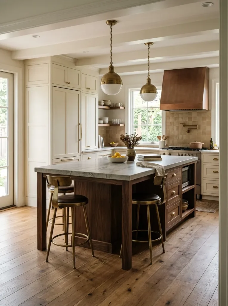
In a kitchen large enough to accommodate an island, painting or finishing the island differently from the perimeter cabinets is one of the most effective ways to prevent a beige kitchen from becoming monochromatic. A dark walnut or dark stained oak island provides material contrast that breaks the warm neutral and introduces depth.
The material transition works on two levels: it creates a visual focal point at the center of the room, and it solves the practical differentiation between prep and serving surfaces versus storage. The island shouldn’t be so dark that it reads as a disconnected object; an undertone relationship between the beige cabinets and the wood — both warm, both with brown undertones — keeps the combination reading as intentional. Ebonized or cool-grey stained wood against warm cream cabinetry tends to look like a mismatch rather than a decision.
7. Open Shelving in Natural Oak or Aged Brass Against Beige Walls

Replacing upper cabinets on one wall with open shelving introduces breathing room into a kitchen that might otherwise feel enclosed by continuous cabinetry. In a beige kitchen, open oak shelves against a beige or warm white wall become part of the color story rather than a contrast to it — the warm wood reads as a natural extension of the warm neutral palette.
The styling of open shelves in this context matters enormously. Ceramic pieces in off-white, terracotta, and warm stoneware complement the palette; glass items and metallic objects add contrast. The practical reality is that open shelving in a kitchen accumulates grease dust faster than closed cabinets, particularly shelves near the cooking surface. This is a maintenance trade-off worth knowing before committing — shelves positioned far from the range require less attention than those directly above or beside it.
8. A Warm Sand or Putty Kitchen with Polished Concrete Floors
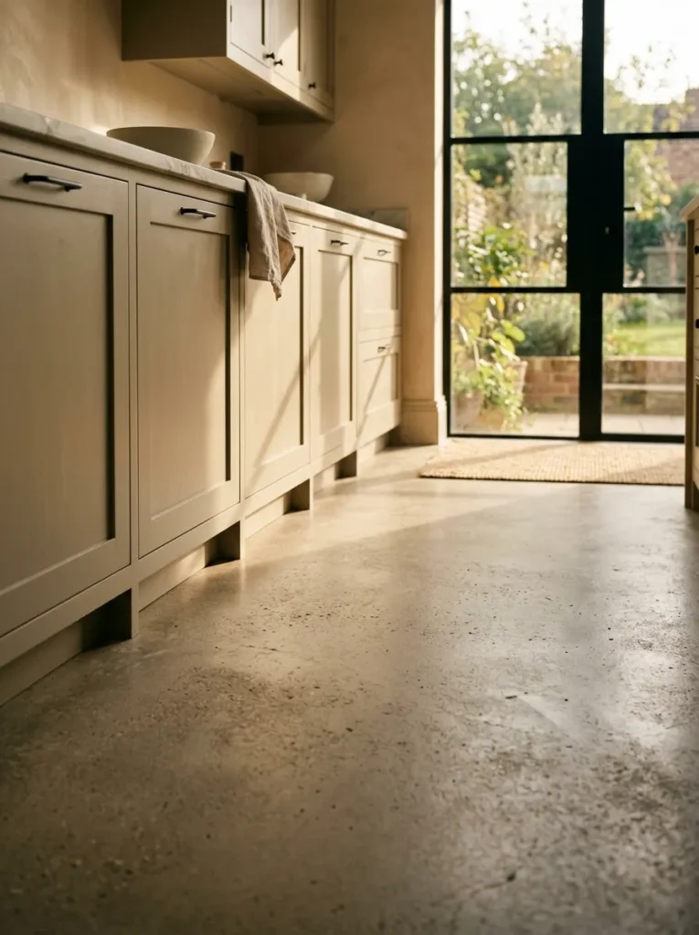
Polished or honed concrete in a warm grey or sand tone is one of the few floor materials that can sit next to beige cabinetry without creating the beige-on-beige problem that ceramic or stone in similar tones can cause. The material difference — the matte density of concrete versus the softer finish of cabinet paint — creates visual separation even when the color tones are close.
The combination photographs particularly well in kitchens with south or west-facing windows, where the concrete floor catches warm afternoon light and the cabinetry above it reflects it back. In cool or north-facing kitchens, polished concrete can feel cold even when its tone is warm — a wool or cotton runner in a deeper tonal accent helps considerably in this situation.
9. Cream Cabinets with an Unlacquered Marble Counter and Warm Veining
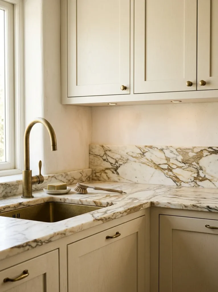
Cream cabinets paired with marble in a warm vein — honey veining in Calacatta, gold veining in Statuario, or the rosy tones of Portuguese or Asian Statuary — create a kitchen that reads as quietly refined rather than showy. The key is choosing marble with veining that reinforces the warm palette rather than contradicting it.
Marble with blue or grey veining against cream cabinets can shift the whole room cooler than intended. Marble with gold, honey, or rust veining stays consistent with a warm beige kitchen. The standard marble maintenance caveat applies: regular sealing, avoiding acidic cleaners, and accepting that the surface will develop a character over time. For households who want the marble look without the care commitment, a quartzite in a similar tone or a high-quality porcelain slab in a marble pattern are practical alternatives.
10. A Terracotta or Rust Accent in Hardware and Textiles
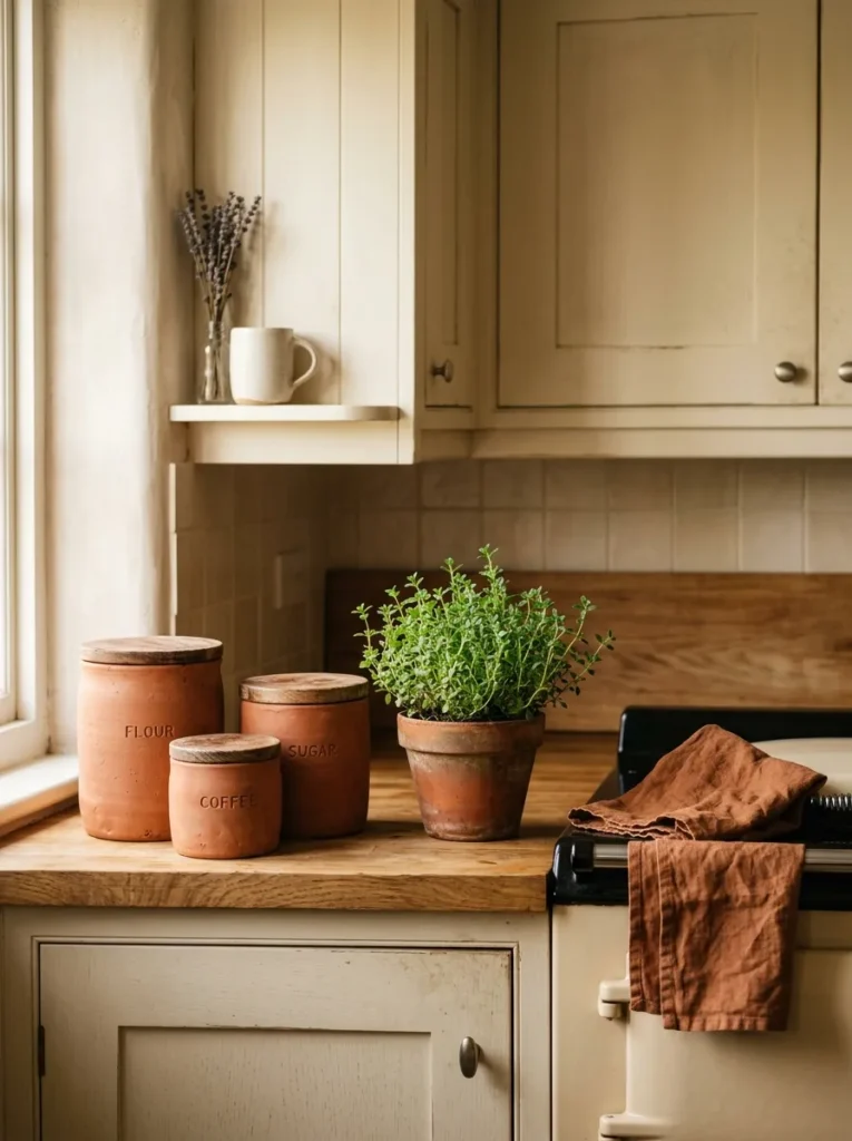
Beige kitchens can feel tonally flat when every element lives at the same level of saturation. Introducing terracotta or rust as an accent color — in a ceramic dish, a woven textile, a pendant light shade, or a small appliance — adds enough chromatic interest to prevent the palette from reading as washed out.
The accent doesn’t need to be everywhere. Two or three points at different positions in the room — a set of terracotta ceramic canisters on the counter, a rust-toned linen tea towel hung from the oven rail, a warm amber glass pendant — create the impression of a deliberate palette without looking accessorized. The terracotta accent works particularly well against cream or sand cabinetry and becomes less effective against greige, where the two warm-brown tones compete for the same color space.
11. Beige Kitchen with a Statement Black Range or Appliance
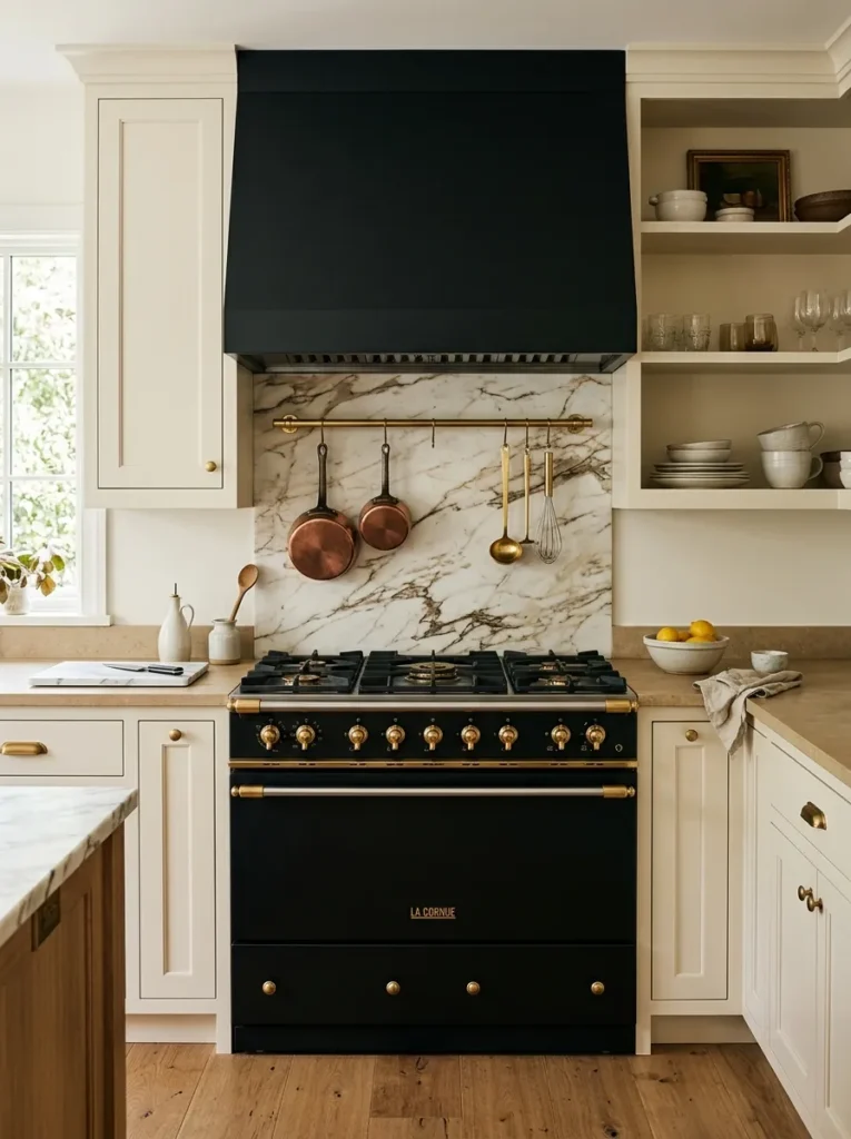
Matte black appliances in an otherwise warm neutral kitchen create the kind of contrast that prevents the space from reading as entirely monochromatic, and they do it at the appliance level — which requires no cabinetry change and less commitment than a hardware swap. A matte black range in particular functions as the room’s focal point while reading as utilitarian rather than decorative.
The combination of cream or greige cabinetry with matte black appliances is effectively a version of the warm-neutral-with-dark-contrast strategy, applied to functional elements rather than decorative ones. For renters or households with existing stainless appliances, matte black hardware on cabinet pulls alongside neutral appliances creates some of the same contrast effect at a lower cost.
12. Limewash or Roman Clay Walls in a Warm Sand Tone
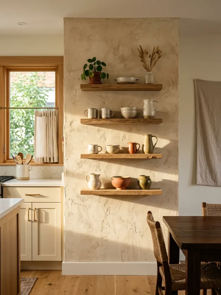
In a kitchen with open shelving or limited upper cabinetry, the wall is a more prominent visual element than in a kitchen where upper cabinets run to the ceiling. A limewash or Roman clay finish in a warm sand or soft terracotta tone introduces texture and depth to a surface that flat paint makes featureless.
The textured wall finish works well behind open shelving precisely because the items displayed on the shelves create a different surface in front of the wall, so the texture is seen between and around the shelves rather than as an unbroken expanse. In kitchens with full upper cabinetry, this technique is more effective on the end wall, the window wall, or a small section of visible wall above the counter than as a full-room treatment.
13. Warm Beige with Aged Copper Fixtures and Faucet
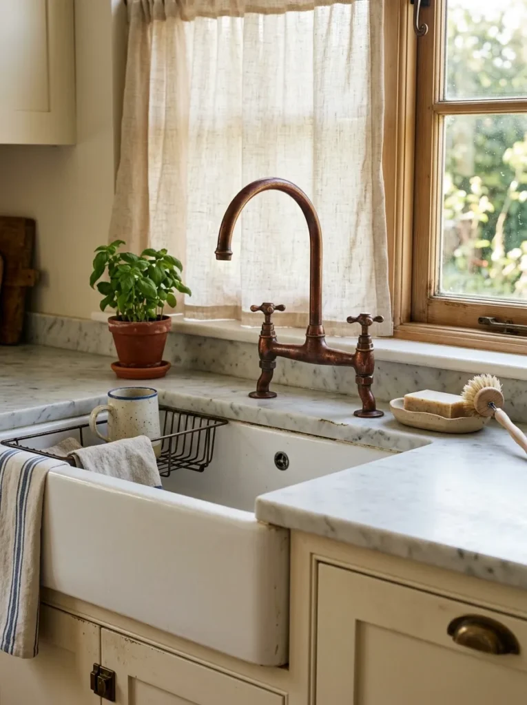
Copper as a hardware and fixture material in a warm kitchen is a distinct alternative to brass — the tone is redder and richer, and in an aged or unlacquered form, it develops an irregular patina that suits a kitchen built around warm natural materials rather than a precise contemporary palette.
Aged copper works best in kitchens with a slightly organic or slightly traditional atmosphere — raw linen curtains at the window, natural wood on the island or shelving, ceramic accessories rather than glass or stainless. In a contemporary flat-front kitchen with clean lines, copper can feel out of register with the cleaner aesthetic; the more architectural setting suits unlacquered brass or matte black hardware instead. The patina on unlacquered copper will develop differently depending on the water chemistry and cleaning products used, which is worth factoring into the maintenance expectation.
14. Beige Cabinets with a Thick, Honed Marble Waterfall Edge
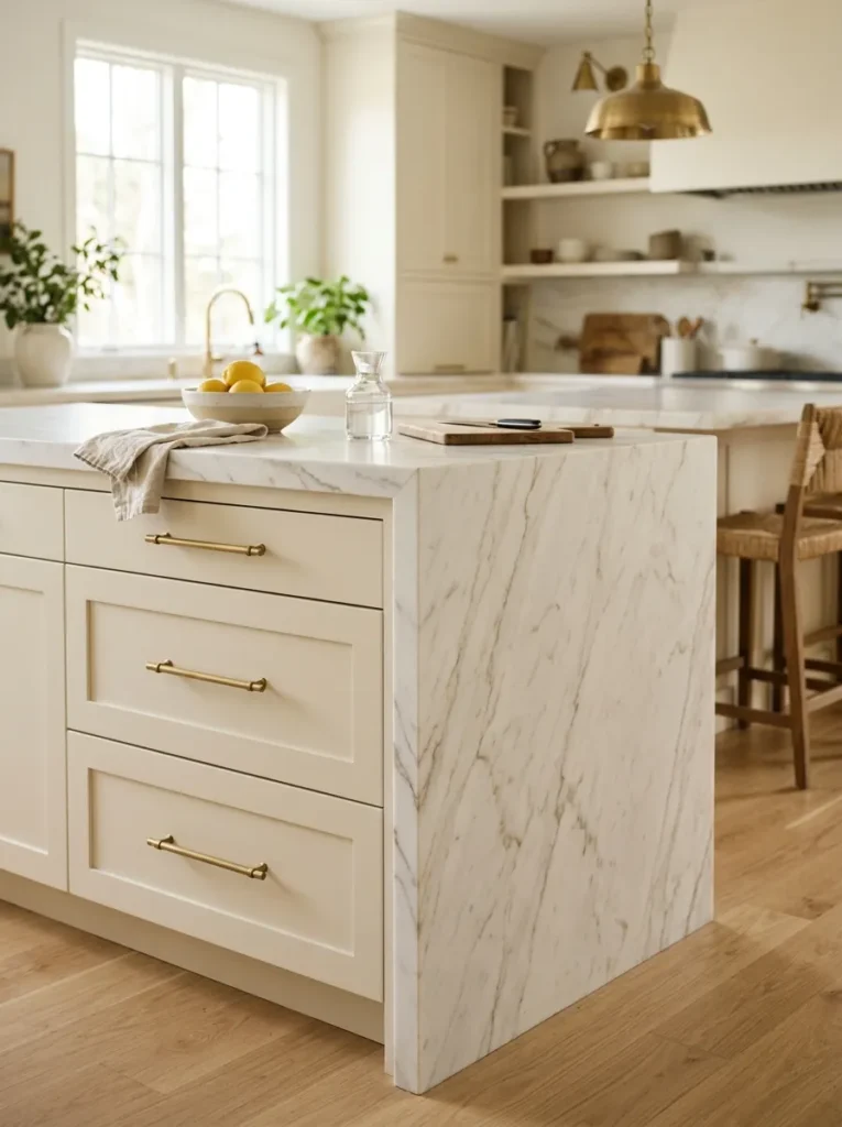
A waterfall edge — where the counter material flows over the side of a kitchen island, cutting continuously from horizontal surface to vertical plane — is a detail associated with higher-end kitchen installations. In a beige kitchen, a thick honed marble waterfall on the island produces a statement of material quality that reads clearly even in a room built around quiet warm neutrals.
The honed (matte) finish is preferable to polished in this context because it stays consistent with the matte or satin surfaces of the cabinets around it. Polished marble next to matte-painted cabinets creates a surface finish inconsistency that reads as slightly unresolved. The thickness of the stone matters visually: a slim ¾-inch edge looks appropriate on a contemporary flat-front island; a 2-inch mitered or straight edge suits a more substantial or traditional profile.
15. A Woven Pendant Light or Rattan Shade Over a Beige Kitchen Island
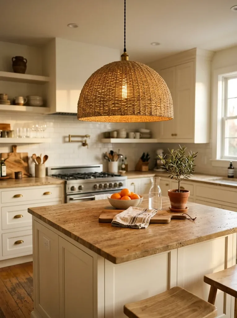
Pendant lighting over a kitchen island does two things: it provides task lighting at counter height and it introduces a visual object at ceiling height that the cabinets and counters below don’t reach. In a warm beige kitchen, a rattan, woven seagrass, or bamboo pendant shade adds a material texture that reads as natural and organic rather than industrial or contemporary.
The rattan shade works best in a kitchen that has other natural material details — oak or walnut wood tones, ceramic accessories, linen or cotton textiles. In a kitchen that is predominantly engineered surfaces (quartz, painted cabinet), a rattan pendant can feel like a single decorative gesture without the material support from the room. In that case, a warm metal pendant in aged brass or antique bronze would continue the material conversation more naturally.
16. Cream Cabinets with a Deep Sage or Olive Green Accent Wall
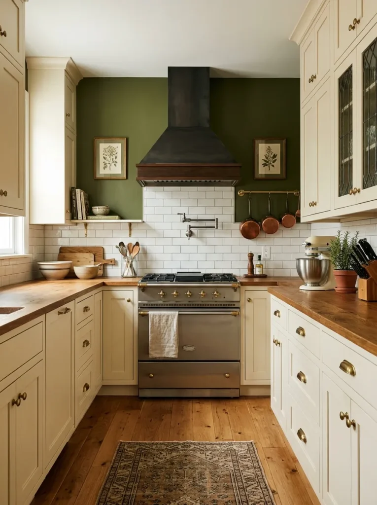
Pairing a warm cream kitchen with a painted accent wall — specifically the wall at the far end of an open-plan kitchen or the wall behind a range — in deep sage, olive, or forest green creates a contrast that grounds the warm neutral without pulling the palette cold. Green and warm beige are naturally compatible because both reference organic, botanical materials.
The depth of the green matters.Cream subway next to cream can look indecisive — the two colors are too close in value for either to carry the contrast role. A deep, saturated sage, an olive with strong brown undertones, or a dark forest green provides enough value contrast to read as a genuine design decision. The green should be applied to a surface that’s primarily seen rather than wrapped around the entire kitchen, where it would overpower the cream cabinetry.
17. Exposed Brick or Plaster Behind a Beige Kitchen
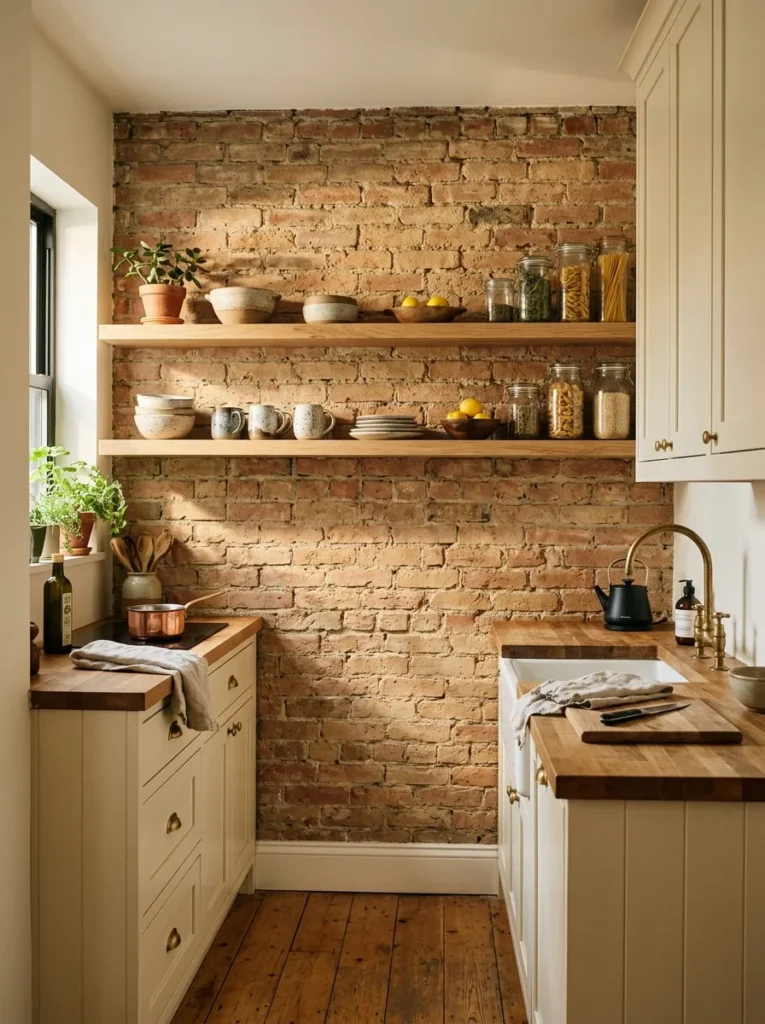
Raw exposed brick or rough-cast plaster on the wall behind open kitchen shelving — or as a section of the kitchen’s back wall — introduces a historical, organic texture that works naturally with warm neutral cabinetry. The earthy tones of brick (warm red, brown, sandy yellow) and aged plaster (cream, warm grey) complement beige rather than contrasting with it.
In kitchens where brick is structural and genuinely exposed, the decision is mostly about whether to leave it natural or seal it — sealing prevents dust and flaking while altering the surface slightly. In kitchens where brick exposure requires installation, brick slips (thin slices of real brick applied to a wall) are a realistic alternative to structural demolition and produce a convincing result at a fraction of the cost. Raw plaster requires a plasterer; a Roman clay finish is a paint-on approximation available as a DIY product.
18. A Beige Painted Kitchen with Warm Oak Floating Shelves
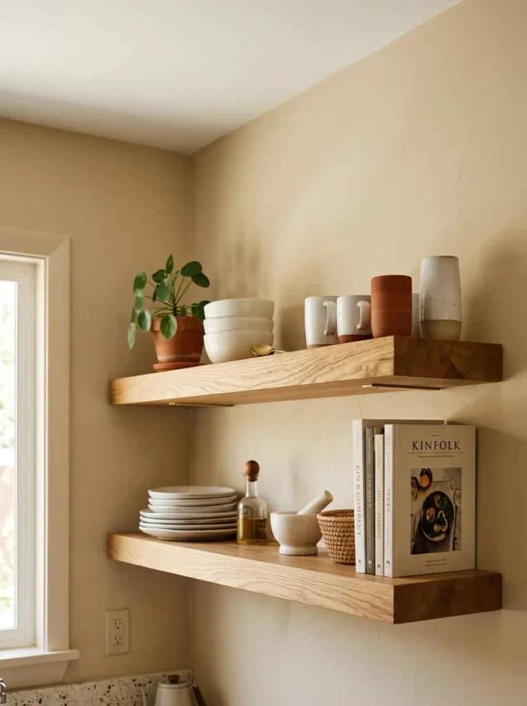
The combination of painted beige cabinetry with warm oak floating shelves is one of the most direct paths to a kitchen that reads as designed rather than installed. The contrast between the painted surface and the natural material — while remaining in the same warm tonal family — is enough to prevent monotony without requiring any element that draws significant additional cost.
Oak floating shelves in a standard kitchen install with bracket hardware that can be concealed behind the shelf face or, for thicker shelves, left visible as a deliberate detail in black or brass. The thickness of the shelf affects the visual result: a 2-inch or thicker shelf looks architectural; a thin 1-inch shelf looks like an afterthought at most standard ceiling heights. In kitchens with particularly high ceilings, two shelves stacked at different heights create more visual interest than a single shelf at standard height.
19. A Beige Kitchen with Dark Penny Tile or Encaustic Cement Floor
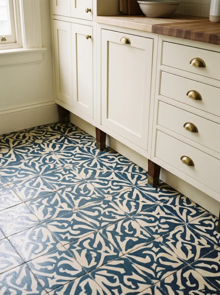
A kitchen floor in dark penny tile — navy, forest green, or near-black — or in encaustic cement tile with a pattern in deep tones against a warm background creates the strongest vertical contrast available in a beige kitchen without touching the cabinetry or walls. Dark floors beneath warm neutrals above ground the room and create a sense of gravity that prevents the kitchen from looking washed out.
Pattern in floor tile at this scale is significant but contained — the floor isn’t what greets you at eye level, which means it provides visual interest from above without dominating the room at the level where you interact with it. Encaustic cement tile requires sealing and is not as impervious to moisture as ceramic or porcelain; in a kitchen with a dishwasher or frequent spills, this is a practical consideration that should drive the choice toward a porcelain that mimics the encaustic aesthetic.
20. A Beige Shaker Kitchen with Subway Tile in a Running Bond Stack
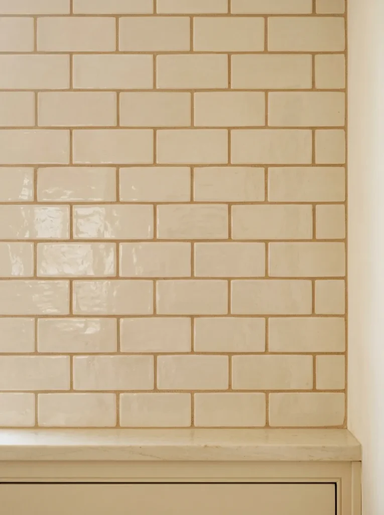
The traditional subway tile backsplash gets a warmer and more current reading when it appears in cream, warm white, or barely-there greige rather than the classic bright white version, and when the grout is a tone-on-tone sand or warm grey rather than white. In a beige shaker kitchen, this combination resolves the backsplash question without introducing any new material into the palette — it extends the existing warmth.
TheCream subway tile backsplash in horizontal running bond with warm sand grout and shaker cabinet edge below
or running bond orientation affects the visual result. A horizontal running bond is classic and recedes; a vertical stack bond is more contemporary and draws the eye upward; a 45-degree herringbone reads as the most patterned and adds the most visual activity of the three. For a beige kitchen that is already quiet in its palette, the herringbone version adds some texture interest that the room might otherwise lack. Cream tile in bright white grout is the most common mistake in this context — the contrast between warm tile and cool grout reads as unresolved and can make the tile look dingy by comparison.
The Undertone Problem: Why Some Beige Combinations Look Wrong
The most common failure mode in a beige kitchen isn’t the beige itself — it’s a conflict between warm and cool undertones in adjacent materials. A creamy cabinet with a pink undertone next to a grey-green tile creates an uncomfortable visual tension that’s hard to diagnose without understanding undertones, but instantly perceptible.
Beige contains undertones of yellow, pink, or green depending on the specific paint formula. The materials around it — tile, countertop, hardware — have their own undertone tendencies. The practical rule: all warm elements should lean in the same direction. A yellow-beige cabinet pairs with a warm honey-veined marble; a pink-beige pairs with a blush or terracotta accent; a grey-beige (greige) pairs with cool stone and matte black. Mixing across those undertone groups produces the dated or muddy quality that gave beige kitchens their bad reputation.
Before finalizing any material combination, view samples of all key elements together in the actual kitchen light. Undertones shift significantly between showroom lighting (often warm and flattering), north-facing kitchens (cool and grey-casting), and south-facing kitchens (warm and amber). A paint chip and a tile sample next to each other in the room before ordering is the minimum verification step.
Final Thoughts
Beige kitchens succeed or fail based on decisions made before the room is assembled. The undertone of the cabinet paint, the warm or cool lean of the countertop, and the contrast at the hardware and floor levels determine whether the result reads as considered or flat. The ideas here give you the range — from travertine counters to dark penny tile floors, from zellige backsplashes to dark walnut islands — but the specific combination needs to be checked against your kitchen’s actual light conditions.
If you’re starting with beige kitchen cabinets, work outward: counter first, then backsplash, then hardware, then floor. Each decision narrows the range for the next one, and the sequence matters. Choosing hardware before countertops, for example, often creates a situation where the counter and hardware don’t relate at all.
Save the ideas from this guide that fit your kitchen’s orientation and light, and revisit before making any material commitments.