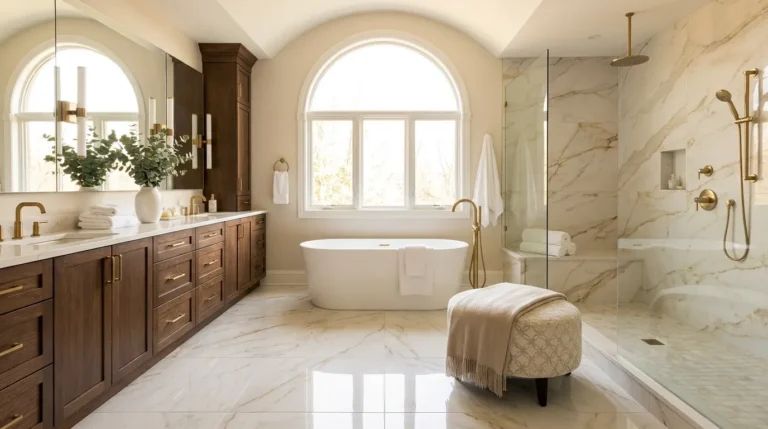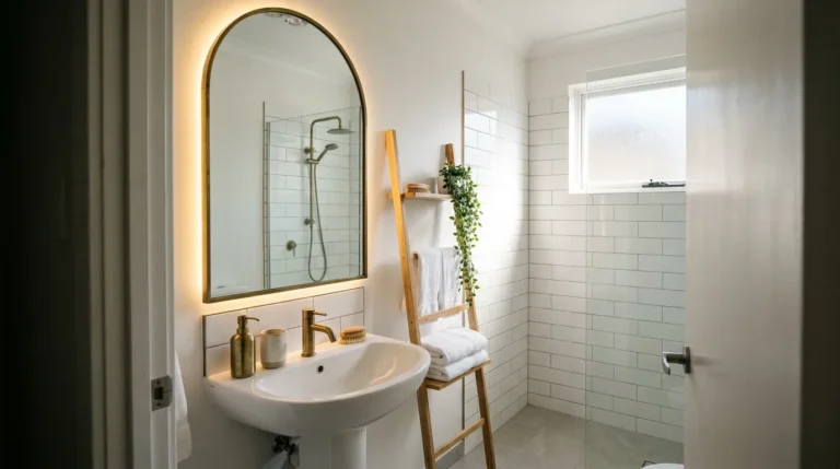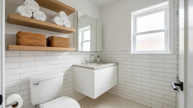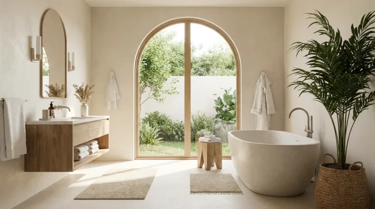
23 Scandinavian Bathroom Ideas That Feel Bright and Calm
A genuinely Scandinavian bathroom is not simply a white bathroom with a wooden stool in it. That’s a useful starting point, but it’s also where most Nordic bathroom inspiration stops. The actual quality that distinguishes the aesthetic — the sense of calm without coldness, brightness without clinical harshness — comes from the relationship between warm white surfaces, natural wood used with restraint, matte rather than polished finishes, and a quality of light that the room seems to generate rather than simply receive.
These Scandinavian bathroom ideas address the decisions that produce that quality rather than the decorative layer that sits on top of them. Some require renovation; others are immediate. Each one explains the mechanism behind the visual effect, so the result holds up in daily use rather than only in the reference photograph.
1. Choose White Subway Tile in a Matte or Satin Finish Rather Than Gloss
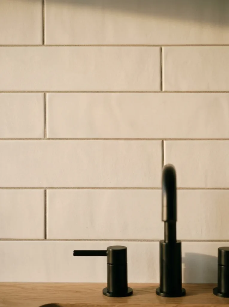
Standard gloss white subway tile is the default in most bathroom renovations, but it’s not the choice that reads as Nordic. A matte or satin finish on the same tile format reads quieter, absorbs light rather than reflecting it, and produces a surface that looks warm without looking worn. Gloss tiles in a small bathroom can feel brighter initially but also amplify every water mark, splash, and soap residue in a way that matte finishes don’t.
The grout colour matters as much as the tile finish. White grout on white tile produces the most continuous, uninterrupted surface. A very light warm grey grout adds the grid line back in a way that reads as intentional rather than minimal. Dark grout against white tile is a high-contrast choice that suits more contemporary or graphic interpretations of the aesthetic, but sits less naturally within the Nordic palette.
2. Install a Floating Vanity in Pale Oak or Ash
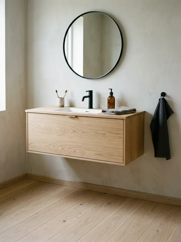
A wall-mounted floating vanity in pale natural oak or ash — with the basin sitting on the surface rather than an integrated ceramic unit — does several things simultaneously: it raises the floor to wall line, makes the floor appear to extend under the vanity, and introduces a warm wood tone at the most-used surface in the bathroom. In a small bathroom particularly, the visible floor beneath a floating vanity makes the room read as larger.
Solid timber in a wet environment requires proper sealing and ventilation to avoid warping over time. The wood should be oiled regularly and kept dry after use — a reasonable maintenance commitment for a surface that contributes significantly to the room’s warmth. An alternative for lower commitment is an engineered oak vanity door and frame with a more moisture-resistant core material.
3. Use a Large Round Mirror Rather Than a Rectangular Cabinet
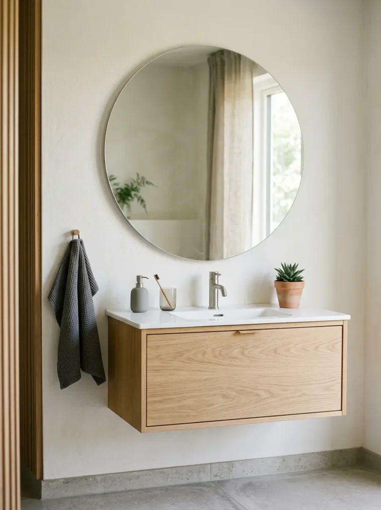
A large round mirror above the vanity has a specific effect in a small bathroom: the circular form contrasts with the room’s right-angle dominant geometry, which makes the space feel deliberately considered rather than functionally assembled. A round mirror that’s slightly too small for the vanity width reads as tentative; one that matches or slightly exceeds the vanity width reads as the visual anchor it’s designed to be.
A plain circular mirror without a frame suits the most restrained Nordic interpretation. A mirror with a thin frame in oak or aged brass adds material warmth at eye level. The mirror position should centre on the basin beneath it rather than the vanity unit, since this is the position that works best for use.
4. Keep the Palette Within Three Tones of the Same Warm Family
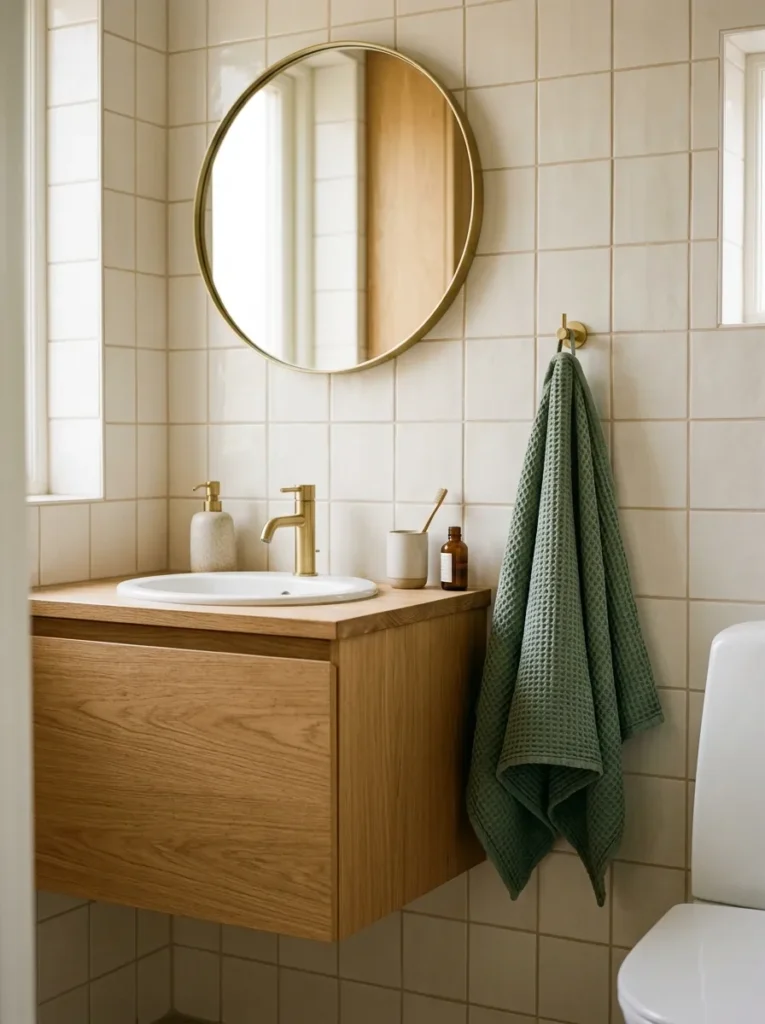
The bathroom that most genuinely reads as Scandinavian is usually built on three tones: a very pale warm white for the walls and ceiling, a light natural wood tone for the vanity or accessories, and a slightly warmer, slightly deeper tone for one accent surface or textile. All three share a warm undertone, and that shared undertone is what makes the room feel cohesive rather than merely neutral.
The mistake is introducing a fourth tone with a different undertone. A warm white wall with a warm oak vanity and a cool-toned grey bath mat introduces an undertone conflict that reads as slightly off without the cause being immediately obvious. Hold all proposed materials together in the actual space and in the actual lighting before committing.
5. Specify Matte Black or Matte Gunmetal Fixtures Rather Than Chrome
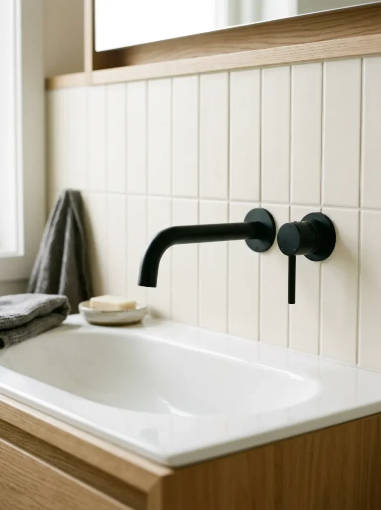
Chrome is the default fixture finish in most bathrooms and among the least Scandinavian choices available. Chrome reflects light aggressively and reads as polished in a way that conflicts with the matte, absorbed quality that Nordic interiors rely on. Matte black or matte gunmetal fixtures — taps, showerhead, towel bars, drain cover — read considerably more restrained and contemporary, and they suit the warm white tile palette better than chrome by providing a dark material note that the eye reads as deliberate contrast.
The key limitation: matte black fittings show water spots and fingerprints more visibly than chrome in certain light conditions. Regular wiping keeps them looking sharp, but it’s a maintenance consideration worth making consciously rather than discovering after installation.
6. Add a Teak or Oak Bath Mat or Stool
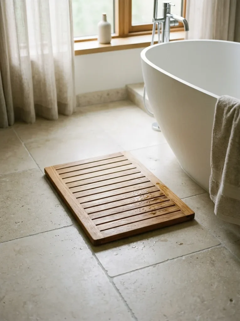
Timber on the bathroom floor — a teak bath mat or a small stool in teak or treated pine — is the most visible material decision in a Nordic-influenced bathroom. Teak is the preferred species for direct water contact: its natural oil content makes it genuinely moisture-resistant without additional sealing, and it develops a warm silver-grey patina over time that suits the palette. An untreated pine or fir stool near (but not directly in) the shower provides a similar warmth at lower cost.
The timber piece doesn’t need to be large. A narrow teak board mat beside the bath or shower, or a single small stool positioned where it can dry between uses, is sufficient to introduce the material and its warmth without requiring a full timber floor installation.
7. Install a Concealed Cistern and Rimless Toilet
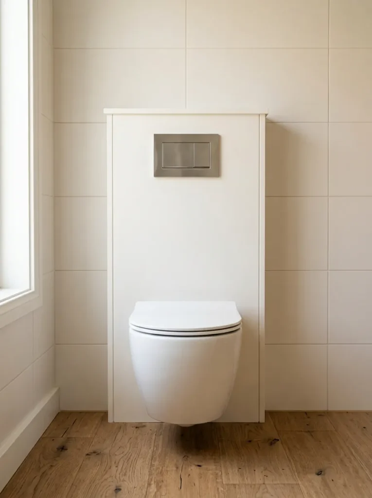
A back-to-wall toilet with a concealed cistern — where the cistern sits within the wall cavity or a panel, leaving only the flush plate visible — reads as considerably more resolved than a standard close-coupled suite in a bathroom that’s otherwise pursuing a clean, minimal quality. The visible tank on a standard toilet is one of the larger elements of visual clutter in any bathroom, and its absence reads immediately as a considered decision.
Rimless toilets are easier to clean than standard rimmed bowls, which is a practical detail worth noting in a bathroom where ease of maintenance matters. Combined with a wall-hung seat in a matte finish, this is the toilet specification most consistent with the Nordic approach.
8. Use Full-Height Tiles on One Feature Wall
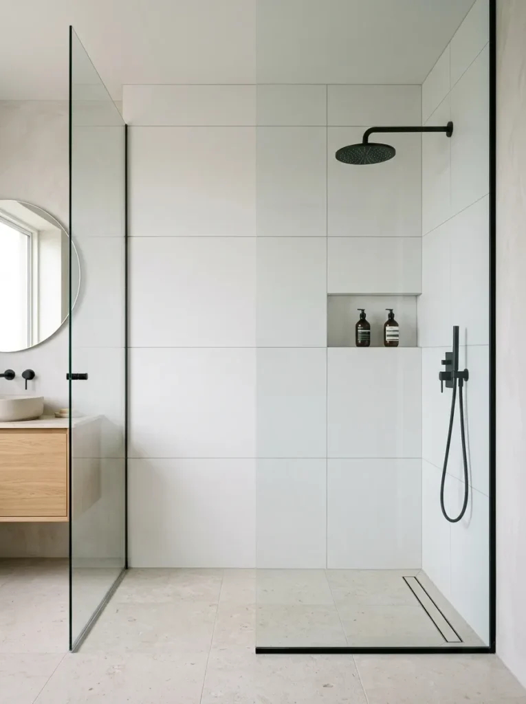
Running tiles floor to ceiling on the shower wall or the wall behind the vanity turns that surface into an architectural feature rather than a tiled surface that happens to be in a bathroom. In a Scandinavian bathroom where the palette is restrained, the decision to tile fully rather than partially is what makes the choice look deliberate. Partial tiling — to a standard half-height, for example — reads as a budget decision rather than an aesthetic one.
Large-format tiles (60×60cm or 60×120cm) on a full-height wall minimise grout lines and produce the most continuous surface. Smaller tiles in the same space create more visual activity through the grout grid, which suits some interpretations of the aesthetic but looks busier in very compact bathrooms.
9. Choose a Simple Undermount Basin Over a Counter-Mounted One
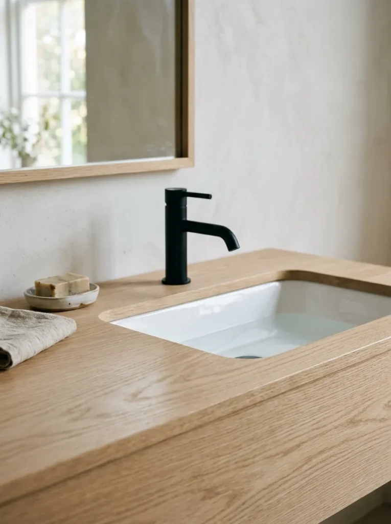
An undermount basin, set into the underside of the vanity surface so the counter runs continuously to the basin edge, produces a cleaner line at the sink than a surface-mounted ceramic bowl. The continuous counter surface is easier to wipe down, doesn’t collect debris at the edge seam, and reads as considerably more resolved. This is the vanity basin choice most consistently seen in Nordic bathroom interiors.
If a surface-mounted bowl is preferred for design reasons, a single-piece matte ceramic bowl in white or a warm off-white can work — but it requires the counter surface around it to be deliberately minimal, since the bowl becomes a visible object on the counter rather than a functional surface integrated into it.
10. Paint the Ceiling the Same Warm White as the Walls
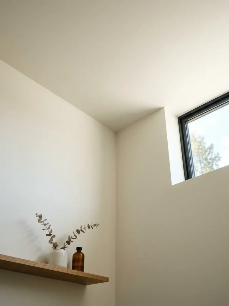
A white ceiling above white bathroom walls should logically read as seamless, but the colour temperature of standard bright white ceiling paint is often cooler than the warm white used on bathroom walls, which produces a subtle but visible temperature conflict at the wall-to-ceiling junction. Using the same paint — or a ceiling version of the same tone — on both surfaces removes that conflict and makes the room feel more resolved and unified.
In a bathroom with limited natural light, this also prevents the ceiling from reading as a separate cooler surface floating above the walls. The junction between wall and ceiling should be clean and crisp rather than coved, which reads more contemporary and suits the restrained Nordic approach.
11. Introduce Linen or Waffle-Weave Towels in a Consistent Colour
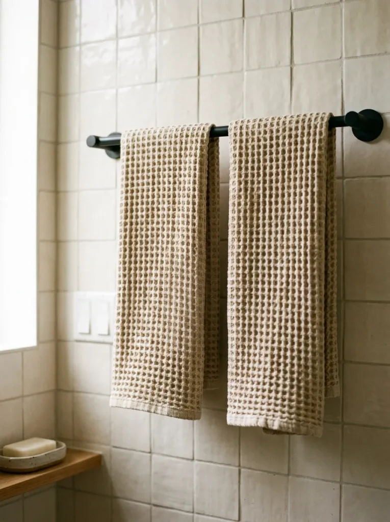
Towels are the most visible textile in any bathroom and the easiest and most immediate way to shift the room’s visual character. Linen bath towels or waffle-weave cotton in a single consistent colour — warm white, oatmeal, undyed natural, or a muted dusty sage — produce a coherent textile story that mixed-colour or patterned towels don’t. The weave texture matters: a towel with visible weave structure reads as more natural and more considered than a smooth-pile towel in the same colour.
Keeping to two colours maximum across bath and hand towels — a field colour and a tonal stripe — maintains the simplicity the aesthetic requires. More than two colours introduces a complexity that competes with the room’s clean material palette.
12. Fit a Shelf in Natural Oak Below the Mirror
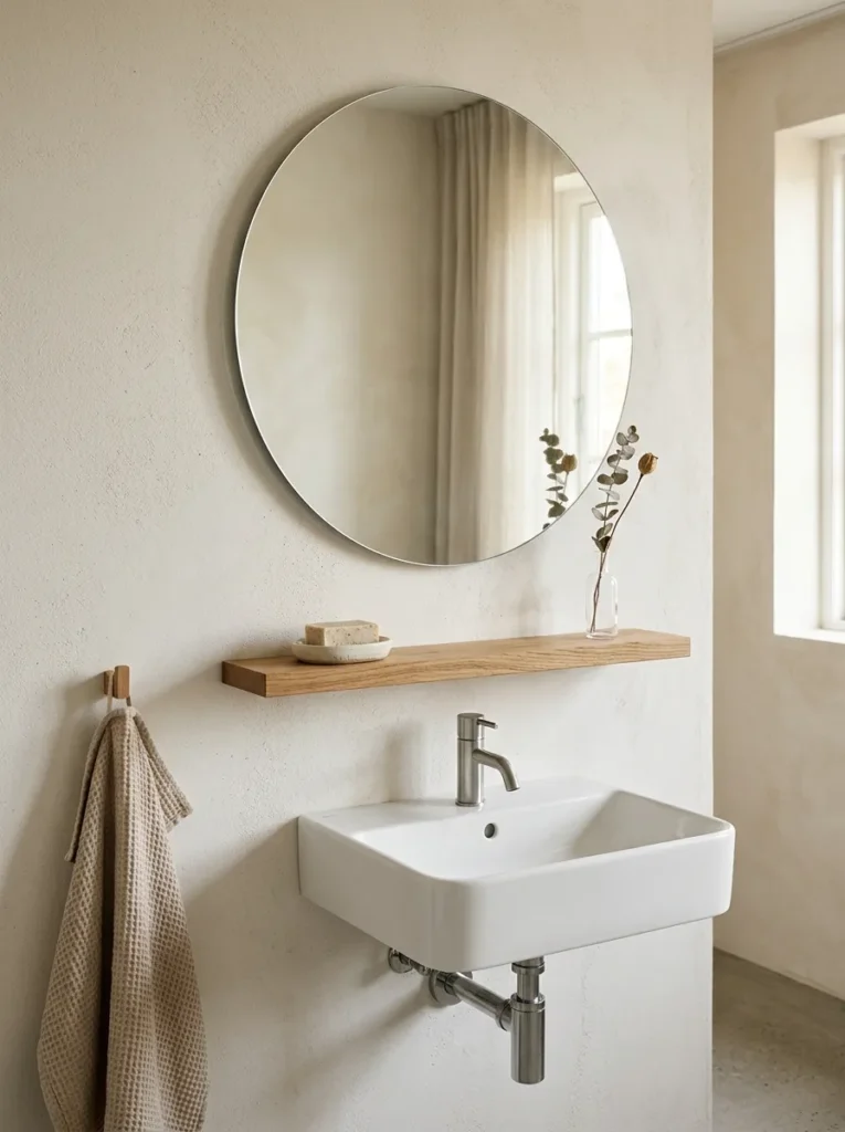
A floating shelf in pale oak or ash below the vanity mirror — or along one wall if the mirror is above the basin — provides a display and storage zone that reads as part of the room’s material story rather than an added accessory. The shelf brings the wood tone to eye height and gives the room a consistent natural material note that the tile and plaster surfaces around it don’t provide.
The shelf should be lightly styled: a ceramic soap dish, a bud vase, one small plant. The restraint of the styling is what makes the shelf read as a considered feature rather than overflow storage. Overcrowding the shelf defeats the visual purpose of having it in the first place.
13. Source a Ceramic Soap Dispenser and Dish Rather Than Plastic
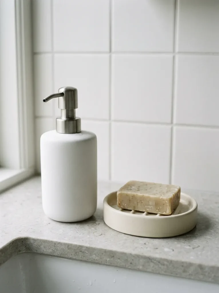
The soap dispenser and soap dish on a bathroom vanity are the objects handled daily and seen every time someone enters the room. Standard plastic pump dispensers are functional but read poorly against the warm white tile and timber of a Nordic-influenced bathroom. A hand pump dispenser in matte ceramic — or a ceramic soap dish in an off-white or warm clay tone — changes this surface at minimal cost and makes an immediate visual difference.
Both should share the same or similar ceramic material rather than being in different finishes. A matte white ceramic pump beside a terracotta dish reads as two unrelated decisions; two objects in similar matte ceramics within the same tonal range reads as intentional.
14. Use Recessed Downlights on a Warm Dimmer Circuit
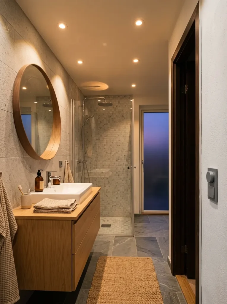
Recessed ceiling downlights on a dimmer — with warm-white LED bulbs at 2700K — provide the most practical overhead lighting for a bathroom used daily and also for evening bathing. At full brightness the room functions for tasks; at 40–50% it reads considerably softer for evening use. The dimmer is the critical component: a bathroom with only full-brightness overhead lighting cannot adapt to different uses and moods, which works against the quality of calm the Nordic aesthetic requires.
Position downlights to illuminate the vanity wall evenly rather than centred overhead, which casts shadows on the face that are unflattering for morning grooming. A line of downlights along the vanity wall, or a single well-positioned fixture above the mirror, serves better than a single central ceiling fitting.
15. Add a Vertical Radiator as a Towel Warmer
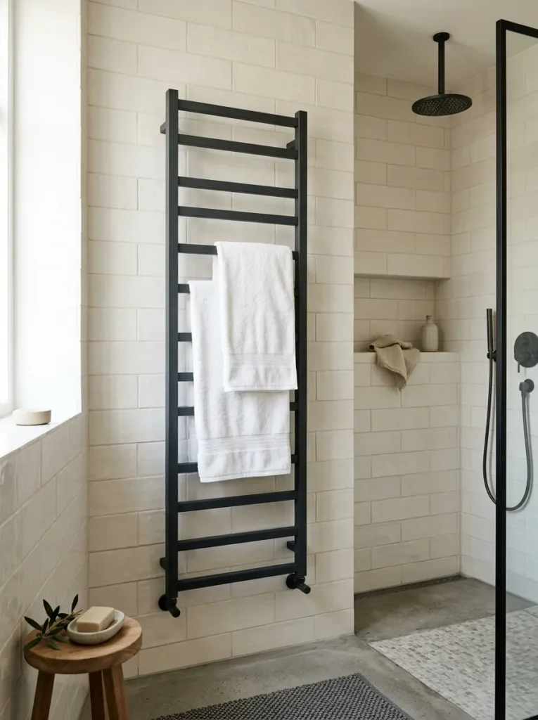
A vertical ladder towel radiator — particularly in a matte white or matte anthracite finish — is both a practical fixture and a visual architectural element in a Scandinavian bathroom. Mounted on an otherwise plain wall, a slim vertical radiator provides the room with a graphic vertical element at a consistent scale and material register. In a bathroom without a large window or feature architectural detail, this can be the wall’s most resolved visual decision.
Chrome ladder radiators read as less Nordic — the polished surface competes with the matte quality of the rest of the room. A matte white version disappears into the wall tone; a matte anthracite or dark charcoal provides a deliberate dark material note that anchors the wall.
16. Keep the Shower Screen Frameless or Black-Framed
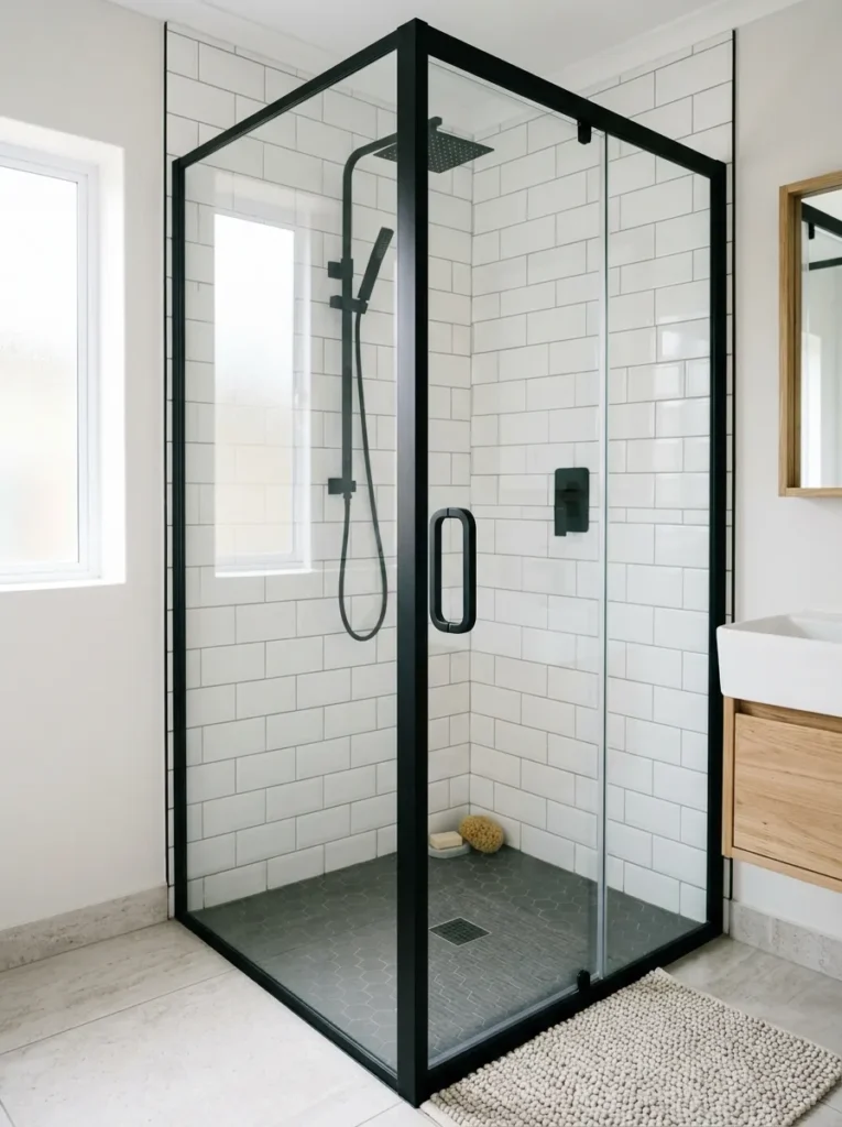
A frameless glass shower screen — clear glass with minimal hardware in matte black or brushed metal — reads as considerably more resolved than a silver-framed semi-frameless screen in a bathroom that’s otherwise pursuing a clean aesthetic. The frame hardware is the detail most visible in a shower screen, and chrome frame profiles in a Nordic-influenced bathroom interrupt the matte material palette immediately.
A fully frameless screen requires higher quality glass and more precise installation than a framed option, which affects cost and lead time. A black-framed screen is a less expensive alternative that maintains the dark fixture finish consistency and reads more intentional than silver.
17. Introduce a Pendant or Decorative Ceiling Light Above the Bath
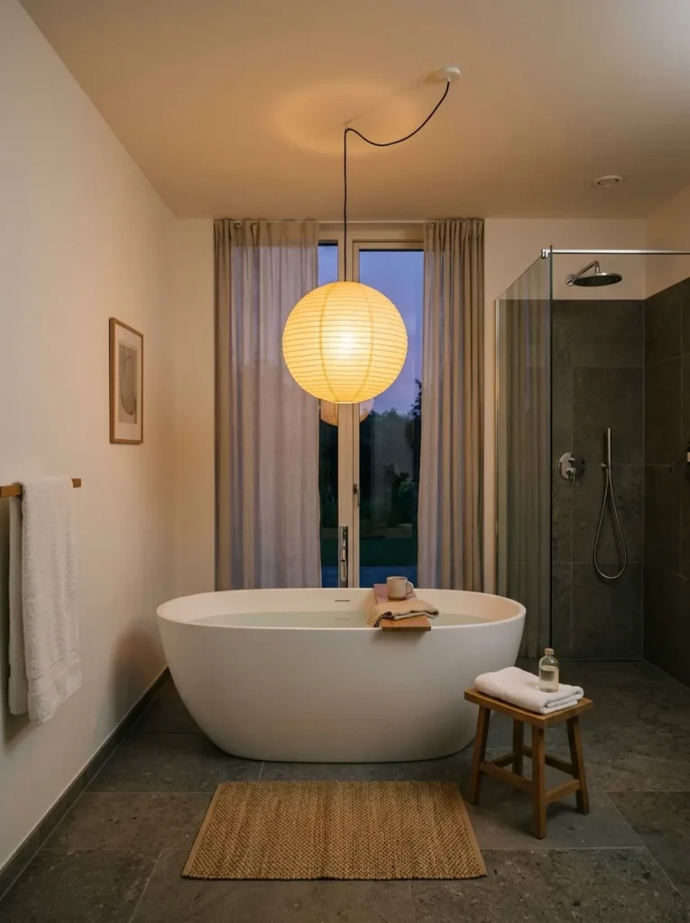
A bathroom with only recessed downlights is fully functional but visually flat. A pendant or ceiling rose above the freestanding bath or the bath zone of a built-in tub introduces a light source that reads as a design decision rather than an infrastructure one. A paper pendant in a natural material, a glass globe in a warm-toned glass, or a simple bare bulb in a quality fitting all work better than an additional downlight in the same position.
The fixture needs to be rated for bathroom use and positioned outside the zone of direct water spray — check the specific IP rating requirements for the installation position in your region, as these vary. A pendant above a freestanding bath, well away from the showerhead, typically satisfies this requirement but confirmation from an electrician is necessary.
18. Extend the Tile Into a Niche Rather Than Installing a Wire Caddy
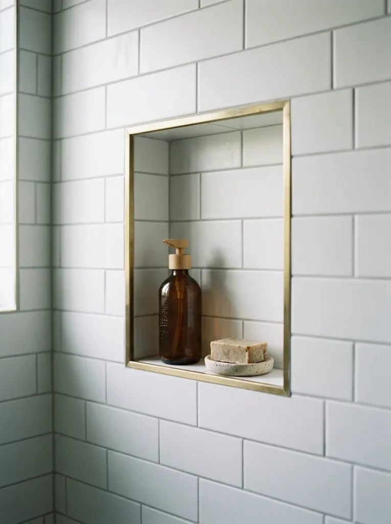
A recessed tile niche in the shower wall — typically one or two tile widths wide and positioned at a comfortable reach height — provides shampoo and soap storage without a caddy, pole, or surface-mounted fitting. Tiled in the same material as the surrounding shower wall, it’s invisible until you’re looking for it and reads as architectural rather than functional. A niche with a contrasting tile material — a brass-edged inset, or a contrasting ceramic tile — becomes a deliberate detail within the shower composition.
The niche must be planned before tiling begins. Retrofitting a niche into an existing tiled shower requires removing tiles and confirming the wall cavity allows it, which is more work than planning it from the start. It’s worth raising with the tiler at the specification stage rather than after the fact.
19. Use a Single Pendant or Wall Light for the Vanity Rather Than a Bar
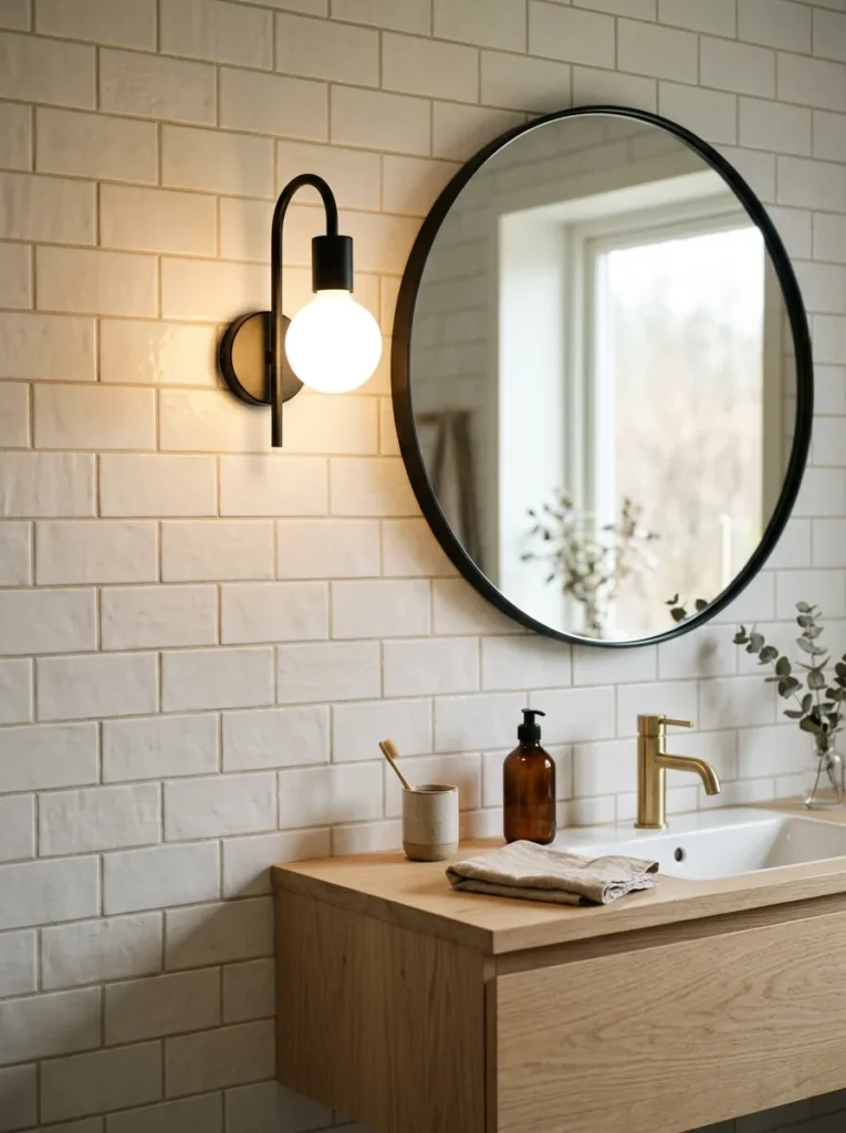
A vanity bar light — a long horizontal fixture mounted above the mirror holding multiple bulbs — is the standard option in many bathrooms and among the least considered available. A single pendant beside the mirror (plug-in if hardwiring isn’t feasible), or a wall-mounted sconce in matte black or aged brass either side of the mirror, reads as a genuine design decision rather than a lighting spec that came with the bathroom.
The bulb quality matters considerably here: a warm-white globe bulb in an open fitting at the vanity provides the most flattering and natural quality of light for daily grooming tasks. A covered shade at the same position provides less even illumination.
20. Plant a Single Low-Maintenance Species in a Ceramic Pot
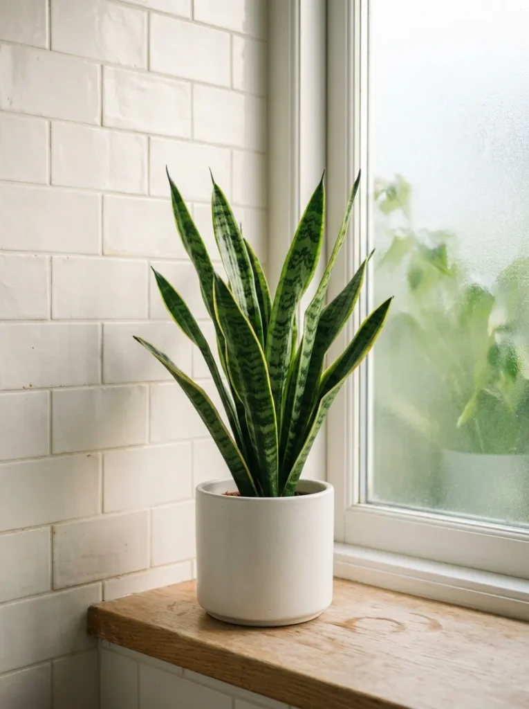
A plant in a bathroom works when the species genuinely suits the conditions: typically low to medium indirect light and higher-than-average humidity. Snake plant, pothos, peace lily, and ZZ plant all perform well in these conditions without frequent attention. One well-chosen plant in a matte ceramic pot sized appropriately for the space reads as considered; three or four small plants scattered across the vanity counter read as clutter.
The pot should be in the room’s palette: a matte white or off-white ceramic suits the warm white palette; a terracotta pot suits a slightly warmer, earthier version of the aesthetic. A pot in a contrasting colour that doesn’t relate to the room’s other tones introduces a visual distraction the bathroom probably doesn’t need.
21. Keep the Countertop Entirely Free of Product Packaging
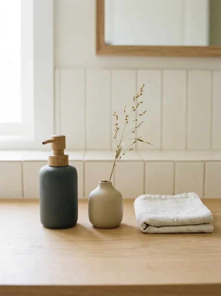
The vanity countertop in a Nordic-influenced bathroom should hold only what has been deliberately chosen to be there. Product bottles in their original packaging — shampoo, skincare, toothpaste — are the most reliable way to undermine the visual quality of a bathroom that’s otherwise been carefully considered. Decanted into matte ceramic dispensers, or stored in a cabinet below, the same products don’t compete with the room.
This is the least expensive idea in this list and the one with the most immediate impact on how a bathroom reads. It requires no renovation, no installation, and no permanent change — and the difference between a countertop cleared to three considered objects and one covered in product packaging is visible from the doorway.
22. Use Pale Limestone or Travertine as an Accent Surface
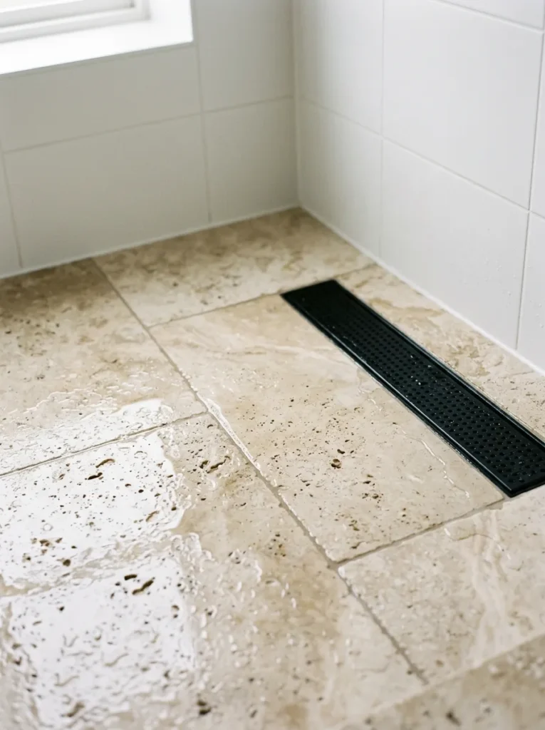
Pale limestone or honed travertine, used as an accent surface — on the shower floor, as a small shelf, or as the vanity counter material — introduces natural stone variation that tile cannot replicate. The warm cream-to-beige tonal range of both materials sits naturally within the Nordic palette and produces a surface that reads as both natural and refined. Both require periodic sealing in wet environments and are more porous than ceramic tile, which is a maintenance consideration.
As a floor material in a shower, travertine’s textured surface provides grip without requiring a separate bath mat. As a vanity counter, its weight and warmth produce a material quality considerably beyond what laminate or ceramic surfaces can achieve.
23. Leave One Wall Unpainted or in a Single Contrasting Material
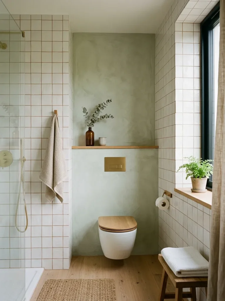
A bathroom in which every surface is the same warm white tile or paint reads as complete but undifferentiated. One surface in a different material — a feature wall in a pale limewash plaster behind the toilet, a section of vertical shiplap in painted white pine below a picture rail, or a single wall in a pale sage or muted clay — gives the room a material distinction that prevents it from reading as a blank canvas.
The contrast should be tonal rather than bold: a pale sage wall in a room of warm whites reads as a gentle variation within the same calm register; a brightly coloured accent wall works against the characteristic quietness the Scandinavian bathroom aesthetic relies on.
Final Thoughts
A Scandinavian bathroom that genuinely feels bright and calm usually arrives at that quality through its material choices rather than its styling. The decision between matte and gloss tile, between chrome and matte black fixtures, between a floating oak vanity and a painted flat-pack unit — these are the decisions that establish the room’s character before any accessory is added.
For anyone renovating from scratch, start with the tile finish and the fixture finish — both commit the room’s entire surface language in one decision. For anyone working with an existing bathroom, the vanity surface, the towels, the ceramic dispensers, and the countertop edit are the four changes that shift the room’s daily quality most immediately.
Save the ideas in this guide that align with your room’s scale and your renovation scope, and revisit when you’re ready to make the material decisions that count.