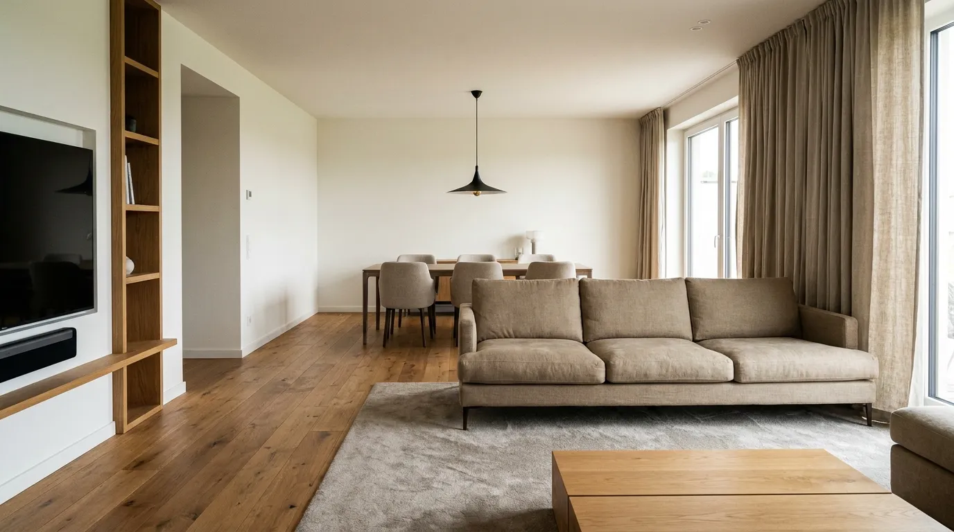
19 Open Concept Living Room Ideas That Feel Spacious
Open-plan living rooms have a paradox: more space doesn’t automatically mean the space feels better. Without walls to define where things go, furniture drifts to the perimeter, zones blur into each other, and large rooms can feel less resolved than smaller ones that were forced by constraint to be more considered.
These 19 open concept living room ideas address both sides of that — the visual ambition and the practical reality. Some ideas are about spatial logic: how to define zones, anchor furniture, and create the sense of distinct areas within a continuous floor plan. Others are about the specific decisions that make large rooms feel inhabited rather than merely large. A few are about correcting the mistakes that appear most often in open-plan spaces: the sofa pushed against the wall, the rug that’s too small, the ceiling light that flattens rather than layers.
The ideas here are organised to move from foundational decisions toward refinement — starting where the planning should start.
1. Define Zones with Rugs Before Buying Any Furniture
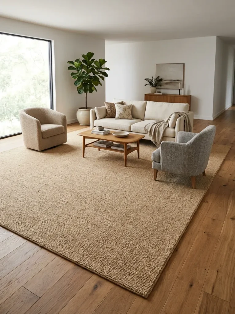
In an open-plan space, the rug is doing structural work. It tells the eye where one zone ends and another begins — something walls would handle in a conventional room. This means the rug decision should come before, or at least alongside, the furniture decision, not after.
The sizing error that undermines most open-plan living rooms is a rug that fits the sofa but not the zone. For a living area, the rug should be large enough that all main seating legs sit on it — or at least the front legs of each piece. A rug that only catches the coffee table reads as a mat rather than a zone anchor, and the room reads as furniture placed on an open floor rather than a defined space.
In practical terms, this often means going considerably larger than feels instinctive in the shop. Lay tape on the floor to map the intended zone before purchasing.
2. Float the Sofa Away from the Wall
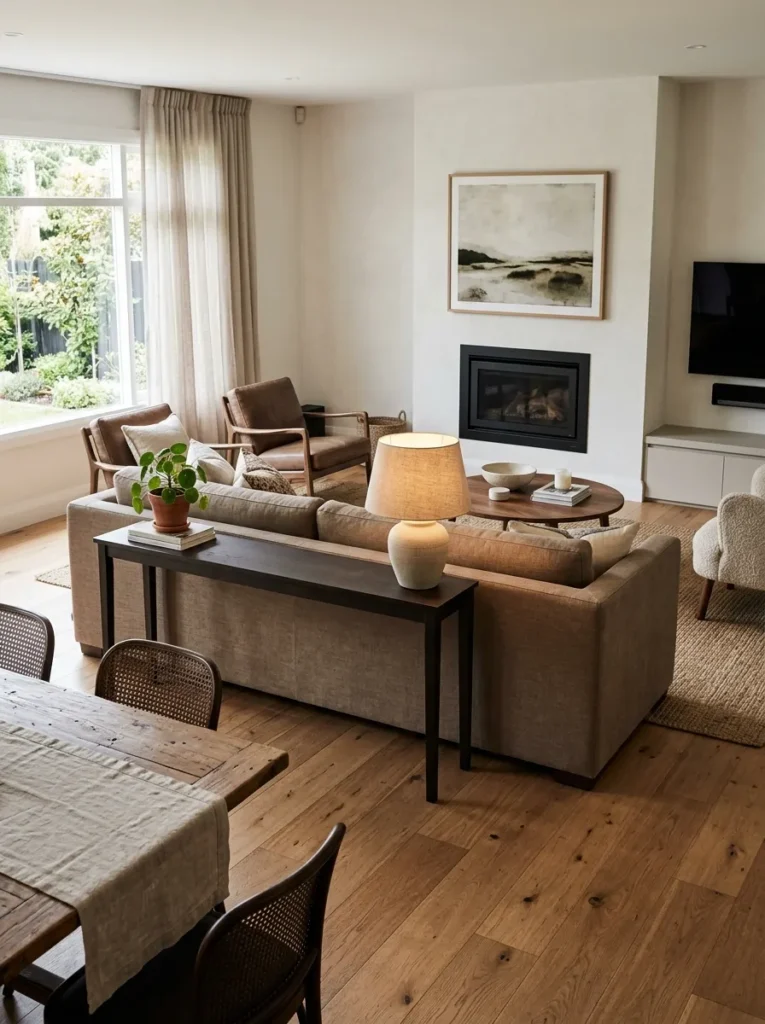
Pushing all furniture against the walls is the single most common mistake in large open-plan rooms, and it produces exactly the opposite of the intended effect. Rather than making the room feel bigger, it creates an empty centre and a perimeter of isolated furniture — more waiting room than living space.
Floating the sofa — positioning it with its back to the open-plan flow rather than against a wall — defines the living zone immediately and creates a sense of enclosure without any physical barrier. The sofa back becomes an informal room divider, and the space behind it (between sofa and wall) can become a console table zone or circulation corridor.
The sofa doesn’t need to be in the centre of the room. It should be positioned to face the room’s focal point — a fireplace, a media wall, a view — with enough space behind it (roughly 90cm minimum for circulation) to feel intentional rather than stranded.
3. Use a Double-Sided Bookcase as a Soft Room Divider
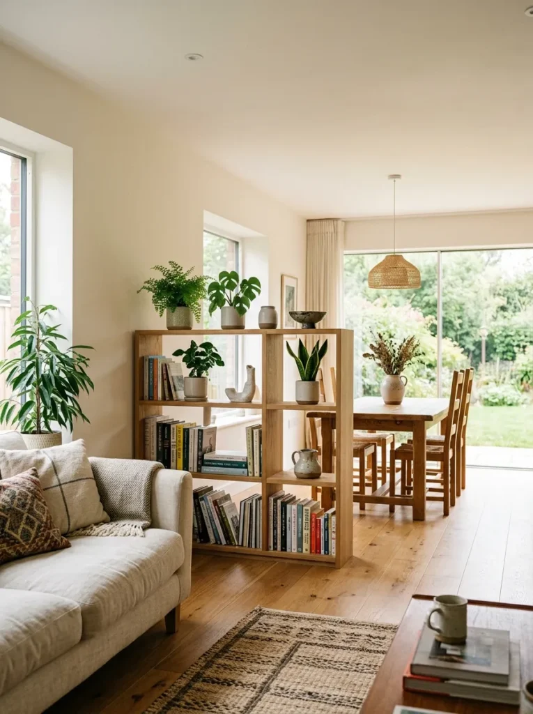
Where a floating sofa creates a visual break, a low or medium-height bookcase placed perpendicular to the main open-plan flow creates a more architectural zone division — without the commitment of a wall. Double-sided units (accessible from both sides) are ideal, but even a unit accessed from one side works if the open shelves allow visual connection through the structure.
Height matters considerably. A bookcase at 120–150cm reads as furniture; one at 180cm or above starts to feel like a partition that reduces the sense of connection between zones. In most open-plan spaces, the sweet spot is shoulder height or below — enough to indicate a boundary without blocking sightlines to windows or architectural features beyond.
For renters, this is one of the few genuinely effective zone-definition strategies that requires no permanent modification.
4. Anchor the Living Zone with a Statement Sofa, Not Accessories
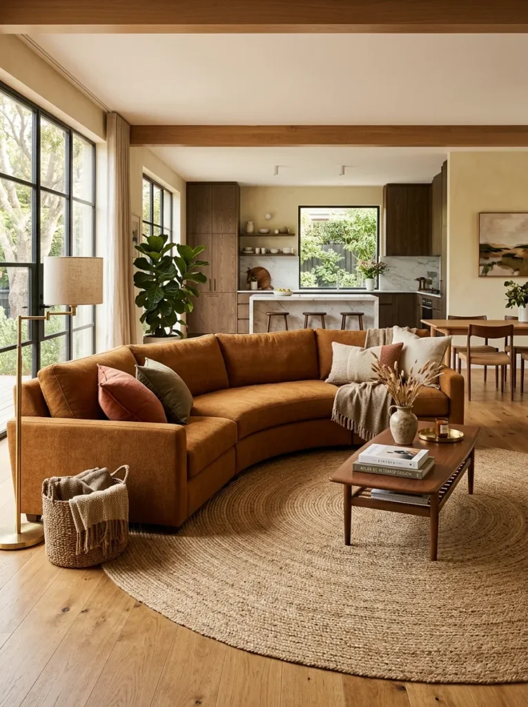
In an open-plan room, the living area needs a visual anchor that reads clearly from the dining or kitchen zone. Accessories — cushions, throws, art — are too small to carry that weight. The sofa is the piece that does it, which means the sofa choice matters more here than in a conventional living room where the walls and architecture do some of the work.
A sofa with a strong silhouette — a deep-seat sectional, a curved piece, or a clearly defined two-piece configuration — reads as a zone anchor. A narrow, low-profile sofa in a room with 2.7m ceilings can look like it’s floating helplessly in the middle of the space.
Colour also plays a role: a sofa in a tone that relates to the rug below and the wall behind it reads as placed deliberately; one that has no visual relationship with its surroundings reads as moved in from somewhere else.
5. Use a Continuous Flooring Material to Unify the Whole Plan
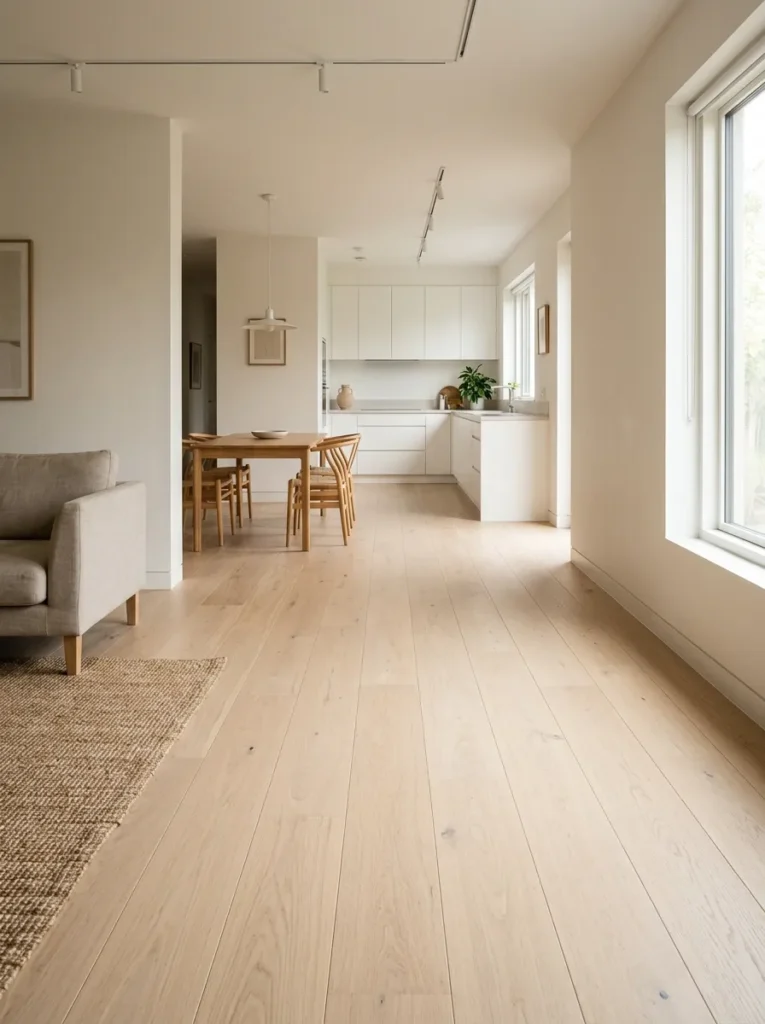
One of the most common open-plan mistakes is using different flooring materials in adjacent zones — wood in the living area, tile in the kitchen — with no transition detail. While this can work in principle, abrupt material changes fragment what should read as a continuous space.
A single flooring material running through the full open-plan area — wide-plank oak, large-format stone-effect porcelain, or polished concrete — reads as architectural rather than assembled. The different zones then read as activities within one unified floor plate, which is exactly the quality good open-plan spaces project.
If different materials are already present or unavoidable (a kitchen requiring tile for practical reasons), a flush transition strip rather than a bevelled threshold keeps the visual flow as uninterrupted as possible. Avoid large material contrasts in small-to-medium open-plan spaces; reserve them for very large footprints where the scale justifies the shift.
6. Layer Lighting Across All Three Zones
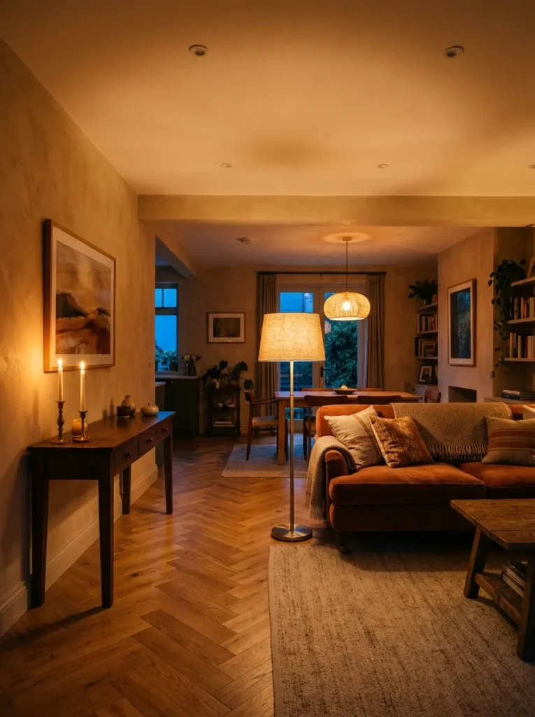
Open-plan rooms often have one ceiling point per zone, which means the light flattens every area at the same level. This is functional but lifeless, and it prevents the room from shifting in character between morning and evening.
An effective open-plan lighting plan uses three layers in the living zone: ambient (a central fitting or recessed downlights), task (a floor lamp or reading sconce beside the sofa), and accent (a table lamp on the console or sideboard). The ability to turn each layer on independently — with dimmers where possible — means the room can feel different at midday, during dinner, and after.
The pendant over the dining table is often the strongest single light in an open-plan space because it’s at eye level when seated and creates a distinct pool of light that defines the dining zone more clearly than almost any other single intervention.
7. Match the Colour Palette Across Zones While Varying Tone
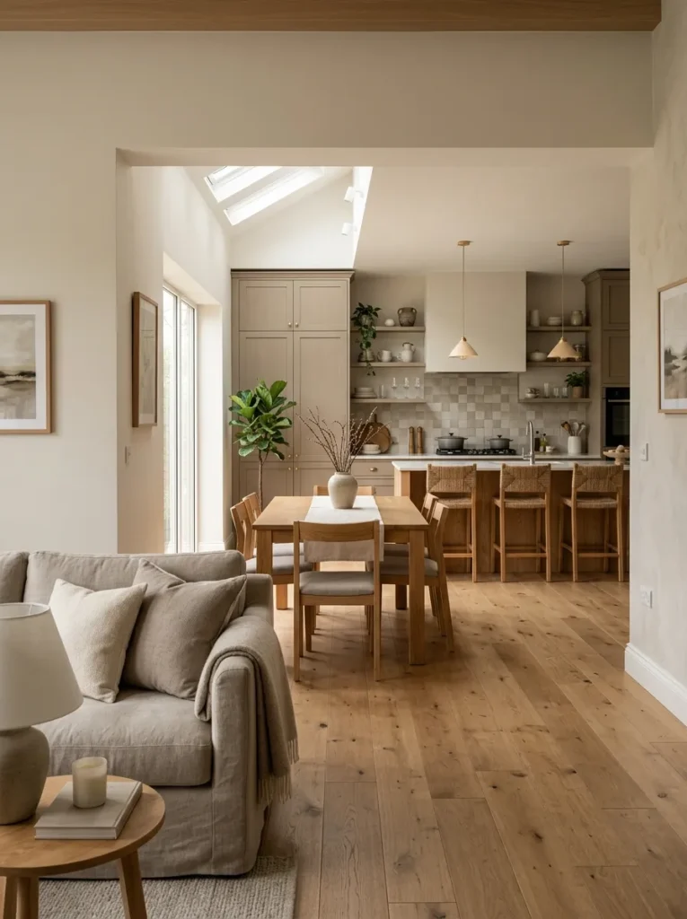
Open-plan spaces need colour coherence more than any other room type because the eye sees multiple walls and surfaces simultaneously. A wall colour in the living area that has no relationship to the kitchen cabinetry or dining furniture creates visual competition rather than visual flow.
The approach that works most reliably is choosing a dominant neutral that appears in some form across all zones, then using tone variation — lighter in some areas, deeper in others — to distinguish them. For example, a warm greige wall in the living area might relate to greige-toned cabinet doors in the kitchen and a table in a complementary warm oak. The eye reads them as part of the same palette rather than as three rooms competing.
Bold colour choices in open-plan spaces work best when they’re confined to one zone and the other zones remain supporting rather than competing.
8. A Long Console Table Behind the Sofa
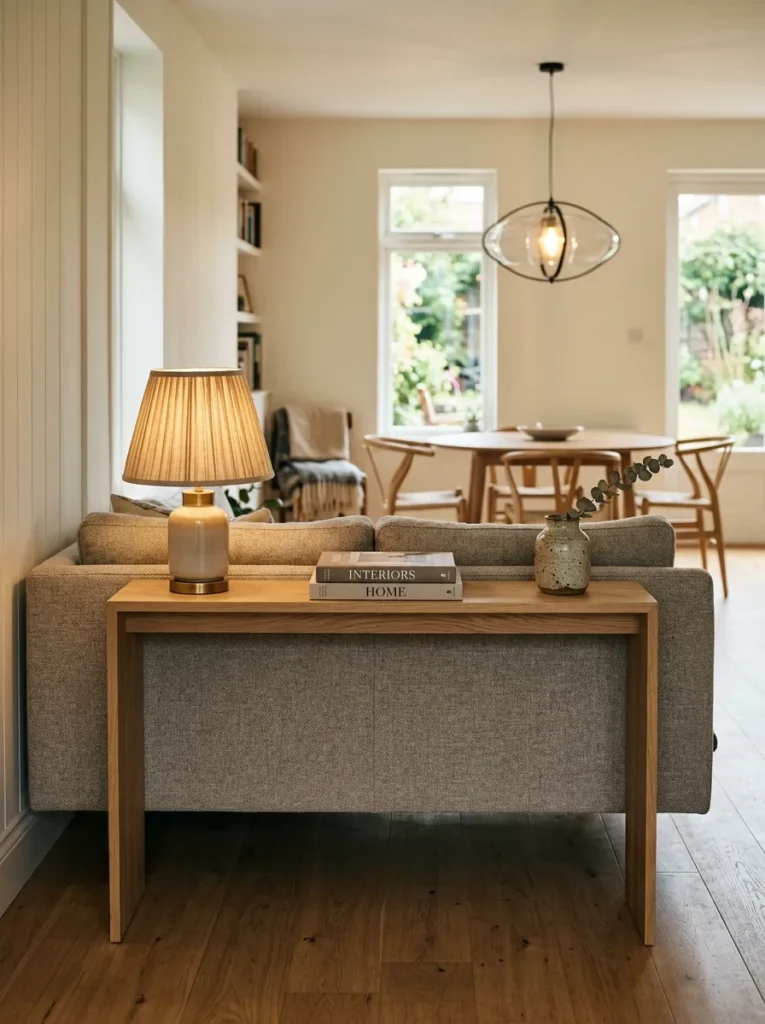
The gap between a floating sofa and the wall behind it — typically 60–120cm depending on room depth — is often left empty, which makes the sofa look marooned. A slim console table placed directly behind the sofa back activates this space without consuming it.
Practically, the console adds a surface at the point where the living zone and circulation zone meet: useful for lamps (which add a lighting layer without floor footprint), for books, and for objects that give the back of the sofa something to read against from the dining or kitchen side of the room.
The console’s height should sit level with or very slightly below the sofa back — typically 75–85cm. A console that’s too tall looks like it’s trying to be a wall.
9. Designate the Dining Zone with a Pendant at Meal Height
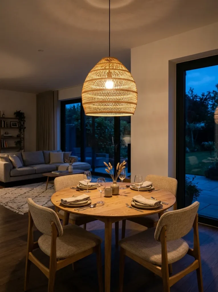
In an open-plan layout, the dining area is the most functionally specific zone and is often the easiest to define clearly — because a pendant light hung directly over the table does most of the work. The light creates a distinct pool that separates the dining experience from the surrounding space without any physical structure.
The pendant height is worth getting right. For a standard dining table (75cm height), the bottom of the shade should hang roughly 75–85cm above the table surface. Too high loses the intimate connection to the table; too low obstructs sightlines across the table for seated diners.
In very large open-plan spaces, a cluster of two or three pendants over a longer dining table makes the installation feel proportionate to the ceiling height. A single small pendant over an eight-seater table tends to look inadequate.
10. Use an Architectural Arch or Column to Mark Zone Transitions
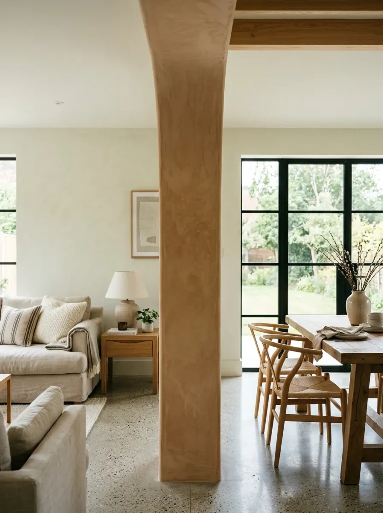
Not every open-plan space has them, but where a structural column, a half-wall return, or an existing arch sits at the boundary between zones, acknowledging and emphasising it rather than disguising it strengthens the room’s logic considerably.
A column painted in a contrasting tone, or wrapped in a complementary material (lime plaster, timber cladding, a painted accent), marks the transition between living and dining zones as something the architecture intended rather than something added afterward. An arch framing the kitchen end reads similarly.
Where these features don’t exist structurally, a partial bulkhead or a double-sided bookcase (from Idea 3) can create a similar effect — but genuine architectural features are always worth working with rather than around.
11. Choose Furniture That Suits the Ceiling Height
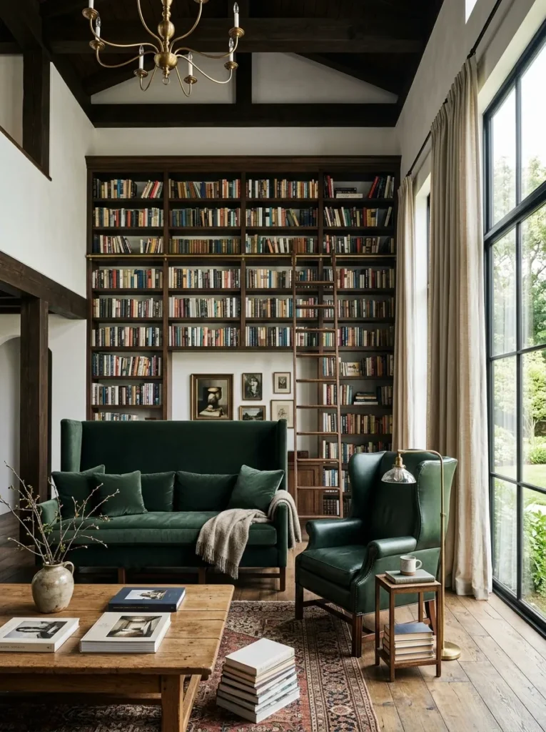
Furniture scale in open-plan rooms is more sensitive to ceiling height than in smaller rooms, because the proportional relationship between the furniture height and the ceiling is constantly visible. A conventional sofa at 85cm back height against a 3m ceiling reads differently from the same sofa in a room with a standard 2.4m ceiling.
In rooms with high or double-height ceilings, furniture can be taller without feeling oppressive — a high-back sofa, a substantial armchair, bookshelves at full ceiling height. In rooms with lower ceilings, lower-profile furniture (closer to 65–70cm sofa back height) keeps the room from feeling top-heavy.
The table is less sensitive to ceiling height variation than upholstered furniture, but pendant light scale very much is — a pendant that looks proportionate in a standard room can look like a decorative object (rather than a light fitting) in a double-height space.
12. Create a Reading Corner with a Curved Chair and Floor Lamp
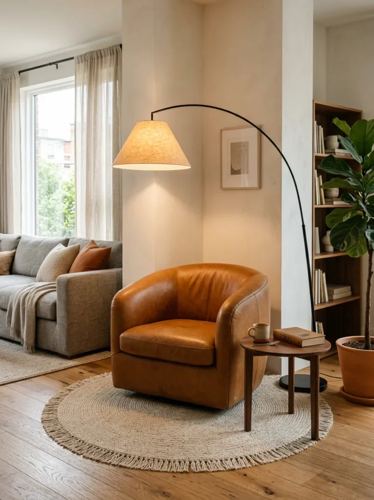
Large open-plan rooms often have an unresolved corner — space that exists because the room is large but that hasn’t been given a clear purpose. A reading corner, anchored by a curved or lounge chair and a dedicated floor lamp, turns an ambiguous area into a defined sub-zone within the living area.
The curved chair matters specifically here. In an open-plan space with rectangular furniture throughout, a rounded silhouette in the corner creates a visual soft point that reads as considered rather than placed for lack of a better option. It also faces into the room — toward the sofa and fireplace or media wall — rather than turning away, which keeps the corner engaged with the broader living zone.
This sub-zone reads best when it has its own rug — even a small one beneath the chair and lamp — which gives it a distinct floor identity within the larger living area rug.
13. Install Full-Height Curtains to Scale the Room Vertically
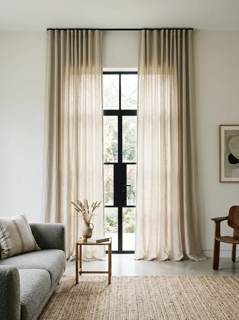
Floor-to-ceiling curtains are one of the most effective visual tools in open-plan spaces, particularly those with high ceilings or large windows. The curtain rod should be positioned close to the ceiling rather than just above the window frame — this elongates the apparent height of the window and makes the ceiling feel deliberately proportioned rather than incidentally tall.
In open-plan rooms, curtains also perform a zoning function at the room’s perimeter: they create a soft, textural wall at the window end that the eye reads as a boundary. A living area defined by a sofa on one side and floor-length curtains on the other feels more enclosed (in a comfortable sense) than one that simply ends at a bare window.
Fabric weight and opacity should suit the room’s light needs. Sheer linen panels filter light while maintaining connection to the outside; heavier lined curtains are needed where blackout or acoustic privacy matters.
14. Use a Single Cohesive Material for Open Storage Units
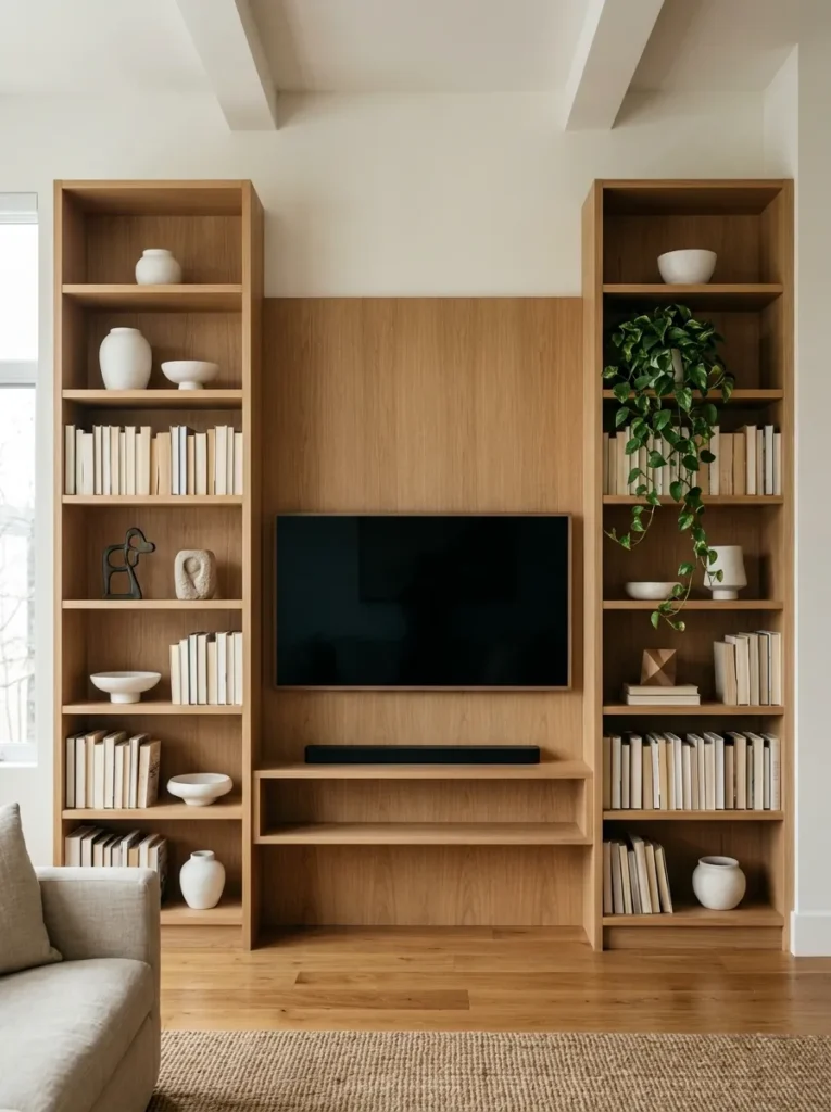
Open shelving and visible storage in open-plan living rooms can read as clutter or as considered display — the difference is usually consistency of material. Units in matching timber, or a single painted finish across freestanding pieces, read as part of the room’s architecture. Units in three different finishes read as items brought together from different places.
This applies to the objects on the shelves as much as the shelves themselves. A shelf with books in different-coloured spines, white ceramics, a plant, a brass object, and a collection of family photos of varying frame types reads as accumulation. The same shelf with books turned spine-in (showing page edges), a few deliberate objects in a consistent material range, and one plant reads as a considered moment.
Open shelving in open-plan spaces is more visible from more angles than in a conventional room, so the tolerance for visual noise is lower.
15. Add a Media Wall That Spans the Full Width of the Living Zone
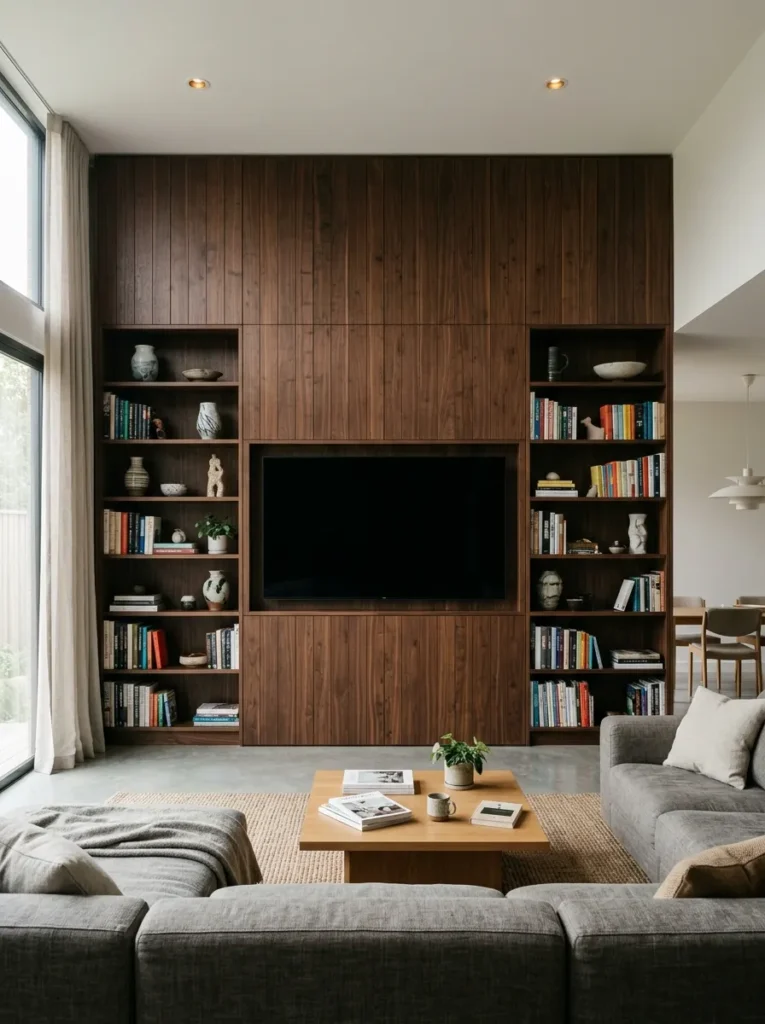
A media wall — rather than a freestanding TV unit or wall-mounted screen with nothing around it — anchors the living zone’s focal point and gives the zone a solid visual terminus. In an open-plan space, a screen floating on a bare wall can look isolated; a full-width media wall treatment (timber panelling, built-in shelves on either side, or a painted recess in a contrasting tone) gives the screen a frame that relates to the room’s proportions.
The width of the media wall should relate to the sofa width or the full living zone width — not just the screen size. A panel that’s barely wider than the TV itself looks like a feature that wasn’t finished.
Practical note: built-in media walls require planning around cable management from the start. Retrofitting cable channels into walls afterward is straightforward but easily forgotten until it’s inconvenient.
16. Use Plants at Multiple Heights to Soften Scale
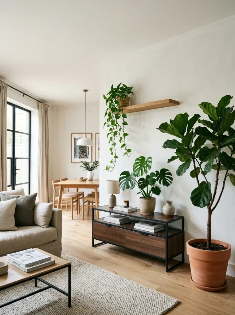
Very large open-plan rooms can feel slightly cold — the architecture is generous but there’s nothing to interrupt or soften it. Plants at three distinct heights — a floor plant (1.2m+) near the living zone edge, mid-height specimens on the console or sideboard, and small trailing plants on open shelving — create vertical rhythm without consuming usable floor area.
The floor plant matters most. A fiddle leaf fig, olive tree, or large monstera at the junction between living and dining zones acts as a soft visual divider — not a barrier, but a presence that the eye registers as marking a transition. It works where a bookcase might feel too structured and a rug change alone isn’t enough.
Plants don’t require natural light directly at the position they’re placed, but they do need adequate light within the room. Assess actual light levels before placing a large specimen in a corner that happens to be visually useful but inadequately lit.
17. Choose a Dining Table Length That Fits the Open Plan, Not Just the People
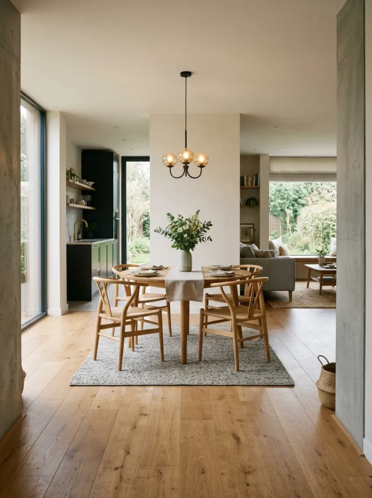
In a standalone dining room, the table can fill the room to the maximum usable extent. In an open-plan space, a table that’s very long relative to the dining zone makes the whole plan feel as though the dining function has taken over — the proportional relationship between table and surrounding space matters.
The general principle for open-plan dining areas is to leave at least 90–100cm of clearance around the table on all sides where chairs are pulled out, and at least 75cm on the side facing the kitchen or circulation route. In practice, this constrains table length considerably in smaller open-plan footprints.
Round or oval dining tables often work better in open-plan spaces than rectangular ones for this reason: their absence of corners reduces the minimum clearance required, and their shape reads as more sociable when the table is viewed as part of a larger room rather than the room itself.
18. Paint the Ceiling a Tone Deeper Than the Walls
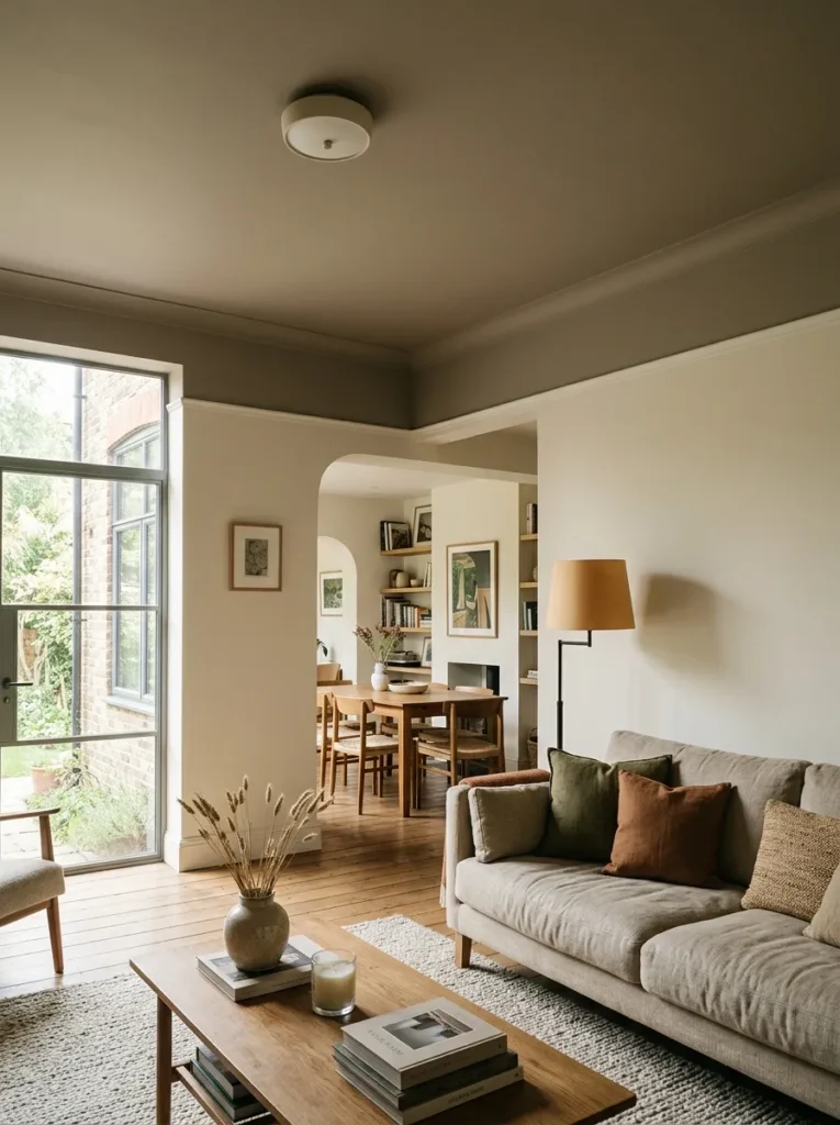
In open-plan spaces with standard or modest ceiling heights (2.4–2.7m), painting the ceiling the same colour as the walls or in a stark contrast (bright white against a coloured wall, or vice versa) tends to emphasise the ceiling plane as something separate from the room. Painting the ceiling in a tone one or two shades deeper than the wall colour creates a subtle effect of visual enclosure — the room feels like it has a lid, which reads as considered rather than incidentally left white.
This approach works particularly well in open-plan spaces that are decorated in warm or mid-toned colours, where the ceiling shade reads as a natural continuation of the palette. In very light or pale rooms, the differentiation is subtler and may not be worth the effort unless the ceiling height genuinely needs to feel reduced.
19. Design for Acoustics, Not Just Aesthetics
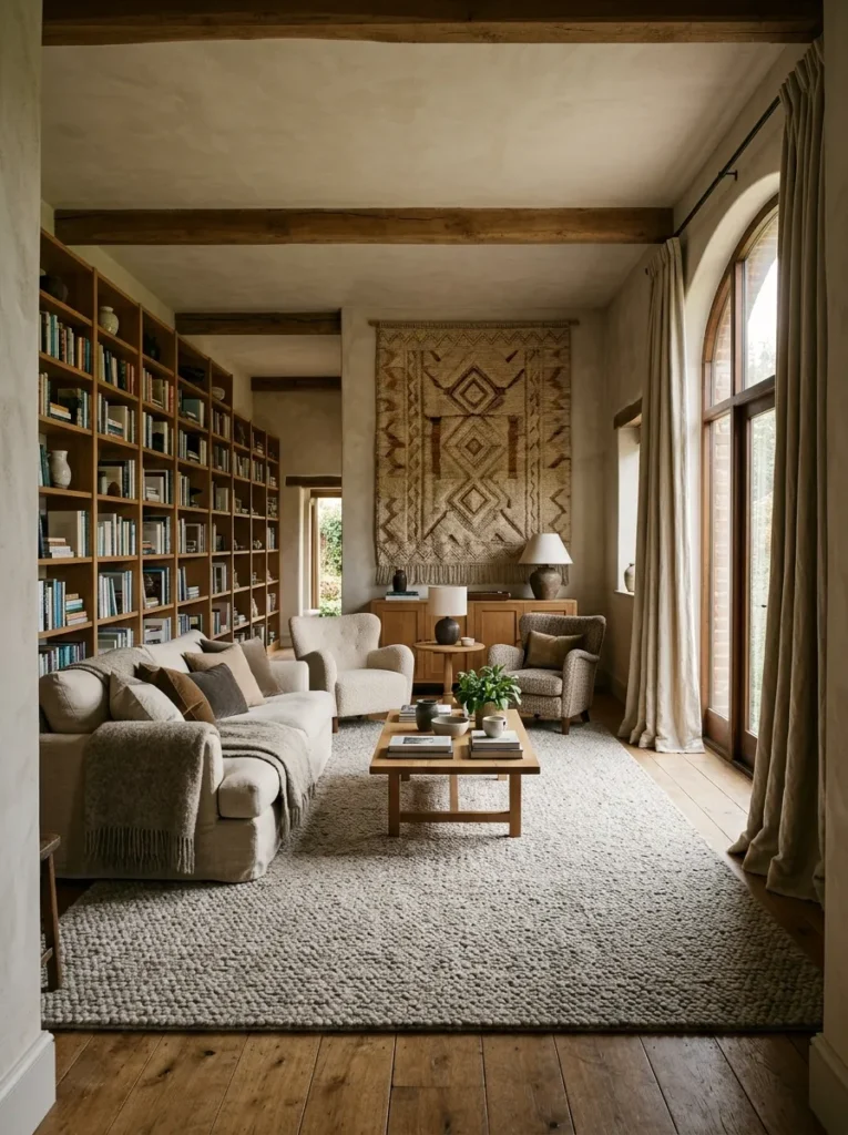
Open-plan spaces are acoustically challenging in ways that conventional rooms aren’t. Hard flooring, high ceilings, and large continuous surfaces create reverberation — the sense that sound bounces around the room rather than being absorbed. This is less of a design issue and more of a liveability issue that many articles on open-concept living rooms don’t address.
Soft furnishings — an oversized rug, upholstered seating with depth, full-length curtains, cushions in heavier woven fabrics — all absorb sound and reduce reverb. A large open-plan room with polished concrete floors, a leather sofa, and bare walls will sound quite different from the same room with a jute rug, upholstered seating, linen curtains, and a bookcase full of books.
The acoustic quality of the room affects how the space feels to spend time in, and it’s worth considering alongside the visual decisions rather than noticing only after everything is installed.
What to Decide Before You Arrange the Furniture
Open-plan spaces reward planning more than any other room type, because the foundational decisions constrain (or enable) everything else. Before purchasing furniture or committing to a layout:
Map the zones on the floor plan. Decide where the living, dining, and kitchen/cooking functions will sit and how large each zone needs to be. In most open-plan spaces, the living zone is the largest and most flexible; the dining zone should be proportionate to actual use (a household that rarely hosts a full dinner party doesn’t need a six-seater table dominating a third of the floor).
Identify the focal points. Each zone benefits from a clear focal point — a fireplace or media wall in the living area, a pendant over the dining table. Know where these are before placing furniture around them.
Plan the lighting circuit. Open-plan lighting is harder to change after the fact than in conventional rooms. If the space is being renovated, getting multiple lighting circuits (so living and dining zones can be lit independently) is worth the upfront cost.
Consider the acoustic implication of your flooring choice. Polished concrete and tile amplify sound; timber and large rugs absorb it. This isn’t a reason to avoid hard floors, but it is a reason to plan the soft furnishings with acoustic absorption in mind.
Final Thoughts
Open-concept living rooms reward considered decisions more than any other interior. The freedom they offer — no walls, continuous space, natural light uninterrupted — is also what makes them unforgiving of the easy defaults: furniture pushed to walls, rugs too small, lighting left at one level, zones undefined.
If you’re starting fresh, the layout decisions (zone placement, rug sizing, sofa position) should come first. Lighting comes second, because its circuit needs to be planned before walls are closed. Everything else — furniture choice, colour palette, materials, styling — can be adjusted after those foundations are right.
Start with the two or three ideas from this list that solve a specific problem your space has, rather than trying to apply all 19 at once. Save the ones worth returning to, and revisit the practical sections when you’re closer to making decisions.