19 Contemporary Living Room Ideas That Feel Modern and Relaxed
Contemporary gets mistaken for cold more often than any other style, mostly because most contemporary living room ideas lean so hard into sharp lines and monochrome palettes that the room ends up feeling like a showroom rather than somewhere anyone actually wants to sit down. That’s a design failure, not a requirement of the style itself. A genuinely relaxed contemporary room comes down to specific choices around form, material contrast, and restraint — the decisions that keep clean lines from tipping into sterile. This list covers the ones that actually do that work, not the generic advice about “keeping it minimal” that every other article repeats. Some of these ideas are simple swaps. A few will mean rethinking the whole layout.
1. Choose a Curved, Low-Profile Sectional Over a Boxy One
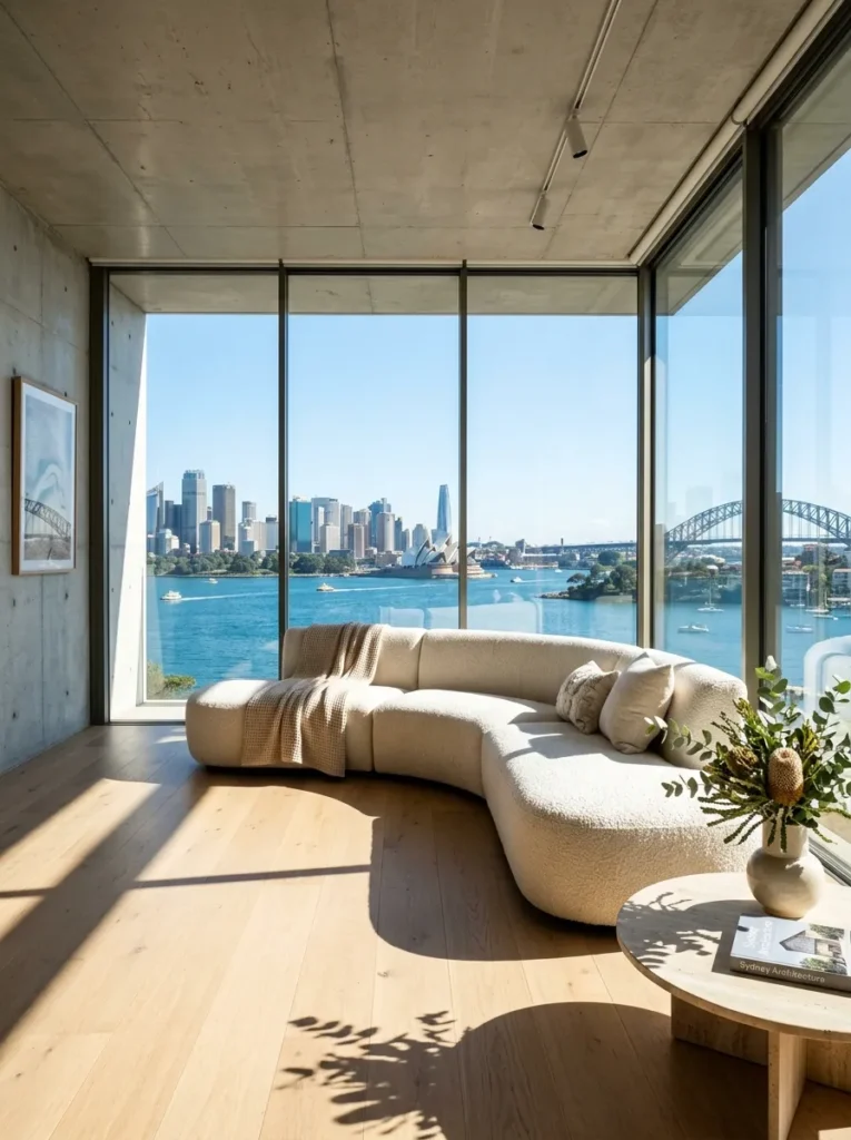
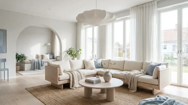
A rectangular sectional with sharp 90-degree corners photographs fine but occupies a room the way a piece of office furniture does. A curved sectional, low to the ground with a seat height under 40 centimetres, softens the entire footprint of the seating area without sacrificing the actual square footage of cushion space. Most people assume curved furniture means less seating. It doesn’t — it just means the room stops looking like it was assembled from a catalogue diagram.
2. Anchor the Room With a Sculptural Stone Coffee Table
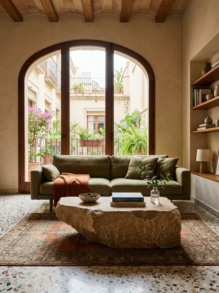
A glass or thin-metal coffee table disappears visually, which sounds like a benefit until the room needs an anchor and has nothing to offer. A sculptural coffee table in honed travertine or a single block of stone gives the seating area real visual weight, the kind that makes the rest of the furniture feel arranged around something instead of just placed in a row. This is the decision that changes everything about how considered the room reads from the doorway.
3. Conceal the TV Behind a Sliding Wood Panel
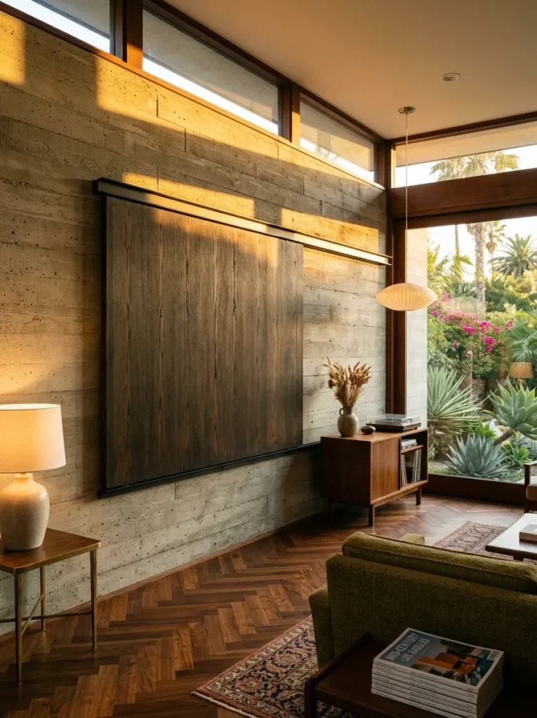
A black rectangle mounted on the wall is the fastest way to undercut every other design choice in a contemporary living space, no matter how good the rest of the room looks. A sliding panel in smoked oak or fluted wood, mounted on a track in front of the screen, closes over the TV entirely when it’s off and slides open with one motion when it’s on. It costs more than a standard mount. It’s also the single change most likely to make the room feel like a living space rather than a display for a screen.
4. Mix Matte Black Hardware With Warm Brass, Not One or the Other
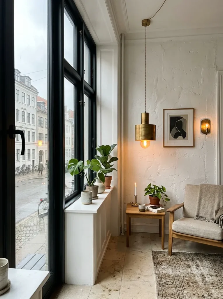
Committing every metal finish in the room to a single tone — all black, all brass, all chrome — is the safer choice and almost never the more interesting one. Pairing matte black door and window hardware with warm brass on lighting and accent pieces gives the room a sense of having been collected over time rather than ordered from one finish catalogue. Most people avoid mixing metals because they’re worried it’ll clash. Done with intention, it reads as the opposite.
5. Open the Wall With Floor-to-Ceiling Sliding Glass
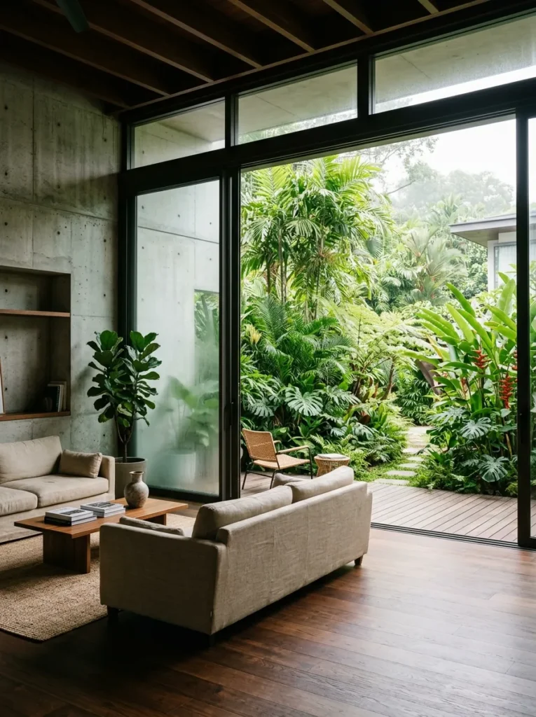
A single window, however large, still reads as a hole in a wall. Floor-to-ceiling sliding glass, ideally opening onto a patio or garden, removes the boundary between the living room and whatever’s outside it entirely, which is the fastest way to make a contemporary space feel expansive regardless of its actual square footage. This is a significant renovation, not a weekend project, and it’s worth it if the layout allows for it at all.
6. Hang One Sculptural Pendant, Not a Symmetrical Pair
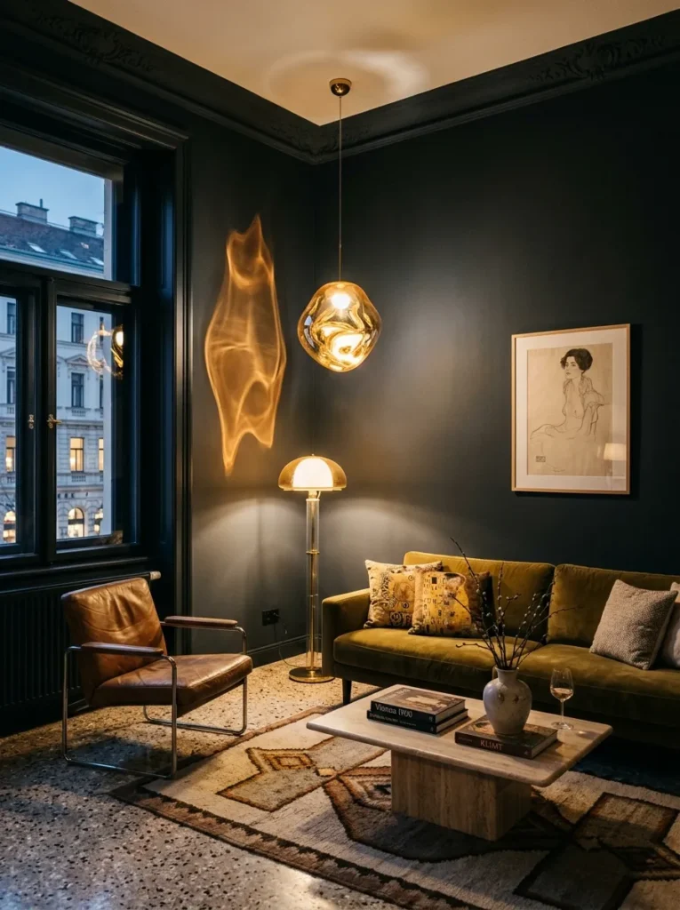
Symmetrical lighting reads as formal, which works against the relaxed feeling this whole list is chasing. A single oversized sculptural pendant, in blackened steel or hand-blown glass, hung slightly off-center above the seating area, gives the room a focal point without the stiffness that a matched pair of fixtures always introduces. Hang it low enough to feel intimate — the base of the fixture should sit no higher than 160 centimetres from the floor in a standard ceiling height.
7. Build the Palette Around Tonal Layering, Not Multiple Colors
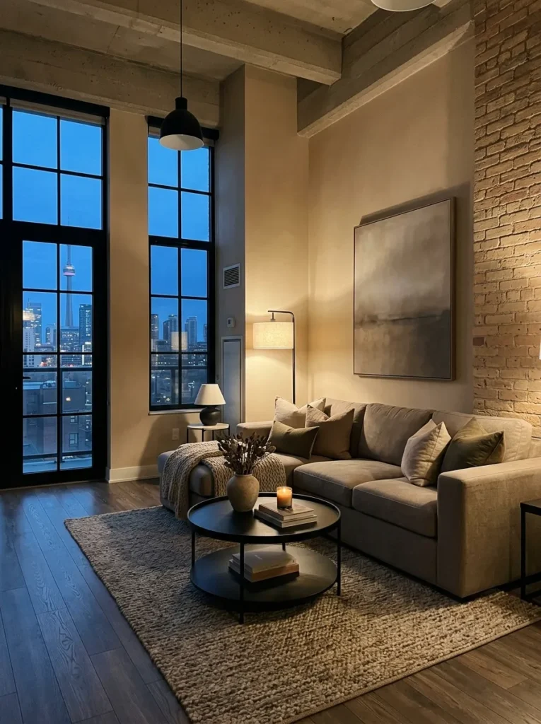
A contemporary living room design that leans on three or four different accent colors starts to look busy no matter how expensive the furniture is. Staying within one tonal family — warm greiges layered with taupe, sand, and a single deeper brown — and varying the texture instead of the hue gives the room depth without the visual noise multiple colors introduce. This is a harder discipline than picking a palette off a mood board, and it’s the reason certain rooms photograph as calm while others photograph as cluttered.
8. Choose a Floating Media Console Over a Floor-Standing One
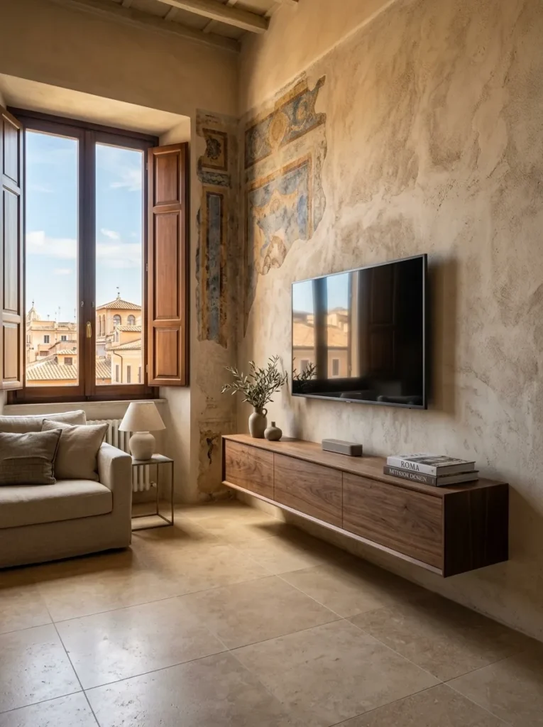
A media console sitting directly on the floor visually anchors the entire wall to the ground, which makes the room feel heavier than it needs to. A floating console, mounted 20 to 25 centimetres above the floor with no visible legs, keeps the wall feeling open underneath it and makes the floor easier to clean, which matters more than it sounds like it should once you’ve lived with it for a year.
9. Install a Linear, Flush-Mounted Fireplace
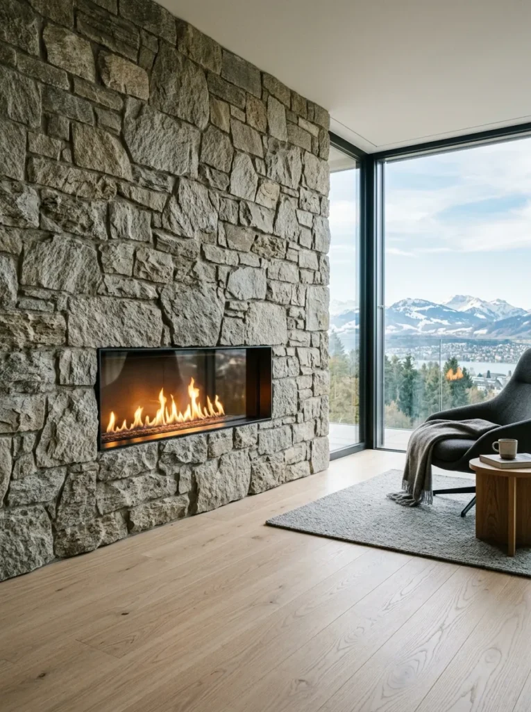
A traditional mantel and hearth can feel like a mismatch dropped into an otherwise clean-lined room. A linear fireplace, flush-mounted into the wall with no surrounding mantel, reads as an architectural feature rather than a decorative addition, and gives the seating area the same focal point a traditional fireplace provides without competing with the room’s other lines. That’s not just a style preference — a flush installation also frees up wall space above it for art or shelving that a mantel would otherwise block.
10. Put the Room’s Lighting on Three Separate Circuits
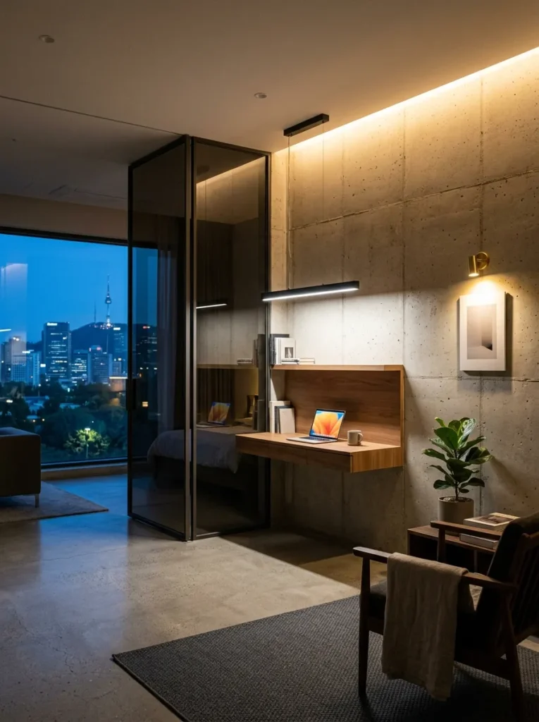
A single switch controlling every light in the room means the space only ever has one mood: fully on. Splitting ambient overhead lighting, task lighting near reading chairs, and accent lighting on artwork or shelving onto three separate circuits lets the room shift from bright and functional during the day to layered and relaxed in the evening. Most contemporary rooms get the furniture right and completely skip this step, which they will regret the first time they try to unwind in a room lit like an office.
11. Use a Built-In Shelving Wall as a Room Divider
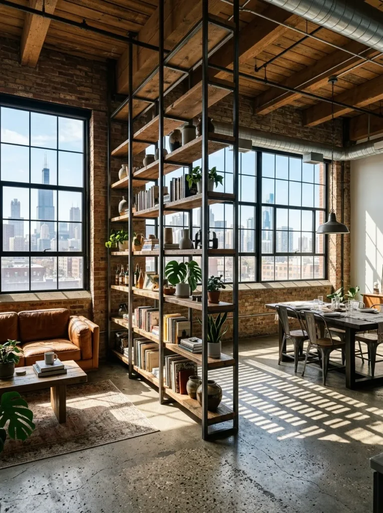
In an open-plan layout, a full-height shelving unit — open on both sides, holding books and objects rather than solid doors — can define the living room’s boundary without closing it off from an adjacent dining or kitchen space. This works considerably better than a half-wall or a change in flooring alone, since it gives the eye something to register as a boundary from every angle in the room. Style it with visible gaps rather than filling every shelf, or it starts to look like storage rather than architecture.
12. Hang One Oversized Abstract Painting, Not a Grouped Set
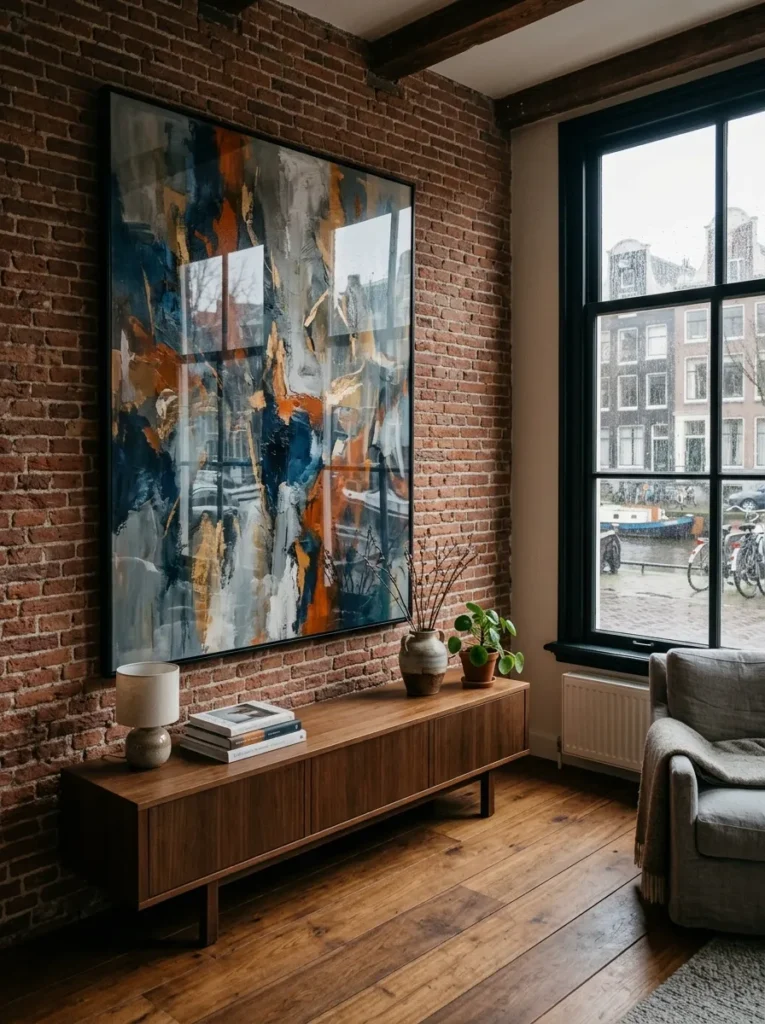
A cluster of smaller framed pieces reads as busy against a contemporary room’s clean lines. One large-scale abstract painting, at least 150 centimetres across, does more with a single gesture than five smaller works arranged in a grid ever could. Scale is the entire point here. A piece that feels slightly too big for the wall is almost always the correct size.
13. Choose a Geometric Rug to Define the Seating Zone
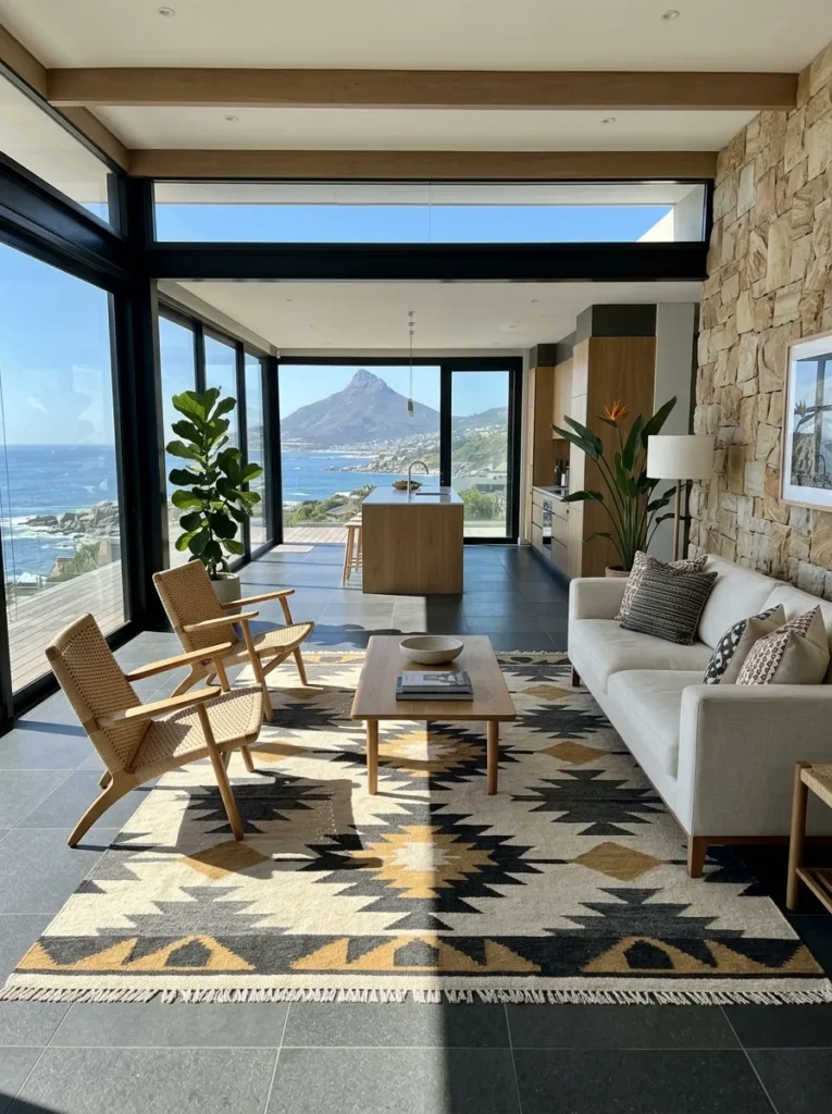
In an open floor plan, furniture alone doesn’t always read as a distinct zone from across the room. A rug with a subtle geometric pattern — not busy, just enough structure to distinguish it from a plain weave — visually contains the seating area and signals where one part of the room ends and another begins. Size it so all the front legs of the furniture sit on the rug; anything smaller makes the whole arrangement look like it’s floating.
14. Add an Arc Floor Lamp Instead of a Table Lamp Beside the Sofa
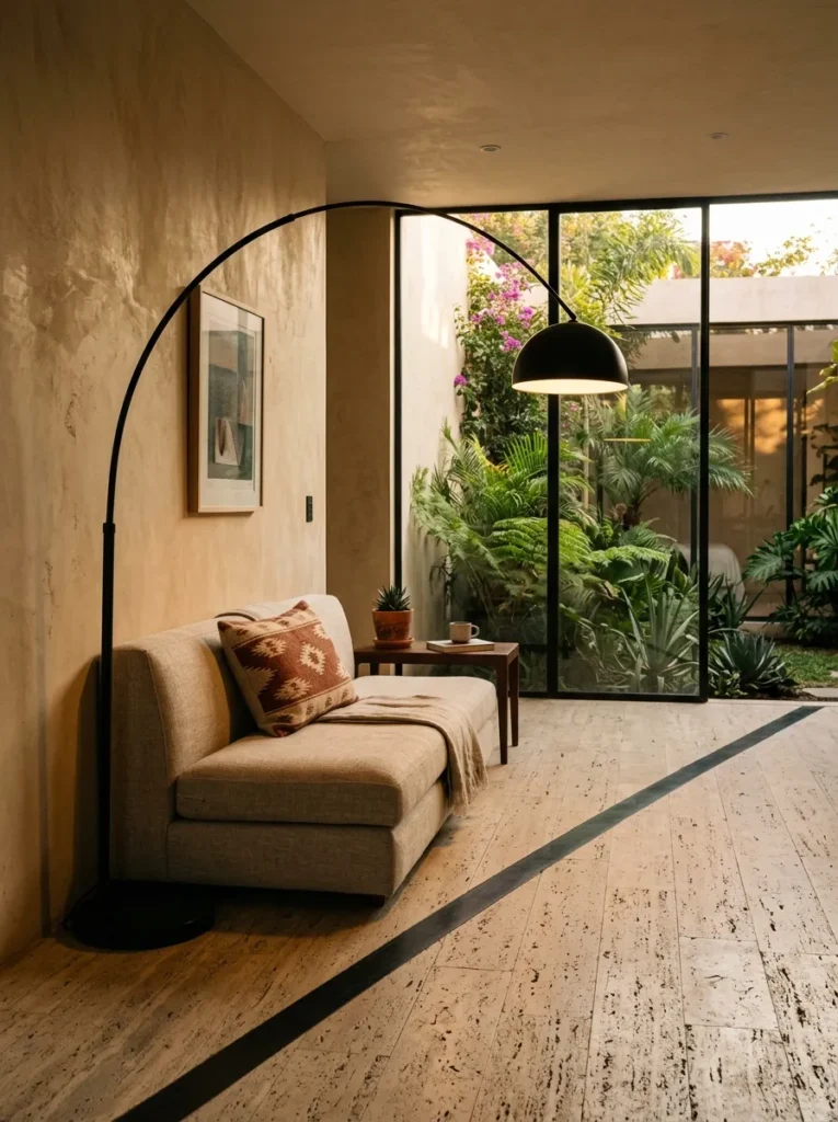
A table lamp needs a side table, and a side table takes up floor space that a low-profile contemporary sofa often doesn’t have room to spare. An arc floor lamp, based off to the side and curving its light out over the seating area, delivers the same reading light without needing a table underneath it at all. This is a small footprint solution to a problem most people solve by squeezing in furniture that doesn’t actually fit.
15. Build a Window Seat With Storage Underneath
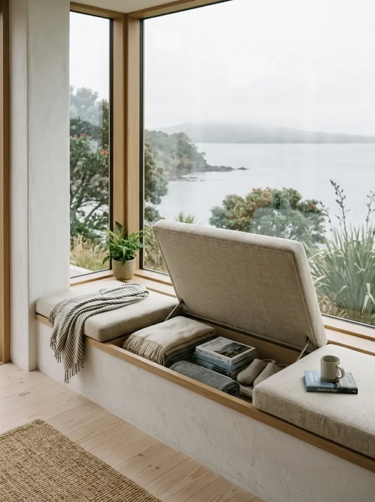
A plain windowsill is wasted potential in a room that’s short on both seating and storage. A built-in window seat, upholstered in a durable weave and hinged to lift for storage underneath, adds a second seating option and somewhere to hide blankets or games without adding a single additional piece of furniture to the floor. This works particularly well under a large window that would otherwise just be empty wall space at floor level.
16. Cluster Plants at Varying Heights Instead of One
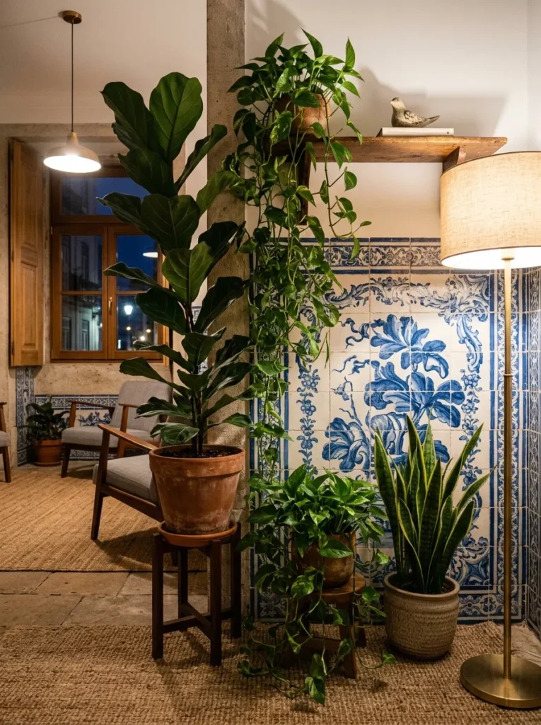
A single plant in the corner reads as an afterthought in a room this size. Grouping three plants of different heights — a floor-standing fiddle-leaf fig, a mid-height snake plant, and a trailing pothos on a shelf — introduces the organic irregularity a contemporary room’s hard lines need, and it does it with considerably more presence than one plant standing alone ever manages. Keep the pots in a consistent material, though, or the cluster starts to look accidental instead of arranged.
17. Mix Leather, Bouclé, and Wool Across the Cushions
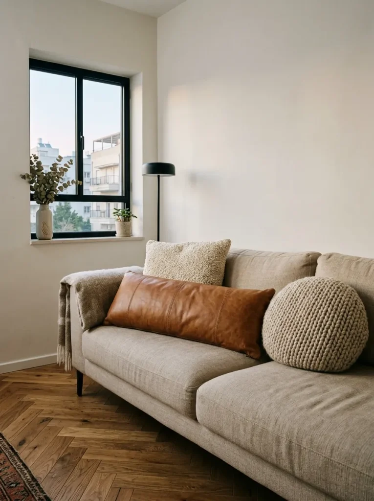
A sofa dressed entirely in matching cushions from the same set looks like a showroom display, not a room someone actually lives in. Mixing a leather lumbar cushion, a bouclé square, and a wool-knit round cushion across the same sofa gives the seating area textural depth that a matched set never achieves. Keep the color story tight even as the materials vary — this is a texture decision, not an excuse to introduce five new colors at once.
18. Choose a Low, Wide Console Table Behind the Sofa
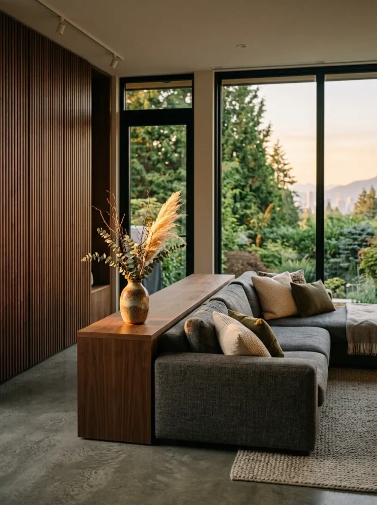
A narrow console table behind a sofa looks like an afterthought squeezed into leftover space. A low, wide console — ideally close to the same length as the sofa itself — gives the back of the room a genuine surface for lamps, books, or a vase, and it visually grounds the sofa from behind the same way the stone coffee table grounds it from the front. Most people skip this piece entirely in a relaxed living space, then wonder why the back of the sofa always looks unfinished.
19. Leave One Corner of the Room Deliberately Empty
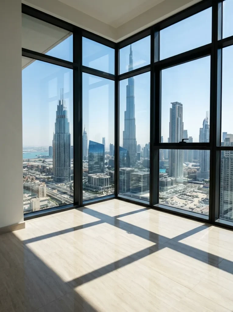
Here’s the one most lists get backwards: the instinct in a large contemporary room is to fill every corner with a chair, a plant, or a sculpture, since empty floor space can feel like a missed opportunity. A room with one corner left genuinely empty — no furniture, no object, just floor and wall — reads as more considered and more relaxed than one where every inch has been assigned a purpose. Most people can’t resist filling the space. The better move, and the harder one, is leaving it alone.
Final Thoughts
Nineteen ideas is more than any single living room needs applied all at once, and cramming every change into one renovation usually leaves the room feeling overworked instead of relaxed. Start with the furniture decisions — the sectional, the coffee table, the console — since those set the tone for everything else in the room and are the hardest to change later. From there, move to lighting and the smaller layering details, which cost less but do just as much to shift the mood of the space. The best contemporary living room ideas were never really about achieving a perfectly clean look; they’re about knowing which few decisions create warmth without undoing the clean lines that drew you to the style in the first place. Start with the biggest piece in the room. Everything else gets easier to place after that.
Save these contemporary living room ideas for your next home refresh.