21 Kitchen Shelf Styling Ideas That Feel Designer-Made
Open kitchen shelves are one of the most photographed features in home design and one of the most consistently difficult surfaces to style well. They look effortless in editorial photos and tend to look cluttered or chaotic in practice — because what looks right in a controlled shoot and what holds up across daily use, dust, cooking steam, and changing seasons are genuinely different things.
The gap between a shelf that looks designed and one that looks decorated comes down to a few principles that most styling advice skips: knowing how many items is too many, understanding which objects belong in a kitchen environment and which deteriorate quickly near heat and grease, and building an arrangement around visual hierarchy rather than filling the available space. These 21 kitchen shelf styling ideas work through every meaningful variable — object selection, material, proportion, negative space, shelf composition, and the practical realities of a working kitchen — with enough specificity that you can apply them to your actual shelves rather than an aspirational one.
1. Start by Removing Half of What’s Currently on the Shelf
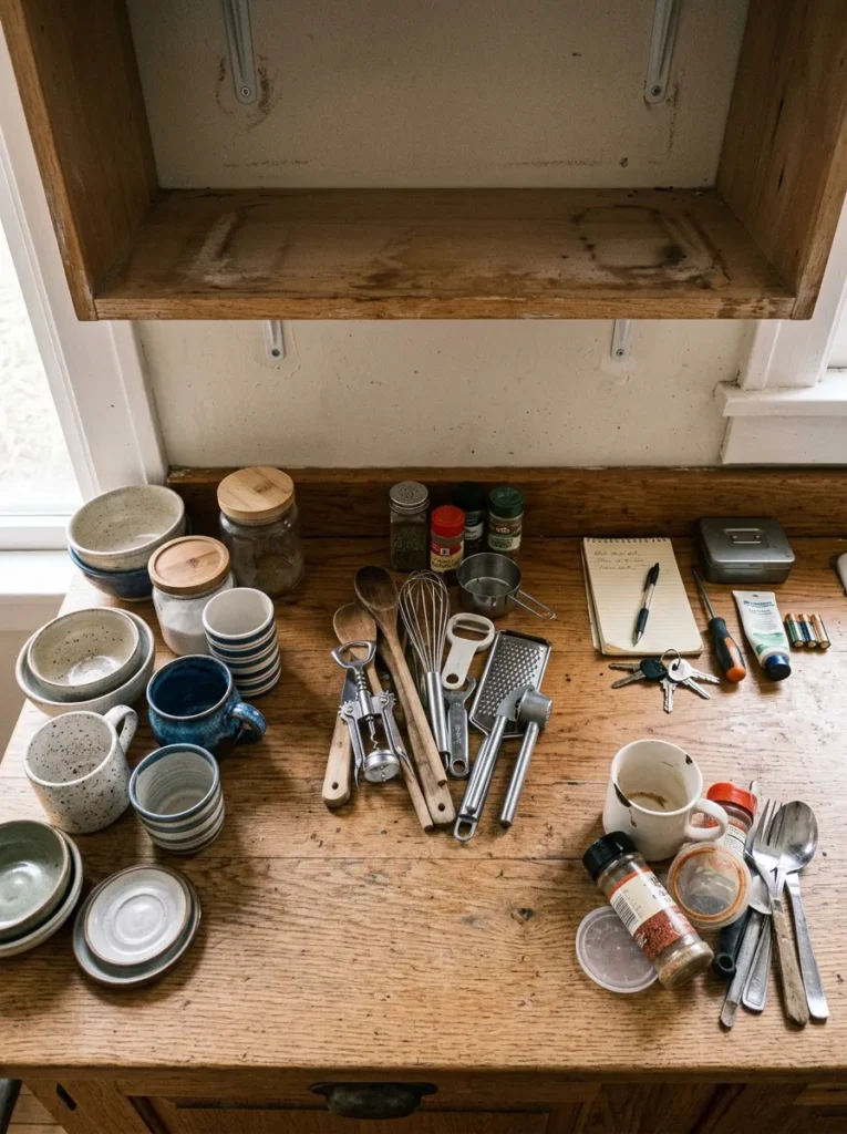
The first styling move on any kitchen shelf is subtraction rather than addition. Most shelves look overwhelming because they contain too many items at similar visual weights competing for attention simultaneously. Before any object is rearranged, take everything off and lay it on the counter. Then return only what would survive this question: does this earn its place visually and practically on a kitchen shelf?
Removing half — sometimes more — of what was originally there is not failure. It’s editing, and editing is the difference between a shelf that looks curated and one that looks like a storage solution. After removing the obvious departures, step back from the empty or near-empty shelf. The negative space itself has value. The objects that return should feel like they’re being placed into that space deliberately, not stuffed back in because the shelf needs to be full.
2. Build Every Shelf Around a Triangle of Heights

The fastest way to move a shelf arrangement from flat to composed is to establish a clear triangle of heights across the shelf — a tall element at one end, a shorter mid-height element toward the center, and a low element at the other end or the front edge. This creates diagonal movement that the eye follows naturally rather than reading the shelf as a static horizontal line.
The triangle doesn’t need to be precise or symmetrical. An arrangement where a tall ceramic pitcher sits left of center, a medium stack of plates rises in the middle, and a small bowl sits at the front right creates the same triangulated visual movement as a perfectly graduated staircase — but more naturally. What matters is that the shelf has a clear hierarchy: something that commands height, something that bridges, and something that grounds.
3. Reserve the Shelf Depth for Front-and-Back Layering

Shallow shelves have one visual plane; deeper shelves have two. On a shelf with 10 or more inches of depth, arranging everything flush against the back wall wastes the front half of the display space and makes the shelf look flat regardless of how interesting the objects are. Pulling a few items to the front edge — a small bowl, a single ceramic object, a book lying flat with something resting on it — creates depth and dimensionality that photographs well and reads as composed from across the kitchen.
The front-and-back layering works best when the front objects are noticeably different in scale from those behind them: small and low in front, taller and larger behind. This scale difference creates visual separation between the two planes and makes the arrangement look genuinely three-dimensional rather than like two rows of things placed at different depths.
4. Group Items in Odd Numbers Rather Than Pairs
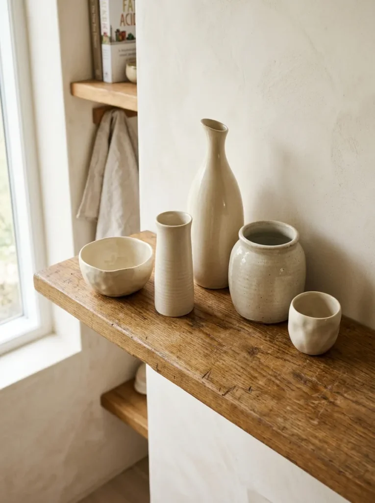
Even-numbered groupings create symmetry, and symmetry in small object arrangements tends to read as formal or static — which is rarely the quality kitchen shelves are aiming for. Odd numbers — three ceramics of different heights and widths, five cookbooks arranged as a group, a cluster of seven small spice jars — create the asymmetry and movement that makes an arrangement read as collected rather than arranged.
This doesn’t mean every grouping on the shelf needs to be odd — a pair of matching objects can work as a specific compositional choice, particularly when used to create a deliberate balance point within a larger asymmetric arrangement. But the tendency to place two of everything — two plants, two identical vases, two matching ceramics at each end — produces a shelf that reads as decorated rather than styled.
5. Choose Ceramics in One Consistent Color Family

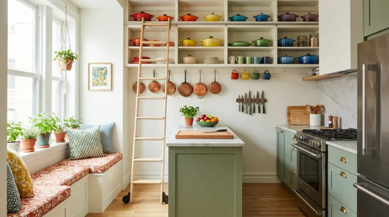
The material choice that does the most work on a kitchen shelf, with the least effort, is a consistent ceramic palette. A shelf where every ceramic piece — bowls, cups, pitchers, lidded jars, small plates — belongs to the same color family (all earthy neutrals, all cream and white, all deep greens and blues) reads as a collected whole rather than a random accumulation. The individual pieces don’t need to match each other; they need to share a color relationship.
This is also the most practical approach for kitchen ceramics specifically: a collection built over time in a consistent palette looks intentional even when it was assembled gradually from different sources. The easiest palette to work with in most kitchens is warm neutrals — cream, sandy beige, warm white, oatmeal — which suits almost every kitchen style from contemporary to farmhouse and relates naturally to natural wood shelves.
6. Use One Large Statement Ceramic as the Shelf’s Anchor
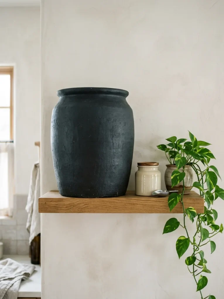
Every shelf benefits from at least one object with enough scale and visual weight to anchor the rest of the arrangement. In a kitchen, a large ceramic pitcher, a wide-mouthed crock, an oversized bowl, or a sculptural vase in a distinctive material or color does this most reliably. The statement piece should be the tallest or widest object on the shelf — the point the eye arrives at first and departs from before moving to the smaller objects around it.
The statement piece does not need to be expensive. A single well-chosen piece from a ceramic market, a vintage shop, or a small potter’s studio can outperform a shelf of matching retail ceramics in the quality it communicates. What makes it work is proportion — large enough to hold its own against the shelf width — and material quality that bears close inspection: a matte glaze with variation, a handmade form with slight irregularity, or a color with depth.
7. Add One Living or Dried Plant Element at the End of Each Shelf
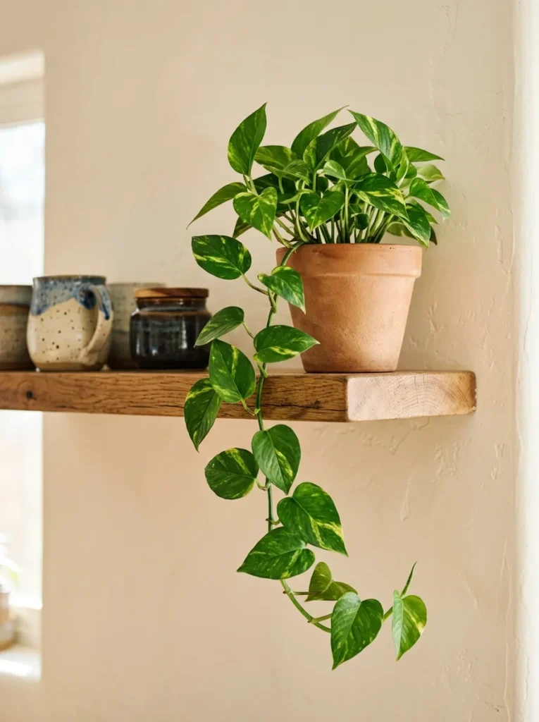
A kitchen shelf without any organic material tends to read as still and slightly static — all hard surfaces, no movement. One living plant or dried organic arrangement at the end of a shelf (or at an interior break point in a longer shelf run) introduces a material that behaves differently from everything else: it catches light differently, it has irregular form, and in the case of a trailing plant, it creates the gentle downward movement that pulls the eye to the shelf’s edge and below.
The species selection matters for kitchen environments. Plants in direct proximity to the cooktop experience heat and grease exposure that can deteriorate most houseplants. Trailing pothos and heartleaf philodendrons are among the most tolerant of kitchen conditions and can be positioned at the shelf end away from the heat source. Dried arrangements — pampas, eucalyptus bundles, dried herbs — are the most maintenance-free option and work well on shelves where the aesthetic is organic and textured.
8. Stack Dishes Vertically in a Plate Stand Rather Than Flat

Plates and bowls stored flat in stacks occupy significant shelf height and create a functional mass that reads as storage rather than style. Standing plates and shallow bowls vertically in a plate stand or a simple wooden rack — so the decorated or glazed face is visible from the front of the shelf — transforms functional dishware into a display element without requiring any additional decorative objects.
The plate’s face tells the visual story when it’s vertical; the underside of a stacked plate tells nothing. A set of handmade ceramic plates with a beautiful glaze, or a collection of vintage patterned plates with related colors, reads as a genuine display when stood vertically and provides the everyday accessibility of open storage simultaneously. The rack itself should be minimal — thin wire, simple wood, or black iron — so it supports the plates without competing visually with them.
9. Paint or Tile the Shelf Back Wall in a Contrasting Tone

The back wall of an open shelf — the surface objects sit in front of — is one of the highest-leverage styling decisions available without purchasing any new objects. Painting the back wall a different tone than the surrounding kitchen walls creates a defined frame for the shelf display and makes objects of any color or material read more distinctly because they’re viewed against a deliberate backdrop rather than a continuation of the surrounding wall.
The contrast doesn’t need to be dramatic to be effective. A shelf with warm white walls and a back wall painted in a warm clay, a soft sage, or a deep charcoal each produces a very different atmospheric result, and any of them improves the readability of the objects in front of it. Tile applied to the back wall — particularly in a material that extends the kitchen’s backsplash onto the shelf — is the most finished and durable version of this idea.
10. Organize Books With Spines Out, Grouped by Color

Cookbooks and culinary reference books on a kitchen shelf provide height, visual texture, and practical justification for taking up shelf space. The arrangement of spines — whether mixed randomly, organized by subject, or grouped by the color of the spine — determines whether the books read as a collected, curated element or as a pile that happens to be horizontal.
Organizing by spine color is the most visually effective approach for kitchen shelves where the books are primarily decorative context for the display rather than frequently referenced: all the warm-toned spines grouped together, separated from the dark spines by a ceramic object or small plant. For shelves where the books are genuinely used, organizing by subject and keeping the group to a consistent width so it reads as a composed section of the shelf rather than a random collection produces the best balance of function and appearance.
11. Mix Open Storage With One Styled Section Per Shelf

On a shelf that serves a genuine storage function — holding everyday dishes, glasses, or pantry items — trying to make the entire shelf look styled creates a tension between functionality and appearance that neither serves well. A more sustainable approach divides each shelf into two zones: an organized storage section where like items are grouped consistently, and one intentionally styled section that holds objects chosen for their appearance rather than their function.
This division works because it frames the constraint honestly: the kitchen shelf is partly storage and partly display. The styled zone provides the visual interest and design intention; the storage zone remains accessible and usable without the constant maintenance that trying to make pasta boxes look like a design choice requires. The boundary between the two zones can be defined by a material shift, a height difference, or simply a clear visual break where the utilitarian items end and the display objects begin.
12. Use a Wooden Cutting Board or Tray as a Styling Base

A large wooden cutting board, a marble slab, or a slate tray propped vertically or lying flat on a kitchen shelf provides a material anchor that makes everything around it look more composed. The board doesn’t display anything — it simply provides a rectangular or round plane of natural material that grounds the surrounding objects and creates a visual backstop for smaller items placed in front of it.
A cutting board leaned against the back wall behind a grouping of ceramics or a small plant arrangement creates the same layering effect as a piece of art behind a console table — the vertical element behind gives the smaller objects in front a visual context rather than leaving them floating at the shelf’s back edge. It also communicates that the shelf belongs to a kitchen without resorting to obvious signaling: a cutting board is functional, material-rich, and visually appropriate without being decorative in a forced way.
13. Keep Glassware Near the Light Source for Maximum Visual Effect

Glassware — drinking glasses, carafes, glass pitchers, decanters — is among the most visually effective material on a kitchen shelf specifically because it interacts with light in a way that ceramic, wood, and metal don’t. When positioned on a shelf that receives natural light from a nearby window, glassware refracts and reflects that light in ways that bring the shelf to life. The same glasses on a dark, unlit shelf simply look like storage.
The practical consideration compounds the visual one: glassware near natural light picks up condensation and watermarks less quickly than glassware stored in enclosed spaces, and the light that passes through or reflects off the glass also reveals immediately whether pieces need washing. Clustering several related glasses together — a set of the same stem, or several different clear glass vessels in compatible heights — creates a light-gathering zone on the shelf that photographs beautifully and looks genuinely considered.
14. Let One Shelf Stay Almost Empty as a Visual Rest

The impulse when styling any shelf is to fill it — to use all available space because leaving space feels like wasted opportunity. The reverse is often true: a shelf that’s 70 to 80 percent filled reads as curated; one that’s 95 percent filled reads as cluttered regardless of the quality of what’s on it. One shelf in a multi-shelf arrangement that holds only one or two objects, or even remains intentionally bare, provides the visual rest that makes the surrounding shelves read as composed rather than dense.
This is a counter-intuitive but reliable principle. The empty or near-empty shelf creates negative space that the eye reads as breathing room, and it makes the objects on the surrounding shelves appear more deliberate by comparison. A single large ceramic on an otherwise clear shelf, positioned either centered or intentionally off-center, communicates that the arrangement was made with restraint — which reads as more considered than any amount of carefully arranged objects on every available surface.
15. Introduce One Brass, Copper, or Matte Black Object for Metal Warmth

A kitchen shelf styled entirely in wood, ceramic, and plant material has warmth but can lack definition. One object in a warm metal — a brass canister, a copper measuring cup, a small matte black iron trivet or bowl — provides the material contrast that gives the shelf visual specificity and relates it to the kitchen’s hardware and fixture finishes.
The metal object doesn’t need to be large. A small brass salt cellar, a copper measuring cup hung from a hook at the shelf edge, or a single matte black cast iron object at the end of the shelf provides enough metallic contrast to shift the shelf’s overall reading. The finish should relate to at least one other metal in the kitchen — if the kitchen has brass cabinet pulls and a brass faucet, a brass shelf object connects the display to the room’s existing material story rather than introducing an arbitrary finish.
16. Style a Corner Shelf as a Vignette Rather Than a Storage Zone

Corner shelves — whether purpose-built floating triangles or the end section of a longer open shelf run — have a tendency to become the kitchen’s overflow zone because they feel slightly separate from the main shelf run. Treating a corner shelf as a contained vignette rather than additional storage produces a completely different result: one small plant, one ceramic object, one wooden element arranged as a single composed grouping rather than divided by function.
The constraint of the corner shape actually helps this styling approach: it limits how many objects can fit, which forces the editing that most other shelf sections resist. A corner shelf vignette with three objects at different heights in related materials reads as a deliberate design moment — the kind of detail that makes a kitchen feel like someone thought about it carefully.
17. Group All White or Cream Objects Together on One Shelf Section

A mono-material or mono-color grouping — all white ceramics, all cream objects, all natural wood pieces on a single shelf section — creates a visual rest zone that reads as serene and considered within a shelf that includes other materials and textures. The group doesn’t need to be uniform in form; a wide shallow bowl, a tall narrow vase, and a small lidded jar in the same off-white ceramic palette read as a composed collection rather than a matched set.
This grouping principle solves the most common kitchen shelf problem: the arrangement that mixes too many colors and materials in adjacent positions, producing visual noise rather than visual interest. By organizing similar tones together and letting the transitions between tone groups be intentional — a wooden cutting board dividing the white ceramics from the earthy neutrals, for example — the shelf develops a readable color rhythm rather than a random one.
18. Hang Objects From the Shelf Edge for Three-Dimensional Depth

Hanging objects from hooks mounted at the front edge of a kitchen shelf extends the display into vertical space below the shelf plane, which adds a dimension that purely surface-level styling can’t achieve. A mug hung from a small hook at the shelf’s edge, a bundle of dried herbs tied with string, a copper strainer, or a small cutting board hung from a wooden peg — all bring the shelf’s styling below its surface and create the layered, collected quality that well-designed kitchen shelves share.
The hooks should be minimal and consistent: small brass hooks, simple iron cup hooks, or wooden pegs rather than large or decorative hooks that become the visual subject rather than the objects they hold. Two or three objects hung at the shelf edge rather than a full row maintains the visual character of selective display rather than functional storage.
19. Choose a Shelf Material That Does Visual Work on Its Own

The shelf itself is part of the styling equation, not a neutral backdrop for the objects it holds. A solid walnut floating shelf with visible grain has material quality that reads as refined without any objects on it; a plywood shelf with a painted finish reads as more contemporary and graphic; a reclaimed wood shelf with knots and natural imperfections reads as warm and organic. The shelf material determines what palette, material, and style of objects will work on it most naturally.
This is the decision to make before any other styling choice. A thin black iron bracket shelf suits small, curated collections of objects in matte and warm materials; a deep, thick natural oak shelf suits heavier ceramics and a more generous arrangement. Styling a shelf without considering its own material quality is like choosing a frame without considering what it adds to the artwork inside it.
20. Edit Seasonally Rather Than Permanently
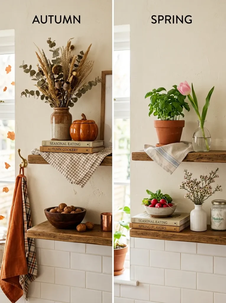
One of the reasons styled kitchen shelves drift from curated to cluttered over time is that nothing is ever removed — items only accumulate. Treating the kitchen shelf arrangement as something that’s edited seasonally rather than set permanently maintains its visual quality without requiring a complete restyle each time.
A seasonal edit doesn’t mean dramatic changes. Removing one or two objects that feel dated or over-familiar, adding one fresh element — a new dried arrangement, a small potted herb, a single new ceramic piece — and adjusting the positions of existing objects slightly refreshes the shelf without disrupting its established character. Doing this four times a year requires about twenty minutes each time and is the difference between shelves that look considered and ones that look forgotten.
21. Style for the Viewer’s Angle, Not the Photographer’s

The final principle is the one most kitchen shelf styling advice ignores because it’s based on editorial photography rather than lived experience: the best arrangement viewed from directly in front of the shelf is rarely the same as the best arrangement viewed from the primary vantage point in the kitchen — which is usually a few feet away, slightly off-center, and at standing or seated height rather than perfectly aligned with the shelf face.
Before finalizing any kitchen shelf arrangement, walk to the position in the kitchen where you spend most of your time — the primary prep area, the kitchen table, the island — and look at the shelf from there. Adjust the arrangement for that view rather than for a straight-on close-up perspective. The objects that read most strongly at kitchen distance are those with scale, contrast, or height — small detailed objects that look beautiful up close often disappear in the overall arrangement when viewed from across the room.
What Makes a Kitchen Shelf Look Designer-Made
The consistent qualities in kitchen shelves that read as genuinely considered — rather than decorated or merely organized — follow a clear pattern.
The number of objects is fewer than instinct suggests. Negative space is as deliberate as the objects it surrounds. The palette is consistent through material or color even when the objects themselves are varied in form and scale. At least one object per shelf has genuine scale — large enough to anchor the arrangement at the room’s viewing distance. The shelf contains both functional elements (the dishware that gets used) and purely visual ones (the ceramic that exists because it’s beautiful), and the two types are in deliberate proportion. And the arrangement relates to the kitchen’s existing material story — its cabinet finishes, hardware, backsplash tile — rather than existing as a separate decorating exercise disconnected from the room.
None of these qualities require expensive objects or a professional stylist. They require the editorial confidence to remove more than you add, choose fewer things more carefully, and let the shelf breathe.
Final Thoughts
Kitchen shelf styling is among the most visible and most changeable surface decisions in any home. Unlike a backsplash or cabinet finish, it can be reconsidered in an afternoon and refined over time as your collection of objects, plants, and kitchen tools evolves. The ideas here work progressively — start with the edit and the triangle of heights, then layer in the material and palette choices, then refine the details of layering, negative space, and viewer angle.
Begin with the shelf that bothers you most, empty it completely, and rebuild it using two or three of these principles rather than all twenty-one at once. One shelf done well — edited, proportionally composed, with consistent material palette and at least one object with genuine scale — tells you more about what the rest of your shelves need than any amount of planning from a distance.
Save the ideas here that match your shelf material, your kitchen’s style register, and the objects you already have. The best-styled kitchen shelves are built around what’s genuinely there, edited with discipline, not around what a design brief imagines they should contain.