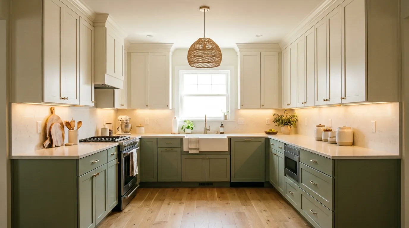
21 U-Shaped Kitchen Ideas That Feel Spacious
The U-shaped kitchen is one of the most efficient layouts in residential design. Three connected runs of cabinetry and countertop create a natural work triangle, put storage and prep space within easy reach, and give a serious cook everything they need within a few steps. The challenge isn’t functional — the U-shape excels at function. The challenge is spatial: done wrong, a kitchen with cabinetry on three sides can feel like a corridor with a sink in it.
Making a U-shaped kitchen feel genuinely spacious requires attention to the things that affect visual perception as much as actual square footage — ceiling height, counter clearance, cabinet proportion, lighting placement, and the single decision with the largest impact in small kitchens: whether to open one of the three walls. These 21 ideas move through every meaningful decision in a U-shaped kitchen, from the layout foundations to the finishing details, with enough practical context that each idea serves your actual room rather than an idealized one.
If you’re planning a new kitchen or refreshing an existing one, start with the layout and clearance ideas before moving to the visual ones. Getting the proportions right first makes every subsequent decision easier.
1. Maintain at Least 42 Inches of Aisle Clearance Between Facing Counters
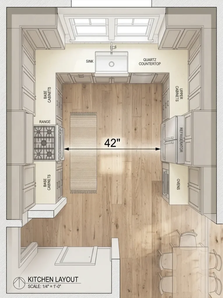
Before any design decision — cabinet finish, countertop material, backsplash — the clearance between opposing countertops in a U-shaped kitchen determines whether the space functions comfortably or becomes a frustrating bottleneck. For a single cook, 42 inches is the widely accepted minimum. For two cooks working simultaneously, 48 inches is a better target.
That clearance is measured between cabinet faces, not wall to wall, which means it shrinks when upper cabinets have deeply projecting doors, appliances are installed with protruding handles, or the dishwasher door drops open at knee height during loading. Plan for those door swings at the design stage rather than discovering the conflicts after installation. In existing kitchens that feel tight, this clearance issue is often the primary cause — and the only real solution is removing or reconfiguring one cabinet run.
2. Use Light Cabinetry on at Least Two of the Three Walls
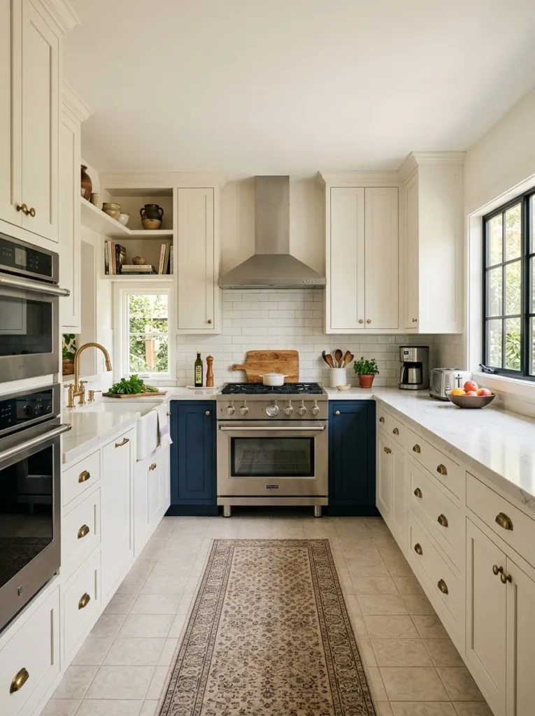
Color is the fastest visual lever in any U-shaped kitchen, and it works in both directions. Dark cabinetry across all three walls of a U-shape absorbs light from every angle simultaneously, which is why compact kitchens with full dark cabinet runs consistently feel smaller than their actual square footage suggests. Keeping at least two walls in a lighter finish — warm white, soft greige, pale sage, or natural wood in a blonde or honey tone — allows light to reflect and circulate rather than getting absorbed.
This doesn’t mean dark cabinetry is off-limits. A deep navy or charcoal on the base wall of the U, with lighter upper cabinets above and lighter finishes on the two side runs, creates contrast and visual interest while keeping the room’s overall brightness high. Pair any darker lower cabinet choice with a light countertop and reflective backsplash to maintain the sense of openness.
3. Take Upper Cabinets to the Ceiling to Increase Visual Height
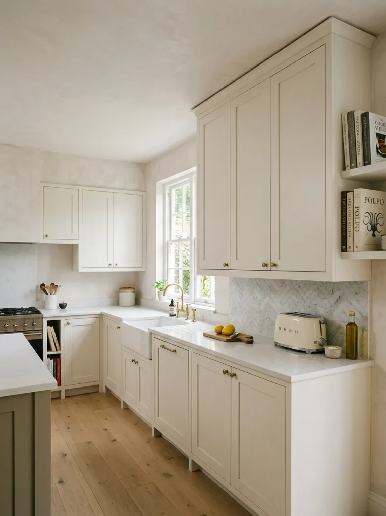
One of the most reliable ways to make a U-shaped kitchen feel more expansive is to run upper cabinets all the way to the ceiling rather than stopping at the conventional 7-foot height and leaving a soffit gap above. The gap between cabinet tops and ceiling in most kitchens reads as a horizontal compression — a built-in visual stop that prevents the eye from traveling upward and makes ceiling height feel lower than it is.
Ceiling-height cabinets require a step stool or a rolling library ladder for the highest shelves, which is a practical trade-off worth acknowledging. They also make the kitchen appear taller, eliminate the dust-collecting ledge above standard cabinets, and add meaningful storage for infrequently used items. In rooms with lower ceilings of eight feet or below, the impact on perceived height is particularly significant.
4. Position the Refrigerator at One of the U’s Open Ends
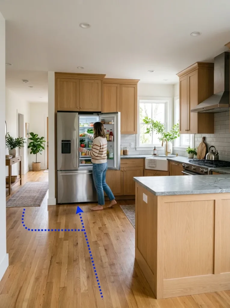
Appliance placement in a U-shaped kitchen directly affects how traffic flows through the space. The refrigerator is the appliance accessed most often by the most people — including family members who aren’t cooking — and placing it in the interior of the U means they must cross through the cook’s work zone to reach it. This creates the kind of congestion that makes a kitchen feel cramped not because of its size but because of its traffic pattern.
Positioning the refrigerator at one of the outer ends of the U keeps it accessible to everyone without requiring entry into the active cooking triangle. It also means the refrigerator door opens outward into open space rather than into the aisle, where it would block movement between counters. If the refrigerator must go inside the U due to plumbing or existing rough-in constraints, choose a model with a door that opens toward the opening of the U rather than deeper into the workspace.
5. Open One Wall to an Adjacent Space in Smaller Kitchens
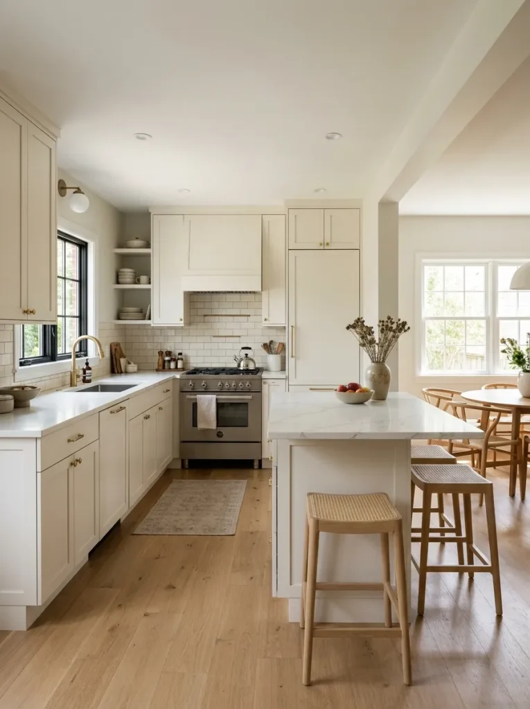
The standard U-shape uses all three walls as continuous cabinetry runs. In smaller kitchens — those under approximately 100 square feet or in rooms narrower than ten feet — that three-wall configuration creates a fully enclosed workspace that can feel like a dedicated closet rather than the kitchen’s center. One of the most effective adaptations for compact spaces is opening one of the three walls by removing upper cabinets and replacing the section with a peninsula or bar counter that faces into an adjacent dining or living space.
This single change transforms the kitchen’s spatial character entirely. The cook maintains the workspace of the U-shape while gaining visual connection to adjacent rooms. The open side brings in borrowed light and depth. The counter on that wall becomes the kitchen’s social interface — the place where guests perch while meals are prepared. What remains is the functional core of the U with the enclosed feeling eliminated.
6. Plan the Work Triangle With Sink, Stove, and Refrigerator as Three Distinct Points
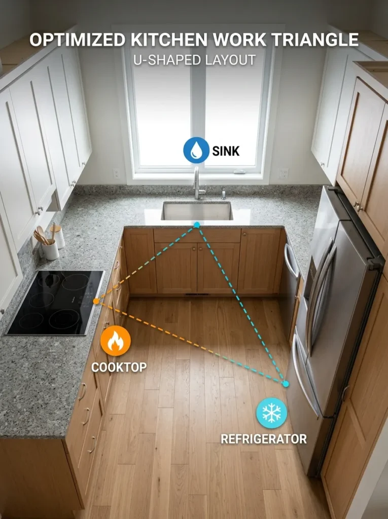
The kitchen work triangle — the path between sink, cooktop, and refrigerator — is most efficient when each leg sits between four and nine feet apart and the total triangle perimeter stays under 26 feet. In a U-shaped kitchen, the natural layout places these three elements on three separate walls, which is ideal. Problems arise when two of the three end up on the same wall, collapsing the triangle into a straight line that eliminates the spatial separation the layout is designed to provide.
Before finalizing any cabinet plan, confirm that the major appliances form a genuine triangle rather than a compressed line along one or two walls. In existing kitchens where this has already gone wrong, moving a sink or cooktop is expensive but sometimes worth considering if the workflow is the primary frustration. More commonly, the issue is the refrigerator being placed too centrally rather than at one of the U’s ends.
7. Add a Small Island or Rolling Cart in the Center of Large U-Shaped Kitchens
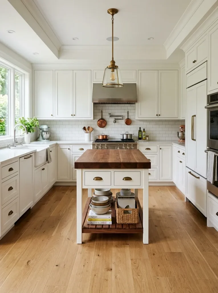
In a kitchen with enough clearance to spare — where the center aisle is 60 inches or wider — a small island or permanent rolling cart in the center creates an additional prep surface without compromising traffic flow. A central island also addresses one of the U-shape’s functional gaps: the layout provides excellent perimeter storage and counter space, but the open center can feel like wasted real estate in larger rooms.
The island must be sized to preserve at least 42 inches of clearance on all sides between the island and the surrounding counters. In practice, this limits most U-shaped kitchen islands to a relatively compact footprint — 24 to 36 inches wide and no longer than the central aisle allows after clearances are subtracted on both sides. A rolling cart with locking wheels is worth considering over a fixed island in any kitchen where the clearances are marginal, since it can be moved when full aisle access is needed.
8. Use Two-Tone Cabinets to Visually Separate Upper and Lower Zones
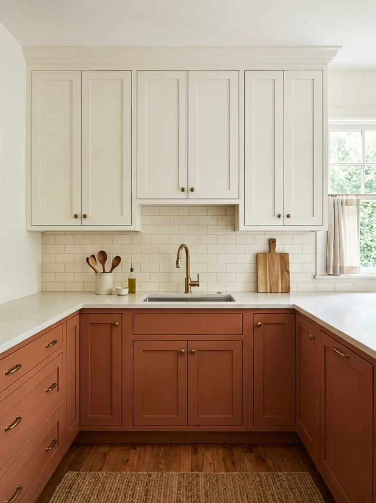
The two-tone cabinet approach — light uppers, darker or different lowers — is particularly effective in U-shaped kitchens because it creates a horizontal mid-point division across all three walls simultaneously. The upper cabinets recede visually, making the kitchen feel taller; the lower cabinets ground the design with weight and material interest.
The most natural division occurs at the countertop line, where the countertop material itself acts as a third element separating the two cabinet tones. In practice, this means the color shift happens at approximately 36 inches from the floor regardless of upper cabinet height. The two tones don’t need to be dramatically different — a warm white upper against a greige or sage lower reads as considered; a matte white upper against a deep navy lower creates more contrast and visual drama. Either approach produces a more resolved result than a single color running uniformly across all six cabinet faces in a full U-shape.
9. Specify Flat-Front Cabinet Doors for a Less Enclosed Feel
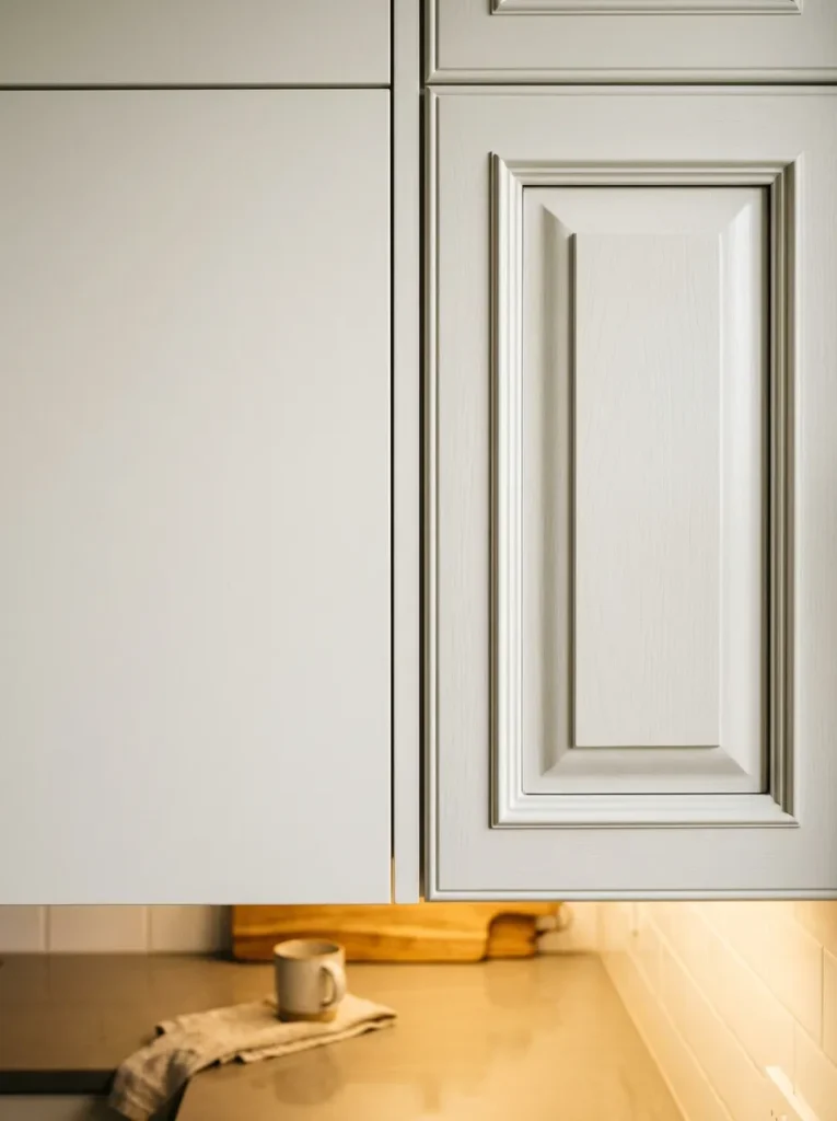
Cabinet door profile affects a kitchen’s spatial reading in ways that are easy to underestimate. Raised-panel doors with their frames, recessed centers, and shadow lines add visual weight to every door face, which multiplies across eighteen or twenty-four doors in a typical U-shaped kitchen. Flat-front or Shaker-style doors with minimal relief read quieter, cleaner, and lighter — the surface is less visually busy, which helps a fully enclosed three-wall layout feel less congested.
Full flat-front doors work best in contemporary or transitional kitchens where the design language is already clean and unfussy. Shaker doors — a flat center panel with a simple rectangular frame — are more versatile and work across a wider range of kitchen styles. In a small U-shaped kitchen, the choice between these two and a traditional raised-panel door is not merely aesthetic; it’s a proportional decision that affects whether the room reads as a space or a collection of cabinet faces.
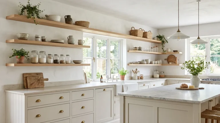
10. Replace Some Upper Cabinets With Open Shelving on One Wall
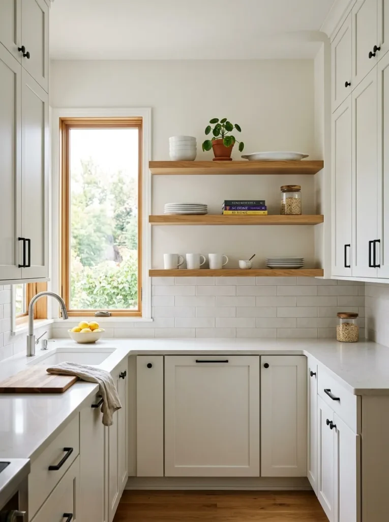
Swapping a section of upper cabinets on one of the three walls for open shelving does several things simultaneously. It breaks the visual monotony of continuous cabinet runs across all three walls, introduces a zone of visual openness into an otherwise enclosed layout, and creates display space for objects — ceramics, glassware, plants, cookbooks — that give the kitchen a more personal and lived-in quality than closed cabinetry alone can provide.
In a small U-shaped kitchen, this is one of the most effective tools for preventing the closed-box feeling without altering the footprint. The practical consideration is organization: open shelves require more consistent tidying than closed cabinets, since the contents are always visible. A section of two or three shelves in the area between the sink and the window, or on the wall that receives the most natural light, is typically the most successful placement.
11. Install Lazy Susans or Pull-Out Shelves in Every Inside Corner
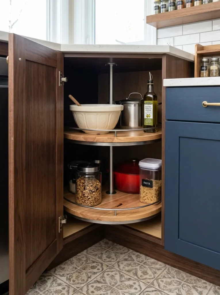
The inside corners of a U-shaped kitchen are where the layout’s efficiency most commonly breaks down. Standard base cabinets that simply meet at 90-degree corners — with shelves accessible only through the door opening at the corner’s edge — create storage that is technically present but practically unusable. Items pushed to the back of those shelves can effectively disappear for months.
Lazy Susan turntables, kidney-shaped or full-circle rotating shelves, and pull-out drawer systems designed specifically for corner cabinets turn these dead zones into functional storage. A two-tiered lazy Susan in a base corner cabinet can hold a considerable volume of cookware, small appliances, or pantry items that remain genuinely accessible with a single rotation. This is one of the kitchen upgrade decisions with the best functional return relative to cost, and it should be specified in new kitchens rather than retrofitted.
12. Use Diagonal or Blind Corner Drawers for the Upper Corner Cabinets
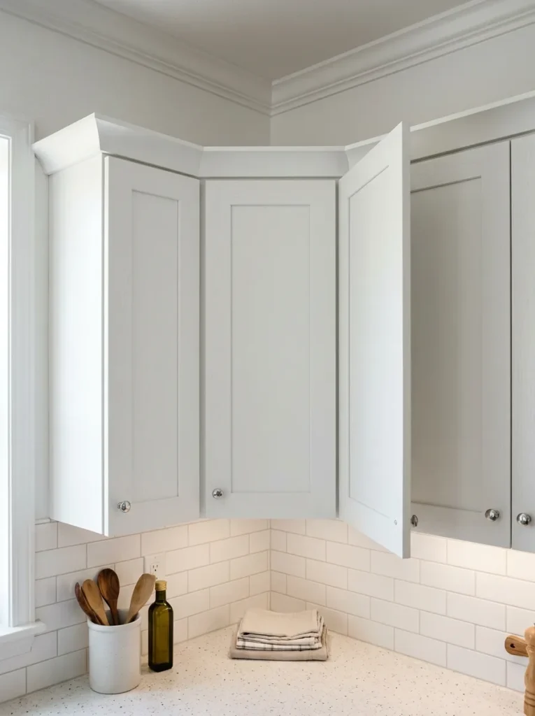
Upper corner cabinets present a different version of the same problem as lower corners: the space deep behind the corner door is difficult to see and reach. Solutions at upper-cabinet level include diagonal corner cabinets — where the door is set at 45 degrees rather than at 90, giving direct front-facing access to the corner — or simple open shelving in the corner section that makes the full depth visible and accessible without reaching into darkness.
Diagonal corner cabinets require planning at the design stage since they change the standard cabinet module widths on both sides of the corner. If working with an existing kitchen, assess whether the current upper corner storage is genuinely being used or simply housing rarely accessed items that could move elsewhere. Freeing an inaccessible upper corner and replacing it with open shelving or a windowless display niche can make more useful space than a cabinet that technically holds things but practically doesn’t.
13. Specify Deep Drawers Instead of Base Cabinet Shelves for Pots and Pans
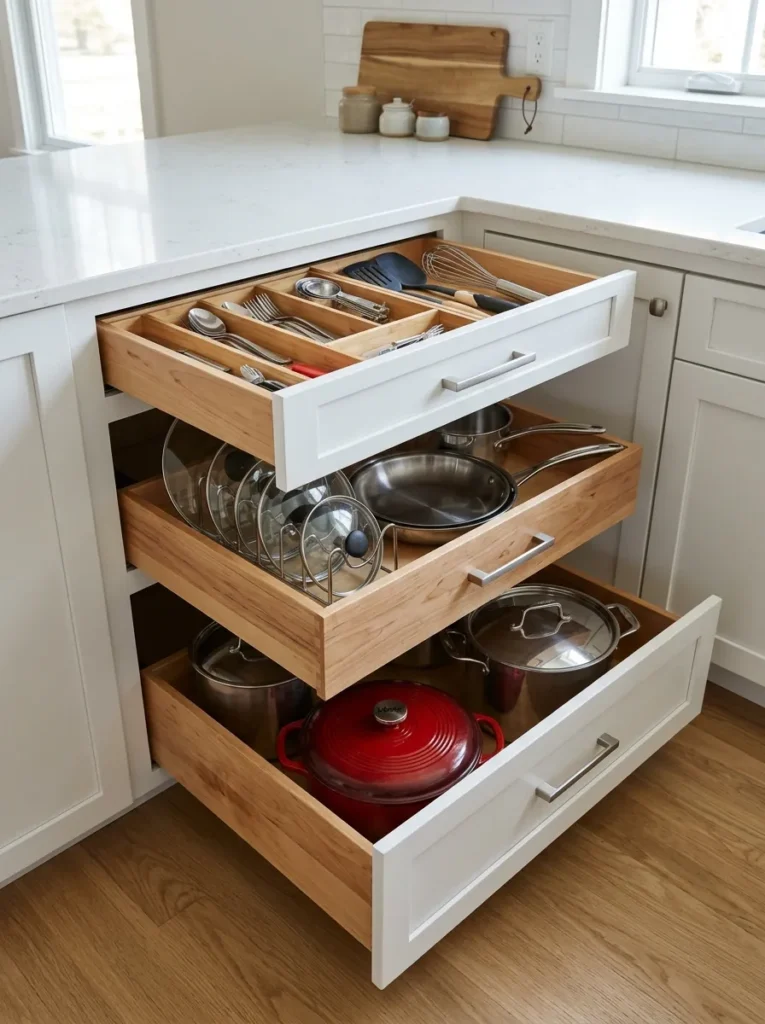
The standard base cabinet with two fixed shelves is an inherited kitchen convention that rarely serves serious cooks particularly well. Deep drawers — either three-drawer banks or a single wide drawer in a two-drawer configuration — give full visibility and front-to-back accessibility to every item inside. Pots, lids, sheet pans, and mixing bowls are all visible and reachable without kneeling and reaching into the cabinet’s back half.
In a U-shaped kitchen with extensive base storage, converting the two base runs flanking the back wall to primarily drawer storage rather than shelf-and-door configurations dramatically improves daily usability. Soft-close drawer hardware is worth specifying regardless of budget level — the quality of feel at every interaction with kitchen storage accumulates significantly over years of daily use, and the cost difference over a full kitchen’s worth of drawers is modest.
14. Choose a Backsplash That Runs Continuously Across All Three Walls
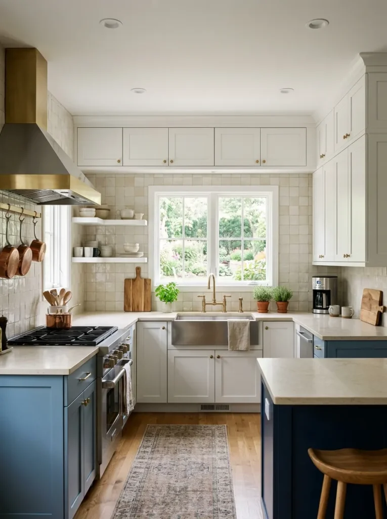
The backsplash in a U-shaped kitchen has more visual surface area than in any other layout — it runs across the entire back of the space between countertop and upper cabinet on three connected walls. A continuous backsplash material running uninterrupted around the full U creates a strong visual cohesion that reads as one designed element rather than three separate walls that happen to share a material.
Where the backsplash stops and starts matters almost as much as what it looks like. A backsplash that terminates partway along a run, meets a different material mid-wall, or simply doesn’t extend around the corners leaves visible seams that make the kitchen read as partially finished. Extending the backsplash continuously — including returning it around the corner transitions — produces the complete, resolved appearance that distinguishes a thoughtfully designed kitchen from one that was completed piecemeal.
15. Use a Bold or Patterned Tile on the Back Wall as a Focal Point
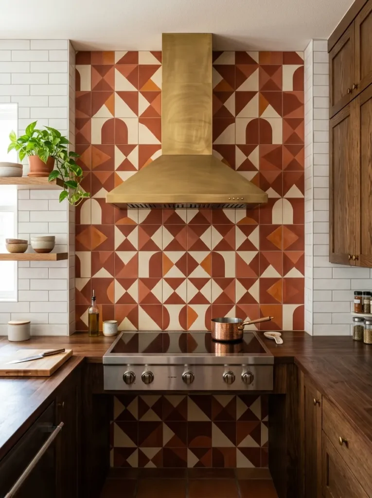
Within a continuous backsplash, the back wall of the U — typically the one that faces you as you enter the kitchen and usually houses the cooktop or primary prep zone — is the natural candidate for a bolder material or pattern. Using the same simple subway tile or slab backsplash across all three walls is an option, but treating the back wall as the kitchen’s visual focal point while keeping the two side walls in a quieter complementary tile creates a hierarchy that makes the kitchen feel more designed.
Zellige tiles with their handmade variation, large-format porcelain in a warm stone or marble look, or a field of geometric tile in a contrasting color all work for this focal wall without necessarily being dramatic. The practical consideration: the back wall backsplash behind the cooktop sees more grease and heat than the side walls, which influences both tile selection and grout color. Darker grout joints on a light tile hide kitchen residue more successfully than bright white grout.
16. Layer Under-Cabinet, Pendant, and Ambient Lighting Independently
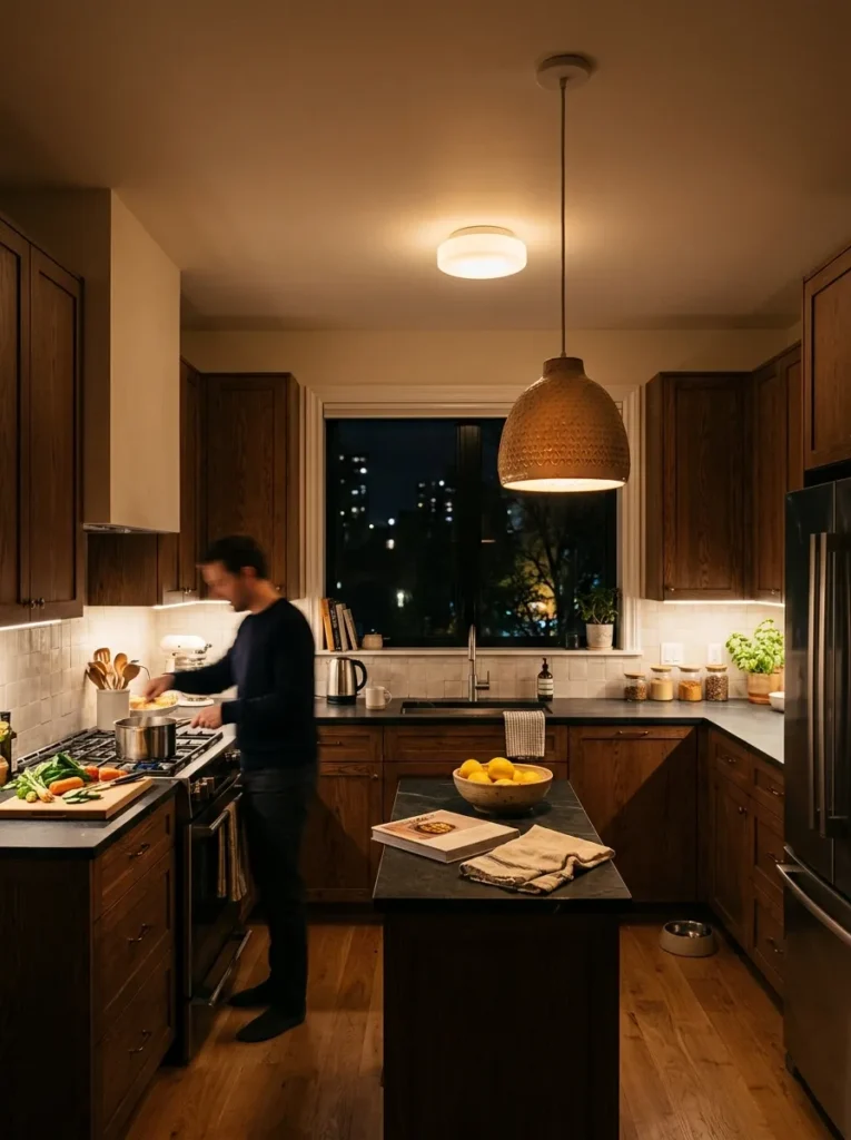
Overhead lighting alone in a U-shaped kitchen is insufficient regardless of how bright the fixture is. A centered ceiling fixture illuminates the center of the aisle and the upper cabinet faces; it casts the countertops into shadow because the cook’s body blocks the light when working at the counter. This is a functional problem before it’s an aesthetic one — inadequate counter lighting makes kitchen work genuinely harder.
Under-cabinet LED strips positioned toward the front edge of the upper cabinet shelf provide directed task lighting exactly where food prep happens. Pendant lights above an island or peninsula add a secondary light layer with visual character. A dimmable overhead ambient source handles general illumination. Running all three on independent switches or dimmers lets the kitchen serve multiple functions across the day — bright task light for cooking, lower ambient light for dining nearby, accent light in the evening.
17. Extend the Countertop on One Run to Create a Breakfast Bar
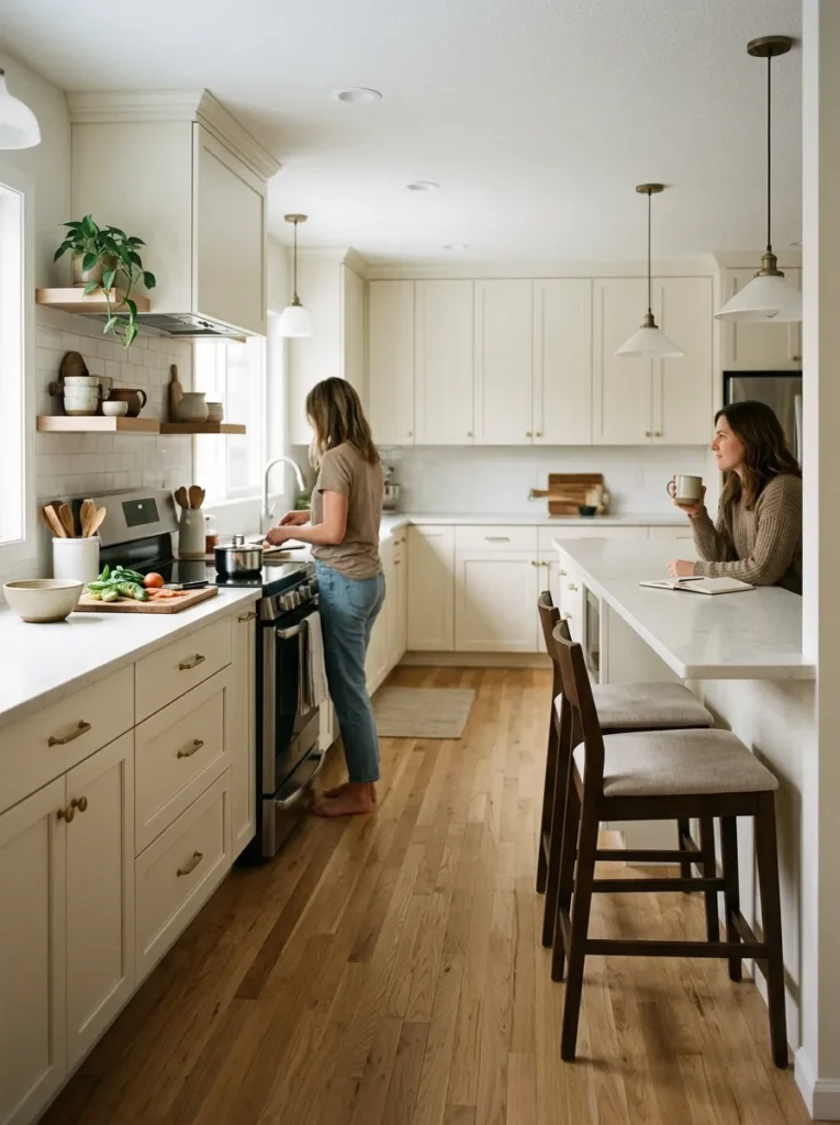
Converting one of the U’s base cabinet runs — typically one of the shorter side walls — into a breakfast bar by extending the countertop overhang six to twelve inches and placing stools on the outside creates a casual seating zone that connects the kitchen to adjacent spaces without requiring any structural change. The extension uses the existing cabinet footprint and simply brings the countertop edge out to accommodate seated height.
Standard counter height of 36 inches suits counter stools 24 to 26 inches tall; bar height of 42 inches works with bar stools 28 to 30 inches tall. The knee clearance under the overhang needs to be at least 15 inches deep for comfortable seated use. This transformation works best on the run that opens toward the dining or living area rather than the run that faces another cabinet wall, since the seating should face outward into a more open space rather than directly into the kitchen’s working interior.
18. Use Handleless Cabinets or Integrated Hardware for a Streamlined Look
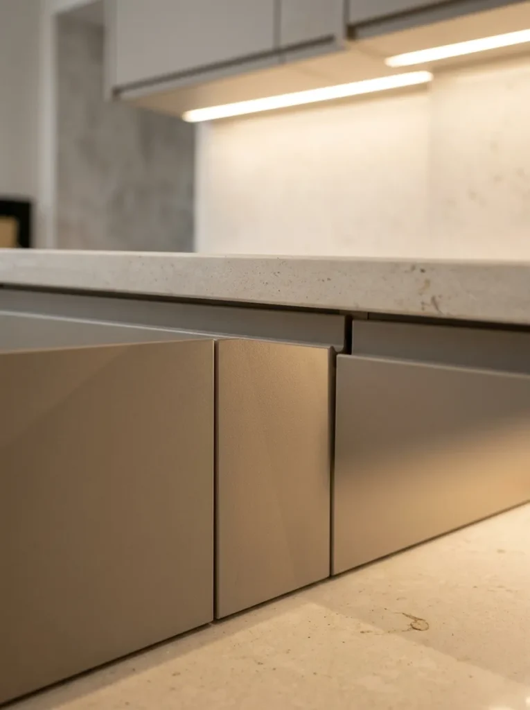
Cabinet hardware in a U-shaped kitchen multiplies significantly: pulls or knobs on twenty-plus doors and drawers across three walls create a repeating visual rhythm that can feel busy if the hardware is large or decorative. Handleless cabinets with push-to-open mechanisms, or those with a routed finger pull integrated into the door edge, reduce that visual repetition entirely and give the kitchen a cleaner, more spacious reading.
Integrated handle profiles — where the top or bottom of the door itself is shaped into a grip channel — are more durable than adhesive push-to-open systems and more practical for everyday use. For those who prefer visible hardware, a simple, thin bar pull in a consistent metal finish minimizes the visual impact better than a larger knob or decorative pull. As with all metal finishes in a kitchen, committing to one finish across every piece of hardware produces a more coherent result than mixing across the runs.
19. Install a Window in the Back Wall or Bring in a Skylight
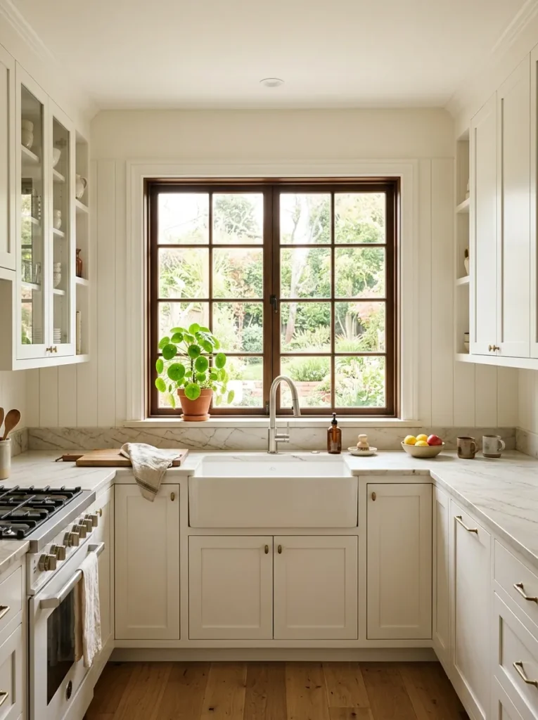
Natural light changes the character of an enclosed U-shaped kitchen more than any painted or material choice. The back wall of the U — the one directly opposite the kitchen’s open side — is often a solid wall with no window, because the plumbing or structural arrangement of the house places the kitchen interior without an exterior-facing surface. When a window is possible on this wall, it completely resolves the closed-in quality that the layout can produce: the back of the U becomes a view rather than a wall.
Where a conventional window isn’t structurally possible, a skylight above the kitchen center can achieve the same effect of introducing natural light into the enclosed space. Even a small skylight positioned over the back wall’s work surface dramatically brightens the kitchen’s darkest zone and connects the interior visually to something beyond the cabinetry. If neither is possible, a large format mirror used as a splashback behind the cooktop reflects the kitchen’s existing light and creates the optical illusion of depth on what would otherwise be a solid back wall.
20. Open the U to a Dining Area Through a Partial Wall or Wide Doorway
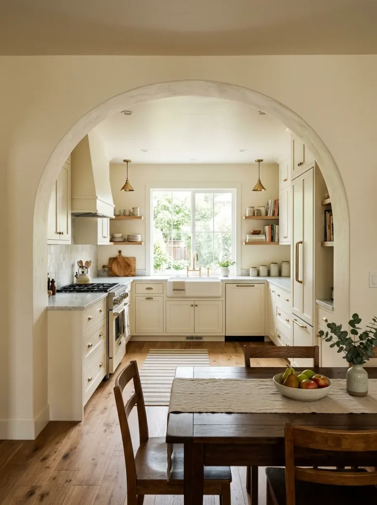
In homes where the kitchen sits adjacent to a dining room or breakfast area, removing a partial or non-load-bearing wall between them is one of the most impactful changes available to a U-shaped kitchen. The layout retains its three walls of storage and countertop while gaining the borrowed light, visual depth, and social connection of an adjacent open space. Even a wide arched opening or a pass-through at counter height — rather than a full wall removal — makes a significant difference to how enclosed the kitchen feels.
This is a structural decision that requires professional assessment before proceeding — distinguishing a load-bearing wall from a partition wall is not reliably done without inspection, and removing the wrong one creates a serious problem. Where the wall is confirmed as non-structural, the transformation is usually one of the most dramatic spatial improvements available to the kitchen without changing its floor area or cabinet configuration.
21. Design a Peninsula Into One End of the U as a Functional Room Divider
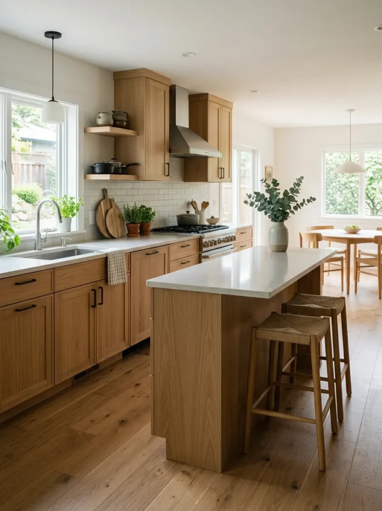
Where a complete wall opening isn’t possible or desired, a peninsula extending from one end of the U performs similar double duty. The peninsula uses the existing cabinetry footprint of that wall’s end, extends the counter edge into the room, and creates a defined boundary between kitchen and adjacent space without a wall. One side is the kitchen’s working surface; the other is the social interface — bar-height seating, a casual surface for guests, or simply a defined visual edge that separates the kitchen from the dining zone.
A peninsula with base cabinet storage on the kitchen side adds functional storage while the outward-facing side provides seating. Its length should not consume more than about a third of the kitchen’s total open aisle width — the remaining two-thirds needs to remain clear for circulation into and out of the kitchen space. A peninsula that’s too long creates the pinch point that makes the U-shape feel enclosed again rather than resolving it.
What to Prioritize When Planning or Refreshing a U-Shaped Kitchen
The decisions that affect how a U-shaped kitchen feels fall into a clear hierarchy: layout and clearance come first, storage functionality second, visual and material choices third.
Getting clearances right — particularly the 42 to 48 inches between opposing counters and the refrigerator at the U’s outer end — determines whether the kitchen functions well regardless of how it looks. No amount of beautiful tile makes a kitchen that’s two inches too narrow actually comfortable to cook in.
Corner storage is the layout’s most common functional failure. If corners are treated as dead space and left unaddressed, a significant portion of the kitchen’s theoretical storage capacity becomes inaccessible. Lazy Susans and pull-out systems should be specified for every inside corner at the design stage.
Light — both natural and artificial — addresses the layout’s most common perceptual failure: feeling enclosed. Under-cabinet task lighting, a window or skylight on the back wall where possible, and opening or partially opening one of the three walls to an adjacent space all address the enclosed quality more effectively than any paint color or cabinet finish.
The visual choices — two-tone cabinets, bold backsplash tile, handleless hardware, countertop material — matter and are worth doing thoughtfully, but they function best as enhancements to a layout that already flows and feels proportionally right.
Final Thoughts
A U-shaped kitchen’s strengths are real: it offers more countertop and cabinet space than almost any other residential layout of the same footprint, keeps the three primary work zones within natural reach, and gives a serious cook the kind of enclosed, dedicated workspace that other layouts can’t replicate. The ideas here are largely about unlocking those strengths rather than working around limitations.
Start with clearance and corner storage before any visual decision, and let the lighting and material choices follow. A well-planned U-shaped kitchen that opens toward natural light and maintains comfortable aisle width doesn’t need dramatic finishes to feel spacious — though the right backsplash, cabinet tone, and two-tone treatment will make it feel more designed as well as more functional.
Browse these U-shaped kitchen ideas and save the ones that suit your room’s dimensions and your cooking habits. The best kitchen layout is always the one calibrated to how you actually use it.