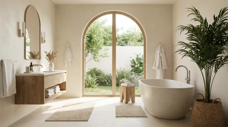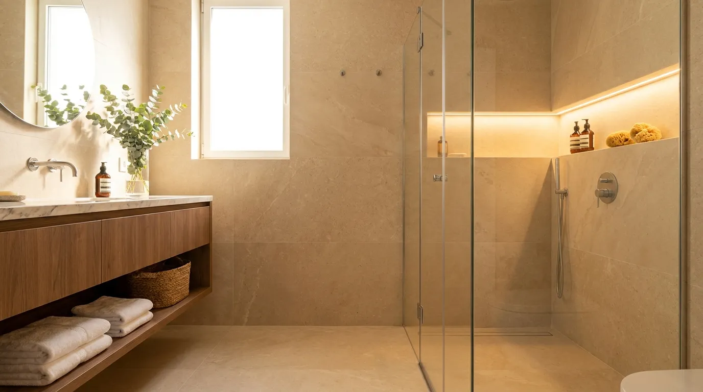
23 Small Bathroom Ideas That Make Compact Spaces Feel Bigger and More Elegant
A small bathroom doesn’t have to feel like a compromise. In fact, some of the most striking bathrooms in design history are compact — because constraint forces intention, and intention is what separates a designed space from an assembled one. These 23 small bathroom ideas are built around a specific premise: that making a bathroom feel bigger is less about square footage and more about how light moves, where the eye travels, and what the room asks you to notice. Some of these ideas are architectural — the kind that change a room fundamentally. Others are decisions you can make this weekend without touching a single tile. All of them are specific, practical, and grounded in real design logic rather than the usual advice to “add a mirror and keep it light.” Whether you’re working with a 3m² ensuite or a narrow galley bathroom that came with your apartment, there’s a combination here that works for your space. Save this list before you start planning.
Idea 1: A Full-Height Mirror Wall on One Entire Side
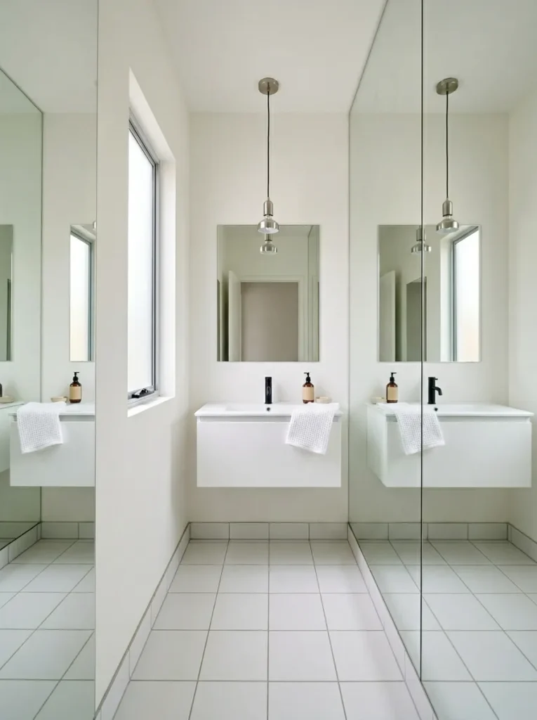
A full wall of mirror — not a mirror hung on a wall, but mirror used as the wall surface itself — is the most dramatic space-expanding move available to a small bathroom. The effect is not the gentle suggestion of more space that a standard vanity mirror provides; it is a complete doubling of the visible room. The reflected opposite wall, the reflected ceiling, and the reflected floor create a spatial illusion that makes the brain recalibrate the room’s actual dimensions. Implementation requires mirror panels fixed flush to the wall surface using mirror adhesive and appropriate fixings; the seamless junction between panels (achieved with mirrored tile or a continuous panel cut to size) is what determines whether the effect reads as intentional or makeshift. The key constraint: keep the wall that faces the mirror (the one that gets reflected) clean, minimal, and well-considered — because you’ll be seeing it twice.
Idea 2: A Wall-Mounted Toilet to Free Up Floor Space
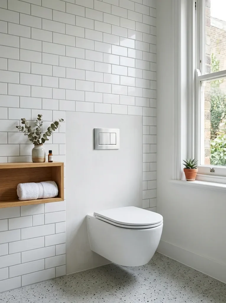
A wall-mounted toilet creates visible floor space beneath the pan — typically 15–20cm of clear floor between the wall and the point at which a floor-standing toilet would begin. In a small bathroom, this strip of uninterrupted floor is significant: it makes the floor appear to run continuously and uninterrupted under the toilet, which signals spaciousness to the eye in the same way that furniture on legs does. The concealed cistern behind a panel wall also eliminates the visual bulk of the cistern box, which sits above a floor-standing toilet and creates an awkward upper mass in a small room. The installation cost is higher than a standard toilet (the frame for the concealed cistern requires some wall construction), but the result is irreversible once installed — the visual payoff accumulates every single day. Pair with a slim flush plate in a matching finish to the room’s other hardware.
Idea 3: Continuous Large-Format Floor and Wall Tile in the Same Material
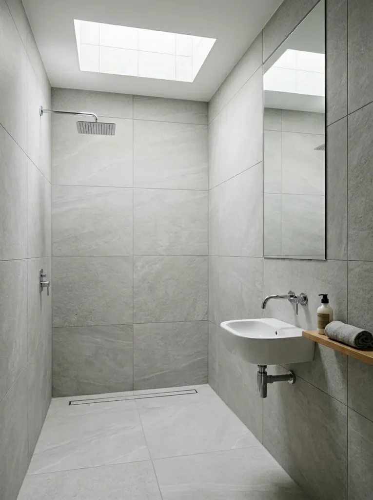
The single most effective tiling strategy in a small bathroom is material continuity: using the same tile on both the floor and walls eliminates the visual interruption that occurs when two different surfaces meet at the skirting line. That interruption — a grout line, a material change, a colour shift — is a signal to the eye that two separate surfaces exist, each with its own boundary, which emphasises the room’s smallness. When the same tile wraps seamlessly from floor to wall, the eye reads the space as a single continuous surface rather than a box with a bottom and four sides. Large-format tiles (90x90cm or larger) reinforce this further by reducing grout lines to a minimum, which removes the visual grid that smaller tiles impose across the surface. The grout colour should match the tile as closely as possible to complete the effect.
Idea 4: A Corner Shower with a Frameless Glass Panel — Not a Door
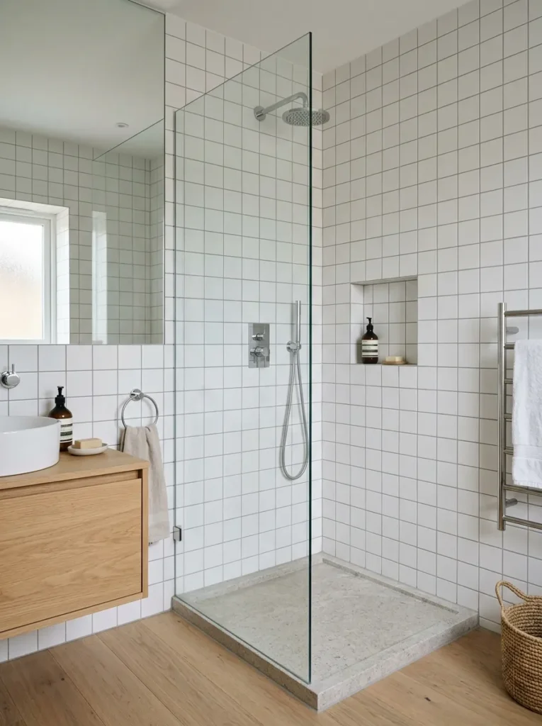
A full shower enclosure — four walls of glass and a door — occupies visual space in a small bathroom even when no physical floor space is consumed, because the frame elements create a box-within-a-box that subdivides the room into even smaller zones. A single fixed frameless glass panel eliminates all of that: it provides the water splash barrier that makes a shower functional without imposing any visual barrier on the room. The eye travels through the glass as if it isn’t there, the shower wall continues as part of the overall room rather than being separated from it, and the floor remains a single uninterrupted plane. For this to work effectively, the shower floor should be flush with the bathroom floor (a linear drain rather than a raised tray) so there is no physical edge at the shower boundary, only the invisible glass above it.
Idea 5: A Pocket Door or Barn Door Instead of a Standard Swing Door
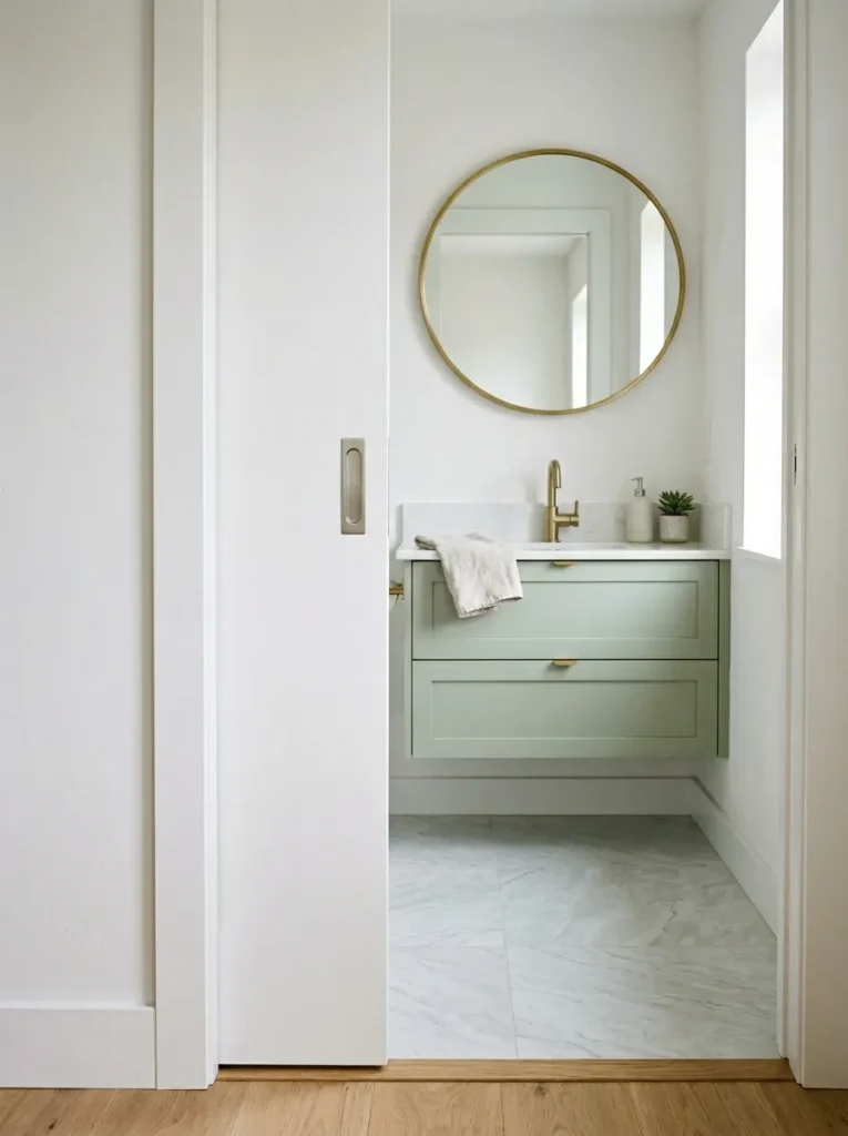
A standard bathroom door swings through an arc of 600–800mm when opening — in a small bathroom, this arc consumes a meaningful portion of the usable floor area both inside the bathroom and in the adjacent corridor. A pocket door, which slides entirely into a wall cavity, eliminates that arc completely. The full floor area of a pocket door bathroom is available from the moment you enter: no awkward step-around-the-door, no choice between keeping the door open or sacrificing the floor space in front of the vanity. The installation requirement is a wall thick enough to accommodate the door thickness — a standard stud wall retrofitted with a pocket door frame works in most cases. The door should be finished flush with the surrounding wall (no protruding frame) and fitted with a recessed pull rather than a handle that projects into the room, so the wall reads as continuous when the door is closed.
Idea 6: Vertical Stripes or Tall Narrow Tile Patterns to Add Height
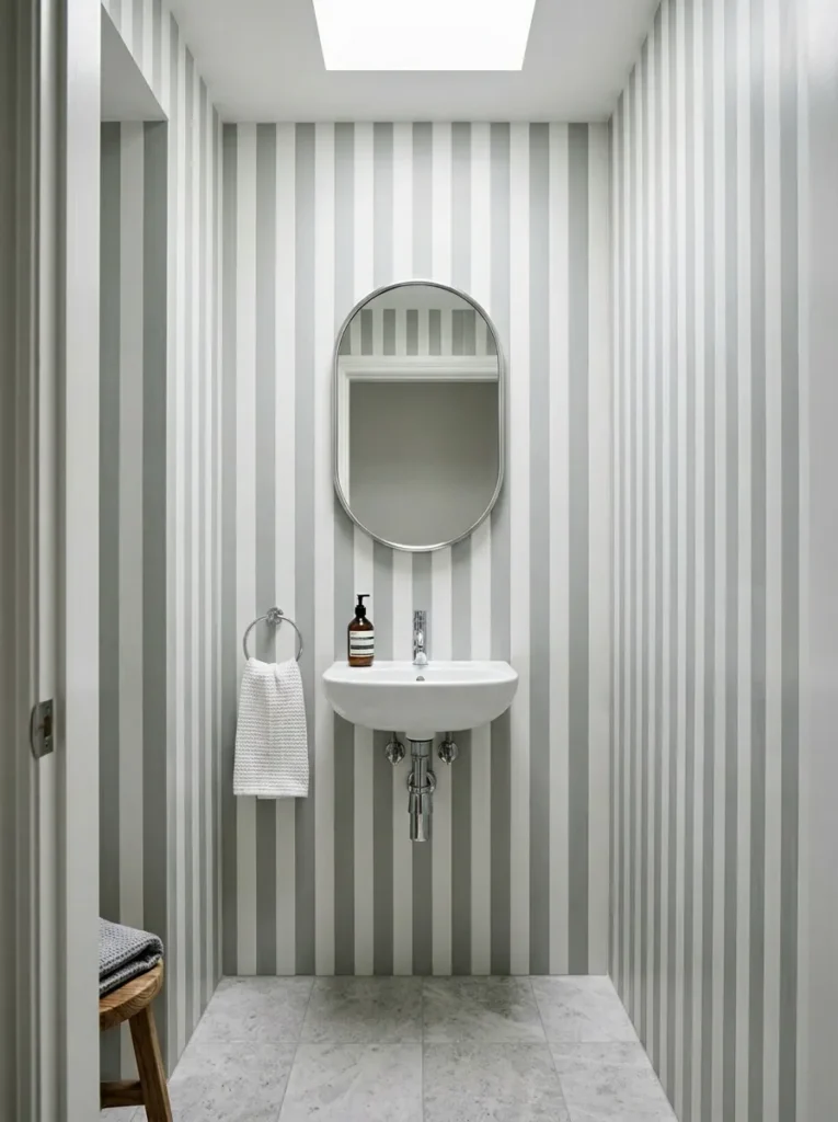
Vertical lines make rooms feel taller — this is the most reliable spatial optical illusion available, and it works in bathrooms at least as well as it works in fashion and architecture. The mechanism is simple: the eye follows vertical lines upward, and when it reaches the ceiling, it has travelled a perceived distance that feels greater than the actual ceiling height. Narrow vertical tile patterns (alternating two close tones — white and pale grey, or two shades of the same hue) are the most consistent version of this approach in a bathroom because they run floor to ceiling without interruption and the tile pattern itself enforces the vertical direction. The tonal difference between the two stripe colours should be subtle rather than high-contrast — a strong stripe reads as graphic wallpaper, which can feel busy in a small space; a soft tonal stripe reads as texture, which the eye interprets as wall surface rather than pattern.
Idea 7: A Floating Vanity with Visible Legs or Under-Clearance
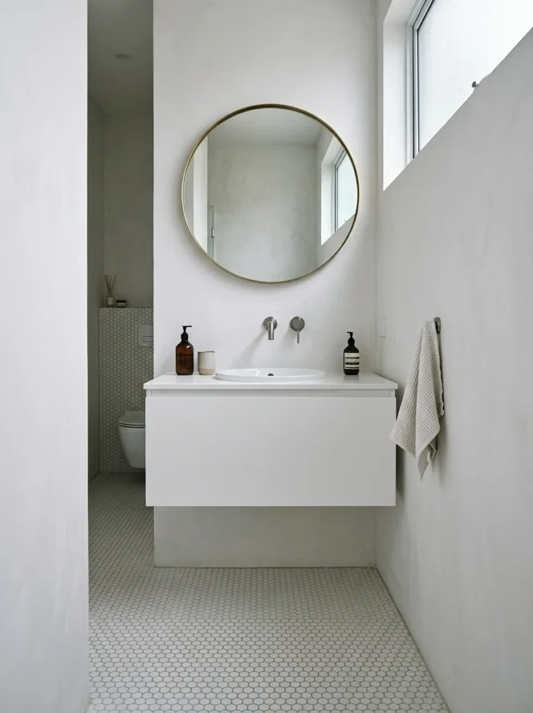
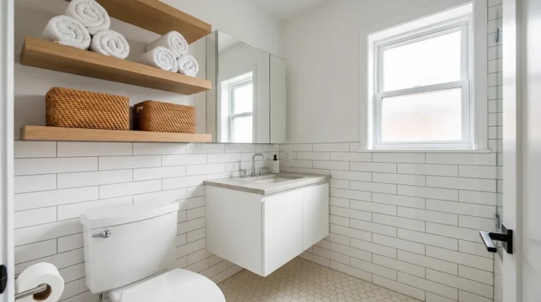
The floating vanity — wall-mounted, with clear open space between its base and the floor — is the single most impactful small-bathroom furniture decision available because it performs two spatial tricks simultaneously. The visible floor running beneath the vanity makes the floor plane appear uninterrupted and therefore larger. And the open space beneath it creates a visual depth — a shadow zone — that the brain reads as additional room volume. The effect is identical to the reason why sofas on legs feel lighter in a living room than floor-hugging sofas: visible floor creates perceived space. The practical specification: the under-clearance should be at least 20cm for the visual effect to read clearly — less than that and the shadow under the vanity looks like a dark gap rather than deliberate open space. A wall-mounted faucet reinforces the lean, clean aesthetic by eliminating deck holes from the vanity surface.
Idea 8: A Transom Window or Glass Brick Wall for Borrowed Light
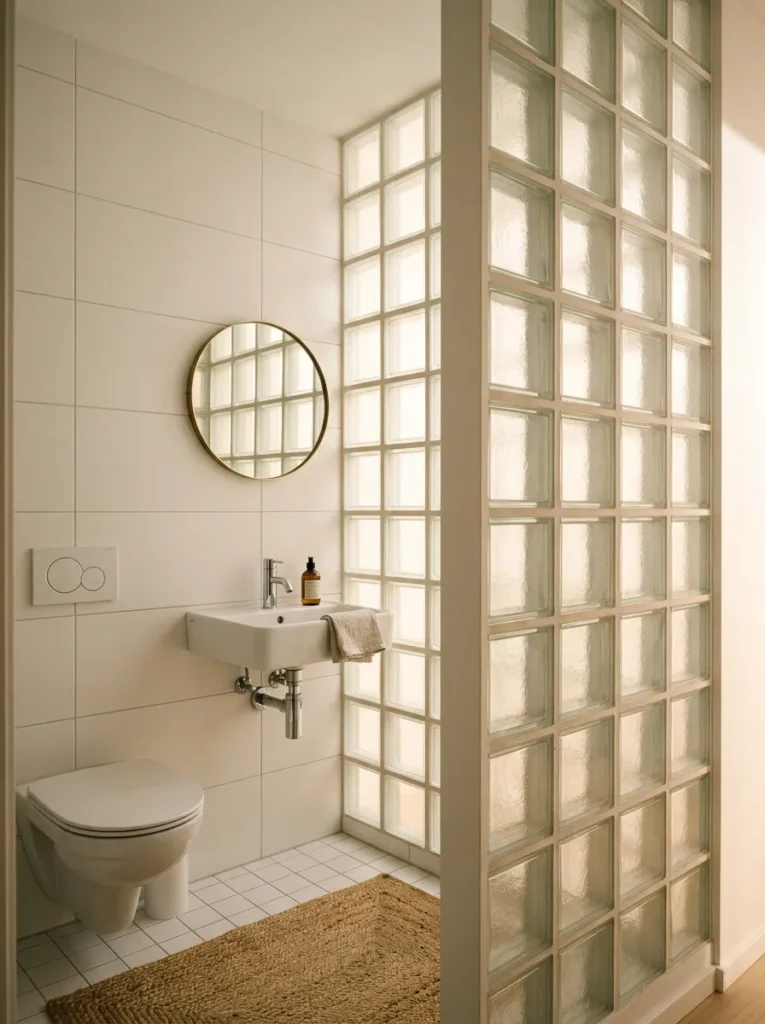
Internal bathrooms — bathrooms without external walls or windows — are one of the most common small-bathroom problems in apartment buildings, and their perpetual dimness contributes more to their feeling of smallness than their actual square footage does. A glass brick panel section in a non-load-bearing wall between the bathroom and an adjacent lit space (a hallway, a bedroom, a landing) allows natural light to pass through while maintaining complete privacy — the translucent bricks diffuse light without transmitting any image. The result is a bathroom that feels naturally lit even without direct access to a window, which changes the room’s atmosphere fundamentally. Glass bricks are also a structural element in their own right, so the panel they form can replace a conventional stud wall rather than sit within one. The soft, even, sourceless quality of diffused borrowed light is one of the most flattering and spacious-feeling light conditions possible in a small room.
Idea 9: A Recessed Shelf Running the Full Length of One Wall
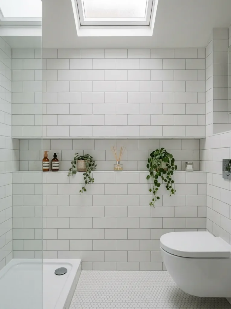
A recessed shelf that runs the entire length of a wall — set flush into the wall plane rather than projecting from it — provides storage without consuming a single centimetre of floor space, and without creating the visual clutter of a surface-mounted shelf. The key distinction is the word “recessed”: a shelf that projects into the room creates a narrow-point that reduces the passable width; a shelf set into the wall leaves the room’s full width intact at floor level, which is where the body moves and where the perception of space is formed. The construction method for a recessed shelf requires either setting the shelf into an existing cavity (in a stud wall) or building a false wall 20–25cm from the real wall surface and recessing the shelf into the false wall. The full-width version of this shelf — running from corner to corner — reads as architectural detail rather than storage addition, which is what makes it elegant.
Idea 10: A Ceiling-Mounted Shower Head Over a Wet-Room Floor
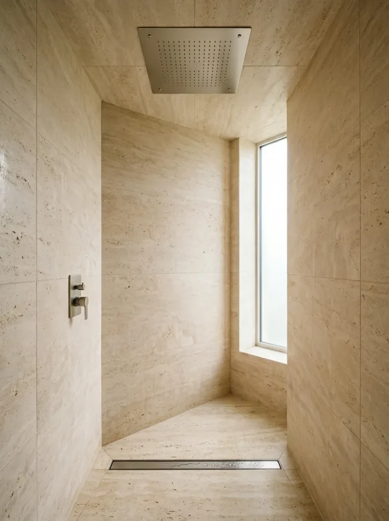
A ceiling-flush rainfall shower head installed directly over a wet-room floor — where the entire bathroom floor is the shower, sloped to a linear drain — is the small bathroom configuration that removes more visual complexity than any other single decision. There is no shower tray (and its raised edge, which interrupts the floor plane), no enclosure (and its glass or frame elements), no shower head on a wall arm (and its projection into the room space). Instead: a single square panel in the ceiling, a single linear drain in the floor, and an unbroken surface everywhere else. The room reads as a single unified volume. The ceiling-flush head also directs water vertically downward, which means the splash zone is circular and contained rather than directed at one wall — allowing the rest of the room to function dry. The linear floor drain should run the full width of the room for adequate drainage of the open floor area.
Idea 11: A Compact Corner Vanity That Reclaims Dead Space
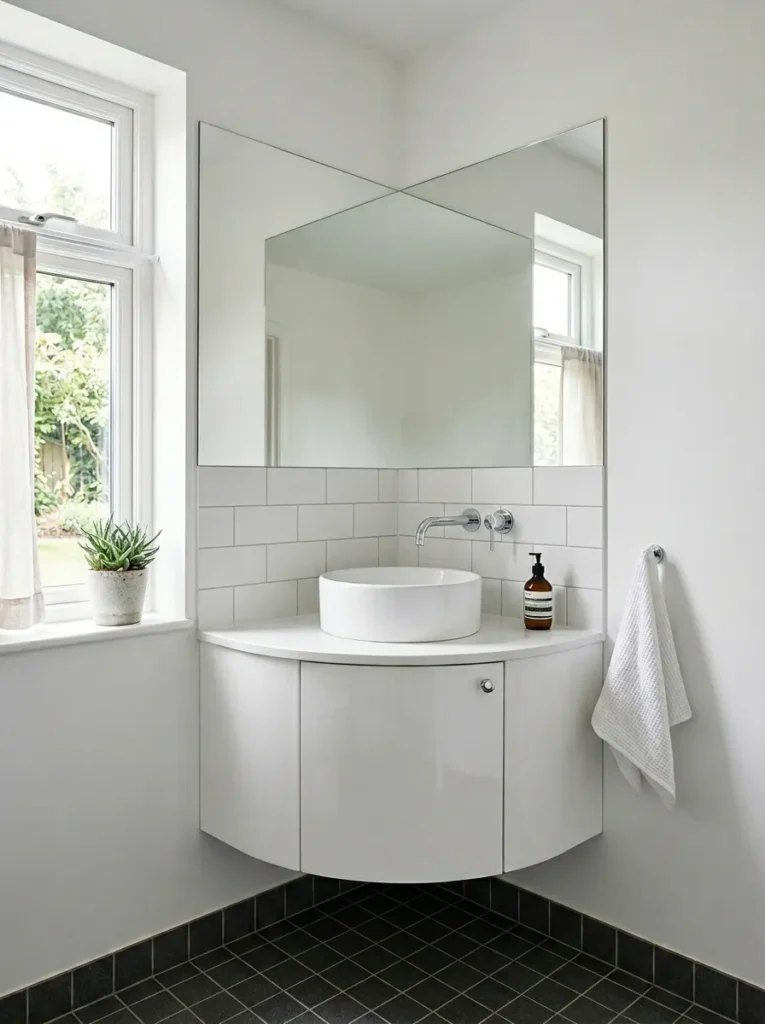
The corners of a small bathroom are typically the least-used and least-considered areas — the spaces where a floor-standing pedestal toilet or a blank wall section live, contributing nothing. A corner vanity fitted into the corner itself reclaims that geometry: the triangular or gently curved footprint uses the corner as the rear of the cabinet, placing the sink basin at the forward point where it is accessible from in front rather than from the side. This configuration is particularly useful in square or near-square small bathrooms where no one wall is long enough to accommodate a standard rectangular vanity. A wide mirror covering the full wall above the corner vanity is the companion decision — it reflects the room outward and makes the corner, which is typically a visual termination point, appear to extend beyond the wall.
Idea 12: Paint the Ceiling the Same Colour as the Walls
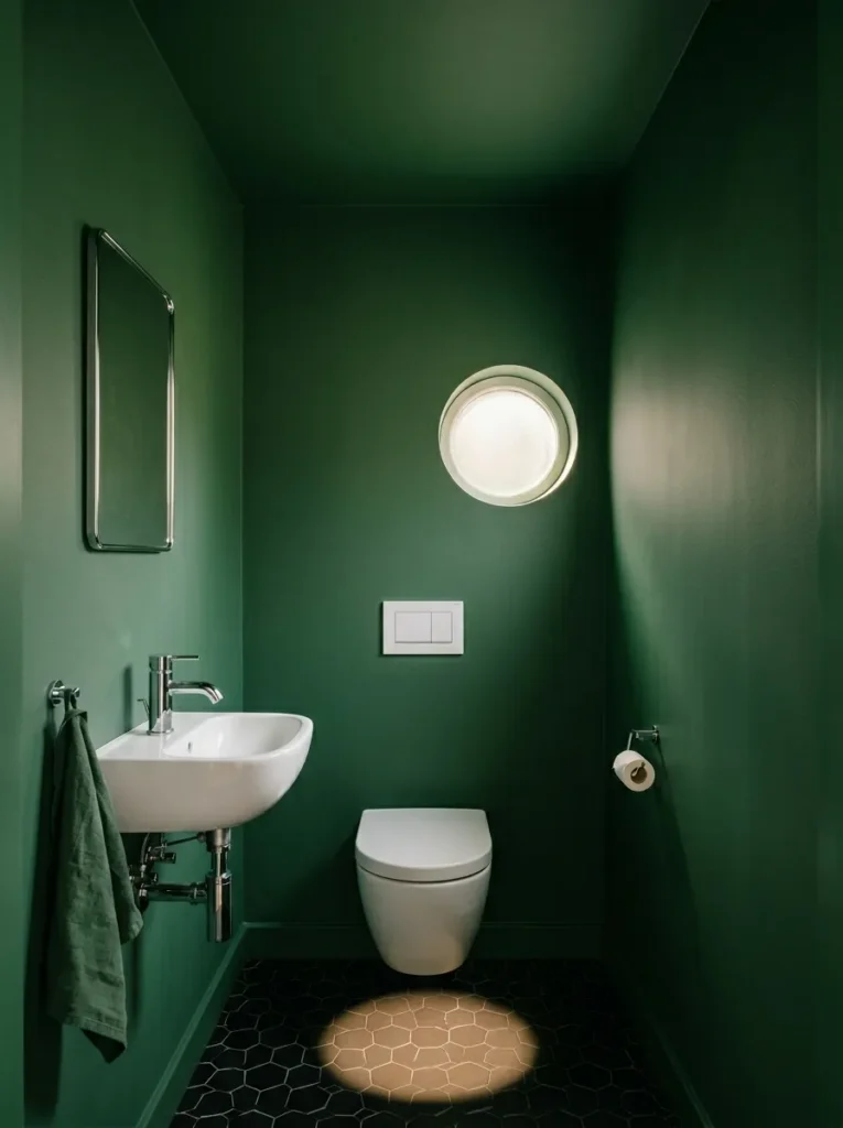
Painting the ceiling the same colour as the walls — with no break at the junction line — removes the most prominent horizontal boundary in a room. The wall-ceiling joint, when the ceiling is a lighter colour than the walls, creates a clear visual lid on the room: the eye reaches the colour change and stops, registering the ceiling as the room’s upper boundary. When ceiling and walls are the same tone, the eye continues upward without registering the boundary, and the room appears to have greater volume. In a small bathroom, this is particularly effective with deep or rich colours — a deep forest green, a dark navy, a charcoal — because the enclosing quality reads as deliberately jewellery-box-like rather than cramped. The white fittings (toilet, basin) become sculptural against the uniform dark ground, which gives the room a composition that light-on-light bathrooms lack.
Idea 13: A Tall Narrow Window Placed High on the Wall
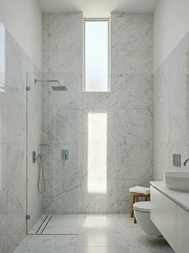
A tall narrow window placed high on a wall introduces natural light without sacrificing wall space at the mid-height zone where a vanity, mirror, or shelving lives — and the high placement creates a quality of light that a standard window position doesn’t achieve. High-entry light hits the far wall at an angle and travels across the room at a descent, catching wall and floor surfaces at varying intensities across the day. This creates a room that reads differently in morning and afternoon light, which gives a small bathroom an atmospheric variability that makes it feel less static and enclosed. The tall narrow proportions also reinforce the vertical orientation — drawing the eye upward — which increases apparent ceiling height. In terms of privacy, a high-placed window eliminates the need for any blind treatment, since sight lines from outside naturally don’t penetrate at that height.
Idea 14: A Continuous Floating Shelf Running Over the Toilet and Into the Shower Zone
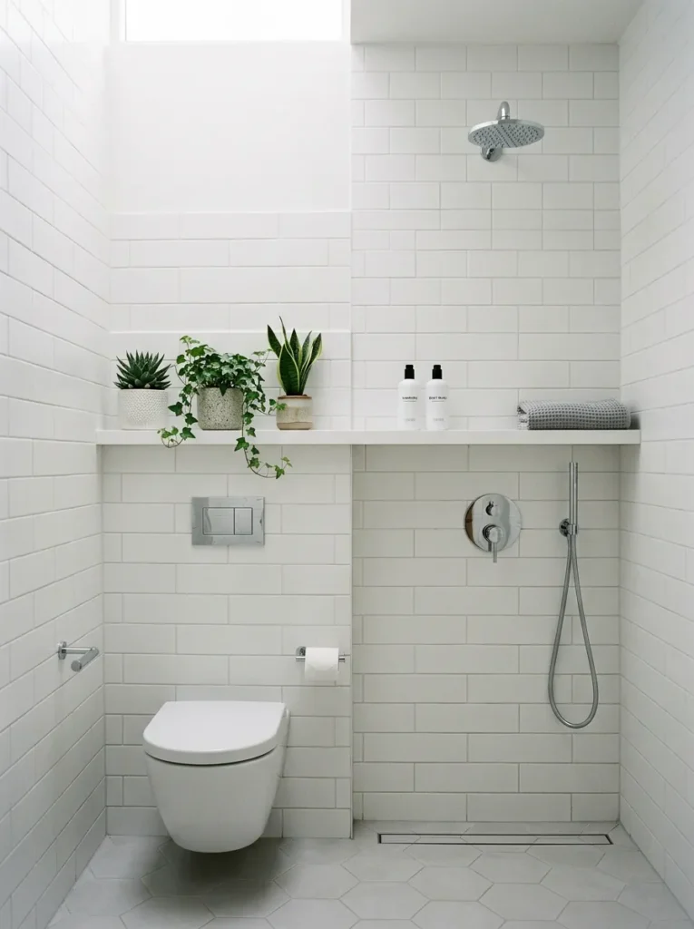
A single shelf running uninterrupted across the full length of a wall — spanning multiple zones including over the toilet and into the wet zone — creates a horizontal datum line that makes the bathroom feel deliberately designed rather than functionally assembled. The key design principle is continuity: the same shelf passing over different functional zones without stopping implies that the room is a single considered space rather than a collection of separate functional areas. The height at approximately 200cm is critical — high enough to clear the shower head on the wall below, high enough to avoid being an obstacle, but visible enough to function as a room-defining element. In the wet zone, the shelf requires waterproofed fixing and a surface material (painted MDF with a waterproof finish, or a stone or porcelain shelf) that tolerates occasional humidity exposure.
Idea 15: A Dark Grout Colour Against White Tile for Graphic Precision
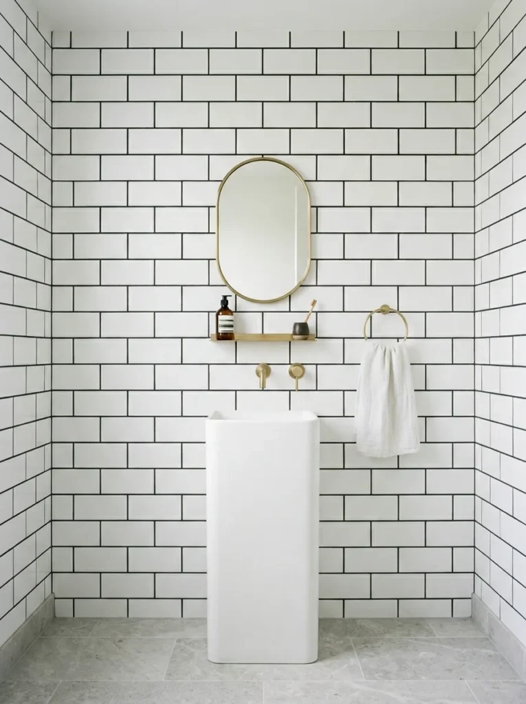
Dark grout with white tile is a design decision that generates consistent disagreement — and that disagreement is a sign that it’s distinctive rather than safe. Standard white or grey grout with white tile produces a wall that reads as a single white surface with minimal visual information; dark grout with the same tiles produces a wall that reads as a precise, graphic grid — every tile individually outlined, the overall pattern visible and intentional. In a small bathroom, this approach does something unexpected: rather than trying to minimise the visual information in the room (which is the conventional small-space approach), it provides visual interest that gives the eye something to engage with, making the room feel more designed and therefore more considered rather than simply constrained. The practical maintenance concern about dark grout showing dirt is legitimate; however, dark grout also conceals the staining that light grout accumulates over time, so the maintenance reality is more balanced than it first appears.
Idea 16: A Built-In Bench Seat in the Shower With Hidden Storage Below
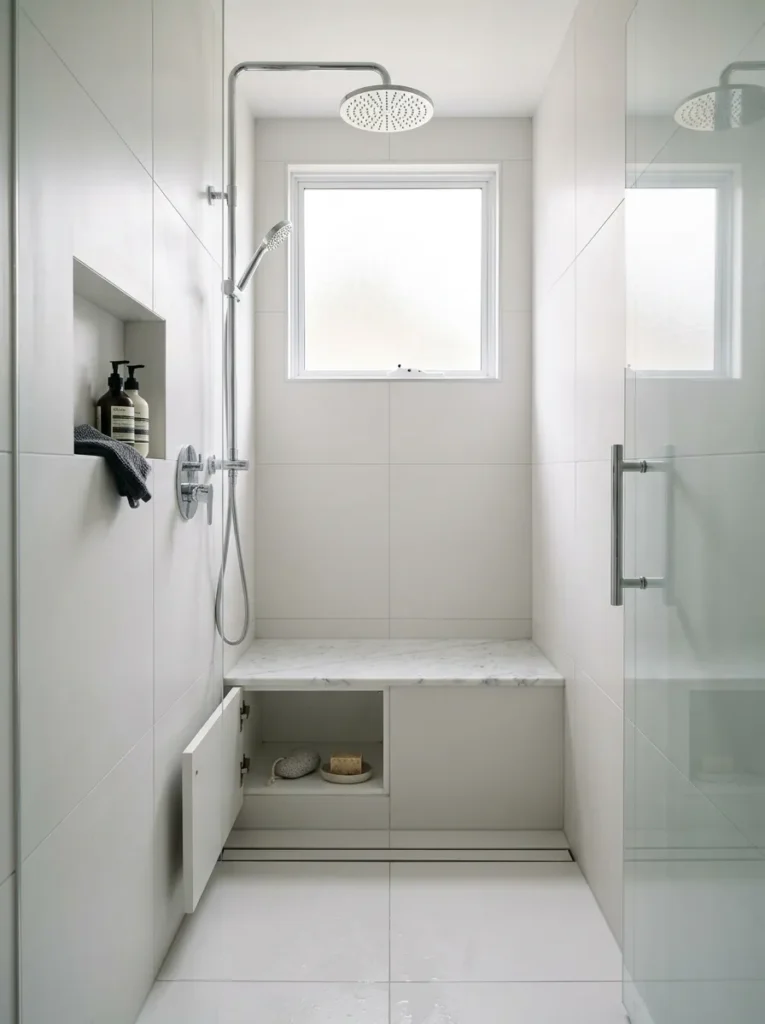
A built-in bench in a shower does three things in a small bathroom: it provides a practical seating surface for shaving, washing feet, or a rest during a longer shower; it acts as a structural support for the shower wall above it; and — when constructed with a hollow interior — it conceals a small storage volume that otherwise has no home in a small shower room. The hidden storage within the bench is the element most people don’t expect: a waterproofed hollow accessible via a magnetic push-to-open panel on the front face holds spare soap, a pumice stone, and the items that would otherwise sit on a shower floor creating slip hazards. The bench surface should be in the same material as the surrounding tile or a complementary stone — a marble bench in a tiled shower reads as an upgrade, not an afterthought. At 30cm depth, the bench consumes shower floor space efficiently: the shower remains fully functional, the seated user’s feet still clear the drain.
Idea 17: A Mirrored Splashback Behind the Basin
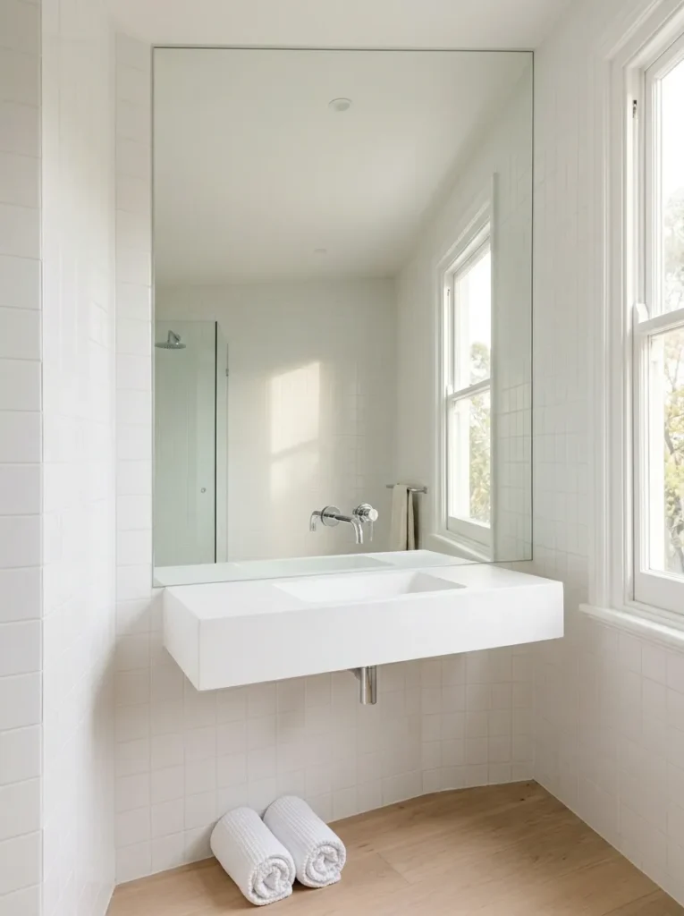
Using mirror as the splashback material behind a basin — rather than tile — combines the function of a vanity mirror with the function of a decorative splashback into a single seamless surface, and the result in a small bathroom is a depth illusion at the most intimate point in the room: the vanity. A mirrored splashback reflects the wall and window behind the user, creating a view that pushes the room’s apparent rear boundary backward. It also doubles the natural light entering from that reflected window, which brightens the room without any additional light source. Mirror is entirely appropriate as a splashback material: it is non-porous, wipes clean easily, and tolerates the minor moisture exposure from a basin without any sealant requirement. The specification decision is whether to use a single full-width panel (seamless, maximum impact) or mirrored tiles (more texture, easier DIY installation).
Idea 18: Open Structural Shelving Instead of Upper Cabinet Doors
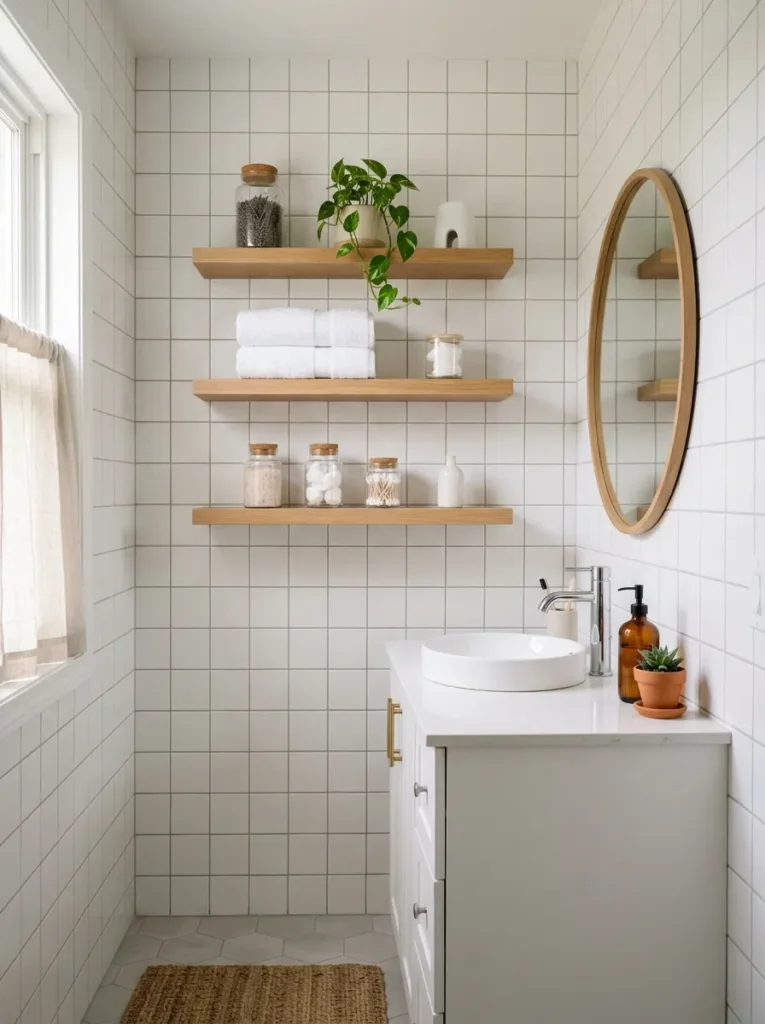
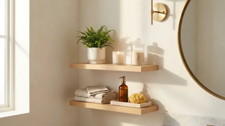
Upper bathroom cabinets — the wall-mounted units with doors that sit above a vanity — are one of the primary causes of visual compression in a small bathroom. Their solid door fronts create a dark mass on the wall that breaks the visual flow upward and makes the ceiling feel lower and closer. Replacing upper cabinets with open floating shelves removes that visual mass: the wall behind the shelves remains visible, the ceiling remains reachable by the eye, and the room reads as taller. The trade-off is that open shelving requires visual discipline — everything on the shelves will be seen. This is solved by containerisation: glass apothecary jars, ceramic pots, and woven boxes are all attractive when organised, and they provide real concealment for anything not worth displaying. The design benefit of visible organisation is also psychological: an organised open shelf signals control, which makes a small space feel intentional rather than cramped.
Idea 19: Vertical Stacked Tile Orientation Instead of Horizontal
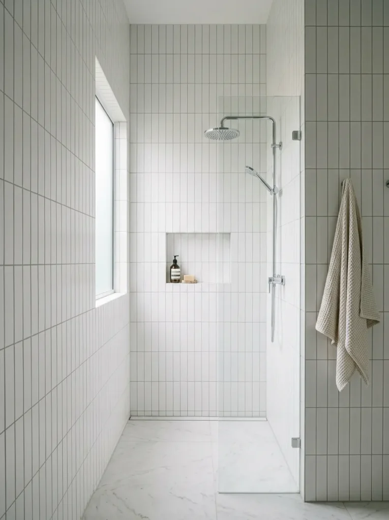
The standard tile orientation for rectangular subway or brick-bond tiles is horizontal — the long axis runs along the wall, and the tiles stack in offset rows. This orientation emphasises the room’s width. Rotating the same tile 90 degrees to orient the long axis vertically, and stacking them in straight columns rather than offset rows, reverses the emphasis entirely: the eye follows the vertical pattern upward, which makes the ceiling feel higher and the room taller. In a small bathroom where ceiling height is a felt constraint, this single orientation decision — requiring no additional cost or material — addresses the compression more effectively than most interventions. The straight stack-bond (tiles aligned directly above each other rather than offset) reinforces the vertical emphasis further: offset rows create a diagonal implied line, while straight stacking creates pure vertical rhythm.
Idea 20: A Frameless Shower Opening With No Threshold
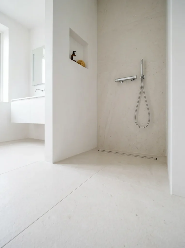
The threshold step — the raised edge between a shower tray and the bathroom floor — is one of the most visually fragmenting elements in a small bathroom. It physically divides the floor into two zones, it creates a tripping hazard, and it signals that the floor is not a continuous surface but two separate objects sharing the same room. A threshold-free frameless shower opening, combined with a flush linear drain and continuous flooring material, reads as a single unified floor plane that happens to slope slightly in one zone. The room reads as larger because the floor appears larger. The wet-room construction method this requires (a tanked, sloped floor that drains efficiently without a raised tray) adds cost over a standard shower tray installation, but the perceptual return — a floor that never interrupts itself — is one of the most impactful space-expanding decisions available.
Idea 21: A High-Gloss Ceiling to Reflect Light Downward
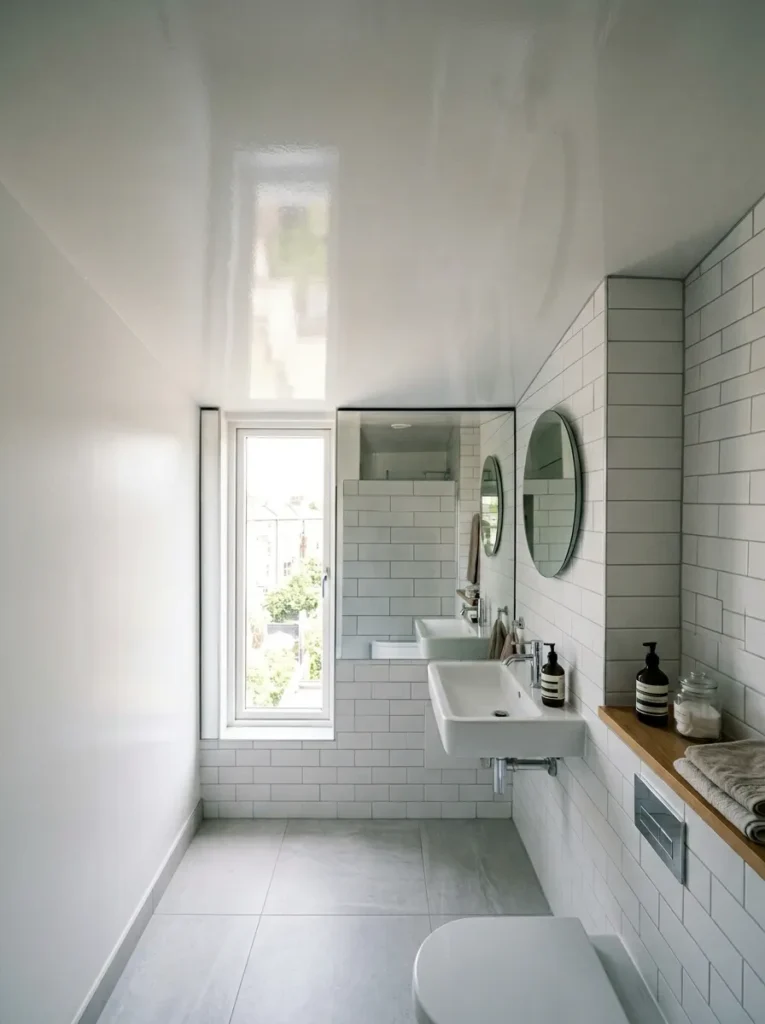
The ceiling is the one surface in a bathroom that nobody tiles, rarely paints in anything other than white matt emulsion, and almost never uses as a design decision. A high-gloss lacquer finish on a white ceiling turns it into a soft mirror — not reflective enough to see a sharp image (which would be disorienting), but reflective enough to bounce light from the windows back into the room and create the impression that the room is lit from above as well as from the sides. In a small bathroom where the window is small and the room dark, this multiplies the available natural light without adding any artificial light source. The practical requirement is a perfectly smooth ceiling — high-gloss paint amplifies every imperfection, so filling and sanding before painting is mandatory. Use a specialist interior gloss or semi-gloss formulated for bathrooms to withstand the humidity.
Idea 22: A Slimline Towel Radiator That Doubles as a Room Divider
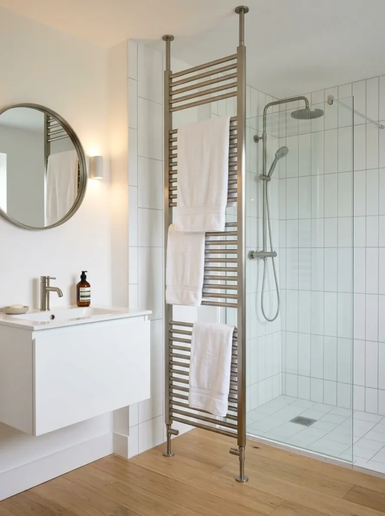
A floor-to-ceiling slimline towel radiator positioned perpendicular to a wall — projecting slightly into the room — creates a soft architectural boundary between bathroom zones without consuming significant floor space or blocking sight lines in the way a half-wall would. In a small bathroom that contains both a shower and a vanity, the visual separation between wet and dry zones helps the room read as comprising distinct areas rather than being a single undifferentiated box. The slimline radiator achieves this with a profile of only 25–30cm — the warm towels draped at different heights add visual mass and textile interest without any additional furniture. The brushed nickel finish reads as architectural rather than decorative, which prevents it from looking like a prop and ensures it contributes to the room’s overall finish quality.
Idea 23: Niche Lighting Inside Recessed Wall Niches
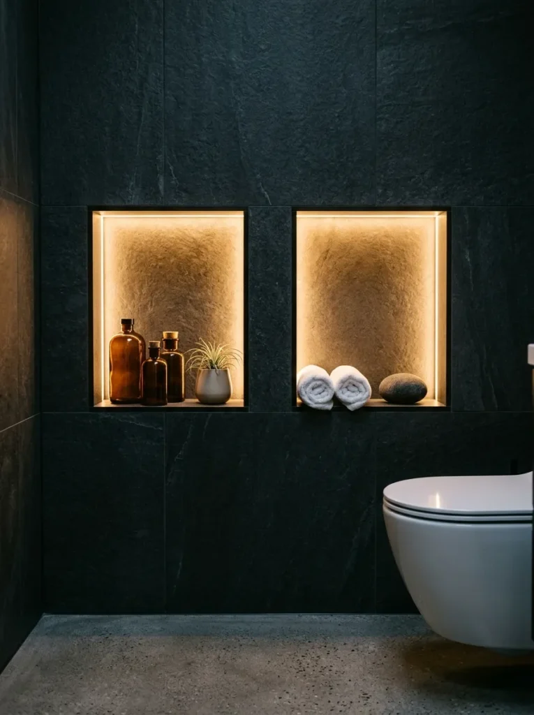
LED-lit recessed niches perform a spatial trick that unlit niches do not: the light source inside the niche draws the eye into the wall, creating a perceived depth beyond the wall surface. The brain reads depth as space, so a room with illuminated niches feels deeper and larger than a room of the same dimensions without them. The warm amber colour temperature of the niche LED (2700K or lower) provides the correct spa-adjacent atmosphere, and the backlit display quality it creates turns even simple objects — glass bottles, a small plant, rolled towels — into something that reads as curated. The practical implementation requires only an LED strip light on a transformer recessed into the niche perimeter before tiling — a simple addition at the tile stage or a retrofit in an existing niche using a surface-mounted strip with an adhesive backing. In a small bathroom, even two niches add meaningful storage and a lighting layer that makes the room feel finished in a way that overhead-only lighting never achieves.
Conclusion
Small bathrooms reward precision. Every decision — tile orientation, door type, vanity style, ceiling finish, light placement — compounds. The ideas in this list work not because they are independently clever, but because they understand the specific mechanisms by which small bathrooms feel either constrained or considered: the continuity of floor planes, the movement of light, the interruption of sight lines, and the points at which the eye is given something to follow upward rather than outward. You don’t need 23 of these. You need the five or six that address the specific spatial problems your small bathroom has. Implement them well, and the square footage stops mattering.