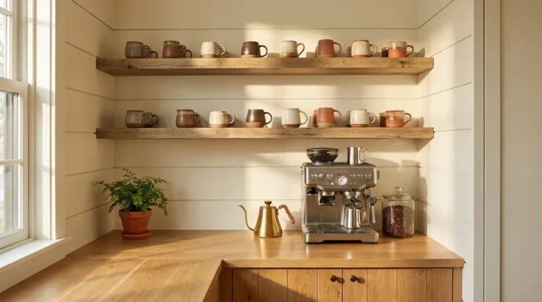
19 Kitchen Counter Organization Ideas That Look Beautiful
Most kitchen counter organization advice focuses on what to remove — which is important, but it’s only half the work. The kitchen counter that looks genuinely beautiful isn’t just less cluttered than a disorganized one; it has a visual logic of its own. Items are grouped intentionally. Heights vary along the counter’s length. The sink area reads as styled rather than functional. The appliances that can’t be put away are treated as anchor pieces rather than visual problems to manage. And at least one section of the counter is completely clear — a visual rest that makes everything else read more deliberately.
These 19 ideas cover both the organizational decisions and the aesthetic ones, because a kitchen counter that’s only organized — not styled — misses what makes it genuinely beautiful.
Edit the Counter First — Identify What Belongs Versus What Drifted There

Before any styling decision, the kitchen counter needs an honest edit. Remove every item from the surface and return only the things that genuinely belong there: appliances used daily that are too large or heavy to store conveniently, items that require counter access as part of the regular cooking routine, and the deliberate display elements that contribute to the counter’s aesthetic. Everything else — the mail stack, the random utensil that migrated from a drawer, the supplement bottles, the grocery list — belongs somewhere else.
The counter that looks beautiful isn’t the one with the most attractive items on it. It’s the one where every item has a considered reason to be there. The edit creates the foundation for every aesthetic decision that follows. No styling choice improves the look of something that shouldn’t be on the surface in the first place.
Define a Working Zone and a Display Zone Before Adding Anything New
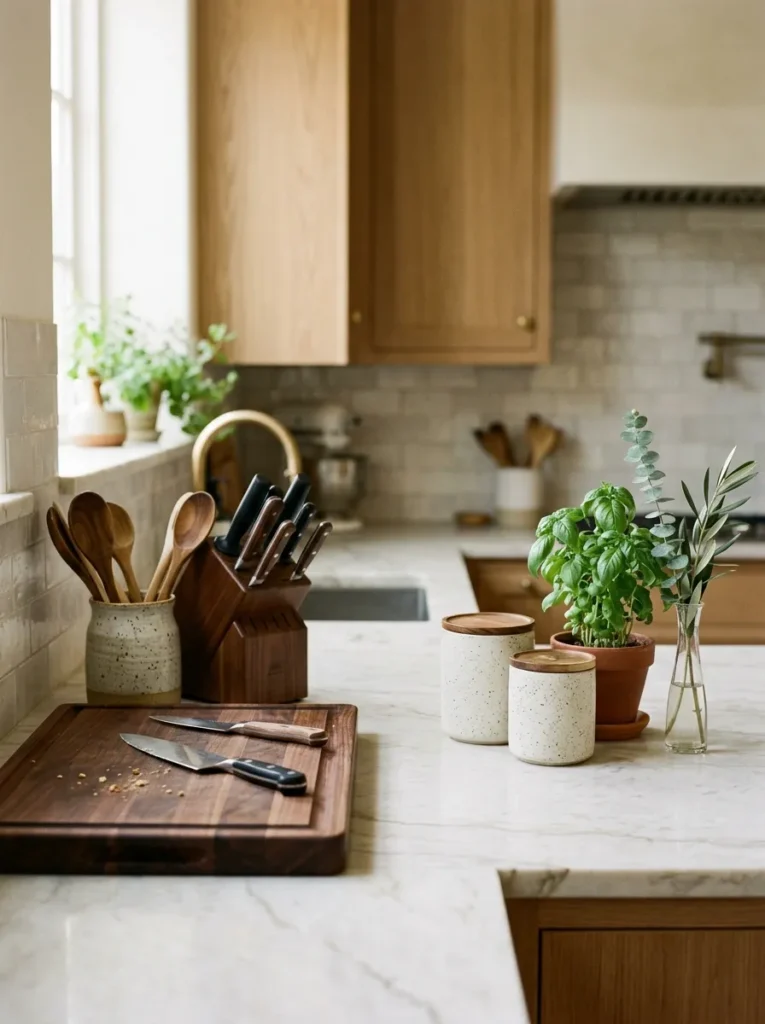
A kitchen counter typically plays two roles that work against each other when they share the same surface without any organizational distinction. The working zone is where food is actively prepared — where the cutting board goes during cooking, where the knife block lives, where hands and tools make contact with food. The display zone is the section styled with beautiful objects — canisters, botanicals, the cutting board as a prop when not in use, a ceramic utensil holder — that makes the counter look curated between cooking sessions.
Identifying which counter sections serve which role before placing any item makes every decision more coherent. Working zone items and display zone items have different spatial requirements, different material logic, and different visual character. When they share the same space without a zone distinction, the counter reads as accumulated. When each has its own section, the counter reads as arranged.
Coordinate the Finish of All Small Appliances for Visual Coherence

A kitchen counter with a black toaster, a stainless coffee maker, a white electric kettle, and a chrome stand mixer reads as visually busy regardless of how cleanly each appliance is maintained. The four different finish colors compete with each other rather than composing into a unified surface, and no amount of styling around them resolves the underlying finish conflict.
Coordinating small appliance finishes — moving toward a single finish family (all stainless, all matte black, all white, all warm chrome) — resolves this competition and makes the counter read as a deliberate design decision rather than an accumulation of independent purchases. The three appliances that benefit most from coordination, because they’re most often visible simultaneously, are the coffee maker, the toaster, and the electric kettle. Swapping one or two of these into a coordinating finish creates an immediately more cohesive counter surface without changing anything else.
Store Only What’s Beautiful or Genuinely Functional — Everything Else Goes in a Cabinet

The filter that determines what earns counter space in a beautiful kitchen: every item on the surface should pass at least one of two tests. It’s genuinely beautiful — something that contributes to the counter’s aesthetic even when it’s not in use. Or it’s genuinely functional and too large or heavy to store conveniently, retrieved and returned to the cabinet being the impractical option. Items that are purely functional and easily stored belong in a drawer or cabinet, retrieved when needed rather than permanently displayed.
This filter clears the majority of kitchen counter clutter: the small appliances used monthly that live on the counter because no storage home was ever found for them, the supplement bottles, the cleaning products visible on the sink edge. The beauty test and the functional test applied together leave a counter surface where every remaining item earns its position.
Use Uniform Canisters for the Daily-Use Items That Must Stay Out

If flour, coffee, salt, sugar, or other daily-use dry goods earn counter space based on frequency of use, their original packaging — paper bags, commercial containers in varying sizes, folded tin cans — works against the counter’s visual coherence the same way original spirit bottles work against a bar cart. Transferring these items into a set of uniform canisters converts the counter’s most practical items into one of its most attractive visual elements.
A canister set in matte white ceramic, warm terracotta, glazed stoneware, or clear glass with coordinating lids reads as architectural rather than stored goods. The individual choice matters: airtight-seal canisters keep dry goods fresh, and labeled lids prevent household members from opening the wrong container. The visual investment pays daily dividends because the canisters are on the counter at every moment — they’re not occasionally decorative but permanently displayed functional objects that should look as good as they work.
Create the Coffee or Tea Station as a Designed Vignette
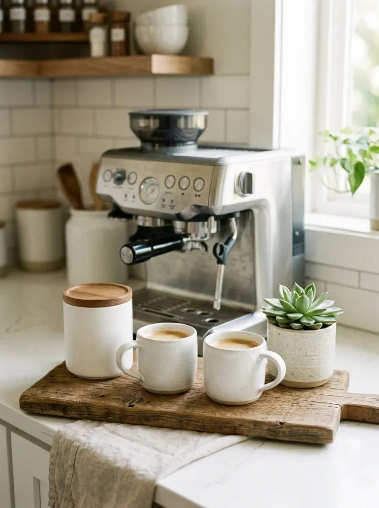
The coffee area is the kitchen counter’s most visited section every morning and, in most kitchens, its most visually neglected. The coffee maker sits where it was first placed, surrounded by a loose collection of mugs, sweetener packets, and whatever else accumulated nearby over time.
Styling the coffee station as a deliberate vignette applies the same composition logic as any other curated surface arrangement. The coffee maker serves as the back anchor piece. A small wooden board or slim tray defines the station’s footprint on the counter. Matching mugs in a pair are positioned in front of or beside the machine. A uniform canister holds coffee. A small plant or slim bud vase provides the vertical accent. The grouping has a boundary, a hierarchy, and a clear spatial logic. The same items without this composition read as a utility corner. With it, they read as one of the counter’s most carefully arranged sections.
Treat the Sink Area as the Counter’s Most Important Styled Zone

The sink area is often treated as a design concession — the section where function overrides aesthetics, where the dish soap sits in its original packaging and the sponge rests in a plastic holder because that’s simply how it’s always been. But the sink area is actually the counter’s highest-visibility zone: it’s where people stand longest during kitchen tasks, where guests’ eyes naturally travel when visiting the kitchen, and where the daily domestic routine is most concentrated.
A styled sink area means coordinating pump dispensers for dish soap and hand soap in the same material family, a ceramic or stone soap dish, a natural-handled dish brush in a small ceramic holder, and no visible product packaging anywhere at the sink. When the entire sink zone speaks one material language — all ceramic, all matte stainless, all warm stone — it reads as a deliberate design decision rather than the default outcome of buying each item separately at different times.
Display Cooking Utensils in a Beautiful Holder as a Counter Centerpiece

The cooking utensil holder positioned beside the stove is one of the most consistently visible items on a kitchen counter — at the center of the cooking zone, reached dozens of times during each cooking session. In most kitchens, it’s a plastic or basic metal utility crock that draws attention to itself as a purely functional object with no aesthetic contribution.
A handthrown ceramic, stoneware, or textured stone utensil holder changes this entirely. Add wooden or natural-handled tools — a wooden spoon, a bamboo spatula, a natural-bristle brush — visible at varying heights above the rim, and the composition reads as genuinely attractive. The tools themselves contribute to the visual: wooden handles at varied heights above a beautifully glazed vessel create a kitchen counter moment that’s both functional and considered. The utensil holder is among the single-item aesthetic upgrades with the highest visual impact relative to cost.
Vary the Height of Items Along the Counter’s Full Length for Visual Rhythm

A kitchen counter where every item stands at roughly the same height — the coffee maker at 13 inches, the canister set at 12 inches, the utensil holder at 11 inches — reads as visually flat from across the kitchen, regardless of how well each individual item is chosen or styled. Flat counters look like displays, not kitchens.
Visual rhythm along a kitchen counter requires variation: a short item beside a tall one, a flat cutting board leaning against the backsplash beside a tall kettle, a low fruit bowl beside a tall vase. The rhythm should read across the full counter length, not just within one grouped section. Step back from the counter and assess the full horizontal line. If all the items make the same silhouette height, introduce one taller element — a slim vase, a tall kettle, a cookbook standing open — to break the uniformity.
Add a Wooden or Marble Cutting Board as Both a Prop and a Working Surface

A quality cutting board is one of the kitchen counter’s most naturally beautiful objects — warm wood grain, worn from use, or cool marble with natural veining — and one of the most commonly hidden in a cabinet between uses. On the counter, a cutting board functions as both a practical surface and a styling prop simultaneously.
Leaning a large wooden or marble cutting board against the backsplash in the working zone adds warmth, material texture, and visual depth to the counter at a scale that small accessories can’t achieve. A large board leaned vertically reads differently than one lying flat: it takes less counter footprint, shows more of its surface grain or pattern, and creates a substantial object in the display zone that holds its own against the adjacent appliances. This is one of the simplest and most effective counter styling moves available.
Leave at Least One Full Section of Counter Completely Clear
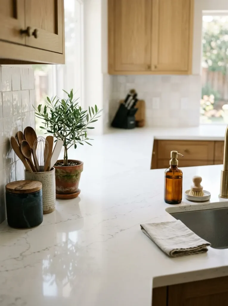
Every piece of advice about kitchen counter organization — from competitors and from this article — is about what to put on the surface or how to arrange it. This idea is the exception: the most important styling decision on a kitchen counter is identifying one full section of the surface to leave completely empty.
A clear counter section communicates that the surface has breathing room — that the kitchen isn’t at maximum capacity, that there’s space to work, to set something down, to use the kitchen actively. It also makes every adjacent item read more distinctly because it has empty space beside it rather than another item. The clear section should be the longest continuous stretch the layout allows: not a 6-inch gap between two groups, but a genuine uninterrupted section of visible countertop. On a long counter, this might be a full 24 inches or more. That space is never wasted; it does more visual work than anything placed within it.
Add a Small Tiered Stand to Create Vertical Layers Without More Footprint

In a kitchen where counter space is genuinely limited, a two-tier stand or small riser creates additional surface capacity in vertical space rather than horizontal — more objects accommodated at the same footprint. But beyond the spatial benefit, a tiered stand creates the height variation that the visual rhythm principle requires without requiring any furniture change or additional arrangement.
A tiered fruit stand, a two-level spice riser, or a small step-style riser at the end of the canister zone lifts the back-row items above the front-row ones, making both rows simultaneously visible. The materials that read most beautifully in a kitchen: warm oak or walnut for organic warmth, marble for an elevated contrast material, matte white powder-coated metal for a modern kitchen. The stand should be in proportion to the items it holds — a large tiered stand with small items reads as overscaled; the right scale makes the items appear deliberately elevated.
Grow a Potted Herb Garden as the Counter’s Functional Botanical Element

A small row of potted kitchen herbs — basil, rosemary, thyme, mint — positioned near the kitchen window is the counter element that earns its space most completely: it’s genuinely functional as a cooking ingredient source, genuinely beautiful as a living botanical, and genuinely aromatic in a way that makes the kitchen feel immediately more alive.
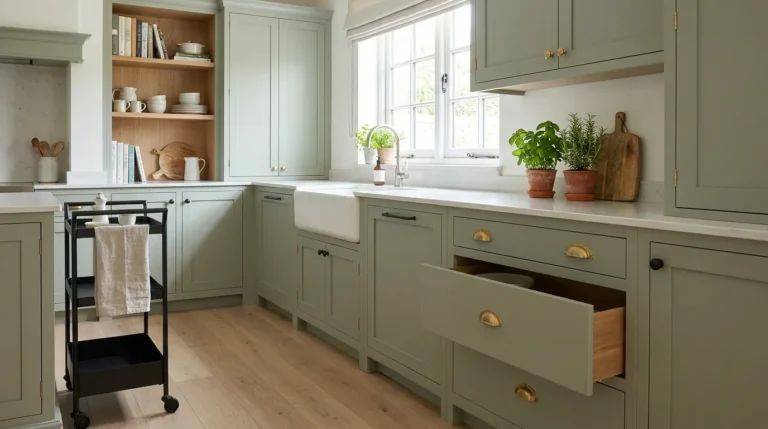
The styling principle for a counter herb garden: use matching pots rather than the nursery plastic containers the herbs arrive in. A set of three identical terra cotta pots, white ceramic planters, or dark glazed containers planted with herbs of varying heights — basil tallest, thyme lowest — reads as a designed element rather than a collection of purchased plants. Position the row near the window for light and to make the herbs visible from the kitchen’s primary working position.
Place a Bowl of Seasonal Fruit as a Living Color Accent

A bowl of fruit on a kitchen counter does something no purchased decorative object can: it changes with the season, signals the home’s grocery habits, and provides both color and organic form at a counter scale that small accessories rarely achieve. Lemons in a cream ceramic bowl read entirely differently in January than in July — the same object communicating seasonal awareness without any deliberate styling change.
The bowl choice matters as much as the fruit. A shallow wide ceramic bowl, a wire French basket, a handthrown stoneware bowl, or a wooden bowl each reads differently against the counter’s material and holds different fruit quantities differently. The bowl should be large enough to hold a meaningful quantity of fruit rather than three pieces rattling in an oversized vessel. Fruits with visual interest — lemons, limes, green apples, blood oranges, figs, pomegranates — add more to the counter’s aesthetic than generic mixed fruit.
Add One Stem or Branch Near the Window as the Counter’s Visual Full Stop

At one end of the kitchen counter — typically the end nearest the window or the brightest natural light source — a single stem or architectural branch in a slim vase serves as the counter’s visual full stop: the element that closes the horizontal composition and gives the eye a place to rest after traveling the counter’s length.
The choice of stem matters: a single eucalyptus branch, a stem of olive leaves, a sprig of dried cotton, a single amaryllis stem, or a seasonal branch that coordinates with the time of year. The vase should be slim and vertical — a bud vase, a narrow ceramic cylinder, a small glass vessel — that holds one stem intentionally rather than making the stem appear to be the remnant of a larger arrangement. One stem in a narrow vase near the window reads as a completed design choice.
Place a Cookbook or Recipe Stand as an Unexpected Styling Piece

A beautiful cookbook standing open or displayed face-out on a countertop stand is among the most personal and most often overlooked kitchen counter styling elements. Unlike every other item on the counter, a cookbook communicates something specific about the person who lives there: what they cook, what they find beautiful in food culture, what inspires them in the kitchen.
A cookbook stand — a small wooden or acrylic holder that keeps the book open and upright at the back of the working zone — is both functional during cooking (the recipe at eye level) and beautiful at all other times (the book’s cover or a beautiful spread of photography visible at the counter’s back). A well-designed cookbook cover is genuinely attractive as a counter object. A recipe card stand with a handwritten card works equally well for smaller kitchens where a full book would be visually oversized.
Fold and Display a Beautiful Kitchen Towel as the Counter’s Textile Element

A kitchen counter is an environment of hard surfaces: stone, ceramic tile, stainless steel, glass, wood. A folded linen or cotton kitchen towel placed deliberately on the working zone’s edge adds the only softness in this material landscape — and does something none of the hard-surface items can achieve: it communicates warmth and immediate domestic readiness.
The towel should be chosen rather than utility-purchased. A linen blend in a warm neutral, a textured cotton with a simple woven stripe, or a waffle-weave cotton in an earthy tone — folded and placed at the end of the working zone or loosely draped beside the sink — reads as a considered textile choice rather than a functional afterthought. A beautiful kitchen towel costs no more than a utility one and changes the counter’s material warmth register in a way no ceramic or stone item can replicate.
Choose One Artisan Kitchen Object That Functions as Both a Tool and a Display Piece

A marble mortar and pestle. A ceramic salt cellar with a small wooden spoon. A honey jar with a wooden dipper beside it. A beautiful wooden pepper mill with a distinctive turned profile. These are kitchen tools with enough aesthetic quality to earn counter space as display pieces between uses — objects that are functional when reached for and beautiful when not.
Identifying one or two kitchen tools in this category and positioning them deliberately in the display zone adds a visual authenticity that purely decorative items can’t provide. The object communicates that the kitchen is actively used and that its tools were chosen with some care — not simply purchased for function. The marble mortar and pestle is the most versatile of these tools: its weight, material contrast, and profile read as genuinely sculptural against a kitchen counter surface, at a scale that earns its counter position.
Evaluate the Counter from the Kitchen Entry and Style That View Specifically

Every other idea in this article is about the counter at close range — what to put on it, how to arrange it, which zones to define. This final idea is about the full-room view: stepping back to the kitchen entry point, looking at the counter from the distance a person sees it when they first walk into the room, and evaluating what that view reveals.
The kitchen entry view is the counter’s first impression — the view that determines whether the kitchen feels organized and inviting or cluttered and visually busy before anyone has walked to the counter itself. From this distance, individual styling details become secondary: what reads is the overall silhouette, the height variation, the color coherence, and the presence or absence of clear counter surface. Style the counter, then step back to the entry, and make one adjustment from that viewpoint. It is almost always the most important adjustment made in the entire process.
Pro Designer Tips
Repeat one material or color across the counter’s full length. When the warm wood of the cutting board, the wooden handles in the utensil holder, and the wooden lid of the coffee canister are all visible along the same counter, the repetition creates cohesion without requiring any matching sets. Repeating one material three or more times across the counter’s length is the simplest way to make a counter read as intentionally designed.
The backsplash is the counter’s visual backdrop — style in front of it, not just on it. Items positioned against the backsplash — a leaning cutting board, a cookbook stand, a row of uniform canisters — benefit from the backsplash’s tile or stone as a composed backdrop. This relationship between counter items and backsplash material is the visual depth principle that makes kitchen counter photographs look professionally styled.
Small appliances in storage are better than large appliances in poor condition. A coffee maker with a stained carafe or a toaster with crumb residue visible does more damage to the counter’s appearance than no appliance at all. The appliances that stay on the counter should be maintained. Any appliance showing wear, staining, or damage should either be cleaned thoroughly before being styled around or moved to a cabinet until replaced.
A counter that looks great in winter morning light may look different in summer afternoon light. Natural light changes the appearance of materials, finishes, and colors across the counter’s surface at different times of day and in different seasons. Evaluate the counter’s appearance at the light condition most important to you — typically morning for a kitchen — and make styling adjustments for that specific light rather than a neutral midday assessment.
Keep one kitchen towel at the counter and one at the stove — not four scattered across both. The towel becomes a styling prop only when it’s one deliberate piece in a deliberate location. Multiple towels draped in multiple places read as utility, not design. One beautiful towel, folded once and placed at a specific position, is the rule.
Final Thoughts
A kitchen counter that looks beautiful isn’t the result of buying more attractive items to put on it. It’s the result of a specific sequence of decisions: edit first, then define zones, then coordinate the finishes of what can’t move, then style what remains with the visual principles — height variation, clear zones, intentional empty space — that make the result read as designed rather than accumulated.
The surface that holds together visually is almost always the one that holds fewer things, not more. Every item earns its position by passing the beauty test, the functional test, or both. The rest goes in a cabinet — and the counter becomes the room feature it was always capable of being.