23 Dining Room Shelf Decor Ideas That Feel Curated
A dining room shelf is observed differently from any other shelf in the home. It’s seen at length, from a fixed seated position at the dining table, by people who have nothing to do except be present in the room. It functions as the backdrop to meals, to conversation, to the experience of being at that table. The shelf that “feels curated” in this context is always the one with specific characteristics: each shelf level reads as its own complete arrangement, negative space is as deliberate as the objects placed within it, and the display coordinates with the dining room’s overall character rather than existing independently of it.
These 23 ideas address each element of that quality — from the foundational composition principles to the dining-specific display choices that no generic shelf-styling guide covers, because they only make sense in a room where meals are served and guests are seated.
1.Anchor Each Shelf Level With One Large Statement Object
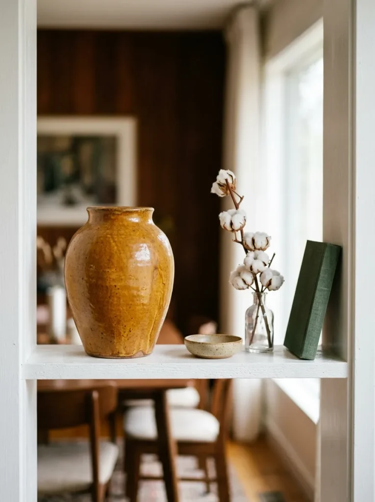
The shelf arrangement that feels random almost always has the same underlying cause: objects of similar scale spread evenly across the surface, with no single piece carrying enough visual weight to ground the composition. A shelf filled with objects of roughly the same size reads as a collection of things rather than an arrangement — the eye scans across it without a clear entry point or resting place.
Anchoring each shelf level with one large statement object resolves this. A tall vase, a substantial handthrown ceramic, a large art book placed horizontally, a broad platter leaning against the back wall — each one defines the shelf’s visual center of gravity. Every smaller object arranged around the anchor reads as contextual rather than random. The anchor should be genuinely significant relative to the shelf: at least one-third of the shelf’s visible length, or visibly taller than any adjacent object. One anchor per shelf level is the rule; two of equal size on the same shelf compete rather than compose.
2.Treat Each Shelf Level as Its Own Separate Composition
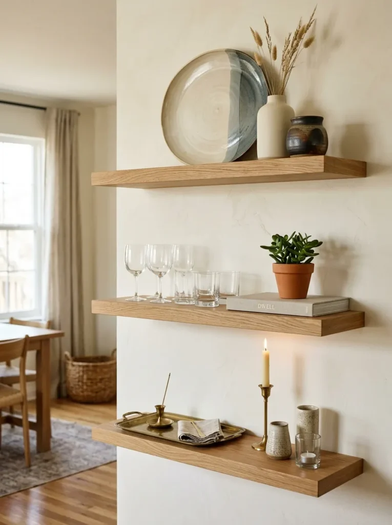
A shelving unit with multiple tiers is not one large display. It is a vertical stack of individual compositions, each with its own spatial boundary, its own visual hierarchy, and its own internal logic. Styling that treats all shelves as a single continuous surface — filling it from end to end as one long arrangement — produces a display the eye reads as a wall of objects rather than a composed unit.
Treating each shelf as its own composition means giving each tier a clear beginning, a middle, and a deliberate end — whether that end is a final object or empty surface that closes the composition. The three tiers of a shelving unit then read both individually and collectively: the eye moves from one to the next the way it reads a page, tier by tier, each shelf a complete thought. From across the dining room, the unit reads as organized. Up close, each shelf reads as considered.
3.Leave Visible Negative Space on Every Shelf
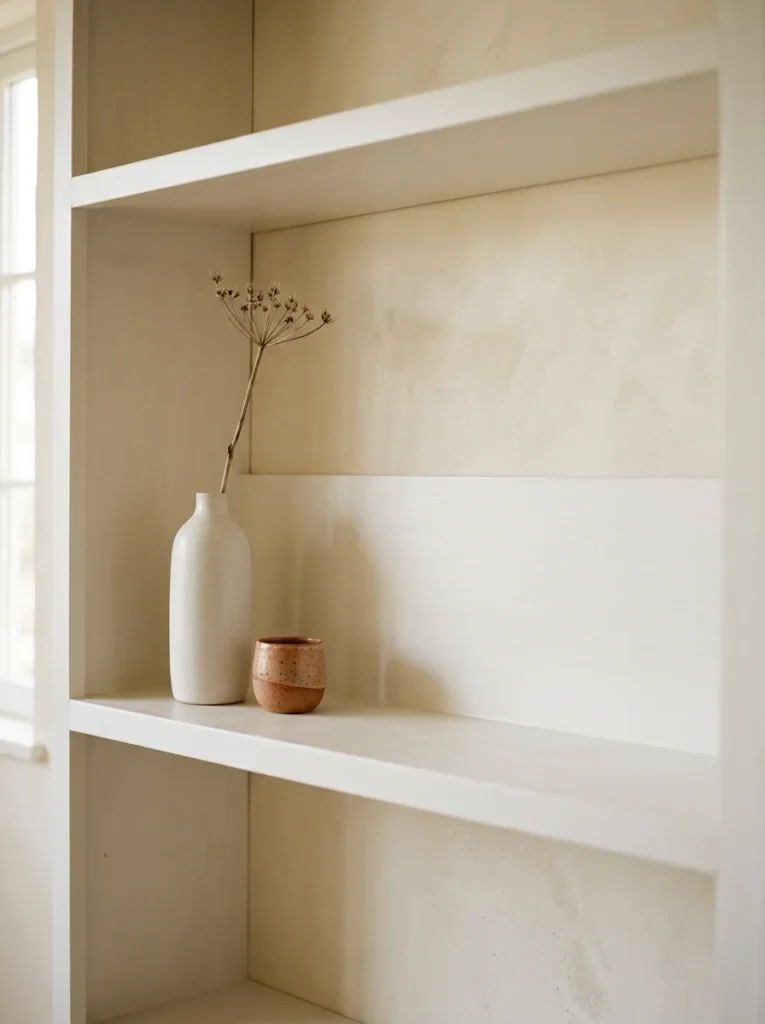
The quality most consistently present in shelf displays that feel genuinely curated — and most consistently absent in those that feel cluttered — is negative space: visible shelf surface intentionally left clear around and between the objects placed there. Negative space is not wasted space. It is the visual rest that allows each object to be seen distinctly rather than in competition with everything adjacent to it.
For a dining room shelf specifically, the shelf’s own surface material deserves to be part of the composition. Walnut-stained wood, painted white pine, a marble-top shelf unit: these materials contribute to the dining room’s aesthetic and earn visible representation within the arrangement. Filling the shelf surface to its edges eliminates this contribution entirely and makes the display read as packed rather than chosen. The practical guide: at least one-third of each shelf’s surface area should be visibly clear of objects at all times.
4.Style for the Seated Eye-Level View From the Dining Table
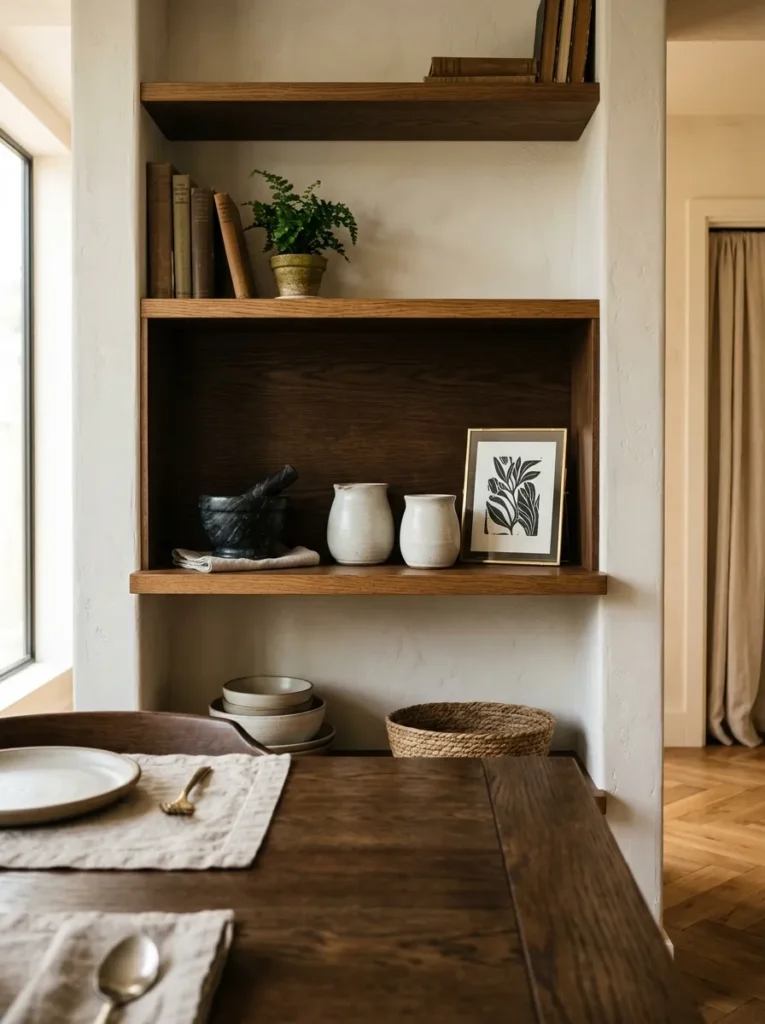
The dining room shelf has a viewing context that no other room’s shelf shares: it is seen at length, from a fixed seated position, by guests who have nowhere to look except the room itself. The shelf is a backdrop to the dining experience — present during meals, during conversation, during pauses between courses. This makes the seated eye-level view the single most important viewing angle for a dining room shelf display.
In practice, this means identifying which shelf level aligns with seated eye level — typically the shelf between 2.5 and 4 feet from the floor — and styling that tier with the greatest intentionality. The most beautiful object on the unit, the most carefully composed arrangement, the anchor piece with the most visual character should occupy this level. The upper shelves read at standing height. The lower shelf reads at approach distance. But the tier at the seated guest’s eye level is the one seen for the full duration of every meal served in that room.
5.Display Open Glassware in a Row for Function and Visual Rhythm
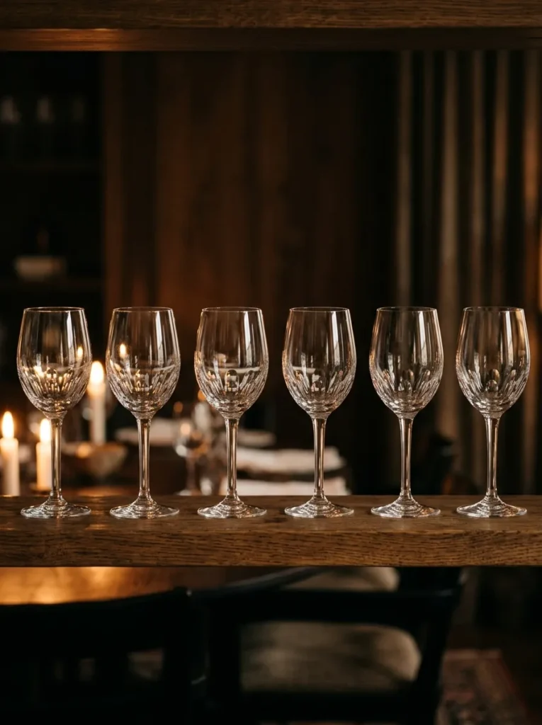
Glassware on a dining room shelf serves two roles simultaneously: it provides accessible storage for glasses used at the table, and it creates the display’s most consistently elegant visual element — uniform, light-catching, and immediately legible as dining-room appropriate. A row of matching glasses reads as genuinely prepared for company rather than aspirationally decorated.
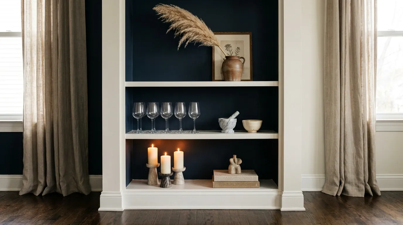
Six identical wine glasses standing in a line along the back of a shelf create visual rhythm: the repeated form at consistent height and regular spacing reads as a composed element rather than stored glassware. Crystal or clear glass catches both natural daylight and candlelight from the dining table in a way that no ceramic or solid object achieves at the same scale. The glassware row is most effective on the shelf immediately closest to the table — where practical access and visual impact coincide, and where candlelight from a dinner setting catches the glass edges most dramatically.
6.Stack and Display Ceramic Plates or Chargers as Sculptural Objects
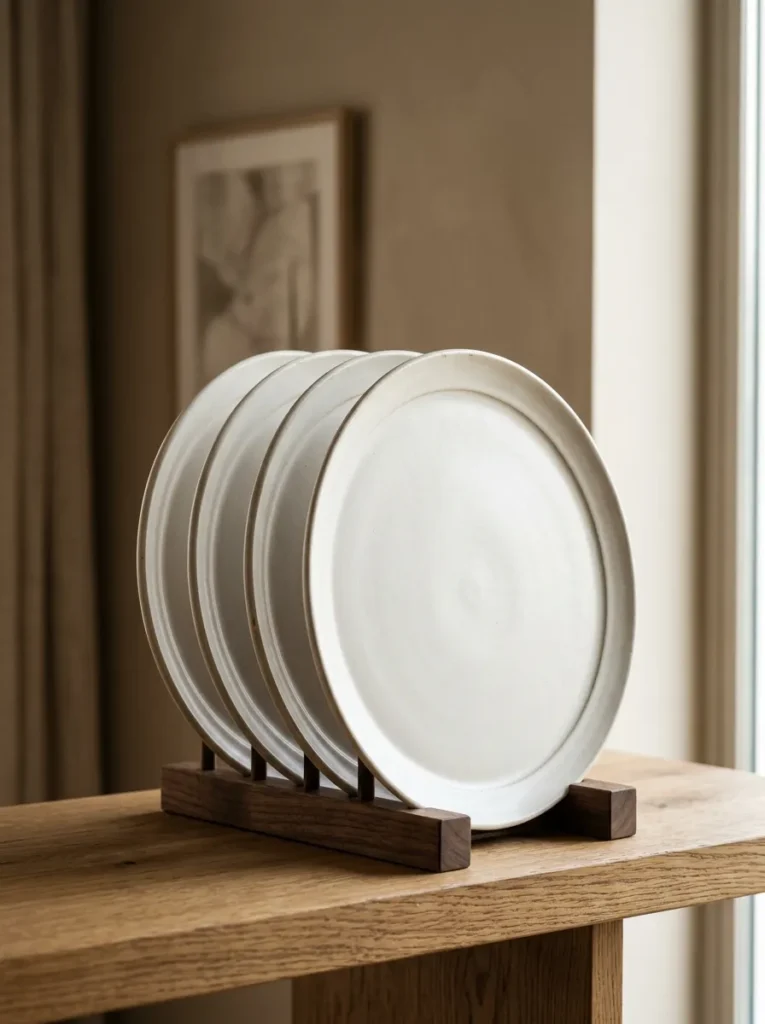
A ceramic plate is a flat object when lying horizontal, but a sculptural one when standing vertically. A stack of three or four matching plates in a plate stand, or a single large charger leaned against the shelf back, creates visual interest at the shelf’s background zone that no vase or candle achieves: the displayed plate communicates the dining room’s function while serving as a genuinely beautiful surface element.
The plate choice determines the display’s character entirely. Matte white stoneware plates read as calm and modern. Hand-painted blue and white ceramic plates read as collected and traditional. Dark-glazed plates in espresso or deep olive read as moody and sophisticated. A set of four chargers displayed as a vertical group becomes a design statement as visually strong as any art piece placed in the same position — with the added quality of communicating that the room is genuinely used for dining rather than simply styled to look like it is.
7.Lean a Large Platter, Art Plate, or Artisan Ceramic Against the Shelf Back
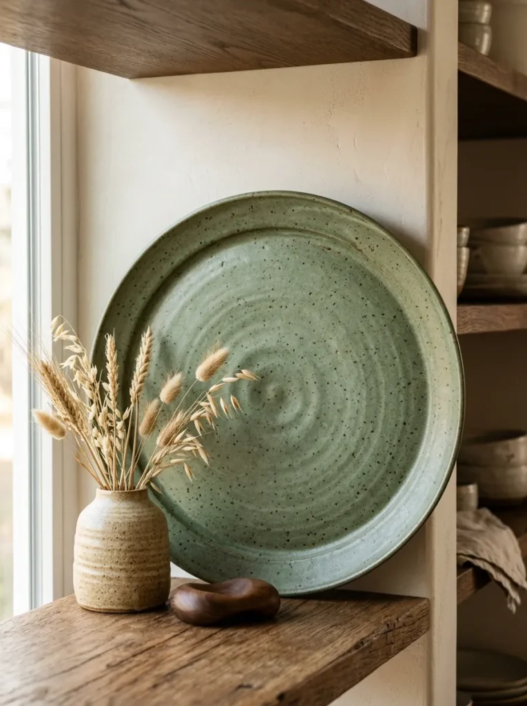
A single large object leaned against the shelf’s back wall occupies the display’s most visually dominant position — the full background height of the shelf, unobstructed by any object in front of it — and provides a scale and visual presence that free-standing objects arranged in a row cannot achieve from that same position.
A handthrown ceramic platter in a warm glaze. A hand-painted decorative plate with a visible artisan mark or pattern. A large raku-fired bowl positioned face-forward to show its interior glazed surface. Any of these objects, leaned at the shelf back rather than standing alone, benefits from the wall as a structural support and fills the shelf’s entire background plane. Everything positioned in front of it — the glassware, the candle holder, the small ceramic — reads as a foreground layer against a composed backdrop. This front-to-back visual depth is what gives the display a three-dimensional quality rather than a flat one.
8.Group a Collection of Similar Objects for Visual Coherence
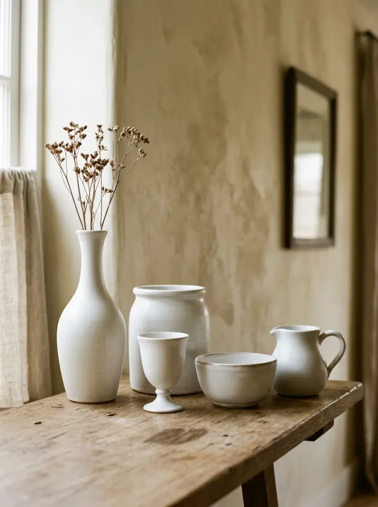
A shelf arrangement built around one material family or object category — all ceramics, all brass pieces, all stoneware vessels, all handmade pottery — creates the visual coherence that makes a display feel like an assembled collection rather than a gathering of individual purchases. The repetition of one material across different object forms signals that the display was built with a specific point of view.
For a dining room shelf, a grouping of matte white ceramic vessels in different scales — a tall narrow vase, a short wide bowl, a small pitcher, a medium crock with a wooden lid — reads as a deliberately assembled collection of clearly related objects. The material identity remains consistent across every piece while the forms vary in height, width, and function. This combination of material unity and formal variety creates more visual interest than a matched set of identical objects while maintaining the coherence that a mismatched collection lacks entirely.
9.Display a Cookbook or Recipe Hardcover as a Shelf Art Piece
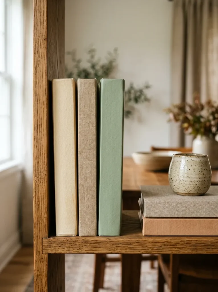
A hardcover cookbook — particularly one with a strong cover design, a beautiful spine color, or exceptional food photography — is a shelf art piece that no other dining room object matches for personal relevance. A cookbook on the dining room shelf communicates something specific about the household: what food culture matters here, what cuisines are explored, what beauty the kitchen and table are oriented toward.
Displayed spine-out in a small group, face-forward on a small wooden stand, or horizontally as the base layer for a ceramic placed on top, the cookbook becomes the shelf’s most quietly personal element. A single large cookbook leaning against the back panel reads as an editorial decision. Two or three spine-out books in coordinating colors — warm cream, soft sage, natural tan — read as a curated selection. The cookbook earns its dining room shelf position because its subject matter connects it specifically to the room’s purpose in a way that a novel or design book on the same shelf cannot.
10.Create a Dedicated Candle Zone on the Shelf Nearest the Table
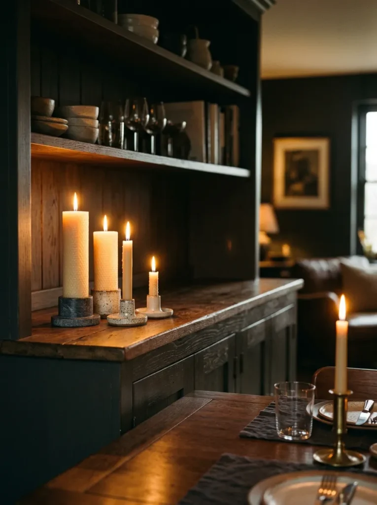
Candlelight and the dining table share a relationship no other room in the house has — which makes a shelf dedicated to candle display a dining-room-specific idea rather than a generic shelf styling tip. A candle zone on the lowest or nearest-table shelf level creates a visual connection between the shelf’s display and the dining experience that no other object type achieves as naturally.
Two or three pillar candles of varying heights in ceramic, glass, or natural stone holders clustered at one section of the shelf level nearest the table. When lit for a dinner, the candles at shelf height create ambient light at a different level than the table candles, adding depth and warm illumination to the entire room. When unlit, they read as a composed arrangement within the shelf’s larger display — a zone with a specific, dining-appropriate purpose that the room’s guests understand immediately.
11.Add One Trailing Plant That Cascades Over a Shelf Edge
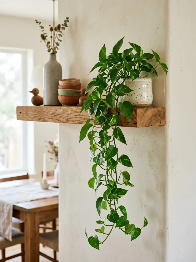
A trailing plant breaks the horizontal plane of the shelf edge in a way no upright botanical achieves: it grows downward rather than rising upward, contrasting with every other element on the shelf — the upright glassware, the vertical vases, the leaned platters — and introduces organic, living movement that no arrangement of inanimate objects can replicate regardless of how it’s composed.
The most effective trailing plants for a dining room shelf: pothos (tolerates lower light conditions and trails generously), heartleaf philodendron (similar conditions and trailing habit), or string of pearls (more delicate, more architectural). The plant should occupy a corner or end position where its trailing growth hangs freely rather than being tucked behind adjacent objects. One trailing plant on a shelf unit with three or four tiers is sufficient — more than one reads as a greenhouse rather than a dining room display.
12.Use Dried Botanicals as the Shelf’s Primary Vertical Accent
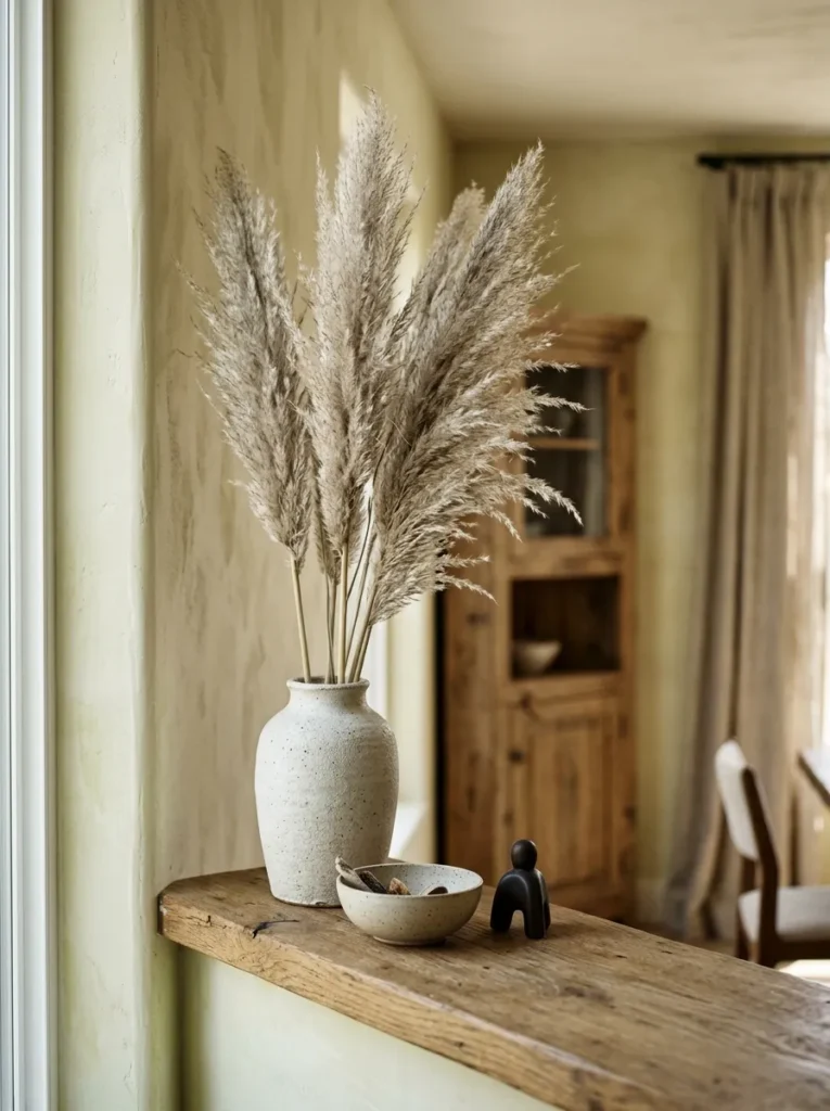
Dried botanicals — eucalyptus branches, pampas grass stems, dried cotton, preserved magnolia leaves — are the dining room shelf’s most versatile vertical element. They add height, organic texture, and a warmth that no ceramic or glass object achieves at the same scale, and unlike fresh florals, they maintain their appearance indefinitely without any care, water, or replacement.
For a dining room shelf, dried botanicals belong in the arrangement’s back layer: a tall dried stem in a ceramic or ceramic-look vase positioned at the back-center or back-corner of the shelf creates the arrangement’s vertical peak without competing with functional objects in the foreground. Their color palette coordinates naturally with most dining room neutral palettes — the silvery grey of dried pampas, the warm beige of cotton stems, the muted sage of preserved eucalyptus — without requiring any deliberate color-matching between the botanical and the room’s existing palette.
13.Place a Single Potted Plant at the Shelf’s End as the Visual Full Stop
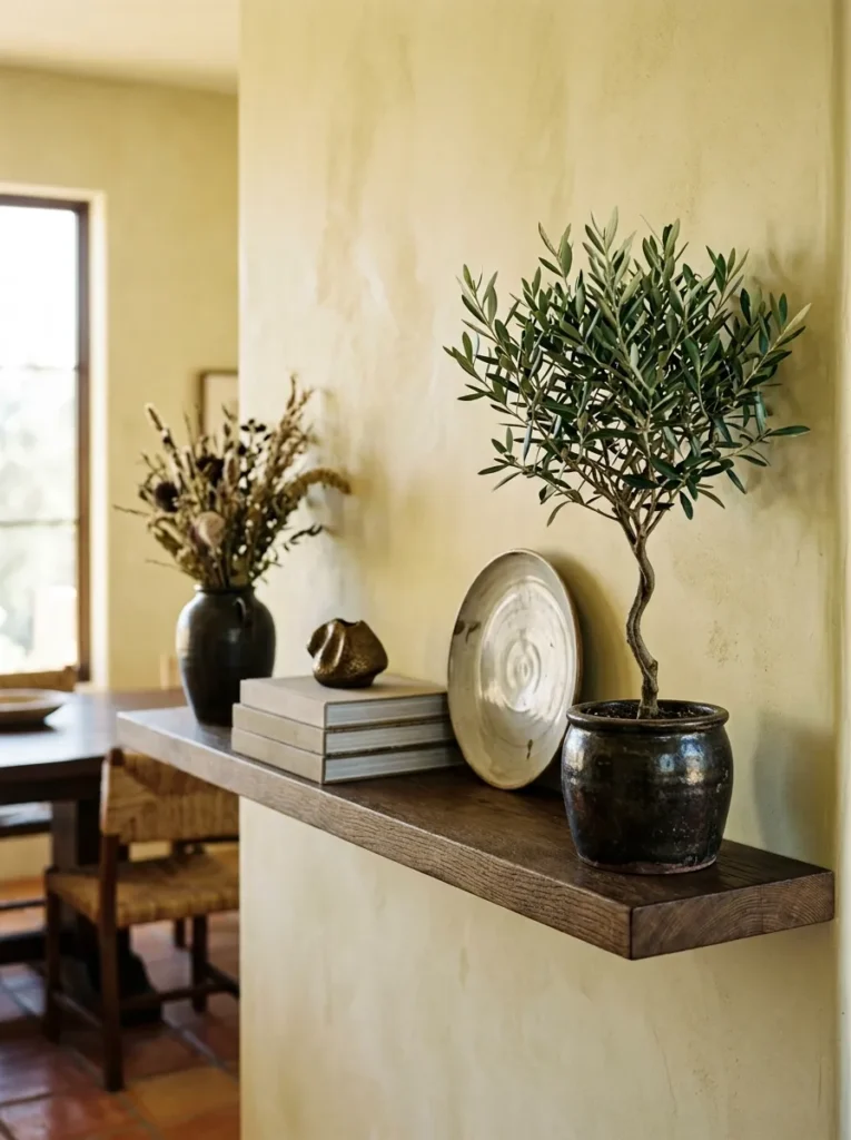
At the far end of a shelf display — the final element that closes the horizontal composition rather than continuing it — a single potted plant serves as the arrangement’s visual full stop: a definitive ending that tells the eye where this display concludes, cleanly and with a living organic quality that a ceramic or glass object at the same position doesn’t provide.
This end position is specifically important on dining room shelves because the terminal edge of the shelf unit often aligns with the edge of the dining room’s field of view from the table. A compact potted rosemary, a small olive tree in a ceramic pot, a modest fern in a handthrown vessel, or a single succulent in a dark-glazed planter each occupies this terminal position with exactly the organic finality it requires — a soft, living boundary that the eye reads as the composition’s deliberate conclusion rather than the point where the styling simply ran out of space.
14.Lean a Small Framed Print or Artwork Against the Shelf Back
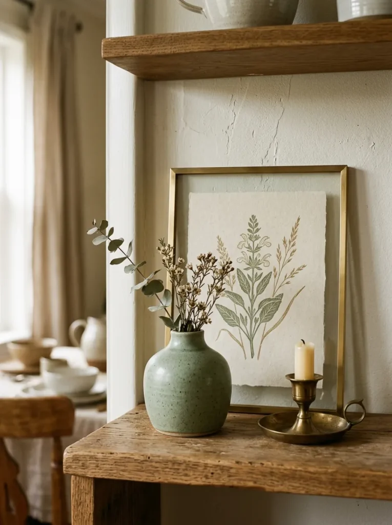
A small framed print or artwork leaned against the shelf’s back wall adds something every arrangement of objects lacks on its own: a pictorial element that introduces imagery, color, and pictorial scale that three-dimensional objects cannot provide from the same background position. The leaned print occupies the shelf’s background plane and adds compositional depth by creating a visible backdrop layer behind the objects in the foreground.
The print should be selected for its relationship to the dining room’s palette and visual character rather than for its subject matter alone. A botanical print that includes the shelf’s ceramic tones. A geometric abstract in the room’s accent color. A simple monochrome print in warm cream and charcoal. The frame’s material should coordinate with the shelf’s other metal or wood finishes. The result is a depth composition the eye reads in three layers: objects in front, the arrangement in the middle, the artwork behind — each layer distinct from the one beside it.
15.Place a Sculptural Art Object as the Shelf’s Focal Point
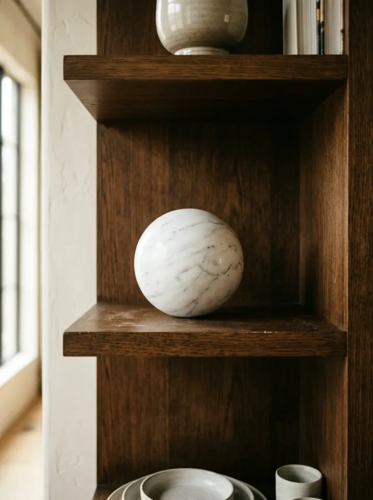
A sculptural object — a handthrown ceramic form, a smooth stone sphere, a carved wooden vessel, a cast glass piece with visible internal color — is the dining room shelf element that carries the highest design intention. It communicates that the person who styled this shelf made a decision to include something with no purpose except to be beautiful, which is a more expressive statement than any functional or semi-functional object placed in the same position.
The sculptural object should occupy the shelf’s primary position: the seated-eye-level tier, unobstructed by other objects in front of it, at a position from which it reads clearly from the dining table. Its scale should be substantial enough to register from 8 to 10 feet away — an object too small to read at that distance functions as clutter at dining room scale rather than sculpture. One genuinely beautiful sculptural piece placed with intention does more for a dining room shelf’s overall quality than a shelf full of smaller decorative objects combined.
16.Use a Decorative Tray to Define a Sub-Zone Within One Shelf Level
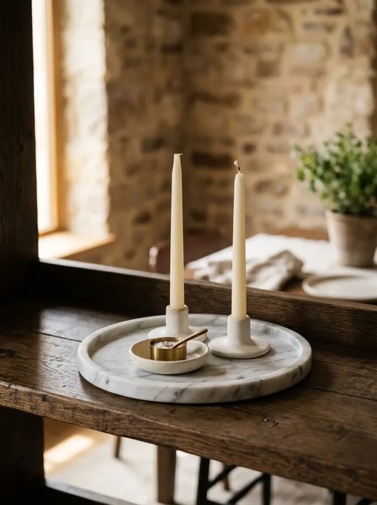
A tray placed on a shelf level does something no free-standing object achieves on its own: it creates a contained zone with a defined boundary, signaling that the objects inside it constitute a deliberate group. A round marble tray, a rectangular oak tray, or a small lacquered tray on a dining room shelf separates the objects within it from the objects around it — much as a drinks tray on a bar defines the service area within a larger surface.
The tray’s contents should be related in type — all candleholders, all small ceramics, all table accessories such as napkin rings or a salt cellar — so that the grouping reads as purposeful. The tray itself contributes its own material: a marble tray against a warm wood shelf, a dark lacquered tray against a white-painted shelf, a natural oak tray against a stone-toned shelf. The material contrast between tray and shelf surface is part of the tray’s visual contribution to the overall arrangement.
17.Build a Book Stack as a Base Layer for Other Display Objects
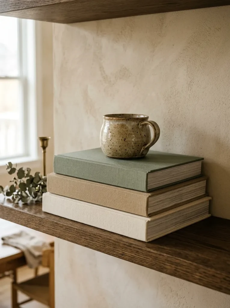
Horizontal books — two or three volumes stacked flat — serve a specific compositional purpose that vertical books and objects alone cannot provide: they create an elevated base layer that lifts whatever rests on top of them into a slightly more prominent visual position, and they contribute the book spines’ colors and textures as a visual block that anchors the arrangement’s lower zone.
In a dining room shelf context, the books selected for horizontal display should contribute to the display’s visual palette. A stack of three books in tonal coordination — cream, warm linen, and dusty sage — reads as a designed base. A small ceramic or an artisan object placed on top of the stack occupies an elevated position that draws the eye slightly more directly than the same object on the shelf surface alone. The stack’s combined height — typically 2 to 3 inches — is sufficient to create visual separation between the base and the displayed object above it.
18.Repeat One Material Across All Shelf Levels for Visual Unity
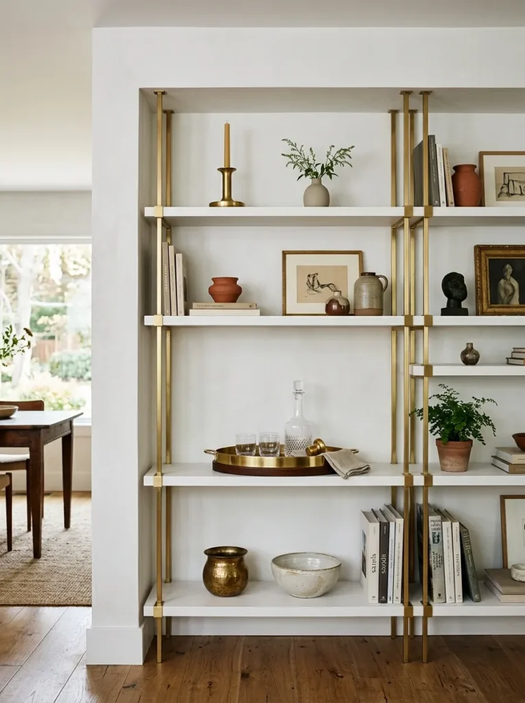
The coherence that makes a multi-tier shelf display read as a single composed unit rather than a collection of separate arrangements usually comes from one decision: repeating one material across all or most shelf levels. When the eye travels from one tier to the next and finds the same material present — a brass candleholder here, a brass-rimmed tray above, a small brass vessel on the top shelf — it reads the entire unit as a single display with a consistent point of view.
Effective material repetitions for dining room shelves: brass across three levels in different object types. Matte white ceramic across three levels in varying vessel forms. Warm walnut across multiple levels in a wooden tray, a wooden bookend, and a wooden bowl. The repetition does not require identical objects — it requires the same material appearing in different forms at different shelf levels. This invisible organizing thread is what separates a display that looks professionally composed from one that simply looks filled.
19.Use the Shelf’s Back Panel or Wall Color as an Active Design Element
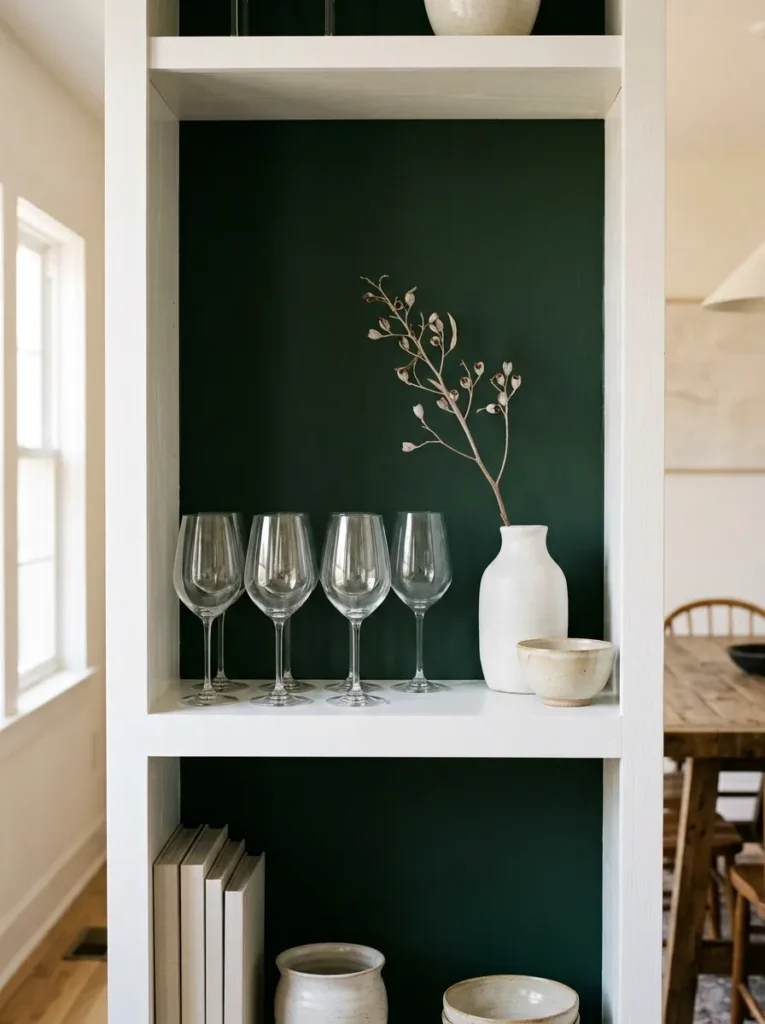
The back panel of a built-in shelf unit, the painted wall surface behind floating shelves, or the interior back of a freestanding shelving unit is the display’s background plane — the surface against which every object is read. In most homes, this plane is left at its default: white paint, natural wood veneer, or the finish the shelf unit arrived with. In the most curated dining room shelves, this plane is used as a deliberate design element rather than an afterthought.
A deep navy or forest green back panel on a white shelf unit transforms every object placed in front of it: light ceramic pieces read as sculptural against the dark ground, glass objects gain dramatic visual contrast, and the unit as a whole reads as a finished design decision rather than a purchased furniture piece. A terracotta or warm clay back panel warms the entire display. A patterned wallpaper or linen-textured surface applied to the back creates a textile backdrop that elevates even simple objects placed in front of it.
20.Style With One Consistent Finish Quality Across All Objects
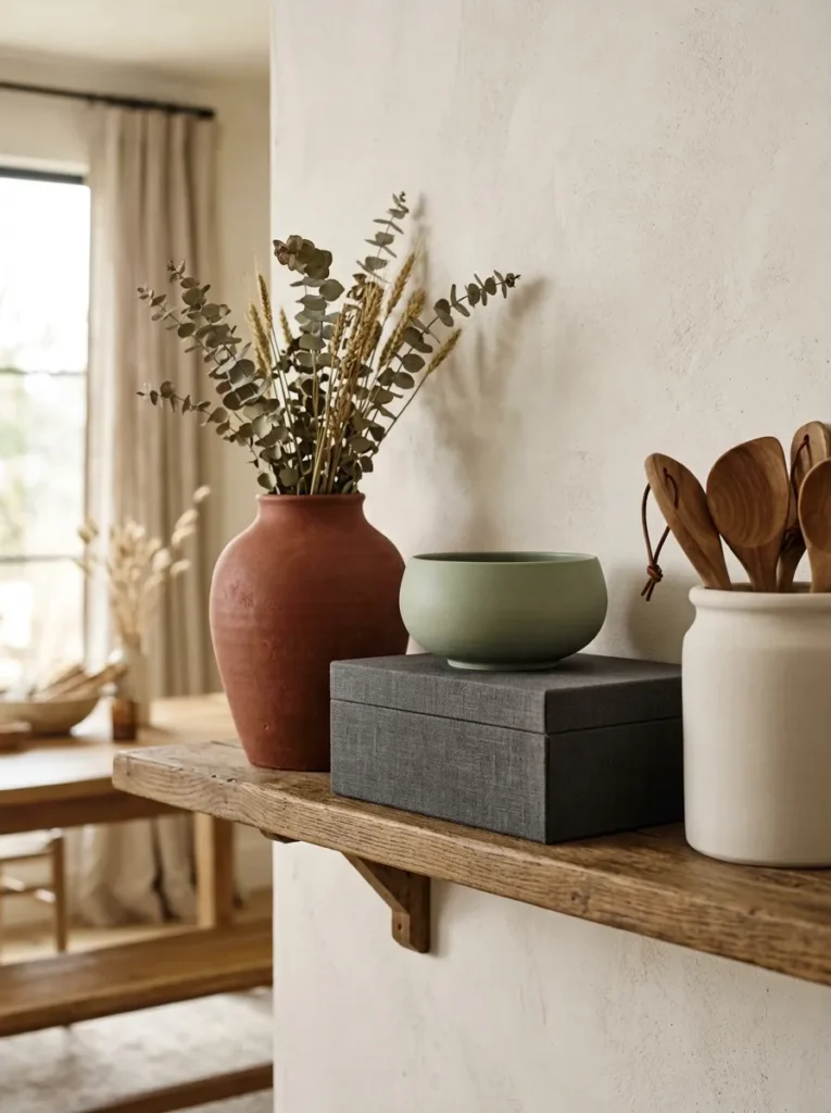
A shelf display that reads as genuinely curated from across a room almost always has one invisible organizing principle: a consistent finish quality — matte, gloss, or natural material — that unifies all the objects even when they vary significantly in size, shape, function, and category.
A matte-finish shelf arranges all its objects in matte surfaces: matte white, matte black, matte terracotta, matte sage. Regardless of category — ceramic, wooden, textile-covered, painted — every object shares the same finish register, and the display reads as a single cohesive aesthetic decision. A natural-material shelf uses only objects in wood, stone, raw ceramic, or linen: no metallics, no glass, no synthetic finishes, and the result is unified by material warmth. A gloss shelf coordinates crystal glassware with lacquered surfaces and high-shine ceramics — every object catching light in the same way from the same seated distance.
21.Rotate the Shelf Seasonally Around the Dining Calendar
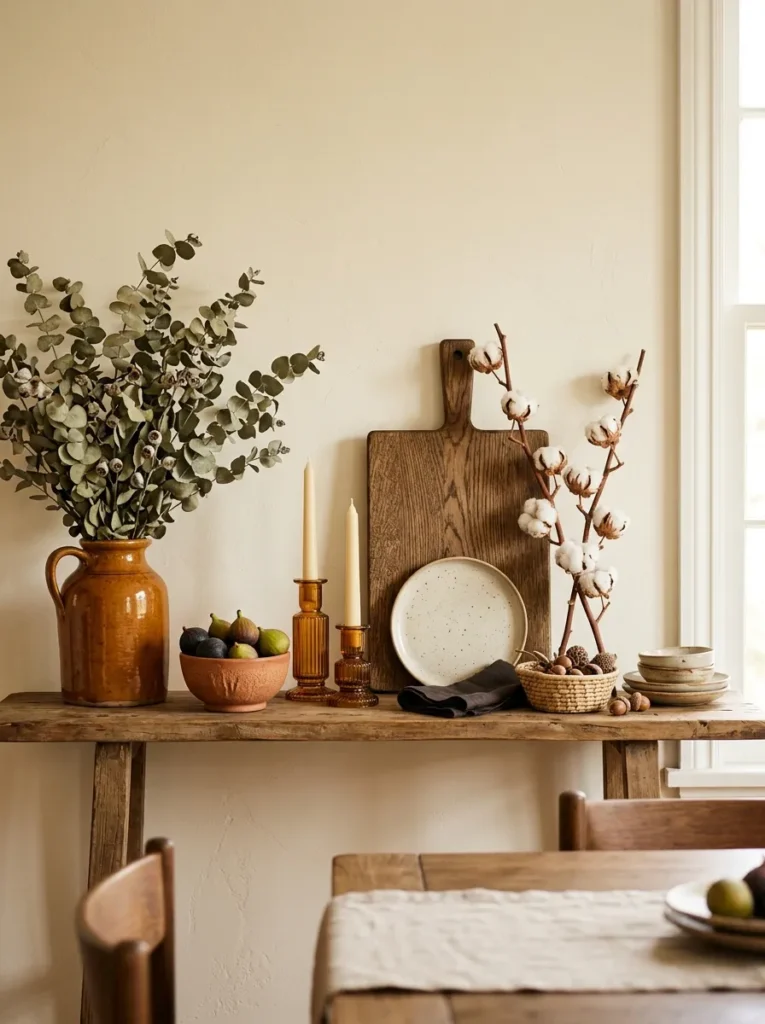
The dining room shelf is more naturally suited to seasonal rotation than any other shelf in the house because the dining calendar drives it: the holidays and seasons most associated with gathering at a table — Thanksgiving, Christmas, early spring entertaining, summer outdoor dining — each carry a distinct visual vocabulary that the shelf can reflect and reinforce.
Fall and Thanksgiving: warm amber glass, dried botanicals, a bowl of figs or small gourds on the lower shelf. Winter and Christmas: slim evergreen stems in a vase, grouped white pillar candles, subtle metallic elements in brass or silver. Spring: lighter botanicals, pale ceramic tones, fresh herbs potted on the end shelf. Summer: citrus in a ceramic bowl, lighter woven textures, uncluttered shelves with maximum breathing room. Each rotation takes roughly thirty minutes and changes the dining room’s seasonal register completely — a meaningful visual reset with no furniture purchase and no structural change.
22.Reserve the Lowest Shelf for Function and the Upper Shelves for Display
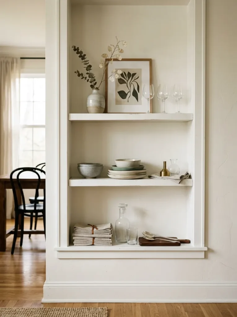
A dining room shelving unit that serves both practical storage and aesthetic purposes works best when the two functions are cleanly divided by shelf level rather than mixed throughout every tier. The lowest shelf — most physically accessible, closest to the table, within arm’s reach during a meal — should serve as functional storage: the bar service items, the extra placemats, the serving pieces used at most dinners. The upper shelves, at and above seated eye level, serve the display function.
This vertical division is logical on both counts. The practical items on the lower shelf are accessible without disrupting the display above. The display on the upper shelves is precisely at the viewing height that matters most during a meal. And the visual hierarchy — functional at the base, beautiful above — reads as considered from across the room rather than as two competing uses of the same space.
23.Let the Dining Table’s Style Inform the Shelf’s Display Direction
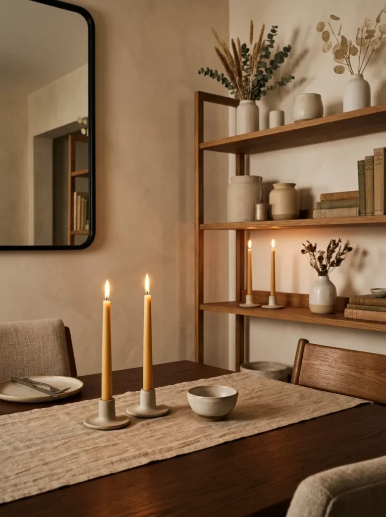
The dining room shelf and the dining table occupy the same visual space — the person seated at one is in direct sightline of the other. A shelf display that coordinates with the table’s aesthetic character makes the room read as a composed, considered whole rather than two independently styled surfaces sharing a room.
A dining table with a dark walnut finish and warm candlelight is best served by a shelf display in warm tones — amber glass, terracotta ceramics, brass candleholders — that reinforces rather than contrasts with the table’s warmth. A table with a pale oak surface and linen runners reads coherently with a shelf display in light neutrals, natural materials, and soft botanicals. The shelf doesn’t need to match the table element for element — it needs to speak the same visual language, using the same palette range and the same material register, so that the seated guest experiences the room as a single composed environment rather than a decorated dining table in front of a separately decorated shelving unit.
Pro Designer Tips
Work from back to front when building each shelf arrangement — never front to back. Place the back-layer anchor first: the leaned object, the tall element, the large piece that fills the background plane. Then add the mid-height standing objects in the middle zone. Finally, decide what — if anything — belongs in the foreground position near the shelf edge. Working front to back produces arrangements that feel crowded because front objects obscure the evaluation of background objects during placement.
Avoid the “tall-medium-short” formula as a substitute for actual composition. Most styling advice instructs arranging a tall, medium, and short object on each shelf to vary heights. This produces visually correct arrangements that never feel inspired because the formula is visible from across the room. Place the anchor object first, then add secondary objects that serve the anchor rather than filling a designated height slot.
Include at least one handmade object on the dining room shelf. A handthrown pot, a hand-carved wooden bowl, a hand-painted ceramic piece — the evidence of a maker’s hand adds warmth and authenticity that no machine-produced object replicates at the same visual register. The handmade object is the dining room shelf’s equivalent of the vintage piece in a living room: it communicates that the room was assembled with discernment rather than purchased to a formula.
Sit at the dining table and evaluate the shelf before finalizing any arrangement. The adjustments made from the seated dining perspective are almost always the most significant adjustments in the entire styling process. What reads as balanced when standing at the shelf often reads as unbalanced from the table. What seemed like the arrangement’s weakest section often becomes the most important zone when evaluated from the seat.
The dining room shelf is the room’s most re-styleable surface — use that flexibility. Unlike the dining table itself, the chandelier, or the rug, the shelf can be restyled in under an hour. Make a seasonal adjustment, swap one object for something new, change the back panel color, remove a third of the objects to test the effect of more negative space. The shelf rewards frequent re-evaluation more than any other surface in the dining room.
Final Thoughts
A dining room shelf that feels curated doesn’t announce the effort behind it. The objects read as chosen. The arrangements feel internally complete. The negative space between them makes every piece visible as its own contribution. And from the seated position at the dining table — the most important viewing angle for any surface in this room — a well-curated shelf becomes part of the dining experience itself: a backdrop worth looking at, a composition worth returning to across the length of a dinner.
Start with the seated view. Anchor each shelf level. Build in three dimensions. Let one material thread the unit together. Leave room for the display to breathe. And let the dining room’s seasonal rhythm drive it forward.