19 Beige Bathroom Ideas That Feel Warm, Not Dated
Beige got a bad reputation it doesn’t entirely deserve. Decades of cheap laminate, worn grout, and under-lit rental bathrooms gave the color its association with neglect rather than intention. The beige bathroom ideas circulating now look nothing like that. They’re built around travertine, textured plaster, raw linen, warm-toned stone tile, and layered earthy neutrals — and they feel genuinely calm in a way that stark white bathrooms rarely do.
The difference between a beige bathroom that reads as dated and one that reads as deliberate comes down to a handful of decisions: undertone, material quality, contrast level, and lighting. Get those right and the palette does substantial work on its own. These 19 ideas cover the full range — from small powder rooms to generous family bathrooms — with enough practical detail to help you decide which direction suits your space.
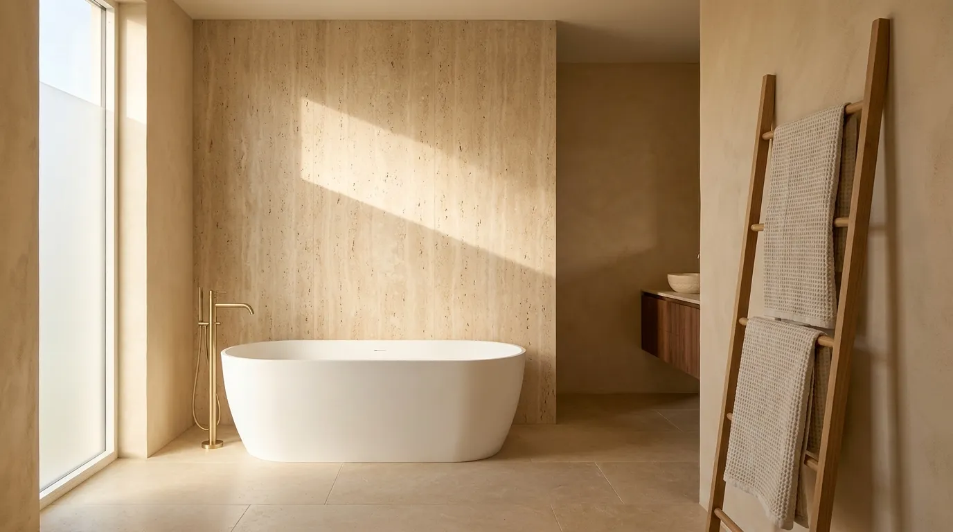
1. Build the Room Around a Travertine Feature Wall
Travertine has reappeared as one of the more striking material choices for bathrooms, and it earns that status by doing several things at once. The stone’s natural veining and warm ivory-to-caramel tones make a single feature wall behind the bath or shower the visual center of the room without requiring any additional decor. The variation across slabs means no two travertine walls look alike, which prevents the “bathroom showroom” flatness that tiles in a single shade can produce.
The practical consideration is weight and installation. Natural travertine is heavy and requires a structurally sound wall and professional fitting. For walls that can’t support stone, porcelain travertine-effect tiles reproduce the appearance convincingly and are considerably lighter, more water-resistant, and easier to maintain — the pores in natural travertine need sealing regularly to prevent staining in a wet environment. Full or honed finishes both work; a polished travertine finish in a warm bathroom can reflect light attractively but shows water spots immediately.
2. Pair Beige Plaster Walls With Warm Brass Fixtures
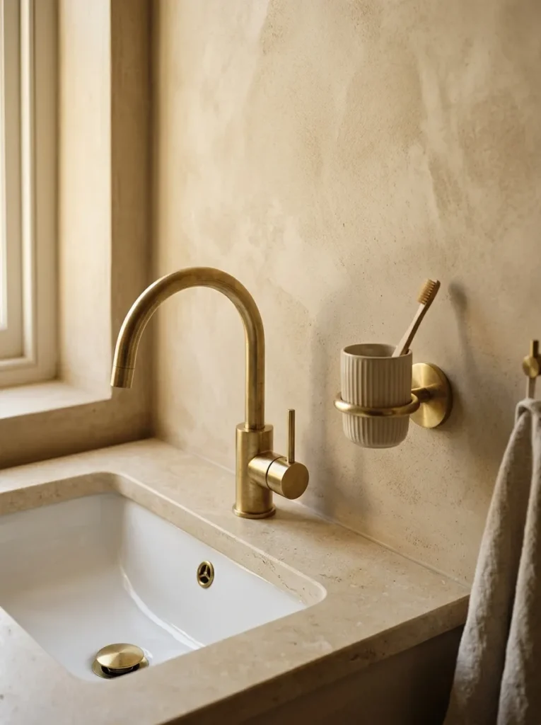
In a beige bathroom, fixture finish is one of the most noticeable single decisions. Chrome fixtures read as cool and contrast sharply with warm neutrals; warm brass, brushed gold, or aged bronze integrate into the palette rather than cutting against it, and they add just enough contrast to prevent the room from looking monochromatic.
Unlacquered or living brass develops a patina over time, which suits a natural material-led bathroom well — the finish softens and becomes more individual as the bathroom is used. Brushed brass is more consistent in appearance and easier to maintain without specialist products. Both tones work; the choice depends on whether a more polished or more relaxed finish suits the room’s overall direction. Matte black fixtures can also work in beige bathrooms that lean more contemporary, but the contrast is more assertive and less inherently warm.
3. Use Limewash or Roman Clay on Bathroom Walls
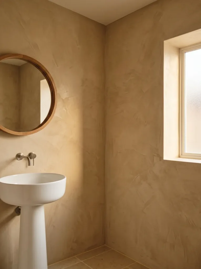
The key detail that separates a considered beige bathroom from a flat one is often surface texture rather than color itself. Limewash and Roman clay finishes on walls create a layered depth — tonal variation within what is essentially a single color — that makes the room read as interesting at close range and calm from a distance.
Both finishes require a sealed substrate and appropriate application technique. They are not inherently water-resistant and should not be used inside shower enclosures without a waterproof sealer top coat. For the walls around a freestanding bath or outside the shower recess, they work well and are available from specialist paint brands in a wide range of warm neutral tones. Rental-friendly limewash-effect wallpaper exists as an alternative, though the visual result is slightly less dimensional.
In a bathroom with limited natural light, warm plaster finishes in a mid-depth beige can make the room feel more richly lit than a pale flat paint, which tends to look washed out under overhead artificial lighting.
4. Choose Beige and Warm White as a Two-Tone Tile Scheme
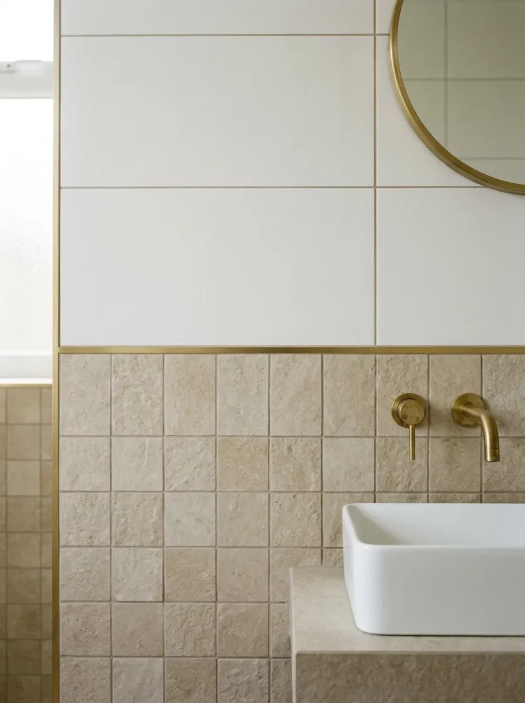
Working with two tones of a neutral palette — rather than a single flat beige — is one of the cleaner ways to add visual depth without introducing color contrast. A warm white subway tile or large-format wall tile above, with a beige or sandy floor tile below (or vice versa), creates a natural break point that makes the bathroom feel taller or wider depending on where the transition falls.
The transition line placement matters considerably. A horizontal break at roughly waist to shoulder height follows the visual logic of traditional dado paneling and suits rooms with reasonable ceiling height. Placed too low, it can make a small room feel squashed. Grout color significantly affects the result: matching grout to tile in each zone maintains the tonal palette; a mid-warm grey grout used throughout unifies the scheme without the clinical effect of bright white grout.
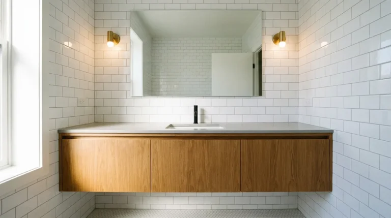
5. Introduce a Floating Walnut or Oak Vanity
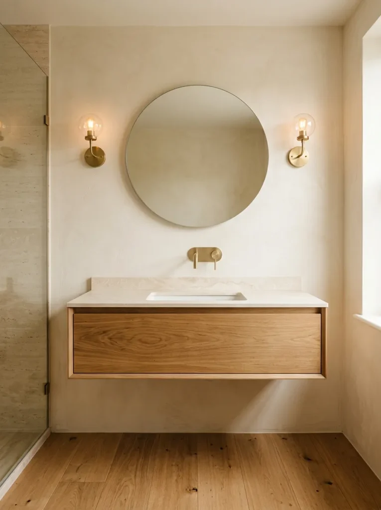
Warm wood makes an immediate difference in a beige bathroom by adding material depth that tile and plaster alone can’t fully provide. A floating wall-mounted vanity in oiled walnut or white oak keeps the floor visible below (which reads as more spacious than a floor-standing unit) while contributing warmth at the room’s main focal point.
Solid wood and water are a practical concern in bathrooms with poor ventilation. Bathroom-grade veneered MDF with a solid wood face, properly sealed at all edges, handles the humidity fluctuation better than solid wood in many climates. Wipe-down immediately after splashing and keep the vanity away from direct shower spray; a floor-standing unit may actually be more appropriate in a particularly wet bathroom where the lower area regularly sees water contact.
The counter surface pairing matters: a beige or creamy stone top (limestone, concrete, or a stone-effect sintered surface) carries the palette through to the counter. A stark white basin on a warm walnut base creates a contrast that can work but may read as slightly disconnected from the room’s warm neutral direction.
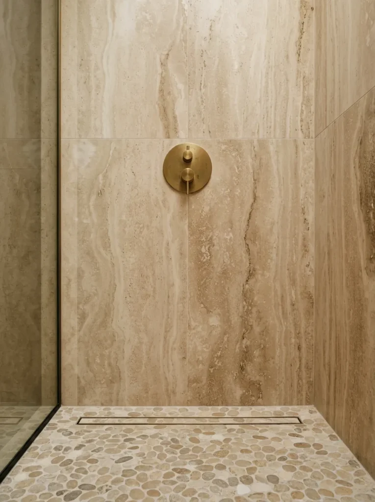
6. Tile the Shower Floor in Warm Pebble Mosaic
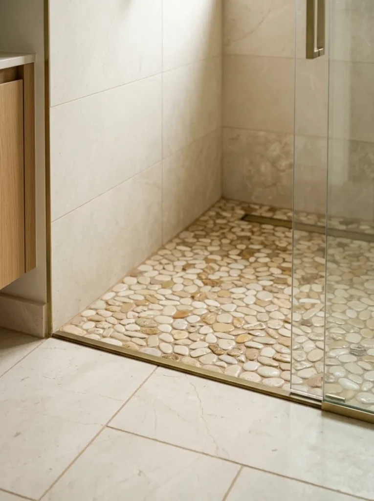
Large-format tiles on a shower floor require specific anti-slip finishes to be functional; pebble mosaic or small-format stone mosaic tiles provide inherent texture that gives adequate grip while looking considered rather than purely practical. Warm-toned pebble mosaic in sand, ivory, and caramel tones grounds a beige shower scheme with a natural, earthy detail at foot level.
The maintenance reality: mosaic tiles have significantly more grout lines than large-format tiles, and grout in a wet shower floor needs cleaning more frequently and resealing periodically to prevent discoloration. If low maintenance is a priority, a large-format anti-slip stone-effect porcelain on the shower floor achieves a cleaner result with similar warmth.
7. Add a Freestanding Soaking Bath as the Central Element
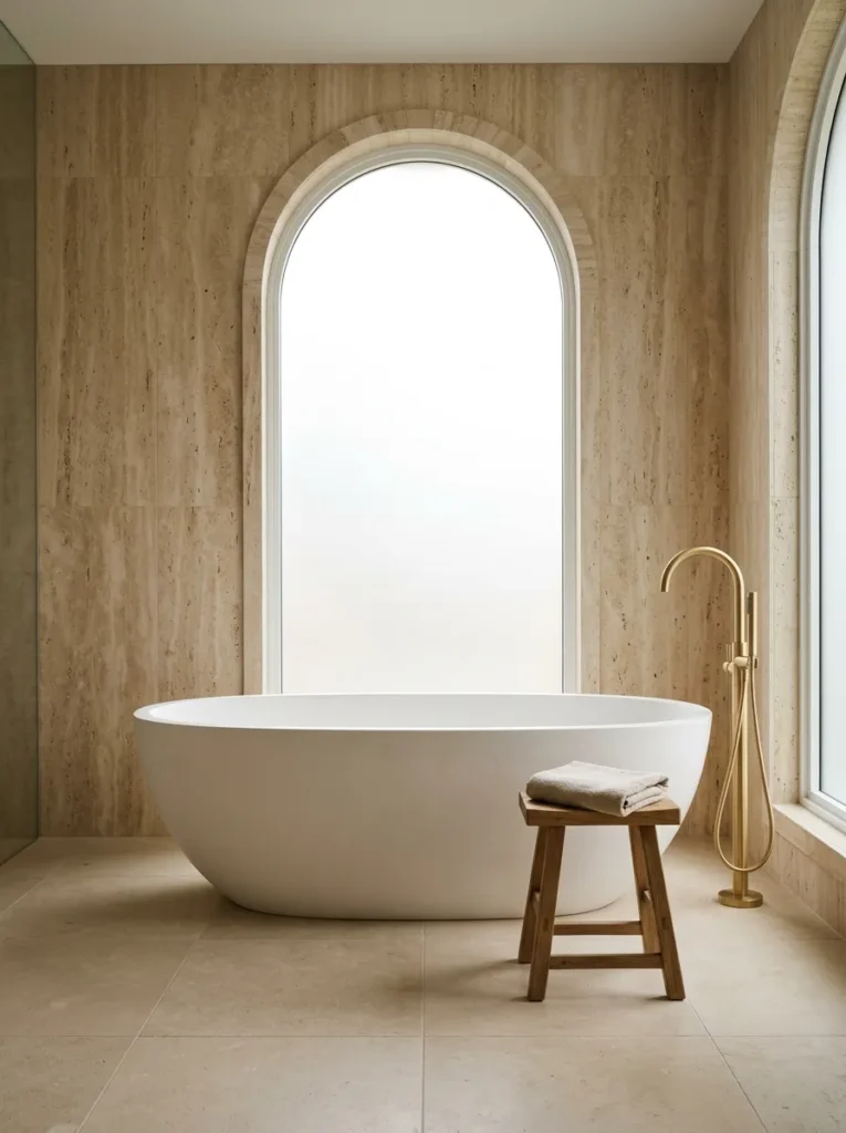
In a bathroom large enough to accommodate it — generally a room where the bath can sit with at least 60–70cm of clear floor on each accessible side — a freestanding soaking bath changes the room’s entire character. Rather than built into an alcove and read as part of the plumbing, it reads as a furniture piece. Paired with a beige plaster or travertine wall, the bath becomes an architectural focal point rather than a utility fixture.
Material choice affects the visual temperature significantly. A matte resin bath in warm white or greige reads softly against a warm neutral backdrop. A stone-resin bath has more visible weight and presence. A cast iron bath with a painted exterior in chalk white or warm cream suits a more period or relaxed aesthetic. All three work; the right choice depends on the room’s scale and the formality of the overall direction.
Floor-mounted tub fillers (filler taps that rise from the floor rather than the wall) work well visually with freestanding baths by keeping wall fixtures to a minimum, though they require planning the plumbing route before floor installation — retrofitting is expensive.
8. Use Vertical Tongue-and-Groove Paneling in a Warm Cream
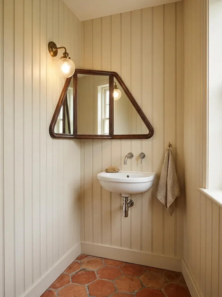
Horizontal paneling in bathroom design often reads as nautical or coastal. Vertical tongue-and-groove — painted in a warm cream, chalky off-white, or pale greige — reads differently: more contemporary, more considered, and particularly effective at drawing the eye upward in a low-ceilinged bathroom or cloakroom. It also adds genuine tactile texture to a room where materials otherwise tend to be flat and reflective.
Panels should be primed and painted with bathroom-specific or moisture-resistant paint to prevent swelling and peeling. In a small bathroom or cloakroom, running the paneling from floor to ceiling on one or two walls (rather than just to dado height) produces a more enveloping, finished effect. As a renter-friendly note: peel-and-stick shiplap panels exist and can approximate the look without fixing to walls, though the finish is visibly less refined.
9. Layer Sandy and Stone-Toned Tiles at Different Scales
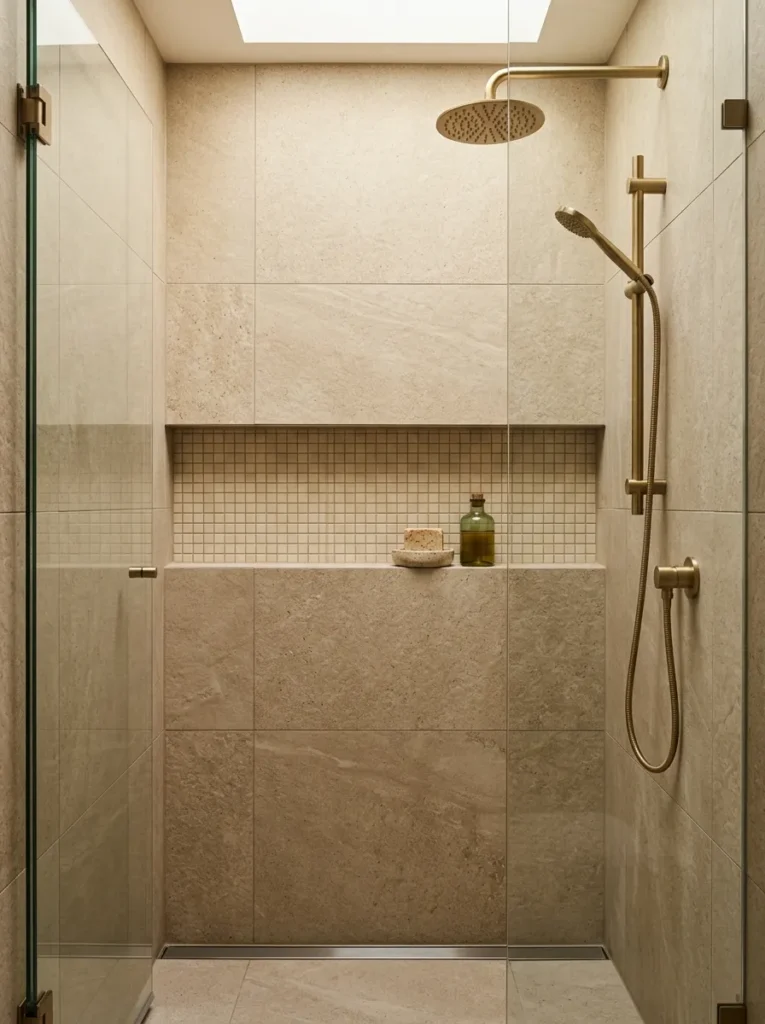
A bathroom tiled entirely in one size and pattern of tile tends to feel flat. Using two tile scales within the same tonal palette — for example, a large-format sandy limestone-effect tile on the main walls and a smaller warm stone mosaic as a feature strip, shower niche interior, or floor — gives the room visual rhythm without introducing color complexity.
The practical principle is that contrasting scale works better than contrasting tone when the goal is warmth and calm. Large and small tiles in the same cream-to-sand palette feel coherent; the same tiles in contrasting tones introduce a sharper dynamic that may suit some directions but moves away from the relaxed warmth most beige bathroom searches are looking for.
Grout width matters here: narrow grout joints (1–2mm) for large tiles maintain the impression of a continuous surface; slightly wider joints (3mm) for smaller tiles are both practical and visually appropriate.
10. Hang a Round Oak or Rattan Mirror Above the Vanity
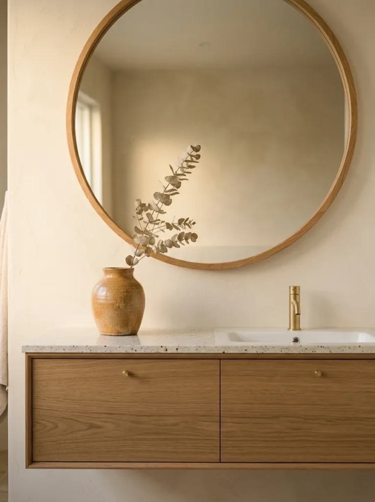
A rectangular mirror above a bathroom vanity is the default choice, and it’s fine — but in a beige bathroom with a warm material palette, a round mirror with a natural oak, pale rattan, or simple solid wood frame adds an organic shape that breaks the grid of tiles and wall fixtures in a useful way. Circles are one of very few decorative shapes that read as contemporary, relaxed, and classic simultaneously.
Size the mirror relative to the vanity below: a mirror roughly two-thirds the width of the vanity basin or countertop tends to look proportioned rather than tentative. For a double vanity, either two round mirrors (centred above each basin) or one wide oval or arched mirror spanning most of the counter width both work and read differently — the paired option feels more deliberately considered; the single large mirror is more fluid and open.
Avoid rattan frames in very steamy bathrooms without adequate ventilation: natural fiber can degrade, darken, or develop mould in high-humidity environments. Oak or painted wood frames are more durable in wet conditions.
11. Install Wall-to-Wall Niches for Concealed Shower Storage
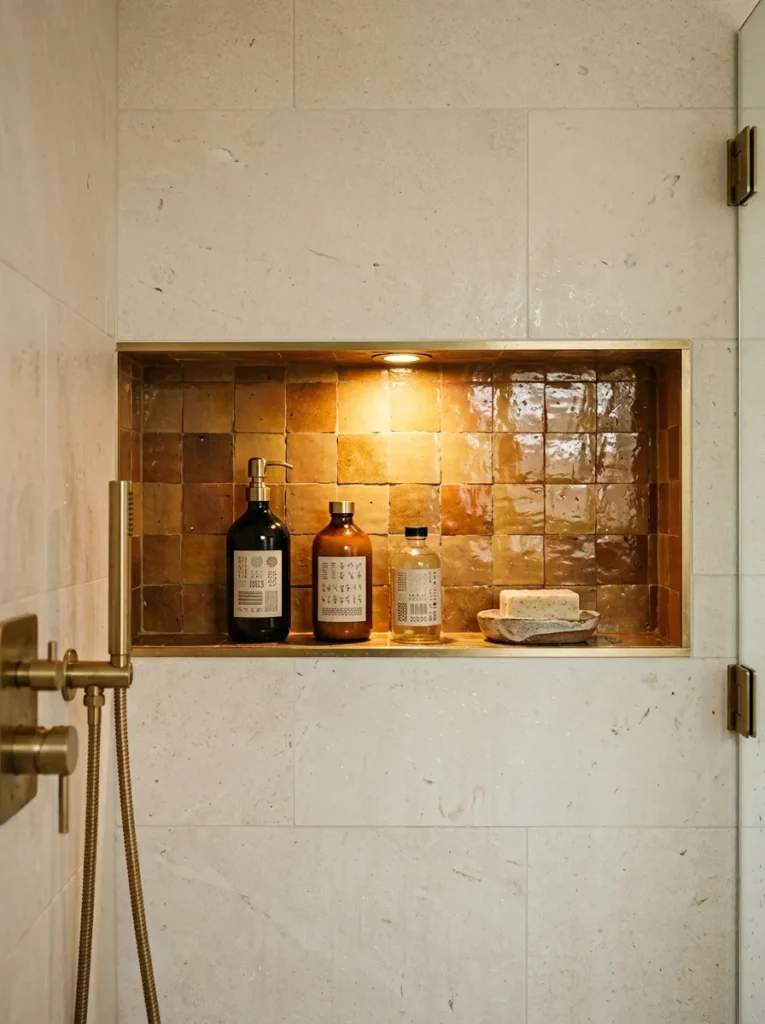
Open shower caddy shelves — the kind that hang from the shower head or clip to the wall — create visual clutter in a bathroom where everything else is carefully considered. Recessed niches cut into the shower wall before tiling offer storage at the same finished surface as the wall itself, making the shower feel architecturally resolved rather than accessorized after the fact.
In a beige bathroom, niches tiled in a slightly contrasting warm accent — handmade terracotta-effect tiles, a warmer sandy tone, or a natural stone mosaic — become a small but significant design detail rather than a purely practical one. Placement: shoulder-height niches suit body product storage; higher niches suit shampoo and larger bottles. A horizontal niche (wider than it is tall) spanning much of one shower wall is a more contemporary approach than multiple small square niches.
Niches must be planned before tiling and require a waterproofed recessed frame; they cannot be retrofitted easily in an existing tiled shower without significant rework.
12. Consider a Beige and Sage Colour Pairing
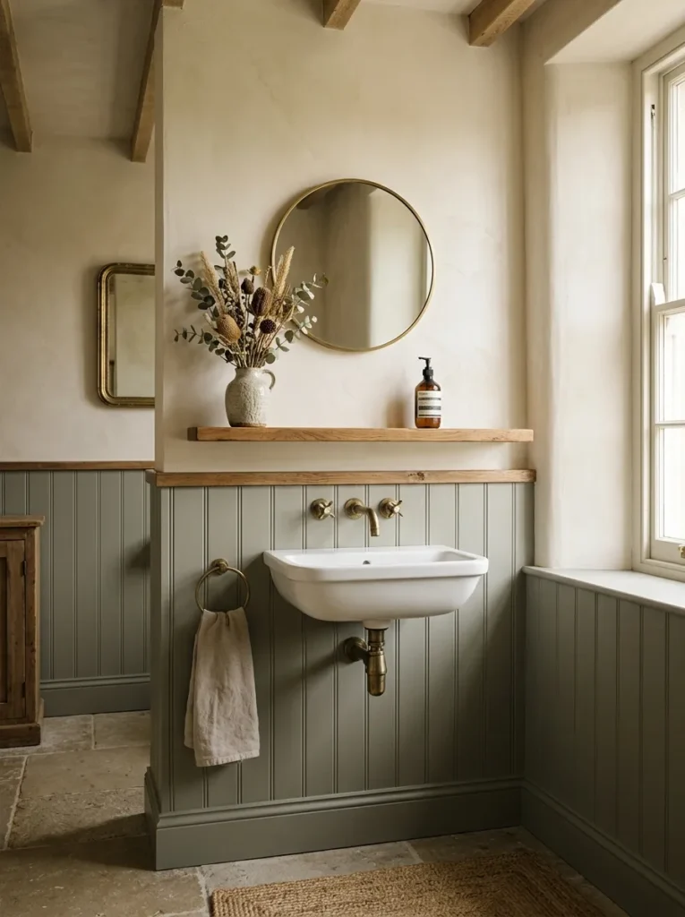
Sage green and warm beige are among the more natural pairings in bathroom design because they reference the same earthy, organic origin — the tones appear together in landscape, in dried botanicals, in aged linen. A sage accent in a beige bathroom can take several forms: painted lower paneling in a muted sage below cream or beige upper walls; a sage bathroom cabinet or vanity unit; sage-toned metro or zellige tiles as a feature.
The pairing works best when both tones are kept muted rather than saturated. A bright, yellow-based green fights with warm beige undertones; a grey-based sage with some warmth reads more softly and connects to the palette rather than contrasting against it. Dried botanicals — eucalyptus stems, dried pampas, small pale-toned ceramic plant pots — reinforce the organic direction without requiring living plants in a bathroom with limited light.
13. Use Zellige or Handmade Tiles for Imperfect Texture
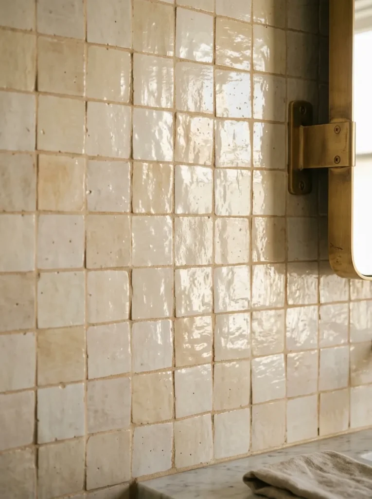
Zellige tiles — traditional Moroccan glazed terracotta tiles with hand-applied glaze producing surface variation and slight irregularity — give a beige or caramel bathroom a quality of texture and light that machine-made tiles cannot replicate. The uneven glaze catches light differently across the surface, so the wall reads as subtly dynamic rather than static. In warm ivory, sand, and caramel tones, zellige produces a particularly rich warm-neutrals effect.
The practical notes: zellige tiles are generally smaller format and their irregularity requires an experienced tiler to install. The surface variation also means grout lines must be wider than for precision machine-cut tiles — typically 3–5mm — which affects the finished look. They’re also more expensive than standard tiles, so they’re best used on a single feature wall, behind the bath, or inside the shower rather than throughout an entire bathroom.
Handmade-effect porcelain tiles in similar tones offer a more budget-conscious approximation with greater consistency and easier maintenance.
14. Choose a Warm-Toned Stone Basin as a Sculptural Detail
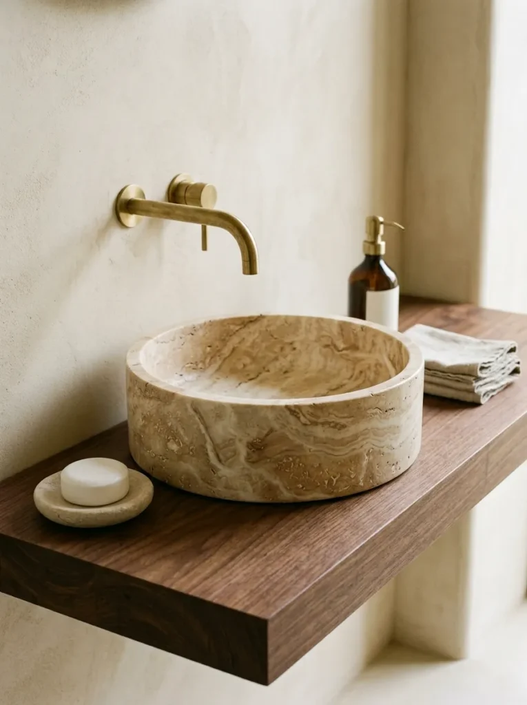
In a bathroom where the vanity top, tile, and wall palette are already carrying the design, a stone basin — a vessel basin or undermount in natural limestone, onyx, or a warm travertine-veined stone — reads as a deliberate material choice rather than a standard plumbing fixture. The basin’s natural veining continues the organic warmth of the palette in a form that changes across every individual piece.
A vessel basin (one that sits on top of the counter surface rather than being inset) changes the countertop’s visual logic and requires a taller wall-mounted or deck-mounted tap to function properly. In a small bathroom, a vessel basin can make a compact counter feel more layered; in a tight space, it can also read as visually top-heavy. A shallow undermount stone basin resolves this — the profile remains low and the material is still visible.
Stone basins need sealing to resist staining and require wipe-down after use, particularly in hard water areas where limescale accumulates. Synthetic stone-look basins in sintered or composite material are more practical in high-use family bathrooms.
15. Add a Linen or Bamboo Storage Ladder
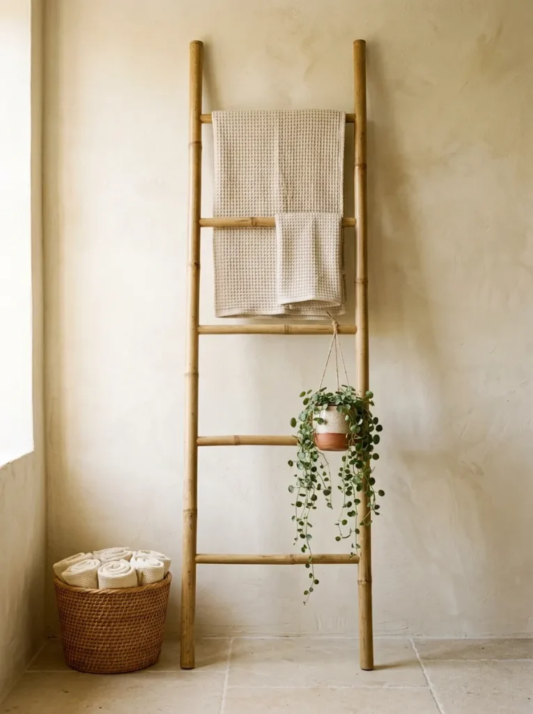
A freestanding storage ladder — a simple leaning frame holding folded towels, a rattan basket, and possibly one or two small plant pots or candles — adds vertical storage and styling without requiring any wall fixing. In a beige bathroom, a natural bamboo or bleached rattan ladder keeps the material palette consistent while serving a real function.
The limitation is stability: leaning ladders need a relatively flat wall behind them and can tip if towels are hung unevenly or the floor is slightly uneven. For bathrooms where stability is an issue, a free-standing towel rail with a frame base (rather than a leaner) is more practical and can achieve a similar warm material tone if chosen in powder-coated steel with a warm finish, natural wood, or bamboo.
Avoid overloading the ladder with objects purely for styling: in a functioning bathroom, one or two neatly folded towels and a small basket reads as intentional; a ladder crowded with accessories reads as a substitute for proper storage.
16. Install Warm Ambient Lighting Above or Beside the Mirror
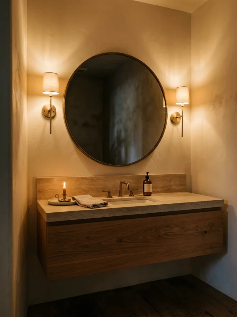
Bathroom lighting design is one of the most commonly neglected decisions in a room renovation, and it matters especially in a beige bathroom. A single overhead downlight aimed at the center of the room leaves the mirror area in shadow — faces are backlit and the room’s warm tones are flattened by cold directional overhead light. Lighting positioned at either side of the mirror (vanity sconces) or directly above it illuminates the face evenly and renders warm wall and tile tones more accurately.
Bulb color temperature is significant. A 2700K–3000K bulb reads as warm white and reinforces the soft, calm quality of a beige palette. 4000K or higher (which is daylight or cool white) reads as clinical under a beige backdrop and will make warm neutrals look muddy. In a bathroom used at different times of day, dimmer-compatible warm white bulbs give the option to drop the light level in the evening — a practical feature that a standard switch doesn’t allow.
17. Frame the Bath With a Plastered or Stone Surround
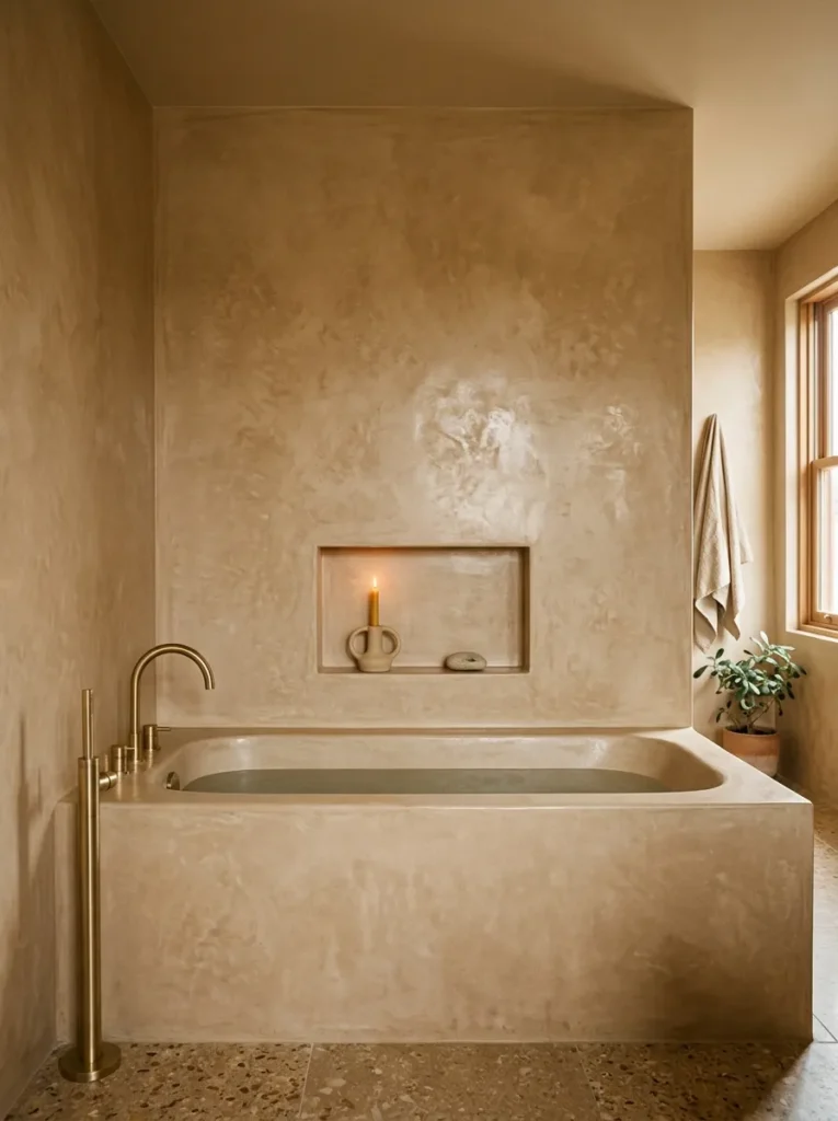
Where a freestanding bath isn’t possible (either because the plumbing is fixed into the floor in an alcove position, or because the room simply doesn’t have the space), the built-in bath surround is an opportunity rather than a compromise. A bath panel and surround finished in microcement, tadelakt, or a smooth limewash plaster — in a warm sandy or pale clay tone — reads as a deliberate material choice rather than a standard builder’s finish.
Tadelakt is particularly suited to wet bathroom surfaces: it’s a traditional Moroccan plaster that is naturally water-resistant when properly applied and polished with black soap, giving a smooth, slightly luminous surface. It requires specialist application and is not a DIY product. Microcement is more widely available and can be applied by trained applicators over most existing substrate without requiring full demolition — which makes it a useful option for bathrooms where replacing fixtures isn’t in scope.
18. Bring in Textured Linen or Waffle Towels as the Sole Textile
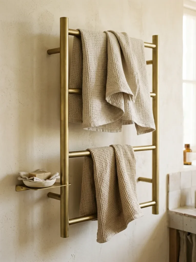
In a beige bathroom, the towels are typically the most prominent textile — and they’re changed regularly enough that they’re also one of the easiest elements to update. Textured waffle-weave towels in undyed linen, warm stone, or chalky cream contribute to the room’s material depth in a way that flat cotton terry towels don’t. The weave catches light, shows texture at close range, and maintains the tonal palette without adding color complexity.
The practical element: waffle and linen towels tend to be less absorbent immediately after purchase and soften with repeated washing. If absorbency is a priority, a waffle-cotton blend offers the visual texture with more immediate practical performance. Keep towel color within two to three tones of the bathroom’s palette; bright white towels against a warm beige room can look slightly jarring rather than crisp.
A single large neutral-toned blanket or bath sheet folded over a heated towel rail or ladder adds the same textile interest with less need for frequent refolding.
19. Use Scented Candles in Warm Earthy Vessels as Finishing Detail
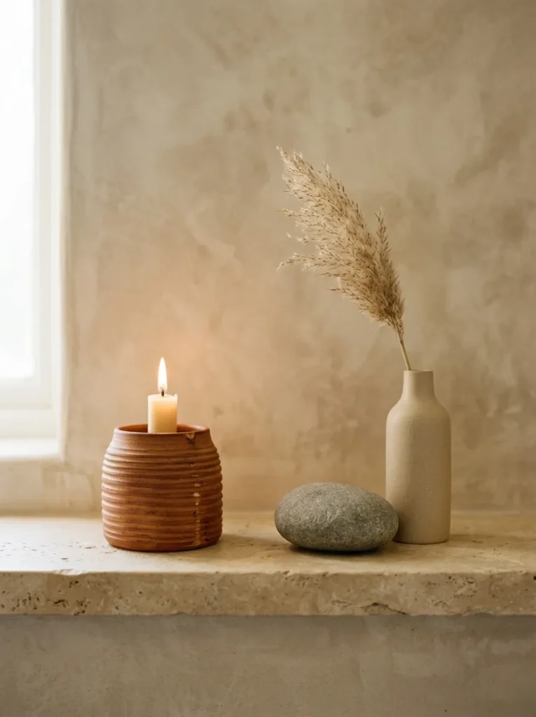
The final detail in a beige bathroom is, in some ways, the easiest: the objects placed on the counter, the shelf, or the edge of the bath should be chosen as deliberately as the materials behind them. A grouping of two or three vessels — a squat ribbed ceramic candle holder, a small stone dish for jewelry or soap, a single dried stem in a narrow bud vase — in warm sand, cream, and clay tones completes the palette at close range.
The useful principle here is number and scale: three objects of slightly different heights read as a considered arrangement; five or six objects of similar scale read as accumulation. A single striking ceramic piece can be more effective than several small objects competing for the same focal point. For a bathroom vanity or counter, less is nearly always more — the surface is functional first and styled second.
Scented candles with earthy, resinous, or botanical fragrances (sandalwood, cedar, vetiver, beeswax) suit the visual palette coherently and contribute to the room’s sensory atmosphere without competing with it.
Getting the Beige Tones Right: A Quick Decision Guide
One of the trickiest aspects of a beige bathroom is choosing the specific shade, because beige covers a wide range: some lean pink, some lean yellow, some lean green, and some lean towards a true warm grey. The undertone matters considerably more than the name on the paint chart.
Undertone checking: View samples in the actual room under both natural light and the bathroom’s artificial lighting. Beige with pink undertones tends to look warm and flattering in artificial light but can read as slightly skin-toned in daylight. Yellow-based beige can feel dated under warm artificial light. A beige that leans grey or mushroom — sometimes called “greige” — tends to be the most versatile because it reads as warm without becoming too saturated under either light condition.
Low natural light: In a bathroom with one small window or no window, avoid very deep or saturated beige on all walls — the room will darken noticeably. Use a lighter, warmer tone on walls and bring depth through materials (textured tile, warm wood, stone) rather than wall color. A pale beige with rich travertine or warm timber reads well in low light; a mid-depth beige on all surfaces in the same light may feel oppressive.
What to pair with beige: Warm brass and brushed gold fixtures, white oak or walnut timber, warm white or cream sanitary ware (rather than bright white, which reads as cool), natural linen and waffle textiles, and earthy stone or ceramic accents all integrate well. Chrome, cool grey stone, or bright blue-white features introduce a contrast that can look unresolved in a primarily warm neutral room.
Final Thoughts
The beige bathrooms that work are the ones where the material choices do the heavy lifting rather than the accessories. If the tiles, the plaster finish, and the vanity are considered, the room will read as intentional without requiring careful arrangement of objects on every surface. Start with the hardest-to-change elements — wall finish, tile choice, fixture tone — and let the softer layers (towels, scent, accessories) come afterward.
Not all nineteen ideas belong in the same room. A travertine feature wall and zellige tiles, for example, will compete rather than layer; a freestanding bath and a built-in stone bath surround are mutually exclusive. Pick the two or three ideas that address the specific character of your bathroom — its size, its light conditions, its existing fixed elements — and commit to those rather than importing everything at once.
A well-designed beige bathroom doesn’t need to announce itself. Pin the ideas that address your particular room’s challenges first, and revisit this guide when the major decisions are made