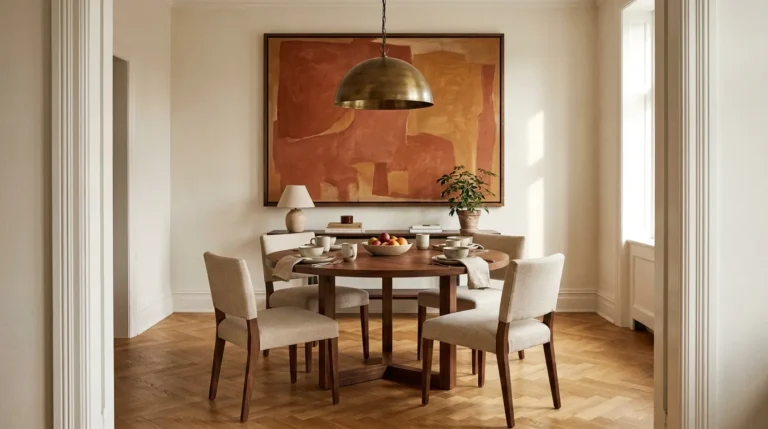
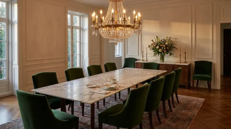
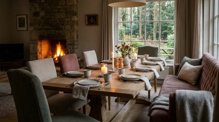
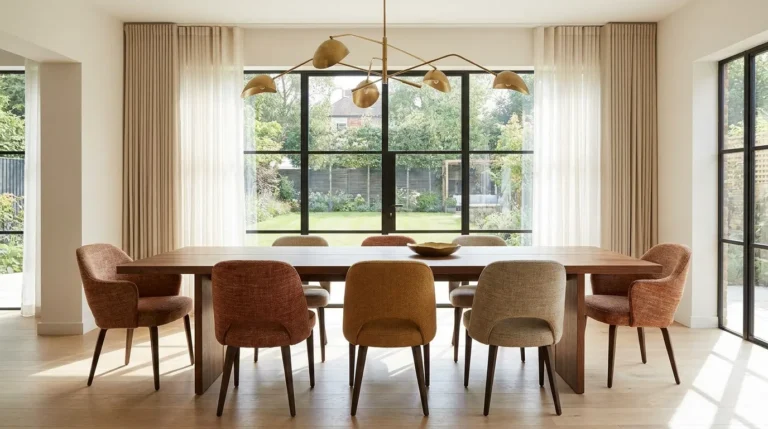
18 Dining Table Setting Ideas That Impress Every Guest
A well-set table changes the experience of a meal before anyone sits down. It signals to guests that their presence matters — that someone thought about the evening before it arrived. It also changes how the food tastes, in the same way that a beautiful room changes how comfortable you feel in it: the context shapes the experience.
The challenge is that most guidance on table setting either goes too formal (crystal stemware, fish knives, eight-course place settings) or too vague (layer textures, add candles, use fresh flowers). Neither helps someone who wants their table to look genuinely considered without spending hours or a significant amount of money getting there.
These 18 dining table setting ideas address that gap. Each one has a specific visual direction, a specific occasion or mood it suits, and enough practical guidance to execute it without guessing. Some are built around a single strong decision — a table runner, a centerpiece, a candle configuration. Others are complete tablescapes with a clear aesthetic from plate to napkin. All of them are achievable with what most people already own, supplemented by a few considered additions.
The goal isn’t a table that looks like a magazine photograph. It’s a table that makes your guests feel genuinely welcome and your food taste better because of where it’s being eaten.
1. The Minimalist Linen Setting

A table set with restraint — natural linen placemats, simple white ceramic plates, one small bud vase per place setting, and linen napkins folded flat rather than sculpted — communicates confidence. It says the meal is the point, and the table is simply dressed appropriately for it.
The key is material quality rather than quantity. A rough-textured natural linen placemat beside a handthrown ceramic plate and a loosely crumpled linen napkin reads as considered even though each individual element is simple. The same arrangement with a polyester placemat, a mass-market plate with an elaborate border, and a paper napkin reads as placeholder rather than setting.
For everyday use and for dinner parties where the food is the hero, this is the setting that works without requiring anything to be purchased, sourced, or set up in advance. The minimalist linen setting is the dining table equivalent of a white shirt: it’s not the most interesting option, but it’s rarely the wrong one.
2. A White-on-White Formal Setting

An all-white table setting — white tablecloth, white dinner plates with a white salad plate stacked above, white linen napkins, clear crystal stemware — achieves formality through material quality and precision rather than decoration. Every piece is white or clear; the interest comes from texture, weight, and the quality of the materials rather than from color or pattern contrast.
The tablecloth is the foundation. A pressed white damask or a heavy cotton linen tablecloth reads as formal; a thin poly-cotton blend reads as mass-catered regardless of what’s placed on top of it. The cloth should hang evenly on all sides — 10 to 12 inches of overhang at each end is the standard for a formal setting — and should be pressed without creases before guests arrive.
In this setting, the flowers or centerpiece become the room’s only color, which means the centerpiece choice carries more visual weight than in a more varied setting. White hydrangeas or white ranunculus in a clear glass cylinder reads as an extension of the table’s logic; a mixed-color floral arrangement in a ceramic vase introduces too many variables.
3. A Layered Plate Stack with Charger, Dinner, and Salad Plates

Stacking plates creates visual depth at each place setting before any food is served. A charger plate (a large decorative base plate, 12 to 13 inches in diameter) sits directly on the tablecloth; the dinner plate sits centered on the charger; the salad plate or soup bowl sits on the dinner plate. Three layers of tableware at each setting read as a fully composed place arrangement rather than a plate waiting for food.
The material relationships between the three layers are what make this work or not. A rattan charger beneath a white dinner plate beneath a terracotta-glazed salad bowl creates a warm, layered, organic setting. A polished gold-rim charger beneath a fine bone china dinner plate beneath a clear glass salad plate reads as formal and precise. Both are coherent; what doesn’t work is stacking three plates whose materials, finishes, and scales have no relationship to each other.
The charger stays on the table through the first course. It’s removed before the main course is served and should never have food placed directly on it — it’s a visual element and a placemat-equivalent, not a serving surface.
4. An Elegant Table Runner Instead of a Full Tablecloth

A table runner — a strip of fabric running the length of the table’s center, typically 12 to 14 inches wide — frames the centerpiece and the table’s length without covering the entire surface. On a beautiful wood table, a runner preserves the wood’s visibility while still adding color, texture, and a composed center axis to the setting.
The runner fabric is the setting’s primary textile decision. A linen runner in natural, cream, or a muted tone suits casual to semi-formal settings and works on both raw wood and painted tables. A printed cotton runner in a botanical or block-print pattern suits more eclectic and earthy table settings. A velvet or embroidered runner suits formal or celebratory occasions where the table warrants more dressed presentation.
Runner placement matters. It should be centered on the table’s long axis with equal overhang on each end (typically 6 to 8 inches over the table edge), and it should not be so wide that it encroaches on the place settings on either side. The runner’s job is to frame the centerpiece, not to dominate the table surface.
5. A Napkin Fold That Tells a Story

A carefully folded napkin at each place setting signals that effort went into the table’s preparation before the first guest arrived. It doesn’t need to be elaborate — a simple fold executed precisely reads as more considered than an ambitious fold executed poorly.
Three folds that work reliably without origami skill: the flat fold (a square of fabric folded in thirds and placed horizontally across the plate, with the fold facing the guest), the diagonal fold (a square folded diagonally into a triangle, placed with the point facing the guest and the fold toward the plate), and the standing pocket fold (a square folded into a rectangle, then folded again to create a pocket at the top that holds a menu card or a sprig of herbs).
The napkin’s placement relative to the plate communicates the setting’s register. A napkin placed on the plate — whether flat or folded — reads as formal. A napkin placed to the left of the plate beside the fork reads as casual. A napkin loosely tucked inside a stemmed glass reads as bistro-style. Each placement is correct within its context; the mistake is a napkin that’s simply placed wherever there was space.
6. A Casual Everyday Setting with Woven Placemats

For meals that aren’t dinner parties but deserve more than bare table and whatever plates come to hand, a consistent woven placemat at each seat creates a defined place setting with minimal effort. A seagrass, rattan, or woven cotton placemat in a natural tone establishes the place without requiring a tablecloth, matching napkins, or a centerpiece.
The placemat’s dimensions should match the standard: 12 by 18 inches suits a standard place setting with room for a plate and glasses. The placemat should sit with its longer edge parallel to the table edge and centered in each seating position. Placemats placed at random angles, too far from the table edge, or overlapping each other read as placed quickly rather than set.
A small bud vase with a single stem — whatever is in season or available — in the center of the table completes the everyday setting without requiring anything elaborate. This is the lowest-effort version of a table setting that still reads as intentional: a consistent placemat, a centered plate, and one live element on the table.
7. A Mix-and-Match Plate Setting with a Shared Color Thread

Mismatched plates — different patterns, different colors, different origins — work on a table when they share one visual element: a color that appears in every plate, a similar scale of pattern, or a consistent glaze quality. Without that thread, mixed plates read as whatever was available; with it, they read as a considered collection.
The most accessible version: collect plates that share a dominant color or a tonal family. Plates in various shades of blue — navy, cobalt, pale blue, blue-and-white transfer-ware — read as a coherent set when mixed, even though each plate is different. The blue thread connects them visually, and the variety creates interest that a matching set doesn’t provide.
This approach suits casual entertaining and long lunches more than formal dinners. It reads as relaxed and personal — the table of someone who has gathered things over time — rather than an occasion requiring a matching service. It also allows guests to notice and comment on individual pieces, which creates conversation.
8. A Paper Menu Card at Each Place Setting

A handwritten or printed menu card at each place setting — sitting on the plate, propped in the napkin pocket, or leaning against a glass — transforms a dinner party table into something that feels genuinely hosted rather than simply organized. It tells guests what they’re about to eat, which builds anticipation, and it demonstrates that the meal was planned rather than improvised.
The card doesn’t need to be professionally printed. A handwritten menu on a card-stock card in clear, consistent script reads as more personal and considered than a printed version. The format can be as simple as: Appetizer / Main / Dessert, or as elaborate as a full typed menu with wine pairings and sourcing notes.
Place the menu card so it’s the first thing a guest encounters at their seat — typically on the plate or in the napkin fold. It should be readable from a seated position. A menu card that’s so small it requires picking up and holding to read has lost most of its visual contribution to the setting.
9. A Centerpiece Built from What’s in the Kitchen

A dining table centerpiece doesn’t require a florist. Some of the most effective centerpieces are built from materials available in any kitchen or grocery store: a cluster of citrus fruits (lemons, blood oranges, or kumquats) in a low wood bowl; a grouping of artichokes arranged between two candles; a simple bundle of rosemary, thyme, and sage tied with kitchen twine standing in a ceramic jar; bread rolls arranged in a basket at the table’s center.
These kitchen-sourced centerpieces work because they’re honest to the meal — they use the same ingredients, or the same class of ingredients, that will appear on the plates. A rosemary bundle as a centerpiece relates naturally to a roasted chicken; a bowl of lemons relates to a seafood meal. The centerpiece and the meal become part of the same aesthetic statement.
Keep the height below 12 inches so guests can see each other across the table. A centerpiece that requires guests to lean sideways to maintain eye contact is a logistical problem regardless of how beautiful it is.
10. A Dried Botanical Centerpiece That Lasts All Season

A centerpiece built from dried botanicals — pampas grass, dried citrus slices, eucalyptus branches, banksia pods, cotton stems, wheat bundles — requires no water, no maintenance, and no replacement for weeks or months. It can be assembled in advance and removed without any mess or cleanup after the meal.
For a dining table centerpiece, dried botanicals work best in a low, wide arrangement rather than tall vase. A shallow ceramic bowl or a wooden tray with dried stems arranged at varying heights — tallest in the center, shorter toward the edges — reads as styled rather than simply placed. The scale should suit the table length: a 72-inch table can accommodate a centerpiece tray of 20 to 24 inches; a smaller table needs a more compact arrangement.
The color palette of dried botanicals is naturally muted — warm oats, pale creams, dusty roses, weathered greens — which suits autumn and winter tables most naturally. For spring and summer occasions, mixing in a few fresh stems (white ranunculus, a branch of cherry blossom) gives the dried arrangement seasonal lightness.
11. A Cascading Fresh Floral Centerpiece at Low Height

Fresh flowers on a dining table are most impressive when they’re arranged at a height that allows unobstructed sightlines — below 12 inches — rather than in the tall vase format that looks better in an entryway than above a dinner plate. A low, abundant arrangement that spreads horizontally rather than rising vertically is the approach that photographs beautifully and functions practically.
The cascading arrangement — flowers of varying sizes and textures spilling over the edges of a wide bowl or a compote dish — is more achievable than it looks. Start with three or four stems of a dominant flower (garden roses, dahlias, peonies, or ranunculus), add stems of a secondary smaller flower, then fill with foliage (eucalyptus, fern, or olive branch). The flowers should face different directions — some toward the table, some outward — rather than all pointing straight up.
Water management matters at a dinner table: a leaking vessel or water-logged flowers that drip onto the tablecloth create a practical problem. Use a properly watertight vessel and trim stems cleanly before placing in water.
12. A Candle Cluster as the Table’s Lighting Layer

A group of candles — three to seven pillar candles and votives at varying heights — positioned at the center of the table creates a lighting layer that transforms the room’s atmosphere at dinner in a way that no pendant light or overhead fixture can replicate. The candlelight is at table level, which means it lights faces from the sides and below, creating warmth and shadow that flattering overhead lighting can’t achieve.
The candle grouping works best when it’s dense enough to read as a composed cluster rather than individual candles placed near each other. Position the tallest candle toward the back of the group, shorter candles in front, and votives or tea lights at the base. The varied heights create depth; the cluster reads as a considered arrangement rather than scattered flames.
Candle safety at a dinner table: no flame should be positioned where a guest reaching across the table risks contact. Test the reach zone of each seat before lighting. Flameless LED candles in realistic wax housings are now visually convincing enough to substitute in households with children or where fire safety is a concern.
13. A Table Set Entirely by Candlelight with No Overhead Fixtures
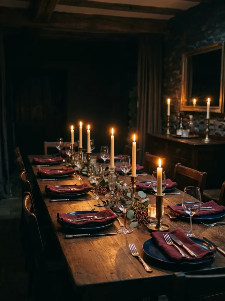
A dinner served with no artificial overhead lighting — only candles and perhaps a fireplace if available — creates an atmosphere that no amount of table decor can replicate with the lights on. This isn’t a table setting idea in the traditional sense; it’s a lighting decision that transforms whatever table setting exists underneath it.
The practical requirements: enough candles to provide adequate light for eating without straining to see the food (typically a minimum of eight to ten candles for a six-person table), candles at heights that light the plates rather than only the ceiling, and either battery-powered or real-flame candles positioned safely across the table and at the table’s perimeter on a sideboard or console.
The table setting itself, in a candlelit dinner, should be simpler than you would set it in full light — the darkness hides complexity and emphasizes warmth. Dark-toned plates and richly colored napkins, which can look heavy in daytime, read beautifully by candlelight. The setting’s success is measured by how the evening feels rather than how it photographs.
14. A Holiday Table with Natural Seasonal Elements
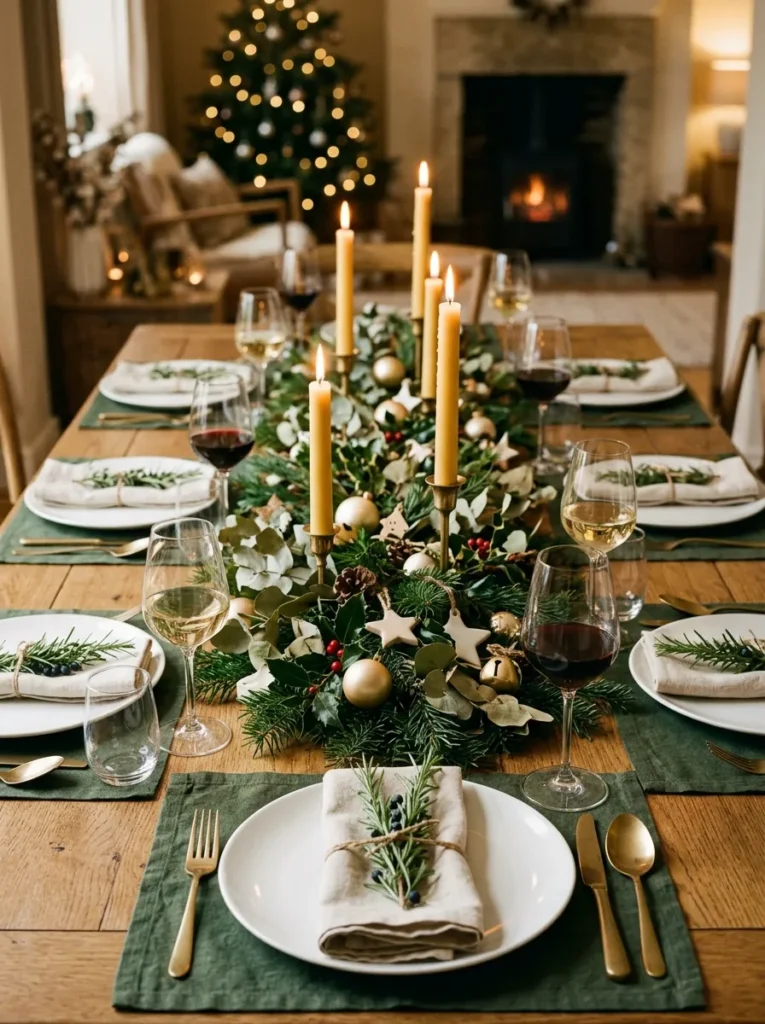
A holiday table setting that uses natural seasonal materials — pine branches, dried orange slices, cinnamon sticks, whole cloves studded into pears, winter berries, sprigs of rosemary — communicates celebration without requiring purchased holiday decor in specific colors. The natural elements carry seasonal meaning without the limited-use quality of themed tablecloths or novelty ornaments.
The arrangement can be as simple as a runner of pine and eucalyptus branches laid down the center of the table, with candles and small ornaments placed between the branches. Or more structured: individual place settings where a sprig of rosemary tied with natural twine sits across each napkin, and a whole dried orange slice serves as a scent element.
The palette of natural holiday elements — deep green pine, warm cream and ivory candles, terracotta dried oranges, pale gold wheat — is more sophisticated and longer-lived than the conventional red-and-green combination. It also photographs more beautifully across different dining room color palettes because it doesn’t require a contrasting background color to read clearly.
15. A Thanksgiving Table with an Earthy Harvest Palette

A Thanksgiving table setting built around a harvest palette — warm terracotta, deep amber, dusty sage, and natural linen — feels genuinely seasonal without resorting to turkey-printed tablecloths or orange everything. The harvest palette is sophisticated enough to look intentional and specific enough to communicate the season clearly.
Build the setting around a centerpiece of seasonal produce: a low arrangement of mini pumpkins, gourds in ivory and pale orange, and acorn squash grouped on a wooden board or a ceramic tray down the center of the table. Tuck dried sage, preserved oak leaves, and a few dried stems into the gaps. Place pillar candles in warm beeswax beside the arrangement.
The table linens should be in the same earthy register: linen napkins in natural or warm oatmeal, woven cotton placemats in warm terracotta or rust. White plates with a simple rim work better than plates with elaborate patterns that compete with the seasonal centerpiece. The simplicity of the tableware lets the harvest arrangement carry the seasonal message without visual competition.
16. A Boho Table Setting with Layered Textures

A bohemian table setting layers organic materials and natural textures in a way that reads as gathered and abundant rather than formally composed. Seagrass placemats, rattan charger plates, handthrown ceramic dishes in warm earthy glazes, loosely crumpled linen napkins, mismatched bud vases with dried pampas and eucalyptus at the center, and a string of warm LED lights woven through the centerpiece for evening glow — these elements together create a table that reads as genuinely personal.
The organizing principle is material coherence rather than matching: every element should be in the same warm, earthy tonal family (terracotta, oat, sage, natural linen, warm wood) even though no two elements are identical. A rattan charger beside a terracotta handthrown plate beside a linen napkin beside a dried eucalyptus stem all speak the same material language without any two pieces being from the same set.
The boho table setting suits casual dinner parties, long outdoor lunches, and brunches more than formal dinners. Its inherent ease — the sense that the setting came together naturally — is most convincing in contexts where relaxed conviviality is the goal.
17. A Table Runner Made from Fresh or Dried Botanicals
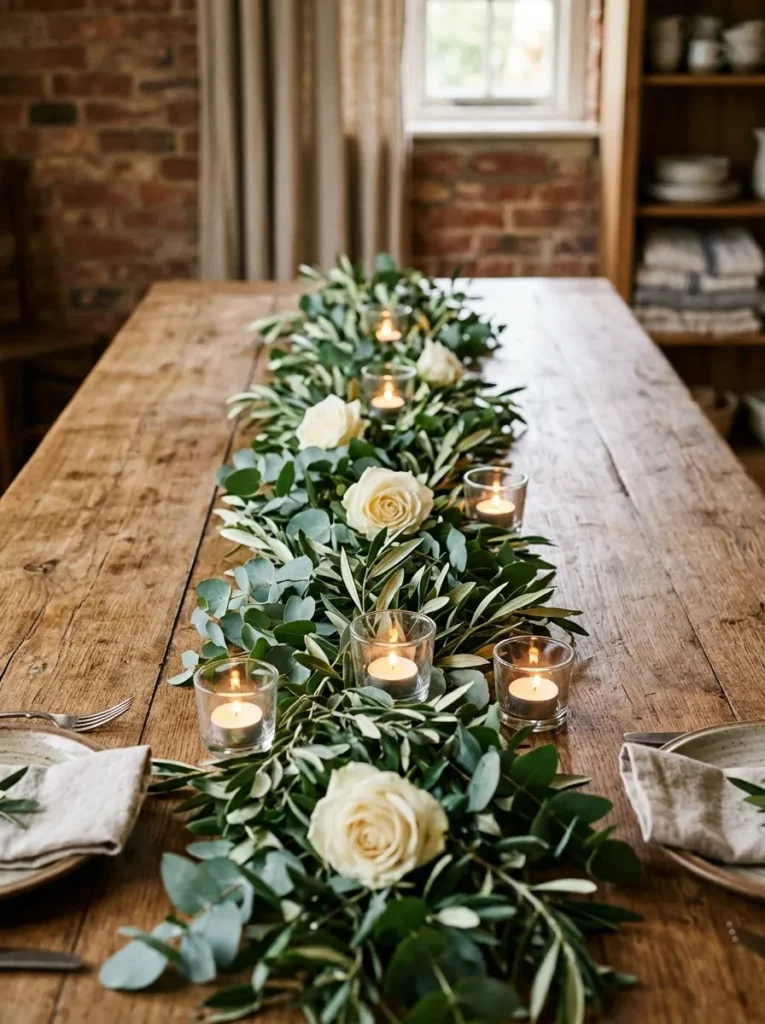
Rather than a fabric runner, a botanical runner — fresh greenery, dried branches, or a combination — laid directly on the table surface creates a living centerpiece that spans the table’s full length. A eucalyptus and olive branch runner with small votive candles nestled between the branches, dried seed pods positioned at intervals, and a few rose heads or ranunculus tucked into the foliage reads as effortlessly abundant.
The practical approach: lay the main branches first, alternating directions so the foliage covers the table surface evenly from end to end. Then place candle holders, followed by any focal flowers or objects. Keep the runner below 10 to 12 inches in width so place settings on either side remain accessible and undisturbed.
Fresh botanical runners last approximately four to six hours before the cut foliage begins to wilt, making them suitable for events where the table is set and used within the same day. Dried botanical runners (using eucalyptus, palm fronds, dried grasses) last considerably longer and can be prepared days in advance. The two approaches require different planning timelines.
18. A Personalized Place Card at Every Seat

A place card at each setting — whether handwritten, printed, or created from a natural object (a sprig of rosemary with a tag, a smooth stone with a name written in paint marker, a dried orange slice with a name scored into the surface) — creates a moment of personal recognition at the table before the meal begins. It tells each guest exactly where they belong, which removes the social friction of choosing seats and signals that the host thought about each person’s position at the table.
The place card format should suit the table’s overall setting. In a formal white-on-white setting, a stiff card-stock card in italic script is appropriate. In a boho table setting, a sprig of herbs with a name written on a small luggage tag reads as consistent with the setting’s aesthetic. In a natural holiday setting, a small pine cone with a name-tag ribbon reads as seasonal and specific.
Position the place card where it’s immediately visible when a guest approaches their seat: propped against the glass, sitting on the plate, or tucked into the napkin fold. A place card that requires searching to find defeats its purpose.
The Four Decisions That Determine Every Table Setting
Before choosing between candles or flowers, formal or casual, linen or ceramic, four foundational decisions shape the entire setting.
Occasion and tone. The most elegant setting for the wrong occasion reads as wrong. A white-on-white formal setting for a casual birthday lunch can make guests feel underdressed and over-managed. A minimal linen setting for a milestone celebration can feel under-prepared. Match the setting’s register to the occasion’s register, and every other decision becomes easier.
The table surface. A beautiful wood table is a design element in itself; covering it entirely with a tablecloth hides a material the room was probably chosen for. A runner or placemats that let the wood read while providing textile texture suits most wood dining tables better than a full cloth. A less interesting table (laminate, scratched wood, an outdoor table used inside) benefits from the concealment a tablecloth provides.
The centerpiece height. No matter what the centerpiece is, its maximum height should allow guests to maintain comfortable eye contact across the table. The standard guideline — nothing above 12 inches unless it’s narrow enough that guests can see between or around it — is worth treating as a non-negotiable rather than a preference.
The number of elements per place setting. A place setting’s visual logic is clearest when it doesn’t exceed what the meal requires. Extra glasses for wines that won’t be served, cutlery for courses that won’t be cooked, and decorative elements that need to be removed before the first course is set create confusion rather than formality. Set the table for the meal you’re actually serving.
Final Thoughts
The dining table settings that make the strongest impression are rarely the most elaborate. They’re the ones where every element belongs — where the napkins suit the plates, the plates suit the centerpiece, and the centerpiece suits the occasion — so that the overall effect reads as a single considered decision rather than many individual ones competing for attention.
If you’re approaching a table setting for the first time, start with Ideas 1 and 6 — the minimalist linen setting and the woven placemat everyday setting. These two establish the underlying logic of a composed place setting before adding centerpieces, candles, and complexity. Once the logic is clear, layering in Ideas 9, 12, and the personalized place card from Idea 18 creates a complete setting that reads as genuinely considered without requiring elaborate preparation.
Save the ideas that suit your occasions and your existing tableware, and return to the practical section when you’re setting the table for something worth doing well.