20 Dining Room Wall Decor Ideas That Add Real Character
Dining room walls are often the last thing to get attention and the first thing guests actually notice. The table gets chosen, the chairs get upholstered, the rug goes down — and then the walls stay bare for months while you try to figure out what’s supposed to go there. It’s a more specific problem than it first appears: dining rooms have particular constraints that living rooms don’t. There’s usually a dominant table to relate to, a ceiling height that affects art scale, window placement that limits wall space, and the fact that people sit facing the walls for extended periods of time.
These twenty dining room wall decor ideas range from structural changes that require a weekend to simple styling choices that require an afternoon. The sequence moves from larger decisions toward smaller ones, so if you’re working through a full room refresh, reading in order will help you prioritize.
1. Hang Overscale Art and Size It to the Table, Not the Wall
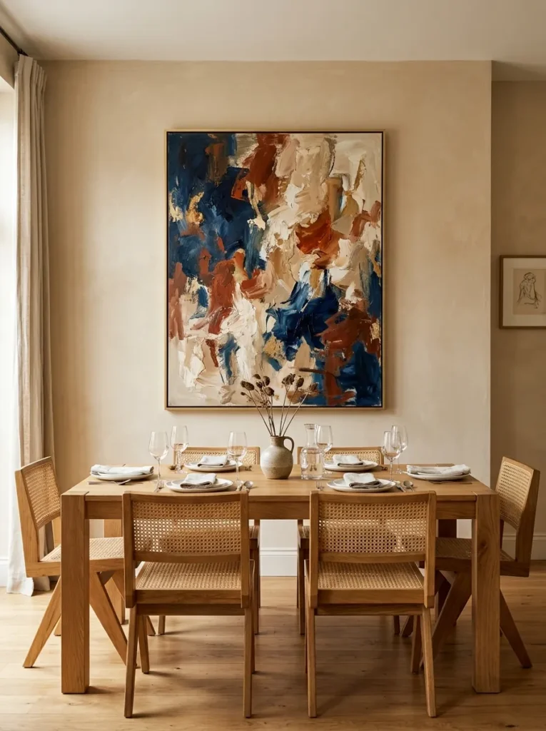
The most common mistake with dining room art is choosing something too small. A piece that looks generous in a gallery or shop reads as timid above a six-seat dining table. The general principle: the artwork’s width should relate to the table below — roughly two-thirds the width of the table when hung above a sideboard, or slightly narrower if it’s the sole focal point on a blank wall.
Height matters too. The center of the piece should typically sit at seated eye level — around 145 to 150 centimeters from the floor — since dining room art is usually viewed while sitting, not standing. One large piece above a sideboard or console is one of the most resolved approaches available in this room, particularly if the art itself has enough tonal complexity to reward close attention over a meal.
2. Create a Gallery Wall That Feels Edited, Not Accumulated
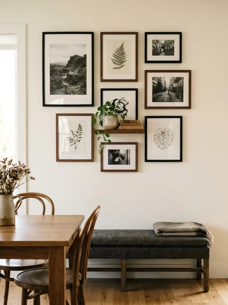
Gallery walls go wrong in dining rooms more often than in living rooms, partly because the table below already creates horizontal visual weight. A gallery wall that competes with that — too wide, too tall, too many frames — makes the room feel restless when the goal is usually something more settled.
The most functional dining room gallery walls have a defined boundary: a clear top line, consistent side margins, and a limited frame palette. Two or three frame finishes maximum. A mix of art, photography, and one or two objects (a small shelf bracket, a mounted plant, a sculptural element) reads more intentional than art alone. Before hanging anything, lay the full arrangement on the floor and photograph it from above — it’s easier to see the balance issues at that stage than after the first holes are in the wall.
3. Install Wainscoting or Board-and-Batten for Architectural Weight
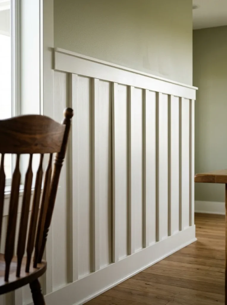
Plain flat walls can make even well-furnished dining rooms feel like they’re missing something. Wainscoting — wood paneling on the lower third to half of the wall — is historically a dining room detail precisely because it creates the sense that the room was designed rather than decorated. It also serves a practical function: the lower wall takes the most contact from chair backs, and painted wood holds up better than painted plaster.
Board-and-batten (vertical planks with flat strips over the seams) is a simpler contemporary version that can be DIY-installed in a weekend. Painted the same color as the wall above, it adds dimension without visual busyness. Painted a contrasting tone — a warm cream above a sage green batten, for example — it creates a defined color split that anchors the room. Chair rail height, typically around 90 centimeters, is a natural division point.
4. Use a Single Wall of Dark, Moody Paint as the Focal Point
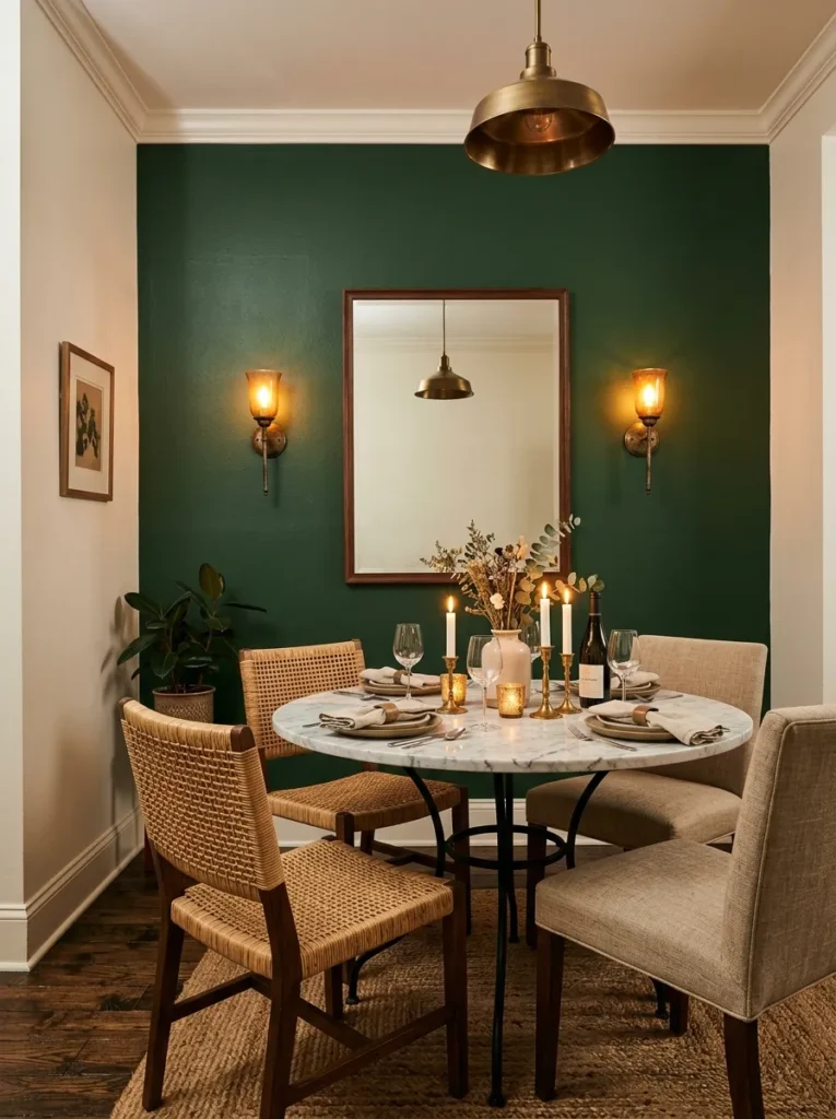
Dining rooms are well suited to deep wall color in a way that living rooms sometimes aren’t. Meals happen in short, intentional sessions rather than through an entire day, so a wall color that would feel oppressive in a room you occupy for eight hours can feel genuinely atmospheric over dinner.
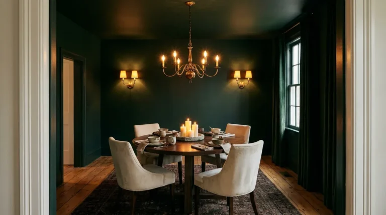
The wall behind the main seating, or the wall the table faces, is the natural candidate. Deep greens, inky navies, warm charcoals, and earthy terracottas all work well here. The paint finish matters: an eggshell or satin finish on dining room walls is more practical than flat — it wipes down cleanly. Pair the dark wall with something warm and reflective nearby, a brass-framed mirror, candlelight, or warm pendant light, to prevent the darkness from simply absorbing all available light without giving anything back.
5. Hang a Large Mirror Opposite a Window or Light Source
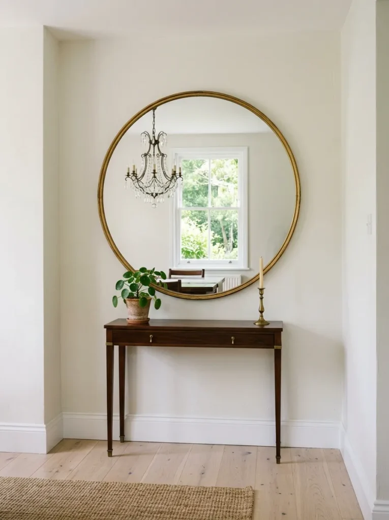
Mirrors earn their place in dining rooms when they’re positioned to reflect something worth doubling — a lit pendant above the table, a window with natural light, or a vignette on the opposite wall. Positioned to reflect a blank wall or a cluttered sideboard, they do nothing useful.
In a narrow dining room, a large mirror on the short end wall genuinely extends the visual length of the space. Scale is critical: a mirror should be substantial enough to read as an architectural element rather than a decorative accessory. A mirror with a width of at least 90 centimeters holds its own in most dining rooms. Frame choice either anchors the room’s style (a heavy gilt frame for something traditional, a simple thin iron frame for something more contemporary) or provides deliberate contrast that makes the piece feel curated rather than matching.
6. Apply Wallpaper to a Single Feature Wall
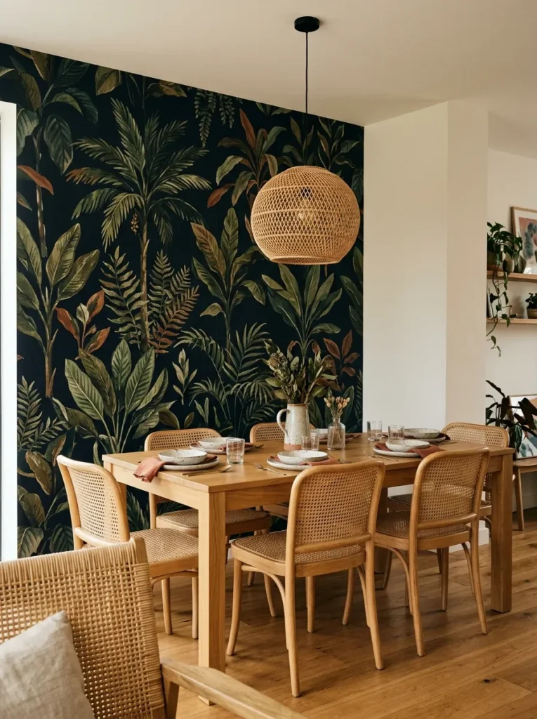
Full-room dining room wallpaper is a strong commitment. A single feature wall — typically the one directly behind the primary seating or at the short end of a rectangular room — gives you the visual impact of a bold pattern without papering yourself into a corner.
The practical consideration is the join between papered and painted walls, which looks best when it falls in a natural break: an internal corner, a door frame, or a ceiling-to-floor architectural division. Choosing a wallpaper that incorporates the room’s existing palette makes the transition less abrupt. Large-scale botanical prints, geometric linears, and textured grasscloth all work particularly well in dining rooms because they reward the kind of sustained looking that happens across a meal. Peel-and-stick wallpaper has improved considerably and offers a renter-accessible version, though the seams require more precise alignment than paste varieties.
7. Mount Wall Sconces to Frame a Focal Point
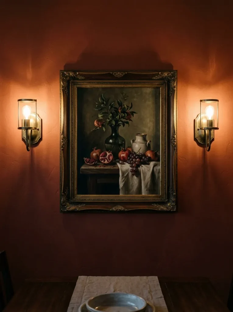
Wall sconces in a dining room serve a different purpose than overhead pendants. Where a pendant above the table creates the primary light source, sconces on the walls create a secondary layer that softens the perimeter of the room and draws the walls into the overall lighting scheme rather than leaving them in shadow.
The most natural placement is flanking a mirror, a piece of art, or a sideboard — two matching sconces creating a symmetrical frame. Height should put the light source roughly at eye level when standing, around 170 to 180 centimeters, so the light washes the wall at a useful angle rather than shining directly into seated diners’ eyes. Hardwired sconces require an electrician, but plug-in sconces with cord-covering kits are a workable alternative that avoids the cost and disruption of rewiring.
8. Build a Display Ledge for Rotating Art and Objects
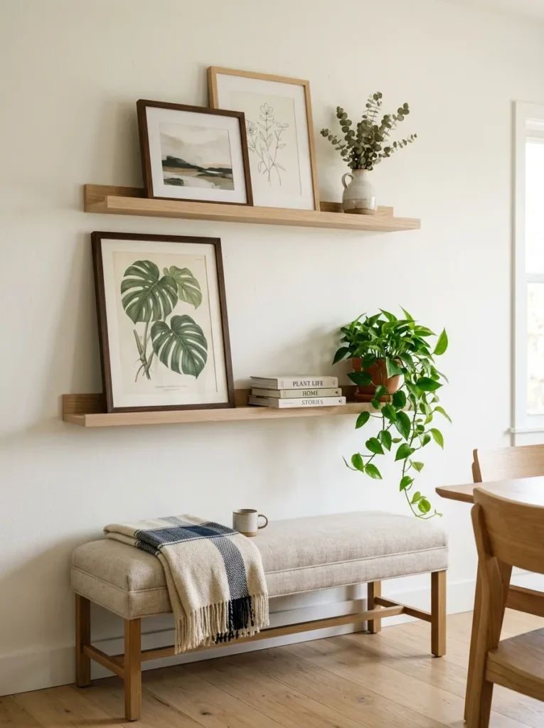
Picture ledges — shallow wall-mounted shelves designed for displaying art and objects — solve the dining room’s classic dilemma: how to fill a significant wall without committing to specific art or specific placement. With ledges, everything is propped rather than hung, which means it can be rearranged or swapped entirely without new holes or repainting.
In a dining room, a single ledge running most of the wall’s width or two staggered ledges at different heights create a display that can include framed prints, small plates, ceramics, books, and plant specimens. The visual key is leaning art at slightly different angles and layering pieces in front of and behind each other — flat parallel alignment tends to look static. Shelf depth of around 10 to 15 centimeters gives enough room to layer objects without the ledge reading as storage.
9. Frame the Room’s Best Architectural Feature With Paint
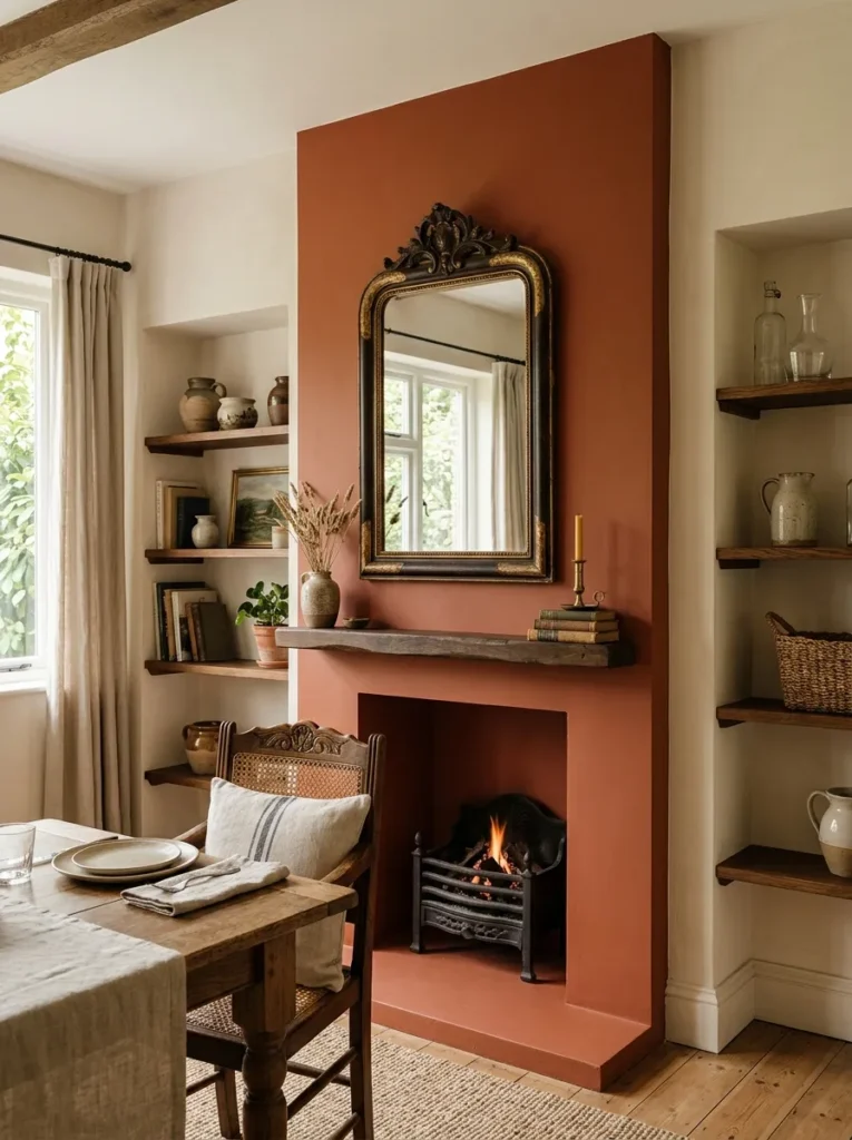
Some dining rooms have features that go unnoticed simply because they haven’t been defined. A chimney breast, an alcove, a recessed niche, or even a door surround can become a deliberate focal point with a coat of paint in a contrasting tone.
Painting an alcove two to three shades darker than the surrounding walls makes the space appear to recede, turning it into a natural display case for whatever lives inside. Painting a chimney breast in a bold accent color while keeping surrounding walls neutral anchors the end of a rectangular dining room without requiring any additional decor. This works best when the rest of the room is relatively restrained — the painted feature carries more weight when the surrounding walls aren’t competing.
10. Hang a Tapestry or Textile as an Alternative to Canvas Art
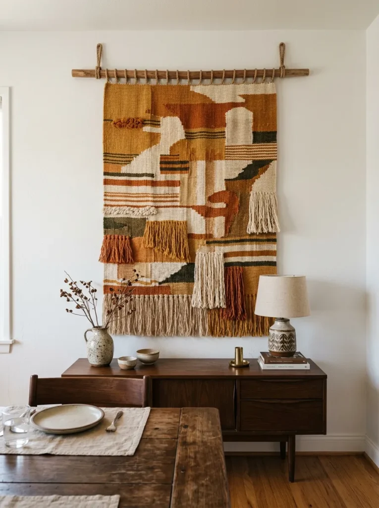
Textiles bring something to walls that paintings and prints rarely do: sound absorption, texture, and a quality of warmth that photographic reproductions don’t replicate. In a dining room, where hard surfaces — table, chairs, floor — already dominate, a large textile adds acoustic softness that subtly improves how the room feels during conversation.
Vintage tapestries, woven wall hangings, antique dhurrie panels, and contemporary fiber art all work. The key is scale: a textile that’s too small reads as a craft project rather than a design decision. A piece that occupies most of its wall’s width, or at least matches the width of the furniture below it, reads as intentional. Hanging options include dowel rods, curtain rings on a thin rod, or clip systems — the hanging mechanism often becomes part of the visual.
11. Line One Wall With Open Shelving for Display and Storage
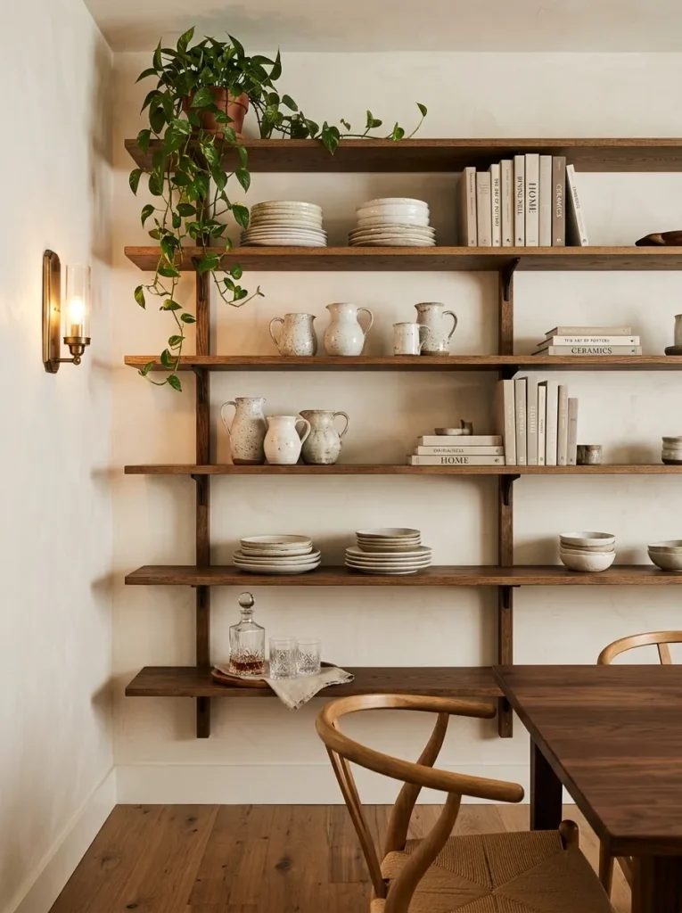
A wall of open shelving in a dining room solves a problem that purely decorative approaches don’t touch: the practical need for storage. Dishes, glassware, serving pieces, linens, and decanters all need somewhere to live, and a well-styled open shelf wall transforms functional storage into the room’s most interesting visual feature.
The styling makes the difference. Consistent dishware creates calm — a run of the same cream plates stacked by size reads as intentional, while a mixture of unrelated pieces reads as overflow. Interspersing objects among the dishes — a few books, a plant, a ceramic jug — breaks the regularity without losing the sense of order. Shelf depth should be practical: around 30 to 35 centimeters for dinner plates, and brackets that can genuinely support the weight of full sets of dishware rather than purely decorative options.
12. Hang Plates in a Curated Wall Arrangement
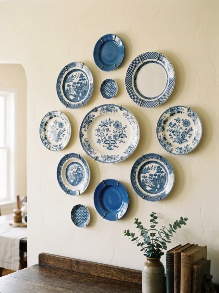
Plate walls are older than most contemporary trends that have borrowed from them, and they remain one of the most appropriate things to hang in a dining room — an obvious formal logic between the room’s function and its decoration. The execution is what separates a considered plate wall from a random collection.
The most resolved arrangements have visual consistency in one or two variables while allowing variation in others: same color family with varied patterns, or same pattern family with varied sizes. Round plates need circular breathing room in the arrangement — too tight and the circles start to visually collide. Plate hanging systems with spring wires are the most secure and the least damaging to plates, and they’re adjustable, which helps when refining spacing. A centered arrangement above a sideboard works well; asymmetrical arrangements on larger walls need a stronger compositional anchor.
13. Install Grasscloth or Textured Wallcovering for Tonal Depth
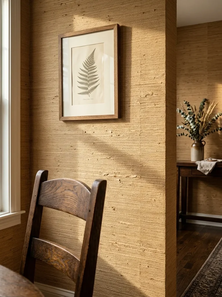
Not all dining room walls need pattern or color drama. A textured wallcovering — grasscloth, jute weave, linen paper, or cork — adds depth that reads differently than flat paint without introducing any specific color or motif. The texture catches light throughout the day, shifting from subtle relief in bright conditions to more pronounced warmth under artificial evening light.
Natural fiber wallcoverings like grasscloth and jute require slightly more care than vinyl or paper wallpapers: they’re sensitive to moisture and can be harder to clean. In a dining room where splashes happen, positioning a textured wallcovering on walls that don’t face the table directly reduces the risk. The tonal variation within natural fiber weaves is significant — two rolls from the same batch can read differently, so installing from alternating rolls produces a more even result.
14. Create a Color-Blocked Wall With Two Paint Tones
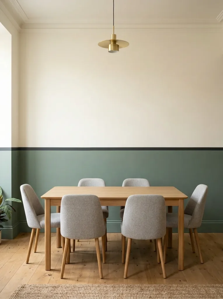
Color blocking in a dining room involves dividing a single wall into two distinct zones — typically upper and lower — using two different paint colors separated by a clean horizontal line. It’s a cheaper and more flexible alternative to wainscoting, and more architectural in feeling than a single flat wall color.
The horizontal division line typically falls between 90 and 120 centimeters from the floor, depending on the ceiling height and the visual weight of each color. Darker color below, lighter above is the most natural arrangement — it grounds the room and mirrors the conventional relationship between floor and ceiling. A contrasting tone as a narrow horizontal band between the two zones, sometimes called a stripe detail, sharpens the transition and adds another degree of intention to the approach. Painter’s tape and a level are the essential tools.
15. Frame a Dining Room Mirror With Wall Sconces for a Vanity-Inspired Look
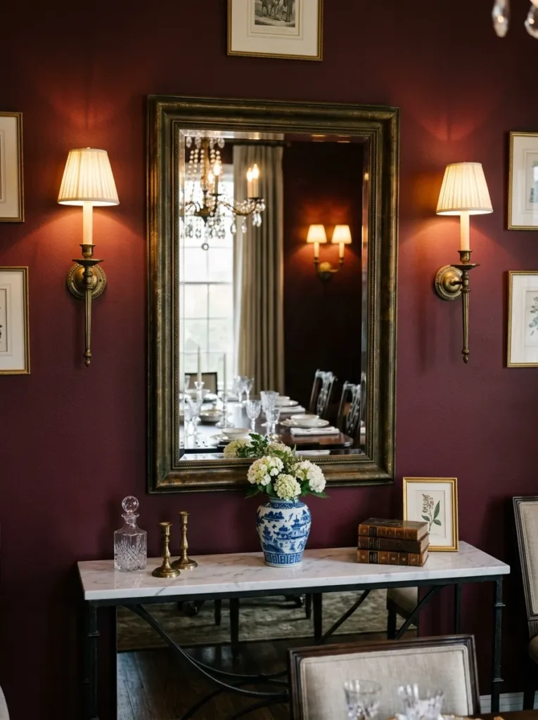
Taking the sconce and mirror combination further: mounting a large mirror with sconces on either side creates the visual language of a hotel lobby or a formal dining room in a period house — a complete wall composition rather than individual elements placed separately.
The mirror width should be at least equal to the sideboard or console beneath it, ideally slightly wider, to create a balanced column of visual weight from table surface to wall. Sconces should align with the outer thirds of the mirror rather than sitting flush beside it — some breathing room between fixture and frame makes the arrangement look less forced. Matching the metal of the sconces to existing hardware in the room, pendant light, door handles, or chair leg finish, makes the whole room feel more cohesive without requiring any additional purchases.
16. Paint or Stencil a Geometric Pattern Directly Onto the Wall
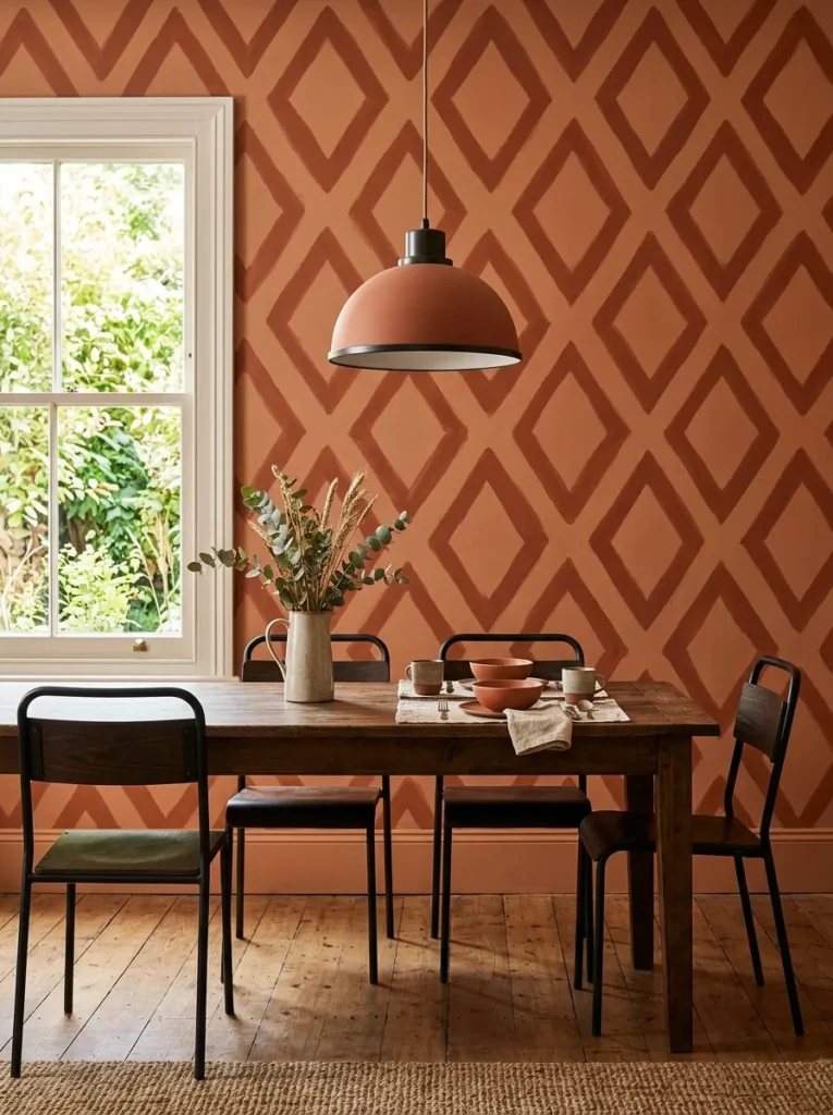
A painted geometric pattern — a diamond repeat, a simple grid, or a herringbone — is one of the lower-cost ways to create a feature wall with the visual complexity of wallpaper. The investment is time and precision rather than materials.
Large-scale geometric stencils are widely available and reduce the technical difficulty significantly. The wall color becomes the base, and a second tone in the same family (or a contrasting one, depending on the desired boldness) goes over the stencil. All-over patterns across an entire wall create a maximalist effect; a partial pattern rising from floor level to chair rail height and stopping cleanly creates a contemporary dado-style treatment. The most forgiving geometric patterns for imperfect walls are those with enough scale that minor misalignments between repeats aren’t visible at normal viewing distance.
17. Hang a Statement Clock as a Functional Focal Point
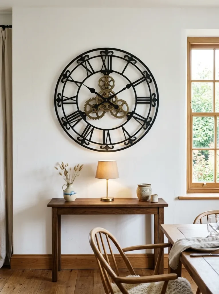
Large wall clocks in dining rooms have a particular formal logic — mealtimes are time-structured by nature, and a substantial clock above a sideboard or on the main wall provides the kind of purposeful decoration that feels appropriate to the room’s function rather than merely decorative.
The scale needs to be genuinely large to read as a focal point rather than an incidental detail: 60 centimeters diameter minimum in most dining rooms, larger in rooms with higher ceilings or longer walls. A clock with an open face or visible mechanism adds visual depth that solid-face clocks don’t. Frame and hand finishes should connect to at least one other metal or material already present in the room. Positioned alone on an otherwise unadorned wall, a substantial clock reads as a deliberate architectural choice; surrounded by competing art, it loses that quality.
18. Add a Narrow Console or Sideboard and Style the Wall Above It
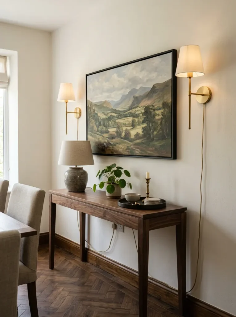
This is technically a furniture choice, but it defines the wall it backs against more than almost any wall treatment. A console or sideboard along the main wall creates a platform for a composed vignette — art above, objects below, lighting at each end — that functions as the room’s visual anchor rather than leaving the wall to work on its own.
The wall above the console benefits from a single clear focal point: one large piece of art, one substantial mirror, or a pair of matching pieces with a central element between them. The console surface itself — with a lamp, a plant, a tray, and one or two objects — completes the composition vertically. The console depth matters: something around 35 to 45 centimeters allows genuine display and storage space without projecting into the room’s circulation paths.
19. Use Vintage or Antique Finds as Wall Sculpture
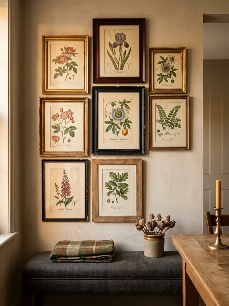
Mass-produced wall art has a sameness that vintage objects don’t. An antique architectural fragment, a collection of old maps, a group of vintage botanical prints in mismatched period frames, or a pair of decorative corbels mounted as sculpture all bring something that contemporary prints rarely achieve: a sense that the room has accumulated over time rather than been assembled.
The challenge is editing. Vintage objects on walls work best when there’s a consistent thread — all botanical, all maps, all mirrors, all from a particular period — rather than a genuinely random mix. One or two strong vintage pieces make a more decisive impression than a wall covered in assorted finds. A single large antique mirror or one framed set of period prints can read more powerfully than ten smaller objects competing for attention.
20. Create a Wall Niche or Arched Recess for Display
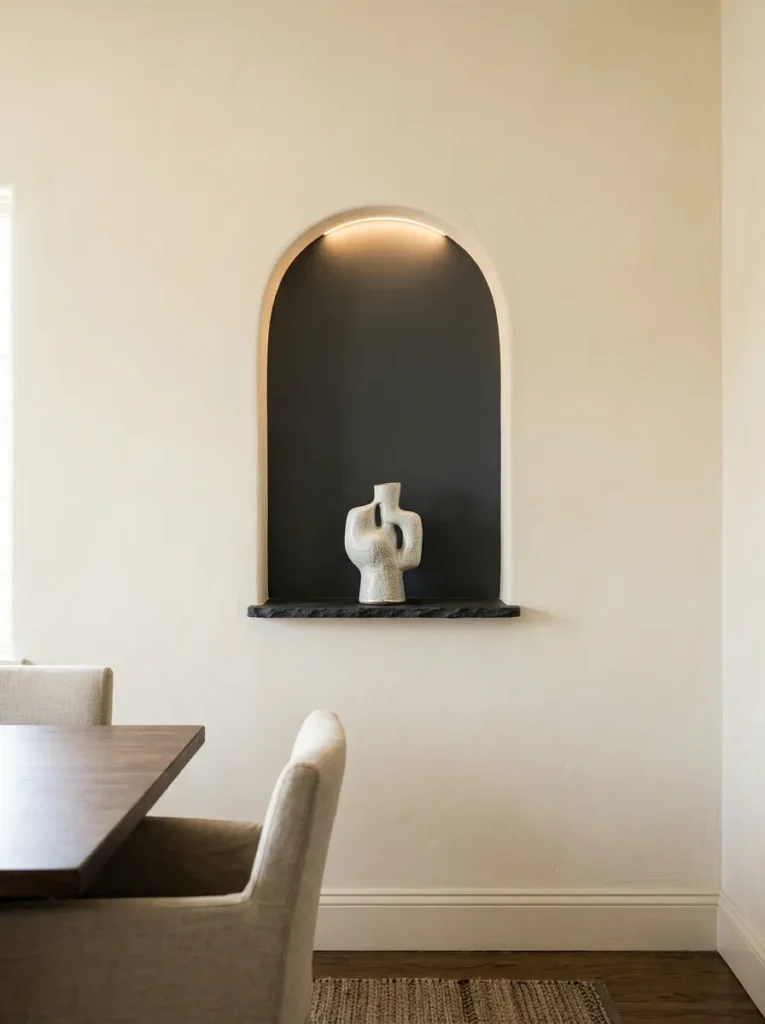
Where the architecture allows — or where a non-structural partition wall exists — a recessed niche or arched opening provides the most architecturally integrated form of dining room wall display. Built into the wall rather than applied to its surface, a niche reads as part of the building’s design rather than decoration placed afterward.
In older homes, existing alcoves alongside chimney breasts are natural candidates. In newer construction or renovated spaces, a shallow niche can be created in a non-load-bearing wall at relatively modest cost. The interior of the niche is typically painted a contrasting tone — often darker — to create visual depth. The display within should be limited and deliberate: one piece of art, a single sculptural object, or a small arrangement rather than a crowded shelf. Lighting the niche from above or below transforms it from a storage space into the room’s most distinct architectural detail.
How to Choose What Goes on Your Dining Room Walls
The most useful filter before buying or hanging anything: what will people be looking at during the meal? Dining rooms are unusual in that guests sit in fixed positions and face specific walls for extended periods. This makes the wall opposite primary seating the most important surface in the room. Whatever goes there — a large painting, a mirror, a dramatic wallpaper — will receive sustained attention. It should be genuinely worth looking at from close range and across the table.
On scale: the single most common error is undersizing. In a dining room with a substantial table, art and mirrors need to be larger than instinct suggests. Hold a piece of kraft paper cut to the proposed dimensions against the wall before buying anything — the shock of seeing the actual scale often recalibrates expectations.
On rental constraints: most ideas in this article work without permanent changes. Picture ledges require only shelf brackets. Peel-and-stick wallpaper leaves walls intact. Plug-in sconces avoid electrical work. The higher-commitment options — wainscoting, painted feature walls, wallpaper — are worth discussing with a landlord before proceeding, and in some cases are approved when done professionally.
On mixing approaches: more than two different wall treatments in a single dining room tends to read as unsettled. The most coherent dining rooms usually have one strong wall idea and let the remaining walls stay relatively quiet.
Final Thoughts
Good dining room wall decor doesn’t fill space — it gives the room a reason to be looked at. The table, chairs, and rug establish the room’s bones, but it’s the walls that determine whether the space has genuine character or simply furniture in it.
If you’re starting from scratch, begin with the wall opposite primary seating: that’s the surface your guests will spend the most time looking at. Get that wall right before addressing anything else. Scale up more than you think you need to, and resist the urge to do multiple things on the same wall when one well-chosen piece would read more decisively.
Browse through these dining room wall decor ideas and save the ones that match both your room’s proportions and the practical realities of your space — renter, budget, or otherwise. The best choice is the one you’ll actually follow through on, not the most ambitious idea