20 Moody Living Room Ideas That Feel Sophisticated, Not Suffocating
There’s a particular kind of living room that stops you at the doorway. Not because it’s flashy, but because it has presence — a quality that brighter, airier rooms rarely achieve. Moody living rooms pull this off through depth rather than decoration: dark walls that make the ceiling feel intimate, layered lighting that controls exactly what you notice, materials with enough texture and weight to hold the eye.
The challenge isn’t creating drama. That part is easy. The challenge is creating a dark room that still functions well — one that doesn’t drain natural light from a north-facing flat, make a small space feel like a corridor, or look theatrical rather than genuinely livable. These twenty ideas move through color, material, lighting, furniture, and detail with that balance as the priority. Some are bold starting points. Others are quieter moves that shift a room’s atmosphere without a single can of dark paint.
1. Choose a Wall Color with an Undertone You Can Live With
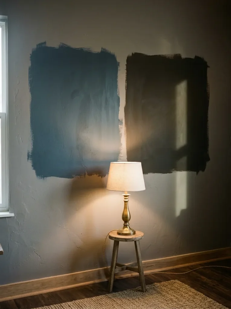
The most common mistake in moody living rooms isn’t going too dark — it’s choosing the wrong undertone. A charcoal with strong blue undertones will feel cold and clinical under artificial evening light. A deep green with grey undertones reads differently at noon versus 8pm. Before committing to anything on the wall, test large painted swatches in the actual room and observe them at multiple times of day.
For most interiors, the most livable dark shades have either warm (red, brown, or yellow) undertones or a balanced warm-neutral base. Inky navies work when the room receives good natural light. Earthy blacks — those with a slight brown warmth — tend to feel more comfortable than pure cool-grey blacks for daily living. The color you see on a paint chip under bright store lighting is rarely the color on your wall at 7pm.
2. Paint the Ceiling the Same Dark Color as the Walls
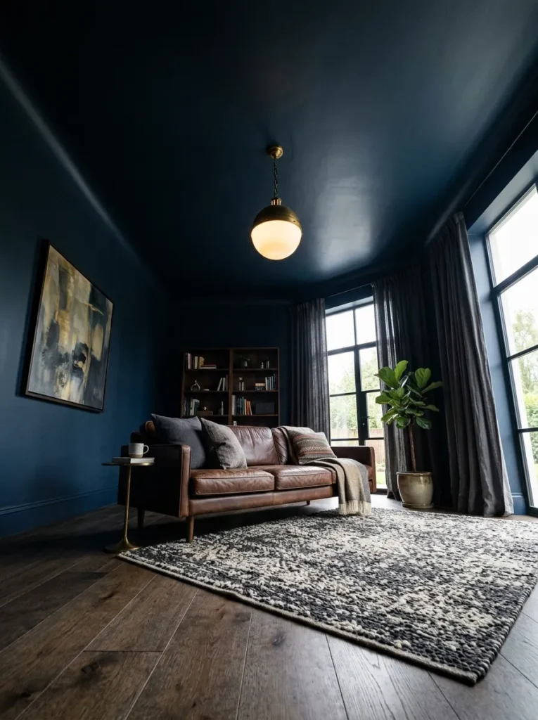
This is the move that separates a genuinely moody room from one that merely has a dark accent wall. When ceiling and walls share the same deep color — or the ceiling goes one shade darker — the room stops feeling like a box with a pale lid. Instead it feels enclosed in a way that reads as intentional and almost cinematic.
The practical concern most people have is ceiling height. This technique does lower the visual ceiling, which matters in rooms already under about 2.4 meters. In taller rooms, it creates a cocooning effect that works well. A useful middle ground: use the same color with a slight sheen difference — flat on walls, eggshell on ceiling — so the ceiling catches light differently without breaking the visual continuity.
3. Layer Three Distinct Lighting Sources Instead of One Overhead
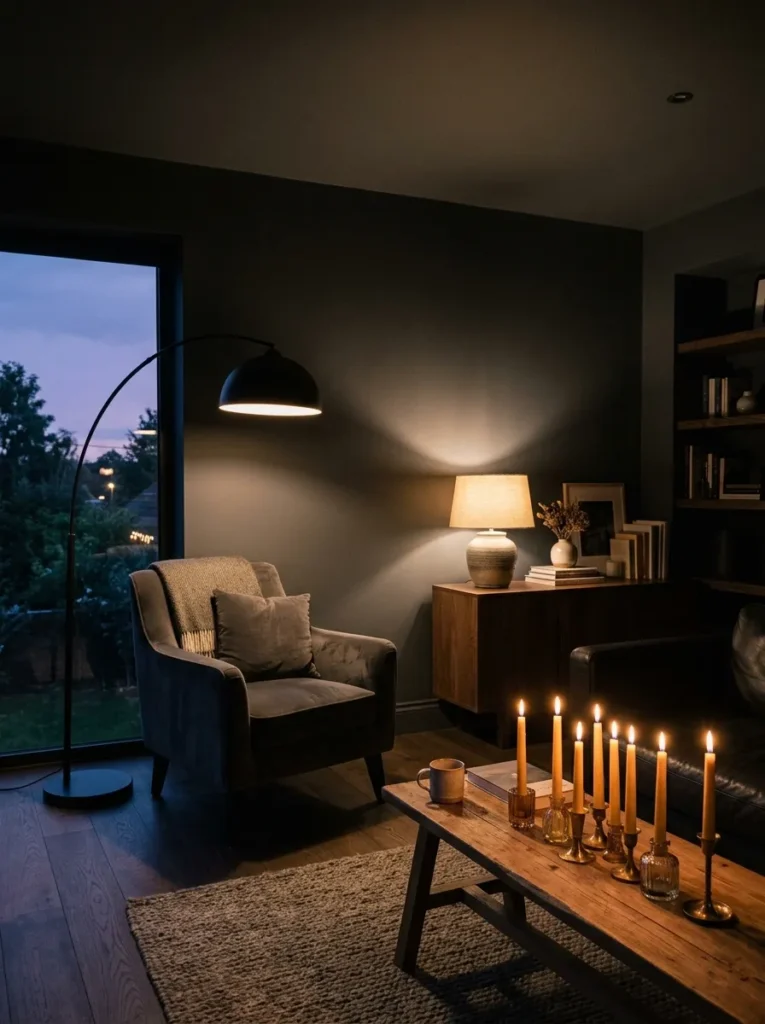
Overhead lighting is the enemy of atmosphere. A single ceiling fixture illuminating a dark room evenly from above creates flat, unflattering light that makes the walls look dull rather than rich. Moody rooms need lighting that creates zones, shadows, and hierarchy.
The practical framework: one ambient source (a floor lamp or low-hanging pendant that washes light downward rather than flooding the ceiling), one task or accent source (a table lamp near seating), and one atmospheric source (candles, a low shelf lamp, or LED strip behind a console or bookcase). This gives you control over the mood without requiring a full rewire. Wall sconces at seated eye level are particularly effective — they put light where people are rather than where nobody sits.
4. Use Smoked or Fumed Oak for Furniture with Natural Warmth
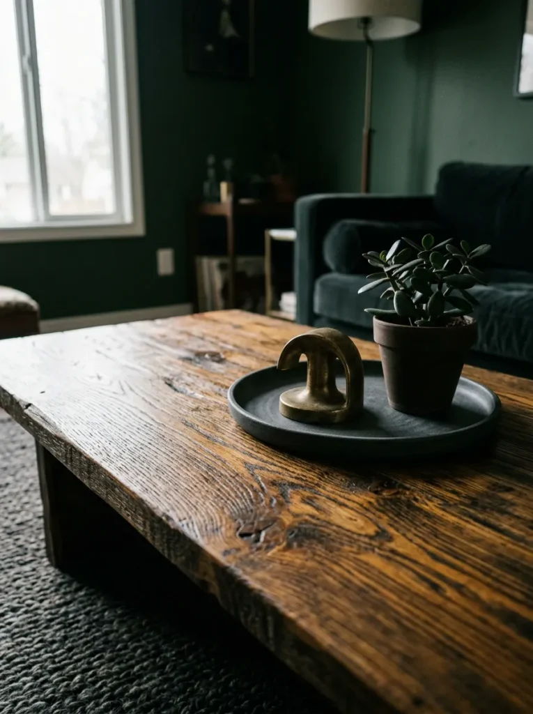
Dark rooms need furniture that absorbs some of that darkness without disappearing into it. Black lacquer furniture tends to vanish against very dark walls, while pale natural wood creates too much contrast. Smoked oak — where the wood is treated to deepen its grain into rich amber-browns and near-blacks — occupies the ideal middle territory.
The grain remains visible, which adds texture at close range, and the warmth of the wood prevents the room from tipping cold. Smoked oak coffee tables, sideboards, and shelving units sit well against inky, forest green, or deep navy walls without competing. The material also pairs naturally with aged brass and black iron hardware in a way that feels resolved rather than assembled.
5. Choose Velvet Upholstery in Jewel Tones or Muted Depths
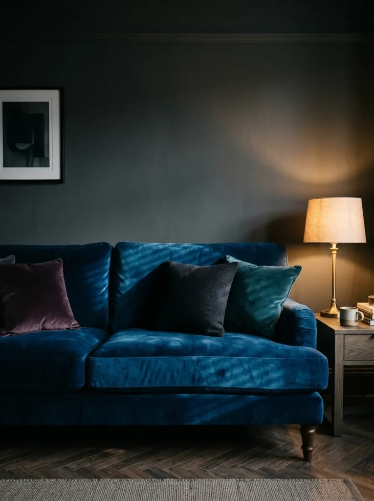
Velvet earns its place in a moody room because it does two things simultaneously: it absorbs light in a way that deepens color, and it reflects directional light in thin bands that suggest luxury without any gilding. A bottle green velvet sofa against a deep charcoal wall reads very differently from a linen sofa in the same space — richer, more intentional, more finished.
The color question matters more than the material choice. Jewel tones — sapphire, forest green, plum, burnt amber — work because they share the room’s depth rather than competing with it. Pale velvet against very dark walls creates jarring contrast that tends to look unresolved. If the walls are the drama, let the sofa sit within the palette rather than against it. Dusty rose velvet is one notable exception — it can work if the wall color has enough warmth to hold it.
6. Install Panel Moulding or Dado Rails and Paint Them the Same Dark Color
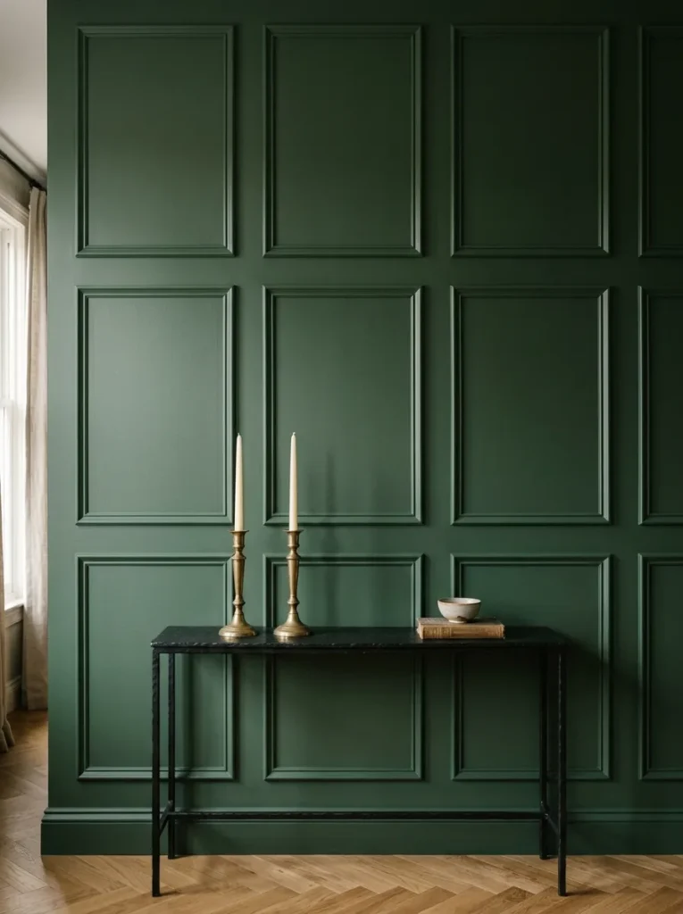
Architectural detail becomes visible in a moody room in a way it rarely does in a pale one. Panel moulding — rectangular frames applied to walls before painting — gives a dark room the layered depth of a period interior without requiring period architecture. When everything is painted the same color, the moulding creates subtle shadow lines that add dimension without breaking the tonal unity.
This is one of the more budget-conscious transformations available, since MDF panel moulding is inexpensive and can be installed with adhesive rather than nails in many situations. The finish matters: paint everything in the same tone with a slight sheen on the panels and flat on the surrounding wall, so panels catch light differently. Renters can achieve a similar optical effect using removable peel-and-stick panel trim.
7. Ground the Room with a Dark, Pattern-Rich Rug
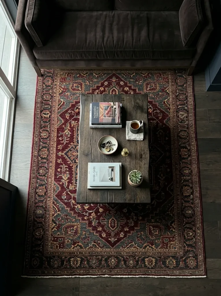
In a dark room, the floor becomes part of the atmospheric whole rather than a neutral backdrop. A pale rug breaks the visual continuity and draws the eye downward in a way that competes with the room’s intention. A dark rug — particularly one with a subtle pattern in similar or complementary deep tones — extends the moodiness to floor level and makes the furniture feel anchored rather than floating.
Wool rugs in deep burgundy, charcoal, or ink blue with traditional or abstract patterns work particularly well. The pattern provides enough visual interest to prevent the floor from feeling like a void while remaining within the palette. Sizing matters: a rug that’s too small in a dark room looks like an afterthought. The rug should reach under at least the front legs of all main seating.
8. Mix Aged Brass and Matte Black Hardware Throughout
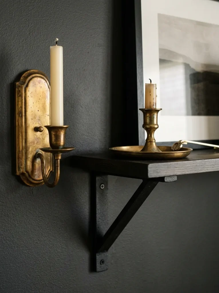
Finish cohesion in a moody living room matters more than in lighter spaces, because there’s no bright background to absorb visual inconsistency. When light fixtures, curtain rods, door hardware, table legs, and decorative objects all pull in different finish directions, the room reads as assembled rather than designed.
Aged brass and matte black are the two finishes that most consistently work against dark walls. Aged brass brings warmth — it references something antique and organic rather than contemporary and polished, which suits the atmospheric quality of a moody room. Matte black provides contrast without the harshness of chrome. The two can coexist if anchored by repetition: brass in lighting and a mirror frame, matte black in furniture legs and shelf brackets, for example.
9. Use Curtains That Pool Slightly at the Floor
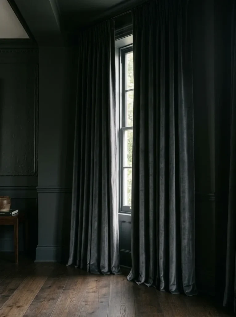
Window treatments are where moody rooms most often go wrong. Short curtains or blinds that stop at the windowsill create a horizontal break that reads as domestic rather than atmospheric. Dark, heavy curtains that hang from ceiling height to the floor — ideally with one to three inches of pooling — make the windows feel architectural.
The fabric weight changes the impression significantly. Lightweight linen or cotton curtains will hang stiffly and look insufficient against a dramatic wall. Velvet, chenille, or heavyweight linen-cotton blends with enough drape to fall naturally are better suited. The color doesn’t need to match the walls exactly — a tone slightly darker or lighter within the same family often looks more deliberate than an exact match.
10. Add a Single Large Piece of Dark Art Rather Than a Gallery Wall
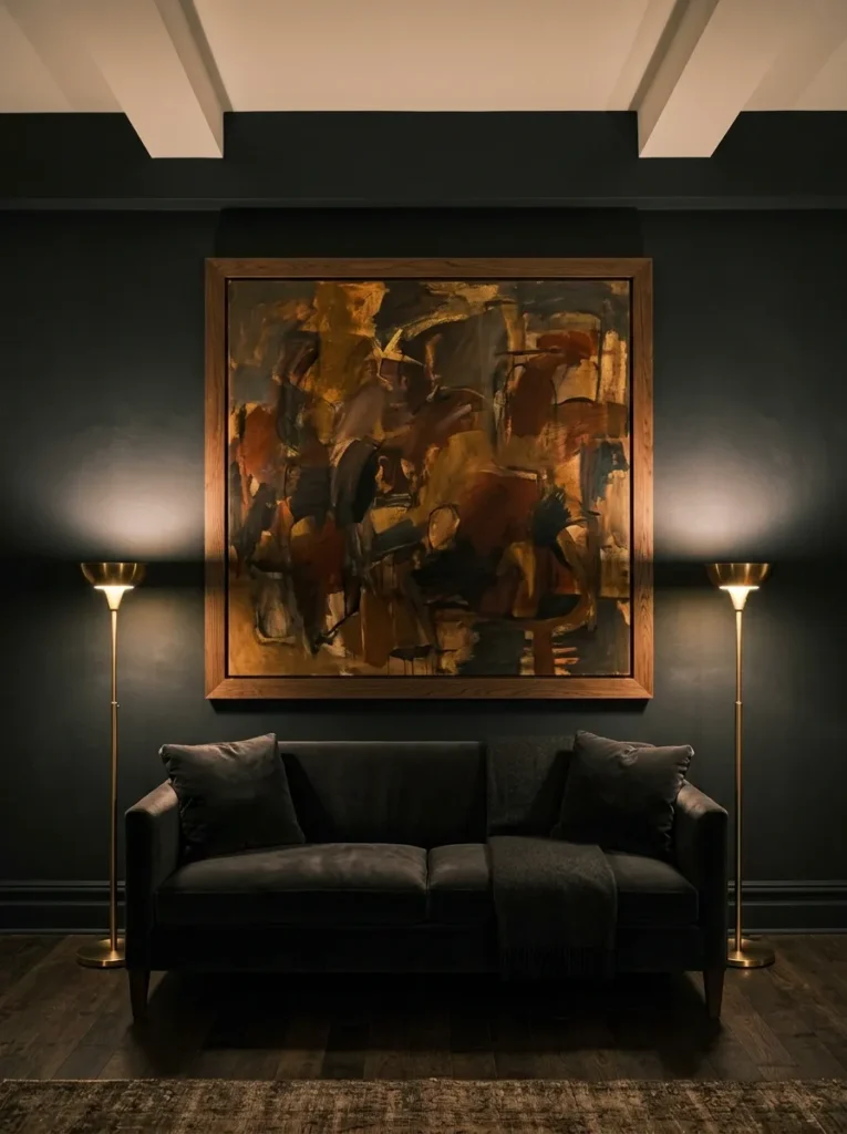
Gallery walls suggest curation and personality, which is valuable in many rooms. In a moody living room, a collection of differently-framed smaller pieces can make the walls feel busy in a way that competes with the atmospheric quality. A single large piece — whether a painting, print, or oversized photograph — commands attention without fragmenting the wall’s surface.
The key is scale. A piece that’s too small against a dark wall disappears. Something that fills roughly two-thirds of the sofa width above a sofa, or proportioned to the wall it occupies, reads as intentional. Dark-framed pieces with warm or earthy imagery tend to integrate better than bright, high-contrast prints. Abstract works with a restrained palette can be particularly effective — they provide something to look at without disrupting the room’s color story.
11. Introduce Limewash or Venetian Plaster Instead of Flat Paint
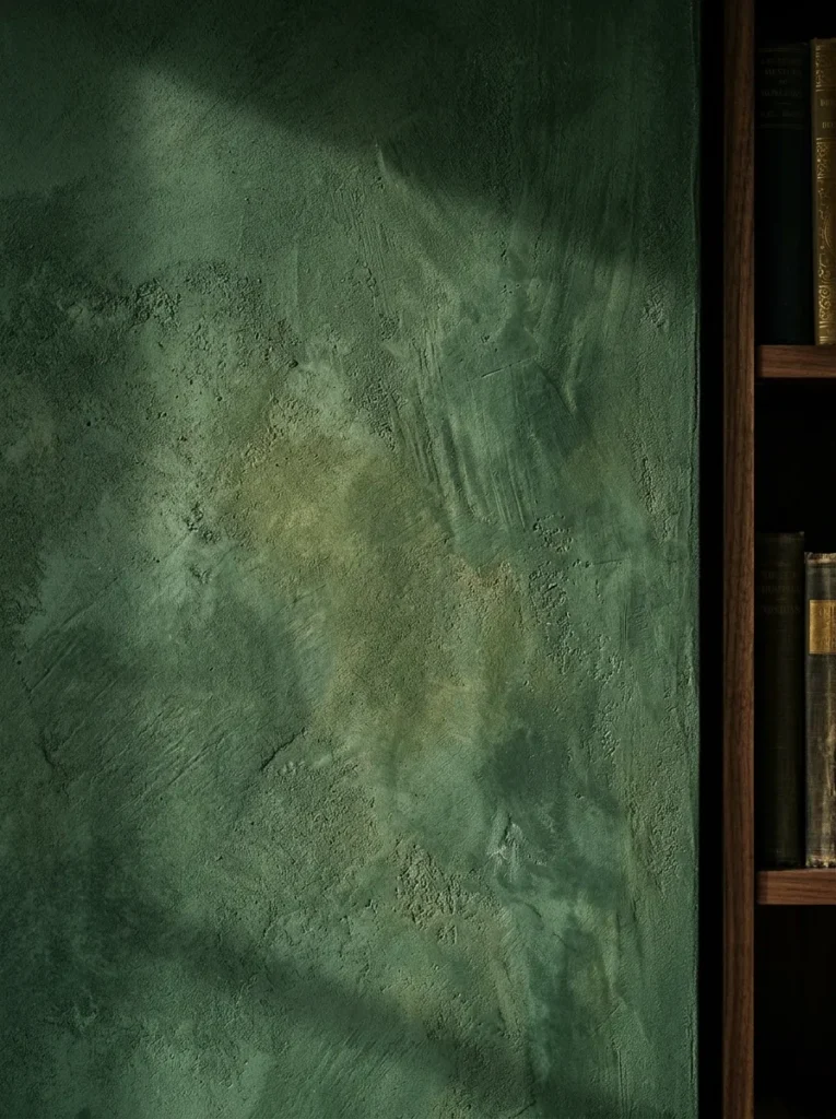
Both finishes do something flat paint cannot: they shift color depending on light direction, giving walls a depth that looks organic rather than applied. Limewash produces a slightly chalky, aged effect with subtle variation across the surface — two walls painted the same color will never look identical, which is part of the appeal. Venetian plaster goes further, creating a smooth polished surface with genuine luminosity.
In a moody room, this variation prevents the darkness from feeling flat or oppressive. Under different lighting conditions — midday light from the window, lamplight at evening, candlelight — the wall appears to change color slightly. This is most effective in deep greens, warm terracottas, and earthy blacks. Both are more expensive than standard paint and require skilled application for best results. Several paint brands now produce limewash-effect finishes that can be applied conventionally, which is more accessible for DIY.
12. Use Open Shelving to Break Dark Walls With Curated Objects
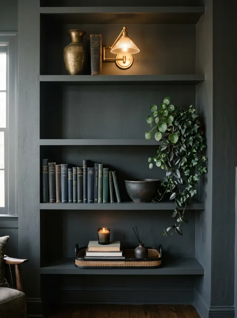
A room that is uniformly dark on every surface — walls, furniture, floors, textiles — risks looking like a film set rather than a home. Open shelving creates natural interruption: a place where objects in varied materials, tones, and forms interrupt the wall without painting it lighter. The shelving itself should integrate — painted the wall color or made from smoked oak or dark iron — so the interruption comes from the objects, not the structure.
What lives on the shelves matters. Dark books with occasional lighter spines, objects in aged brass and matte ceramic, small plants with deep foliage, candles, and stacked trays create a layered visual rhythm. Avoid styling every shelf to the same density — varying between fuller and emptier shelves prevents a cluttered impression.
13. Choose a Sofa Silhouette With Low, Horizontal Lines
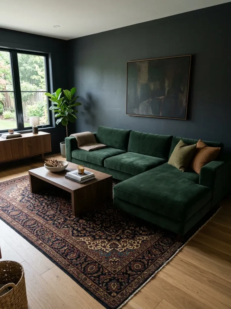
Furniture scale and silhouette affect a moody room’s proportions significantly. High-backed, tufted Victorian-style sofas look theatrical against dark walls — handsome in the right space, overwhelming in a smaller or lower-ceilinged room. Low-slung sofas with clean horizontal lines create a different kind of drama: they make the room feel wider and more expansive while keeping the visual weight near the floor.
A sofa with tight, structured cushions tends to read more sophisticatedly than one with loose, slouchy cushions in a dark scheme — the silhouette stays legible against a busy background. Modular sofas in L-shapes work well in larger moody living rooms because they define zones without requiring additional furniture to fill the space.
14. Mount a Large Antique or Foxed Mirror on a Dark Wall
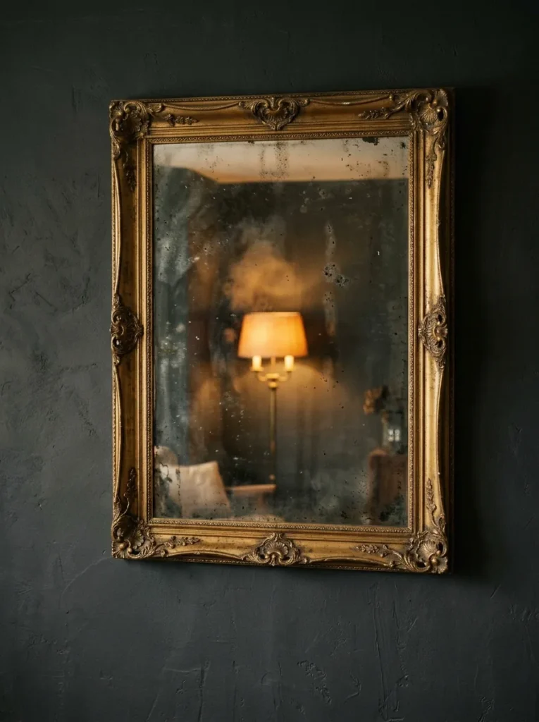
Mirrors in dark rooms serve a different purpose than mirrors in pale ones. They’re not primarily about reflecting light to brighten the space — that kind of thinking leads to an over-mirrored room that contradicts the atmosphere. Instead, an antique or foxed mirror (where the silver backing has begun to degrade, producing a soft, mottled reflection) creates depth in the wall surface itself.
The aged quality matters. A contemporary, highly polished mirror in a sleek chrome frame will look out of place in most moody rooms. A substantial aged frame in gold leaf, dark tortoiseshell, or wrought iron, with a glass that reflects softly rather than sharply, reinforces the room’s sense of history. Positioning it to reflect a lamp or candlelit area rather than a window or bare wall makes the reflection atmospheric rather than functional.
15. Build a Reading Corner with a Statement Chair and Directional Light
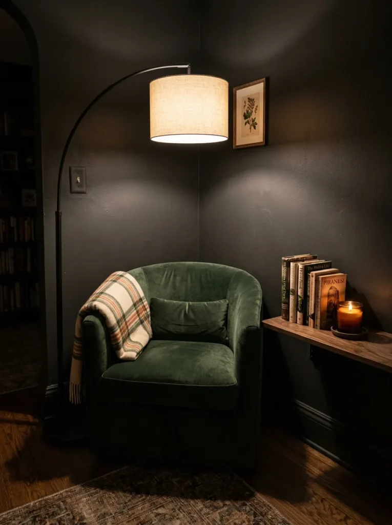
Moody rooms benefit from spatial intention — zones that feel purposeful rather than furniture arranged in a default configuration. A reading corner requires relatively little: one distinctive chair (a curved barrel chair, a deep wingback, or a low tub chair depending on the scale), a narrow side table or shelf, and a directional floor lamp positioned slightly behind and to one side.
What makes this moody rather than merely functional is the scale of the chair relative to the corner and the quality of the lamp. A floor lamp that casts a pool of warm light downward and keeps the surrounding walls relatively dim creates the impression of a self-contained sanctuary. The chair fabric can introduce a different texture — a leather wingback in a room of velvet, or a bouclé barrel chair in a room of darker wovens — without breaking the palette.
16. Use Botanicals With Dark or Waxy Foliage
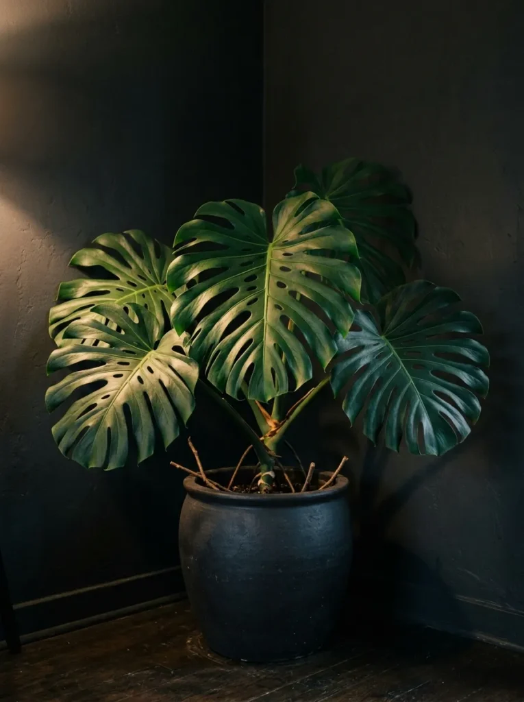
The usual advice — add plants to brighten a space — doesn’t translate to moody rooms, where bright lime-green or variegated foliage reads as decorative noise. Plants can absolutely work in dark interiors, but the selection changes. Species with deep, waxy, or structurally interesting foliage integrate better: Monstera deliciosa with its deep green and architectural silhouette, rubber plants (Ficus elastica) in their burgundy or dark green varieties, ZZ plants with almost architectural upright stems, or dark-leafed Philodendrons.
A single large specimen in an aged ceramic pot — matte, dark, or earthy-toned — makes more visual impact than a collection of smaller plants. In terms of care: darker rooms genuinely receive less light, so light requirements matter. Most of the species above tolerate lower light conditions, but any plant described as requiring “bright indirect light” will likely struggle in a room with deep walls and minimal window exposure.
17. Layer Textiles in Contrasting Weights But Consistent Tones
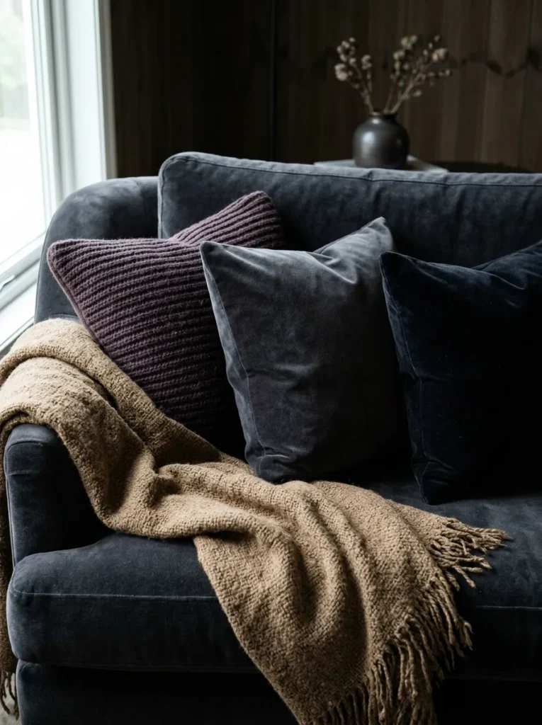
The instinct to pile textiles of contrasting colors onto a moody sofa — a bright pillow here, a pattern there — usually works against the atmosphere rather than enriching it. What works better is layering textiles that vary in weight and texture while remaining within a tonal family: a heavyweight throw in dark camel over velvet cushions in charcoal, with a wool blanket draped over one arm in deep rust.
The variation comes from material rather than color. Ribbed knit against smooth velvet against loosely woven linen creates interest through tactile contrast that reads in photographs and draws the hand in person. The palette stays composed. Three to four pillows in related tones (not identical — one charcoal, one near-black, one dark plum) plus a throw is usually enough for a standard sofa. More than that tips from considered into crowded.
18. Paint Built-in Joinery, Including Bookshelves and Alcoves, in a Darker Shade Than the Walls
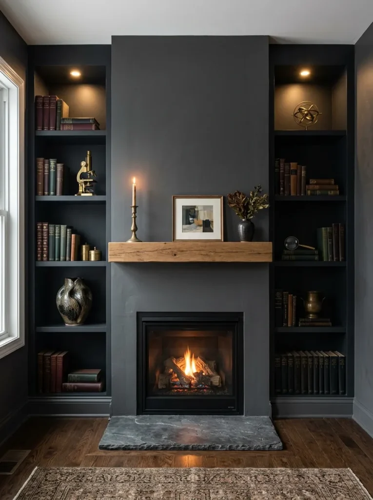
Built-ins are an underused tool in creating atmospheric depth. Rather than painting alcoves and bookshelves white — which creates harsh light-dark contrast — painting them one or two shades darker than the surrounding walls produces a recessed, layered effect. The shelves appear to recede, drawing attention to whatever is displayed on them.
This works particularly well in living rooms with chimney breast alcoves, where the alcoves on either side of a fireplace become intentional dark recesses that frame the hearth. On either side, shelves stocked with books, objects, and soft lighting against a very dark backing create something close to shadow boxes — contained scenes rather than exposed shelving.
19. Introduce Burnished or Aged Leather for Contrast and Patina
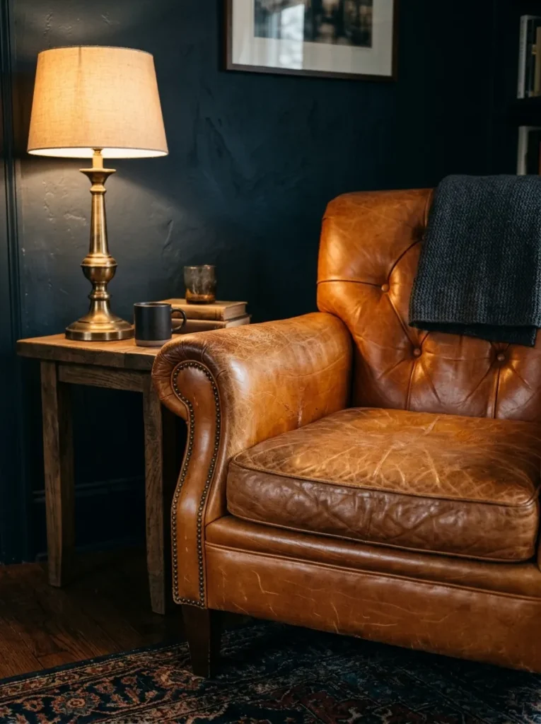
Dark rooms benefit from materials that change over time rather than remaining static — they reinforce the sense that the space has accumulated character rather than been assembled. Leather, particularly when aged, burnished, or in a quality that develops patina with use, does this better than most materials.
A leather Chesterfield, a mid-century leather armchair with saddle-soap worn into its surface, or even leather-wrapped boxes and trays on a coffee table bring an organic quality that synthetic or very new materials don’t. The best leather tones for dark rooms are cognac, dark tan, and oxblood — warm enough to provide contrast against very dark walls without the brightness of camel or cream.
20. Control the Entry Point: Make the Doorway Frame the Room Like a Stage
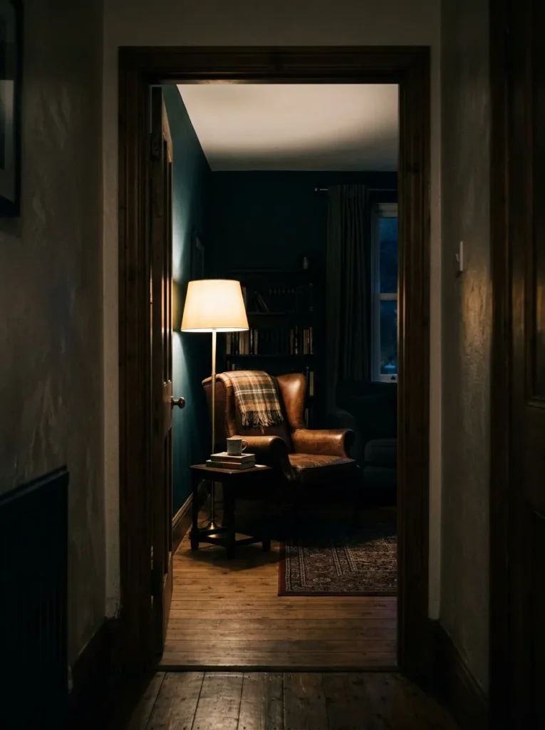
The final idea isn’t about any individual element — it’s about understanding how a moody room is experienced. Unlike a bright, open-plan space that reads immediately, a dark room reveals itself gradually. The doorway is the frame, and what you see first matters.
Positioning a key piece — a lamp, a large artwork, a distinctive chair — in the sight line from the main entrance gives the room an immediate focal point that signals intention. Lighting that piece specifically, while keeping peripheral areas slightly dimmer, creates a naturally directed view. This is particularly effective in rooms with double doors or an open arch rather than a closed door, where the room is partially visible from the hallway. A room that draws you in, rather than simply sitting there to be discovered, feels more sophisticated in every practical sense.
How to Prevent a Moody Room from Feeling Oppressive
A room can be dark and feel enveloping, or dark and feel genuinely uncomfortable. The difference usually comes down to a few consistent factors.
Light sources at multiple heights matter more than total brightness. A room with one overhead light and no alternatives will feel like a cave regardless of wall color. A room with a floor lamp, two table lamps, and candlelight at various heights will feel rich even if the total wattage is similar.
Contrast in small details keeps the eye moving. A completely uniform dark room with no variation in tone, material, or texture becomes monotonous rather than atmospheric. A brass lamp base, a pale ceramic on a shelf, the sheen of velvet against matte plaster — these small contrasts provide the visual rhythm that keeps the space feeling alive.
Furniture scale needs recalibrating in dark rooms. Pieces that looked appropriately sized in a showroom may read as heavy and crowded against dark walls because there’s less visual space around them. Erring toward furniture that’s slightly smaller than you think you need, and leaving more floor visible, usually produces a better result than filling the room.
Mirrors should reflect something worth reflecting. An antique mirror positioned to reflect a lit lamp or candle doubles the atmospheric light in that corner. The same mirror positioned to reflect a blank dark wall doubles the darkness.
Final Thoughts
The rooms that make the biggest impression are rarely the ones that did the most. They’re the ones that made deliberate choices and followed them consistently. A single dark wall and a pile of mismatched soft furnishings won’t produce atmosphere. But a considered palette, layered lighting, and materials chosen for how they interact with low light will — even in a small flat, even on a careful budget.
If you’re starting from nothing, begin with the wall color and the lighting plan before buying any furniture. Both are harder to change later, and both affect how every subsequent purchase will read in the space. If you’re working with an existing room, lighting is the fastest single adjustment that changes the feel: two new lamps positioned thoughtfully will do more for the atmosphere than a room full of new cushions.
Save the ideas here that suit your room’s proportions and natural light — a large south-facing room has more latitude than a north-facing flat — and revisit this guide when you’re ready to layer in the details.