25 Kitchen Cabinet Color Ideas That Never Go Out of Style
The kitchen cabinet decision is the most consequential color choice in any home renovation — and the one with the highest cost to reverse. Paint colors on walls can be changed in a weekend; cabinet colors require either repainting or replacement, both of which involve real money, real disruption, and a real timeline. The question worth asking before any cabinet color is chosen isn’t “what’s popular right now” but “what will I still respect in fifteen years.”
Some colors pass that test reliably. Warm whites have anchored American kitchens for a century and are still being specified. Forest greens appeared in Victorian kitchens, disappeared, and returned. Navy blue’s association with quality and permanence predates the kitchen trend cycle entirely. These colors work not because they’re neutral or safe but because they’re grounded — connected to materials and traditions that don’t expire. The 25 ideas here are chosen on exactly that basis: the colors and approaches that earn their place across decades rather than across seasons.
Each idea includes the undertone guidance, finish recommendation, and material pairing that determines whether the color works in your specific kitchen rather than just in a photograph.
1. Warm White With a Cream Undertone for Enduring Brightness

Warm white — not the stark, cool brilliant white that can read clinical under incandescent light, but a white with a visible cream, ivory, or slightly sandy undertone — is the single most reliably timeless cabinet color available. It works with warm and cool countertops, with dark and light floors, with stainless steel and brass hardware, and with every kitchen style from farmhouse to contemporary. Its flexibility comes directly from the warmth of the undertone, which reads as welcoming rather than sharp under both natural and artificial light.
The undertone decision matters more than most people expect. A cool white with a blue or grey base can appear dingy against warm natural wood floors and harsh against yellow or beige walls. A warm white with cream undertones holds its quality across these combinations. Testing painted samples under both daylight and your kitchen’s evening artificial light is essential before committing — the same white can read very differently under warm incandescent versus cool fluorescent light.
2. Off-White With Subtle Depth for Kitchens That Want More Than White
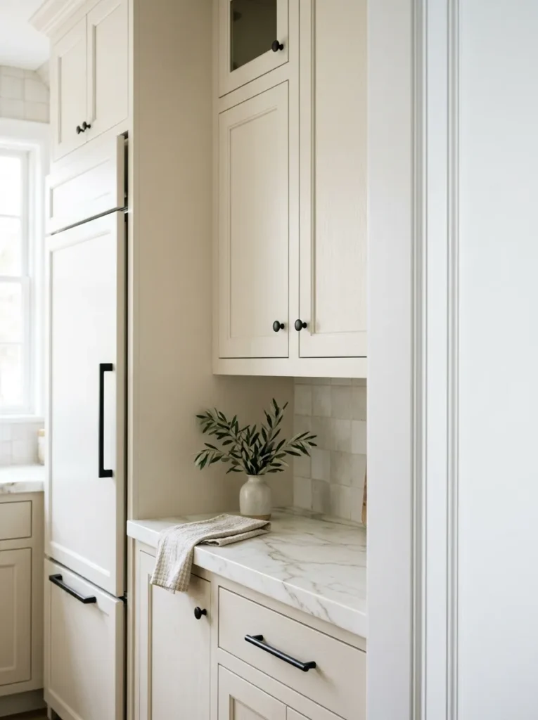
For kitchens where pure white feels too clean or too plain, an off-white with slightly more color depth — a warm linen, a pale greige, a soft mushroom — provides the tonal variation that gives the cabinets visual interest without committing to a specific color direction. These tones photograph beautifully, age without looking dated, and function as a sophisticated neutral that makes other design decisions in the kitchen — hardware, tile, countertop — easier rather than more constrained.
The practical distinction from warm white is depth of pigment: off-white has enough color to be distinctly readable as something other than white when placed beside true white trim or appliances. This depth is what gives it its character and also what requires attention to undertone — an off-white with a pink undertone reads very differently from one with a warm yellow or grey base. Pair with warm white trim rather than cool white, which reads cold beside most off-white cabinet tones.
3. Classic Shaker Style in Soft Sage Green for Organic Freshness

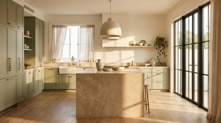
Sage green on kitchen cabinets occupies a specific color territory that bridges the botanical, the historic, and the contemporary simultaneously. It’s muted enough to read as a neutral in many kitchen contexts — it doesn’t demand attention the way a bright color does — and connected enough to nature that it ages with the easy grace of organic materials rather than the stylistic clock of a fashion-driven color.
The sage green that ages best on kitchen cabinets has a dusty, grey-green quality rather than a bright or saturated yellow-green. Lime-toned sages can read too fresh and garden-like for a long-duration investment; grey-based sages read more architectural and settled. Against natural oak or walnut, sage green creates one of the most reliably satisfying kitchen pairings available. Against white countertops and marble backsplash, it reads more formal and composed.
4. Deep Forest Green for Richness and Permanence
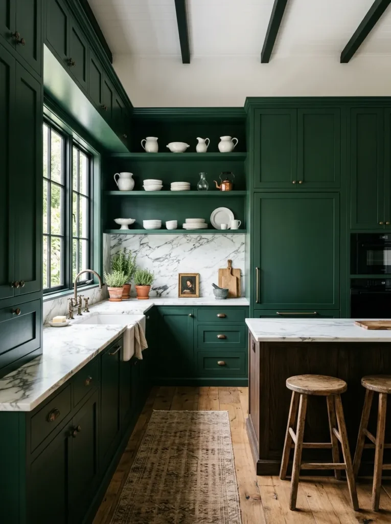
Forest green — the deep, dark green of old-growth foliage and English country kitchens — is one of the oldest cabinet colors in residential design and one of the few that has returned repeatedly across style periods without ever feeling like a revival. Its depth provides the visual weight that large kitchen cabinet runs need to feel architecturally resolved rather than decorative, and its connection to natural materials — wood, stone, bronze — gives it an organic quality that prevents it from reading as a trend color.
The finish matters considerably on a dark green. A matte or eggshell finish reads as more traditional and formal; a satin finish provides the soft sheen that makes dark greens look refined rather than flat or painted-looking. The key pairing: brass and aged bronze hardware, which shares the warm metallic quality of forest green’s natural context — aged copper gutters, wrought iron gates, bronze latches. Chrome beside dark green reads too cool and too contemporary to hold its quality over time.
5. Warm Greige for the Broadest Design Flexibility

Greige — the hybrid of grey and beige that has become the defining kitchen neutral of the past decade — works on cabinets precisely because it avoids the specific color commitments that date more quickly. It’s warm enough to sit beside natural wood without the temperature disconnect that cool grey creates, and neutral enough that a homeowner who updates countertops, hardware, or flooring in five years will find that the greige cabinets work with the new selections as naturally as with the original ones.
The greige that ages best has a warm undertone that leans slightly toward beige rather than gray — a balance point that reads as sophisticated without the coldness that grey-dominant greige can develop under warm artificial light. Against white or light countertops, warm greige reads airy and composed. Against dark stone countertops, it creates a layered tonal arrangement that suits contemporary and transitional kitchens equally.
6. Charcoal Gray for a Kitchen With Architectural Seriousness

Charcoal grey — warm rather than cool, with enough depth to read as a genuine dark color rather than a lighter grey — is the darkest shade on the neutral cabinet spectrum before crossing into black territory. It provides visual weight and architectural seriousness that lighter neutrals don’t deliver, and it suits kitchens that are designed to be the most distinct room in the house rather than a background for other decisions.
The warmth of the grey undertone is the critical variable. A cool blue-grey charcoal can read stark and industrial, which works in a specific urban-contemporary kitchen context but ages less gracefully across style periods. A warm charcoal with a slight brown or red undertone stays readable as refined rather than severe across a broader range of kitchen styles. Hardware in brushed brass or unlacquered bronze softens the charcoal’s formality without introducing a competing palette.
7. Inky Navy Blue for Depth Without Darkness

Navy blue on kitchen cabinets creates a depth that most neutrals can’t achieve while remaining distinctly different from the severity of black. Its maritime and military history gives it a permanence of association that makes it feel established rather than fashionable — navy blue has never been a trend color because it’s been continuously present in quality design across centuries. On kitchen cabinets, it reads as a deeply considered choice rather than a seasonal one.
The specific navy that ages best on cabinets is closer to the deep blue-black of a calm evening sea than to the bright, primary navy of sporting equipment. Avoid navies with obvious purple undertones, which can read as indigo under warm light and shift the color’s impression across the day. Against white marble or quartz countertops, navy is one of the most classically resolved combinations available. Against warm wood countertops, it reads warmer and more organic.
8. French Navy With a Slight Grey Undertone for Sophistication

Distinct from inky navy, French navy — the slightly greyed, slightly dusty dark blue associated with classic European kitchen design — has a quieter sophistication than its deeper counterpart. The grey undertone prevents it from reading as bold or assertive; it reads instead as reserved and confident, which is the quality that makes a cabinet color feel genuinely timeless rather than confidently on-trend.
This specific shade pairs particularly well with natural stone countertops — limestone, aged marble, honed slate — rather than engineered quartz or polished granite. The dusty quality of French navy and the natural variation of real stone share a material language that reads as organically assembled rather than selected from a design catalog. Nickel or matte black hardware suits the understated quality of this shade better than bright brass, which can read as too assertive beside such a restrained blue.
9. Dusty Blue for a Kitchen That Feels Both Soft and Considered

Lighter than navy, dusty blue sits in the muted, slightly grey-blue territory that suggests sky, water, and Scandinavian design traditions simultaneously. It brings color to kitchen cabinets without the visual commitment of a saturated shade, and it pairs with an unusually wide range of countertop, hardware, and flooring choices — from white marble to butcher block, from brass to matte black — because its dusty, desaturated quality absorbs rather than conflicts with adjacent color decisions.
The key to selecting a dusty blue that ages well is avoiding both the obviously grey (which reads as undecided) and the obviously aqua (which has trend associations that date it). A dusty blue with a very slight grey-green undertone occupies the most versatile position within the range. Against natural wood open shelving or wooden elements, dusty blue creates the soft material contrast that makes a kitchen look photographed rather than simply furnished.
10. Pale Sage for a Kitchen That Whispers Rather Than Declares

Where forest green makes a statement and sage green holds its ground, pale sage barely raises its voice — and that restraint is precisely its strength. A pale, barely-there sage on kitchen cabinets reads as a color choice to those who notice such things and as a sophisticated neutral to everyone else. It functions like a white kitchen with a quality that white alone can’t provide: it suggests intention.
Pale sage works best in kitchens with good natural light, where the subtle green undertone remains readable. In dim kitchens or those with cool north-facing light, very pale sage can shift toward a cool grey-green that loses the warmth that makes it appealing. It pairs beautifully with unlacquered brass — the warm gold of brass lifts the pale green without competing — and with warm-white Shaker profiles that reinforce the gentle, unhurried quality the color communicates.
11. Warm Olive for Kitchens That Want Earthy Depth Without Green’s Full Commitment

Warm olive — the yellow-tinged, earthy green that references military hues, olive oil, and Italian country kitchens — provides a color depth that standard sage doesn’t achieve while retaining the organic, nature-derived quality that makes green cabinet colors feel permanent rather than fashionable. It reads as more specific and more interesting than sage while remaining less committed than forest green.
The warmth of olive cabinet color makes it one of the most forgiving cabinet choices for kitchens that mix material temperatures: warm wood, cool stone, warm brass, and stainless steel all coexist more easily beside olive than beside cooler, more saturated greens. Against a honed Calacatta marble or a creamy white quartz, olive provides a warm organic contrast that reads as naturally composed.
12. Terracotta-Adjacent Warm Clay for Kitchens With Mediterranean Warmth

A muted, warm clay or terracotta-toned cabinet color sits well outside the mainstream of kitchen cabinet advice and is precisely the more interesting for it. This earthy warm tone — somewhere between a pale brick and a dusty peach in its most successful versions — connects to the warmth of Mediterranean and Southwestern architecture and creates kitchen atmospheres that feel genuinely warm and inhabited rather than precision-designed.
The critical word is muted: a saturated terracotta on kitchen cabinets can read like a color decision that was made in a particularly bold moment and regretted in a calmer one. A muted, slightly dusty version reads as sophisticated and resolved. Against natural wood tones, warm clay creates an earthy monochromatic palette that feels organic and complete. Against white countertops, the warm-cool contrast reads clean and considered.
13. Warm Taupe for Kitchens That Want More Than Grey but Less Than Beige

Taupe sits in the specific neutral territory between grey and beige that provides the warmth of beige without its association with the 1990s and the sophistication of grey without its occasional coldness. On kitchen cabinets, warm taupe reads as a considered neutral that allows other kitchen decisions — countertop pattern, backsplash material, hardware finish — to be the visible design choices rather than competing with a cabinet color that demands attention.
The best taupe for kitchen cabinets has a warm undertone with enough grey to prevent it from reading as simply beige under varying light conditions. Against dark countertops — black granite, dark soapstone, honed black quartz — taupe creates a high-contrast combination that reads as genuinely sophisticated. Against medium wood tones, it reads as tonal and composed.
14. Matte Black for a Kitchen With Definitive Edge

Black kitchen cabinets are not everyone’s choice, but for the homeowners who choose them with conviction, they hold their quality with a permanence that few other colors match. Black is one of the oldest architectural colors in history; its use in kitchens references the blacksmith’s forge, the cast iron range, and the lacquered Japanese kitchen aesthetics that Western design has periodically borrowed from across the past two centuries.
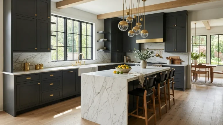
The finish decision is as significant as the color: high-gloss black reads as contemporary and formal — appropriate in a kitchen that’s designed as a specific statement; matte black reads as quieter and more architectural, which suits a wider range of kitchen styles and is the version that ages more gracefully without feeling like a period decision. Against brass hardware and a light marble countertop, matte black creates one of the most resolved kitchen color compositions available.
15. Near-Black With a Slight Warm Undertone for Depth Without Starkness

For kitchens where true black feels too committed, a very dark charcoal or near-black with a warm undertone — a hint of deep brown or red beneath an almost-black surface — reads as black at a normal viewing distance while providing the warmth that pure black lacks at close range. This is the choice that delivers the visual weight and seriousness of a black kitchen without the potential for the combination to read as cold or severe.
The warm undertone in a near-black also interacts better with natural wood — walnut shelving, oak floors, teak accessories — than pure cool black, since the warmth in the cabinet color and the warmth in the wood speak a compatible material language. Against white countertops, near-black with warm undertones reads as deeply sophisticated rather than stark.
16. Pale Powder Blue for a Kitchen With Classic Coastal or Vintage Character

Powder blue — the muted, slightly chalky light blue associated with vintage kitchen appliances, Scandinavian ceramics, and New England coastal architecture — brings a quality of period charm to kitchen cabinets that no purely contemporary color achieves. Its association with craftsmanship, tradition, and natural light gives it the timeless character that comes from historical depth rather than simply from neutrality.
The muted, chalky quality of powder blue is what separates it from the trend versions of light blue that appear and disappear from kitchen design magazines. Bright, saturated light blues feel of the moment; the chalky, slightly faded powder blue feels as though the kitchen has always been that color. Against white tile, white appliances, and white trim, powder blue creates a clean vintage palette. Against natural wood or linen-colored elements, it reads warmer and more organic.
17. Warm Burgundy for Dramatic Kitchens With Deep Historical Roots

Deep burgundy or wine-red on kitchen cabinets sits well outside the safe zone and is the more interesting for it. The history of deep red in domestic spaces is long — it appears in Victorian kitchens, French provincial farmhouses, and English country estates — and that historical depth prevents it from reading as a trend choice even when it appears in contemporary design publications. It reads as confident and referential rather than fashionable.
The version that ages best is a muted, slightly dusty burgundy rather than a bright or wine-grape red — a tone that references aged brick or darkened cherrywood rather than a fresh paint chip. Against dark natural wood, it creates a rich monochromatic depth. Against brass hardware and cream countertops, it produces the warmth of a well-furnished Victorian kitchen without the formality.
18. Soft Blush for a Kitchen With Warmth and Delicacy

Blush pink on kitchen cabinets is a more committed choice than most of the options in this article, and the risk is real: a saturated or obviously pink cabinet color can become one of the primary sources of regret in a kitchen. The version that avoids that outcome is a soft, warm blush — barely pink, closer to a warm white with a slight blush cast — that reads as sophisticated and rosy rather than obviously colored.
This tone works best in kitchens with strong natural light, where the blush cast is evident and warm-seeming. In dim kitchens it can disappear into a muddy off-white. Against warm wood countertops and unlacquered brass hardware, soft blush creates a warmly composed palette. Against white marble with pale veining, it reads delicate and considered.
19. Warm White Upper Cabinets With Darker Lower Cabinets as a Two-Tone Foundation

The two-tone cabinet approach — lighter uppers, darker lowers — is not a trend but a compositional principle with a long history in kitchen design. Painting the upper cabinets in warm white and the lower cabinets in a deeper, related tone (navy, forest green, greige, charcoal) creates a visual organization that mirrors the natural relationship between sky (light above) and ground (heavier below). The kitchen reads as designed rather than uniformly colored.
This combination also distributes wear practically: lower cabinets receive more handling, more fingerprints, and more general contact than uppers, and the darker lower color accommodates this use without showing wear the way pale-colored lowers do. The countertop acts as the natural dividing element between the two tones — the visual boundary where the color transition occurs is always at the countertop line, which gives the transition architectural logic rather than an arbitrary visual split.
20. Navy Lower Cabinets With Natural White Oak Upper Cabinets

An alternative to the painted-upper-painted-lower two-tone approach uses natural wood for one set rather than two paint colors. Natural white oak uppers — with their pale, warm honey grain — above navy blue lower cabinets creates a two-tone composition where the warmth of the wood and the depth of the navy are balanced by the countertop material between them.
The visual logic: the navy provides architectural weight and color depth at the base of the room, while the natural oak uppers keep the upper kitchen feeling open and warm. This combination reads as resolved across a wide range of kitchen styles — it works in contemporary kitchens as cleanly as in transitional or classic ones — because it combines the permanence of a deep color with the permanence of natural wood, both of which have long material histories.
21. Forest Green Island Against White Perimeter Cabinets

The painted island against unpainted or differently colored perimeter cabinets is the most targeted version of the two-tone approach — it concentrates the color in a single, freestanding piece rather than distributing it across all the lower cabinets. A forest green island in a white kitchen is the most widely specified version of this arrangement because the combination is bold without being overwhelming: the island is the kitchen’s single color commitment, and its independence from the perimeter allows the surrounding space to stay neutral.
The island’s hardware finish connects the painted piece to the rest of the kitchen — using the same brushed brass or matte black hardware on both the island and the perimeter cabinets gives the kitchen finish coherence despite the color difference. The island countertop can match the perimeter (for visual continuity) or differ (for deliberate contrast — a butcher block island top in a kitchen with white marble perimeter, for example).
22. Deep Teal for a Kitchen With Maximum Color Depth and Sophistication
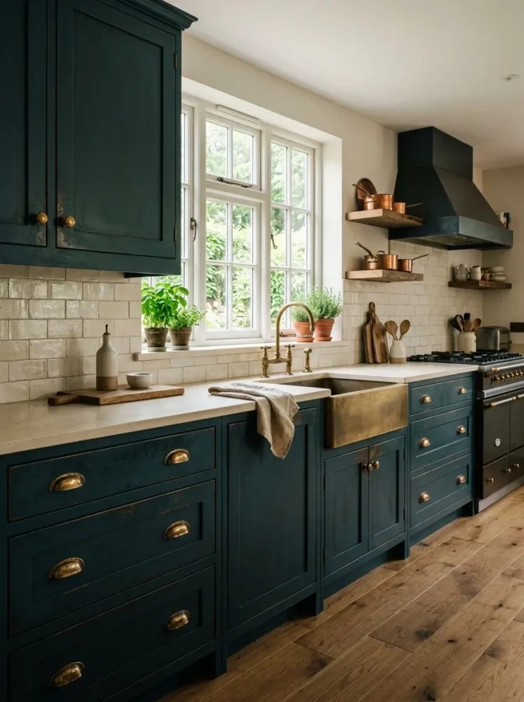
Teal sits at the intersection of blue and green in a way that gives it more depth and complexity than either pure blue or pure green achieves on kitchen cabinets. The best kitchen teal is dark and slightly unsaturated — close to the color of aged copper that has developed its patina — rather than the bright teal that reads as contemporary and fashion-forward. Dark teal’s association with nature (deep ocean water, old copper, aged bronze) gives it the longevity that purely contemporary colors lack.
Against aged brass hardware, dark teal creates one of the most visually complete kitchen color combinations available: both the teal and the brass reference the same natural material story — oxidized metal, patinated copper, aged bronze — and the combination reads as assembled over time rather than selected from a catalog. White or cream countertops lift the dark teal from brooding to sophisticated.
23. Natural White Oak for Warmth Without Paint

Natural white oak cabinet faces — without any stain or paint, simply sealed to protect the grain — provide a warmth and organic character that no painted color achieves on the same surface. The pale honey-to-amber grain of white oak responds to light through the day, shifting in tone as the angle changes, and develops a gentle patina over time that makes the kitchen look more settled and refined rather than worn.
White oak works across a broader range of kitchen styles than any other wood species currently available in residential cabinet construction: it suits contemporary, Scandinavian, farmhouse, and transitional aesthetics equally because its grain is consistent and its color is warm without being assertive. Against dark countertops — charcoal stone, black quartz, dark soapstone — white oak creates a light-dark contrast that reads as genuinely designed. Against cream or white countertops, it reads warm and organic.
24. Walnut for Richness and Character in Kitchens That Value Material Quality

Walnut cabinet faces — in their natural medium-dark brown with the flowing grain pattern specific to the species — are among the most materially distinctive cabinet choices available. Unlike the universal versatility of white oak, walnut is a specific material with a specific visual character: rich, warm, slightly moody, and deeply connected to American furniture-making tradition. The kitchens that choose walnut are making a decision about material quality as much as about color.
The grain variation in walnut means no two adjacent cabinet doors are identical, which gives walnut kitchen cabinet runs a visual depth and richness that no uniform color can replicate. Against brass hardware, walnut creates a warm, material-focused composition. Against black or dark stone countertops, it creates a rich tonal depth. Against white countertops and backsplash tile, the contrast is clean and strong — the walnut reads as the room’s material anchor rather than its color statement.
25. Charcoal Green for a Color That Reads as Both Dark and Green Simultaneously

Charcoal green — the very dark, almost-black green that appears in shade rather than sunlight — sits at the intersection of the dark-cabinet and green-cabinet tendencies in a way that neither category fully captures. It has the visual weight of black or charcoal without the neutral quality of those colors, and it has the organic connection of green without the lightness that most green cabinet colors carry.
This is the most sophisticated of all the green cabinet options and the one with the longest staying power — it has appeared in English country house kitchens for centuries, is strongly present in contemporary high-end kitchen design, and has the material depth to suit both contexts without appearing to belong to either one exclusively. Against natural wood — a walnut shelf, an oak floor, a teak accessory — charcoal green creates the closest thing to a perfect material combination that kitchen design reliably offers.
How to Choose a Cabinet Color That Will Last
Three questions determine whether a cabinet color will hold its quality across fifteen years or feel like a decade-specific decision:
Is the undertone right for the room’s light? The most common cabinet color regret involves an undertone that reads differently than expected under the room’s actual light conditions. Test painted samples of any color on the actual cabinet surface and observe them under morning daylight, afternoon light, and evening artificial light before committing.
Does it relate to a natural material? The cabinet colors that age best — forest green, navy, warm white, natural wood — are all connected to natural materials or traditions that don’t expire with style cycles. Cabinet colors that exist only as contemporary color trends have a harder time aging gracefully.
Does the finish suit the color and the style? Matte and eggshell finishes read as more architectural and traditional; satin finishes add sheen that suits both traditional and contemporary styles; semi-gloss reads as more kitchen-specific and practical but also more utilitarian. The finish choice affects how the color reads as much as the color itself.
Final Thoughts
Kitchen cabinet color is a decision with a ten-to-twenty-year time horizon in most homes, which means the right question is not which color is most popular right now but which color will look as right in 2035 as in 2025. The 25 ideas here are anchored on that longer view — colors with historical depth, material associations, and the kind of undertone and finish characteristics that hold their quality across style changes rather than being carried by them.
Start with the room’s light condition, then the material palette — countertop, floor, hardware — and work backward from those fixed variables to the cabinet color rather than choosing a color and hoping the rest will follow. The palette that works hardest over the longest time is almost always the one that was chosen for how it fits the room rather than for how it looked in a photograph.
Save the ideas here that suit your kitchen’s architecture and your own sense of which colors feel permanent rather than timely, and return to this guide when you’re ready to commit.