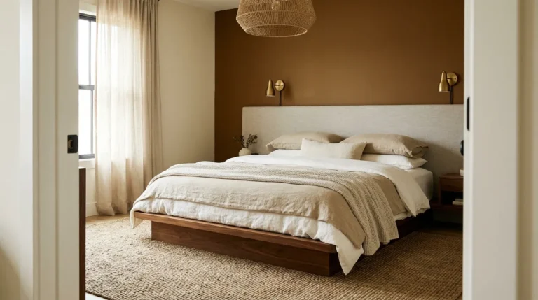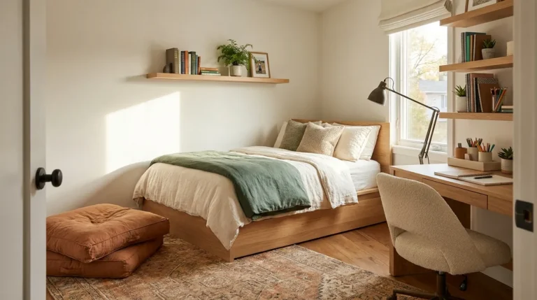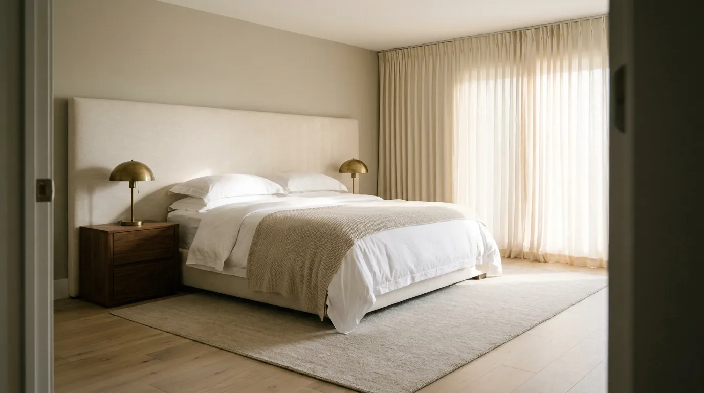
24 Luxury Bedroom Ideas That Feel Hotel Inspired
Hotel bedrooms earn their quality not through expensive furniture but through a set of decisions that most home bedrooms skip: the right bedding weight, lighting that works at multiple levels, surfaces that read as curated rather than accumulated, and a complete absence of things that belong somewhere else. That last detail is what most people underestimate. The feeling of stepping into a well-designed hotel room has as much to do with what isn’t there as what is.
These luxury bedroom ideas translate the hotel aesthetic into decisions a real bedroom can accommodate. Some are structural — headboard treatment, ceiling colour, curtain placement — and some are immediate, costing less than a night at a hotel itself. Each one explains not just what the idea looks like but what produces the effect, so the result works in practice rather than only in the reference image that inspired it.
1. Start With a High-Quality Mattress and Bed Base Before Everything Else
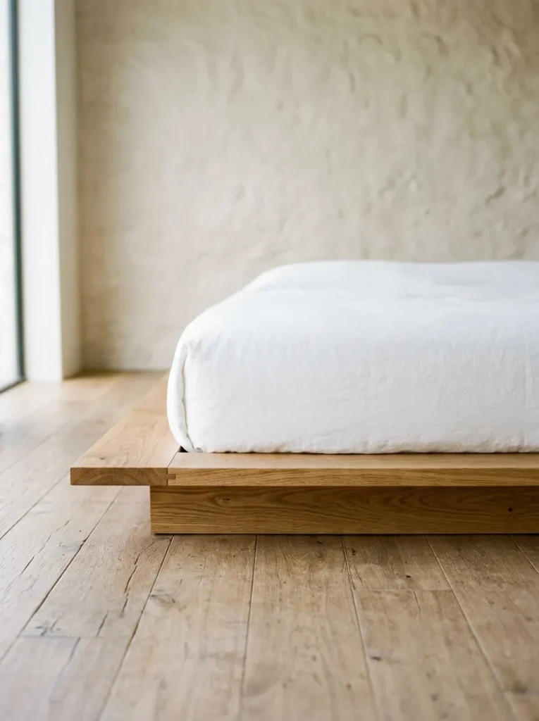
Every other luxury bedroom decision depends on getting the sleeping surface right, and it’s the investment most people defer while spending freely on headboards and bed linen. A hotel-quality sleeping experience begins with a mattress appropriate for the room — a platform base keeps the visual line low and architectural; a divan base with drawer storage solves the storage problem that otherwise requires bedroom furniture competing for space.
The base and mattress should be decided before specifying the headboard, because the headboard’s height relationship to the mattress and pillows determines how the whole wall reads. A headboard that’s too short disappears behind the pillows; one scaled appropriately to the bed height creates the framed, considered look that appears in every aspirational bedroom image.
2. Layer Bedding in Three Distinct Weights
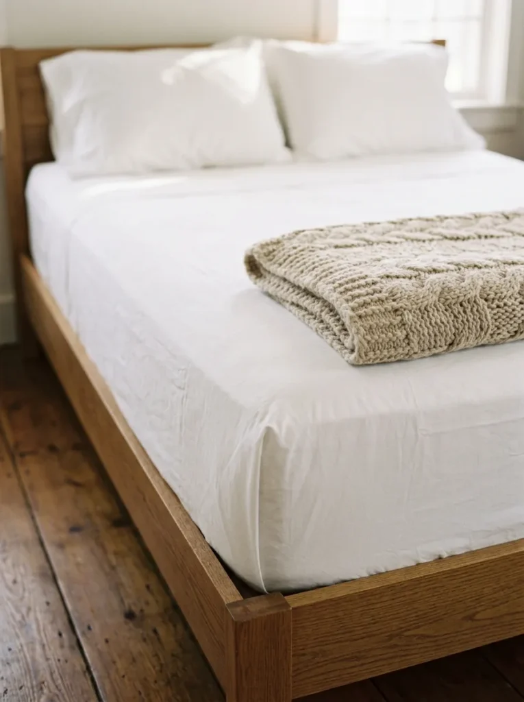
Hotel bedding achieves its pulled-together quality through a specific layering logic, not through expensive duvet covers alone. The standard approach: a fitted sheet, a flat sheet tucked tightly over the mattress with hospital corners, a duvet or comforter folded back across the lower third of the bed, and a folded throw at the foot. Four elements, each with a different weight and texture.
At home, the flat sheet is the element most often skipped, and it’s the one that most changes the visual result. The combination of tightly tucked flat sheet below and duvet folded back above — with pillows stacked rather than casually arranged — is the arrangement that reads as hotel rather than domestic. Thread count matters less than the texture and drape of the fabric: linen and percale both drape naturally; polycotton blends do not.
3. Choose a Headboard That Reads Tall Relative to the Room
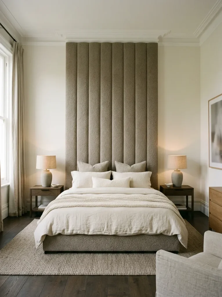
The headboard is the room’s dominant focal point and its proportions determine how the entire bedroom reads. A headboard noticeably taller than the mattress-plus-pillow stack — 120cm above the mattress surface is a useful minimum for a standard room height — creates the full-wall presence that gives a bedroom its sense of intention. A low or narrowly-framed headboard in a standard-height room reads as insufficient scale rather than restraint.
Upholstered headboards in a neutral fabric — linen, bouclé, velvet in a muted tone — suit the widest range of bedroom palettes and don’t fight the bedding the way a patterned or strongly coloured headboard can. The width should match or slightly exceed the mattress: a headboard significantly narrower than the bed reads as mismatched proportion regardless of how well-made it is.
4. Install Floor-to-Ceiling Curtains That Span the Entire Window Wall
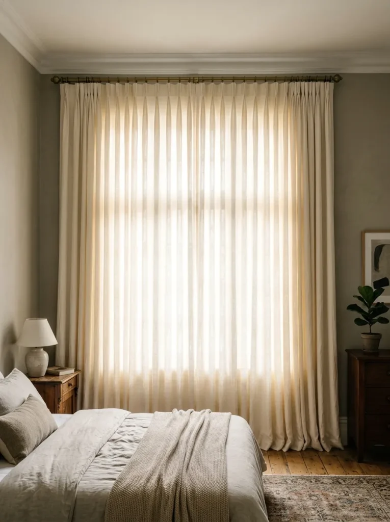
Curtains hung just above the window frame and only as wide as the glass belong in a different aesthetic conversation than the one this article is about. For a hotel-quality bedroom, curtains should be hung from as close to the ceiling as possible and span the full width of the window wall — extending past the window frame on each side by at least 30–40cm. This makes the window appear larger, the room taller, and the whole wall feel considered.
Blackout lining is non-negotiable for a bedroom meant to feel like a proper rest environment. Pinch-pleat or pencil-pleat heading tape produces more formal, hotel-style fullness than eyelet curtains. Curtain fabric should be heavy enough to hang with some structure — a sheer or lightweight fabric pools rather than drapes and reads as insubstantial against the scale the rest of the room is working toward.
5. Use a Two-Tone Neutral Palette on Walls and Ceiling
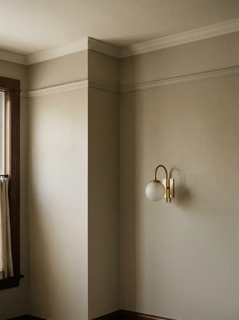
The palette that reads most convincingly as hotel-inspired isn’t white. Hotels use warm neutral tones — a soft greige, a warm stone, a barely-there sage — on walls and ceilings, often with the ceiling painted one to two shades lighter than the walls to give height without creating a hard contrast. Cool greys and blue-based whites tend to feel clinical under domestic lighting conditions rather than restful.
In a bedroom with good natural light, a greige or warm stone on the walls in an eggshell finish provides a quality of light absorption that shifts gently across the day. Pair the wall tone with a ceiling one shade lighter in the same family, and the room reads as resolved without any furniture in it.
6. Place Bedside Tables at the Correct Height for the Mattress
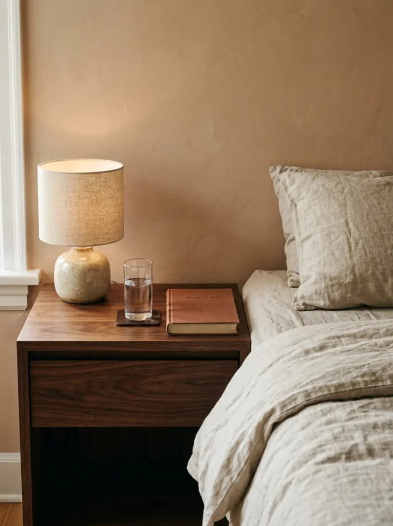
Hotel bedrooms get bedside tables right almost universally, which is part of why they read so differently from home bedrooms. The top of the bedside surface should sit at or very slightly above the top of the mattress — roughly 60–65cm for a standard mattress height on a low base. A table sitting 15cm below the mattress doesn’t function well for reading or for accessing a glass of water, and it reads visually as if it belongs to a smaller piece of furniture.
Width matters too. A bedside table narrower than about 40cm reads as inadequate at the scale of most beds; one deeper than 50cm starts to dominate the adjacent floor space. The surface area should accommodate a lamp, a glass, and one other object — that’s the edited version of a hotel nightstand.
7. Use Matching Bedside Lamps Rather Than Mix-and-Match
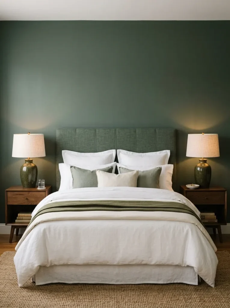
Symmetry on either side of the bed is one of the details that separates a bedroom that reads as designed from one that reads as gradually assembled. Two matching bedside lamps — same shade, same base, same finish — produce an immediate visual resolution that asymmetrical or mismatched lamps don’t. Hotels use this almost without exception because the symmetry reads as intentional rather than coincidental.
The shade shape matters for function: a drum shade at roughly 30–35cm diameter provides good reading light and doesn’t dominate the bedside surface. Warm-white bulbs (2700K) are right for a bedroom context — anything cooler shifts the room into a register that doesn’t support rest.
8. Add Wall-Mounted Reading Lights Above Each Nightstand
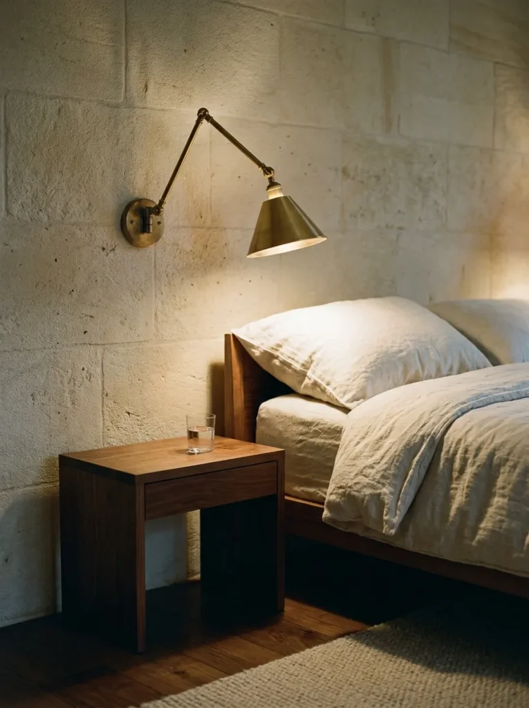
Reading in bed with a lamp on the bedside table requires either the lamp uncomfortably close to the face or the room light at an angle that doesn’t illuminate the page adequately. Wall-mounted reading sconces — angled downward, dimmable, mounted approximately 120–140cm from the floor — direct light exactly where it’s needed without illuminating the partner’s side of the bed, and they free up the entire bedside table surface.
Swing-arm wall sconces in aged brass or matte black suit the widest range of bedroom aesthetics. The switch should be on the fitting itself or on a bedside dimmer — a wall switch requiring you to get out of bed to turn off the light defeats the purpose.
9. Remove the TV From the Wall Above the Bed
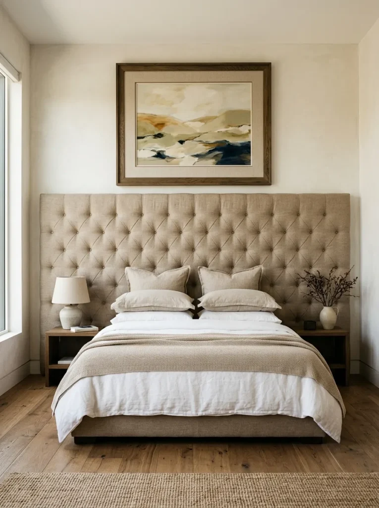
A television mounted directly above the headboard is one of the most common bedroom decisions that actively works against the hotel aesthetic. Hotels with genuine design intent position the television on a credenza or media unit at the foot of the bed, where it reads as a piece of furniture rather than a screen on a wall, or they use a swivelling arm that allows the TV to face the bed when in use and fold away when not.
The wall above the headboard is for the headboard treatment itself — whether an upholstered panel, a piece of art, or the wall behind. A television in that zone overrides everything else in the room’s composition every time you enter the space.
10. Choose a Rug That Extends Generously Beyond the Bed
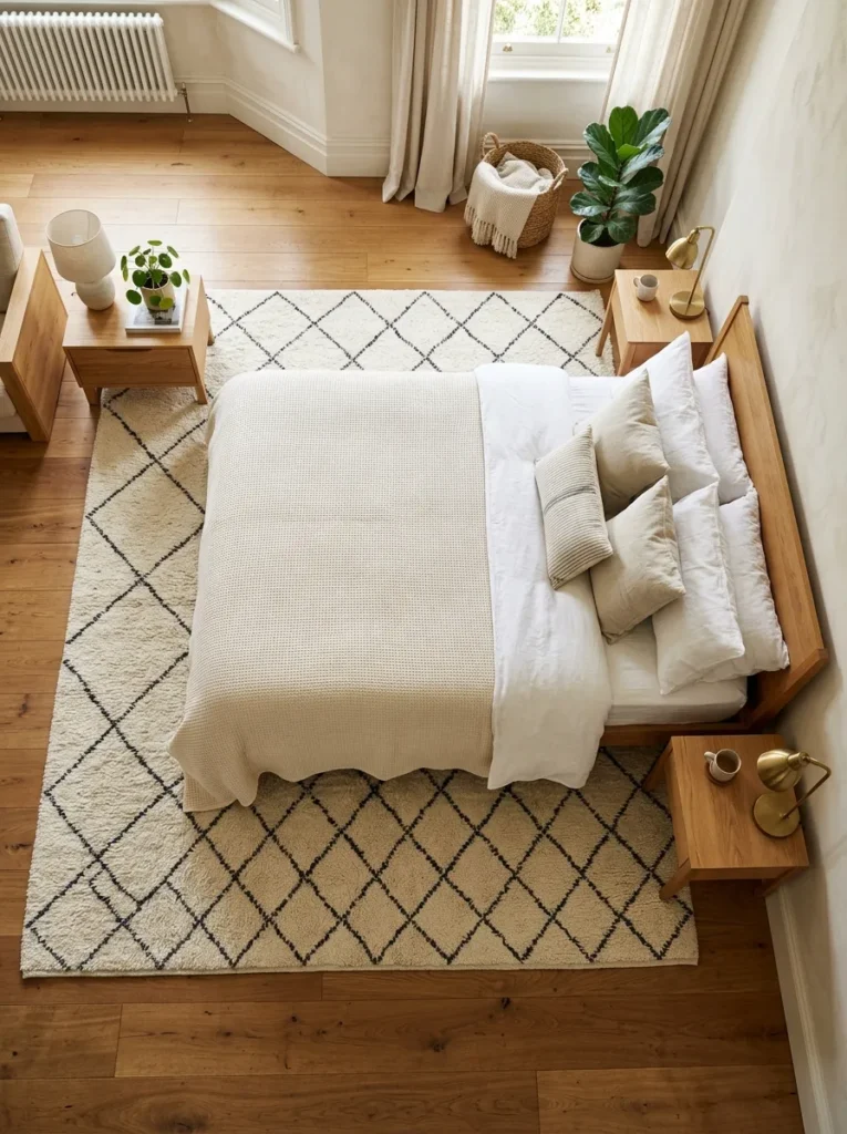
A rug in a bedroom should sit under the lower two-thirds of the bed and extend at least 60cm beyond each side — enough that the first thing bare feet touch in the morning is rug rather than cold floor. A rug too small makes the bed look floating and disconnected; the right scale grounds the bed within the room and creates a defined zone.
In a bedroom with a neutral palette, a rug is one of the few places where pattern or textural interest can enter the room: a low-pile Moroccan Beni Ourain, a natural jute in a herringbone weave, or a subtle geometric in a tone within the existing palette. Pile height affects maintenance — a high pile collects more dust and requires more frequent care than a flat-weave, worth factoring in when access around the bed is tight.
11. Create a Tonal Material Story Across Bed, Curtains, and Walls
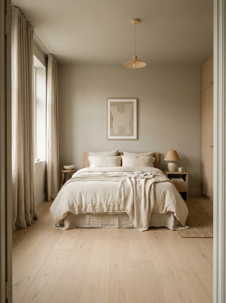
Hotel rooms that photograph beautifully almost always have a clear material story — three or four elements that share an undertone family rather than competing. Warm cream linen on the bed, greige walls, natural linen curtains, and an oak floor all sit within the same warm-neutral family. Introduce a grey-blue duvet cover into that palette and the composition loses its coherence immediately.
Identify the undertone direction — warm or cool — and choose everything within it. Warm palettes (cream, sand, terracotta, warm grey, oak) read as restful and welcoming under warm artificial light. Cool palettes (blue-grey, crisp white, pale sage) read crisper and suit rooms with strong natural light. Mixing undertones without intention produces a bedroom that looks slightly off in photographs even when it doesn’t look wrong to the eye.
12. Use a Fitted or Semi-Fitted Wardrobe Rather Than Freestanding Pieces
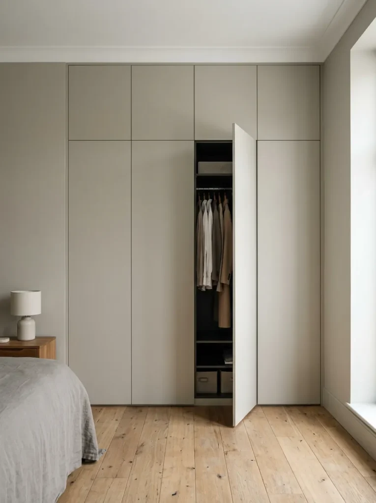
A row of freestanding wardrobes — particularly flat-pack pieces in different sizes — is the detail that makes a bedroom feel domestic in the least aspirational sense. Hotel-quality rooms treat storage as architecture: built-in wardrobes with flat-front doors in the same tone as the walls disappear into the room rather than announcing themselves as storage units.
Where built-in wardrobes aren’t possible (rental properties, listed buildings), freestanding wardrobes in a consistent finish and uniform height read more considered than mismatched pieces, even at lower individual quality. Two wardrobes of identical height and door style in the same finish produce considerably more visual calm than three pieces that differ in any of those dimensions.
13. Introduce a Dedicated Reading Chair and Lamp
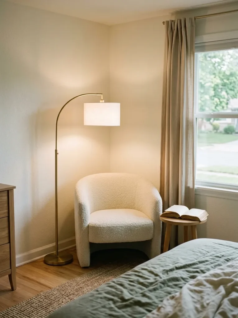
The presence of somewhere to sit in a bedroom other than the bed signals that the room has been thought about as a space rather than simply as a sleeping location. A compact armchair or slipper chair positioned near the window or in a corner with its own floor lamp or table lamp creates a second zone within the bedroom that makes the room feel larger and more intentional.
The chair fabric should respond to the room’s existing palette without duplicating it. If the bed is in linen, the chair can be in velvet or bouclé without conflict, since the material difference itself provides the distinction between the two pieces. A chair in exactly the same fabric as the duvet reads repetitive rather than coordinated.
14. Hang a Single Large Piece of Art Above the Headboard
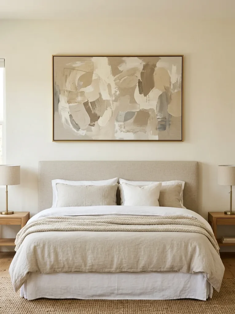
A single large-format artwork above the headboard — its lower edge roughly 20–30cm above the headboard top — reads as a considered placement rather than decoration filling a gap. Hotel rooms with art above the bed almost always use one large piece rather than a gallery wall, because a gallery wall in that position competes with the headboard for visual dominance and creates busyness above the room’s most restful focal point.
Artwork scale should broadly match headboard width: a canvas significantly narrower than the headboard reads small and disconnected. The tonal relationship between the artwork and the wall behind it matters — a very light artwork on a pale wall reads as disappearing; a darker or more saturated work provides the visual anchor the position requires.
15. Conceal All Cables and Charging Points From View
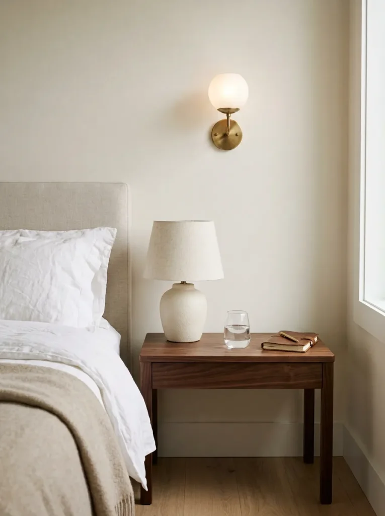
Visible charging cables, multi-socket extensions, and television wires are among the highest-impact visual distractors in a bedroom otherwise aiming for a composed quality. They’re also among the easiest to address without renovation. Cable management solutions — trunking along the back of a nightstand, a USB-integrated lamp base, or a bedside charging drawer — resolve most visible cable situations without structural work.
Where the television remains in the room, a wall-mounted cable channel or in-wall cable kit conceals the drop from TV to socket entirely. The before-and-after impact on how the room reads is disproportionate to the effort involved.
16. Layer Fragrance as a Consistent Sensory Detail
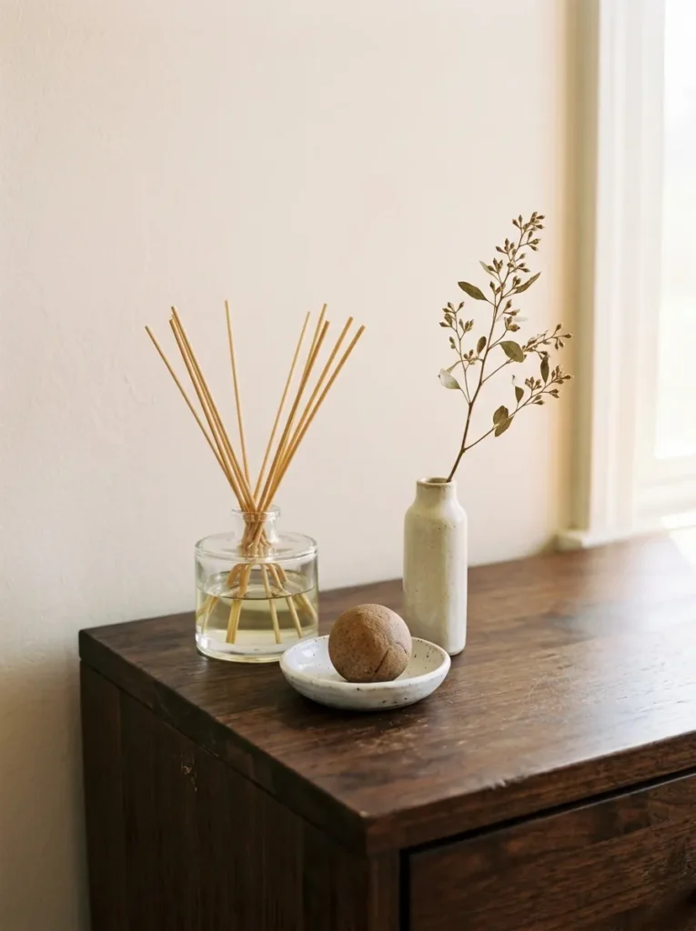
Hotel rooms have a recognisable olfactory quality — a clean, specific, slightly distinctive scent that signals arrival and context. At home, a single quality diffuser or room spray in a consistent fragrance, positioned at the bedroom entrance or near the reading chair, establishes a sensory register the body associates over time with rest and retreat.
The fragrance choice matters more than the delivery method. Woody, resinous, or softly floral scents (sandalwood, vetiver, light jasmine, cedar) read as considered and restful. Heavy synthetic fragrances or multiple competing scents in the same room have the opposite effect. One fragrance, used consistently, is the approach.
17. Install Dimmers on Every Light Circuit in the Room
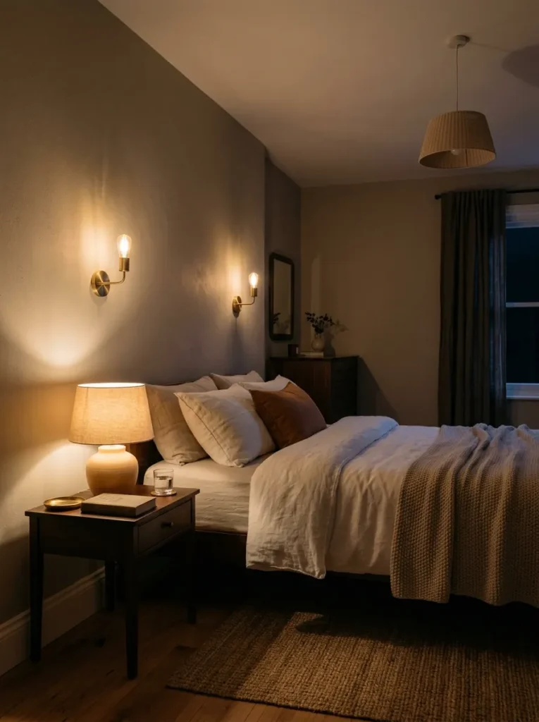
A bedroom with lights that operate only at full brightness can be well-furnished and beautifully decorated and still not feel restful in the evening. Dimmers on the ceiling fixture, on wall sconces, and on any plug-in lamps allow the room to shift from daytime function to evening wind-down at 30–40% without changing anything physical about the space.
LED bulb compatibility is worth checking before specifying dimmers: some LEDs produce an audible hum or flickering quality at low settings that undermines the restful quality entirely. Trailing-edge dimmers suit LED bulbs better than leading-edge models and are available from most electrical suppliers without significant cost difference.
18. Keep Each Bedside Surface to Three Objects Maximum
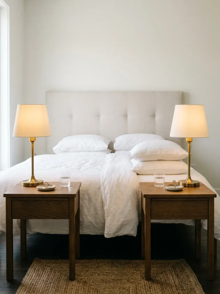
Hotel nightstands read as composed because the objects on them are chosen deliberately: a lamp, a glass, and usually one small object. Nothing else. The discipline of a three-object maximum isn’t about minimalism as an aesthetic — it’s about giving each surface element enough breathing room to register as intentional rather than accumulated.
Apply this principle to both nightstands simultaneously. Two well-composed bedside surfaces, matching in their edit if not their exact styling, read as a designed composition across the head of the bed. One composed side and one working surface covered in miscellaneous items makes the composed side look like an accident rather than an intention.
19. Use a Tray to Define and Contain the Bedside Composition
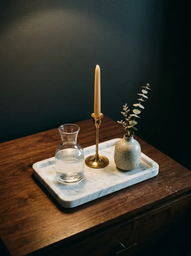
A tray on the bedside table performs a specific visual function: it gives a collection of small objects a boundary that makes them read as a deliberate grouping rather than a scatter. A rectangular stone tray holding a small carafe, a single taper candle in a holder, and one small object reads as a considered arrangement; the same objects without the tray read as items that accumulated.
The tray material should suit the room’s palette: honed marble for pale neutral bedrooms; hammered brass for a warmer, richer scheme; matte black lacquer for a darker setting. The tray should occupy no more than about two-thirds of the bedside surface — a tray that fills the entire nightstand starts to crowd the space rather than organise it.
20. Add Tactile Contrast Through Throw Cushion Texture
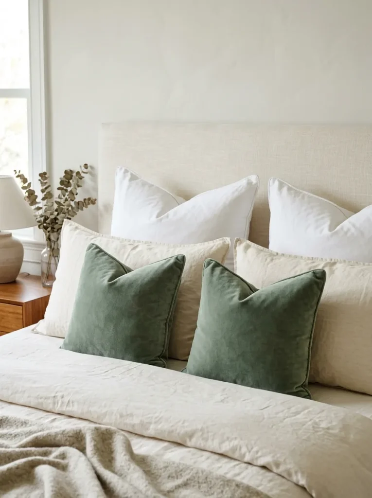
Cushions on the bed in a hotel room exist to add a third layer of texture and colour variation between the bedding and the headboard — not for comfort during sleep, which hotels explicitly suggest removing to the floor or a bench at the end of the bed. The styling logic: two or three Euro square cushions against the headboard at the back, two standard cushions in the bed fabric in front, and one or two smaller accent cushions in a contrasting texture at the front.
In a white linen scheme, small velvet cushions in dusty terracotta or sage introduce both tactile contrast and enough colour variation to keep the bed from reading as monotonous. The accent cushions should be removed when sleeping — the bed as styled by day and the bed used by night serve different purposes.
21. Use Moulding or Panelling to Add Architectural Weight
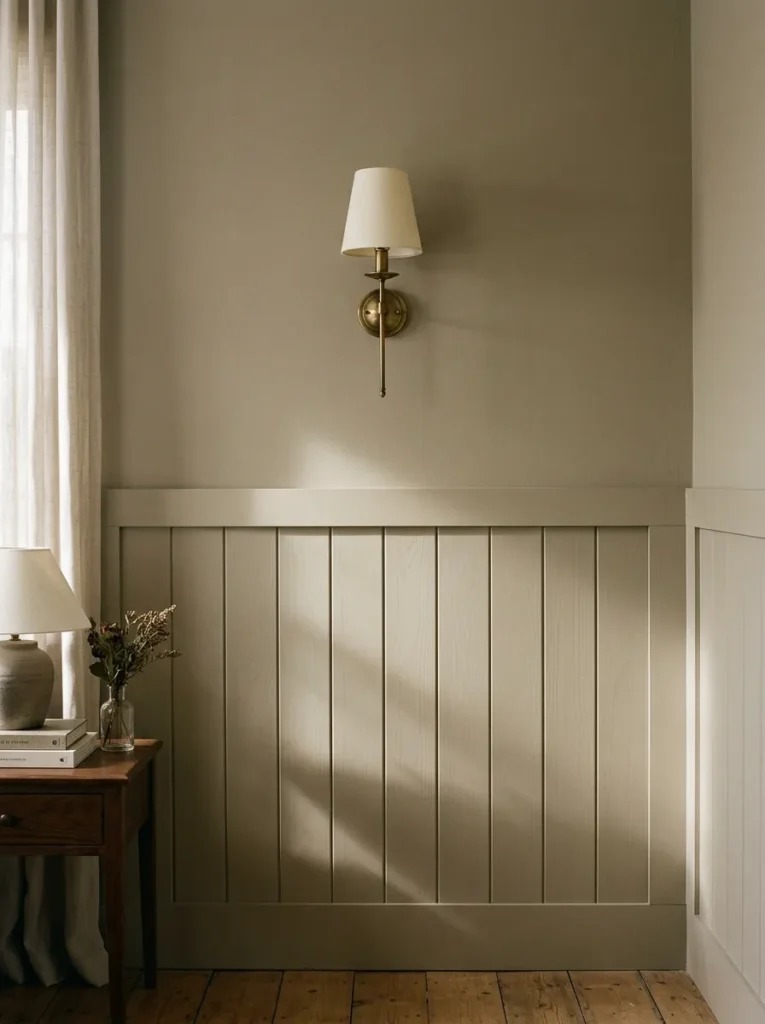
A bedroom with plain painted walls and no architectural detail relies entirely on furniture and textiles for its visual interest. Adding a cornice, picture rail, or half-height panelling gives the room bones that read independently of its contents — the quality of considered architecture that older hotels derive from the building itself, now achievable in newer properties through painted MDF-profile moulding in the same tone as the wall.
The shadow gap at the base of an upper panel painted the same colour as the wall beneath reads as deliberate depth rather than a seam. This is the detail that makes painted panelling in a tone-on-tone scheme look architectural rather than applied.
22. Treat Door, Skirting, and Architrave as Deliberate Colour Decisions
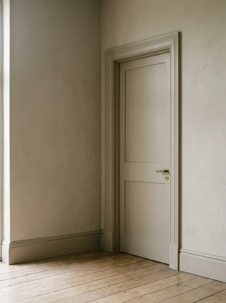
Doors, skirtings, and architraves in a standard domestic bedroom are painted white almost without exception and almost without thought. In a hotel bedroom that reads as designed, the joinery colour is deliberate — often the same tone as the walls, which makes the room feel more continuous and less fragmented by white borders, or in a deliberate deep contrast that gives the joinery its own presence.
Painting the skirting and architrave the same tone as the walls removes the low-level white border that visually reduces wall height and makes the room feel more like one resolved surface. It takes an afternoon and a litre of paint, and the impact is immediate.
23. Create a Bench or Footstool at the End of the Bed
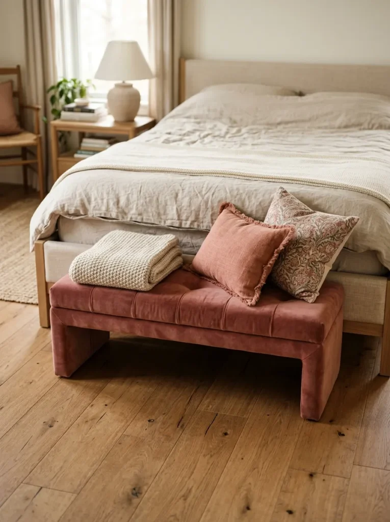
The end of the bed is a zone that most domestic bedrooms leave unaddressed — either empty floor or the nearest dumping surface. A bench or upholstered footstool defines the sleeping zone, provides a surface for a folded throw and accent cushions when the bed is in use, and gives the room a second horizontal element at low level that makes the whole composition read as more complete.
The bench should be roughly the width of the mattress or slightly narrower, and low enough that it doesn’t visually obstruct the bed when entering. An upholstered version in a tone one shade deeper than the duvet, or in a contrasting material — leather, bouclé, velvet — provides the visual anchor the foot of the bed needs without competing with the headboard at the other end.
24. Edit Down to What’s Actually Worth Seeing

The governing principle behind every luxury bedroom idea in this guide: a room achieved by adding more of the right things rather than reducing what’s already there reads as decorated rather than designed. Hotel rooms of genuine quality have fewer objects in them than a typical home bedroom, not more. Every surface holds what belongs there, and nothing else.
In practice this means the chair that holds clothes is either addressed as a chair or removed. The multiple small objects on the dresser reduce to a tray with three selected pieces. Additional storage is solved through wardrobe solutions rather than supplementary furniture. The room after this edit is the room that actually embodies the luxury bedroom aesthetic.
What to Prioritise First
For anyone working with an existing bedroom rather than a blank specification, the sequence matters as much as the individual decisions.
Bedding and linen first. The most immediate, high-visibility change and the one that shifts the daily experience of the room most directly. Quality bedding, properly layered, transforms before anything structural changes.
Lighting next. Add dimmers to existing circuits, install wall-mounted reading lights where absent, address any cool-white bulbs. The evening character of the room changes completely.
Surfaces third. Clear the bedside tables to three objects each, introduce trays, hide cables. No cost and immediate visual impact.
Structural decisions last. Painting the joinery, adding panelling, addressing storage — more involved but producing the most lasting change to the room’s architectural quality.
Final Thoughts
A bedroom that genuinely achieves the hotel-inspired quality these luxury bedroom ideas are pointing toward usually shares one characteristic with the rooms that inspire it: the decisions are few and each one is made well. The temptation in a bedroom renovation is to add — more cushions, more art, more decorative objects — when the rooms that feel most considered arrive at their quality through a clear edit.
Start with bedding and lighting. Those two decisions, made carefully and with the right specifications, change a bedroom more completely than furniture or decoration can. Once those are right, the structural decisions become easier because the room’s quality is already established.
Save the ideas here that address what your bedroom is actually missing and come back to this guide when you’re ready to make the decisions that matter.