21 Dark Dining Room Ideas That Feel Moody and Elegant
Dark dining rooms have an unfair reputation for being impractical — too dim for everyday use, too heavy for smaller spaces, too demanding to get right. The rooms that earn that reputation are usually the ones that stopped at a tin of dark paint and hoped the atmosphere would follow. The ones that don’t are almost always the result of understanding what actually produces the quality of moodiness worth having: layered light sources, deliberate contrast, the right material weight in the furniture and textiles, and a dark tone that suits the room’s natural light rather than working against it.
These dark dining room ideas move from foundational decisions — colour and light — through furniture, architecture, and styling. Every one addresses the practical question underneath the visual one, because a dark dining room that looks right but doesn’t function comfortably for a dinner party or a family breakfast fails at its most basic purpose.
1. Choose a Dark Tone That Suits Your Room’s Natural Light, Not Just the Swatch
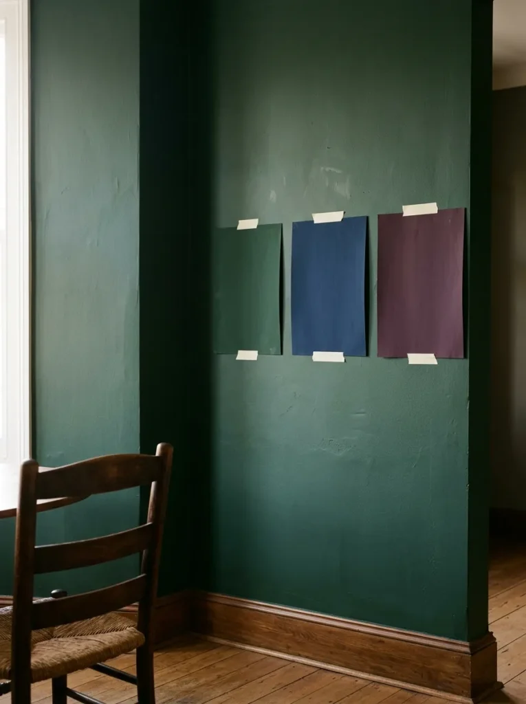
The most common failure in a dark dining room is choosing a colour in isolation — from a swatch, from a mood board, from a room photographed in a studio with controlled light — and applying it to a room with entirely different natural light conditions. A deep forest green reads warm and enveloping in a south-facing room; in a north-facing one, the same green can read flat, slightly grey, and much less inviting.
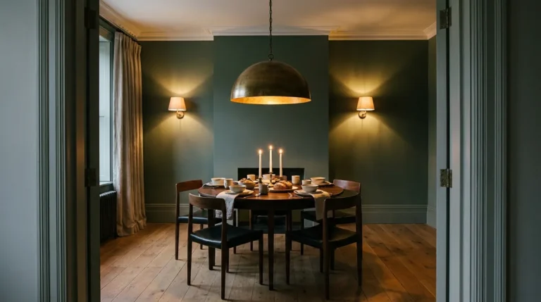
Before committing to any dark tone, sample it at A3 size minimum and observe it across a full day — morning, midday, afternoon, and under your actual artificial lighting in the evening. The evening behaviour under warm lamplight is usually the most important test for a dining room, since that’s when the room gets most of its use. The colour temperature of your light sources will shift the perceived tone considerably: warm bulbs deepen and enrich dark greens, navies, and plums; cool-white bulbs can make the same colours look washed-out or cold.
2. Layer Three Distinct Light Sources
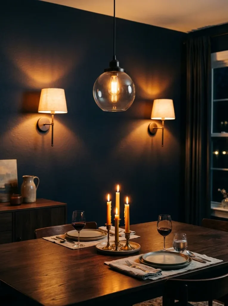
A dark dining room with a single overhead pendant is a room that will feel gloomy rather than atmospheric the moment the sun goes down. The distinction between gloomy and atmospheric is almost entirely a function of where the light falls and from how many sources. Three layers — one overhead source providing general orientation, candlelight or low table lighting providing warmth at surface level, and at least one accent source illuminating the walls or a display — produce the multi-level warmth that makes a dark room feel rich rather than dim.
The pendants or chandelier above the dining table should be dimmable as a baseline. Adding wall sconces at a lower level — even on simple plug-in fittings rather than hardwired, if rewiring isn’t feasible — changes the character of the room dramatically. At full brightness the room functions; dimmed to half with sconces and candles, it operates at a completely different register.
3. Hang the Chandelier Lower Than You Think
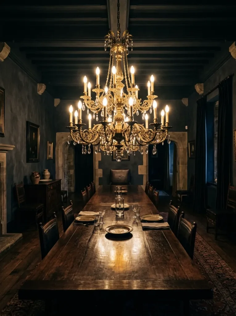
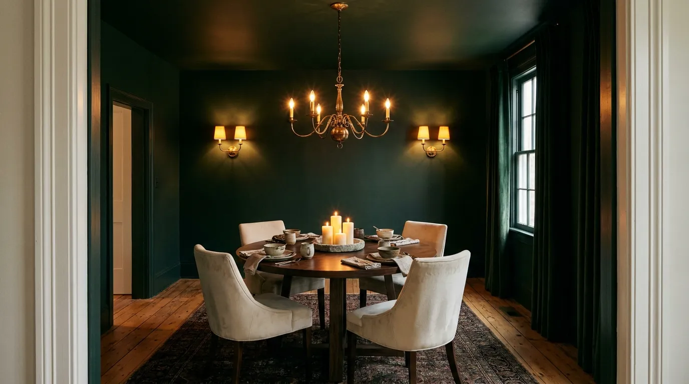
In a dark dining room, the chandelier isn’t just a light source — it’s the room’s primary focal point. Its position determines where the eye goes first and how the table below it reads. Most chandeliers are hung too high, at a height more suited to general room lighting than to creating an intimate dining atmosphere. Lowered to roughly 70–80cm above the table surface, a chandelier or grouped pendant becomes part of the dining composition rather than a ceiling feature at a distance.
The size matters too: a fixture that’s too small in a dark-walled room reads as timid rather than considered. As a rough guide, the diameter of the fixture (in centimetres) should broadly relate to the table length — a 180cm table suits a pendant or chandelier with a presence of 60–80cm across. These are principles, not rules; the actual ceiling height and table width should guide the final decision.
4. Paint the Ceiling the Same Dark Tone as the Walls
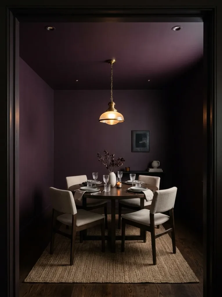
A white ceiling above dark walls is the detail that most undermines a dark dining room. It creates a high-contrast horizontal break at the top of the room that the eye reads as a lid — the room stops rather than envelops. Painting the ceiling the same tone as the walls (or one shade deeper, which makes the ceiling appear to recede rather than press downward) removes that break entirely and produces the genuinely wrapped, cocoon quality that makes a dark dining room feel intentional rather than half-finished.
This is the change that scares most people and has the most significant effect on the room when done. It doesn’t require high ceilings to work — some of the most effective dark dining rooms are in low-ceilinged Victorian or cottage properties where the enveloping quality is exactly what the architecture needs.
5. Use Warm Deep Green Rather Than Black or Very Dark Charcoal
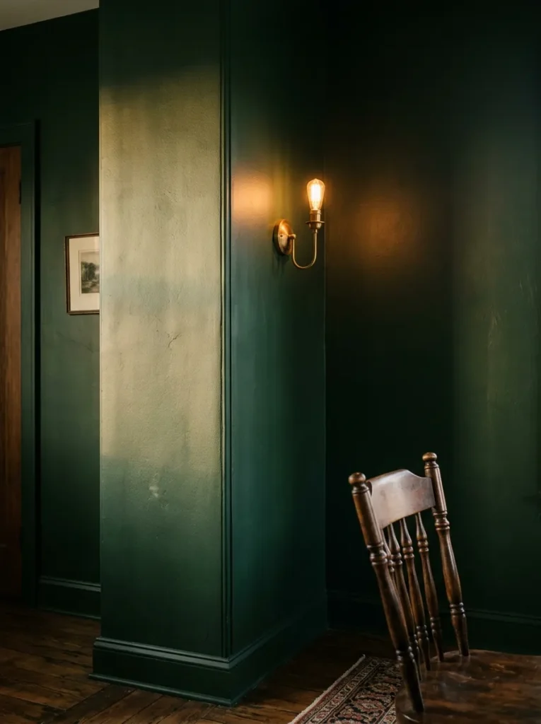
Black and very dark charcoal are the obvious choices in a dark dining room and also the choices most likely to produce a room that feels demanding rather than atmospheric. They absorb light very completely in a way that can make even a well-lit room feel effortful, and they offer very little variation with the time of day or seasonal changes in natural light.
Deep greens — forest, bottle, hunter, or a slightly muted olive — absorb light in a warmer way and shift more noticeably across different lighting conditions, from a slightly cooler morning tone to a lush, warm richness under evening lamplight. This tonal movement across the day is part of what makes dark green dining rooms so photographed and saved. Navy and deep plum perform similarly. True black is more effective as an accent — skirting boards, door frames, a piece of furniture — than as a full-room colour in a dining context.
6. Choose a Round Dining Table for a Genuinely Intimate Atmosphere
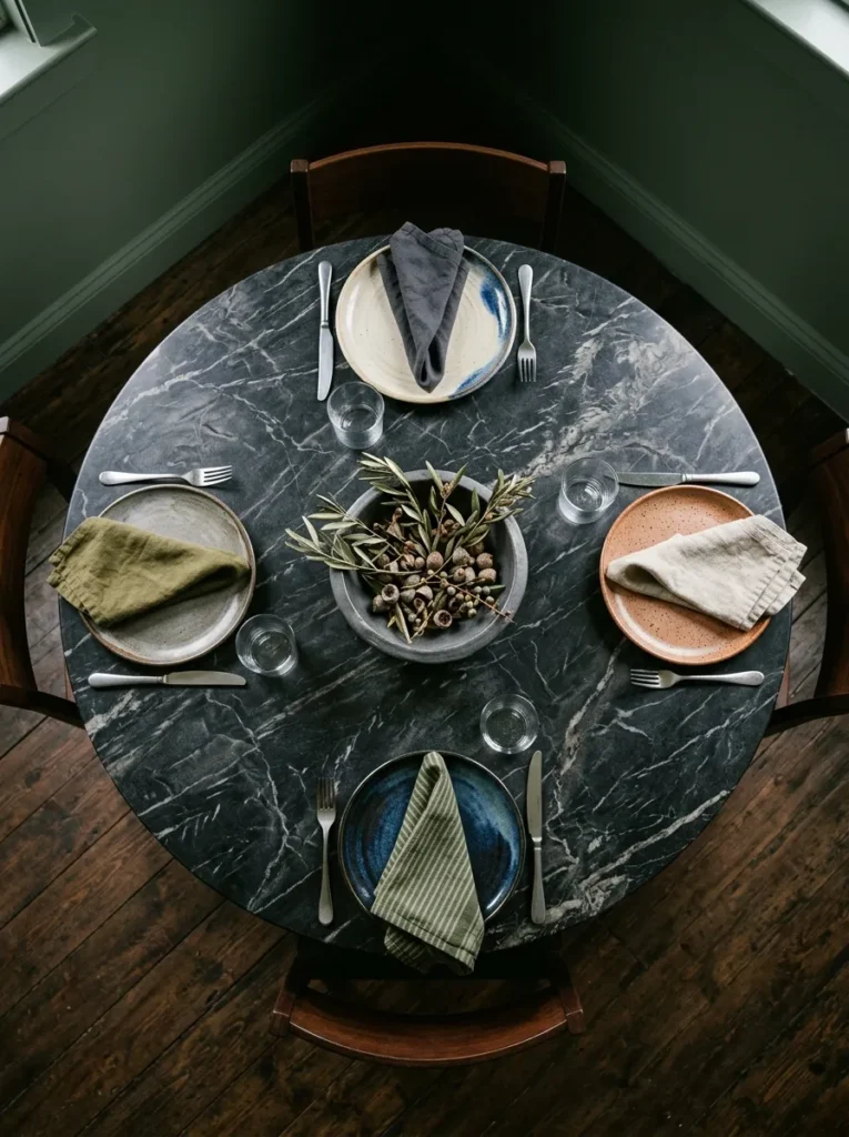
The shape of the dining table determines how people sit in relation to each other and how the room feels at smaller numbers. A long rectangular table in a dark dining room seats more people across a formal arrangement but can feel empty at the far ends during a casual dinner for four. A round table in the same space seats fewer people overall but produces a genuinely different quality of conversation — everyone is equidistant, and nobody is visually isolated at an end.
In a dark dining room that’s used primarily for evening entertaining rather than daily family meals, a round table in a dark material — aged oak, deep walnut, marble — reads as more considered and less like a reproduction of a formal dining suite. The absence of a head-of-table hierarchy also suits the informal dinner party context most dark dining rooms are designed around.
7. Upholster Dining Chairs in a Contrasting Warm Tone
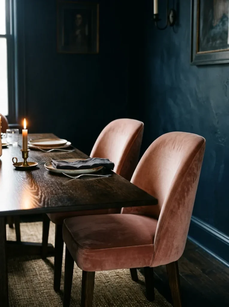
Chair upholstery is where the contrast that makes a dark dining room visually legible comes from. If the chairs are the same deep tone as the walls, the dining setting can read as a mass of dark material in which the chairs, table, and walls become indistinguishable from across the room. A contrasting upholstery — warm cream linen, dusty blush, a muted terracotta, a pale natural velvet — provides the visual separation between the seating and the backdrop.
The contrast doesn’t need to be dramatic. In a deep forest green room, chairs in an oatmeal or warm off-white linen read clearly without competing with the wall. In an ink navy room, a dusty rose velvet or aged leather provides warmth without looking accidental. The upholstery should have enough visual weight — velvet, heavy linen, or leather — to hold up against the dark surround rather than reading as too delicate.
8. Add Wainscoting or Dado Rail for Architectural Depth
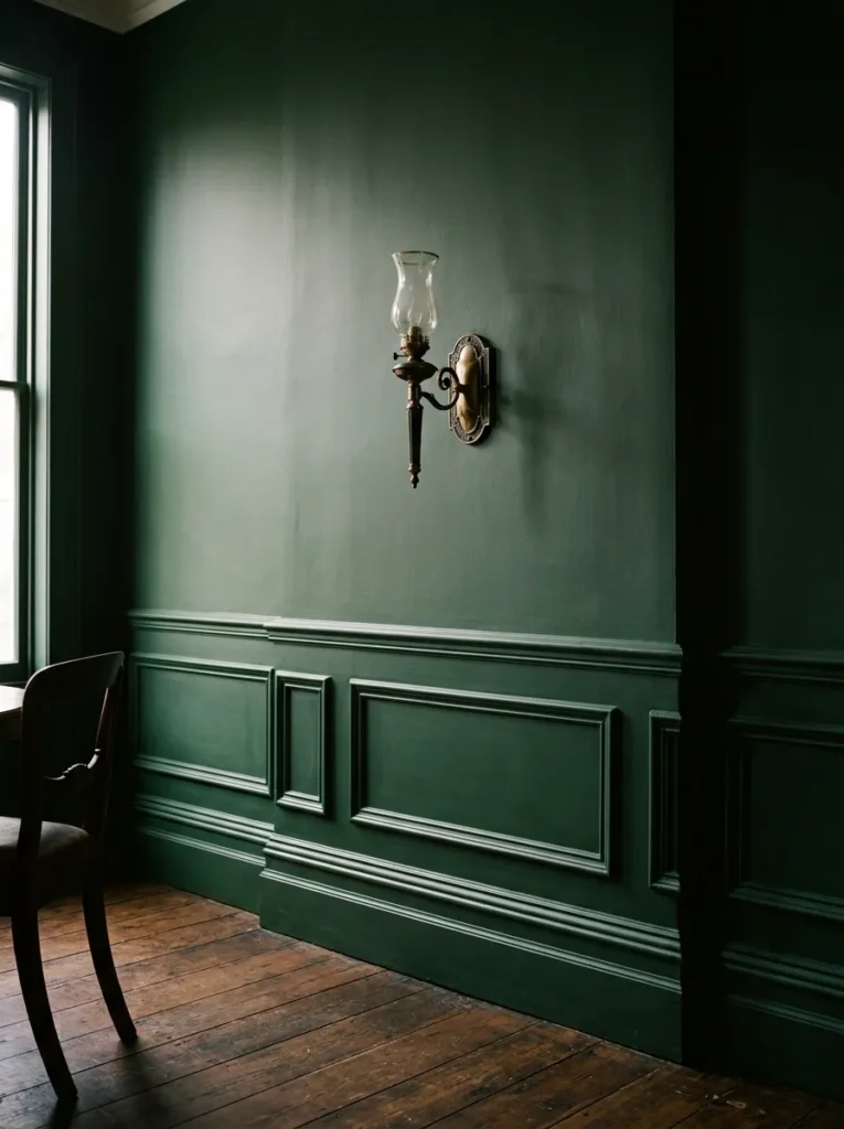
Flat dark walls with no architectural feature can read as monotonous, particularly in rooms where the joinery and cornicing are minimal. Adding a dado rail or wainscoting — either from period-appropriate moulding in older properties or from MDF panelling in newer ones — divides the wall height into two zones and creates shadow lines that give the dark surface dimension.
The most effective approach in a dark dining room is to carry the same paint colour across both the upper wall and the lower panelling, which unifies the room while the panelling’s depth still creates shadow and texture. Painting the panelling a contrasting tone (a lighter shade or a different colour below dado height) reads more traditional and suits period properties; the single-tone application reads more contemporary and works in both old and new rooms.
9. Install Wall Sconces at Dining Height for Layered Evening Light
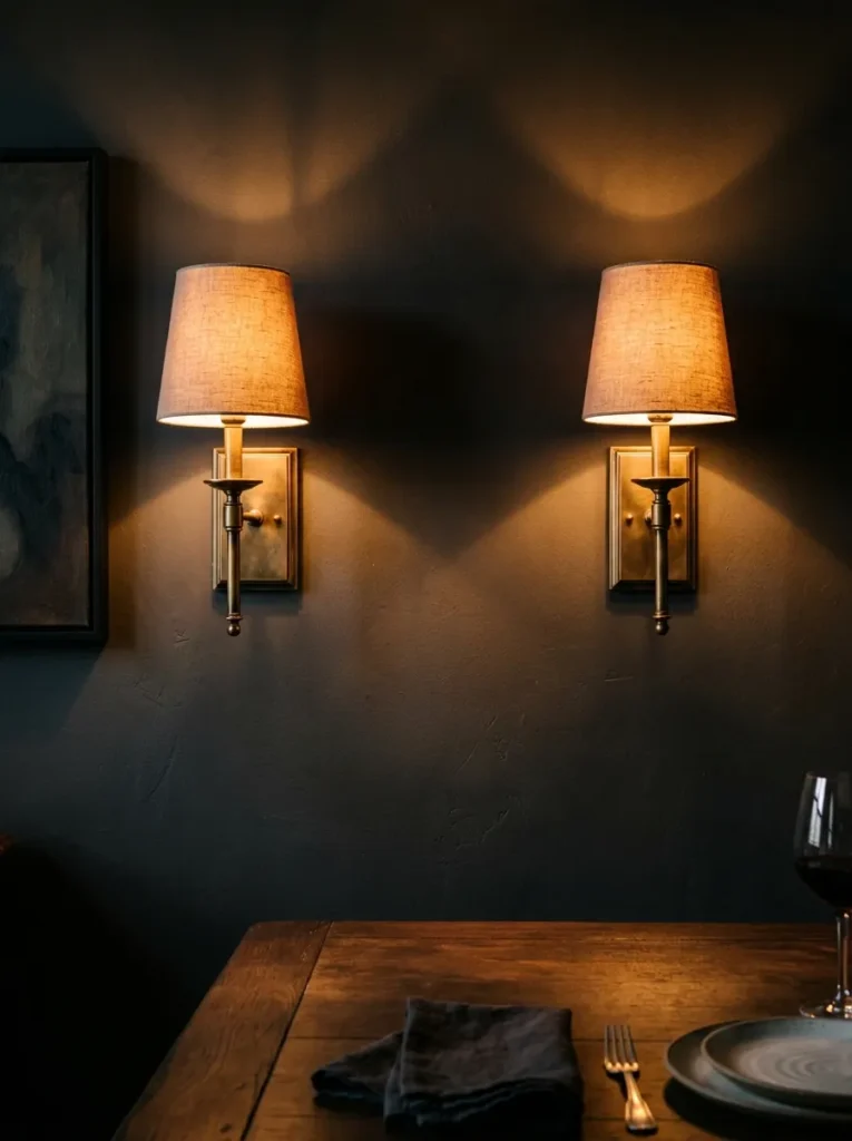
Wall-mounted sconces positioned at roughly seated eye level — approximately 140–160cm from the floor — provide light from a height that creates the most flattering effect across a dining table and the most useful ambient glow on the walls of a dark room. This is lower than most people position wall lights, and the reason it works is that light at this level illuminates the table, the food, and the people around it from an angle that doesn’t cast the hard downward shadows that ceiling-only light produces.
Plug-in sconces with fabric shades are a viable option in rental properties or rooms where rewiring isn’t practical. The fabric shade keeps the light diffuse rather than directional, which suits the warm, non-clinical effect that a dark dining room needs after dark.
10. Use a Dark Vintage or Aged Wood Dining Table
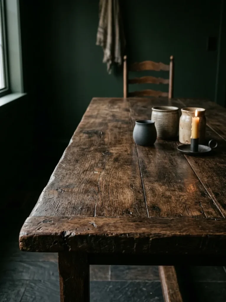
The dining table in a dark room needs enough material weight to hold its own against the surrounding darkness. Pale or painted tables in a very dark room can look washed-out or read as insubstantial — the table becomes a surface that’s hard to read visually. A dark-toned table — aged oak, dark walnut, mahogany, or a reclaimed timber with a deep patina — reads as part of the room’s material register and creates a more cohesive overall composition.
Vintage and antique tables suit dark dining rooms particularly well because the aged surface already carries the kind of depth that new furniture needs time to develop. A reclaimed refectory table or a Victorian mahogany extending table, refinished but not over-polished, has a material presence that reads with the space rather than against it.
11. Hang Dark Velvet Curtains Floor-to-Ceiling
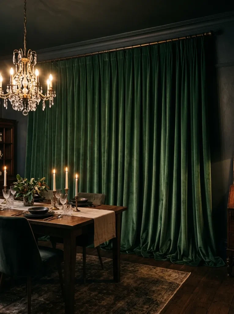
In a dining room, curtains serve a different purpose than in a living room or bedroom. They manage natural light during the day, but more importantly they add a substantial mass of sound-absorbing, light-softening textile to the room in the evening. Floor-to-ceiling velvet curtains in a tone close to the wall colour — with enough variation to be readable as a separate surface — deepen the room’s sense of enclosure at night and significantly improve the acoustic quality of the room during a dinner with multiple people.
Hang the curtain track or pole as close to the ceiling as possible and allow the curtains to fall generously to the floor — a slight puddle or at minimum a clean break at the skirting. The generous drape is part of what makes velvet curtains suit a dark dining room rather than a slim-hung version, which can look mean against the richness of dark walls.
12. Keep the Dining Table Surface Uncluttered as a Visual Reset
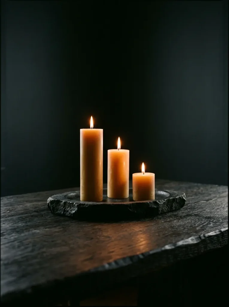
In a dark dining room, the table surface is one of the brightest horizontal planes in the room, and what sits on it determines whether the eye rests pleasantly or feels overloaded. The opposite instinct — filling a dark room with objects to avoid it feeling sparse — tends to produce dining tables that read as overwhelmed rather than considered.
A single low centrepiece — a ceramic bowl, a cluster of pillar candles on a stone tray, a single bud vase — leaves the table surface mostly clear and allows the candles to do the work of adding warmth and visual interest. Candlelight at table height is the single most effective addition to a dark dining room in the evening. Two or three tapers in simple holders provide more visual movement than a mass of candles and less risk of competing with each other.
13. Introduce a Large Dark-Framed Mirror to Manage Light
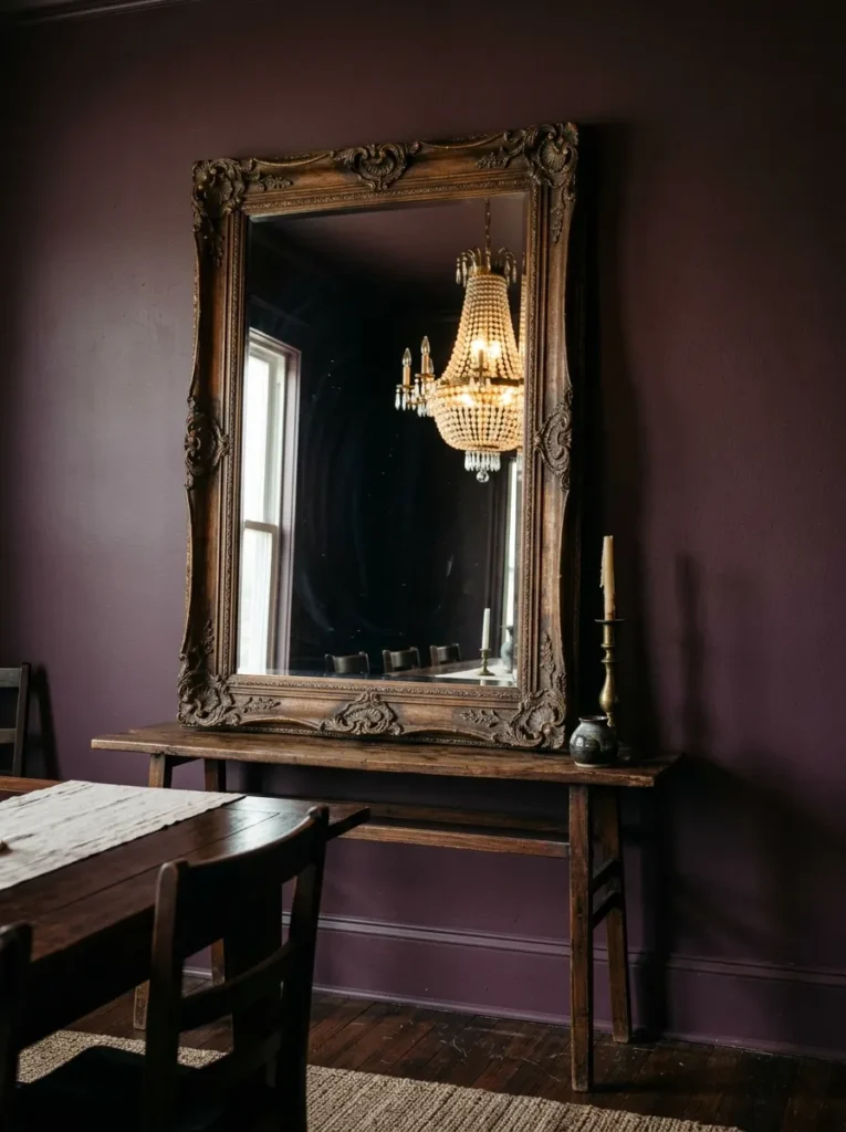
A large mirror in a dark dining room performs a specific function: it bounces light from whatever source faces it, which in the evening means reflecting lamplight and candlelight back across the room. Position matters considerably. A mirror placed on the wall opposite the main light source — whether a window during the day or the principal pendant in the evening — does the most useful work. A mirror reflecting a blank wall or a dark expanse reflects nothing of interest and adds less than its size would suggest.
Frame style and scale both matter. A large ornate frame in dark wood or antiqued gold reads as a considered object in its own right. A thin contemporary frame in a dark room tends to disappear. The mirror should be large enough to read from across the room — a small mirror on a dark wall requires the eye to search for it rather than finding it as an obvious reflective feature.
14. Choose Aged Brass or Antique Gold for All Metal Details
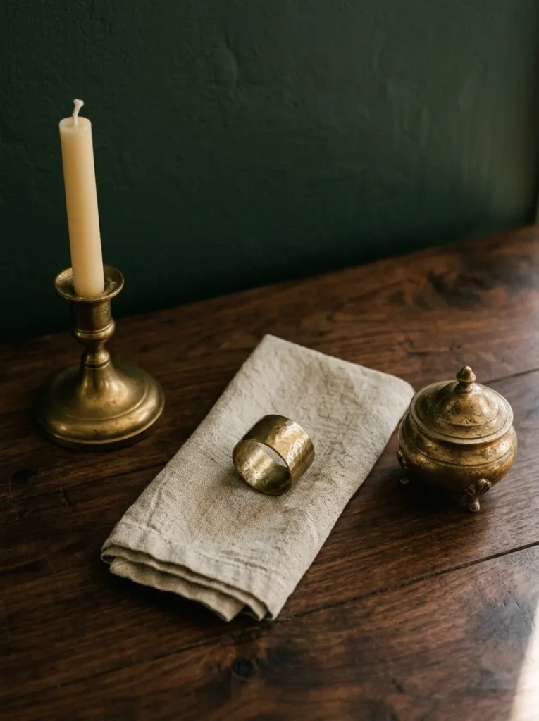
Metal finish is one of the more consequential decisions in a dark dining room because warm metals and cool metals produce entirely different room temperatures against dark walls. Chrome, brushed nickel, and polished steel all read cooler and harder against dark paint or wallpaper — they suit a more minimal, industrial dark dining room but can feel harsh in a room aiming for warmth and atmosphere.
Aged brass, antique gold, unlacquered brass, and dark bronze all carry warmth that deepens against dark backgrounds rather than competing with them. Apply the same finish consistently across the chandelier, sconces, curtain hardware, cabinet handles if present, and any decorative objects. Consistency across these smaller details is what gives a well-executed dark dining room its sense of deliberate design rather than accumulated decision-making.
15. Use Wallpaper Rather Than Paint for Immediate Depth
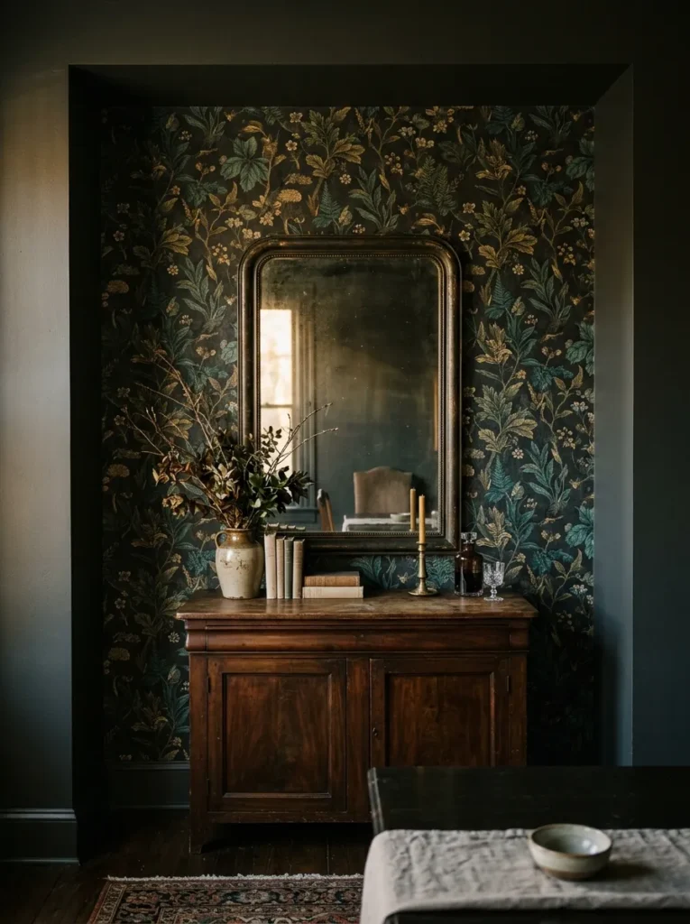
In a dining room — a space that’s used for specific occasions rather than all day, every day — wallpaper is a less risky commitment than it might appear in a bedroom or living room. A rich, repeating pattern in a dark ground colour (botanical, geometric, damask, or abstract) gives a dark dining room immediate surface interest that flat paint can’t replicate, and the wallpaper’s texture catches light differently depending on the hour and source.
Rooms with alcoves or chimney breasts are well suited to papered feature sections rather than all-over application. A single papered wall — particularly behind the dining table or sideboard — and painted walls elsewhere introduces the depth and pattern without the full commitment of four sides. Temporary or peel-and-stick dark wallpaper has improved considerably and suits rental dining rooms where permanent change isn’t possible.
16. Add a Sideboard in a Dark Material for Storage and Styling
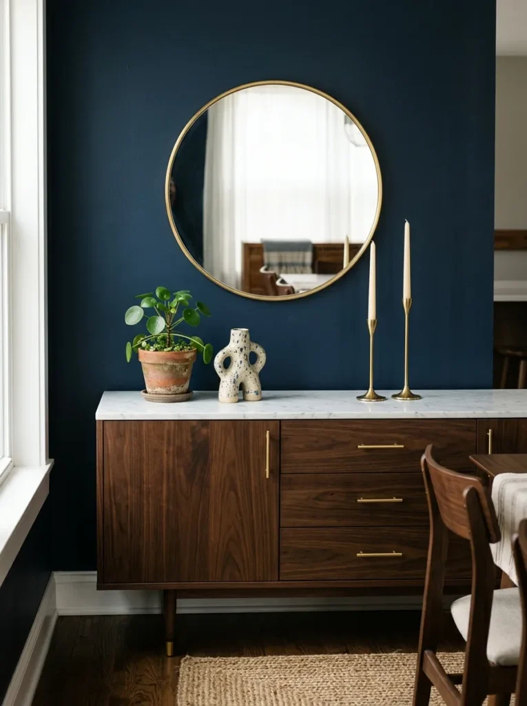
The sideboard is a dining room’s secondary furniture piece — the practical storage for serving crockery, linen, and dining accessories — and in a dark dining room it also contributes to the room’s overall material weight. A sideboard in dark lacquer, deep walnut, or aged ebonised oak reads as part of the room’s palette; a pale or light wood sideboard in the same setting reads as contrasting rather than integrated.
A marble or stone top in a contrasting tone lightens the sideboard surface and provides a useful styling zone — a mirror above, a pair of candlesticks, a ceramic object. Keep the surface relatively spare: three or four objects at most, chosen in tones that respond to the room’s palette rather than introducing new colours.
17. Frame the Dining Area in an Open-Plan Space With Dark Paint
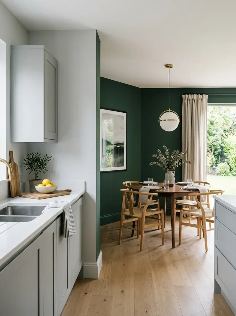
In an open-plan kitchen and dining area, a single dark tone applied only to the walls of the dining zone — leaving the kitchen walls in a lighter tone — creates a visual boundary that defines the dining area without a physical partition. This is particularly useful in newer open-plan layouts where the dining and cooking areas share a single long room without any architectural separation.
The paint boundary should have a logical stopping point — an internal corner, a beam or column, a change in ceiling height — rather than stopping arbitrarily mid-wall. At a doorway or corner, the junction between dark and light reads as a threshold, which is exactly the effect this technique is aiming for.
18. Hang Gallery Wall Art in Light-Coloured Frames
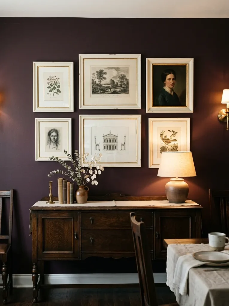
Art in a dark dining room needs enough contrast with the wall to register as individual pieces rather than disappearing into the background. Dark frames on a dark wall require the eye to work to find the edges of each piece, which reduces the impact of the art itself and makes the arrangement look less considered. Light-coloured or warm metallic frames — cream, antique white, warm gold — sit visibly against dark paint and allow the art within to read clearly.
The gallery arrangement itself should be grouped tightly enough that it reads as a composition from across the table, not a scattering of individual pieces across the wall. For a dining room specifically, positioning the arrangement at a height that’s visible when seated — centred at roughly 145–165cm from the floor — means it works both standing and at the table.
19. Install Recessed Ceiling Spotlights on a Dimmer as a Functional Layer
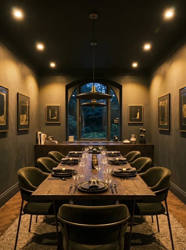
In addition to the chandelier and sconces, a circuit of recessed ceiling spotlights on a separate dimmer gives a dark dining room a functional option for everyday use, cleaning, and occasions where full visibility matters. Dimmed to 20–30%, the spotlights add a subtle wash across the room that supplements the warmer light sources without dominating them.
Warm-white bulbs (2700K) are non-negotiable in a dark-toned room. Cool or neutral white spotlights at even a low setting will push the wall colour into a greyer, flatter register that undermines the warmth the darker palette is trying to achieve. If the existing spotlights are cool-white, changing the bulbs to warm-white is a low-cost adjustment with an immediate and significant effect.
20. Bring in Organic Texture Through Table Linen and Ceramics
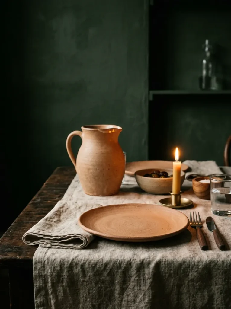
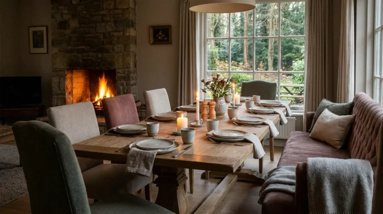
A dark dining room with no organic material — no linen, no natural ceramics, no wood grain visible — can read as hard and slightly formal even at its most beautifully composed. Natural materials at the table — a linen tablecloth in oatmeal or terracotta, ceramic side plates in a matte earthy tone, a rough-textured jug or serving vessel — introduce the imperfection and warmth that makes the room feel occupied rather than staged.
Restraint in colour is what keeps this from reading as busy: in a dark room, the table objects should share a tonal family rather than introducing competing colours. Earthy ceramics, natural linen, and aged wood all sit in the same warm-neutral register that responds to dark walls without fighting them. Bright colours or pattern-heavy table linen compete with the room’s atmosphere rather than contributing to it.
21. Let One Wall Stay Lighter for Balance in Compact Rooms
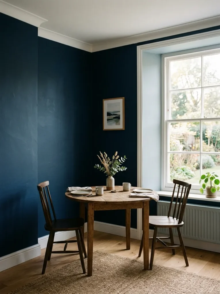
For compact dining rooms where four dark walls would genuinely feel oppressive — rooms shorter than about 3 metres on their smaller dimension — painting three walls in the dark tone and leaving one wall in a significantly lighter version of the same colour, or in a complementary warm neutral, keeps the room from feeling enclosed in the wrong way. The lighter wall reads as a visual release and makes the remaining three dark walls feel like a frame rather than a box.
The lighter wall should ideally be the one opposite the main window or light source, so it catches and reflects available light back into the room. Painting it two or three shades lighter than the main tone, rather than switching to white, keeps the palette cohesive rather than introducing a hard visual break.
Practical Guidance: What to Prioritise in a Dark Dining Room
A few decisions determine the room’s success more than any others, and they’re worth making in a specific sequence.
Colour and finish first. Dark paint in a flat finish reads differently to the same colour in an eggshell or satin finish. Flat finishes absorb light and feel more enveloping; eggshell and satin carry a slight sheen that catches and reflects light, which can make the room feel brighter but slightly harder. Neither is wrong — the choice depends on whether the room is used primarily for evening atmosphere or also needs to function in daylight.
Lighting plan second. Decide where every light source will be before painting, because sconce positions and spotlight circuits both affect the look of the finished room. Painting first and discovering the lighting plan is inadequate is a common and expensive sequencing error.
Furniture and textiles last. The table, chairs, curtains, and upholstery should all be chosen with the wall colour confirmed — ideally with a painted sample on the actual wall — because the apparent undertone of the paint shifts significantly under different lighting conditions and furniture combinations.
Final Thoughts
Dark dining room ideas are more forgiving than their reputation suggests, but they do require the decisions to be made in the right order and at the right level of specificity. The colour choice without the lighting plan is the most reliable path to a room that looks exactly like you feared. Equally, perfect lighting in a room with pale cabinetry, mismatched metal finishes, and a sideboard in the wrong tone won’t produce the atmosphere the dark walls were meant to generate.
Start with colour and light. Get both of those working together — ideally tested with a painted sample under your actual evening artificial light — before committing to furniture or textiles. Not every idea in this guide belongs in the same room; a compact dining room needs different decisions to a large Victorian one, and the most useful move is identifying the three or four ideas that address your specific space.
Save the ideas that resonate with your room and come back to this guide when you’re ready to make the decisions that matter.