18 White Bathroom Ideas That Feel Bright and Timeless
The problem with white bathrooms is not the color — it is the way most people execute it. They buy white tiles, paint the walls white, install white sanitaryware, and stand back wondering why the room feels clinical rather than calm, flat rather than luminous. A white bathroom done well is one of the most genuinely beautiful rooms a home can contain. Done without thought, it is a GP surgery with better lighting. The difference is almost never about spending more money. It is about understanding that white is not a decision — it is the beginning of a series of decisions about texture, undertone, material weight, and the quality of light the room is designed to hold.
This is not a list of white tiles to consider. It is a guide to the specific choices that separate a bright, timeless bathroom interior from a plain one, including several ideas that have nothing to do with purchasing anything at all.
1. Choose Warm White Rather Than Pure White for Every Painted Surface
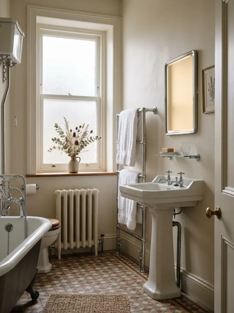
Pure white in a bathroom is almost always a mistake, and most people only understand why after they have lived with it for a year. A pure white wall reflects light without warming it, which means that under the cool LED lighting most bathrooms use, the room reads as cold and slightly institutional — the exact opposite of the timeless, spa-like quality that white bathroom design is supposed to produce. A warm white — one that contains a trace of yellow, sand, or grey undertone — warms the reflected light and makes the room feel finished rather than unfinished. Test paint samples in your specific bathroom under your specific light conditions, not in a showroom. The warm white that performs beautifully in a north-facing bathroom may read yellow in a south-facing one.
2. Use Large-Format Tiles to Reduce Grout Lines and Expand the Space
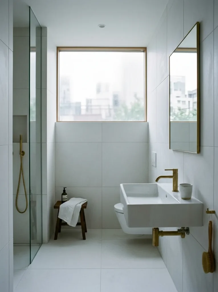
Grout lines are the enemy of the bright, expansive quality that white bathroom design promises. Every grout joint is a dark line interrupting the white surface, and the more of them there are, the smaller and busier the room reads. Large-format tiles — 60 by 60 centimetres minimum, 90 by 90 centimetres ideally — reduce the grout grid dramatically and allow the eye to travel across the surface without interruption. The tile format decision has more impact on the bathroom’s perceived size and brightness than almost any other choice. Use rectified tiles so the joints can be kept to 2 millimetres, and choose grout in a tone as close to the tile as possible — not contrasting white-on-white tile, which would recreate the grid problem in reverse.
3. Install a Freestanding Bath as the Room’s Sculptural Centrepiece
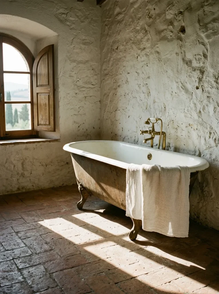
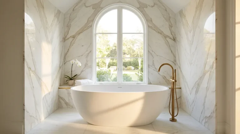
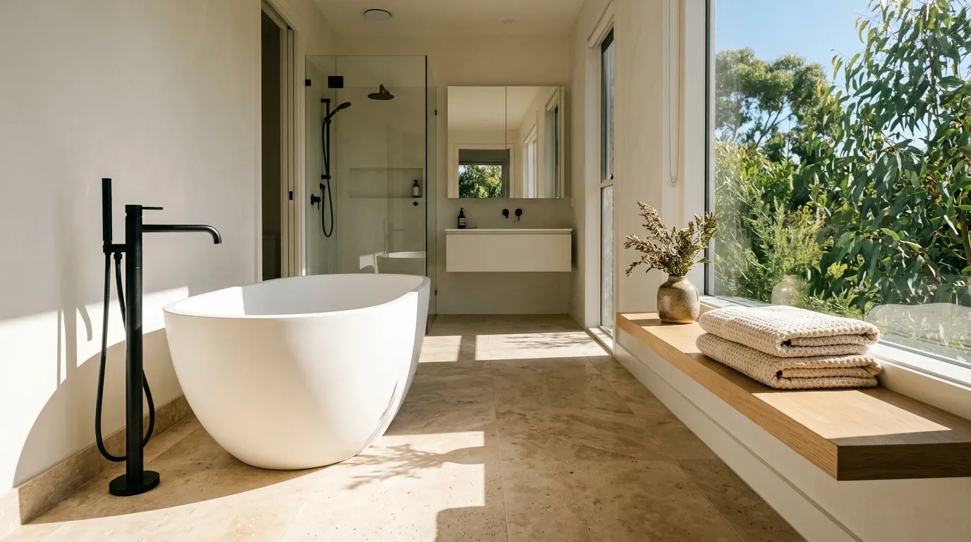
In a white bathroom, a freestanding bath does something that a built-in alcove bath never can: it reads as a piece of furniture rather than a plumbing fixture, and furniture gives a room the quality of being designed rather than installed. A smooth stone resin or cast iron freestanding tub in matte white, positioned away from any wall, creates a spatial relationship between the tub and the surrounding floor that an alcove bath eliminates. The floor becomes visible on all sides, the tub becomes a three-dimensional object, and the room acquires a sculptural quality that white tile alone cannot produce. Position it where it is visible from the bathroom doorway — the reveal on entry is the whole point of the piece.
4. Add Texture Through Fluted or Ribbed Tiles Rather Than Pattern
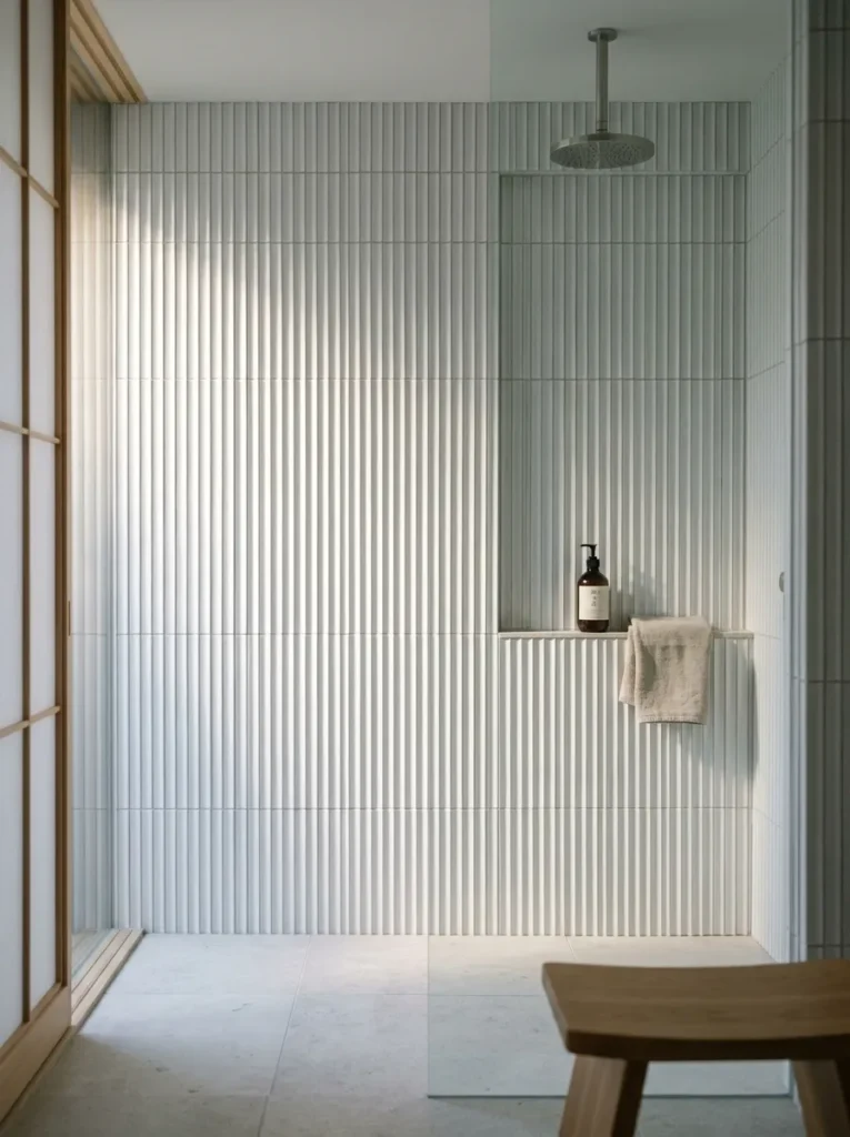
The luminous, layered quality of a well-executed white bathroom interior comes almost entirely from texture rather than pattern. A patterned white tile introduces a graphic element that eventually dates; a textured tile in the same white tone — fluted verticals, ribbed surfaces, three-dimensional relief — catches and scatters light in a way that produces depth without any visual statement. Fluted tiles on the wall behind the vanity or within the shower enclosure read completely differently at different times of day as the light source changes direction. Install them vertically for a room-height effect, or horizontally for a more grounded, material-focused quality. The texture does the work that a second color would otherwise do, without the commitment.
5. Choose Matte Black Fixtures and Fittings to Ground the Palette
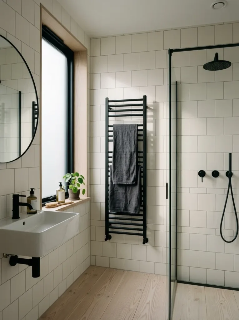
A white bathroom that uses chrome or brushed nickel throughout tends to read as slightly antiseptic — the silver tones in the hardware amplify the coldness that an all-white palette already risks. Matte black fittings — taps, shower fittings, towel rails, cabinet hardware — ground the palette with a dark tonal reference that the eye reads as anchoring rather than dominant. The black does not compete with the white. It clarifies it, the way a dark frame makes a pale painting read more distinctly. Use matte rather than gloss black for everything, without exception. Gloss black in a white bathroom looks graphic and short-term; matte black reads as architectural and permanent.
6. Bring in Natural Stone for One Dominant Surface
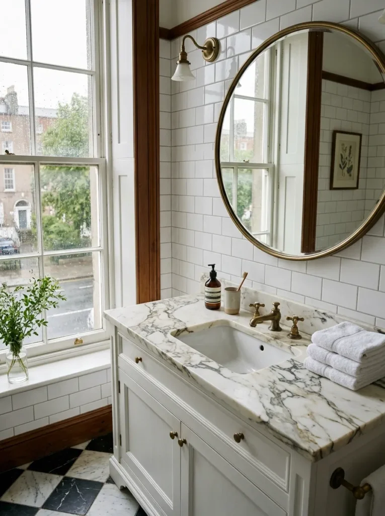
A clean white bathroom that contains even a single surface in natural stone — a honed marble vanity top, a travertine floor, a limestone shower wall — immediately acquires a material richness that any amount of white tile cannot provide on its own. Natural stone’s tonal variation, fossil detail, and geological weight communicate quality in a way that manufactured surfaces cannot approximate, regardless of price. The key is limiting stone to one dominant surface rather than using it everywhere. One honed Calacatta marble countertop in an otherwise white-tiled bathroom is more powerful than a room where stone competes with itself across multiple surfaces.
7. Use a Recessed Niche Instead of a Shower Shelf for Clean Lines
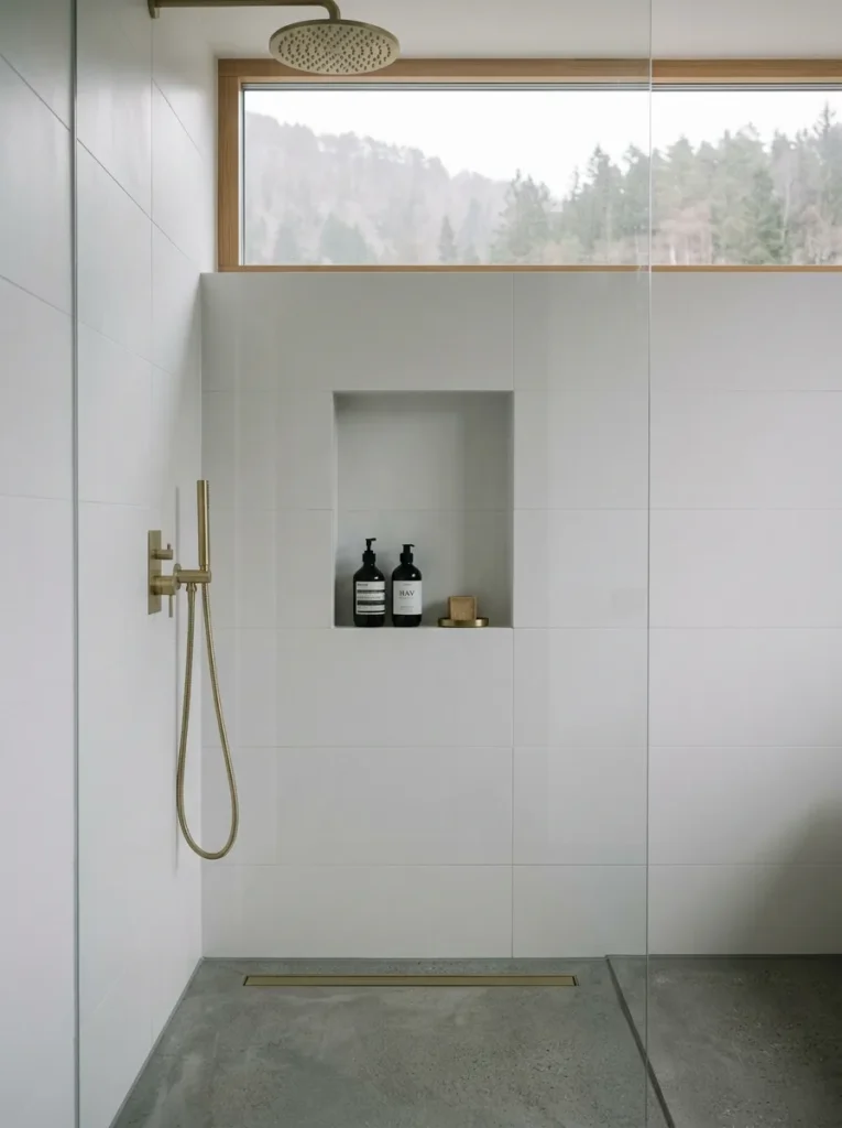
A shower shelf — whether tension-mounted, suction-fixed, or hung from the showerhead rail — is the single object most consistently destroying the clean lines of white bathroom design. It introduces a visible structure, product clutter at eye height, and the kind of visual noise that makes a well-tiled shower look like a rented bathroom. A recessed niche, tiled to match the surrounding wall and installed flush, eliminates the shelf entirely. The products sit within the wall rather than in front of it. The shower reads as a single continuous surface from floor to ceiling, which is the visual quality all clean white bathroom design is actually trying to achieve. Plan it during renovation — a recessed niche cannot be retrofitted without breaking tiles.
8. Install Underfloor Heating Beneath Stone or Ceramic Tile
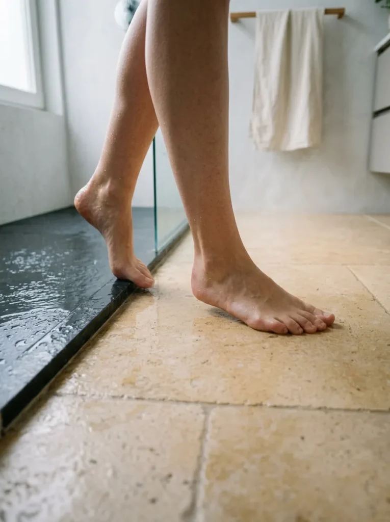
Cold floors are the most immediate sensory experience in a bathroom, and in a white bathroom specifically — where the palette tends toward the cool end regardless of the warm-white choices made on the walls — the floor temperature compounds the visual impression of coldness. Underfloor heating installed beneath any stone or ceramic tile changes the room’s entire character without changing a single visual element. The floor becomes something the body responds to positively at the most vulnerable moment of the day — stepping out of the shower — and that physical warmth reads backwards onto the room’s visual atmosphere in a way that is difficult to explain and impossible to ignore once you have experienced it.
9. Hang Full-Length Mirrors to Double the Perceived Light
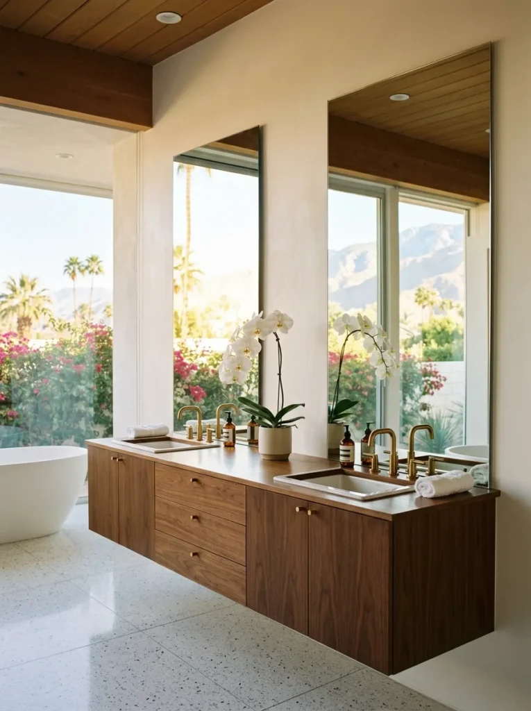
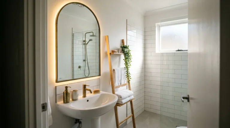
Most bathrooms use a mirror above the vanity and call it done. A full-length mirror on the wall opposite the window — or a pair of full-height pivot mirrors on either side of the vanity — doubles the perception of natural light in the space and makes the room feel genuinely expansive rather than just white. The mirror reflects both the window and the light entering through it, creating a secondary light source within the room at the same intensity as the primary. For a white bathroom renovation, two frameless full-height mirrors flanking a double vanity, or one large floor-to-ceiling mirror on the wall opposite the window, will do more for the room’s brightness than a skylight at a fraction of the cost.
10. Choose a Walk-In Shower With No Door and No Threshold
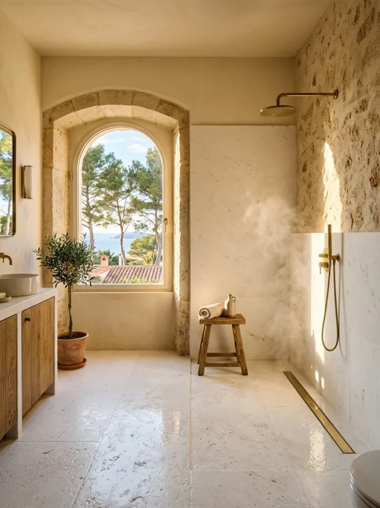
The shower door is the most visually intrusive element in a small white bathroom — a sheet of glass, however frameless, that interrupts the room’s continuous surface and reads as a division rather than a detail. A walk-in shower with no door and no threshold — just an opening, a slight floor slope toward a linear drain, and a correctly positioned showerhead — eliminates the glass entirely and allows the shower tile to read as a continuation of the bathroom’s floor and wall. The spatial effect on a white bathroom interior is significant: the room reads as larger, more resolved, and more genuinely spa-like than an identical room with even a frameless glass door installed.
11. Use a Single Warm Towel Color as the Room’s Sole Accent
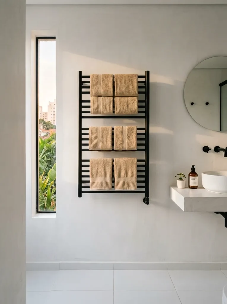
A white bathroom that uses bright white towels exclusively reads as cold and somewhat clinical — the room never acquires the warmth that makes it feel like a genuinely pleasant space to be in. A single warm accent color introduced exclusively through towels — warm cream, sand, warm grey, dusty sage — provides enough tonal relief to make the white palette feel chosen rather than defaulted to, without introducing any object that requires renovation to remove. Fold and hang the towels as you would in a hotel bathroom: uniform folds, same direction, same position. The discipline with which the towels are handled communicates more about the room’s design intention than almost any fixed element in it.
12. Add a Timber Element to Break the All-White Register
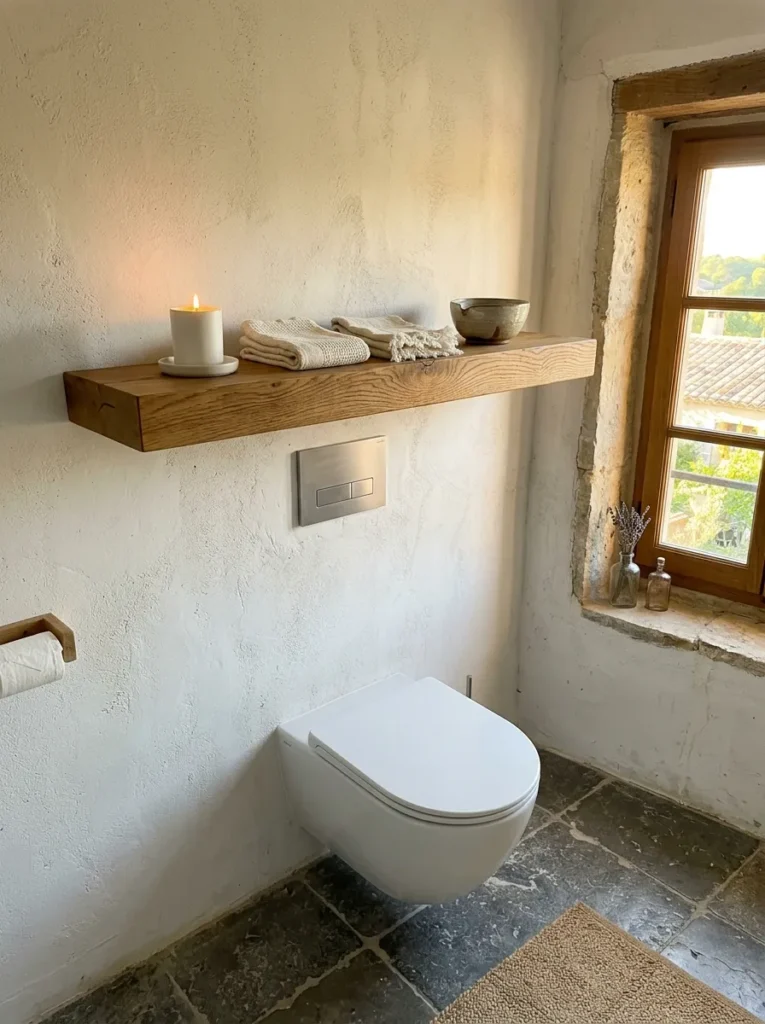
A timber element in a bright white bathroom — a teak bath mat, a floating shelf in white oak, a vanity panel in pale ash veneer — introduces organic warmth that no white surface provides and that the room needs if it is going to feel like a place to relax rather than a room to clean. The timber does not need to be structural or large. A single floating shelf in solid white-oiled oak positioned above the toilet or beside the vanity, holding three or four considered objects, introduces both material warmth and the human quality of a surface chosen for how it feels as well as how it looks. The contrast between the white and the timber is what makes both read more distinctly.
13. Select a Vanity Unit with Furniture-Style Legs Rather Than a Box Base
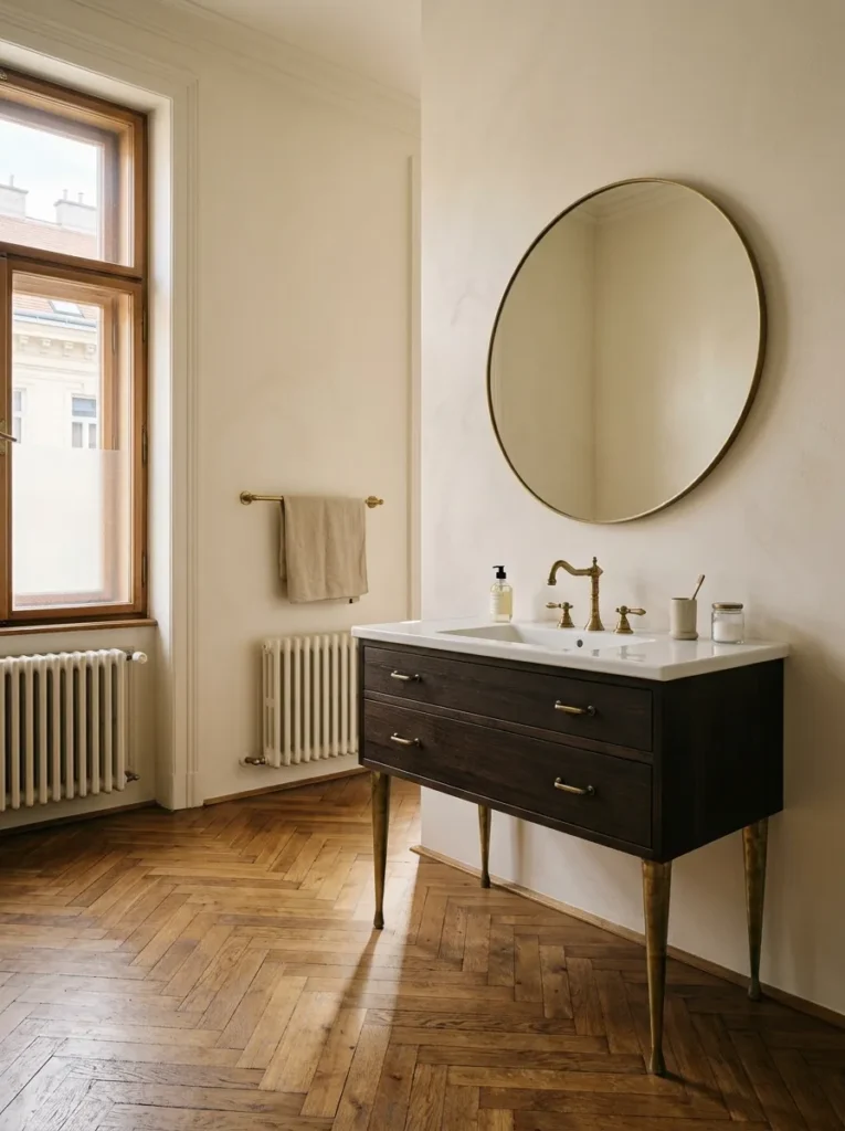
The standard box-base vanity unit — a solid cabinet that runs from the vanity top to the floor — blocks the floor plane and makes the bathroom feel smaller than it is, regardless of the room’s actual dimensions. A vanity with furniture-style legs — whether turned, tapered, or bracket-style — reveals the floor beneath it and allows the eye to travel under the vanity and across the continuous floor to the far wall. This optical effect makes the room read as deeper than it actually is, which matters significantly in smaller white bathroom interiors. The floor visibility also makes cleaning easier and prevents the base from collecting the moisture that enclosed box-base units trap.
14. Paint the Ceiling a Shade Warmer Than the Walls
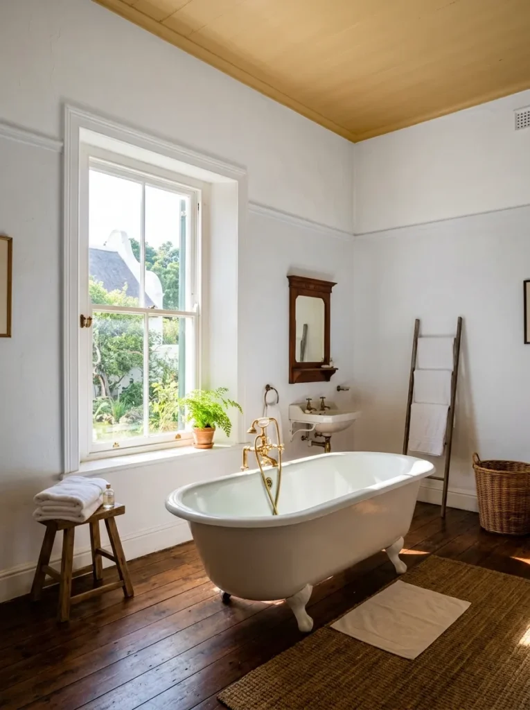
Most white bathroom ceilings are painted in pure white, which creates a tonal coldness at the room’s highest surface that competes with the warm-white walls below and makes the room feel unresolved. A ceiling painted one shade warmer and lighter than the walls — in a warm ivory or the palest version of the wall tone — creates a subtle cocooning effect without reducing the brightness. The warmth at ceiling level reflects downward into the room and complements rather than fights the wall tone. The change is barely perceptible to anyone who has not seen the before-and-after, but the resulting atmosphere is noticeably more resolved and comfortable.
15. Use Zellige or Handmade Tile in the Shower for Artisan Character
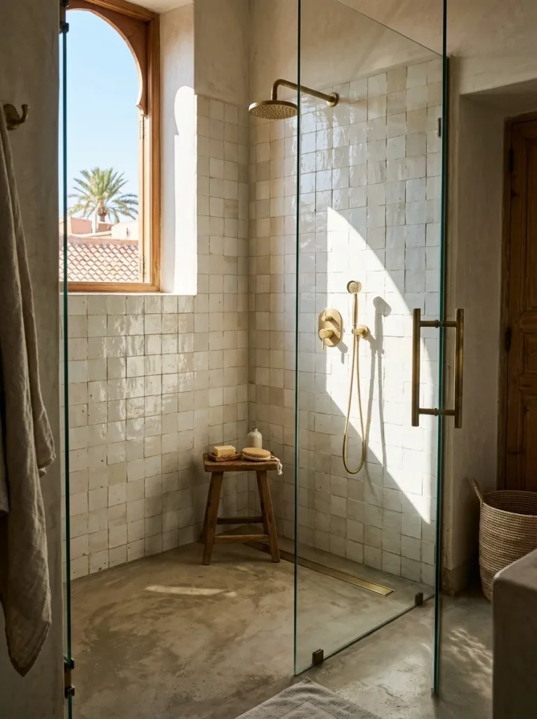
Machine-made tiles have a uniformity that reads as manufactured — every tile the same gloss, the same dimension, the same surface quality — which suits a minimalist bathroom but gives a white bathroom scheme a slightly corporate quality when used exclusively. Handmade Zellige tile or hand-pressed ceramic in a white or near-white glaze has visible tonal variation, slight dimensional irregularity, and a surface depth that machine tiles categorically lack. Used on the shower wall or as a feature across the vanity backsplash, these tiles make the room read as artisanal and considered. The variation between individual tiles is what you are paying for, not despite it.
16. Keep Every Horizontal Surface Almost Completely Clear
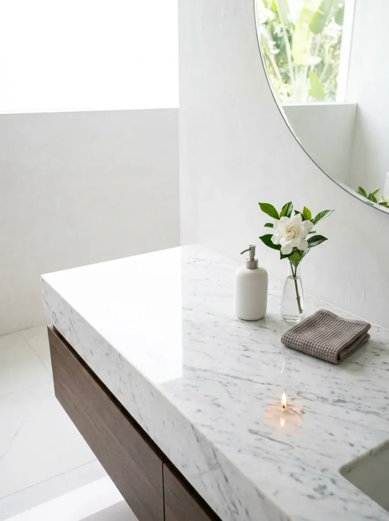
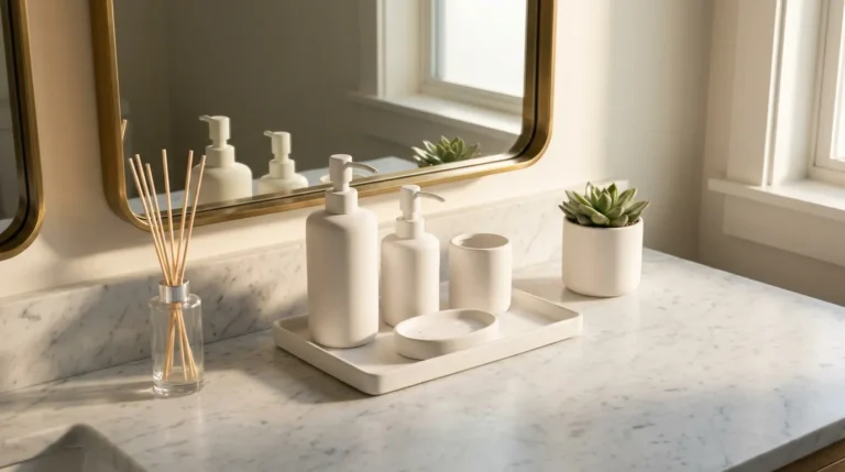
The cleanliness of a timeless white bathroom is produced as much by restraint in object placement as by the quality of any fixture or finish. A white bathroom with six products on the vanity counter, a candle, a soap dish, a hand cream bottle, a toothbrush holder, and a small plant reads as cluttered regardless of how beautiful the individual tiles and fittings are. Three objects on the vanity surface, maximum. Two objects on the bath surround. One object on the toilet cistern. Everything else in a cabinet, a drawer, or behind a door. The room’s white surfaces need clear floor space and clear counter space to breathe, and breathing is what makes a bright bathroom feel spa-like rather than functional.
17. Install Heated Towel Rails in a Matching Matte Finish to the Taps
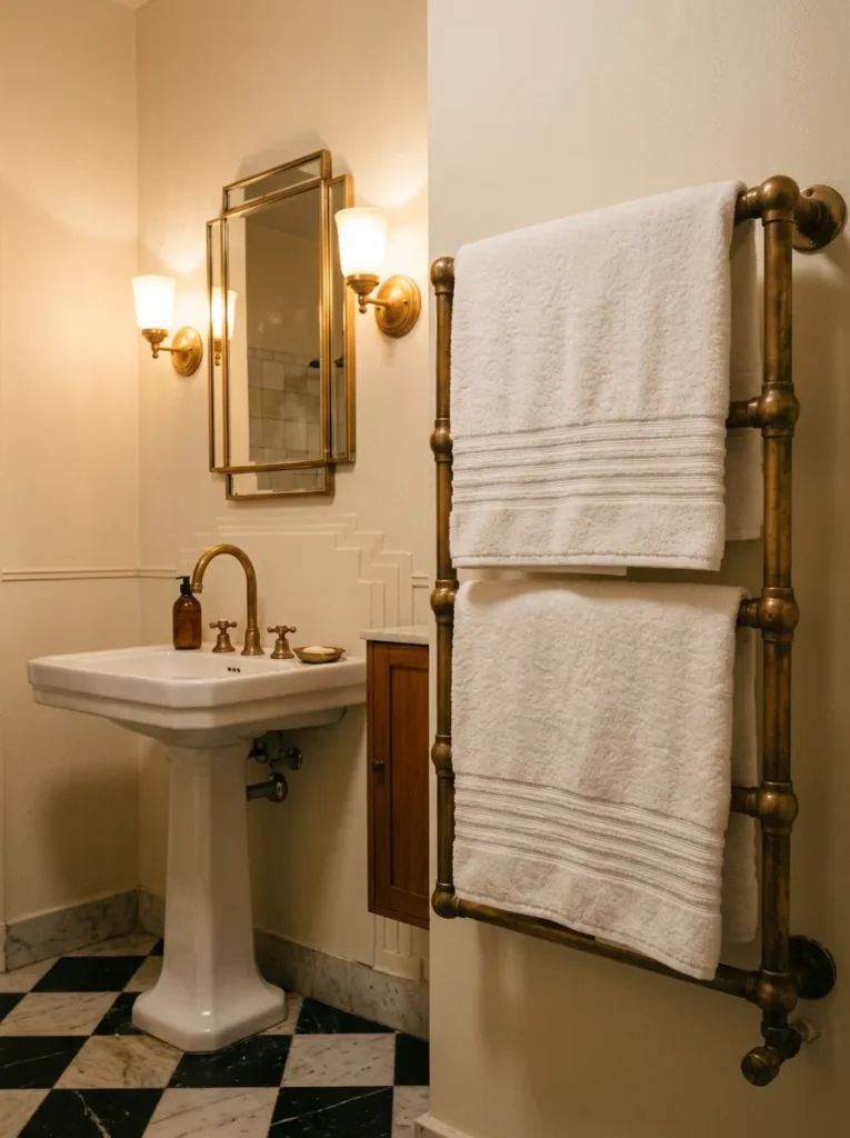
Mismatched metal finishes in a white bathroom are more visible than in any other bathroom palette, precisely because there is nothing else to look at. A matte black tap set and a chrome towel rail in the same white bathroom read as two different rooms assembled in one space. Match the heated towel rail finish to the tap set finish — matte black to matte black, unlacquered brass to unlacquered brass — and both read as part of a considered material selection rather than separate purchases made at different times. The towel rail should also be heated rather than purely decorative, and sized to hold two bath towels without folding them across each other.
18. Never Buy White Tiles That All Come From the Same Batch
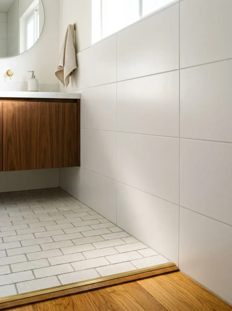
This is the most counterintuitive advice on this entire list, and the most practically important for anyone doing a white bathroom renovation. Tiles from the same production batch have the same shade variation level — their color consistency is maximised. In a purely white bathroom, that consistency becomes flatness, and flatness becomes the thing that makes the room feel built rather than designed. Ordering tiles from two or three different batches — or mixing a smooth large-format wall tile with a textured smaller-format floor tile from a different manufacturer entirely — introduces the kind of subtle tonal and textural variation that makes a room read as layered. Uniform perfection reads as absence of decision. A small mismatch, handled deliberately, reads as taste.
Final Thoughts
A white bathroom ideas list is, in the end, a guide to understanding what white actually is in an interior context — not a single color but a family of surface decisions, each of which either contributes to or subtracts from the quality of light and warmth the room can hold. Start with the paint tone and the tile format, because those two decisions have more impact on the room’s atmosphere than anything else. Then address the fixture finishes, the floor temperature, and the discipline of surface restraint. The bathroom will tell you when enough decisions have been made. The rooms that feel most genuinely bright and timeless are almost always the ones where the owner stopped adding things one step earlier than felt comfortable. That discomfort is usually the correct moment to stop.
Save these white bathroom ideas for your next bathroom renovation or refresh project.