22 White Living Room Ideas That Feel Soft and Elegant
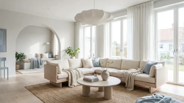
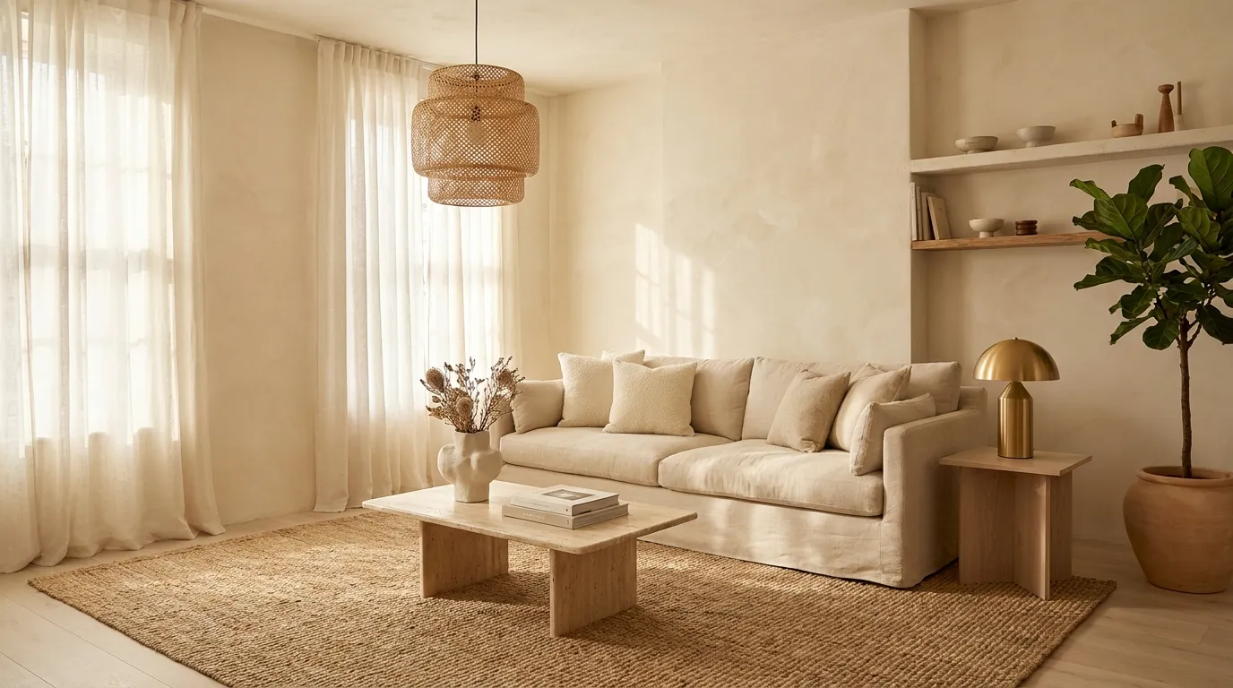
White living rooms tend to polarize. Done carelessly, they read like a show home that nobody actually lives in — bright, flat, and slightly cold. Done well, they’re among the most quietly compelling interiors possible: rooms that feel calm without being empty, refined without being precious, and bright without being harsh.
The challenge isn’t choosing white. It’s understanding that white alone is never a palette — it’s a starting point. What you layer on top of it, beneath it, and alongside it determines whether the result feels soft and inhabited or clinical and staged. This guide covers 22 specific ideas for getting that balance right, from foundational decisions about paint undertones to smaller finishing choices that shift the entire mood. Whether your room is large and open or compact and shaded, at least a dozen of these will apply directly to your situation.
1. Choose an Off-White That Reads Warm, Not Stark
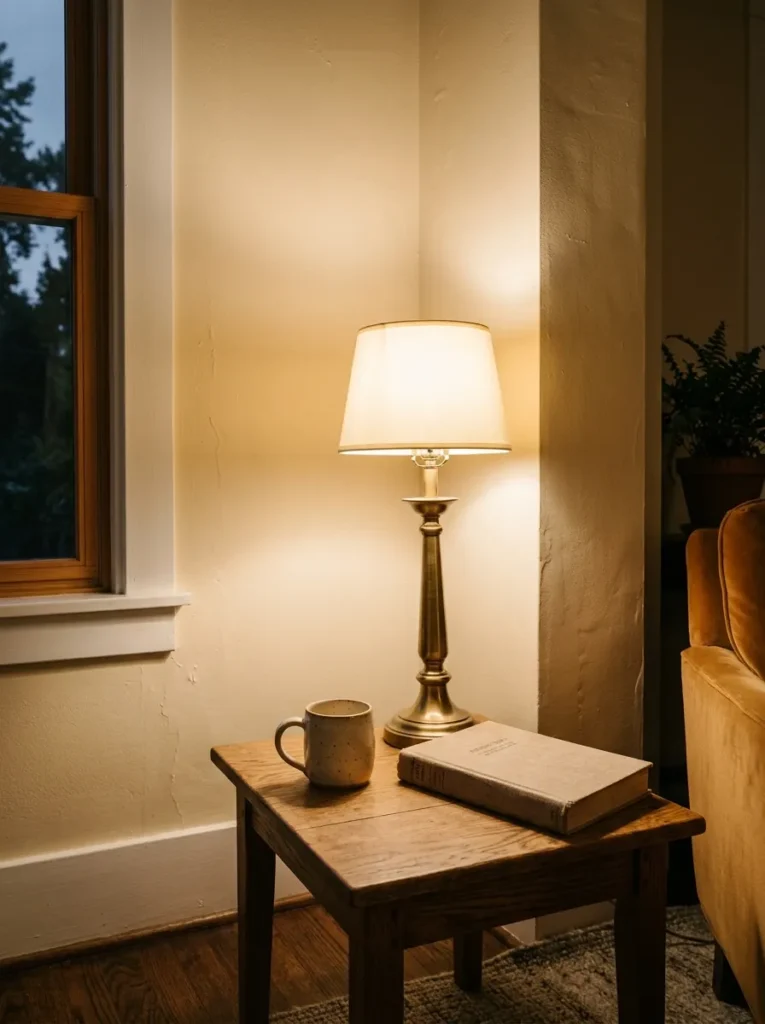
The single decision that shapes everything else in a white living room is paint undertone. Bright, cool whites — those with blue or grey bases — amplify natural light beautifully in south-facing rooms but can feel antiseptic under artificial light or in rooms that don’t receive direct sun. Warm off-whites — those with cream, yellow, or pink undertones — hold better across lighting conditions and feel genuinely welcoming rather than correct.
Before committing to a shade, test large painted swatches (at least A4 size) on different walls and observe them at three points in the day: morning, midday, and evening with lamps on. A white that appears soft at noon can look grey by 6pm. This matters more in living rooms than almost any other space because you use them across the whole day. If your room receives low natural light, a cooler white will compound the problem — lean toward cream-adjacent tones like linen white, natural white, or pale warm ivory instead.
2. Use Limewash or Textured Paint Instead of Flat White
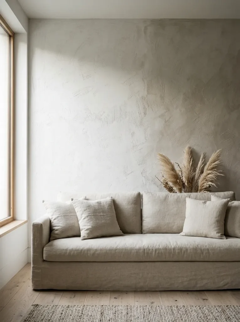
A perfectly flat, smooth white wall is the hardest version of this palette to make look intentional. It reads as either unfinished or clinical depending on the room. Limewash paint — or its plaster equivalents — solves this by creating natural tonal variation across the surface. The wall appears lighter where light strikes it and slightly deeper in shadow, giving the room a sense of texture without any physical relief.
This approach suits period properties and rooms with architectural character, but it also works in new-build spaces where the walls lack personality. The uneven quality of limewash reads as warm and handmade rather than cheap, particularly when walls aren’t perfectly smooth. Application is more involved than standard paint — it typically requires two to three coats with varying brush directions — but the result eliminates the sterility problem that flat white creates. It also photographs exceptionally well, which matters if you care about how the room reads in limewash.
3. Anchor the Room with a Natural-Fiber Rug
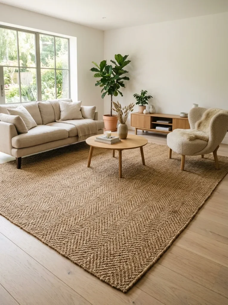
A white living room without a rug almost always looks unfinished, regardless of how carefully everything else is styled. The floor reads as a visual gap between furniture and wall, and without a rug, the room struggles to feel defined. Natural-fiber rugs — jute, sisal, seagrass, or a wool flatweave — are the most useful here because their inherent texture and warm neutral tones provide contrast without competing with the white palette.
For sizing: a rug that extends at least partway under the front legs of all seating creates a properly anchored conversation area. In larger rooms, going fully under all furniture is usually better. The mistake most people make is choosing a rug too small — one that floats in the middle of the room without actually connecting to anything. A jute rug with visible weave variation does more visual work than a pale, smooth rug that nearly disappears against light flooring.
4. Layer Multiple Whites Rather Than Match Them Exactly
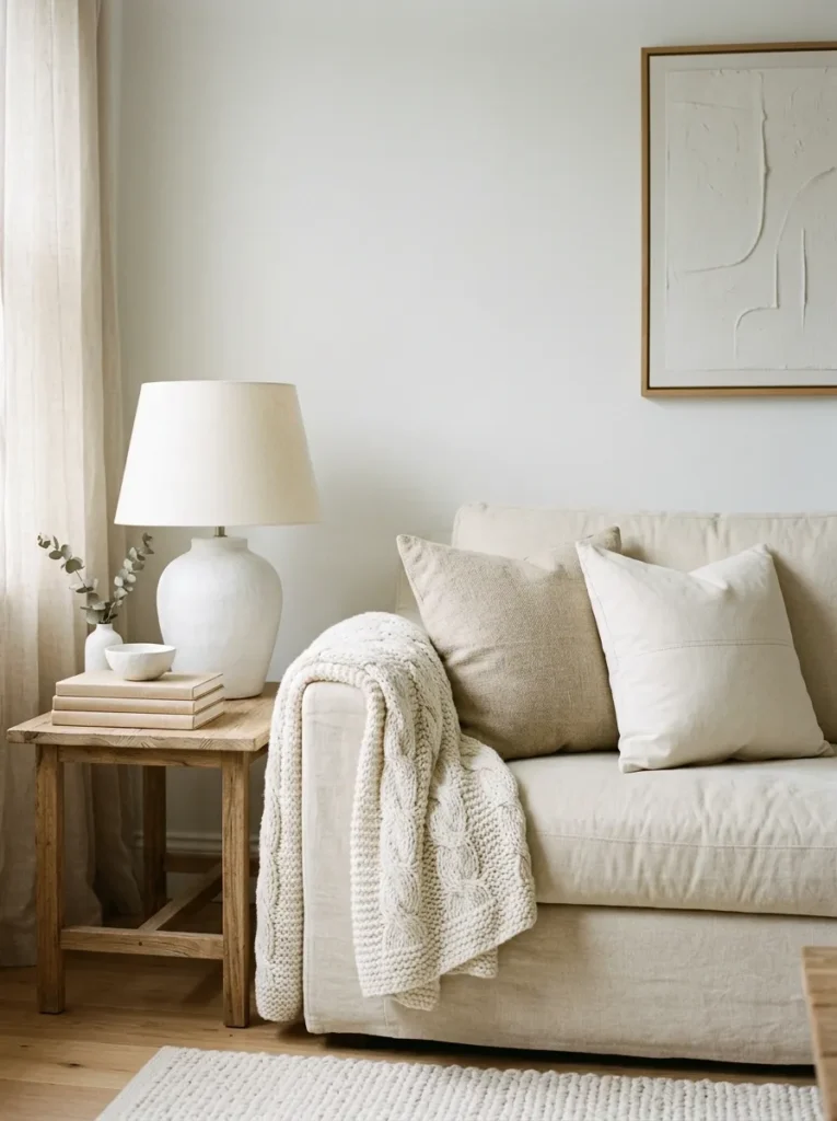
Rooms where every white element — walls, sofa, shelving, cushions — is precisely the same shade tend to look either coordinated to the point of stiffness or, paradoxically, mismatched, because real-world whites never photograph or read identically under changing light. A more useful approach is to deliberately vary the whites across different surfaces.
Warm white walls work well alongside an ivory linen sofa, chalky white shelving, and an off-white wool throw. Each reads as white but carries a slightly different temperature and finish, and the layering produces depth that a single matched tone cannot. The key is keeping all chosen whites in the same temperature family — all warm, or all cool — rather than accidentally mixing a cream sofa against a blue-white wall, which creates visual tension that most people find uncomfortable without being able to identify why.
5. Bring in Wood to Break the Monochrome
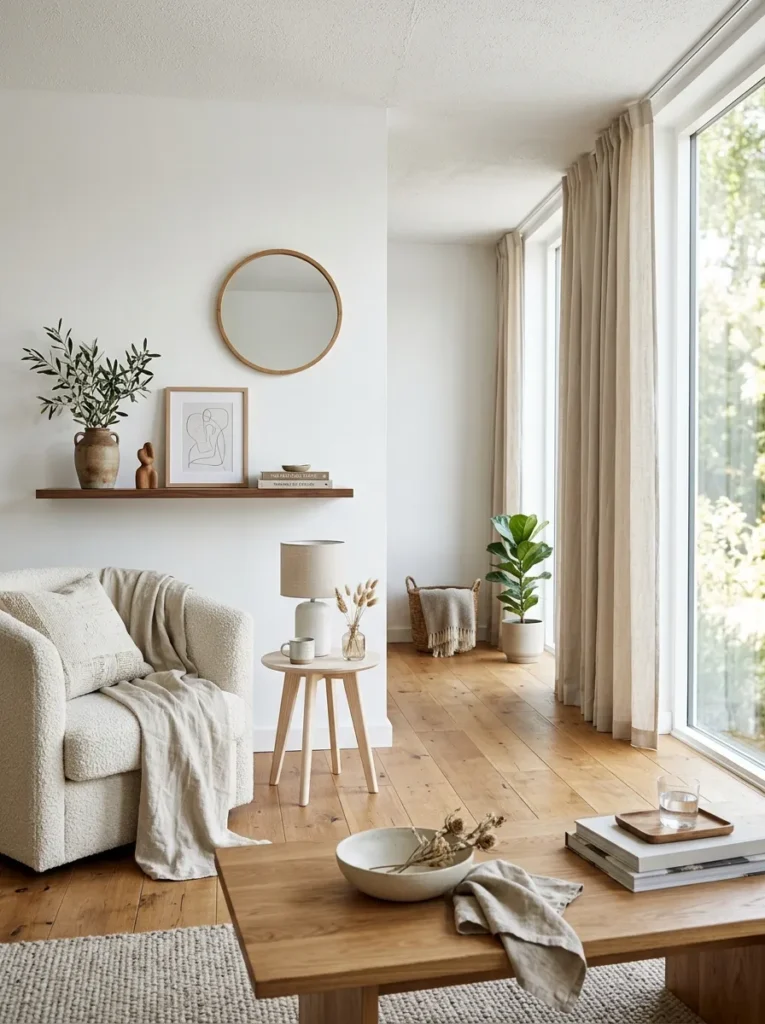
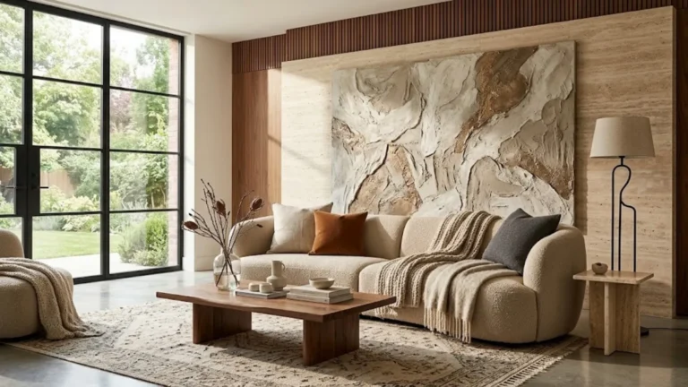
Natural wood is the most reliable material to introduce alongside a white palette because it provides warmth, visual weight, and organic variation without introducing a competing color. The tone of the wood shapes the result significantly: pale oak and ash keep the room light and Scandinavian-adjacent; medium walnut or teak add richness and warmth; darker woods — ebony, wenge — create stronger contrast and suit more dramatic styling.
The distribution matters as much as the choice. Rather than one large wood piece, consider introducing it across multiple surfaces at different heights: a low oak coffee table, a floating walnut shelf, a side table, or exposed wood flooring. This distributes the warmth evenly through the room rather than concentrating it in a single zone. Avoid wood that is uniformly orange-toned — it tends to read cheaply against white rather than warmly.
6. Choose a Sofa in Textured Neutral Fabric
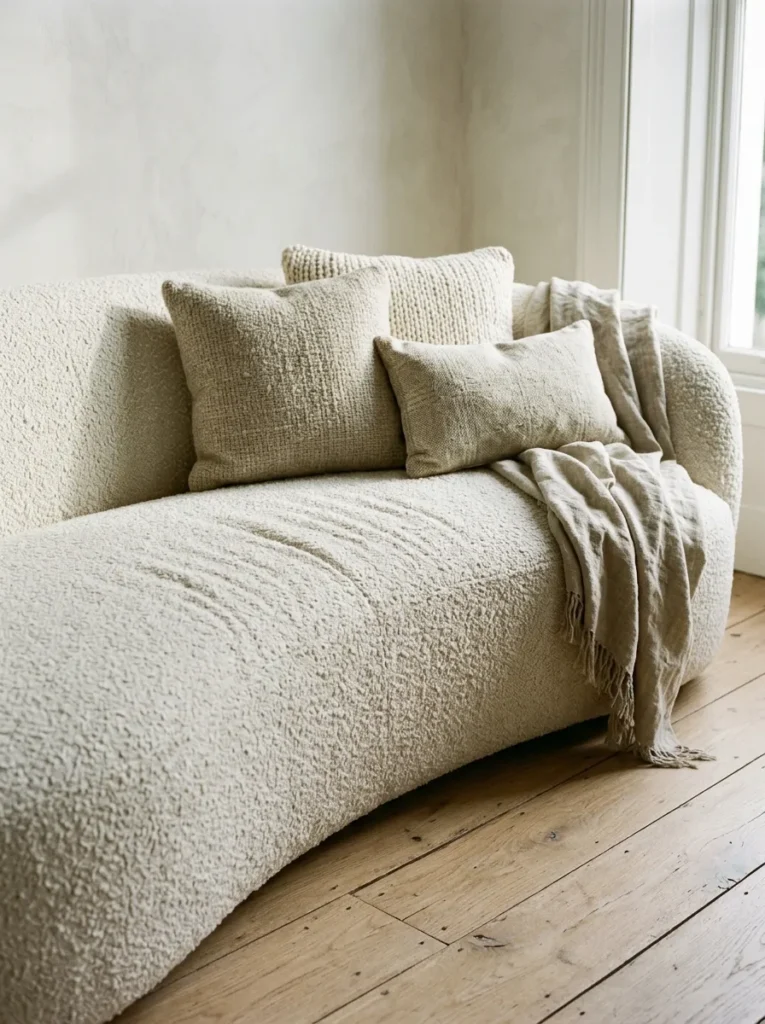
A white sofa is aspirational for good reason — it reads beautifully in photographs and in well-lit rooms — but it’s a genuine commitment. The practical alternative that maintains a soft, pale atmosphere without the maintenance burden is a sofa in textured neutral fabric: bouclé, washed linen, heavy cotton slub, or ribbed velvet in a tone close to the wall.
Bouclé in particular has become almost synonymous with the soft white living room aesthetic, and for functional reasons: the looped texture catches light differently from different angles, adding visual interest that a smooth fabric cannot, and the off-white to cream tones in most bouclé reads distinctly warmer than white walls, naturally creating that layered palette without effort. For families or renters with pets, a sofa cover in a washable linen weave achieves a similar effect with considerably more practicality.
7. Use Linen or Cotton Curtains That Pool Gently at the Floor
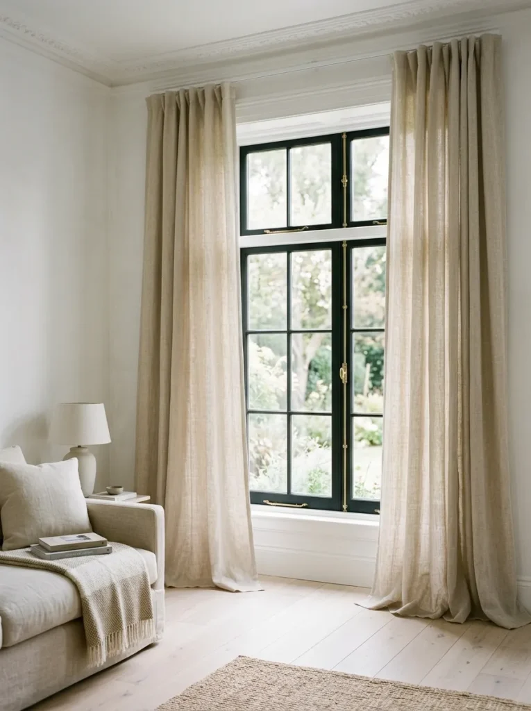
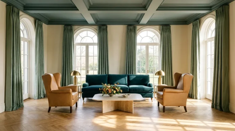
Window treatment is where many white living rooms lose the softness they’ve built elsewhere. Roller blinds — while clean and practical — flatten the room. Curtains in a natural fabric, hung high and wide of the window frame and allowed to fall to the floor (or pool slightly), create vertical structure, softness, and a sense of height that no blind achieves.
For a white room, the fabric weight and opacity matters more than the color. Unlined linen in an undyed or natural white allows light to filter through during the day — giving the room a gauzy, luminous quality — while still providing some privacy. Blackout lining can be added if needed without changing the visual quality from the front. The most common mistake is hanging curtains at the window frame rather than at the ceiling. Even modest ceilings read taller when curtains start near the cornice and finish at the floor.
8. Introduce Plaster or Concrete Textured Accessories
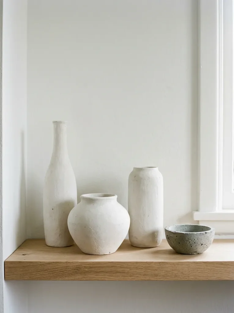
In an all-white or near-white room, accessories in plaster, unfired clay, or concrete carry visual weight without introducing color. A group of sculptural vases in matte plaster, a concrete table lamp, or an undyed ceramic bowl on a coffee table reads as part of the architecture rather than decoration, which suits the restrained quality that makes white rooms work well.
The matte surface of these materials absorbs light rather than reflecting it, which softens the room further. Glossy ceramics or mirrored surfaces can work, but they add a more contrasting energy. For rooms that feel too empty or too styled in equal measure, an arrangement of two or three plaster objects at different heights on a shelf or sideboard is one of the most straightforward ways to add presence without disrupting the palette.
9. Create a Feature Wall with Vertical Panelling
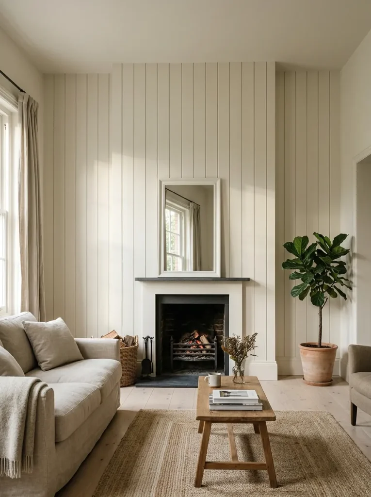
When a room is entirely white, some surfaces need to carry more architectural interest than a flat painted wall can provide. Vertical tongue-and-groove panelling — painted in the same white as the surrounding walls — creates shadow lines that give depth and rhythm to the surface without adding color. It reads as texture rather than pattern, which suits a restrained palette.
This works particularly well on a chimney breast, a TV wall, or a wall behind a primary seating arrangement. The shadow lines created by the panel relief vary with the time of day and the position of natural light, which means the wall reads differently at different hours — a useful quality in a room where visual interest depends on material and light rather than color. It also resolves a specific problem: long, flat walls that feel too prominent and too plain in a white room.
10. Layer Throws and Cushions in Varied Textures, Same Tone Family
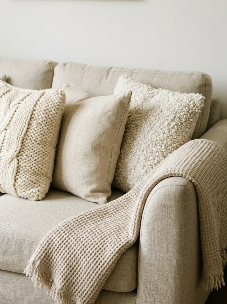
Cushions and throws are where white living rooms most often go wrong in one of two directions: either everything is too matched and the result looks like a hotel lobby, or the room is styled with too many contrasting colors and the white palette loses its coherence. The more useful approach is to vary the texture significantly while keeping the tonal range tight.
Consider cushions in a boucle weave alongside smooth cotton, a knitted or waffle-texture throw alongside a flat linen one — all in tones from cream through natural white to pale oatmeal. The eye reads the contrast between surfaces (rough against smooth, matte against slightly shiny) rather than demanding color contrast, and the result feels layered and lived-in rather than flat. Five to seven cushions on a large sofa reads full without becoming cluttered; three to four on a smaller piece is usually the limit before the proportions tip into overwhelm.
11. Use a Statement Lighting Fixture to Add Visual Drama
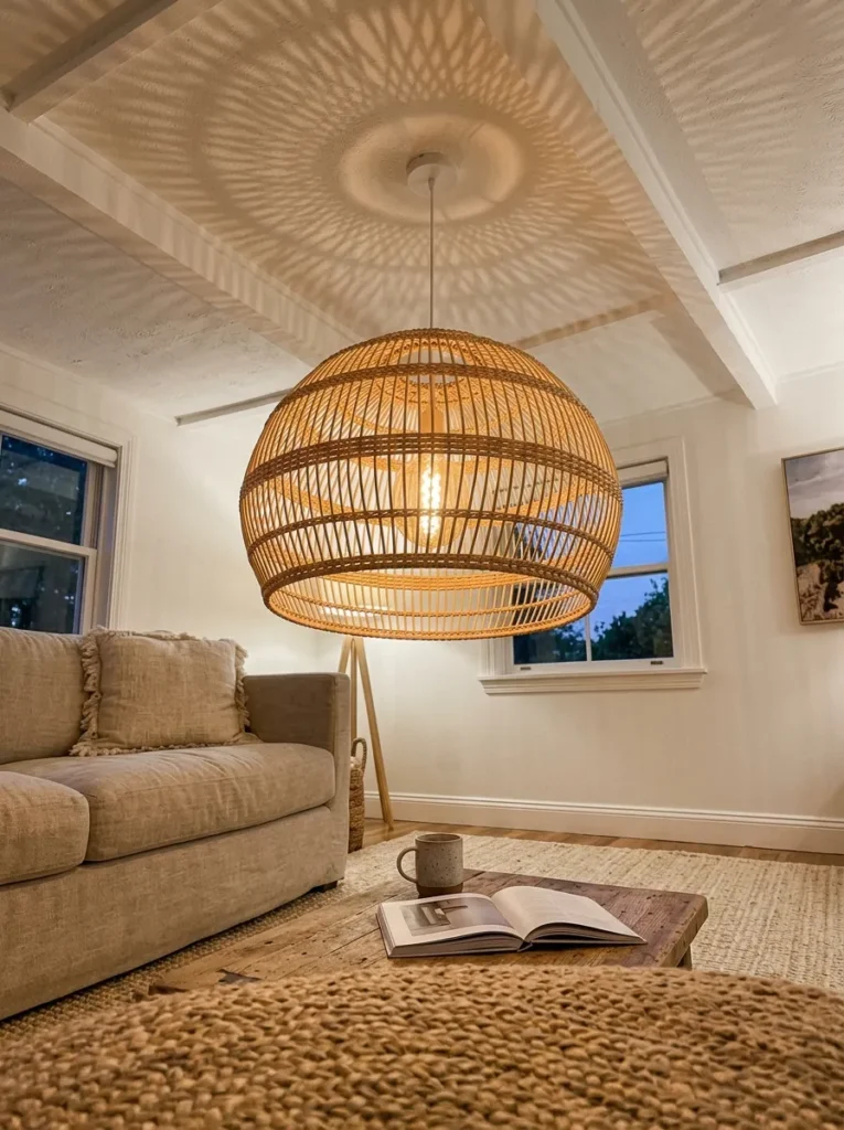
Lighting is the most underused design element in white living rooms, where the assumption often is that a bright room needs less lighting intervention. The opposite is true: a white room with only recessed ceiling lights tends to look flat and institutional after dark. A single statement pendant or chandelier — in rattan, aged brass, sculptural ceramic, or smoked glass — introduces a focal point that the room needs without adding wall color.
Position matters considerably. A pendant hung low over a coffee table (ideally 70–90cm above the surface, adjusted for ceiling height) creates an intimate pool of light that makes the seating area feel defined. Rattan pendants add an organic warmth that suits the natural-material direction; aged brass fixtures complement warm whites; black iron or smoked glass creates stronger contrast and suits a room with more considered, spare styling. Table lamps on sideboards and bookshelves add additional layers of light and prevent the room from feeling reliant on a single source.
12. Style Open Shelving with Restraint and Variation
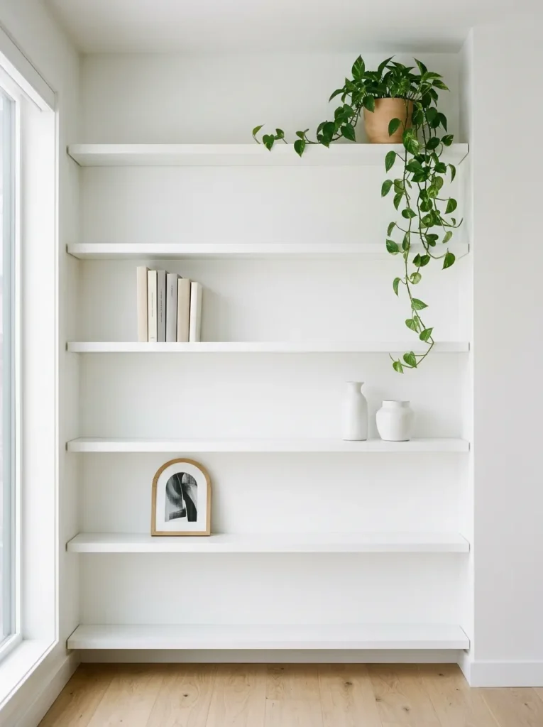
Open shelving in a white living room is a styling challenge that most people underestimate. The instinct — particularly on Pinterest — is to fill shelves densely with books, plants, and objects. The more difficult and more effective approach is to leave meaningful negative space, keep a coherent palette on the shelf, and vary the height and type of object so the eye moves across the arrangement rather than stopping at any one point.
In a white room, shelving works best when the shelf back is left white (matching the walls) and objects are kept within a narrow tonal range: natural wood, white ceramics, books with neutral or removed dust jackets, the occasional trailing plant. An overcrowded shelf in a white room makes the whole room feel smaller and noisier. A restrained shelf — perhaps half full — reads as intentional and adds to the sense of calm the palette creates.
13. Add an Arched Doorway or Decorative Arch Detail
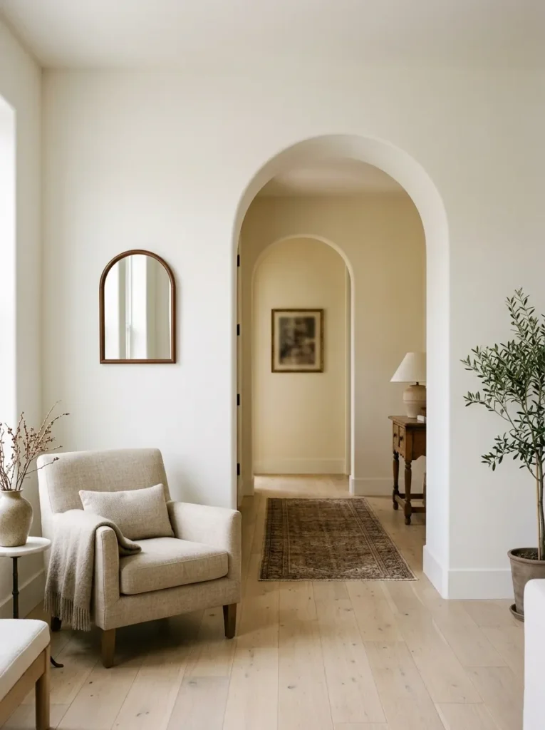
Architectural arches are among the most effective ways to add softness to a white room without any additional color or material, because the curved line itself breaks the rigid geometry of square corners and flat walls. In rooms where an existing arch is present, painting it the same white as the surrounding wall unifies the space. In rooms without one, a freestanding arch frame, an arched alcove created with plasterboard, or even a large arched mirror can introduce the same curve at lower commitment.
An arched mirror in particular is worth considering for smaller white living rooms. Positioned to reflect a window or a well-lit wall rather than a dark corner, it adds perceived depth, the visual softness of the curved frame, and additional light — without requiring any structural work. Choose a frame in aged plaster, raw wood, or unlacquered brass rather than chrome or high-gloss white for a result that sits quietly within the palette.
14. Introduce Indoor Plants That Stay Green Year-Round
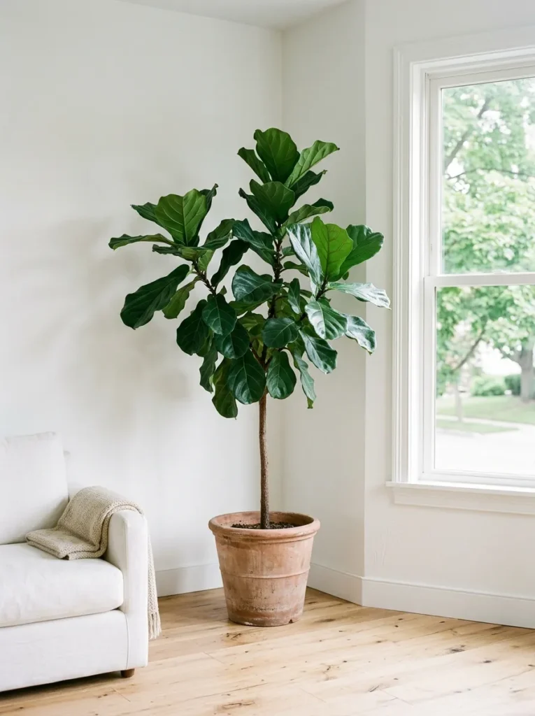
White rooms absorb plant life particularly well because the contrast between the pale background and green foliage is immediately legible without effort. The most useful plants for a white living room — in terms of both visual effect and practicality — are those with structural shape rather than sprawling, unpredictable growth: a fiddle-leaf fig, a large-leaf monstera, a tall snake plant, or a cluster of trailing pothos at a higher level.
The container matters more in a white room than in a busier scheme. Unglazed terracotta, raw concrete pots, or matte white ceramic all work without competing with the palette. Painted or colored pots can become the dominant accent if placed prominently, which may or may not be the intention. For rooms with limited natural light, a single large structural plant — positioned to receive as much indirect light as possible — reads more effectively than multiple small ones scattered around.
15. Create a Reading Corner with a Linen Chair and Floor Lamp
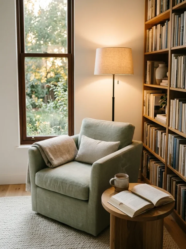
A white living room without a defined secondary seating area can feel either very large or slightly purposeless, depending on scale. A linen armchair — positioned at an angle in a corner, near a window, or beside a bookshelf — creates a human-scale point of rest within the larger room. In a white scheme, the chair reads best in a tone that is related but distinctly different from the sofa: a pale sage linen, a deep but muted terracotta, or a natural undyed canvas all hold their place within the palette without jarring.
A floor lamp with a natural linen shade positioned beside the chair serves double function: it creates a visual grouping that reads as a zone, and it provides directional light for reading that’s warmer and more flattering than overhead lighting. This combination — chair, lamp, small side table — requires a footprint of roughly 150x150cm and suits rooms that have at least one corner or alcove to spare.
16. Keep the Coffee Table Low and Grounded
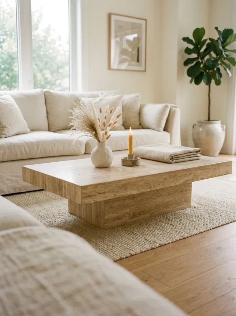
Coffee table height and proportion have a disproportionate effect on how a white living room feels. A table that sits too high brings the visual weight of the room upward, making the space feel crowded. A low, wide coffee table — in stone, solid wood, or a travertine-look material — keeps the visual weight close to the floor, which makes high ceilings feel taller and smaller rooms feel less pressured.
Travertine and limewashed stone surfaces photograph particularly well in white rooms and suit the natural-material direction better than glass (which disappears and creates no visual grounding) or dark stained wood (which can create too much contrast in an otherwise pale scheme). For larger rooms, two smaller tables used together — either identical or intentionally mismatched — allows flexibility for foot traffic and creates a more relaxed, less hotel-lobby impression than a single large rectangle.
17. Use White-on-White Tonal Wallpaper on a Single Wall
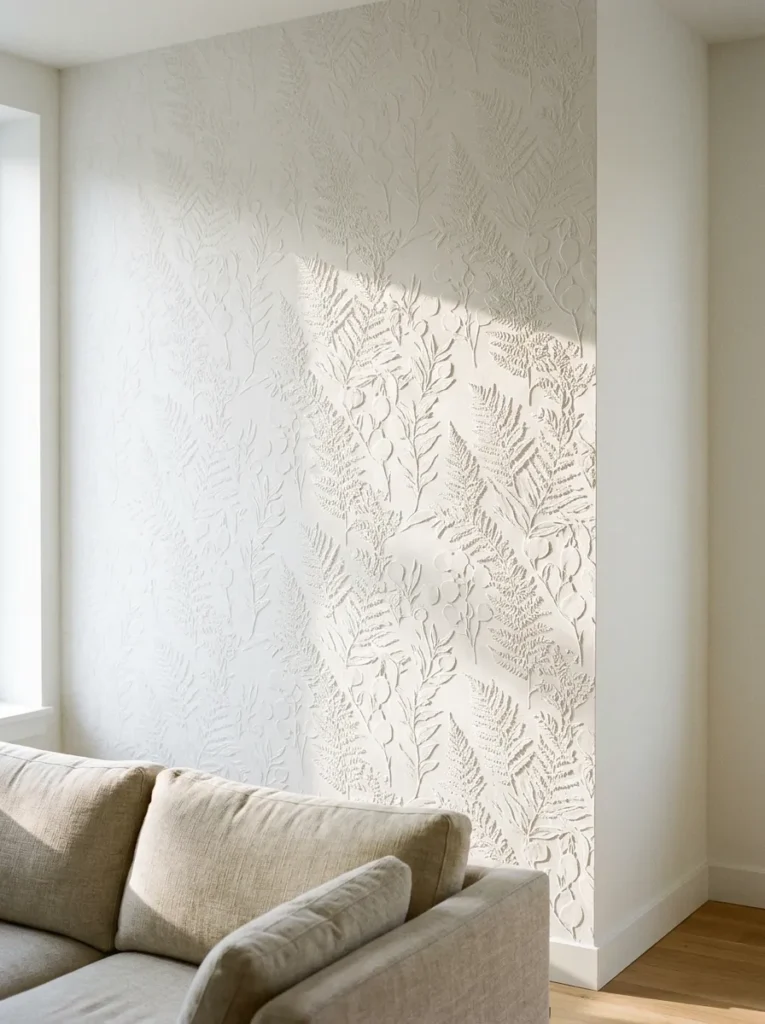
Where paint feels too plain but a patterned wallpaper would disrupt the white palette, tonal white wallpaper — textured weaves, embossed geometric patterns, or botanical prints in white on white — occupies a useful middle ground. The pattern reads subtly, contributing texture and depth without introducing a visible second color, and changes character significantly depending on the angle of light.
This works particularly well on a chimney breast or a wall behind a sofa. In direct light, the pattern nearly disappears. In raking light from a window or lamp at the side of the room, the embossed surface creates gentle shadow that makes the wall feel architectural. The most common mistake with this approach is choosing a pattern that is either too small (the texture reads as noise) or too large (it becomes prominent and competes with the white atmosphere). A medium repeat — botanical leaves, a geometric stripe, or a loose linen weave — tends to sit best.
18. Frame Windows with Deep Reveals for a Considered Look
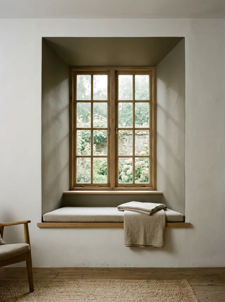
In rooms where windows sit within walls of reasonable depth, the reveal — the recessed interior between the window frame and the room wall — is a detail worth considering separately. Painting the reveal in a white that is two to three shades darker than the room walls creates a shadow-box effect that makes the window look more considered and the room more architectural, without introducing a second color.
Conversely, painting the reveal the same bright white as the window frame rather than matching the room walls can make windows appear smaller and more isolated. The deeper reveal treatment works especially well with casement windows in period properties or with window seats, where the additional depth becomes functional as well as visual. If your walls are thin and reveals minimal, linen curtains pulled well outside the frame achieve a similar impression of depth and deliberateness.
19. Choose Furniture with Visible Legs Rather Than Block Bases
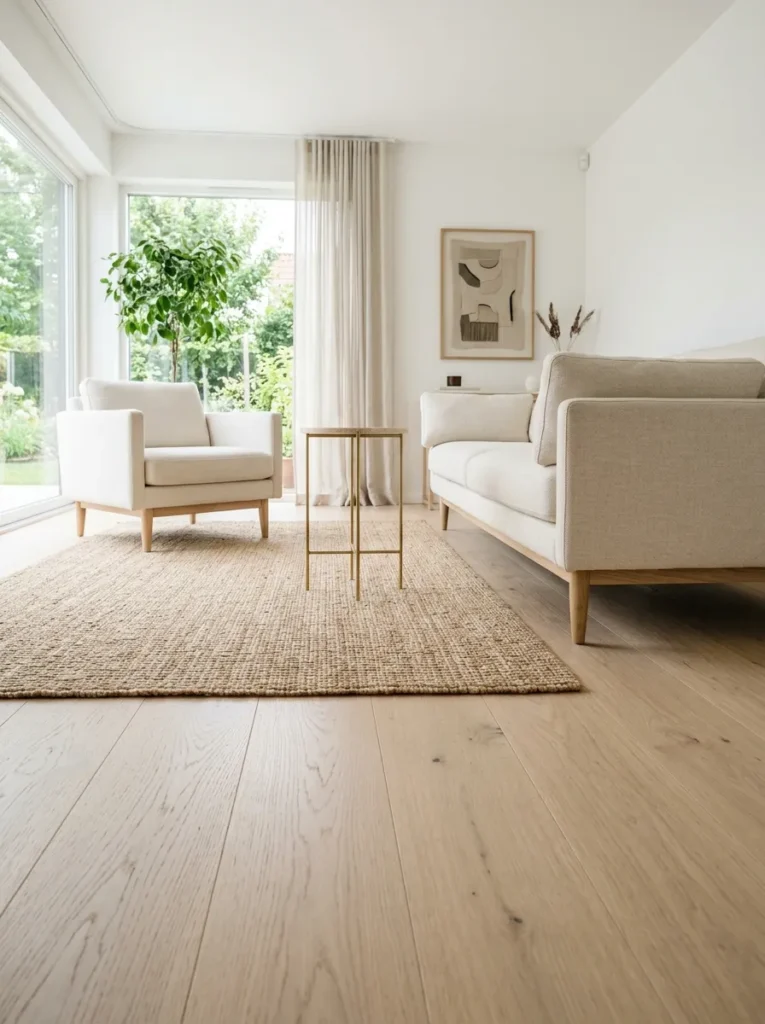
In a pale, open living room, furniture that sits on visible legs allows the floor — whether wood, stone, or a natural rug — to read continuously beneath the pieces. This makes even small rooms feel less divided and more spacious than sofas, armchairs, or sideboards that sit flat on the floor and form visual barriers. Sofas with slender wood or metal legs, armchairs on tapered timber legs, and sideboards raised on a plinth of similar material all maintain visual floor continuity.
The leg finish should relate to the room’s other metal or wood tones — brass legs on furniture pair with brass fixtures; oak legs reference oak shelving or flooring. In all-white rooms with pale floors, furniture on very dark or black legs can read as unanchored and jarring. Natural wood, unlacquered brass, or painted white legs integrate most smoothly.
20. Use Artwork Thoughtfully to Anchor the Palette
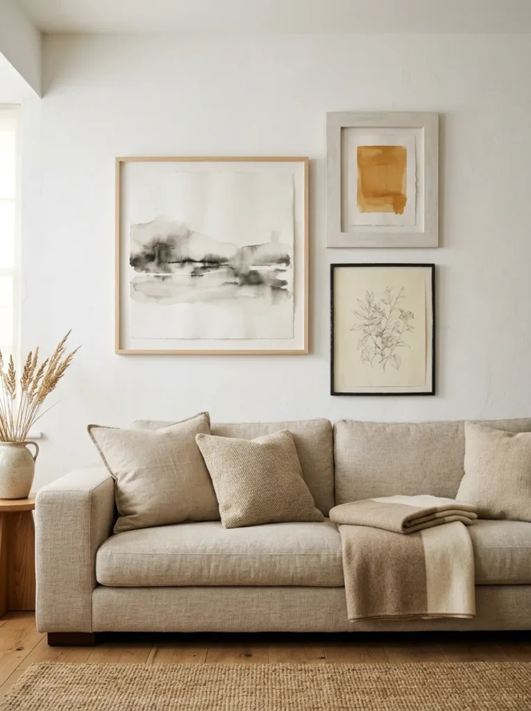
Artwork is where white living rooms most often become either too safe (all white and grey with minimal visual interest) or accidentally disrupted (a large colorful painting that contradicts the whole atmosphere the room has built). The most sustainable approach for a white scheme is to lean toward art in warm neutrals, ink studies, pencil or charcoal drawings, washed-out photography, or abstract work in ochre, terracotta, or sage — tones that relate to the room’s natural material accents.
Frame choice matters considerably in a white room. White frames disappear against white walls, which is sometimes the intention but often just means the art floats without presence. Thin oak or ash frames, aged plaster frames, or raw metal in a dark tone all give the artwork a defined edge against the wall. For gallery arrangements: odd numbers read more naturally than symmetrical pairs; varying frame widths across pieces adds interest without visual chaos; and spacing of 5–8cm between frames in a cluster looks considered rather than cramped.
21. Incorporate Woven or Rattan Elements for Organic Contrast
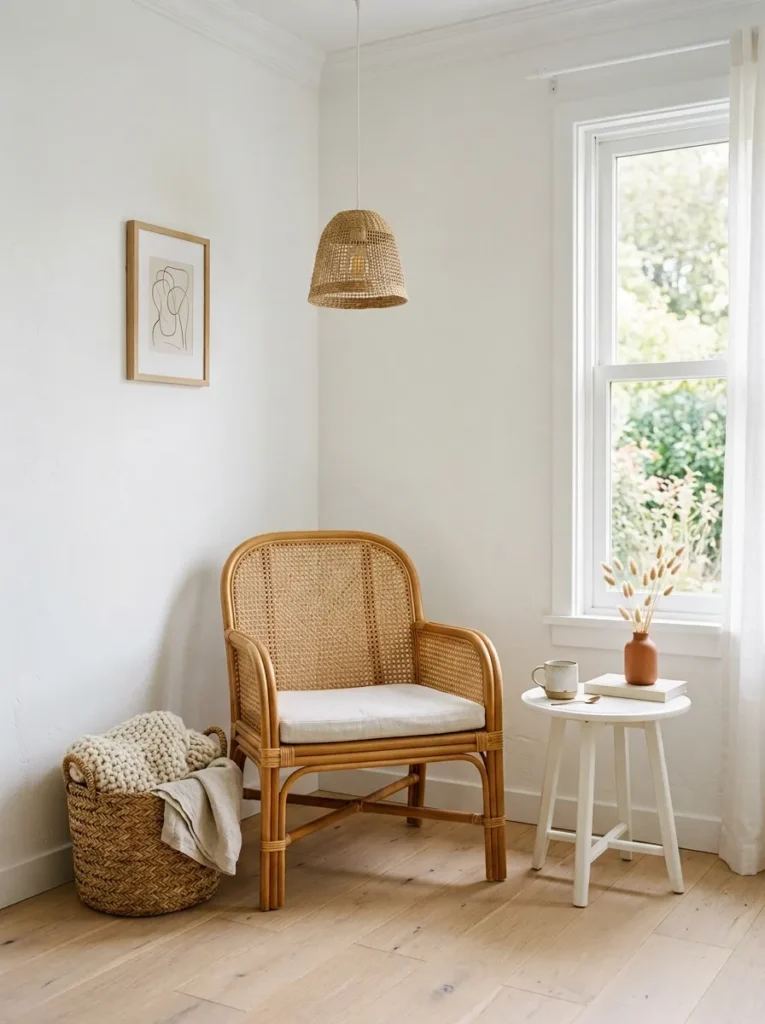
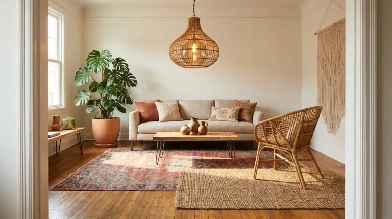
Woven furniture and accessories — rattan, cane, water hyacinth, seagrass — provide some of the best contrast available in a white living room because they bring organic, irregular pattern without introducing a competing paint color. A rattan side chair, a woven pendant shade, a seagrass basket used for blanket storage, or cane-fronted cabinet doors all read warmly against white walls and introduce a material vocabulary that is relaxed and handmade.
The practical consideration is positioning: woven materials can feel out of place in very formal or very spare rooms where everything else is smooth and linear. They suit white living rooms that have a relaxed, warm, or slightly bohemian direction — coastal, Scandinavian-organic, or warm minimalist. In a room that is aiming for something crisper or more architectural, a single rattan basket or a cane-detail on one piece of furniture is enough to add warmth without shifting the overall register.
22. Style the Fireplace or Focal Wall as the Room’s Anchor Point
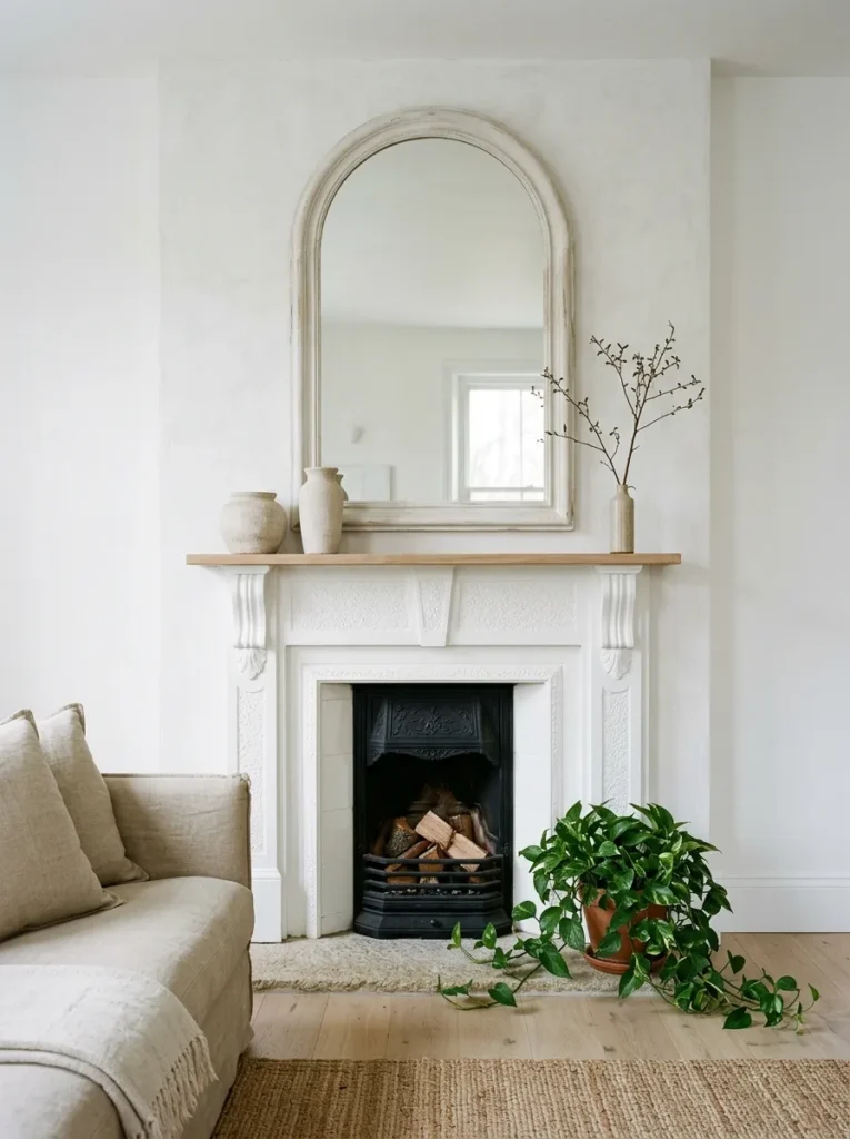
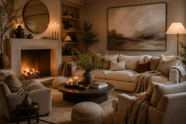
Every living room benefits from a clear visual anchor — a point the eye returns to when taking in the whole space. In a white room where color is largely absent, the focal wall or fireplace needs to do this work through texture, material, and layering rather than contrast. A fireplace painted white but adorned with a textured plaster surround, an oversized arched mirror above the mantel, and a considered arrangement of plaster objects and trailing foliage becomes visually complex enough to anchor the room without introducing a second palette.
For rooms without a fireplace, a floating media unit with a length of driftwood across it, a curated wall of framed artwork, or a structural shelving unit spanning floor to ceiling can serve the same function. The key is that the focal feature must look more considered than the surrounding space — not more colorful, but more layered. A single prominent plant, a large-scale artwork, or a sculptural light fitting can all elevate an otherwise flat wall into a genuine room anchor.
How to Make a White Living Room Feel Warm, Not Clinical
The most common failure in white living rooms is surface uniformity — walls, furniture, and accessories all in the same smooth, pale tone, with nothing to give the eye any place to rest. Warmth in a white room comes from material contrast, not from adding color. Consider which surfaces in your room are currently smooth (walls, sofa fabric, cushions) and then identify where you can introduce rougher, more organic surfaces: a textured rug, a woven throw, unglazed ceramics, a limewash wall, a wood side table.
Lighting layers matter as much as materials. A white room lit only by ceiling lights will always feel flat and slightly clinical; the same room with a floor lamp, a table lamp, and a dimmer on the ceiling fitting feels entirely different by evening. Warm bulb temperatures — 2700K rather than 4000K — are essential in a white room where the walls amplify rather than absorb whatever light quality is present.
The second practical priority is giving the room a visual anchor. White rooms without a clear focal point — a fireplace, a significant artwork, a substantial piece of furniture — feel unresolved. Identify your room’s natural focal wall first and style it with more deliberate layering before addressing the rest of the space.
Final Thoughts
A well-executed white living room is less about choosing the right shade of paint and more about understanding how texture, material, light, and proportion work together in a pale scheme. The ideas that will have the greatest effect are the foundational ones — paint undertone, rug choice, curtain treatment, and lighting — and those decisions should come before styling details like cushions and accessories.
Not every idea here will suit your room, and not every idea should be used together. A room that incorporates limewash walls, vertical panelling, a textured rug, rattan accessories, linen curtains, arched details, and tonal wallpaper simultaneously risks visual noise despite the restricted palette. Choose a coherent direction — warm and organic, spare and architectural, relaxed and layered — and select ideas that reinforce that direction.
If you’re starting from scratch, begin with paint undertone and flooring, then layer in furniture and lighting before adding accessories. If you’re working with an existing white room that feels cold or flat, address the lighting first, then add a natural rug and a textured throw — these three changes alone shift the mood considerably.
Save any ideas worth revisiting as you refine your space — white living rooms reward gradual, considered editing more than any single overhaul.