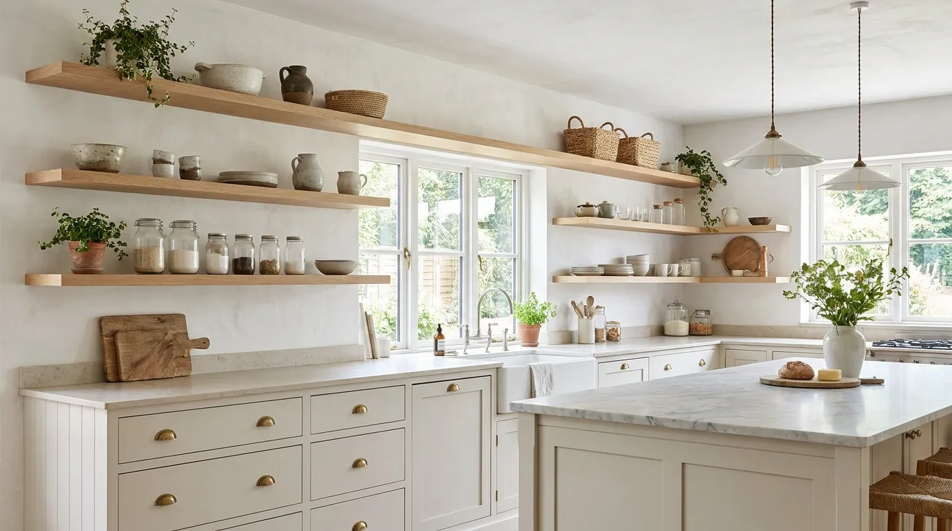
23 Open Shelving Kitchen Ideas That Feel Airy and Stylish
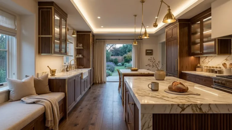
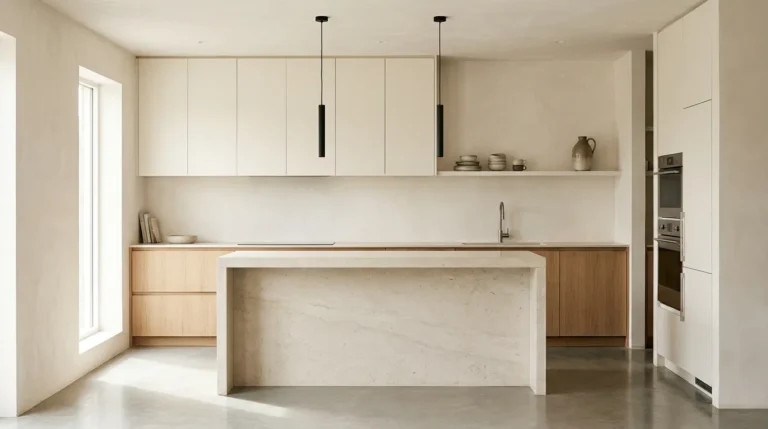
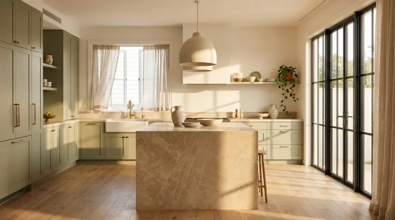
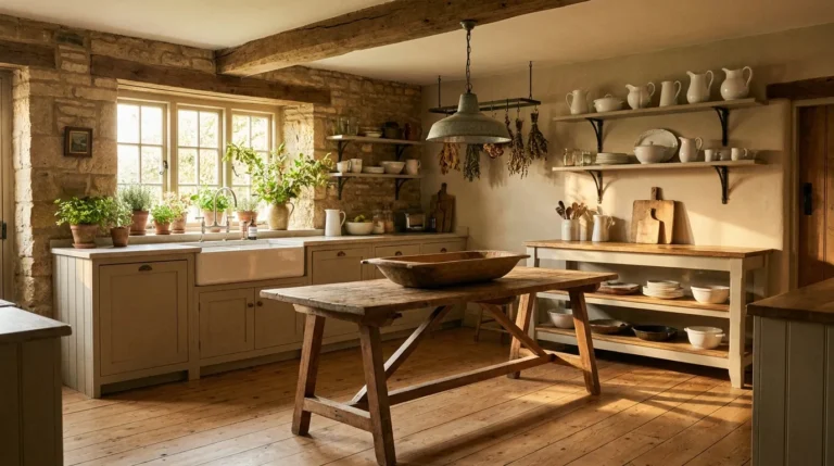
Open shelving has been misunderstood for a decade. The version most people picture — rows of matching white plates, a stack of identical linen napkins, every item in its precise and performative place — is not open shelving done well. It is a photograph of open shelving done for Instagram, and living with it for a week reveals it for what it is: exhausting, inflexible, and not particularly beautiful. The real argument for open shelving kitchen ideas is different. It is an argument about space, about light, about the particular quality of a kitchen that does not feel sealed shut by cabinet doors. When it is done with restraint and genuine thought, open shelving changes the entire register of the room — not because it shows things off, but because it makes the kitchen feel like a room you want to spend time in rather than a function machine you pass through.
1. Limit Your Shelf Count Before You Decide Anything Else
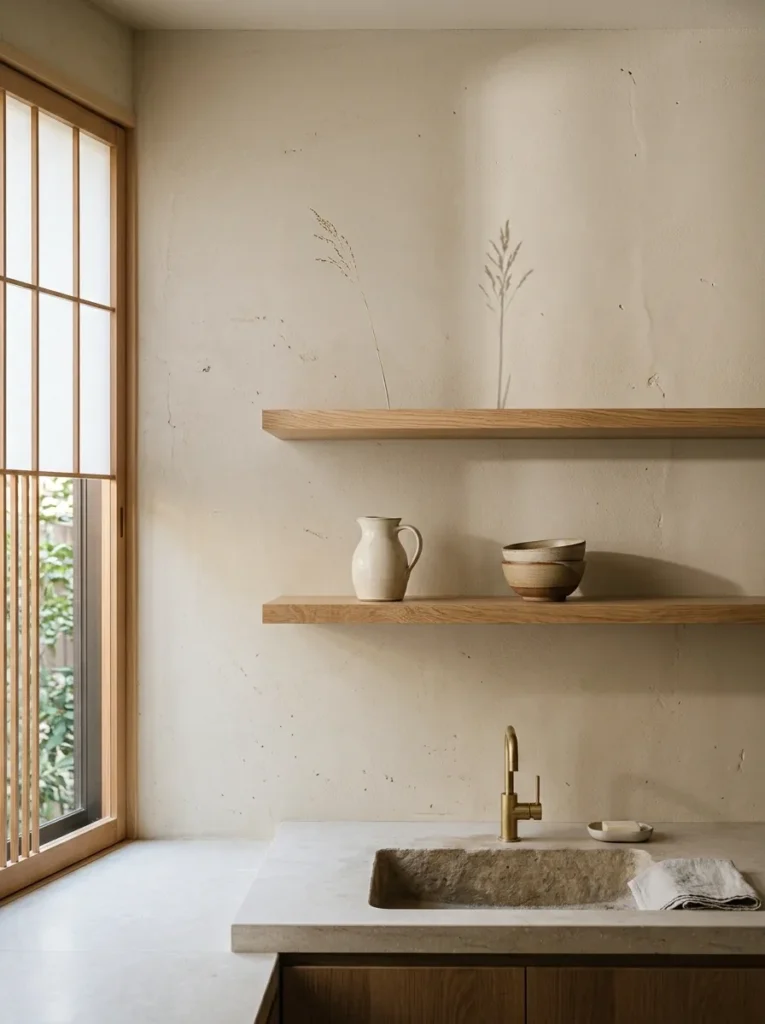
The most common version of open shelving failure is too many shelves. Three shelves instead of seven, two instead of four. Less is not a compromise — it is a structural decision about how much visual information the room can hold without becoming overwhelming. Every additional shelf is an additional surface that requires styling, maintenance, and daily editing, and most people underestimate how quickly a fourth shelf becomes a landing pad for things that have no other home.
Two shelves in the right position, in the right material, with the right objects on them, will do more for a kitchen’s visual quality than six shelves covered in equipment. The rule of thumb is this: count the shelves you think you need, then remove one. The remaining number is almost always correct.
2. Choose the Right Bracket — It Is Not a Minor Decision
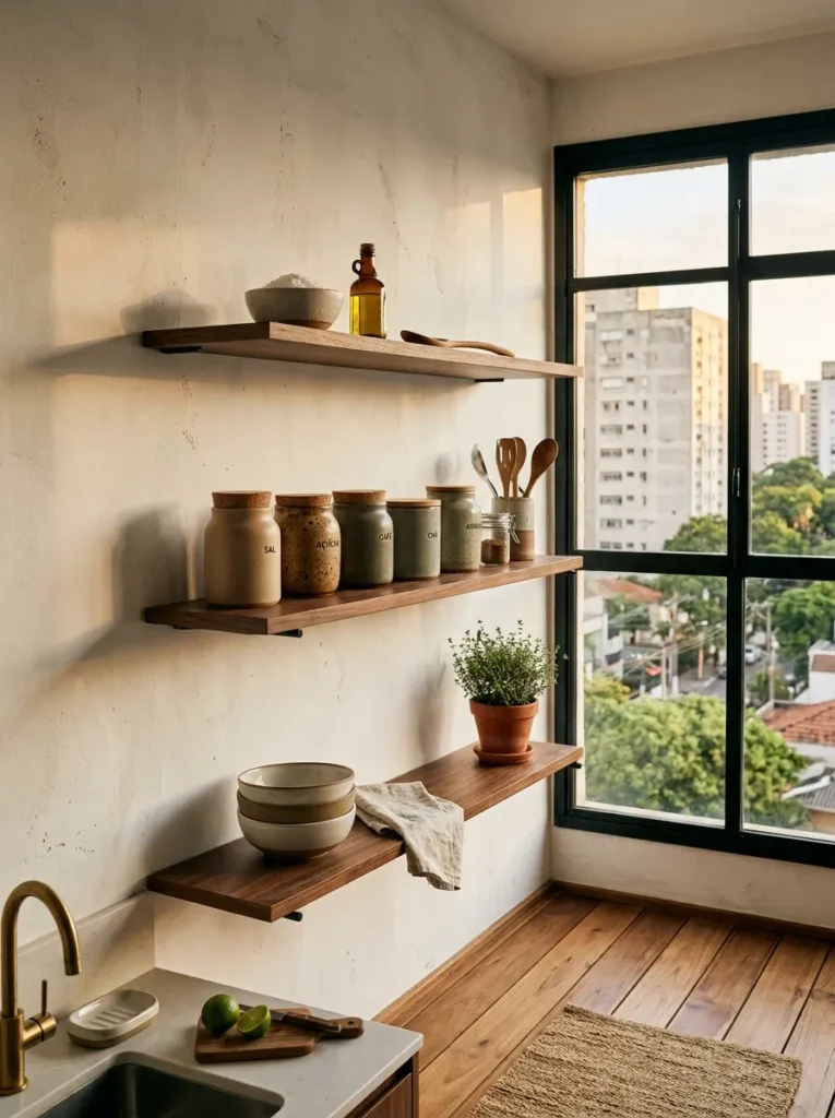
The bracket is half the shelf. This is the decision most people make last and least carefully, and it is consistently one of the things that separates a considered open shelf installation from one that looks like an afterthought. A slim blackened steel rod bracket on a walnut shelf produces an entirely different room than a chunky cast iron bracket on the same shelf. The bracket carries the shelf’s personality as much as the board material does.
The three choices worth considering are: hidden rod supports for a true floating effect; slim hand-forged iron brackets for a craft-forward look; and heavy architectural brackets in unlacquered brass or blackened steel for something more deliberate and visible. Decorative scroll brackets in chrome or brushed nickel are the specific choice to avoid — they reference a style that is neither resolved enough to be vintage nor clean enough to be contemporary, and they age badly.
3. Use Open Shelving Kitchen Ideas to Replace Only the Upper Cabinets
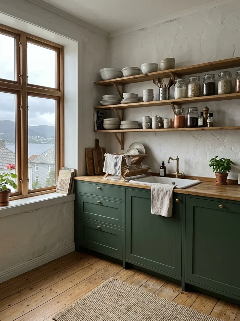
The full open shelving kitchen — no upper cabinets at all, shelves floor to ceiling — is a commitment most people regret, not because the aesthetic fails but because the practicality does. A kitchen without upper cabinet storage cannot absorb a household’s actual cooking equipment, and the result is a shelf overcrowded with things that were never meant to be seen. The better decision is to replace the upper cabinets on one wall only — the wall most visible from the main kitchen sightline — and keep closed storage everywhere else.
This approach also solves the most common open shelf complaint, which is dust. A single shelf wall in frequent use, with objects that are handled regularly, stays cleaner than it has any right to because the daily interaction keeps things from settling. The sealed walls of closed storage look fine from the outside and collect years of undisturbed grime on the inside. The open shelf, managed well, is cleaner in practice than its reputation suggests.
4. Pick One Material for the Shelf and Commit Completely
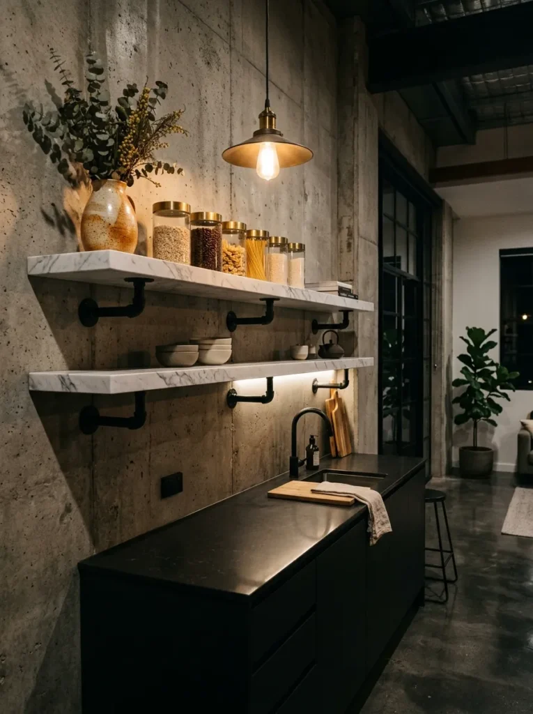
The open shelf’s board material is its most important visual decision. Not the objects on it — the board. A solid quarter-sawn oak shelf, three centimetres thick, with a natural oiled finish, is a different proposition from a white-painted MDF board of identical dimensions, and the difference is apparent from across the room. Material quality reads at a distance in a way that styling decisions do not. A beautifully styled shelf on a thin laminate board will always look cheaper than a sparse shelf on a well-chosen solid material.
The materials worth considering, in descending order of visual interest: solid oak or walnut in a natural or oiled finish, reclaimed timber boards with visible history, honed stone in marble or limestone for a more architectural effect, and painted solid wood for kitchens where the shelf needs to recede rather than advance. The materials to avoid: laminate in any finish, MDF with a painted edge that shows its layered section, and glass shelves in residential kitchens, which read as display-cabinet rather than kitchen.
5. Style in Odd Numbers, Never Even
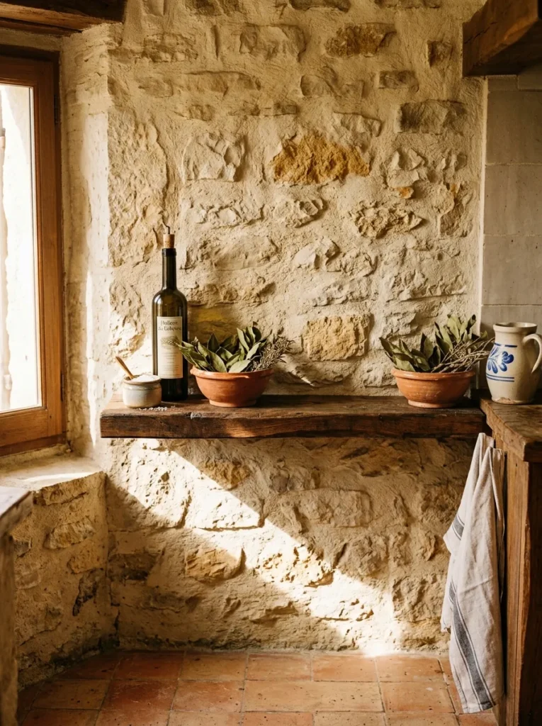
Two objects feel like a pair. Four feel like a set. Five feel like a collection. The difference is not arbitrary — it is the result of how the eye resolves groups visually, and the eye resolves odd numbers as a composition rather than as symmetry. A shelf with five objects, arranged with thought and deliberate spacing, will always read as more interesting than a shelf with six objects arranged in identical rhythm.
The odd number rule applies at both the object level and the shelf level. Three shelves read better than four. Five ceramics read better than six. A single hero object — one tall vessel, one large cutting board leant against the wall — reads better than two identical items placed symmetrically, which is the compositional equivalent of saying nothing twice.
6. Keep the Back Wall a Considered Colour
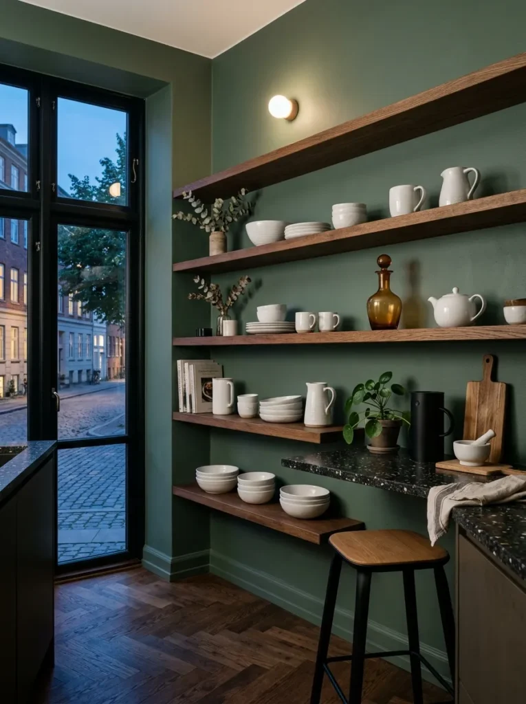
The wall behind open shelves is part of the composition whether the designer intends it to be or not. A white or neutral wall behind white stoneware creates no contrast, no depth, and no reason for the eye to settle. A wall in a deep considered tone — sage, forest green, warm terracotta, charcoal — turns the shelf into a framed composition, makes every object on it read more clearly, and gives the whole wall a sense of having been designed from the inside out rather than decorated on top.
The colour does not need to be dramatic to be effective. Even a warm greige or a soft sage is enough to separate the shelf objects from their background and introduce visual depth. The specific decision to make the back wall colour different from the surrounding kitchen walls — even by a single tone — is enough to change the way the entire shelf reads.
7. Use Floating Shelves Only Where the Wall Can Handle Them
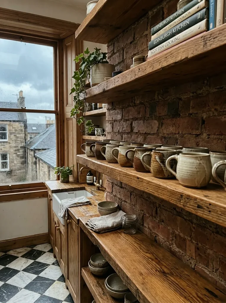
Hidden-bracket floating shelves are load-bearing systems, and the wall they are mounted to determines whether they are safe and stable or a future liability. A timber stud wall, correctly located and anchored into, will handle a loaded shelf comfortably. A plasterboard wall with no stud in the right position cannot and should not be asked to. A masonry or concrete wall is ideal — the shelf will feel genuinely immovable, which it should.
The most common floating shelf failure is a board that sags slightly over two or three years because the anchoring was inadequate, the rods were too short, or the shelf itself is too thin for the span. A floating shelf in solid timber should be a minimum of twenty-eight to thirty millimetres thick for spans up to ninety centimetres. Beyond that, add a central rod support or reduce the span. A sagging shelf is the one thing that cannot be fixed with better styling.
8. Edit What Goes on the Shelves as Ruthlessly as What Goes In a Gallery
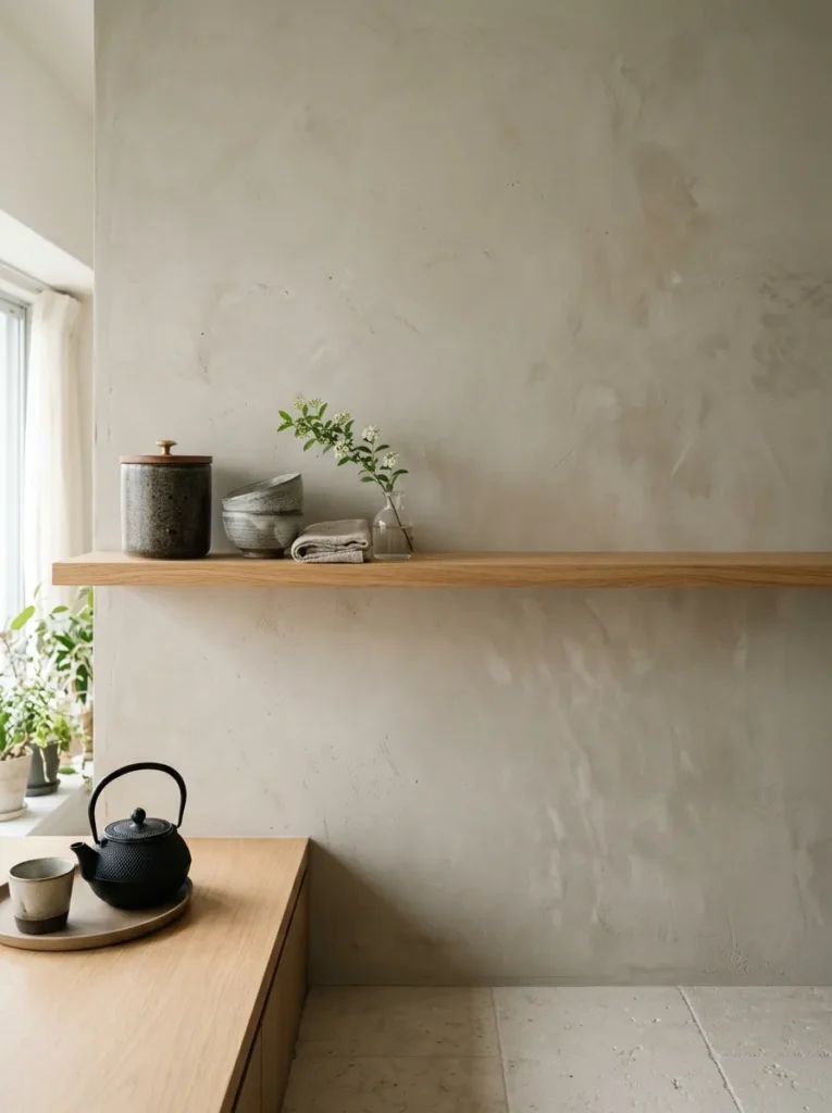
A gallery does not display everything it owns. It makes a selection, and then within that selection it makes another. Open shelves in a kitchen operate on the same principle, and the willingness to leave things out — to put useful but visually disruptive objects somewhere else — is the quality that separates a shelf that photographs well from one that actually elevates the kitchen.
The objects that earn a place on an open shelf are those that are either actively beautiful or frequently used enough to justify their visibility. Mismatched vitamins in plastic bottles, half-empty cleaning products, kitchen gadgets in matte black plastic — none of these belong. Not because the kitchen should look like a showroom, but because the whole point of open shelving is that the things you choose to live with are worth choosing to look at. That standard is not perfectionism. It is the minimum the idea requires.
9. Mix Heights Deliberately — Not Accidentally
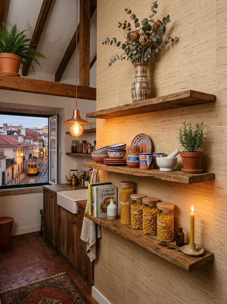
A shelf where every object sits at roughly the same height — canisters of similar scale, mugs in a neat row — is a shelf without visual rhythm. Introducing height variation deliberately means combining tall and short items in the same shelf zone, leaving gaps at different points, and thinking about the overall skyline the objects create when viewed from across the room. A tall olive oil bottle beside two low bowls beside a medium-height carafe is a shelf with a rhythm. Three mugs in a line is just three mugs.
The practical technique is to step back and look at the shelf from three metres away before calling it finished. At that distance, individual objects become shapes, and the shape the composition makes as a whole is what the room will read every day. If the skyline is flat, something needs to change height.
10. Let the Shelf Depth Match Its Purpose
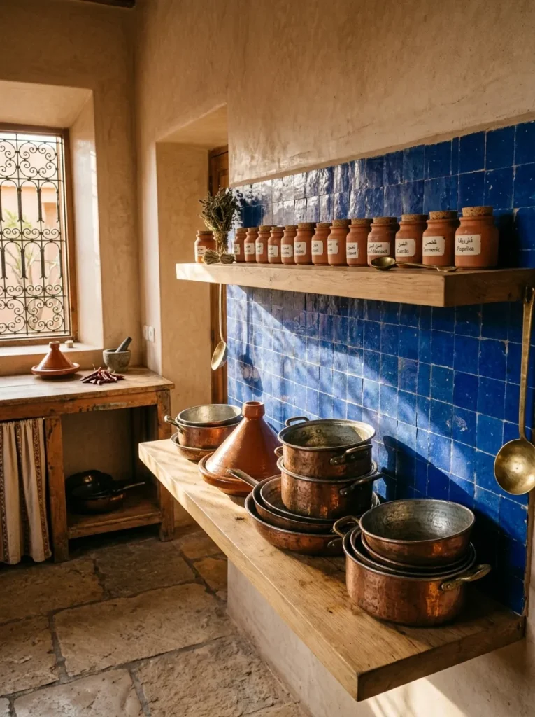
Most standard open shelves are installed at twenty-five to thirty centimetres deep, which is wide enough for dinner plates and appropriate for most ceramic objects. But a shelf installed specifically for spice jars and small bottles can be as shallow as twelve to fifteen centimetres — deep enough to hold the objects but shallow enough that nothing can be hidden behind anything else, which is the visual clarity that makes a spice shelf work. A shelf intended for stacked plates or cookbooks needs thirty-five to forty centimetres.
Getting the depth wrong in either direction creates a specific problem. A shelf too deep encourages stacking and layering, which quickly reads as clutter. A shelf too shallow for its objects creates a precarious composition that no amount of styling can resolve. Depth is the variable that gets specified last and matters most.
11. Make One Shelf the Colour Shelf
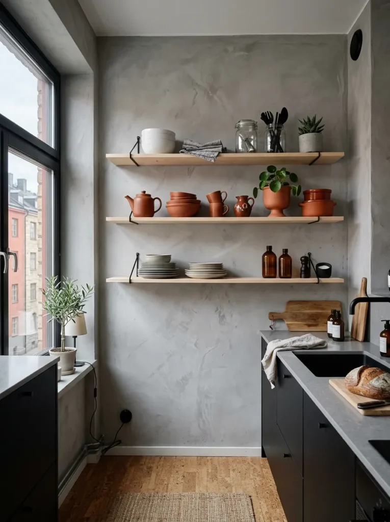
Three shelves of white and neutral stoneware is a choice that produces a kitchen that reads as calm but rarely as interesting. Designating one shelf — not all of them, one — as the shelf where colour is allowed changes the visual dynamic of the entire wall without overwhelming it. A middle shelf of rust, terracotta, amber glass, and copper introduces warmth and life to a run of neutral shelving in a way that feels curated rather than accidental.
The colour shelf works best when the colours are related — all warm, or all cool, or all drawn from a single earthy palette — rather than a random mix of whatever happens to be in the kitchen. Restraint within the colour decision is as important as making the decision at all.
12. Use Open Kitchen Shelving to Frame a Window Rather Than Block It
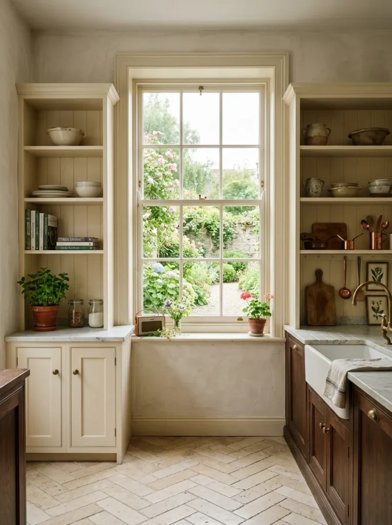
Kitchen windows are almost always treated as obstacles to storage — the wall around them is used but the window zone itself is left clear for light. Shelves installed either side of a kitchen window, running to its edge but not across it, do something quite different: they frame the window as an architectural feature, create a visual relationship between the shelving and the light source, and use the window’s daylight to illuminate the shelf objects from behind and beside.
The shelf ends should meet the window frame precisely — not leaving a gap, not overlapping it, but meeting it as if the two elements were designed together. That precision is the difference between shelves near a window and shelves designed in relationship to a window.
13. Group Ceramics by Family, Not by Function
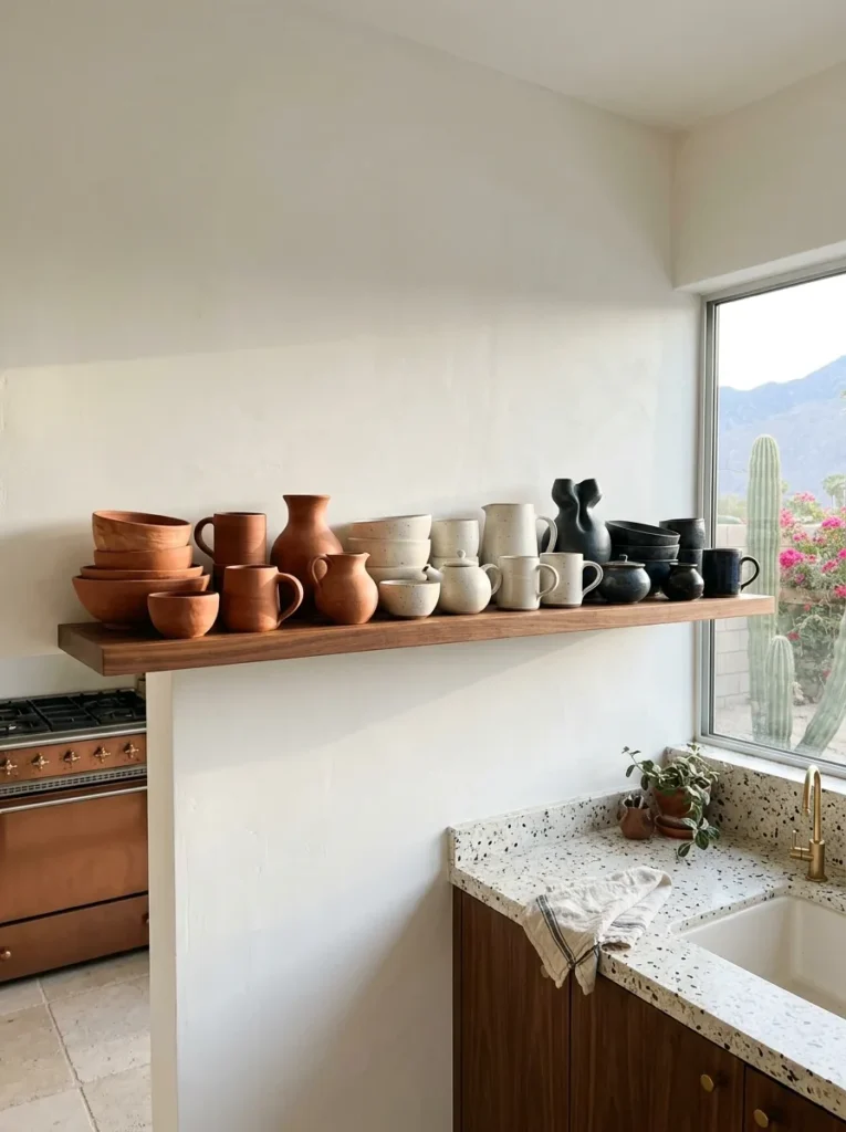
The conventional organisation of a kitchen shelf follows function: mugs together, plates together, bowls together. This produces a shelf that reads as a cupboard without doors — organised but not interesting. Grouping ceramics by material family instead — all the terracotta pieces together regardless of whether they are cups or bowls or plates, all the white stoneware together, all the dark glaze pieces in one zone — produces a visual gradient across the shelf that reads as composition rather than storage.
This is the organisational decision that changes how the shelf reads from across the room. It asks the viewer to see the ceramics as a collection rather than as equipment, which is exactly the shift that makes open shelving feel like a design choice rather than a substitute for cabinet doors.
14. Include One Empty Shelf — Always
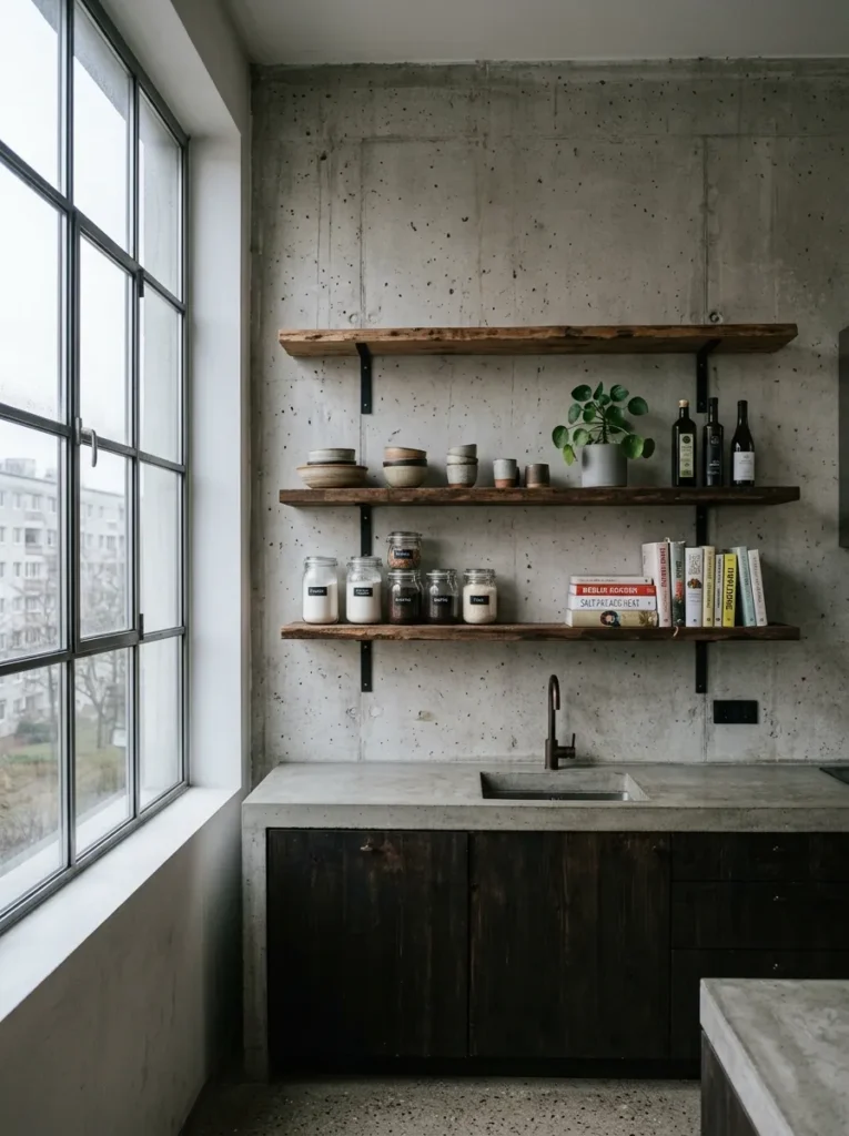
An empty shelf in a kitchen feels counterintuitive because kitchen space is almost always at a premium and an unused surface seems wasteful. It is not. An empty shelf performs two functions simultaneously. It gives the eye a place to rest in a composition that would otherwise be visually continuous. And it signals, more clearly than any styling trick, that the shelves were chosen and arranged rather than simply filled.
The empty shelf should not be the lowest one, which tends to read as incomplete. It should be the highest, where it recedes from the primary sightline and reads as breathing room rather than absence. Leave it empty and leave it alone.
15. Use Recessed Shelf Niches Instead of Floating Boards
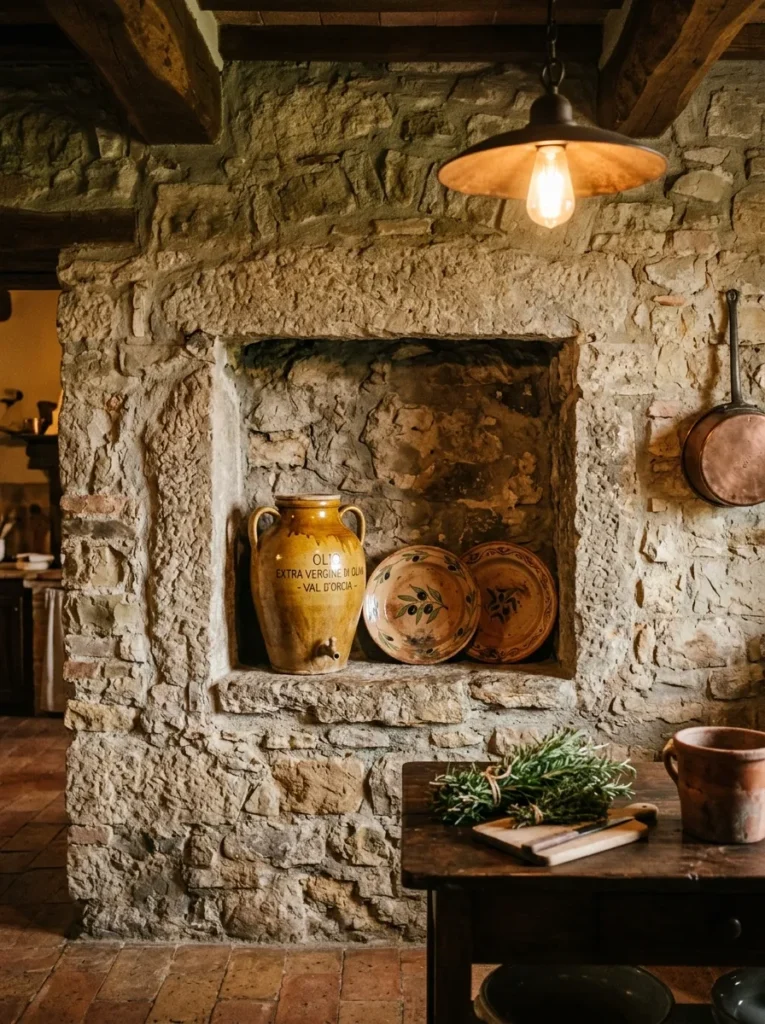
Where the wall construction allows it — and in older masonry homes it often does — a recessed niche cut into the wall depth produces something that no floating shelf can replicate: a shelf that appears to be part of the building rather than added to it. The niche edges are the wall itself. There are no brackets, no visible supports, no board edge competing for attention. The niche simply exists, and the objects inside it read as found rather than placed.
The depth available in a standard masonry wall is typically ten to fifteen centimetres — enough for a row of spice jars, a single ceramic vessel, or a small collection of glasses. More than enough to read as deliberate. The finish inside the niche should match the wall — plastered, limewashed, or left in natural stone — not tiled or painted in a contrasting colour, which makes the niche feel like an insertion rather than an excavation.
16. Let the Brackets Earn Their Place Visually
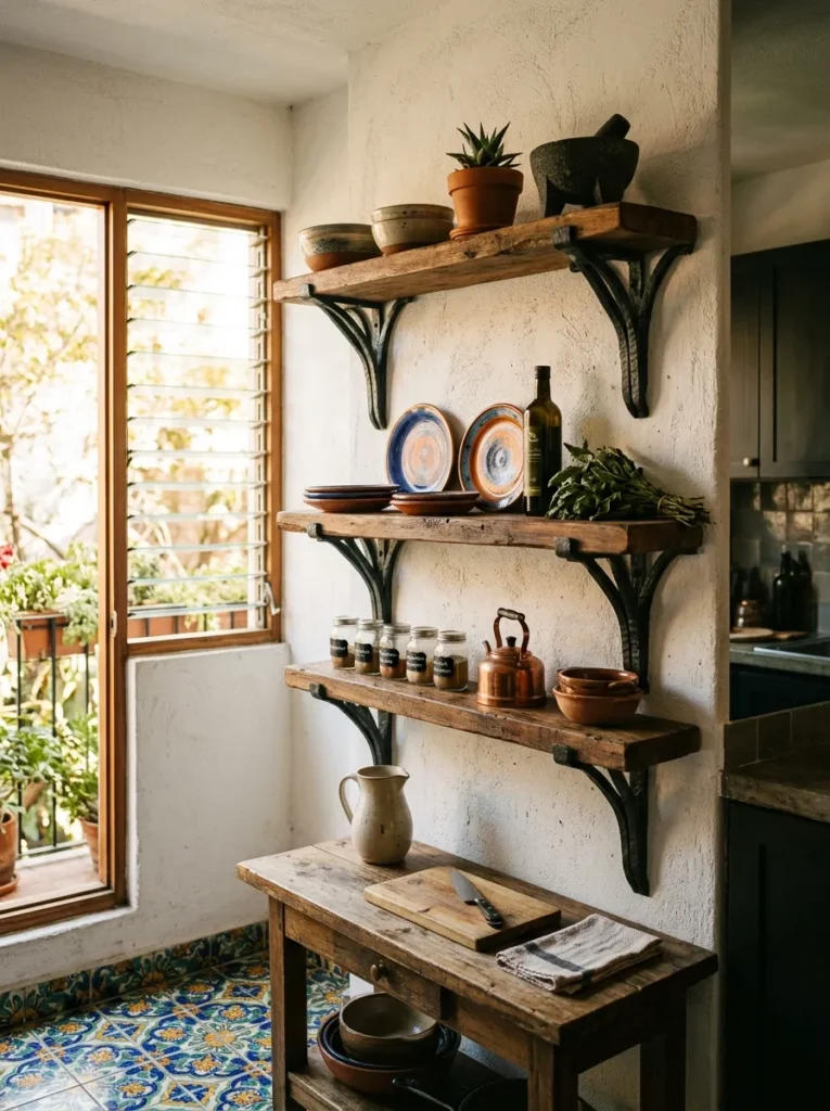
If the brackets are visible — and sometimes they should be — they should be worth looking at. A hand-forged iron bracket in a Y or horseshoe form, made by a blacksmith or sourced from a craft supplier, is a designed object in its own right. Mounted on a wall, supporting a shelf, it contributes its own visual quality to the composition. The bracket is not hardware to be tolerated. In the right kitchen, it is the most characterful element on the wall.
The key is that bracket and shelf material should be decided together, not separately. A hand-forged iron bracket under a delicate marble shelf is a collision of registers. Under an aged oak board or a reclaimed pine plank, it is exactly right.
17. Add Under-Shelf Lighting to Every Run
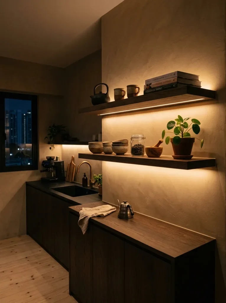
Under-shelf lighting in a kitchen is almost always discussed in the context of task lighting — illuminating the worktop for food preparation. In an open shelf context it does something entirely different: it lights the objects on the shelf from beneath, which produces a quality of illumination that no overhead source can replicate and makes the shelf composition visible and warm even when the rest of the kitchen is at low light. A warm LED strip at 2200K, recessed into a routed channel under the shelf’s front edge so the strip itself is invisible, costs very little and changes everything about how the shelf reads after dark.
The same principle applies as with under-bed LED strips: if you can see the LED dots, the installation has failed. The glow should appear sourceless.
18. Install a Pot Rail Below the Lowest Shelf
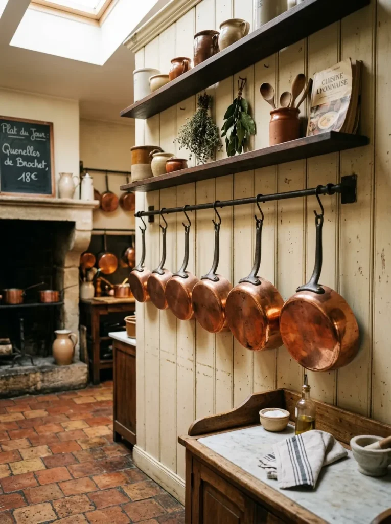
A pot rail — a horizontal bar of wrought iron, unlacquered brass, or smoked steel — mounted at around 130 centimetres from the floor, directly below the lowest open shelf, extends the storage capacity of the shelf zone downward without requiring additional shelving. Copper pans, cast iron skillets, and colanders hung in graduated sizes on S-hooks create a visual layer below the shelf that is both functional and genuinely beautiful.
The specific condition for this working is that the pans themselves are worth looking at. A collection of carbon steel, copper, or well-seasoned cast iron is a kitchen’s working history made visible, and hung correctly it reads as craft rather than clutter. A row of non-stick pans in matte grey does not carry the same weight.
19. Limit Colour on the Shelf to Three Tones Maximum
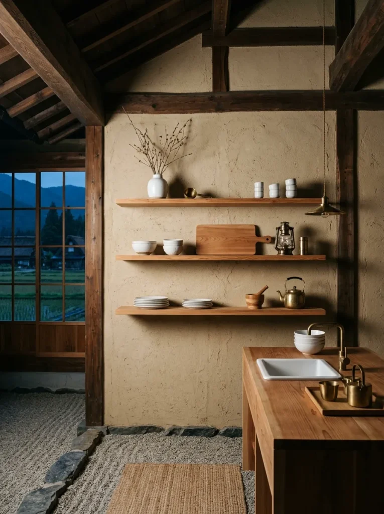
The most consistent quality of open shelves that photograph well and live well is colour restraint. Not monochrome — restraint. A shelf where every object belongs to one of three carefully chosen tones — natural wood, white stoneware, and aged brass, for example, or terracotta, cream, and olive — reads as a deliberate palette. A shelf where objects accumulate in every colour that happened to be in the kitchen produces visual noise that no arrangement can resolve.
Three tones. Not three colours — three tonal families. This allows for variety within each family (several different stoneware pieces in the white-and-cream family, for example) while maintaining the visual coherence that makes the shelf look designed. Anything that falls outside the three chosen tones goes in a cabinet.
20. Use Open Shelves Above a Range or Hob as a Display Moment
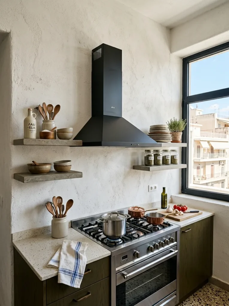
Shelves installed above a range or hob — flanking the hood or sitting either side of it — are the most purposeful open shelf position in the kitchen because they are immediately legible as functional (the objects are near the cooking zone, for obvious reasons) and immediately visible from the main kitchen sightline. They are also the position where getting the height right matters most. Shelves should sit a minimum of sixty centimetres above the hob surface for safety and practical access, and the objects on them should be things actually used in cooking rather than decorative ceramics placed there for appearance.
A shelf of frequently reached-for items — good olive oil, a wooden spoon in a tall crock, the salt cellar, one or two spice jars — positioned near the range tells a true story about how the kitchen works. That honesty reads better than a composed arrangement of things that never move.
21. Let the Wall Between Shelves Be Part of the Design
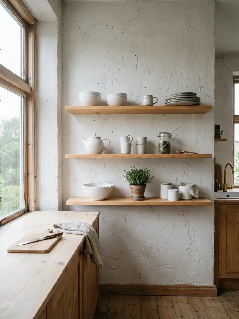
The wall visible between and behind open shelf objects is not background — it is part of the composition, and treating it as incidental is the reason so many open shelf installations feel unresolved. The texture of limewash, the warmth of clay plaster, the depth of a painted tone, the rawness of exposed brick — these are not behind the shelves. They are beside and between the objects, equally present, equally visible.
If the wall behind the shelves is not interesting, the shelves will always need to work harder than they should. And shelves that are trying too hard always look like it.
22. Treat the Shelf Like a Still Life, Not Storage
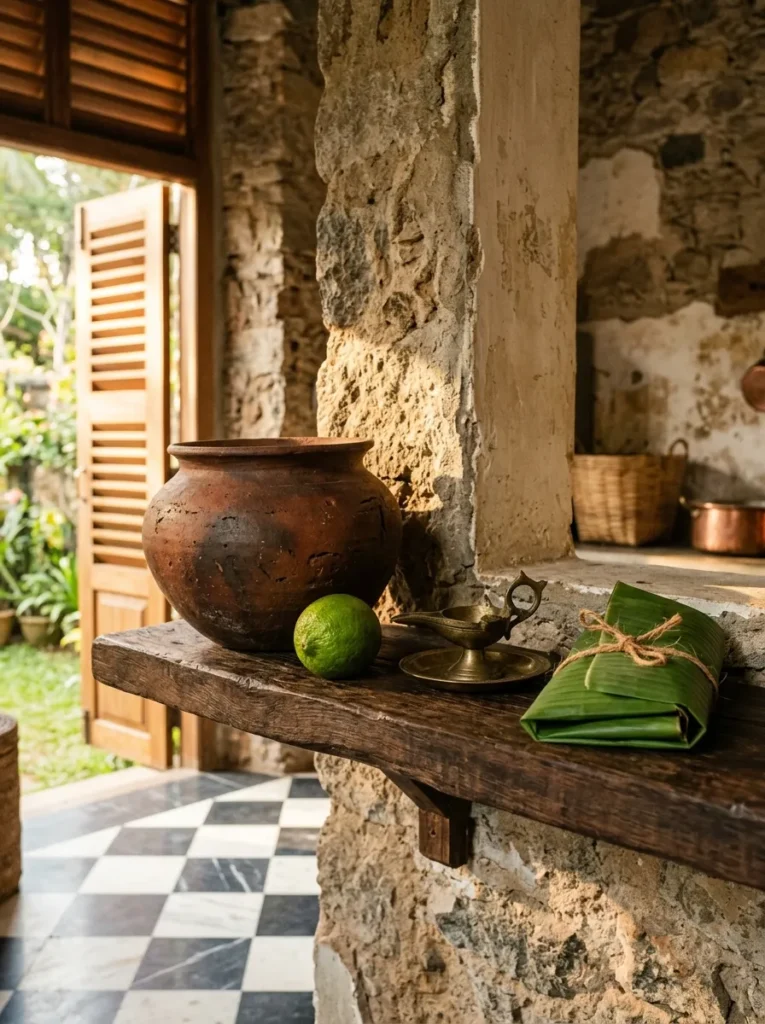
A still life is not a random arrangement of objects — it is a considered one in which every object has been chosen for its visual contribution to the whole. The best open kitchen shelves operate on exactly this logic. A large earthenware pot, a single lime, a small brass oil lamp, and a folded leaf on a stone shelf is a still life. It may hold nothing useful at all, and it does not need to. Its purpose is to make the kitchen feel like a space inhabited by someone with a genuine visual sensibility, and that quality is worth more to the atmosphere of the room than an additional row of storage.
Not every shelf needs to operate at this level. But at least one should, and it should be the shelf that the kitchen’s main sightline falls on first.
23. Stop Before You Think You Are Finished
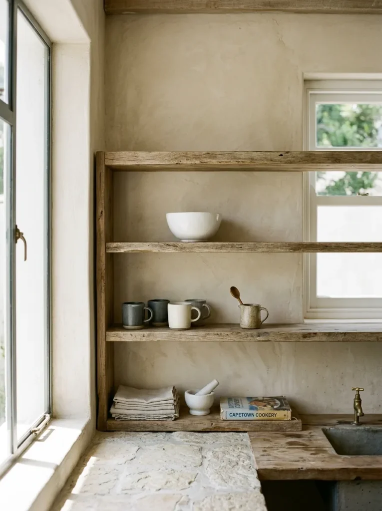
The final and most important instruction about open kitchen shelving is this: stop adding things ten minutes before you feel done. The instinct when styling a shelf is to keep going until it feels complete, but completion in a shelf context almost always means one object too many — the thing that tips the composition from considered to crowded. The shelf that looks best is almost always the shelf as it stood immediately before the last addition.
This is not minimalism. It is editorial judgment. A shelf is not finished when there is no more room. It is finished when every object on it is earning its place and the space around them is doing the same. The moment you add something because a surface feels empty rather than because the object is right, stop. Put it in a cabinet. Live with the space. The space, more often than you would expect, turns out to be exactly what the shelf needed.
Final Thoughts
Open shelving kitchen ideas work best when they are treated as an editorial problem rather than a storage solution. The question is never how much can go on the shelves — it is how little can go on them while still making the kitchen feel complete. Start with one wall, two shelves, and a material you genuinely find beautiful. Get those right before adding anything. The shelf you build with restraint and genuine consideration will outlast four iterations of the over-styled version, and it will look better on the first Tuesday morning in November when no one is photographing it than it ever does in a Pinterest image. That is the real test of whether a shelf has been done well.
Save these open shelving kitchen ideas for your next kitchen refresh.