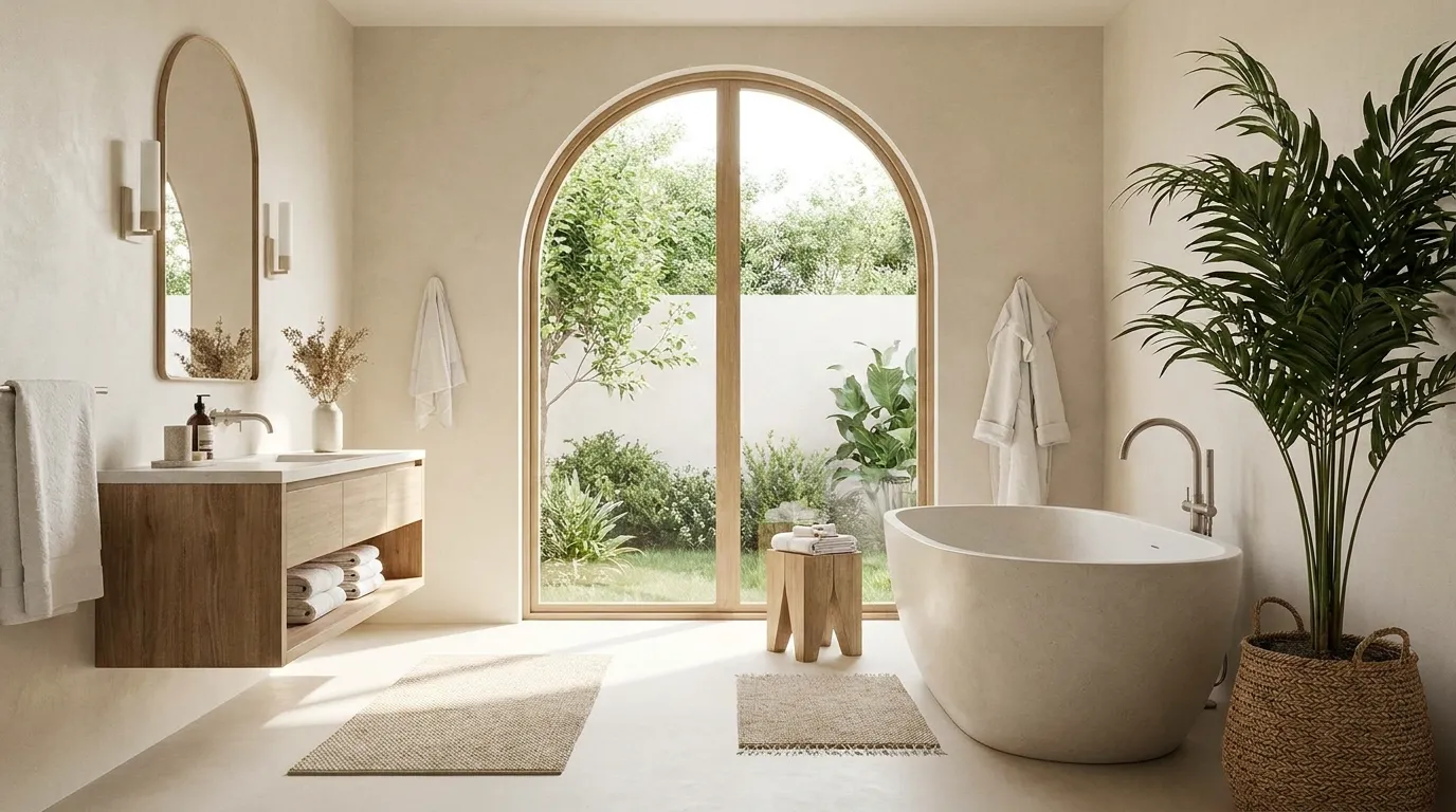
24 Minimal Bathroom Ideas That Feel Calm and Spacious
Most bathroom makeover guides tell you to add things — a new mirror, a plant, a tray of neatly arranged products, some floating shelves with artfully placed candles. The problem is that minimal bathroom ideas work in the opposite direction. The calm you’re looking for isn’t something you install. It’s what remains after you stop adding. These 24 ideas are not about buying a new aesthetic. They’re about understanding what creates the feeling of space and quiet in a bathroom — and then making every single decision in service of that.
1. Choose a Single Grout Colour and Match It to Your Tile
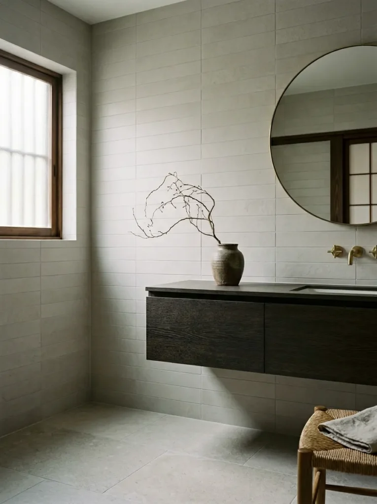
This is one of those decisions that looks unremarkable in isolation and transforms the entire room in practice. When grout contrasts sharply with tile — white tile, dark grey grout — the eye reads a grid. Hundreds of little boxes, tiling across every wall and floor surface. It’s visual noise, and it’s the kind most people don’t notice until it’s gone. Match the grout tone as closely as possible to the tile, and the surface becomes a continuous plane rather than a pattern. The room reads larger. The walls feel quieter. Sanded grout in a tone within two shades of the tile body is enough. You don’t need to be exact. You need to stop the contrast.
2. Install a Frameless Shower Screen Instead of a Curtain
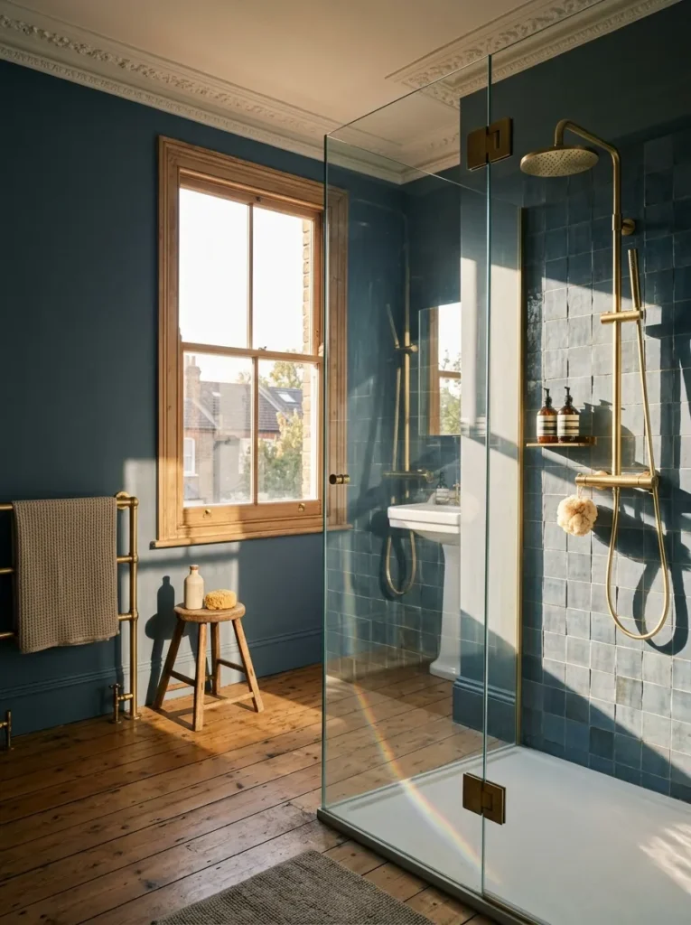
A shower curtain closes off roughly a third of the bathroom visually, even when it’s pushed to one side. The rod, the rings, the fabric bunching — none of it disappears. A frameless toughened glass screen, hung on a single pivot or on minimal hardware, keeps the entire floor plane visible from the doorway. The eye travels the full length of the room without interruption. This matters especially in bathrooms under four metres long, where any visual break reads as a wall. Ten-millimetre clear toughened glass is the specification worth asking for — it holds its shape without a frame and doesn’t flex when the door opens.
3. Float the Vanity 20 to 25 Centimetres Off the Floor
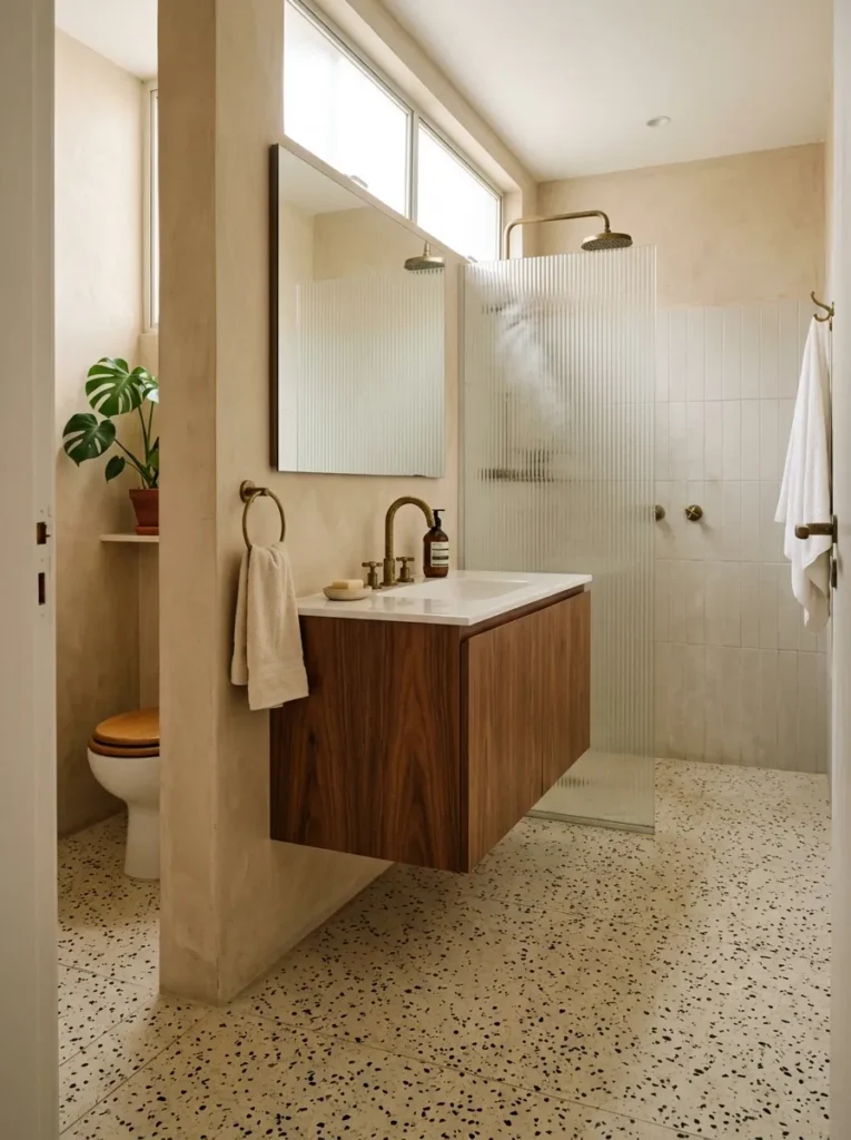
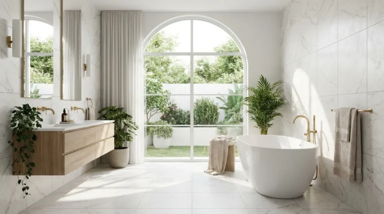
Wall-mounted vanities are one of the most effective tools in a calm bathroom design, and they’re consistently underused outside of hotel renovations. Raising the cabinet off the floor — not to countertop height, just clearing the floor by 20 to 25 centimetres — does two things simultaneously. It creates a continuous floor plane that reads as uninterrupted space, and it makes cleaning underneath effortless, which means the floor stays clean longer. The visual logic is the same as floating furniture in a living room: your eye fills in the space beneath the object and the room feels lighter for it. The fixing must go into the wall studs, not just the plasterboard. This is the one installation that rewards getting a professional in.
4. Use Large Format Tiles and Run Them Continuously Into the Shower
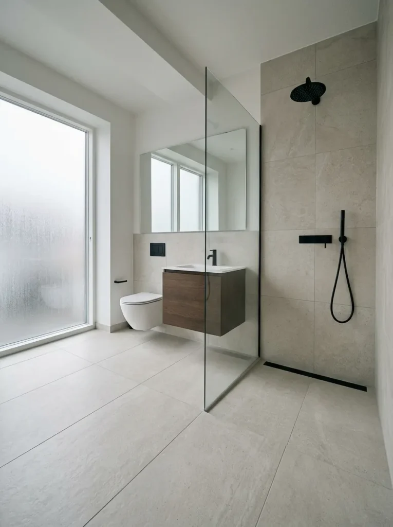
Small tiles create more grout lines, and more grout lines mean more visual segmentation. A 600×1200mm rectified porcelain tile, run continuously from the bathroom floor into the shower tray area, eliminates the interruption that usually separates those two zones. The eye doesn’t register a transition. It reads one continuous surface. Rectified tiles — tiles cut to precise dimensions with minimal variation — are essential here because they can be laid with a 2mm joint rather than the 5mm required for non-rectified tiles. The grout almost disappears. The surface reads as one plane.
5. Choose Recessed Niches Over Freestanding Shelving
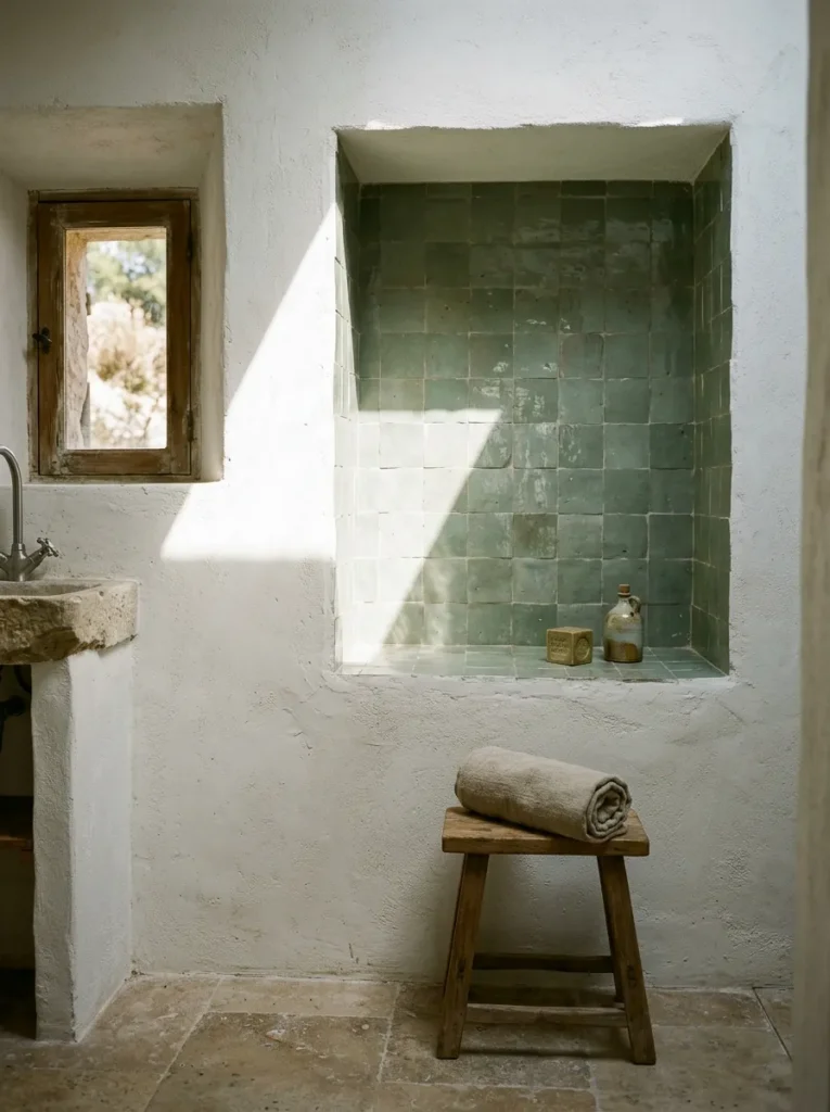
A shelf bracket on a wall is always visible. The products on the shelf, the bracket itself, the shadow it casts — all of it registers as objects in space. A recessed niche, cut between the wall studs and tiled to match the surrounding surface, has none of that visual weight. The niche sits flush with the wall and reads almost as part of it. One niche, 300mm wide by 600mm tall, built between two studs in the shower wall, holds everything a shower needs and takes up none of the room’s visual space. This is the storage decision that actually changes how the room feels, not the one that makes for a tidy mood board.
6. Pull All the Plumbing to One Wall
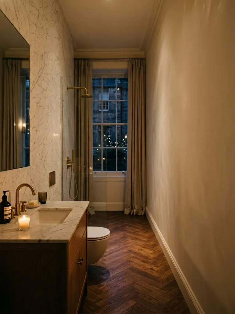
Most bathrooms that feel chaotic have their plumbing running across multiple walls — the toilet on one side, the basin on another, the shower on a third. Each fixture anchors a different surface and the eye has nowhere to settle. Consolidating the plumbing — toilet, vanity, and shower waste on a single shared wall — creates a clear division between the “working” wall and the open wall. The open wall can be kept entirely clear. No fixtures, no accessories, nothing. That emptiness is not wasted space. It’s the thing that makes the room feel generous.
7. Invest in a Concealed Cistern
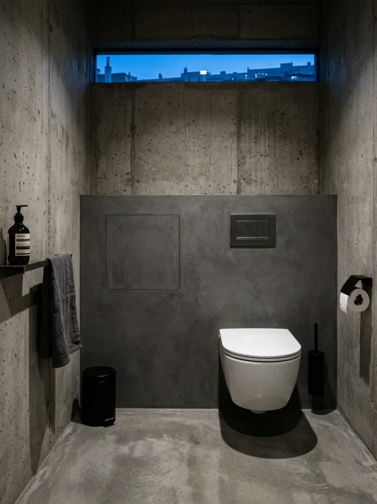
The visible cistern behind a close-coupled toilet is one of those elements that most people accept as fixed and never question. It isn’t. A wall-hung toilet with a concealed cistern — the cistern built into a duct or false wall behind the pan — removes a significant visual mass from the bathroom entirely. The toilet appears to float. The floor beneath it is clear. The wall behind it is flat. This single change often makes a bathroom feel meaningfully larger, not because it adds space but because it removes one of the most visually dense objects in the room. The trade-off is access — the service panel must be easy to reach. A flush-fitting access hatch, tiled to match the wall, is the elegant solution.
8. Use the Same Material on the Floor and the Lower Wall
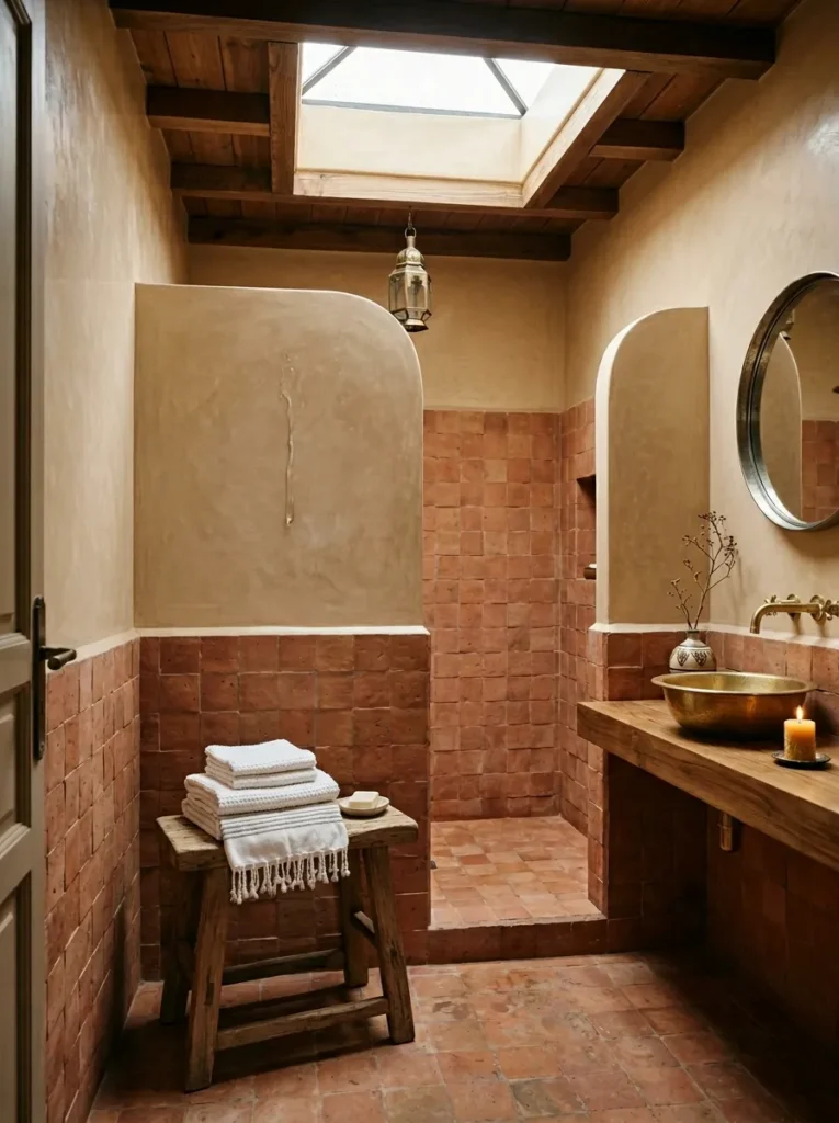
Datum lines — the horizontal boundary where one material ends and another begins — divide a room visually. In most bathrooms there are several: the floor tiles meet the wall tiles, the wall tiles meet the painted plaster, the paint meets the ceiling. Each transition is a visual stop. Running the same tile from the floor up to hip height on all four walls reduces those transitions to one. The eye travels up from the floor through the tiled zone without interruption and the room reads as continuous. It’s a technique borrowed from high-end hotel design and applied here at any budget with consistent rectified porcelain.
9. Fit a Mirror That Spans the Full Width of the Vanity
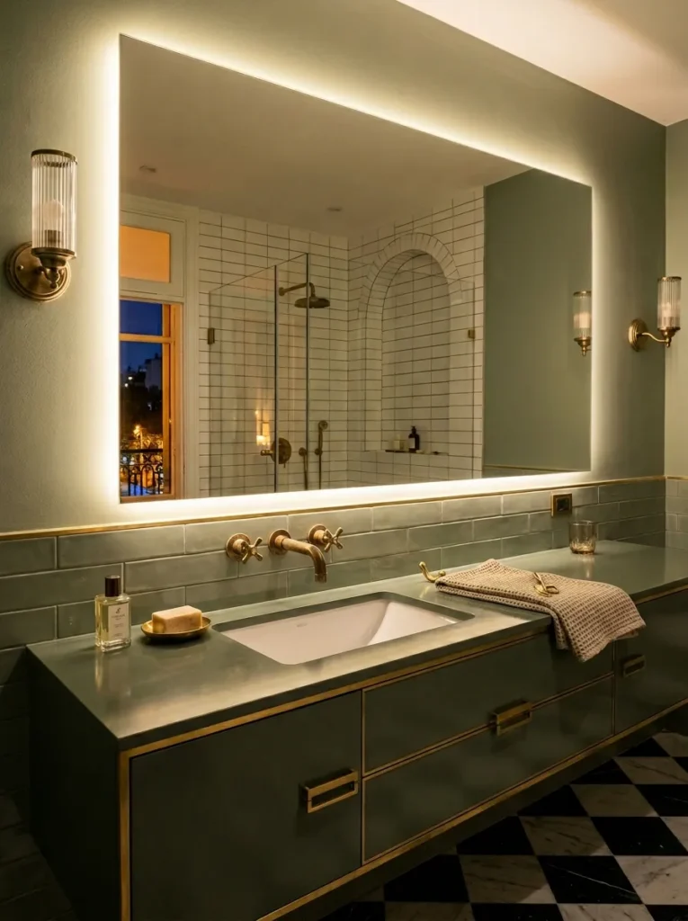
A mirror that’s smaller than the vanity below it creates a gap — a section of wall that’s neither mirror nor tile nor anything, just painted plaster looking slightly incomplete. A mirror running the full width of the vanity, from edge to edge with no frame, turns that wall into a reflective surface. The room doubles in apparent depth. The light doubles. The sense of volume increases without anything in the physical space changing. Frameless mirrors cut to a specific width are available from most glass merchants, and the cost difference over a standard framed mirror is often negligible. The visual difference is not.
10. Choose a Freestanding Bath Only If the Room Can Actually Hold It
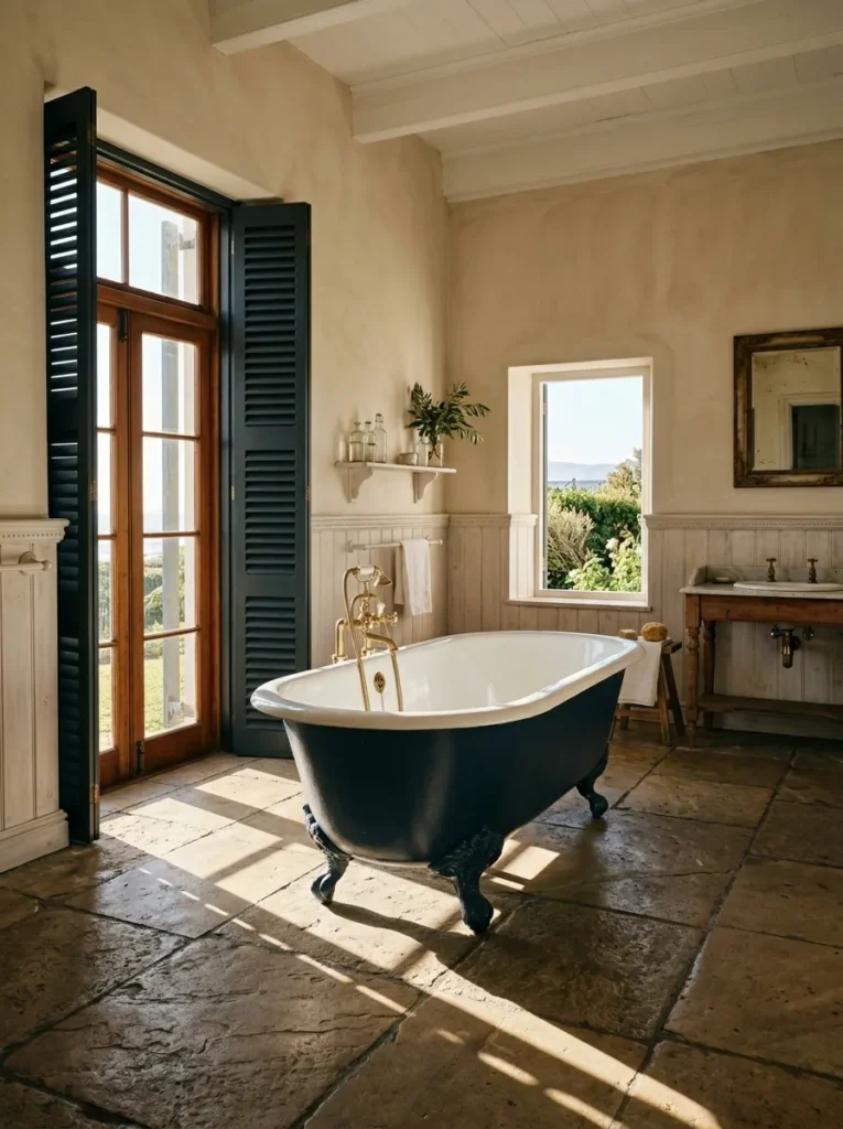
Freestanding baths are in every bathroom inspiration image on the internet, and they work in exactly the spaces those images show — large, airy rooms where the bath occupies the centre without crowding either wall. In a standard bathroom under six square metres, a freestanding bath typically leaves 40 to 60 centimetres of clearance on the long sides, which reads as tight rather than generous. A built-in bath with a panel that matches the wall tile, positioned against one wall, keeps the central floor clear and the room usable. This is the decision most people get wrong because they choose based on aesthetics and only discover the proportional problem when the installation is finished.
11. Replace Towel Rings With a Single Heated Ladder Rack
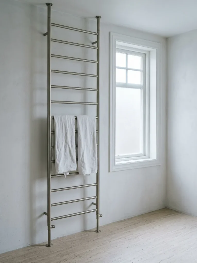
Multiple towel accessories — a ring here, a hook there, a small rail on the back of the door — mean multiple fixing points, multiple pieces of hardware, multiple visual interruptions across different surfaces. A single ladder-style heated towel rail, floor-mounted against one wall, consolidates all towel storage into one vertical element. It heats the room. It dries towels overnight. It replaces four separate accessories with one. Chrome is the obvious choice. Matte gunmetal or brushed nickel reads slightly quieter against white or grey tile, and doesn’t show water spots with anything like the same enthusiasm.
12. Paint the Ceiling the Same Tone as the Walls
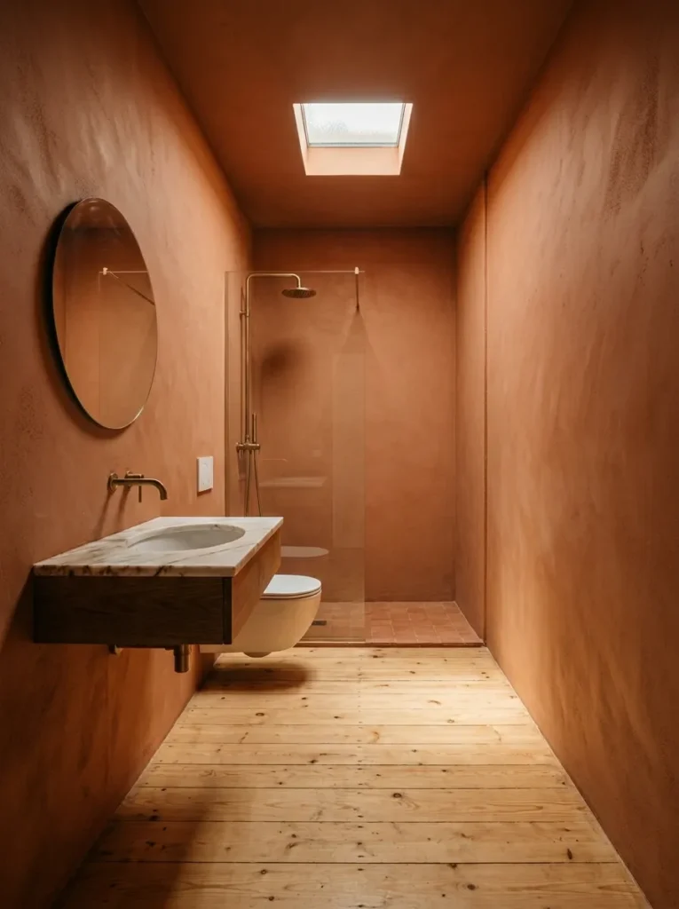
Most people paint ceilings white. The logic is that white ceilings feel higher. The actual effect in a small bathroom is that the ceiling contrast creates a box — four coloured walls with a bright white lid, which draws the eye upward and makes the room feel like a container. Painting the ceiling in the same tone as the walls, or one shade lighter, wraps the room in a single colour and removes the box effect. The room feels quieter. The boundaries soften. In a calm bathroom design, soft sage, warm clay, or any muted mid-tone applied to all five surfaces — four walls and the ceiling — creates an enveloping quality that white ceilings simply can’t deliver.
13. Use a Trough Basin Instead of Two Separate Sinks
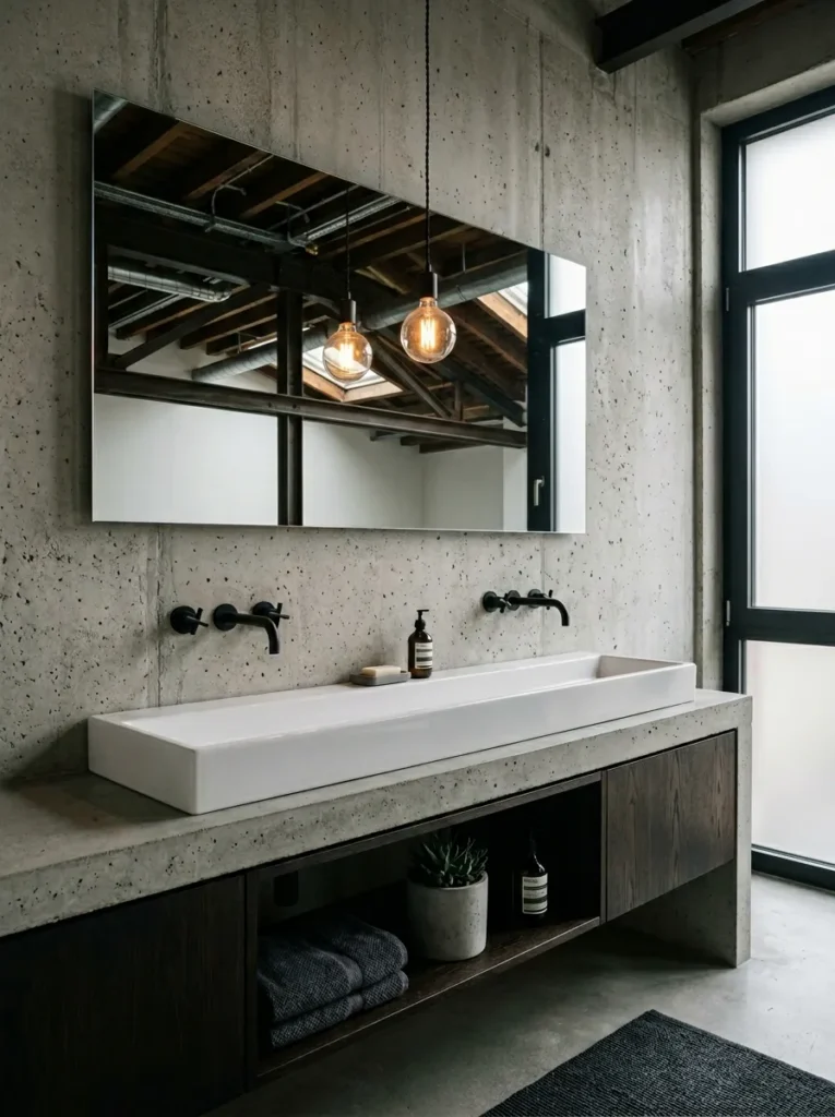
In a double-vanity bathroom, two individual basins usually require two sets of taps, two overflow drains, two separate mounting positions, and a significant visual gap between them. A single trough basin — 900 to 1200mm long, with two sets of taps at either end — covers the same function as a double sink with half the visual complexity. The surface reads as one continuous element. The plumbing is simpler. The cleaning is faster. It’s the kind of decision that looks almost obvious in retrospect and somehow doesn’t appear on most bathroom planning lists.
14. Install Lighting Inside the Mirror, Not Above It
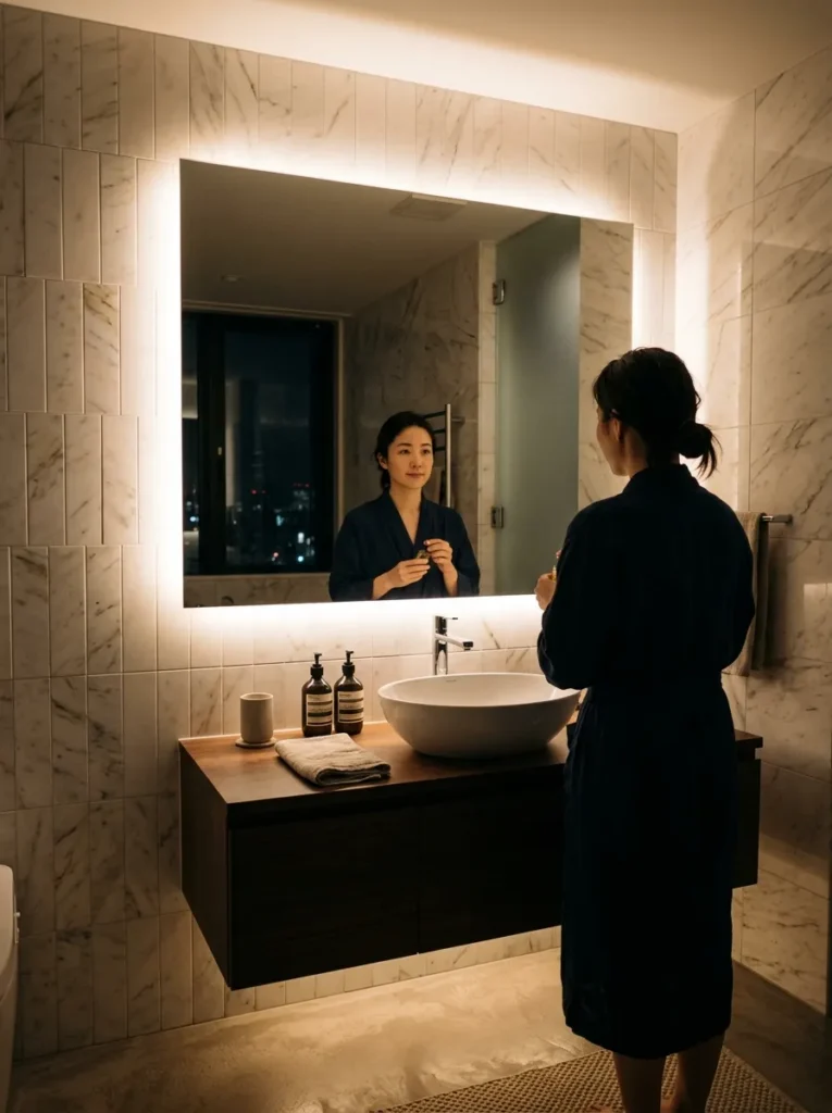
A light bar mounted above a bathroom mirror creates a shadow that falls directly across the face — exactly where you need the most even illumination for grooming. Backlit mirrors, or mirrors with an integrated LED strip around the perimeter, diffuse light forward rather than downward. The face is lit evenly. The mirror appears to glow from within rather than being lit from outside. The bathroom reads as calmer because the light source is invisible — you see illumination without seeing the fixture. A colour temperature of 3000K is close enough to warm incandescent light to feel human rather than clinical.
15. Keep All Hardware in a Single Metal Finish
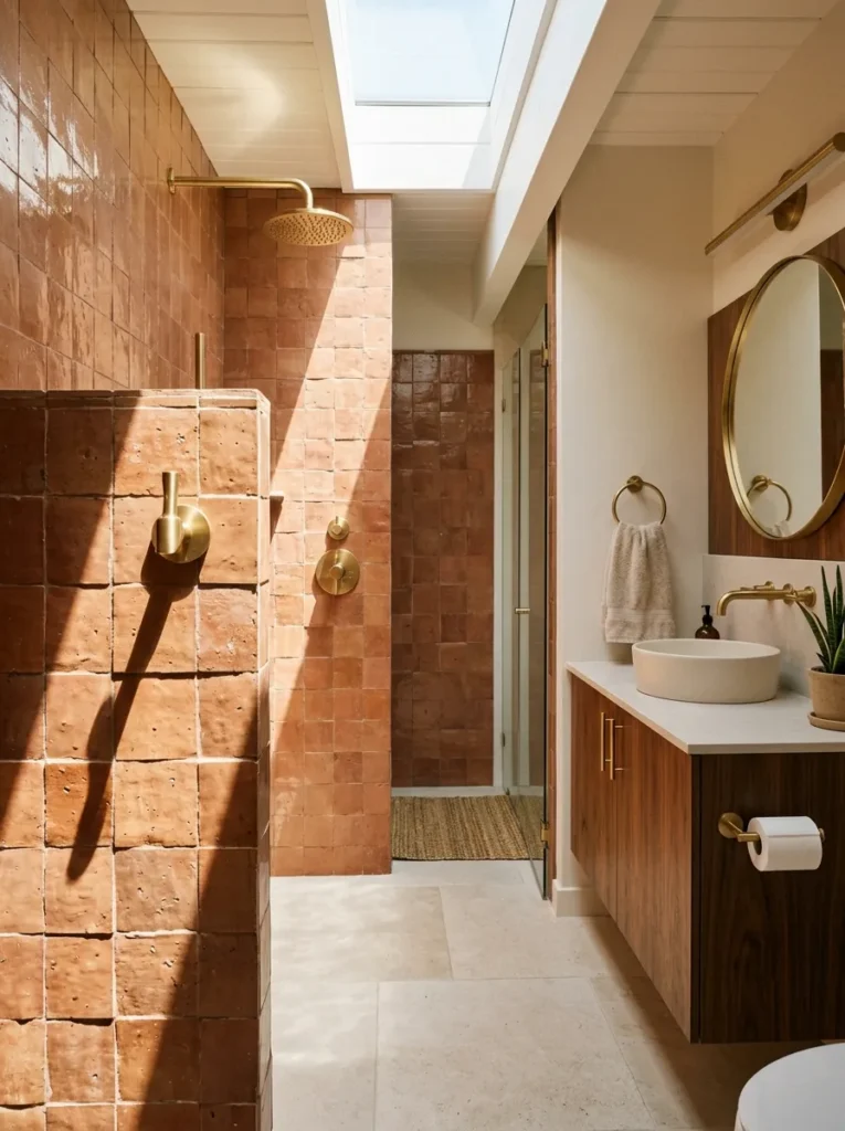
Mixing metal finishes — brushed brass taps, chrome towel rail, matte black toilet roll holder, nickel shower fittings — is the design equivalent of wearing mismatched shoes. Each one is fine in isolation. Together they create a low-level visual agitation that’s hard to name but immediately felt. Choosing one finish — and applying it to every fixture, fitting, and hardware element in the bathroom — creates a coherence that reads as deliberate and calm. Brushed nickel is the most forgiving because it reads as neutral and doesn’t show water marks. Matte black requires consistent maintenance. Polished chrome shows everything.
16. Use a Doorstop to Keep the Door Flush Against the Wall
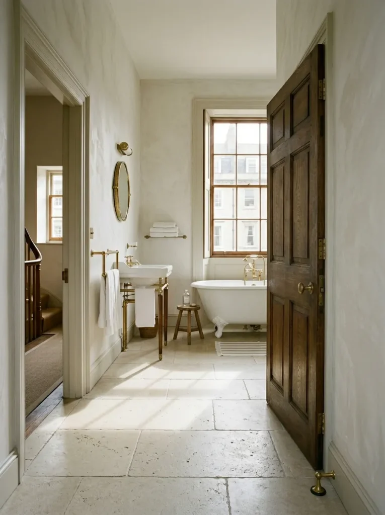
A bathroom door that opens into the room and stops at 90 degrees, projecting into the space, is another object interrupting the floor plane. A door stopper fixed to the wall behind the door — not a floor-mounted bump — means the door can open fully and rest flat against the wall. The floor reads as unobstructed. This costs almost nothing and almost nobody does it deliberately. It is a tiny decision with a disproportionate effect on how the room reads from the doorway.
17. Choose Minimal Bathroom Storage That Closes Completely
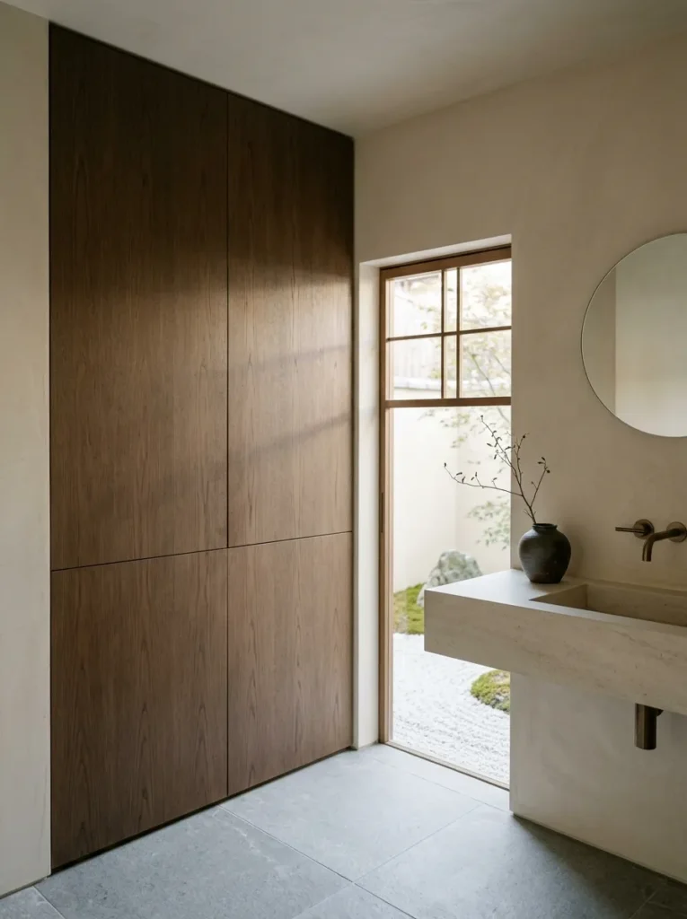
Open shelving in bathrooms means the products on those shelves are always visible — shampoo bottles, cleaning sprays, spare toilet rolls, cotton pads, medications, all of it. The argument for open shelving is accessibility. The counterargument is that those products, in their commercial packaging, are rarely things you want to look at. Closed cabinetry — a vanity with doors, a mirrored cabinet above the basin — hides the clutter entirely. The room functions exactly the same way and looks entirely different. If you enjoy displaying a small number of deliberate objects, one open shelf is enough. Not six.
18. Install an Undermount Basin Rather Than an Above-Counter One
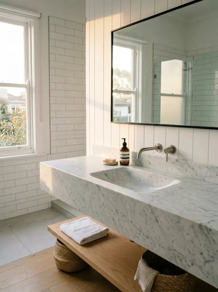
Above-counter basins — the bowl-shaped vessels that sit on top of the vanity surface — became fashionable in high-end hotel design in the early 2000s and have been enthusiastically overused since. They add visual height to the vanity, create a ledge around the base that collects water and product residue, and make the tap height awkward unless specifically specified. An undermount basin — set below the countertop surface so the rim sits beneath the stone or timber — creates a continuous horizontal plane. The countertop reads as one surface with a hole in it. It’s easier to clean. It’s visually cleaner. It’s also the correct choice.
19. Use a Single Overhead Rain Shower Head Instead of Multiple Fittings
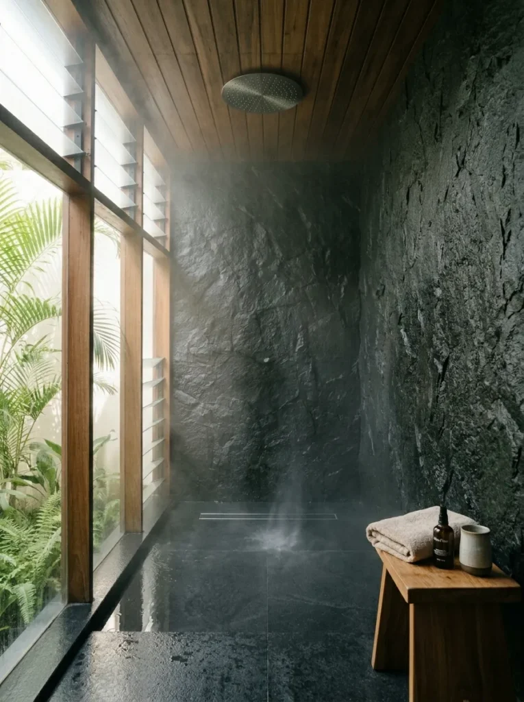
A shower fitted with a body jet system, a handheld attachment, a rain head, and a fixed side jet requires four separate plumbing connections, four sets of controls, and a valve panel that becomes the focal point of the shower wall for the wrong reasons. A single ceiling-flush rain head — 300mm diameter minimum, fed through the ceiling rather than a wall arm — eliminates the hardware entirely. The shower is a hole in the ceiling and a drain in the floor. Nothing else. This is the specification that the best hotel rooms use and that most domestic bathrooms never reach because the brief says “more options.”
20. Choose Wall-Mounted Taps to Keep the Countertop Clear
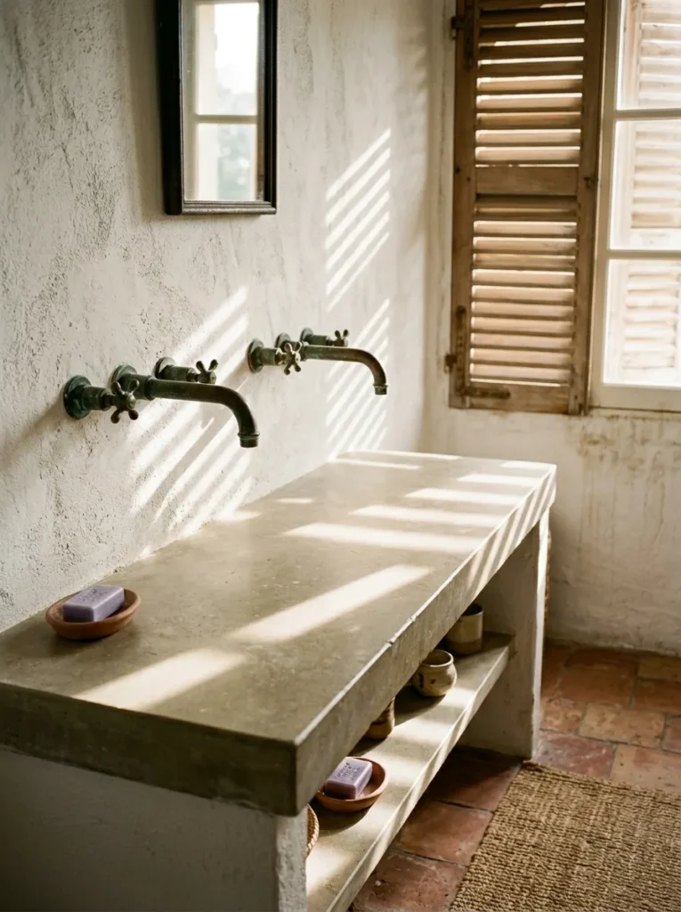
Deck-mounted taps require a hole or holes drilled through the basin or countertop. Each hole is a visual interruption in the surface. Wall-mounted taps — spouts and handles fixed to the wall above the basin rather than through the basin — leave the countertop entirely uninterrupted. The surface is a plane. The tap emerges from the wall above it. The visual logic is clean and the practical effect is a countertop that is genuinely easier to wipe down because there are no tap bases collecting water at the surface.
21. Fit an Extractor Fan Behind the Mirror, Not in the Ceiling
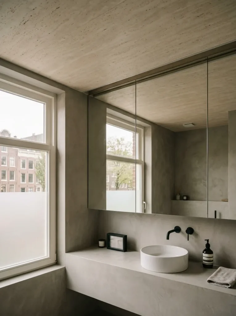
Ceiling extractor fans are functional and visible. The grille, the housing, the ceiling penetration — all of it reads as a practical intrusion into the ceiling plane. Some mirror manufacturers now integrate an extractor fan into the mirror unit itself — the extraction happens through the perimeter of the mirror and vents through the wall behind. The ceiling stays unbroken. The fan is invisible unless you look for it. In bathrooms with painted ceilings or feature ceiling tiles, the ceiling-mounted extractor is the one element that always slightly undermines the rest of the design.
22. Use Matte Surfaces Wherever Possible
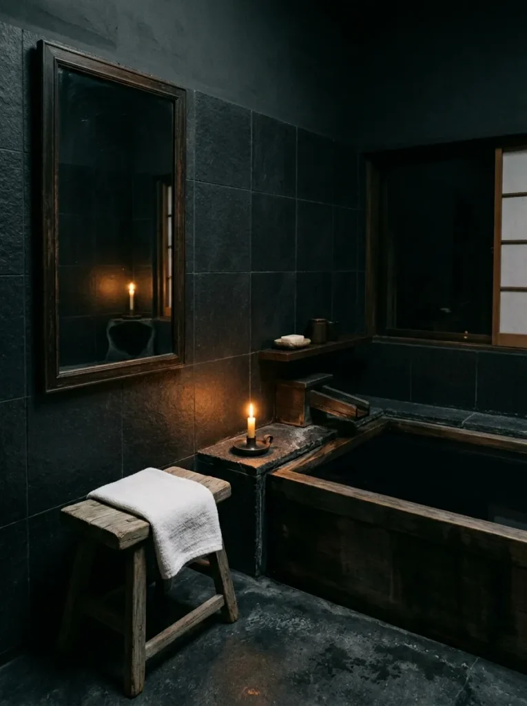
Glossy tile reflects light directionally, which means it also reflects every smear, water splash, and limescale deposit with equal enthusiasm. Matte porcelain, honed stone, and matte paint absorb light rather than reflecting it. The surface reads as flatter and calmer. The room feels quieter. The maintenance is also more forgiving — a matte surface touched by a damp hand reads as clean. The same moment on gloss reads as dirty. For the floor, a slight texture — not rough, just enough tooth that it reads as matte — also reduces slip risk, which is the practical benefit that glossy floor tile enthusiasts consistently overlook.
23. Let One Wall Stay Entirely Empty
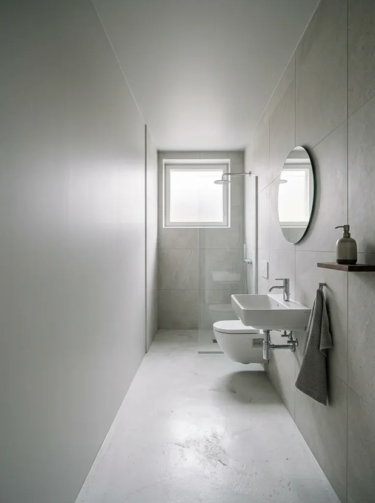
Every bathroom has at least one wall that functions as a dumping ground for accessories — a towel hook, a framed print, a toilet roll holder attached mid-wall, a small shelf added because there was space. These things accumulate over time and each one seemed reasonable at the moment of installation. The cumulative effect is a wall that reads as busy rather than considered. Choosing one wall deliberately and leaving it entirely clear — no hardware, no art, no storage — creates a surface that functions as visual breathing room. It doesn’t look unfinished. It looks intentional. The calm bathroom design principle is that emptiness is a material choice, not an absence of a decision.
24. Stop One Material Short of Everywhere
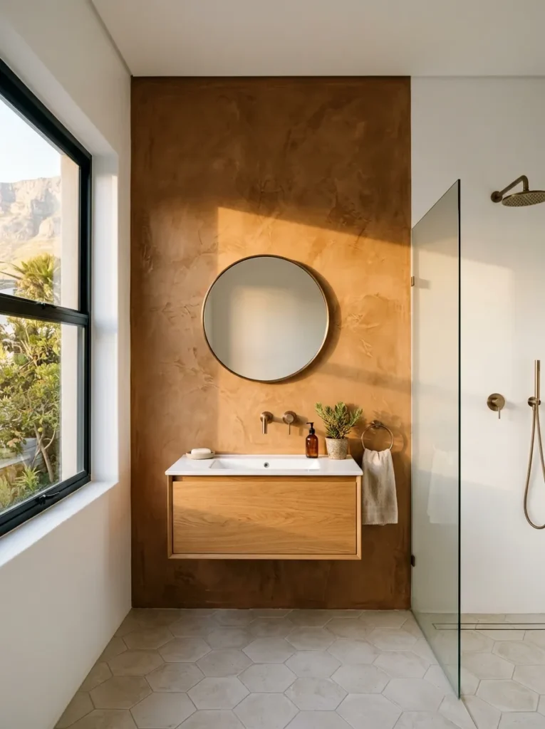
The instinct in a calm bathroom — once you’ve found a material you love — is to use it everywhere. The limewash plaster looks so good on one wall, so put it on all four. The zellige tile is so beautiful, so tile the whole room. The problem is that a single material applied to every surface in a room reads as a texture rather than a decision. It loses its power through repetition. The rule worth testing is this: when you think a material should go everywhere, stop it one surface short. One tiled wall instead of four. One limewash panel instead of the whole room. The contrast between the featured material and the plain surrounding surfaces is what makes both of them visible. Use it everywhere and neither surface does anything.
Final Thoughts
Minimal bathroom ideas are not a style — they’re a discipline, and the hardest part of the discipline is the editing, not the choosing. Most people start with the right instincts, find a tile they love and a tap they love and a layout that makes sense, and then quietly undo all of it in the final stage by adding accessories, mixing metals, opening shelves, choosing the contrasting grout. Start with the floor and the tile, commit to a grout that disappears, and make every subsequent decision in service of the continuous surface. The vanity, the hardware, the storage, the lighting — all of it should be resolved before anything decorative is introduced. If you get the surfaces right, you will need almost no decoration at all. That’s the point.