18 Sage Green Bedroom Ideas That Feel Calm and Organic
Sage green has an unusual quality among bedroom colors: it reads as both a color and a neutral simultaneously. It has enough visual presence to shift a room’s atmosphere entirely, and enough restraint to sit quietly beside almost every material and color combination without competing. That quality — the reason it belongs in the same mental category as warm white and pale greige rather than in the color-as-statement camp — is also what makes getting it right surprisingly specific.
The sage green that looks serene in a south-facing bedroom with warm afternoon light reads dull and slightly grey in a north-facing room under cool indirect light. The sage that works against natural oak furniture can look muddy against grey-painted furniture. The shade that reads beautifully as a wall color can overwhelm as a ceiling color in the same room. These distinctions matter, and most sage green bedroom articles skip all of them in favor of photographing pretty rooms and suggesting you add plants.
These 18 ideas address the full range — from choosing the right undertone for your specific light conditions to pairing sage with rust, blush, and charcoal, from all-sage-everything to single-accent approaches — with enough practical specificity to help you make decisions that will look right in your actual bedroom, not just in a curated photo.
1. Choose the Undertone Before the Paint Color

Sage green is not one color. It’s a family of muted, grey-green hues that each carries a distinct undertone — blue-grey, yellow-green, warm earthy, or cool silver — and that undertone determines how the color reads in different light conditions and beside different materials. A sage with a blue undertone reads cool and sophisticated, works well in south-facing bedrooms with warm afternoon light, and pairs naturally with linen and cool-toned wood. A sage with a warm yellow-green base reads earthier and more botanical, works better in rooms with neutral or warm natural light, and sits comfortably beside walnut, terracotta, and cream.
The test: apply a large sample (at least 12 by 12 inches) to the actual wall and evaluate it at four times of day — morning, noon, afternoon, and under artificial evening light. Sage greens with blue undertones often shift towards grey under warm LED light; those with green-yellow undertones can read slightly olive in north-facing rooms. Knowing which undertone works in your specific room before committing is the decision that prevents the disappointment of painting a room sage green and finding it looks nothing like what you expected.
2. Use Sage Green on All Four Walls for Full Atmospheric Immersion

The most impactful use of sage green in a bedroom is full-room application — all four walls in the same muted green, which creates a genuinely immersive color experience rather than the more tentative quality of a single accent wall. Painted on all four walls, sage green envelops the bedroom in a way that makes the room feel organically complete, like the color was always meant to be there rather than applied as a deliberate design choice.
Full-room sage works because the color’s inherent restraint prevents it from feeling overwhelming even at full saturation — it has none of the aggressive visual presence of a bright or saturated color applied across four walls. The ceiling in this application should either match the wall color exactly (for a fully enveloping quality) or go one shade lighter (to preserve the ceiling’s lifted visual height). Trim in a warm white provides clean architectural definition without introducing visual temperature that fights the green.
3. Apply Sage Green to One Wall as a Gathered, Soft Focal Point

For bedrooms where a full commitment to sage green feels like too much, a single accent wall — almost always the wall behind the bed — creates a soft focal point that frames the headboard without demanding that the room be organized around a color. The advantage of this approach is controllability: the sage wall reads as a design decision without requiring the room’s other elements to defer to it.
The accent wall in sage works best when it’s genuinely deep enough in tone to read as a distinct color at the room’s viewing distance. Pale sage applied to one wall in a room with very pale warm white walls can look like the sage wall is simply receiving more shadow than the others rather than being a different color. Go one or two shades deeper than your instinct on the accent wall — the depth that looks slightly intense on a paint chip often reads as exactly right across a full wall under real light conditions.
4. Pair Sage Green Walls With Warm White Trim and Cream Bedding

The color relationship that most consistently makes sage green bedrooms feel resolved rather than still-being-figured-out is the specific pairing of sage walls, warm white trim, and cream or natural linen bedding. Bright cool white trim beside sage can make the green look dull by comparison — the high contrast reads as stark. Warm white trim, with its slight cream or ivory cast, sits beside sage without creating a sharp temperature gap, and it gives the wall color room to breathe rather than cutting it with visual contrast.
The bedding’s warm cream or natural linen tone completes a palette triangle: cool-warm sage on the walls, warm white at the architectural detail, and natural warm neutral at the bed’s most visible surface. This arrangement is worth noting as a starting point because it succeeds across virtually every variation of sage undertone — from the blue-sage shades to the warmer earthy ones — which makes it the reliable baseline to build from.
5. Introduce Natural Oak or Walnut Furniture for Organic Warmth

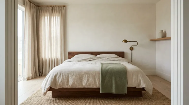
Sage green’s relationship to natural wood is one of the most reliably successful pairings in bedroom design because both materials reference the same organic, nature-derived quality. Natural oak — particularly in its lighter blonde or honey tones — provides warm contrast against sage walls without competition; the two materials share enough natural origin to feel visually related. Walnut in its medium-warm brown works similarly, adding more depth and grounding than oak while remaining organically compatible.
The specific wood finish matters. Heavily lacquered or artificially dark-stained wood reads too formal beside sage green’s inherent quietness. Natural oil-finished or lightly sealed wood in a matte or satin finish has the lived-in warmth that sage green needs as a companion material. If the existing bedroom furniture is darker or more formal than this ideal, raw wood accessories — a plain oak tray, a simple wooden mirror frame, a natural wood shelf bracket — introduce the material quality in lower-commitment form.
6. Add Rust, Terracotta, or Warm Amber as the Accent Color

Sage green occupies a cool-to-neutral position on the color wheel, which makes it pair more naturally with warm earthy tones than with cool ones. Dusty pink, lavender, and pale blue are the colors most often suggested beside sage, but the pairing that produces the most resolved and sophisticated result is warm rust, terracotta, or amber — the earthy opposites that create contrast without competition.
A rust or terracotta throw pillow against sage green bedding, a terracotta lamp base against a sage wall, or amber glass on a bedside shelf beside a sage headboard — these combinations reference the natural color story of a botanical landscape where grey-green foliage meets warm earth and stone. The accent quantity matters: one or two rust or terracotta elements are enough to activate the contrast; several competing rust elements introduce a visual energy that competes with the restful quality sage green is chosen for.
7. Use Sage Green Wallpaper for Texture and Pattern Alongside Color

Sage green doesn’t only come in flat paint. A botanical wallpaper in a sage green palette — one where the sage appears as foliage, background wash, or pattern base — brings pattern and texture alongside color, which produces a more visually complex bedroom wall than paint alone. The wallpaper makes the green feel more designed and more specific to a style direction, and it adds the illustrative or organic quality that flat paint cannot provide.
Applied to all four walls, a sage botanical wallpaper creates a genuinely enveloping atmosphere that reads as more intentional than paint of the same color. Applied to the headboard wall only, it creates the same focal-point effect as the accent wall while adding the additional layer of pattern. The practical consideration: most botanical wallpapers in sage palettes lean toward a warmer, more earthy sage rather than a cool blue-green, which means they pair most naturally with warm wood furniture and earthy accent colors rather than cool-toned accessories.
8. Paint Woodwork and Built-Ins the Same Sage Green as the Walls

The approach that makes sage green look most architecturally embedded in a bedroom — as though the color has always belonged to the room rather than being applied afterward — paints all woodwork, built-in joinery, window surrounds, and any built-in cabinetry in the same sage tone as the surrounding walls. When architecture and wall color merge, the room reads as resolved and period-appropriate in a way that walls-only painting rarely achieves.
This technique works particularly well in bedrooms with good architectural bones — built-in wardrobes, alcoves, window seats, or deep window reveals — because the sage unifies the complexity of the architectural detail into a single coherent surface. It’s worth noting that painting woodwork and trim the same sage color requires a slightly different finish treatment on each: flat or matte on walls, eggshell or satin on woodwork and trim for durability and to create a subtle sheen difference that maintains legibility without a color contrast.
9. Layer Organic Materials — Jute, Linen, Rattan — Throughout the Room

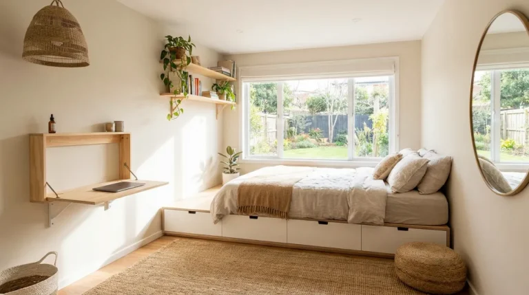
Sage green’s natural, muted quality means it harmonizes most immediately with materials that share its organic register: jute rugs with their warm honey weave, linen bedding with its slub texture, rattan furniture with its natural cane pattern, unglazed terracotta ceramics, raw cotton throws, and woven seagrass storage baskets. These materials don’t just work alongside sage green — they reinforce the same nature-derived sensibility that makes the color feel calm rather than merely green.
A bedroom that layers several of these materials — a jute rug on the floor, linen bedding at the bed, a rattan nightstand or woven pendant light, a simple terracotta plant pot — creates a material story where the sage green walls are one element in an organically coherent whole rather than a color applied to a room of unrelated materials. The layering effect means the room reads as considered even when no single piece is expensive.
10. Try Sage Green as a Ceiling Color in a White-Walled Room

The ceiling is one of the most dramatic and underused color applications available in any bedroom, and sage green makes a particularly effective ceiling color for a specific reason: it reads as sky-like rather than heavy. A sage green ceiling above white walls creates the visual impression of looking upward into a canopy of foliage — an organic, almost outdoor quality that no other ceiling color quite replicates.
This application works best in bedrooms with good ceiling height — eight feet or above — where the ceiling reads as a genuine architectural surface rather than something that bears down on the room. In rooms with lower ceilings, a very pale, almost white sage at the ceiling achieves a similar suggestion of color without the visual weight of a deeper tone. The walls in this configuration should stay white or very pale warm neutral — the ceiling is the color statement, and the walls serve as the neutral backdrop that makes it readable.
11. Choose Sage Green Bedding as a Low-Commitment Starting Point

Not every bedroom needs sage green walls to feel like a sage green bedroom. A duvet cover, pillowcase set, or coverlet in a dusty, muted sage introduces the color at the most visually prominent surface in the room without any permanent changes. For renters, for those uncertain about committing to a paint color, or for anyone who wants to test the sage palette before investing in paint and labor, bedding is the most accessible and most reversible entry point.
The sage bedding works best when the surrounding room palette doesn’t fight it — warm white walls, natural wood furniture, and neutral rugs all provide the right backdrop. Bright white walls can make sage bedding look slightly dull or muted rather than calmly intentional; ivory or warm white walls allow the sage’s muted warmth to read at its best. Linen fabric in sage rather than cotton reads as more organic and visually complex, which suits the calm, natural bedroom aesthetic that sage green consistently aims for.
12. Paint Bedroom Furniture in Sage Green for a Statement Accent Piece

A dresser, wardrobe, or bedside table painted in sage green introduces the color at furniture scale rather than at wall scale — a genuinely different visual weight. A single piece of furniture painted sage in a room with warm white walls becomes the room’s primary color moment without requiring any decision about wall paint, and it can be repainted or replaced without touching the room’s architecture.
This approach is particularly useful for vintage or secondhand furniture that has good bones but needs updating. A simple wooden dresser painted in a matte sage green, with its original hardware replaced with brushed brass, reads as a specific design choice rather than an inherited piece. The matte finish is important: gloss or semi-gloss sage green on bedroom furniture can look clinical or bathroom-like; a flat or chalky matte finish reads as the organic, composed version of the color.
13. Use a Sage Green Upholstered Headboard to Anchor the Bed Wall

An upholstered headboard in sage green linen or velvet introduces the color at the bed’s most architecturally significant position without requiring wall paint or commitment to a full-room color change. Against warm white or cream walls, a sage headboard creates a soft focal point that centers the bed wall and introduces the color precisely where the eye spends the most time in a bedroom — facing the bed from the doorway.
The fabric choice shifts the headboard’s character significantly. Sage linen upholstery reads as organic, relaxed, and casual — the appropriate texture for a room aiming for calm and natural. Sage velvet reads as richer, more considered, and slightly more formal — appropriate for a bedroom with higher-quality material investment throughout. Both work; the choice should match the room’s overall material register rather than being made in isolation.
14. Combine Sage Green With Charcoal or Deep Grey for a Grounded Palette

Sage green’s natural pairing partners are usually light — cream, white, natural wood — which produces a palette that reads as airy and gentle. The alternative that produces a more grounded, sophisticated result combines sage with a deep charcoal or warm dark grey: one color is quiet and nature-derived, the other is architectural and grounding, and the two create a bedroom palette with more visual depth than sage-plus-neutrals alone.
Charcoal in this pairing appears most effectively in the darker accents — a charcoal linen throw, dark-toned nightstands, an aged wrought iron mirror frame, dark hardwood floors — while sage occupies the walls or the bedding. The combination suits bedrooms that want the organic quality of sage green with the sophistication that very light rooms can lack. Warm white or natural wood elements mediate between the two poles and prevent the combination from reading as simply dark and green.
15. Add a Single Large Plant as a Living Extension of the Color Palette

In a sage green bedroom, a large, well-chosen plant is not merely decorative — it’s a continuation of the room’s color story. The relationship between sage green walls and living foliage is one of the most visually seamless in interior design because both elements exist in the same color family, and the plant’s three-dimensional organic form adds what painted walls cannot: irregular, living texture and depth.
The species should have foliage that complements rather than competes with sage’s muted grey-green. Deep, dark waxy foliage — a rubber plant, a ZZ plant, a fiddle-leaf fig — provides contrast in depth of tone rather than a competing color. The pot material anchors the organic narrative: a hand-thrown terracotta or a matte sandy ceramic reads as belonging to the room rather than as an added object. One large plant in the right position makes more impact than several small ones scattered across the room.
16. Use Limewash or Venetian Plaster Finish for Textural Sage Green Walls

Flat paint in sage green creates color; limewash or Venetian plaster in sage green creates atmosphere. Both finishes produce a wall surface that shifts tonally as the light angle changes throughout the day — slightly darker in shadow areas, slightly lighter where light rakes across the surface — which prevents the sage from reading as uniform and static. The variation makes the walls feel like a natural, organic surface rather than a painted one.
Limewash in sage green reads chalky and aged — more farmhouse or Mediterranean in quality, natural and unpretentious. Venetian plaster in sage green reads polished and slightly luminous — more contemporary and considered. Both are more expensive than paint and require skilled application for a professional result. Several paint brands produce limewash-effect finishes that can be DIY-applied and achieve a reasonable approximation of the textural quality at significantly lower cost and complexity.
17. Bring Sage Into a Neutral Bedroom Through Curtains and Textiles Only

The most flexible and most reversible way to introduce sage green into a bedroom is through the room’s soft furnishings — curtains, throw blankets, cushions, and rugs — without changing any surface that’s attached to the architecture. This approach suits renters, those who change their bedroom aesthetic frequently, and anyone who wants the sage green palette without the commitment of paint or furniture.
Floor-length curtains in a dusty sage linen, a single sage green throw draped over the bed’s foot, and two sage accent pillows among neutral-toned bedding can shift an entirely neutral bedroom into the sage green palette without a drop of paint. The key is coordinating the sage items across the room so they read as a deliberate color decision rather than individual objects that happen to be green — the curtains, the throw, and the cushions need to share a closely related sage tone rather than spanning a wide range of green shades.
18. Stay Within the Sage Family but Vary the Depth Across Surfaces

Rather than treating sage as a single flat color applied uniformly, using sage at different depths across different surfaces in the same room creates tonal complexity that reads as a sophisticated color approach. Pale sage on the ceiling, mid-depth sage on the walls, and a deeper dusty sage-green on an upholstered headboard or curtain panels creates a room where the color has dimensionality — moving from lightest at the highest point to richest at the most grounded elements.
This principle mirrors the way color appears in nature: foliage ranges from near-yellow-green at the light-receiving tips to deep, shadowed green at the interior branches. A bedroom that uses sage at multiple depths applies the same logic to the built environment and produces a result that feels organically motivated rather than monochromatic. The depth variation should be subtle enough that all three levels read as part of the same color family — the goal is tonal richness, not contrast.
How to Choose the Right Sage Green for Your Bedroom
Two variables determine which sage works in your bedroom: the room’s natural light direction and the dominant material tone of the existing furniture and floors.
North-facing bedrooms receive cool, indirect light that tends to pull blue and grey undertones forward. In these rooms, a sage with a warm yellow-green or earthy undertone reads more accurately as a true muted green rather than shifting toward grey. South and west-facing rooms with warm natural light can support cooler, blue-grey sages that would read flat in lower light conditions.
For furniture and floors, the rule is undertone matching. Warm wood furniture — honey oak, natural walnut — pairs most naturally with sages that have warm or neutral undertones. Cool-toned grey or white furniture suits cooler, more silver-sage shades. When the room’s furniture is a mix of warm and cool, choosing a sage with a balanced neutral undertone rather than one that leans strongly in either direction produces the most versatile result.
Test on the actual wall. The chip tells you the undertone direction; the painted wall tells you how it reads in the room.
Final Thoughts
Sage green is one of the most reliably calming bedroom colors available — genuinely restful rather than simply inoffensive — when the specific undertone is matched to the room’s light and the palette is built around materials that share its organic register. The ideas here span every commitment level from a full four-wall paint application to sage bedding in a white room, with enough specificity at each step to help you make the decisions that actually determine how the result looks.
Start with the undertone decision. Test samples on the wall before buying a full quantity. Then choose the application — walls, ceiling, furniture, or textiles — based on your room’s architecture and your appetite for commitment. Everything else — the rust accents, the natural wood companions, the linen and rattan layers — builds naturally from those two foundational choices.
Save the ideas here that match your room’s light conditions and your own sense of how much sage green you want in the space, and return to this guide when you’re ready to make the palette permanent.