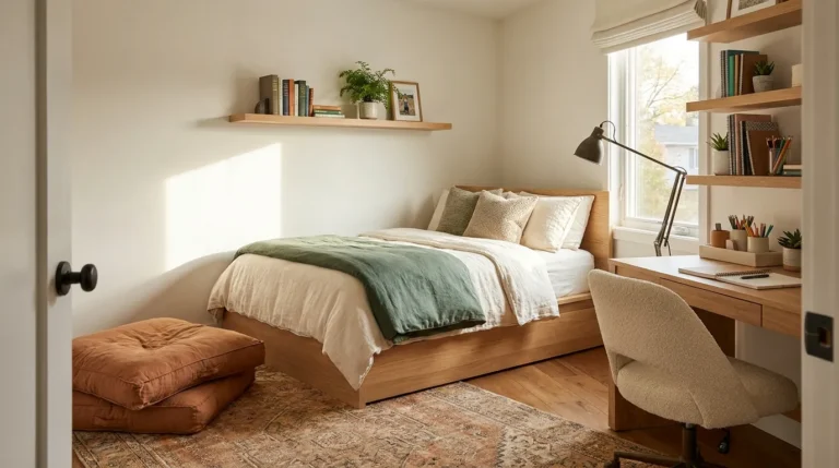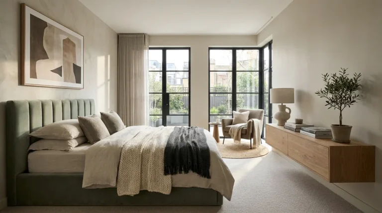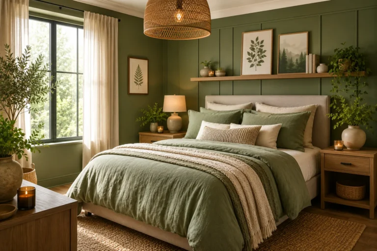
19 Beige Bedroom Ideas That Feel Warm and Timeless
Beige gets dismissed as the safe, boring choice — and then people discover that choosing the wrong beige turns their walls faintly pink in the evening, orange in direct sun, or flat and dingy in a north-facing room. Beige is not a single color. It’s a family of warm neutrals that each carry hidden undertones — yellow, pink, green, grey, or orange — and those undertones determine whether the room looks considered or simply unfinished.
Done well, a beige bedroom is one of the most genuinely livable color choices available. It works under natural and artificial light, it pairs with wood, stone, linen, and leather without conflict, and it creates the kind of settled, unhurried atmosphere that bedrooms need and that trendier color choices often can’t sustain for more than a season. These 19 ideas move from the foundational decisions — wall color, undertone, contrast — through furniture, textiles, and accent choices, with enough specificity at each step to help you make the decisions that actually matter.
1. Understand Beige Undertones Before Choosing a Wall Color
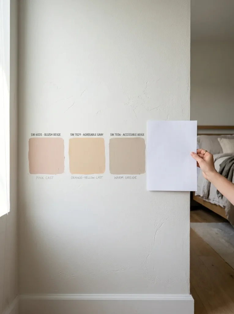
The single most important step in a beige bedroom is choosing the right undertone for your specific room. Beige can carry yellow, pink, green, grey, or orange undertones, and each shifts dramatically under different light conditions. A beige with a pink or orange base can look warm and rich in a south-facing room with good natural light and genuinely unpleasant — like a Band-Aid — in a north-facing room under cool or daylight-balanced LEDs.
The reliable test: hold the paint chip against a sheet of pure white to reveal the undertone more clearly than comparing chips against each other. Then buy samples and paint two 12-by-12-inch squares on the actual walls you’re painting, viewing them in morning light, afternoon light, and evening artificial light before committing. Beige with warm yellow or green undertones tends to be most versatile across different light conditions. Beige with pink or orange undertones needs warmer, south-facing light to read as intended.
2. Choose a Warm White or Soft Greige for Walls if True Beige Feels Too Committed
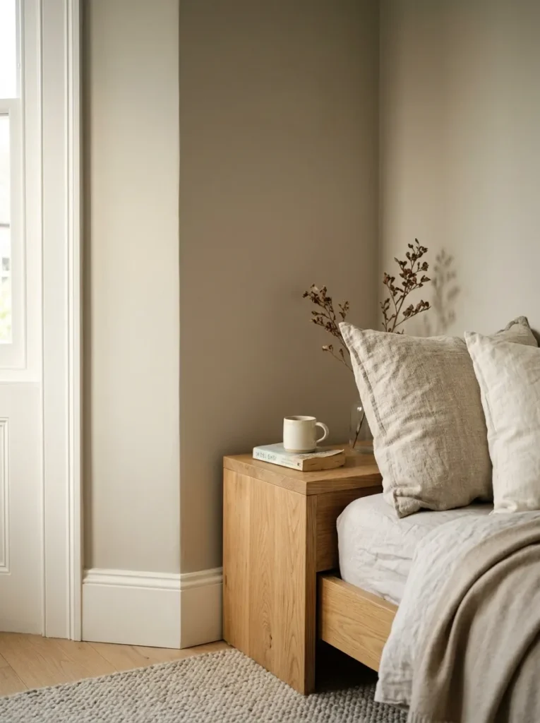
For bedrooms where the full warmth of a true beige feels like too strong a commitment, a warm white — one with a cream or sand base rather than a cool blue-white — or a greige — part grey, part beige — gives you the tonal warmth of the beige family without the depth of a pure beige wall.
The distinction matters in practice. Stark brilliant white reads clinical under warm artificial light. A warm white with a cream undertone reflects evening light in a way that feels sunlit rather than fluorescent. Greige occupies a middle territory: more specific than white, more versatile than pure beige, and particularly useful in rooms that sit between warm and cool in their natural light. Either is a valid starting point for what reads as a beige bedroom when paired with the right textiles and furniture.
3. Use Tonal Layering to Prevent Beige From Reading Flat
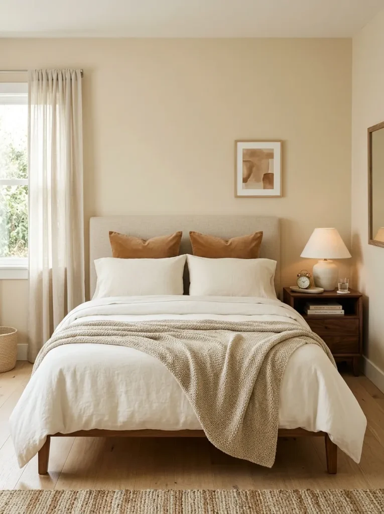
The rooms where beige fails most visibly are those where everything is approximately the same shade of beige without enough tonal variation to create depth. Walls in pale beige, cream bedding, cream furniture, and beige curtains all together produce a room that reads washed-out rather than refined — the eye has nothing to travel between.
Tonal layering means using the beige family deliberately across a range: a mid-depth beige on the walls, a lighter cream in the bedding, a slightly deeper caramel in a throw or accent pillow, and a darker warm brown in wood furniture. These aren’t contrasting colors — they’re variations within the same warm family. The range of tones is what gives the room visual dimension while keeping the palette fully cohesive. A good test: squint at the room. If everything dissolves into a single undifferentiated tone, there isn’t enough tonal range. There should still be a clear hierarchy of light and dark within the palette even with eyes partially closed.
4. Anchor the Bed With a Textured Headboard in a Related Warm Tone
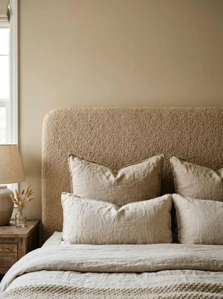
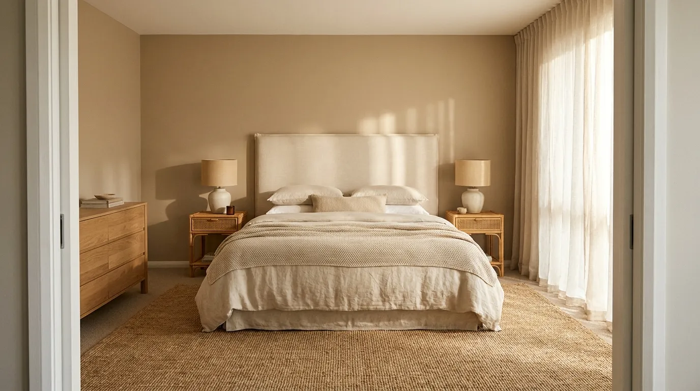
In a beige bedroom where the walls, floor, and bedding are all operating within a warm neutral range, the headboard is the most visible opportunity for surface texture and material richness. A linen-upholstered headboard in warm ivory, a boucle panel in oatmeal, or a cane-front headboard in natural honey all add tactile depth at the room’s most prominent focal point without introducing a color that competes with the palette.
The headboard tone should stay within the beige-to-caramel range rather than jumping to a stark white or a dramatically contrasting dark. A headboard one or two shades deeper than the wall color — a caramel against a pale sand wall — creates just enough separation between bed and wall that the headboard reads as a distinct element rather than disappearing into the background. Proportion matters too: a headboard that’s undersized for the bed frame floats rather than anchors.
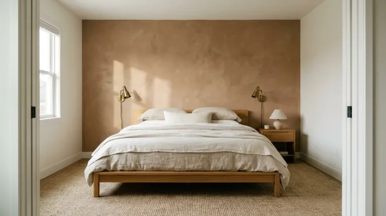
5. Paint One Wall in a Deeper Earthy Tone for Depth Without Drama
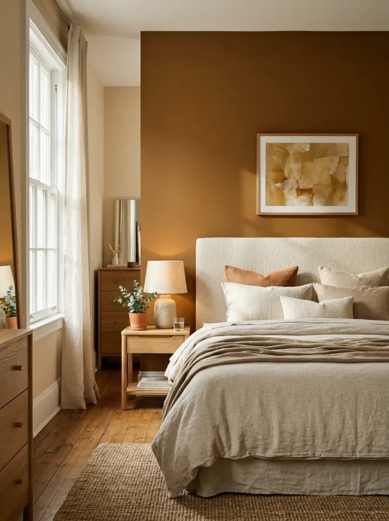
A beige bedroom doesn’t have to be uniformly pale to read as a beige bedroom. One wall — typically the one behind the bed — in a richer, deeper tone within the warm neutral family adds visual weight and definition without introducing color contrast. A warm chocolate, a deep camel, a muted terracotta diluted to a blush, or a rich honey tan all deepen the palette without abandoning it.
The relationship between the accent wall and the surrounding walls should feel like depth rather than contrast. The accent is the same palette taken further, not a different palette introduced for visual interest. This approach works particularly well in north-facing bedrooms or rooms with limited natural light, where a uniformly pale beige can read as slightly grey and lifeless. The deeper accent wall gives the room a tonal anchor that prevents the pale walls from reading as colorless.
6. Layer Linen Bedding in Natural, Undyed, and Warm Tones
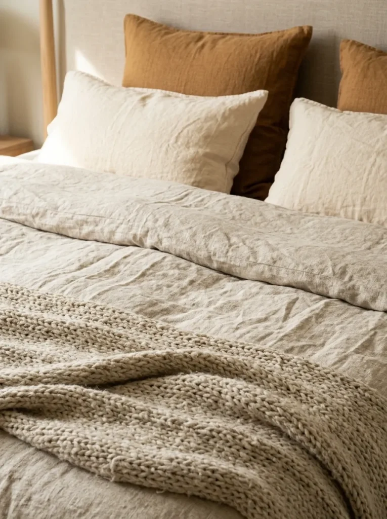
The bed occupies the most visual real estate in a bedroom, and the bedding is what most directly determines whether a beige bedroom feels genuinely warm or slightly flat. Pre-packaged matching bedding sets in a consistent cream color tend to read as domestic-generic; layered linen bedding assembled from individual pieces in related but varied warm tones reads as more considered and more interesting.
Washed linen in natural undyed tones — the slightly irregular, warm off-white of unbleached fabric — is the most useful foundation. Layer it with a duvet or coverlet in a warm oatmeal, a chunky knit throw across the foot in a camel or warm taupe, and euro shams in a tone slightly different from the main bedding. The variety comes from texture and slight tonal variation within the warm family rather than from pattern or color contrast. Washed linen also photographs and reads in person as intentionally relaxed rather than stiffly made, which suits a warm, unhurried bedroom aesthetic.
7. Introduce One Muted Accent Color Without Compromising the Neutral Base
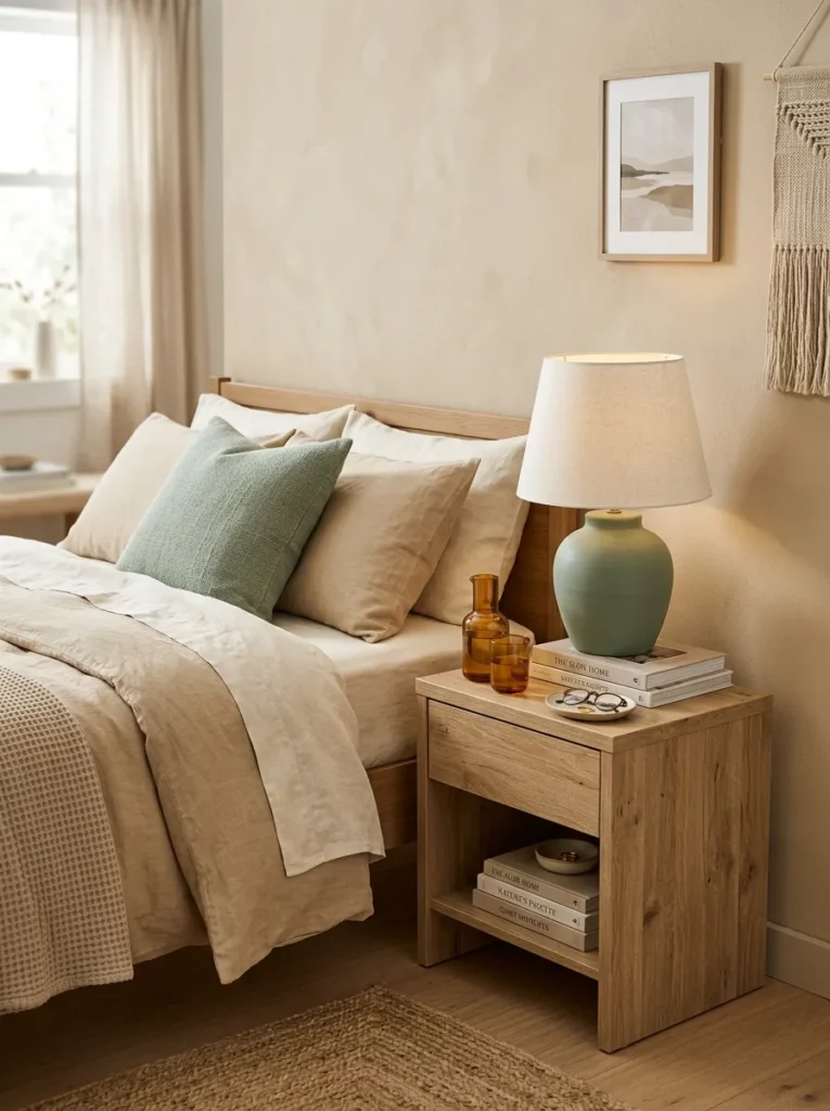
A beige bedroom read entirely within its own palette is a valid and genuinely restful choice. But for those who find pure neutrals too visually quiet, a single muted accent color introduced in one or two places gives the room a point of focus without disrupting the warm neutral foundation.
The accent colors that work best within a beige palette are those that already exist in nature alongside warm sand and stone tones: soft sage green, dusty blue-grey, warm rust, muted terracotta, faded blush. These aren’t bright accents — they’re subdued enough to read as part of the warm neutral story rather than as separate color additions. One accent color in two places — a throw pillow and a ceramic lamp base, for example — is enough to give the eye a resting point without the room becoming about that color.
8. Use Warm Wood Furniture to Add Organic Depth
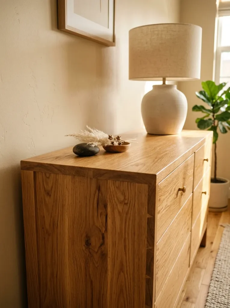
Wood furniture in a beige bedroom serves a purpose that upholstered or lacquered pieces in similar tones don’t: it introduces organic material warmth, visible grain texture, and the slight color variation that comes from natural material rather than manufactured consistency. A nightstand in natural oak, a dresser in walnut, or a low bench in bleached teak all bring a quality to the room that painted or upholstered furniture in the same tonal range simply can’t replicate.
The wood tone should stay within the warm family. Lighter woods — blonde oak, ash, maple in natural finishes — keep the room airy and suit paler beige palettes. Medium warm tones — walnut, honey-toned teak, natural oiled oak — suit mid-depth beige walls and provide more grounding. Avoid very dark stains or mahogany, which introduce a heaviness that can make a warm neutral bedroom feel more traditional than intended.
9. Pair Beige Walls With Warm White Trim, Not Cool Bright White
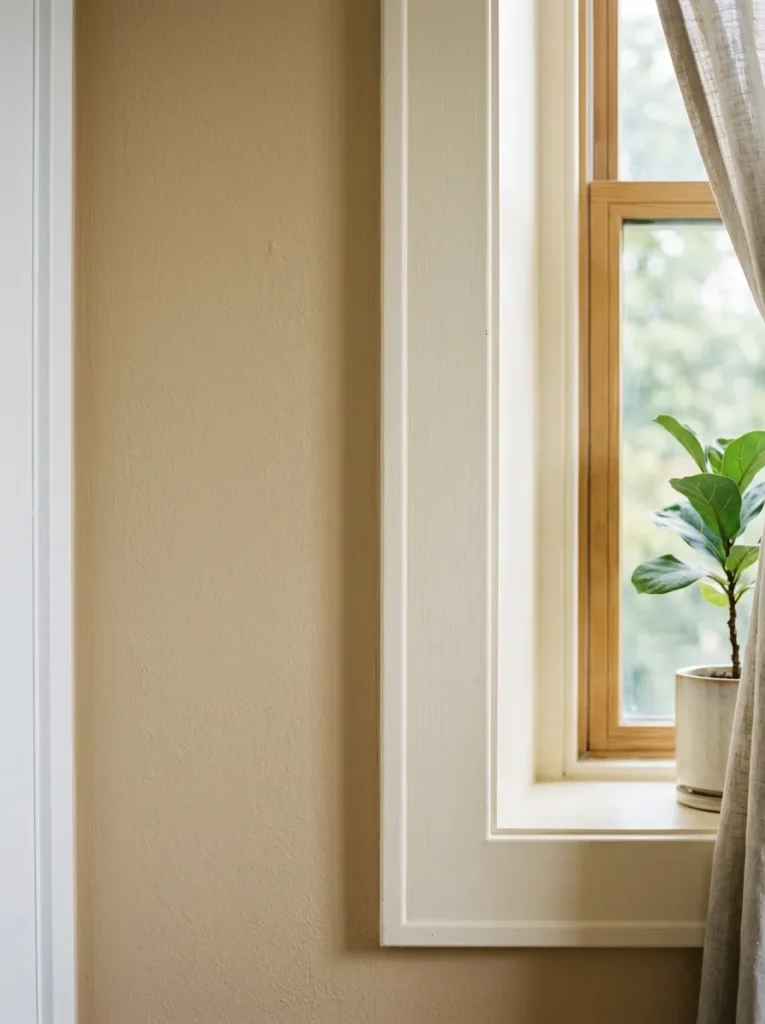
The trim color in a beige bedroom is a decision that’s easy to overlook and surprisingly visible when it goes wrong. Stark, cool bright white trim against warm beige walls creates a jarring contrast that makes the beige appear slightly yellowed or dirty by comparison — the cool white pulls the undertones of the beige toward their least flattering reading.
Warm white trim — a white with a faint cream, ivory, or sand base — sits naturally beside beige walls because the two share the same warm undertone register. The contrast between wall and trim remains clear and architectural, but the relationship reads as harmonious rather than discordant. The same principle applies to ceiling color: a warm white ceiling over beige walls maintains the room’s tonal unity; a cool white ceiling can make the room feel like two separate color decisions placed adjacent to each other.
10. Choose Natural Fiber Flooring or Rugs to Ground the Palette
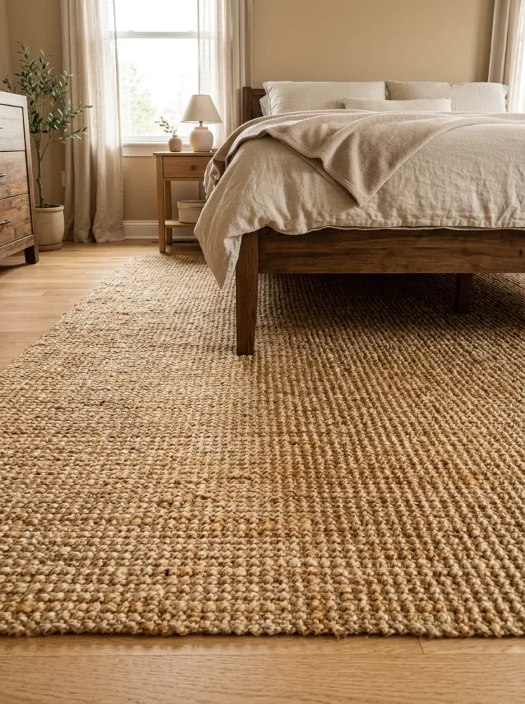
In a beige bedroom, the floor either supports or undermines the warm neutral palette, and the distinction between a warm-toned floor and a cool-toned one is significant. Natural wood in warm honey or natural oak tones, stone in sandy or warm travertine, and natural fiber rugs in jute or sisal all stay within the warm palette and require no additional work to integrate. Cool grey stone, very dark espresso wood floors, or pale cool-toned tiles create a tonal disconnect with the beige walls that takes deliberate effort to resolve.
Where the existing floor is cool-toned and can’t be changed, a large area rug in a warm natural fiber — a jute rug, a sisal-texture wool, or a flatweave cotton in warm cream or oatmeal — covers enough floor area to shift the room’s floor perception toward the warmer register. The rug should extend well beyond the bed footprint on all sides to be effective; a rug that’s too small reads as a spot treatment rather than a floor choice.
11. Add Rattan, Cane, or Woven Elements for Textural Contrast
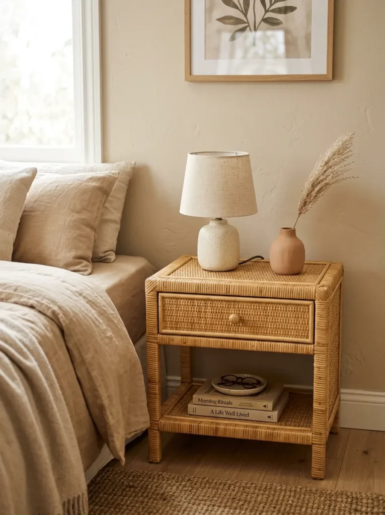
Within a tonal palette as close as a beige bedroom’s, material texture becomes the primary source of visual interest. Rattan, cane, and woven natural materials provide organic texture that sits comfortably within the warm neutral palette while contributing a surface quality that painted wood, smooth upholstery, and flat linen cannot match.
A rattan nightstand, cane-front dresser drawer panels, a woven pendant light shade, or a natural wicker basket in the corner all introduce this weave texture without disrupting the room’s color cohesion. Because the materials themselves are warm in tone — most rattan and cane reads in the honey-to-caramel range that aligns naturally with beige palettes — they integrate without requiring any compensating color adjustments. They’re also among the most reliably photographed materials in bedroom interiors, which suits the room’s Pinterest potential.
12. Layer Multiple Textile Textures in the Same Warm Tonal Range
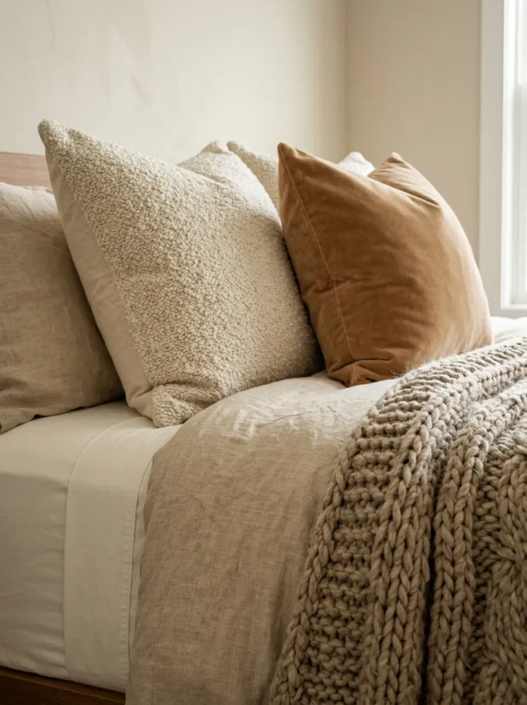
Texture layering is what separates a beige bedroom that looks considered from one that looks like it has no color. The idea is to use multiple fabric textures within the same tonal family so the visual richness comes from surface variation rather than color contrast. The combination of smooth cotton percale, rough-woven linen, soft knit, velvet, and nubby boucle all within the warm ivory-to-caramel range creates more visual depth than five competing colors in the same smooth fabric.
In practice: a linen duvet in natural ivory, a velvet throw pillow in warm caramel, a chunky knit blanket in oatmeal draped across the bed’s foot, and boucle euro shams in cream. None of these are exactly the same color, and none are in a different color — they read as a composed tonal arrangement where the eye picks up texture rather than pattern.
13. Introduce Warmth Through Ceramics and Natural Stone Accents
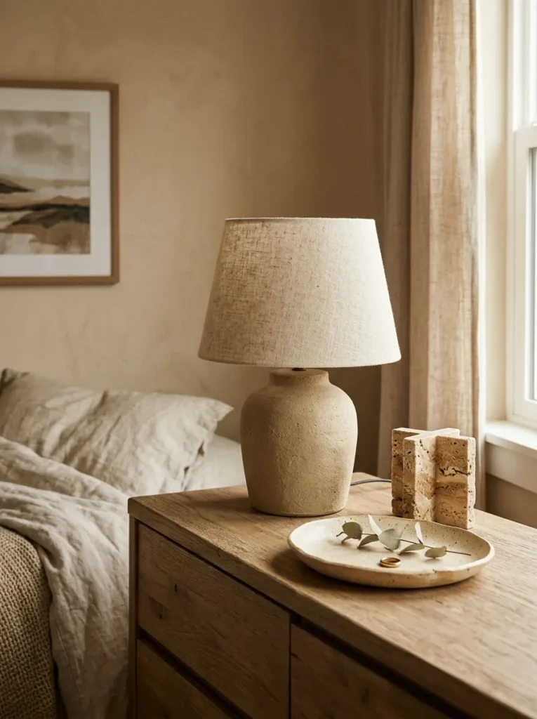
The decorative objects in a beige bedroom have the same responsibility as everything else: to maintain the warm tonal register without introducing competing colors. Matte ceramics in sandy, warm white, or earthy clay tones, natural stone objects in travertine or sandstone, and simple terracotta pieces all sit quietly within the palette while adding the material weight that a purely fabric-and-paint room lacks.
Grouping objects in similar materials — two or three ceramic pieces on a dresser, a stone lamp base with a linen shade — creates the kind of quiet material coherence that reads as curated rather than decorated. Avoid glossy, highly reflective ceramics in a warm beige bedroom, which can introduce a sharpness that works against the room’s unhurried quality. Matte or slightly textured ceramic glazes in the right tonal range add warmth without reflection.
14. Use Wall Art That Stays in the Warm Tonal Register
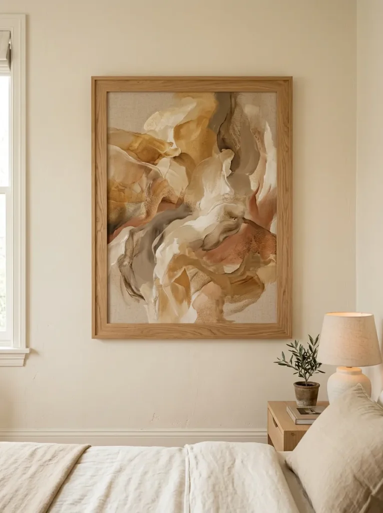
Art in a beige bedroom is an opportunity to reinforce the warm palette or an easy way to inadvertently undermine it. Large, high-contrast graphic prints, cool-toned black and white photography, or pieces with strong competing colors all create a visual interruption that pulls focus from the room’s tonal cohesion.
Art that works in a beige bedroom tends toward the warm end: abstract work in earthy ochres, warm browns, and sandy tones; landscape photography that references warmth; simple line drawings or botanical prints in warm cream and brown tones; or minimal abstract work that uses the wall color as part of its composition. The frame should ideally be in a material that connects to the room — natural wood, aged brass, or simple terracotta-toned ceramic tile frames all sit more naturally in a warm beige room than a black or silver metal frame.
15. Light the Room Warmly to Protect the Palette at Night
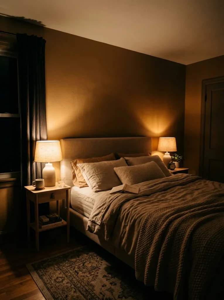
Beige is more light-dependent than most colors. The warm quality that makes it appealing during daylight hours can shift significantly in the evening if the artificial lighting has a cool color temperature. Cool-white or daylight-balanced bulbs strip the warmth from beige walls and can make them read flat, grey, or slightly dingy rather than the warm, inviting tone they show in natural light.
Warm-white bulbs — those rated at 2700 to 3000 Kelvin — maintain the beige palette’s warmth under artificial light conditions and are worth specifying for every fixture in a beige bedroom. Table lamps, sconces, and pendants with warm-toned shades in linen or aged parchment further warm the light before it reaches the walls. The layered lighting approach — bedside lamps, a dresser lamp, and a dimmable overhead rather than one bright overhead alone — gives the room tonal range in the evening that flatly illuminating one fixture can’t achieve.
16. Add a Canopy or Bed Curtains for Enclosure and Warmth
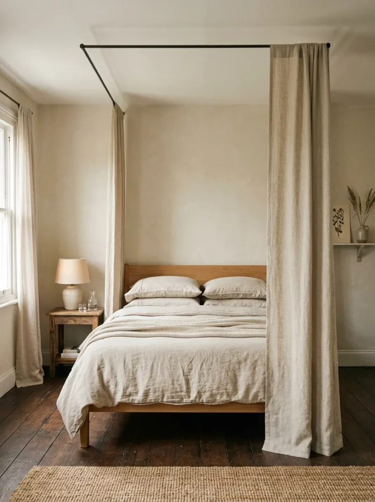
A canopy — whether a full four-poster with fabric panels or a simple ceiling-mounted rod with curtains framing the headboard wall — creates a layer of architectural warmth that transforms the bed from a piece of furniture into a self-contained space within the room. In a beige bedroom, linen or cotton canopy panels in natural undyed or warm cream tones extend the textile palette vertically, creating the sense that the bed is surrounded by the room’s warm material story rather than floating in open space.
This works particularly well in rooms with higher ceilings, where the vertical space above the bed can feel disconnected from the rest of the room’s warmth. A canopy brings the ceiling visually lower at the bed specifically, creating a cocooning quality that suits the retreating, private purpose of a bedroom. The canopy fabric doesn’t need to be elaborate — simple straight panels hung from a minimal rod often read more elegantly in a warm neutral room than a draped or gathered arrangement.
17. Keep Nightstands Consistent in Material and Deliberate in Scale
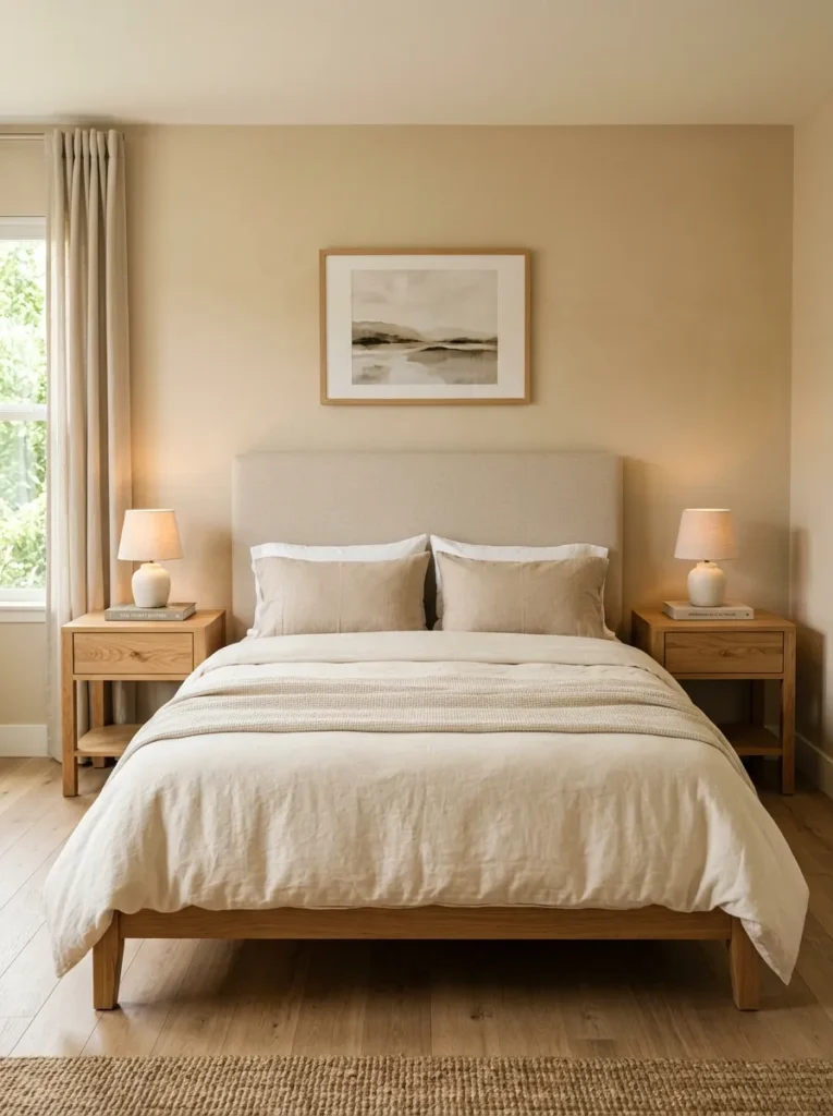
The nightstands bookending the bed have an outsized effect on the bedroom’s overall sense of order, and in a warm neutral room where there’s less contrast to distract from proportion, their scale and material become more visible than in a more visually busy room. Nightstands that are undersized for the bed read as props rather than furniture; those that are too tall or too wide overpower the bed rather than flanking it.
The general guide: nightstands should reach within a few inches of the mattress height, allowing comfortable reach from a lying-down position. Their visual weight should be proportional to the bed — a low platform bed suits a more compact, open-leg nightstand; a taller, fuller bed frame suits a nightstand with more visual mass. In a beige bedroom, a pair of matching nightstands in a natural wood tone — oak, walnut, rattan — keeps the palette unified while providing the surface area for lamps, books, and the small objects that bedside living requires.
18. Hang Floor-Length Curtains in a Tone That Relates to the Walls
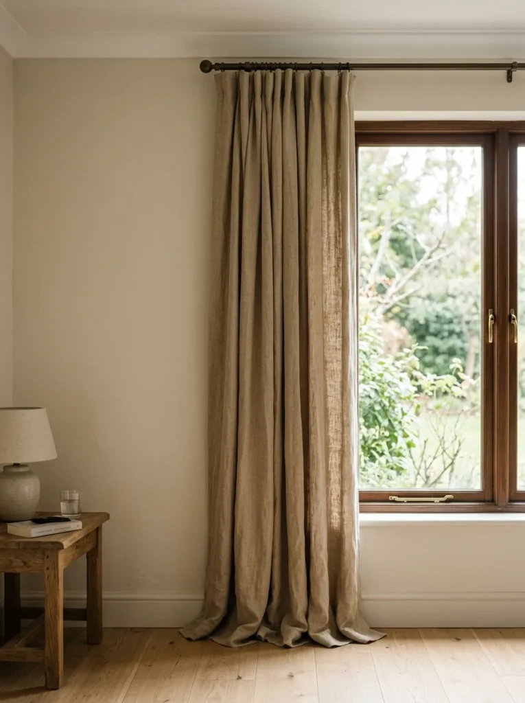
Curtains in a beige bedroom have a specific responsibility: to maintain the room’s warm palette as they frame the windows while managing natural light without disrupting the tonal story. A curtain that’s too white introduces a coolness that conflicts with the beige walls; one that’s too dark creates a contrast that reads as a design choice the rest of the room didn’t make.
Linen or cotton-linen blend curtains in a warm sand, natural undyed, or slightly deeper warm taupe relate to the wall color without matching it exactly. The tonal distance between curtain and wall — a few shades in either direction within the warm family — creates a soft layered look rather than either an exact match or a sharp contrast. As with any bedroom curtain, mounting the rod as high as possible toward the ceiling and using panels that reach the floor makes the window appear taller and the ceiling higher, regardless of the actual dimensions.
19. Edit the Room for Warmth First, Then Add Carefully
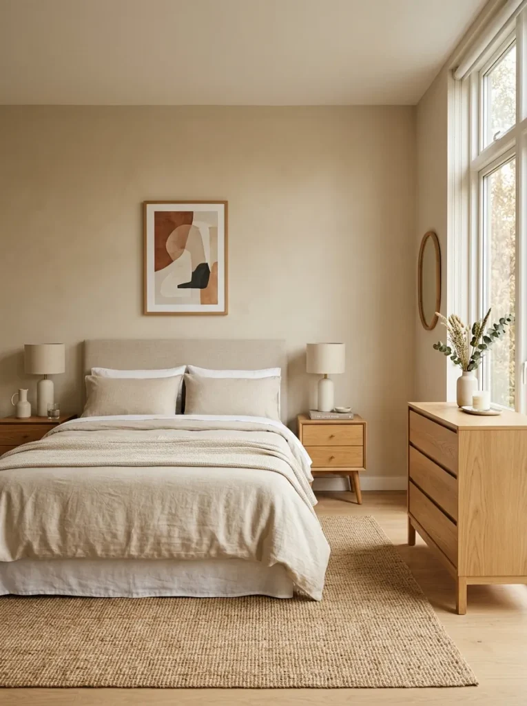
The most common failure mode in beige bedrooms is not having too little — it’s having too much that dilutes the clarity of the warm neutral palette. A beige bedroom that’s been accessorized with objects in too many materials, too many textures that compete rather than relate, or accent pieces in colors that don’t share the warm tonal register ends up looking not like a warm neutral room but like a room without a clear point of view.
The editing principle is simple: if an object introduces a material, texture, or tone that doesn’t connect to the warm beige palette — a bright chrome lamp, a cool grey throw, a piece of art with strong contrasting colors — it’s worth reconsidering its presence. This isn’t about minimalism; a beige bedroom can be layered and rich. It’s about cohesion. Everything in the room should feel like it was chosen because it belongs to the same warm, unhurried visual conversation.
How to Keep a Beige Bedroom From Feeling Boring
The critique of beige — that it’s safe, bland, unambitious — usually describes badly executed beige rather than beige itself. The rooms where the critique holds up are those where beige was chosen as a default neutral and then decorated without any particular intention: one uniform tone across walls, bedding, and furniture, minimal texture variation, and no considered use of natural materials or light.
The correction isn’t to add color. It’s to use the warm neutral palette with more intentionality: choose the beige undertone that actually works in the room’s light conditions, build tonal range deliberately within the warm family, use natural materials for their texture rather than just their color, and light the room at a color temperature that maintains warmth in the evening as well as the daytime. A beige bedroom decorated with those principles in mind doesn’t look safe — it looks settled, and that’s a different thing entirely.
Final Thoughts
Beige is one of those palette choices that rewards the decisions made before a single piece of furniture enters the room: the specific undertone, the trim color, the bulb temperature, the floor material. Get those foundational decisions right and the room builds itself with a natural coherence. Get the undertone wrong and the most beautiful bedding and furniture won’t fully compensate.
If you’re starting a beige bedroom from scratch or refreshing an existing one, begin with the wall color decision. Test actual samples in your specific light conditions before committing, match the undertone to the warmth register of your floors and furniture, and pair with warm white trim rather than cool white. Everything else — the linen layers, the wood nightstands, the rattan accents and ceramic objects — has a natural place to land once the walls are right.
Save the ideas here that match your room’s light conditions and your own sense of the warmth you’re after, and come back to this guide when it’s time to build the layers.