24 Living Room Gallery Wall Ideas That Tell a Story
A gallery wall that actually tells a story is harder to create than one that merely fills a wall. The difference shows immediately: a considered gallery wall reads as a collection with a point of view, a set of decisions made over time with care. A generic one reads as art hung in the approximate same location until the wall was covered.
Most guides on this topic tell you to arrange frames on the floor first, then transfer them to the wall. That’s useful practical advice, but it doesn’t address the real challenge — which is knowing what to put in those frames, how to create visual coherence without uniformity, and which arrangement logic suits your room, your wall, and your aesthetic.
These 24 living room gallery wall ideas cover the full range of approaches: from tightly curated black-and-white photo grids to loose, layered eclectic arrangements; from minimalist two-piece compositions to full staircase walls of family photographs. Each idea has a specific visual direction, a specific content strategy, and enough practical guidance to help you understand whether it suits your wall, your room, and your tolerance for commitment.
The living room gallery wall is one of the most personal things you can put in your home. Here’s how to make it feel that way.
1. Above-Sofa Symmetrical Grid

The wall above the sofa is the most natural gallery wall location in a living room — it’s at eye level from the seating, it’s the first wall visible from the doorway, and its width is defined by the sofa below. A symmetrical grid in this position (two rows of three, three rows of four, four frames of equal size in a square) creates immediate visual order that reads as confident rather than decorative.
The grid works because it borrows its logic from graphic design: equal spacing, equal frames, equal mat widths. The arrangement’s structure does the visual work, which means the content inside the frames can be varied without creating chaos. Black-and-white photographs in a symmetrical grid read differently than they would in a scattered arrangement — the order makes each image more legible rather than less.
The critical proportion rule: the grid’s total width should span roughly two-thirds to three-quarters of the sofa’s length. A grid wider than the sofa reads as unmoored; one narrower than half the sofa length looks undersized for the wall it’s on.
2. Asymmetrical Salon Wall from Sofa to Ceiling

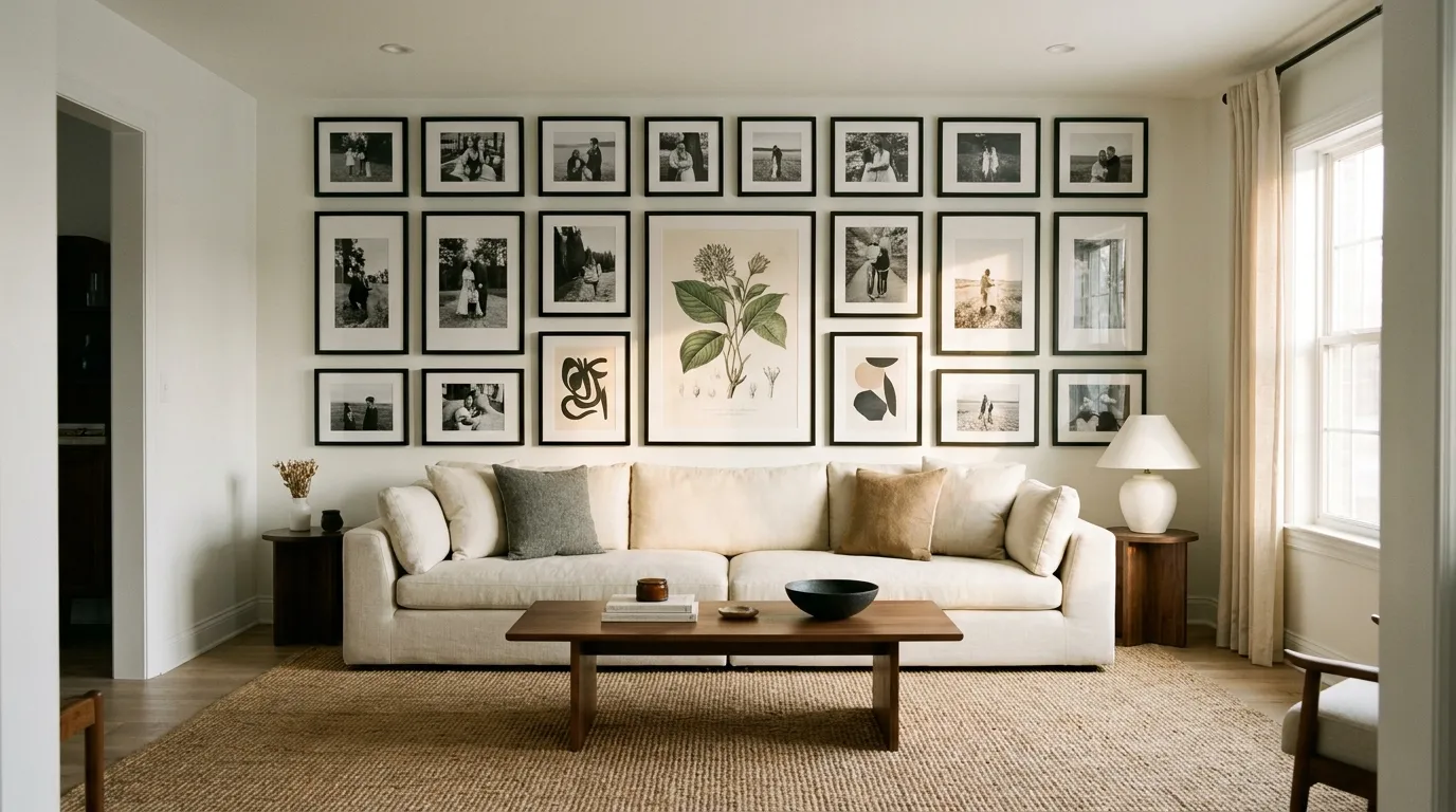
Where the grid borrows from graphic design, the salon wall borrows from 19th-century European hanging practices — frames of every size, stacked from just above the sofa to the ceiling, covering the wall in a dense, layered arrangement that reads as accumulated over decades.
The challenge with a salon wall is that asymmetry that looks intentional requires more planning than symmetry. The approach that works: establish the arrangement’s visual center first (not the physical center of the wall, but the optical center where the largest or most important piece sits), then build outward from there. Larger frames belong in the lower two-thirds where visual weight anchors the composition; smaller frames occupy the upper zone.
The total width should still relate to the sofa below — the arrangement can be taller and denser than a grid, but it should not extend dramatically beyond the sofa’s footprint on either side without a specific reason (an architectural feature, a window, a corner) to anchor the extension.
3. The Single-Row Horizontal Ledge Display

A picture ledge — a slim shelf of 3 to 4 inches depth mounted at a consistent height — running the length of the sofa wall replaces the traditional hung-art gallery with a leaning display. Frames, small canvases, and objects lean against the wall at any angle; the arrangement can be changed seasonally or whenever a piece is swapped out without touching the wall.
This is the most renter-friendly gallery wall format because it requires only the shelf anchors (typically two to four points per ledge section) rather than individual nail holes for every frame. It’s also the most adaptable: no arrangement is permanent, which suits people who collect incrementally and want to incorporate new pieces without rearranging everything.
The ledge works best when the displayed pieces vary in height enough to create movement — a tall narrow canvas beside a small square frame beside a leaning ceramic tile creates a rhythm that a row of identical frames cannot. Introduce one or two three-dimensional objects (a small sculpture, a ceramic vessel, a plant) into the row to break the flat plane of the frames.
4. All Black-and-White Photography in Matching Frames
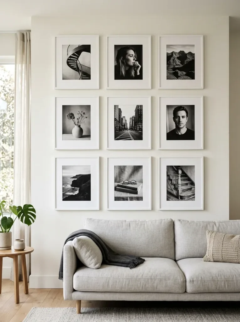
A gallery wall built entirely from black-and-white photography creates a visual coherence that color work rarely achieves — the absence of color removes the most disruptive variable and lets content, composition, and contrast do all the work. In a living room with a strong color palette, an all-black-and-white photography wall reads as a deliberate anchor; in a more neutral room, it provides graphic definition without competing with anything.
The frame choice creates the remaining stylistic decision. All-black frames with white mats read as contemporary and graphic. All-white frames read as lighter and more gallery-like. Thin natural wood frames read as warmer and more collected. All three approaches work; what doesn’t work is mixing multiple frame finishes in a black-and-white photography wall — the frame variety defeats the coherence the monochrome content establishes.
For content, black-and-white works best when the photographs have clear tonal range — true blacks, genuine whites, and a full grey scale in between. Low-contrast or flat black-and-white images lose legibility in a group; high-contrast images hold their own beside each other.
5. A Mix of Original Art and Found Prints

A gallery wall that combines original artwork — pieces you’ve painted, had painted, or purchased directly from an artist — with found prints, reproductions, and pages from art books creates a layered quality that an all-purchased or all-DIY arrangement rarely achieves. The original work gives the wall genuine singularity; the found prints give it context and conversation.
The visual trick is ensuring the original work doesn’t look isolated or over-spotlighted. Position the original piece at or near the arrangement’s visual center — not necessarily the physical center, but the position the eye naturally returns to — and build around it with pieces that relate in subject matter, palette, or mood rather than pieces that are obviously supporting acts.
A small original oil painting in a simple frame reads as far more valuable and interesting beside three thoughtfully chosen reproduction prints than it does hung alone on an empty wall. Context elevates individual pieces; isolation diminishes them.
6. A Family Photo Wall in a Consistent Frame Color
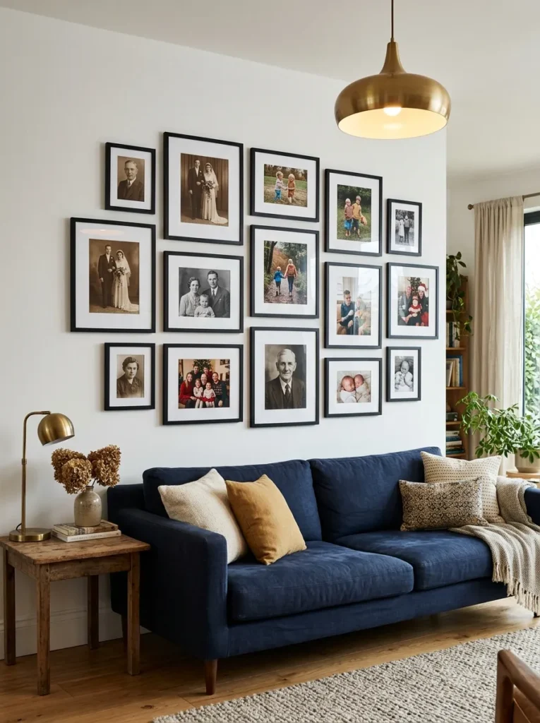
Family photographs in a gallery wall often fail not because of the photos themselves but because of the frames. A mix of natural wood, black metal, white-painted wood, and ornate gold frames makes even beautiful photographs look chaotic. Choosing a single frame color — all black, all white, all natural wood — transforms the same collection of personal images into something that reads as edited and intentional.
The photographs themselves can vary in content, era, and format (portraits, landscapes, candid moments, formal shots) without creating visual problems, because the frame consistency carries the arrangement. Mix older photographs with recent ones; a sepia-toned grandparent’s portrait beside a contemporary family vacation photograph, both in matching black frames, reads as a genuine family timeline rather than an accidental collection.
Mat width is the secondary decision. All-white mats of the same width add a gallery quality to personal photos that elevates them considerably. Varying mat widths within the same arrangement creates a visual inconsistency that undermines the frame unification.
7. A Multigenerational Photo Wall with Vintage Prints

Building on the family photo wall concept but extending it to multiple generations — grandparents, great-grandparents, older relatives from eras before color photography — creates a gallery wall with genuine historical depth. Old photographs, particularly formal portraits from the early and mid-20th century, have a visual quality (high contrast, formal composition, archival toning) that blends unexpectedly well with contemporary photography when framed consistently.
The multigenerational wall works best when it includes photographs across at least three generations. Two generations gives the wall a personal quality; three or more gives it a documentary quality — a family archive made visible and inhabitable.
Digitize and print old photographs at gallery quality rather than displaying the originals, which are vulnerable to light damage. A high-quality print of a 1940s family portrait, printed on fine art paper and framed properly, reads as beautifully as the original without the conservation concerns.
8. The Minimalist Two-to-Four Piece Arrangement

A gallery wall doesn’t require filling an entire wall. Two, three, or four pieces hung with deliberate spatial relationships — enough space between them that each piece has room to breathe, close enough that they read as a composed group rather than separate decisions — creates a minimalist version of the gallery wall that suits contemporary, Scandinavian, and quiet transitional rooms.
The spacing logic is what makes this work. In a traditional gallery wall, frames hang 2 to 3 inches apart. In a minimalist multi-piece arrangement, the space between pieces is itself a compositional element — 8 to 12 inches of deliberate empty wall between each frame reads as an intentional pause rather than a mistake.
This approach suits living rooms where the art itself is strong enough to carry the space without density. A large abstract print beside one smaller complementary piece, with generous empty wall on all sides, reads as confident and considered. Two small prints with the same relationship reads as decorative.
9. Oversized Single Statement Art Positioned at Eye Level

The simplest version of a gallery wall isn’t a wall of many things — it’s one very large piece hung correctly. A large-format canvas, print, or photograph hung at the exact right height (center of the piece at 57 to 60 inches from the floor, which is the standard museum hanging height and corresponds to average eye level) reads as more resolved than any multi-piece arrangement in a room that’s already visually active.
The scale commitment is the critical decision. An art piece that reads as “large” in the gallery or online often reads as small on a full living room wall. For the above-sofa wall of a standard living room, a piece at least 40 inches wide is the starting point for genuine visual impact; 50 to 60 inches wide is more often the right scale.
Hanging height is the mistake made most consistently. Art hung too high — which is the default for most people, who instinctively center it on the empty wall above the sofa — creates a disconnect between the art and the furniture. Bringing the bottom of a large piece to within 6 to 8 inches of the sofa back creates the visual connection that makes the arrangement feel complete.
10. Eclectic Collected Wall with Mixed Media and Textures

An eclectic gallery wall mixes media deliberately — framed prints alongside small woven textiles, a ceramic wall plate beside a framed illustration, a small mirror beside a sculptural relief, a pressed botanical specimen beside a photograph. The mix of flat and dimensional, art and object, is what gives the wall its collected quality.
This approach is the one most commonly attempted and most frequently abandoned partway through because the mixing requires a clear coherence principle to prevent it from reading as random. The principle doesn’t need to be explicit, but it needs to exist. Shared color palette is the most reliable: all objects and frames in the same tonal family — warm earthen tones, cool monochromes, botanical greens — allows diverse forms and media to coexist without fighting.
Three-dimensional objects need mounting hardware suited to their weight and form. Ceramic plates hang on plate hangers that grip the rim from behind; woven textiles need a rod or clip system; sculptural reliefs need appropriate wall anchors. Plan the mounting before purchasing rather than improvising after.
11. A Botanical and Nature Print Collection

A gallery wall built entirely from botanical illustration — vintage herbarium prints, contemporary plant illustrations, pressed specimen frames, nature photography — creates one of the most versatile and room-agnostic arrangements possible. The subject matter relates naturally to plant life in the room, to natural materials in the furniture and textiles, and to the organic quality that most contemporary living rooms are moving toward.
Vintage botanical prints are widely available as public domain reproductions (from sources like the Biodiversity Heritage Library and the Smithsonian archives) which can be downloaded and printed at any size, making this one of the most cost-effective gallery wall approaches available. The illustrations have the hand-drawn detail and color patina of original artwork at a fraction of the cost.
The arrangement should have some internal organization — grouping similar plant families, creating a gradient from light to dark tones, or organizing by color — rather than displaying botanicals at random. Even loose organization creates a sense of curatorial intent.
12. A Boho Gallery Wall with Woven Textiles and Macramé
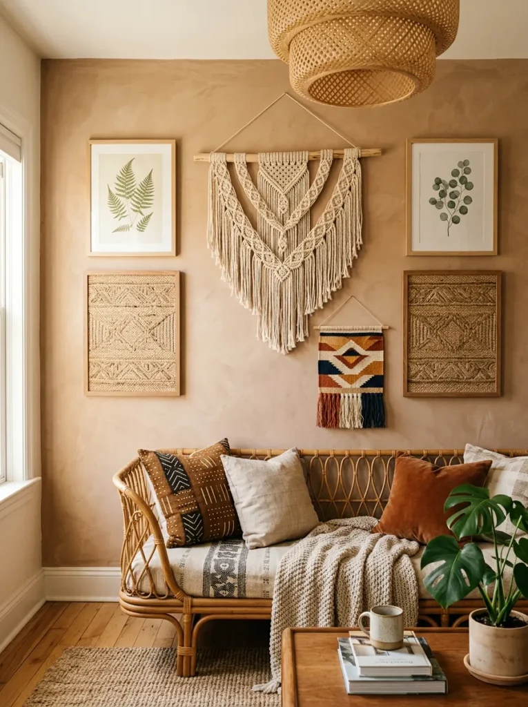
A bohemian gallery wall replaces the conventional frame-on-white-mat format with a mix of wall hangings, woven tapestries, small macramé pieces, printed fabric panels, and a few framed elements in natural wood or rattan frames. The result reads more like a textile collection than a traditional art display.
The arrangement logic is looser than a frame-based gallery wall but still benefits from some structure: hang the largest or most dimensional piece first (typically a woven tapestry or a large macramé) and build the smaller, flatter elements around it. Keep the color palette in the same tonal family — warm terracotta, ochre, natural linen, dusty sage — to maintain coherence across the diverse formats.
This approach suits living rooms decorated in natural materials — rattan furniture, jute rugs, linen upholstery, wood — where the textile-heavy gallery wall feels like an extension of the room’s material story rather than an import from a different aesthetic. It also suits accent walls behind a sofa where the warm textures of the hanging add acoustic softness as well as visual warmth.
13. A Travel and Memory Wall of Collected Souvenirs

A gallery wall built from objects and images collected during travel — a map of a significant city framed beside a photograph taken there, a small print purchased at a local market, a pressed flower from a destination garden — creates a wall with the most genuinely personal narrative of any approach on this list.
The challenge is coherence when the collected items come from many different places and time periods. The frame strategy holds the collection together: all items in the same frame style (a simple natural wood, or all in black), regardless of the diversity of what’s inside them. The frames become the visual constant; the content can vary as freely as the experiences that generated it.
This is also one of the most incremental gallery walls possible — it can begin with three or four pieces and expand over time as new travels and experiences add to it. The wall’s incompleteness at any given point is part of its honesty rather than a flaw.
14. A Children’s Art Gallery Wall in a Family Living Room

Children’s artwork hung with the same care and framing quality as adult art transforms the living room into a space that acknowledges the whole family rather than only its adult aesthetic. A consistent set of frames in a single finish — all white or all natural wood, large enough to mat the artwork generously — elevates even the simplest child’s drawing to something that reads as genuinely displayed rather than stuck to the refrigerator.
The rotating nature of a children’s art gallery is a feature rather than a complication. A frame with a removable back allows artwork to be swapped easily when new pieces deserve display. Dating the artwork before framing creates an archive that grows more valuable over time.
The arrangement can be as formal or informal as the room requires. In a design-conscious living room, a tight grid of consistently sized frames reads as edited and deliberate. In a family living room that’s already eclectic, a looser arrangement with varying frame sizes reads as genuinely celebratory.
15. An All-White Frame Gallery Wall on a Colored or Textured Wall

A gallery wall where every frame is white or off-white, hung on a colored, textured, or patterned wall, creates a visual inversion of the standard dark-frame-on-white-wall approach. The frames read as light against a rich backdrop — against a terracotta limewash wall, against a deep sage green, against a grasscloth wallpaper — which gives the arrangement a softer, more layered quality than high-contrast framing.
This approach also reduces the pressure on the frame itself to make a statement, since the wall treatment carries that role. The frames can be simple and inexpensive because their visual job is to hold and present the art against the background, not to be interesting in themselves.
Content for an all-white frame gallery wall benefits from having some lightness or warmth — heavy, dark imagery in light frames against a colored wall can read as weighted and somber. Botanical illustrations, watercolors, family photographs with bright backgrounds, and abstract work in light tones all suit this context well.
16. A Gallery Wall That Incorporates Mirrors
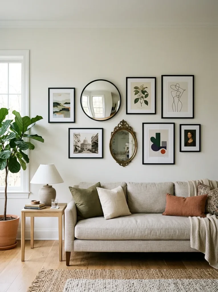
Adding one or more mirrors to a gallery wall introduces a different kind of surface — one that reflects the room rather than displaying a fixed image. In a living room with limited natural light, a mirror within the gallery wall catches and bounces available light back into the room in a way that no framed print can.
The mirror should relate to the surrounding frames in scale and shape but doesn’t need to match them exactly. A round mirror among rectangular frames provides a shape contrast that prevents the wall from reading as too uniform. An ornate-framed mirror beside simple-framed prints creates a material contrast that feels collected.
Position the mirror in the gallery arrangement where its reflection is most useful — typically where it reflects a window, a lamp, or an interesting room element rather than a blank wall or the back of a sofa. The reflection the mirror shows is as much a compositional decision as the art around it.
17. A Mirror-Only Gallery Wall for Light and Depth
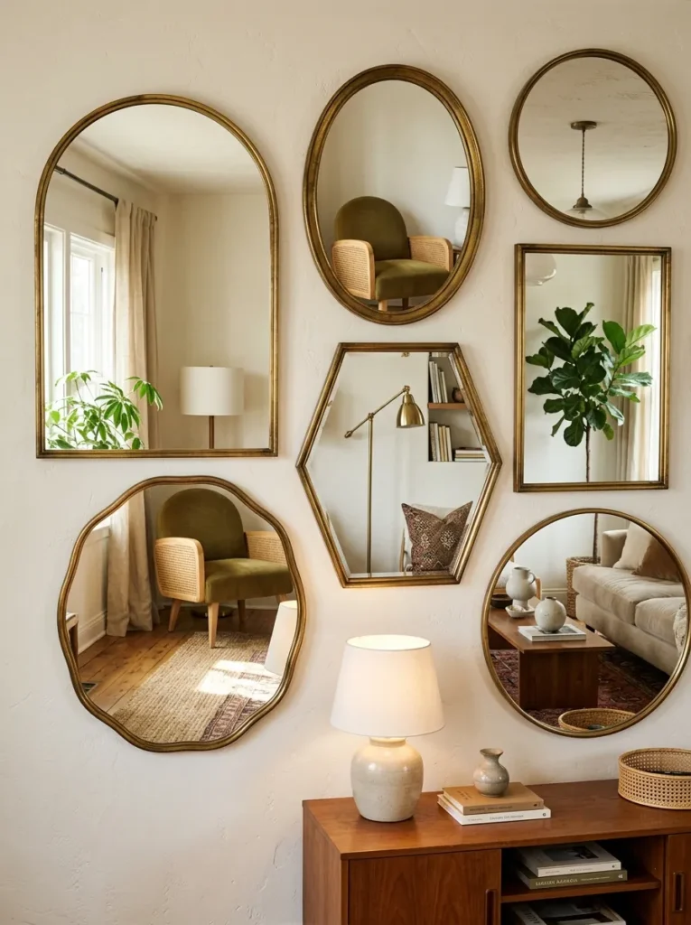
A wall composed entirely of mirrors — varying sizes, varying shapes, all in frames that share a material or finish — creates a gallery wall effect without any art content. The wall reflects the room itself as a continuously shifting display, which changes character with the light, the season, and the movement of people in the space.
This approach suits living rooms where the opposite wall or the view is interesting enough to be worth reflecting — a garden visible through French doors, an interesting fireplace, quality furniture with visual depth. A mirror wall that reflects a blank wall or a cluttered surface reflects the problem rather than solving it.
Frame coherence matters more in a mirror-only wall than in a mixed arrangement, because the frames are the wall’s primary visual element. All frames in the same finish (antique gold, matte black, natural wood) with varying shapes (round, oval, rectangular, arch) creates visual interest through form rather than content.
18. A Staircase Gallery Wall Extending into the Living Room
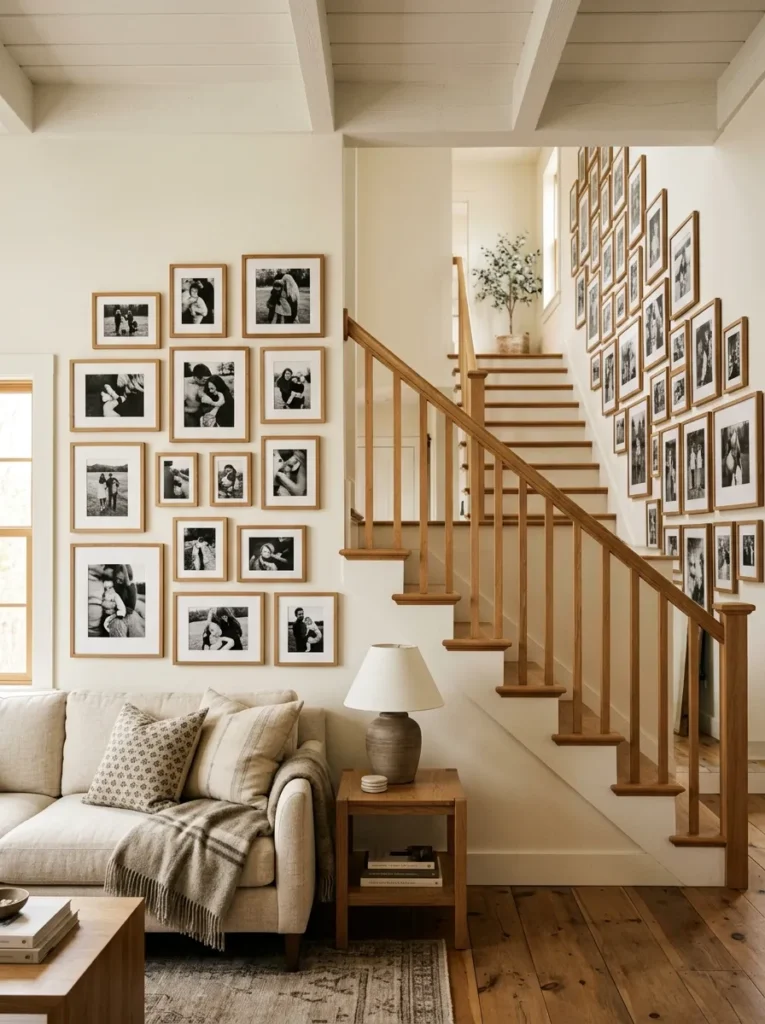
In living rooms adjacent to or open to a staircase, extending the gallery wall from the living room wall up the staircase creates a continuous visual flow that ties the two spaces together architecturally. The staircase wall has a natural diagonal logic — frames hung parallel to the ceiling (level, not tilted) but at incrementally increasing heights as the stair rises — that creates movement and direction.
The living room section anchors the arrangement at seated eye level; the staircase section rises through standing eye level and above. The visual connection between the two sections depends on shared frame style, shared content theme, or both. A mix of family photographs in consistent black frames running from the living room sofa wall up the staircase reads as a seamlessly continuous story rather than two separate arrangements that happen to meet.
Practical note: staircase walls see more movement and vibration than static walls. Frames should be secured with bumper pads at the lower corners to prevent tilting, and heavier pieces should use appropriate anchors rather than relying on a single nail.
19. A Monochromatic Color Story Gallery Wall

A gallery wall where every print, illustration, or photograph falls within the same color family — all prints with blue tones, all work in warm ochre and terracotta, all green botanical and landscape content — creates a cohesive wall that reads as curated without requiring identical subject matter or style.
The monochromatic color approach is the most forgiving content strategy for a gallery wall because it resolves visual conflicts that different frames, styles, and subjects would otherwise create. An abstract print, a botanical illustration, a landscape photograph, and a typographic piece that all share a warm terracotta palette read as a considered collection despite having no subject matter in common.
Frame choice in a monochromatic wall should either disappear (thin frames, white mats that keep the focus on the art’s color) or participate in the palette (frames in a wood tone that relates to the warm art content, or black frames that anchor the cool-toned work).
20. A Typography and Quote Wall with Intentional Layout

A gallery wall built from typographic prints — poems, quotes, single words, song lyrics, places and dates — creates a wall that communicates something specific and readable, which most art walls don’t. Guests can engage with a typography wall verbally; it generates conversation in a way that abstract art rarely does.
The risk is that typographic walls can read as inspirational poster collections if the font choices are generic or the quotes are familiar to the point of cliché. The approach that avoids this: commission or print typographic pieces in specific, personal text — a meaningful date, a line from a book with genuine significance, a phrase in a language connected to family heritage — in a font that has quality and specificity rather than a system default.
Frame consistency matters particularly for a typography wall, since the frames are often more visible than in a picture-heavy arrangement — the white space of a typographic print lets the frame read more clearly. All matching frames in a consistent finish prevent the typography from looking like a collection of notices.
21. A Vintage Poster and Ephemera Wall
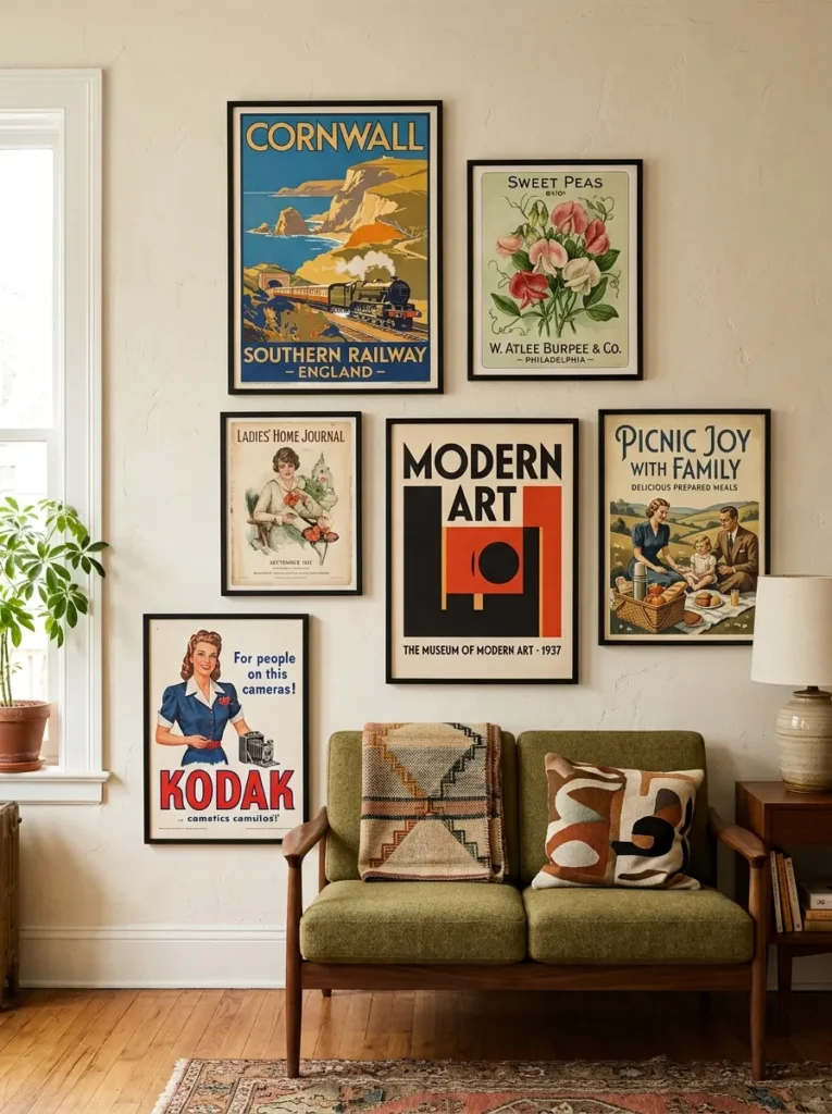
A gallery wall built from vintage posters — travel posters, exhibition announcements, seed packet prints, old magazine covers, advertising art from the early-to-mid 20th century — creates a wall with a distinctly nostalgic, archival quality. The subject matter is typically colorful, graphic, and immediately readable, which gives the wall visual energy that more restrained art choices don’t provide.
Sourcing matters for authenticity. Original vintage posters are available through estate sales, auction houses, and specialty dealers, but high-quality reproduction prints of public domain vintage art are widely available and indistinguishable at normal viewing distances. The arrangement should reflect the content’s graphic energy — slightly denser than a fine art gallery wall, with more visual variation between pieces.
Frame choices for a vintage poster wall should be simple enough not to compete with the graphic content inside them. Thin black frames with no mats let the poster’s color and typography reach the edge; white mats add a gallery quality that can slightly formalize what is inherently casual content.
22. An Architectural Drawing and Blueprint Gallery Wall

A gallery wall composed of architectural drawings — original blueprints, antique architectural illustrations, elevation drawings, hand-rendered technical studies — creates a sophisticated, slightly scholarly wall that suits rooms with architectural detail, libraries and study-adjacent spaces, and living rooms with a more intellectual or collected aesthetic.
The content has a graphic quality (consistent line weights, formal composition, technical precision) that holds together visually without requiring the frame and mat unification that more varied art content needs. A mix of several architectural drawing styles — a classical facade elevation beside a mid-century furniture sketch beside a hand-drawn floor plan — reads as coherent because the drawing language is consistent even when the subject matter varies.
Frame choices: simple black or dark brown frames suit the technical, drafting-table quality of the content. Ornate frames conflict with the functional aesthetic of technical drawings.
23. A Circular and Organic Shape Gallery Wall

A gallery wall composed entirely of round, oval, and organically shaped frames — with no rectangular or square frames in the arrangement — creates an unexpectedly soft, almost sculptural wall composition. The absence of corners makes the wall read as more feminine, more organic, and more relaxed than a conventional rectangular arrangement.
The arrangement logic for a circular gallery wall is different from a rectangular one because circles don’t stack or grid naturally. Instead, they cluster — a tight group where the circular frames are positioned close enough that their edges almost touch, creating a constellation-like arrangement with small irregular gaps between each frame.
Content for a circular gallery wall benefits from subjects that suit the format: portraits work well in oval frames (a long decorative tradition); landscapes and abstract work suit round frames; mixed subjects work if the frame material unifies them. Avoid forcing horizontal or landscape-orientation images into square-cropped circular frames.
24. A Wall That Grows Over Time

The most honest gallery wall is one designed from the beginning to be incomplete — a wall where the initial arrangement leaves intentional space for future additions, so that growth reads as planned rather than accidental overflow.
Start with three to five anchor pieces that establish the wall’s visual logic: the frame style, the content direction, the arrangement’s rough boundary. Leave clearly intentional space — more than the usual 2 to 3 inch gaps between frames, large enough that the empty space reads as reserved rather than forgotten — at the arrangement’s edges or in specific positions within it.
When a new piece is added — a photograph from a meaningful trip, a print found at a market, a piece made by someone you know — position it in one of the reserved spaces. The wall’s evolution becomes visible over time, which is itself the story the wall tells: not a finished installation, but an ongoing record of a life being lived.
How to Arrange a Gallery Wall Without Getting It Wrong
Before hanging a single frame, three decisions shape everything else.
The boundary decision. A gallery wall without defined edges reads as a collection that ran out of space. Define the arrangement’s outer boundary first — this can be the sofa’s width, an architectural feature (a window, a doorway, a fireplace), or simply the area you’ve committed to covering. The arrangement should have a clear edge on all four sides, even if those edges are irregular.
The spacing decision. Standard gallery wall spacing is 2 to 3 inches between frames. This feels close enough that pieces read as a group rather than individual decisions. In a minimalist arrangement, increase this to 6 to 10 inches to create breathing room. In a salon-style arrangement, reduce it to 1 to 2 inches for density. Choose one and stay consistent throughout the arrangement.
The floor-planning step. Trace each frame on kraft paper or newspaper, cut the silhouettes out, and tape them to the wall before committing to nails. This step feels unnecessary until you’ve hung twelve frames in the wrong positions and spent an afternoon filling and repainting nail holes. No amount of planning on the floor translates perfectly to the wall without this step.
The single most important hanging decision: the first frame determines the entire arrangement. Hang the most important piece first — the largest, the one with the strongest visual presence, the one the arrangement centers around — and build outward. Every other frame’s position should be negotiated in relation to that anchor.
Final Thoughts
A gallery wall that tells a story takes longer to get right than one assembled in a single afternoon — and that’s appropriate, because the best ones are built incrementally rather than installed complete.
Among the ideas here, the approaches that provide the most lasting satisfaction are those built around personal content: the family photo wall with consistent frames, the travel and memory collection, the wall that grows over time. These age better than trend-driven arrangements because their content remains meaningful as the surrounding decor changes.
If you’re starting fresh, choose one clear organizing principle — a frame color, a content theme, a tonal palette — and hold to it as the arrangement grows. That single decision prevents the drift toward visual noise that most gallery walls eventually develop when pieces are added without a governing logic.
Save the ideas that resonate most with your room and your story, and come back to the arrangement section when you’re ready to put the first frame on the wall. Start there.