20 Family Room Ideas That Feel Cozy and Functional
The family room carries more load than any other space in the house. It needs to absorb movie nights, homework sessions, weekend gatherings, toddler chaos, and quiet evenings, sometimes all in the same week. That combination of demands is what makes generic inspiration frustrating: a room that looks beautiful in a magazine may buckle under actual daily use.
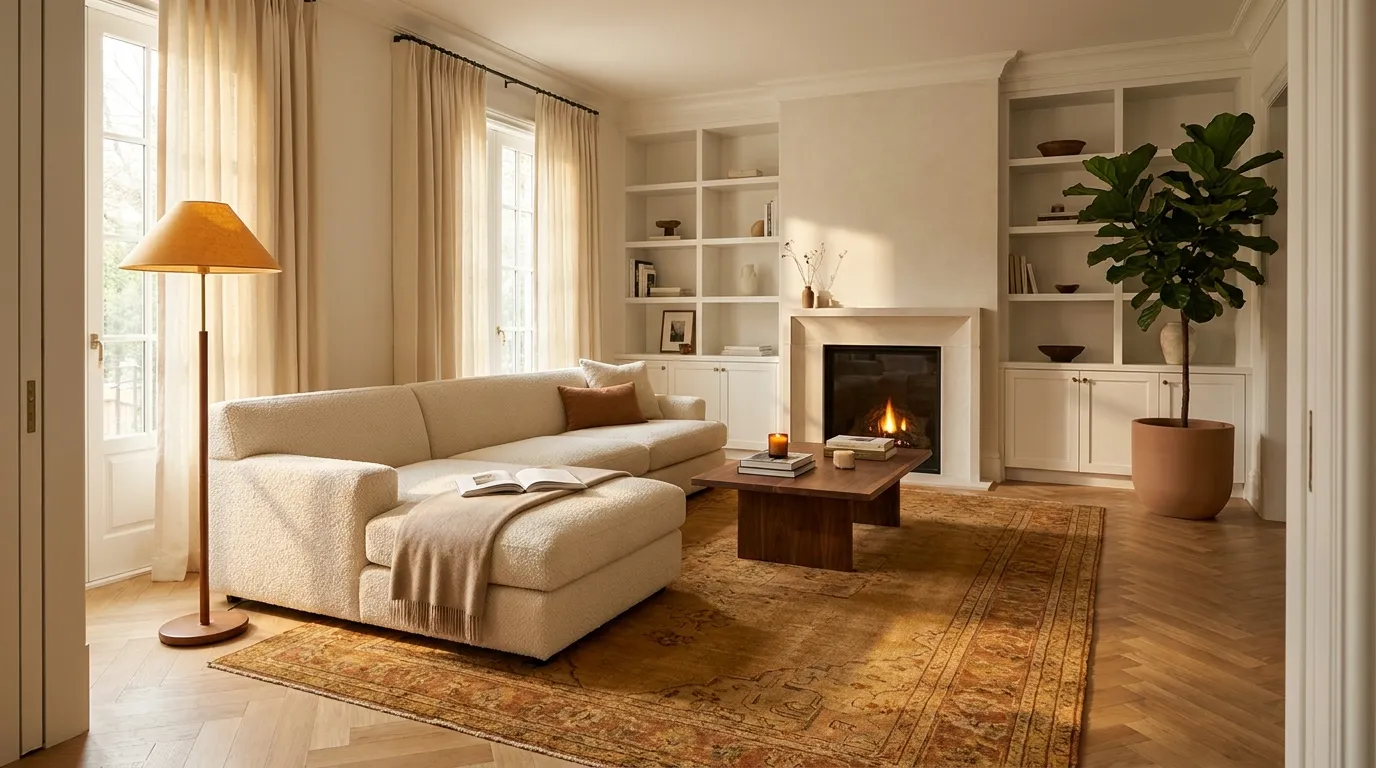
The ideas here are selected for rooms that perform. Each one addresses a specific design problem — too much visual noise, not enough storage, a layout that feels disconnected, lighting that goes flat at night, or furniture that slowly migrates into a pile. Starting fresh, fixing what isn’t working, or making a rental feel livable — these 20 family room ideas give you enough context to understand what would actually work in your space, and why.
1. Anchor the Seating Zone with a Rug That’s Actually Large Enough
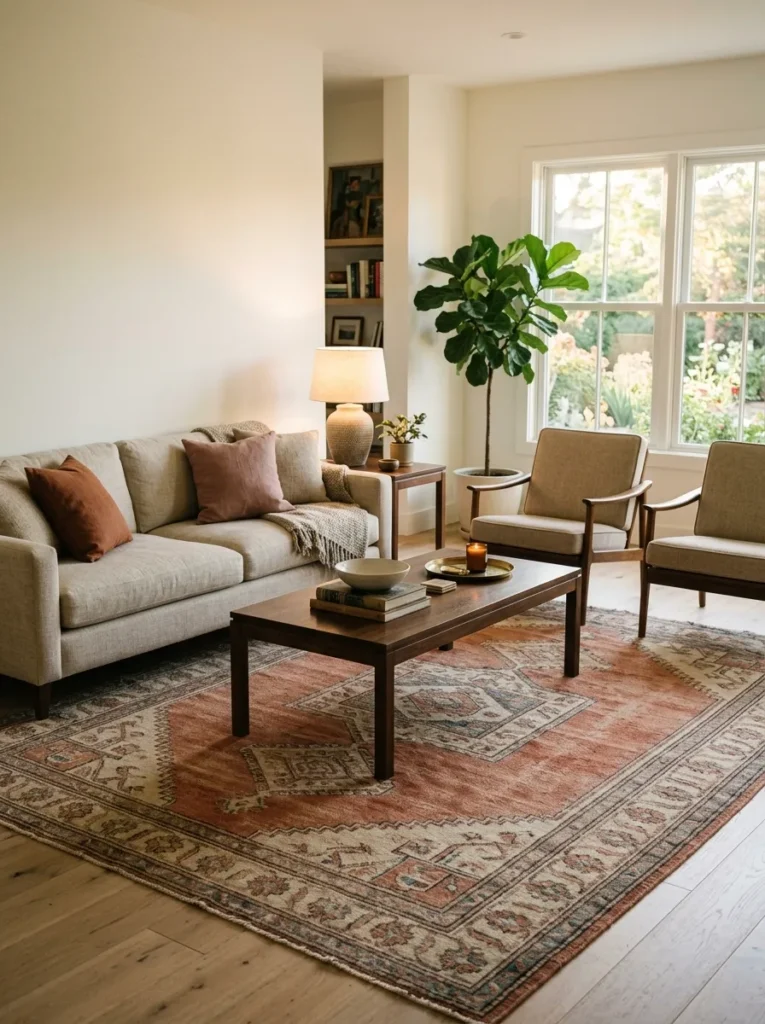
The single most common layout mistake in family rooms is an undersized rug. When a rug barely fits under the coffee table, it visually disconnects every piece of furniture from the room and makes the space feel randomly arranged rather than intentionally composed.
For a properly anchored seating arrangement, the front legs of every major sofa and chair should rest on the rug. In practical terms, this usually means a minimum of 8×10 feet for a standard family room and 9×12 or larger for rooms with sectionals or multiple conversation zones. If that feels like a lot of rug, it’s because most showroom arrangements are staged in spaces larger than average homes — and rug sizing rarely scales down proportionally in the photos.
A low-pile rug in a durable natural fiber like wool or a wool blend will handle foot traffic, resist compression under heavy furniture, and hold its color longer than synthetics. Flatweave options work especially well in rooms with pets.
2. Choose a Sectional Configuration Based on Traffic Flow, Not Just Seating Capacity
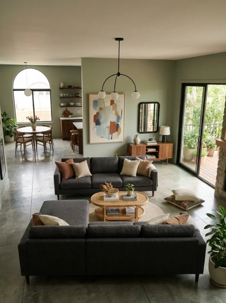
Sectionals are the most practical sofa choice for family rooms, but the wrong configuration can close off the room entirely. The key decision isn’t size. It’s which end the chaise belongs on.
Face the chaise toward the room’s entry or main window, never toward a wall. A chaise that blocks the path from the hallway into the main room forces everyone to walk around furniture rather than through the space, which makes even large rooms feel cramped. In open-plan layouts where the family room connects to the kitchen or dining area, a sectional with a low or open back works better than one with high arms on three sides, which can feel like a fortress dividing the space.
L-shaped sectionals work best in rooms with at least 12 feet of wall length on the longer side. U-shaped configurations need significantly more clearance — generally at least 15×15 feet — to avoid the arrangement feeling closed.
3. Build Light in Three Layers Instead of Relying on One Overhead Fixture
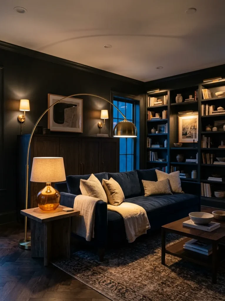
A single ceiling fixture is the fastest way to make a family room feel flat and institutional, especially at night. Layered lighting (ambient, task, and accent) lets the room function differently for different moments without requiring expensive rewiring.
Ambient light comes from the overhead source or recessed cans. Task lighting serves specific activities: a floor lamp beside the reading chair, a table lamp on the side table near the sofa. Accent lighting highlights what you want to draw attention to: a shelf, a piece of art, or a fireplace surround.
The practical approach: start with at least one floor lamp and one table lamp per seating area. Plug-in sconces mounted on either side of a media console or fireplace add visual balance without requiring an electrician. Dimmer switches on the overhead circuit make the most meaningful single upgrade; they cost very little and immediately change how the room feels after 6 p.m.
4. Position the Television at Eye Level When Seated, Not When Standing
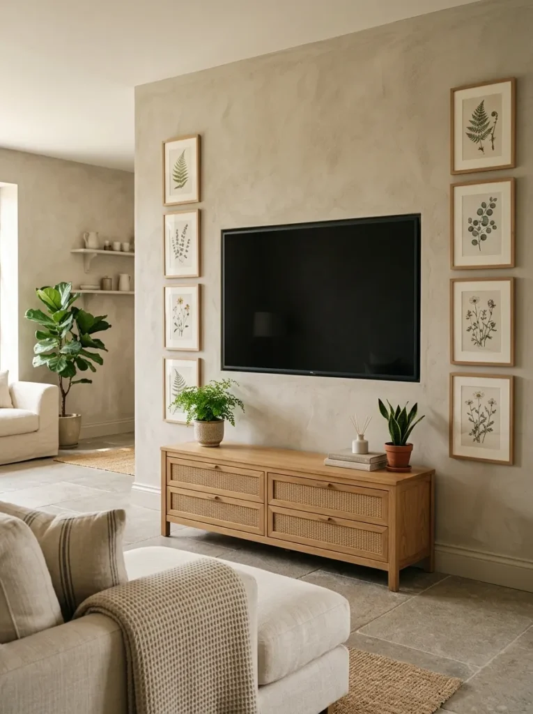
TV placement gets treated as a practical afterthought, but it determines how comfortable the room is for daily use. The center of the screen should sit roughly at seated eye level, which for most adults means between 42 and 48 inches from the floor to the screen’s center. That’s lower than most people initially mount it.
Televisions mounted significantly above a fireplace are one of the most common sources of neck strain in family rooms. If the fireplace surround is tall enough to push the screen to 60 inches or above, the arrangement forces everyone to look upward for extended periods. In these situations, a media console positioned in front of or beside the fireplace (rather than above it) is a more comfortable long-term solution, even if it sacrifices some aesthetic drama.
Gallery walls and floating shelves built around a flush-mounted screen can visually reduce the TV’s dominance in the room without hiding it.
5. Use Built-In Shelving to Frame a Focal Wall Without Adding Visual Noise
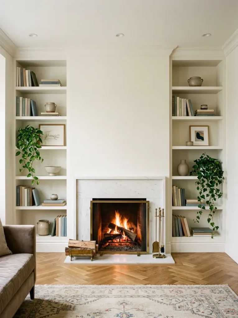
Built-ins accomplish something open shelving on individual units rarely achieves: they make storage look intentional. Floor-to-ceiling shelving flanking a fireplace or media wall creates visual symmetry and adds architectural weight to an otherwise flat wall.
The details that separate good built-ins from awkward ones: consistent shelf depth (typically 10–12 inches for books and objects, 16–18 inches if you’re storing baskets or larger items), adequate vertical spacing between shelves so the arrangement doesn’t look packed, and a painted finish that matches the wall color so the unit reads as part of the architecture rather than furniture pressed against it.
You don’t need a contractor. Modular shelving systems from IKEA, Vitsœ, or similar manufacturers can be configured, anchored to studs, and trimmed with paint and molding to look genuinely built-in at a fraction of the cost. The result works for renters as well, since the units are removable.
6. Choose a Sofa Color That Works With Your Natural Light, Not Against It
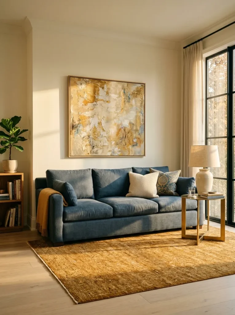
Furniture color looks different depending on which direction your windows face. A room with north-facing windows receives cooler, more diffuse light throughout the day. Warm beige or terracotta upholstery will appear truer to its actual color in this context. A room with south or west exposure gets strong warm afternoon sun, which will yellow greige or ivory tones significantly by late afternoon.
The implication: if your family room has strong directional light, test fabric swatches at different times of day before committing. What reads as a warm neutral in morning light might look noticeably orange or green by early evening. This matters more for large upholstered pieces (sofas, sectionals, accent chairs) than for smaller items, because the surface area is significant enough that the color shift is highly visible.
Darker upholstery like slate blue, forest green, or charcoal tends to be more stable across lighting conditions, and it shows less wear and staining than cream or ivory in high-traffic family rooms.
7. Design Around One Statement Piece Rather Than Decorating Every Surface
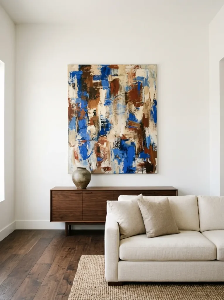
One of the quieter reasons family rooms start to look cluttered isn’t excess furniture. It’s excess decorating. When every surface, shelf, and corner receives equal styling attention, nothing stands out and the room loses clarity.
Choose one visual anchor per room: a large-scale piece of artwork, a distinctive light fixture, a dramatic plant, or an architectural feature like a fireplace surround. Everything else should support that element rather than compete with it. Adjacent walls, neighboring shelves, and surrounding furniture should be noticeably simpler.
In practical terms: if the focal wall has a compelling piece of art above the fireplace, the surrounding built-ins should hold mostly books and a few quiet objects, not gallery-wall-level decoration. The contrast between a busy focal point and quieter surrounding space is what makes a room feel intentional.
8. Use Warm White Paint on Walls to Ground a Room Without Color Commitment
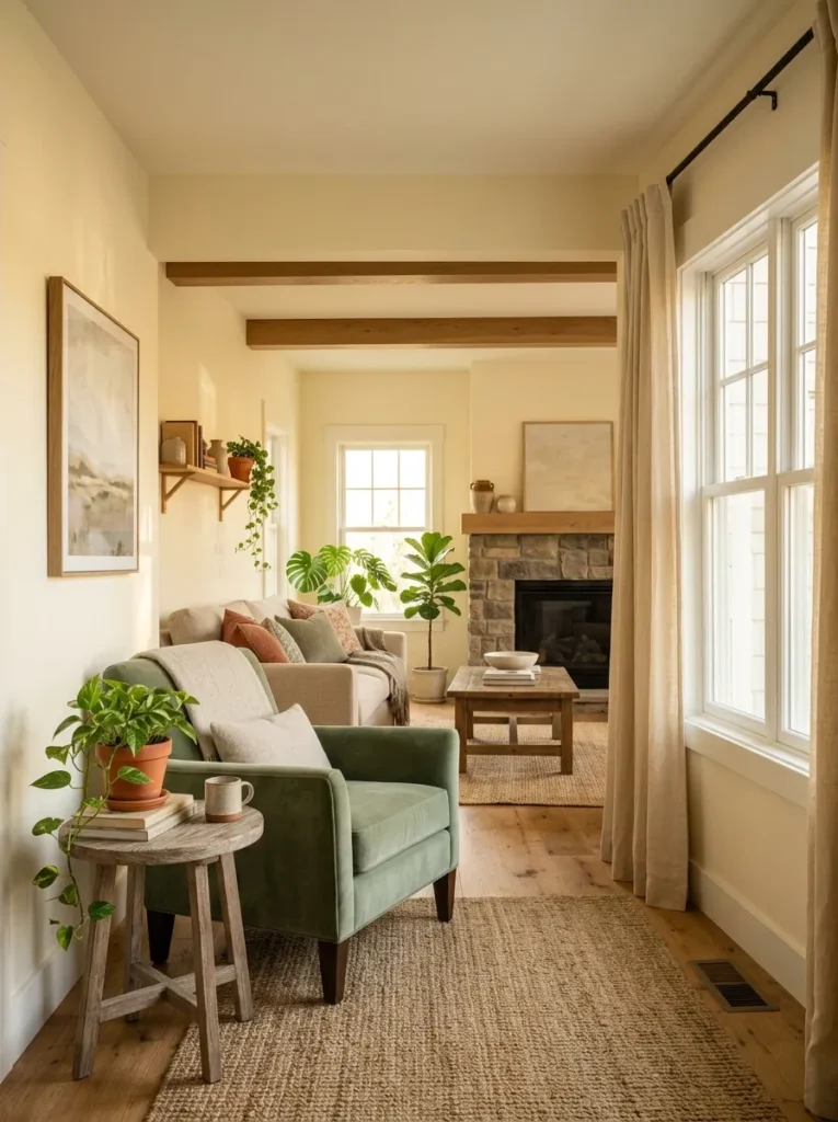
Choosing between a bold wall color and playing it safe with white doesn’t have to be binary. Warm whites (those with yellow, pink, or ochre undertones rather than blue or grey) behave like neutrals but read noticeably softer and more livable than stark whites under incandescent or warm LED light.
The distinction between warm and cool white matters enormously in practice. Bright whites with blue undertones look fresh in rooms with abundant natural light and contrast-heavy decor, but they read as cold and slightly clinical in rooms that rely on artificial light. In family rooms, which often spend evening hours under warm bulbs, a warm white like Benjamin Moore White Dove, Farrow & Ball Pointing, or Sherwin-Williams Alabaster tends to be more forgiving across the full day.
One practical note: sample in your actual room using the largest paint samples available (8×8 inches minimum) and view them in both morning and evening light before committing.
9. Add a Window Seat Where the Architecture Allows It
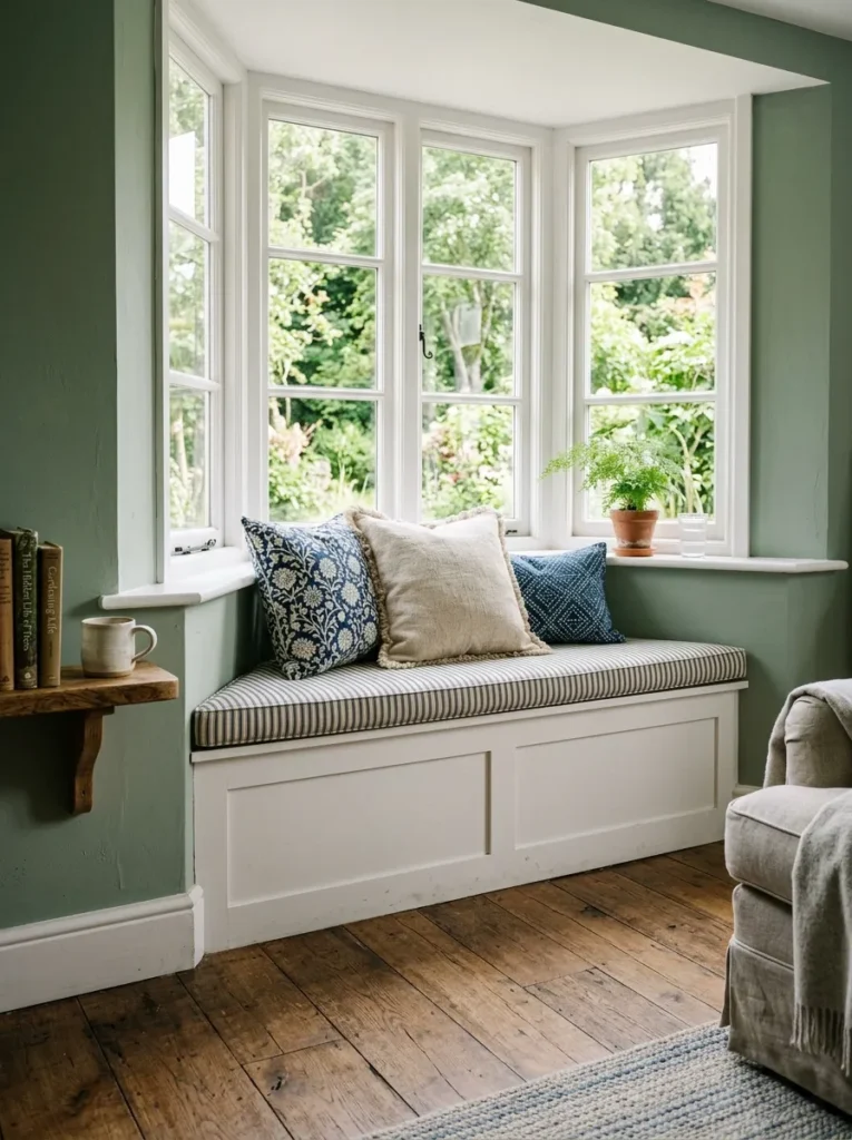
Window seats convert the dead floor space directly in front of a window into a practical spot for reading, waiting, or storing out-of-season items. They’re particularly useful in family rooms with bay windows or alcoves where furniture placement is otherwise awkward.
A useful window seat depth runs between 18 and 22 inches: shallow enough to let light pass over it into the room, deep enough to sit comfortably without the back legs dangling. The seat height should be close to standard chair height, around 17–19 inches, unless the sill is unusually low.
For families that need storage, a hinged or lift-top seat with interior space is one of the most efficient solutions in a room that lacks a basement or attic. It handles seasonal pillows, extra blankets, board games, or whatever the room accumulates over time. A cushion with removable, washable covers extends the practical life significantly.
10. Layer Textiles by Weight and Texture Rather Than Matching Everything
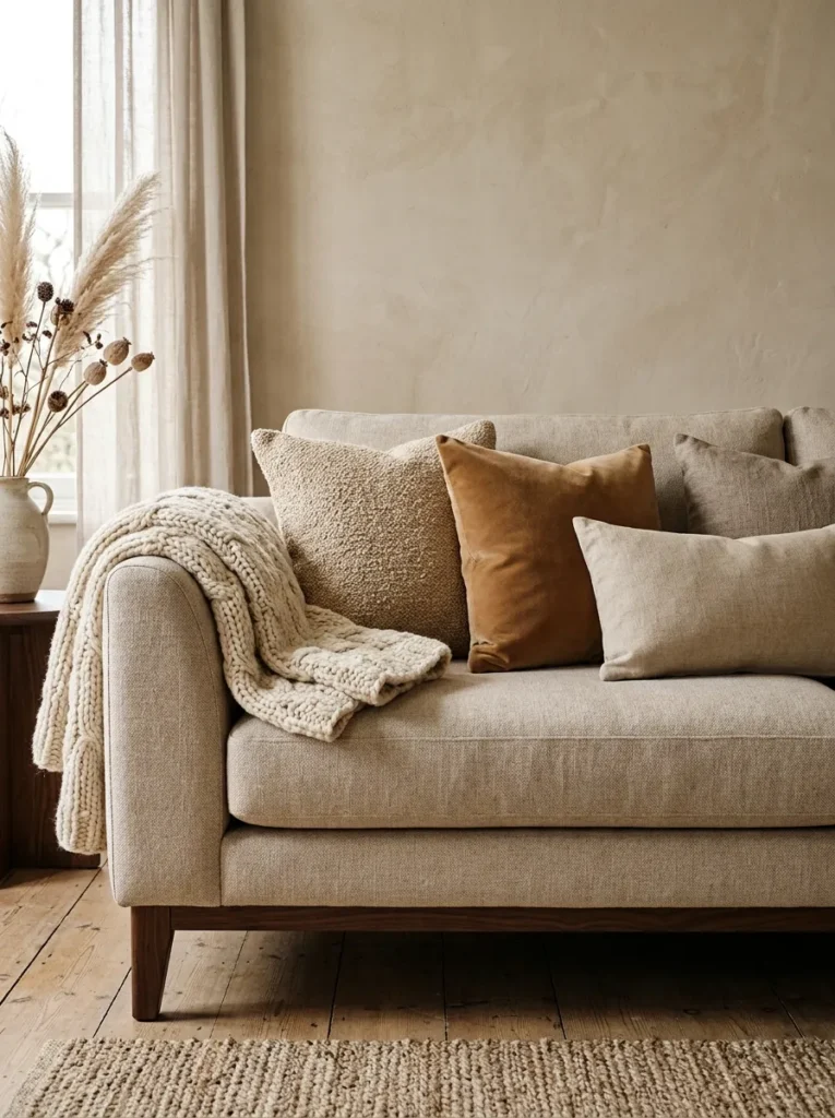
Matching throw pillows and blankets to curtains and rugs produces a room that looks put-together in photographs but bland in person. The effect is fine for showrooms, since it reduces visual risk, but it also flattens the room’s tactile dimension and tends to look slightly artificial.
More effective is to work within a color range and vary texture aggressively. A wool throw, a linen pillow, a velvet cushion, and a cotton slipcover can share a palette without sharing a weave. The differences in surface quality (matte versus sheen, rough versus soft, structured versus draped) create depth that a matching set simply doesn’t offer.
For family rooms that need durability, performance fabrics in velvet weaves and bouclé-style textures have improved significantly and now resist most stains and pet hair well without looking obviously synthetic. The tradeoff with extremely textured bouclé is that it tends to collect debris and requires more frequent lint removal.
11. Give Every Family Member a Dedicated Landing Zone
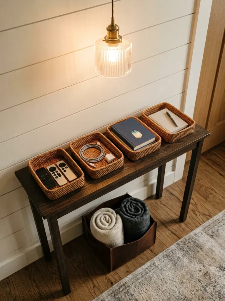
Family rooms accumulate clutter not because families are disorganized, but because the room rarely offers enough designated drop zones for the things people actually bring into it. Remote controls, chargers, books, reading glasses, children’s toys, and school bags create visual chaos because there is no established home for them.
One basket or tray per regular user — positioned near where they sit or settle — reduces the disorder significantly. A low console at the room’s entry point with a tray for keys and a small bin for charger cables prevents the tech sprawl that tends to spread across side tables and ottomans.
Furniture with integrated storage performs better in working family rooms than purely decorative pieces: an ottoman with a tray top serves as coffee table, footrest, and storage; a console with drawers holds items that otherwise end up on the floor.
12. Treat the Coffee Table as a Functional Object First
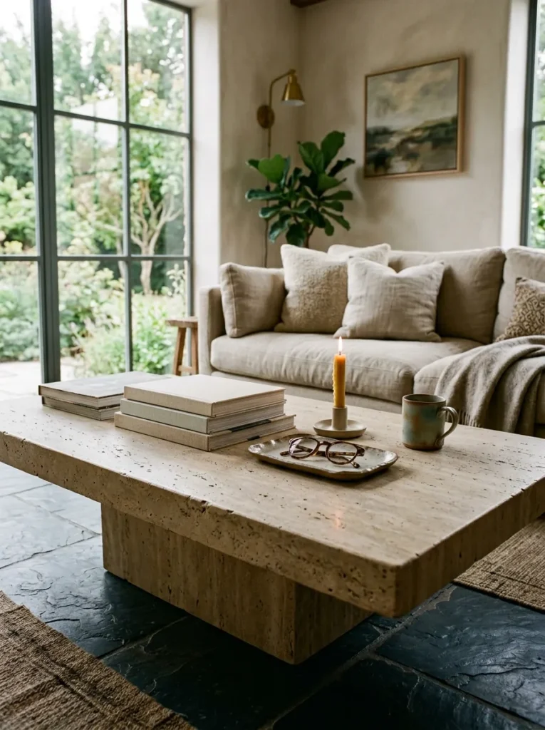
Coffee tables in family rooms endure constant real-world use — feet, drinks, craft projects, laptops — so prioritizing material durability over appearance alone is genuinely practical. Solid wood, stone composite, and sealed hardwood tops handle this load better than lacquered or fragile surfaces. Glass-top tables look light and open, but they show fingerprints and smears immediately and are impractical in rooms with young children.
The proportional relationship between table and sofa also matters: the table height should be roughly level with the sofa seat cushion or no more than two inches below it. A table that sits six inches lower than the seat is uncomfortable to use for anything except looking at.
For small rooms where a large rectangular table disrupts circulation, a set of two or three nesting tables offers the same combined surface area with dramatically more flexibility — push them together, pull them apart, or move one entirely when you need the floor space.
13. Use Curtains to Add Scale and Warmth, Not Just Privacy
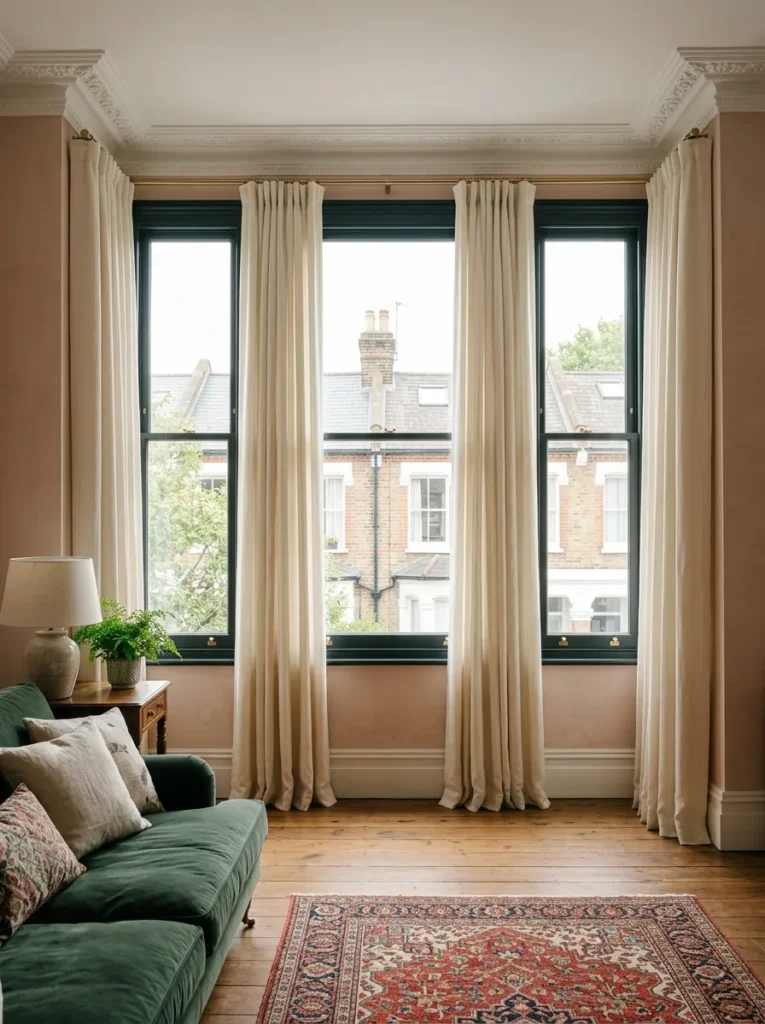
Curtains in family rooms do more visual work than most people expect. Their height, weight, and color affect how tall the room feels, how warm it reads, and whether it seems finished or unfinished. The most common practical mistake is hanging curtains at window-frame height with panels that end at the sill. This cuts the wall into a small, disconnected segment and shrinks the apparent ceiling height.
The general principle for family rooms: hang curtain rods as close to the ceiling as the wall allows — typically 4 to 6 inches below the crown molding or ceiling line — and let panels fall to within half an inch of the floor. This treatment stretches the visual height of the room and makes windows appear significantly larger than they are. Use it in both tall and short rooms; in rooms with standard 8-foot ceilings, it’s especially important.
For light and privacy in the same window, a linen or light cotton panel over a sheer provides flexibility. Blackout liners on back are useful for rooms that also serve as media spaces.
14. Paint or Treat an Accent Wall to Define the Seating Area
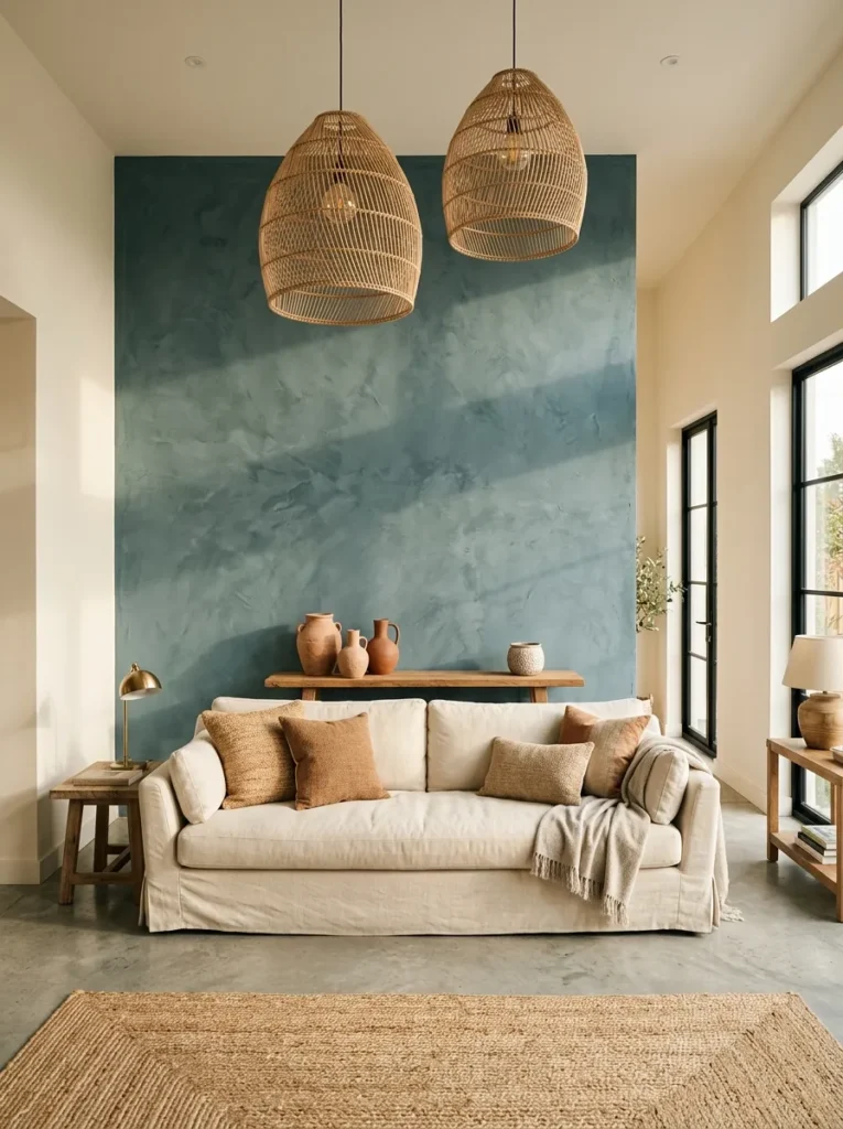
In open-plan homes or large family rooms with ambiguous boundaries, an accent wall serves a structural purpose beyond decoration. It defines which part of the space belongs to the seating zone. This is particularly useful when the family room flows into a dining area or hallway and the furniture arrangement alone doesn’t clearly read as a distinct room.
The most effective accent wall is almost always the one behind the sofa or the one the sofa faces — not a sidewall. A color that’s two or three shades deeper than the adjacent walls reads as grounding without being jarring, while a dramatic contrast (deep navy against light grey, for example) creates a proper focal anchor.
Textured treatments — limewash, Venetian plaster, or a panel molding arrangement — add visual depth without relying on color contrast, which works well in rooms where the existing palette is already complex or furniture is bold.
15. Make the Media Console Earn Its Place With Real Storage
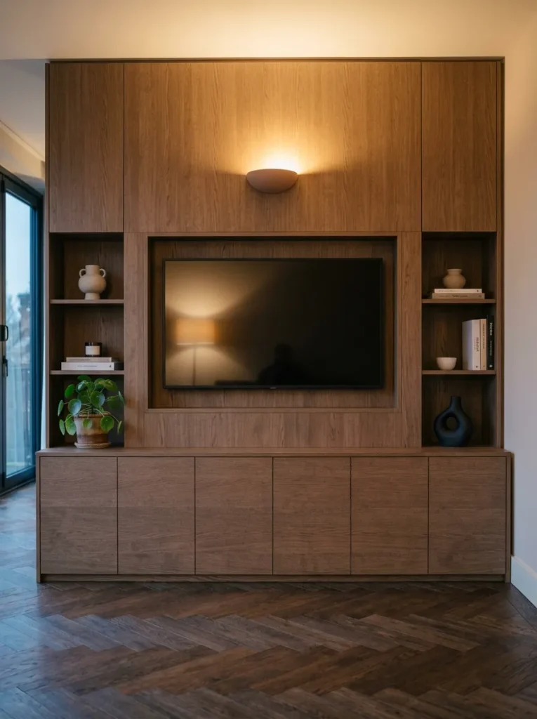
A media console is typically the largest horizontal surface in the room and one of the most visible, yet it’s routinely chosen for appearance alone and immediately rendered dysfunctional by cord tangles, streaming devices, and miscellaneous remotes.
A console that works in practice needs: enclosed cabinet doors (at least two-thirds of the total storage should be hidden, not open display), cable management channels or back cutouts, sufficient depth for equipment (most AV equipment runs 12–16 inches deep), and enough width to provide visual balance with the television above or adjacent to it. A console that’s narrower than the television looks ungrounded.
If you’re working in a rental and can’t mount the TV to the wall, a console with a built-in tv shelf or riser lets the screen sit at a proper height without requiring installation. Closed cabinets on either side can visually frame the screen even when it’s freestanding.
16. Choose a Coffee-and-Cream Color Scheme That Earns Its Keep
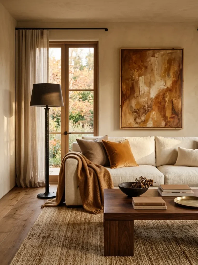
Beige has been both underrated and overused in different decades, but the coffee-and-cream palette (warm toffee, biscuit, ivory, and sand layered together without bright white accents) creates a family room that feels genuinely enveloping rather than cautiously neutral.
What makes this palette work is contrast within the range. An ivory linen sofa against a toffee-stained wood floor and sand-colored walls blurs together. Add a dark walnut coffee table, a deep caramel throw, and a near-black iron table lamp and the room gains the contrast it needs to stop reading as monochromatic. The absence of bright white or grey prevents the palette from trending cold, which is why it holds up well in rooms without strong natural light.
This color family is also one of the most forgiving in family rooms — stains are less visible, wear is less obvious, and the overall effect improves slightly with age rather than looking tired.
17. Hang Artwork at a Height Based on the Viewer, Not the Wall
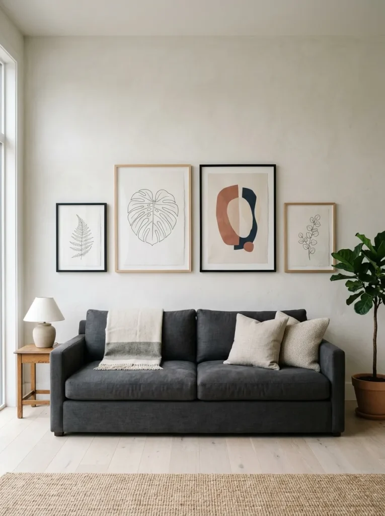
Art in family rooms is routinely hung too high — mounted at a height chosen to fill wall space rather than to be viewed comfortably. The general principle used by most gallery curators places the center of the artwork at approximately 57 to 60 inches from the floor, which corresponds to average eye level when standing.
In family rooms where most viewing happens from a seated position — whether on a sofa below a gallery wall or looking at a piece above a fireplace — the lower end of that range, or slightly below it, often reads better in practice. Above a sofa, the bottom edge of artwork should typically sit no more than 6 to 8 inches above the sofa back, which keeps the furniture and art visually connected.
Groupings of smaller pieces follow the same logic: treat the center of the entire arrangement as the single reference point, and build outward from there. Scatter-hung collections that vary wildly in height tend to look provisional rather than intentional.
18. Use Indoor Plants Strategically for Scale, Not Just Freshness
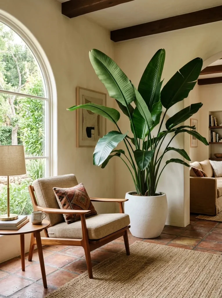
Plants in family rooms are often treated as accessories rather than architectural elements: a small pot on a shelf here, a trailing plant on a console there. Used this way, they add life but don’t change the spatial reading of the room.
Large-scale plants (a fiddle-leaf fig, a Bird of Paradise, or an oversized olive tree) positioned in corners or beside furniture do something smaller plants can’t: they fill vertical space and give the room a sense of organic scale that softens architecture and balances tall, empty walls without adding more furniture or decoration.
Before choosing a species, check the light conditions honestly. Most large tropical plants need indirect but consistent natural light, and rooms with only north-facing windows may not sustain them. In low-light rooms, Monstera deliciosa, ZZ plants, or large snake plants handle shade significantly better and maintain their scale over time.
19. Design a Reading Corner That Signals “This Space Is for Slowing Down”
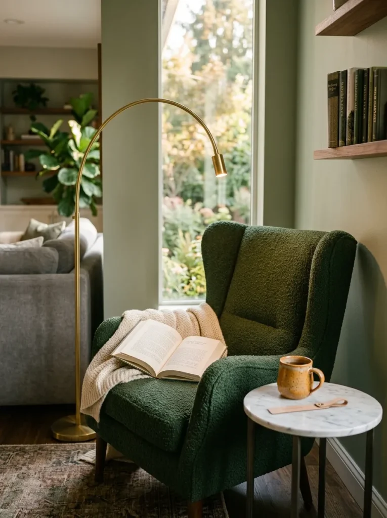
In family rooms that double as multipurpose spaces, a dedicated reading corner is worth the effort even if it occupies only a small footprint. The visual cue (a chair, a lamp, a side table, a small curated shelf) tells the room that not everything in it has to be oriented toward the television.
The chair should be angled slightly away from the main seating area, even by 15 to 20 degrees. This small adjustment gives the corner a feeling of enclosure without actually closing the space off. A floor lamp positioned behind and to one side of the chair provides good reading light without glare.
Keep the side table minimal: a single lamp, a small tray for a drink and glasses. If there’s a wall nearby, a narrow floating shelf at arm’s reach holds whatever the reader is currently working through. The restraint matters. The corner reads as a retreat only when it isn’t cluttered.
20. Resist the Urge to Fill the Room Completely
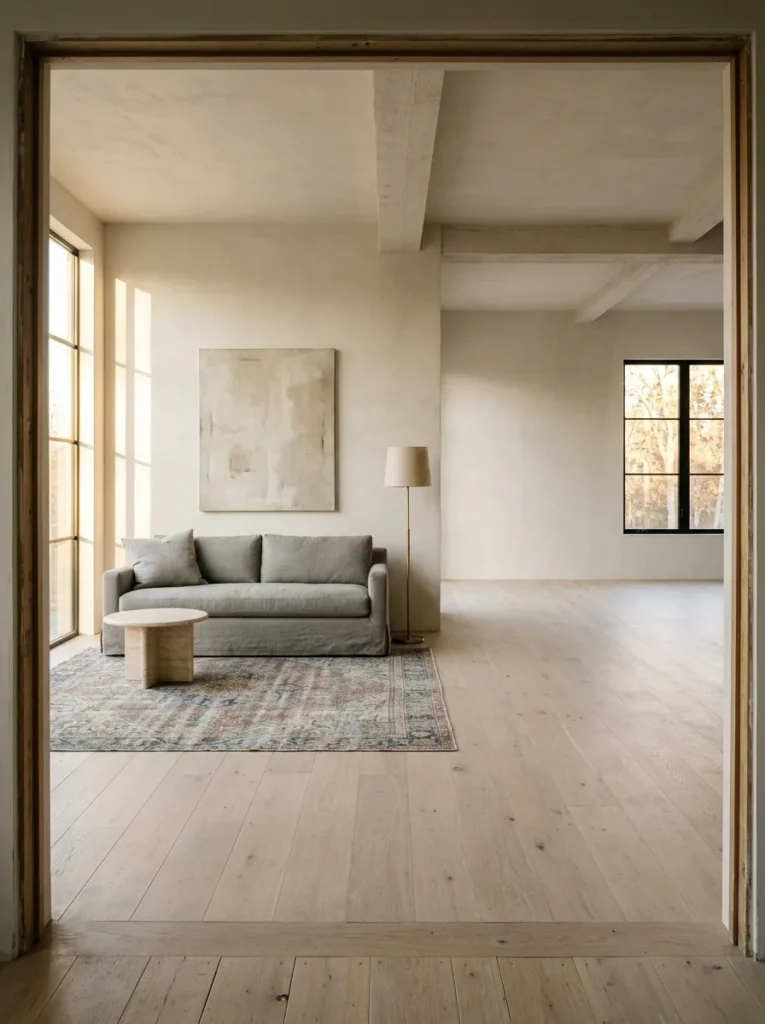
The final idea isn’t about adding something — it’s about leaving room for the space to breathe. In family rooms especially, where furniture tends to accumulate over years of use, the visual weight builds gradually and it’s easy not to notice until the room starts to feel dense and fatiguing.
Deliberately keep one wall or one floor area clear. A gap between the sofa and the side wall, a corner left open to the floor, or a wall with only a single piece of furniture against it all give the eye somewhere to rest. This restraint also serves a practical purpose: it leaves room for people to move, for children to play, and for the space to flex when use patterns change.
Rooms that are fully furnished from corner to corner leave no visual margin and no physical flexibility. The empty space isn’t wasted space. It’s what makes the furnished areas feel deliberate.
How to Prioritize These Ideas for Your Space
Not every family room needs all twenty of these. If you’re starting from a blank slate, the sequence that creates the most cumulative impact: rug and layout first (ideas 1–2), then lighting (idea 3), then storage and furniture function (ideas 11–12, 15), then surfaces and color (ideas 6, 8, 16), and finishing with textiles, art, and styling details last.
If you’re working with an existing room that feels off, start by diagnosing the specific problem. A room that feels chaotic usually needs better storage and fewer decorative objects (ideas 7, 11). A room that feels flat usually needs lighting and textile depth (ideas 3, 10). A room that feels cramped is almost always dealing with an undersized rug or wrong furniture scale (ideas 1, 2, 12).
Don’t combine every idea simultaneously. Pick three or four that address your actual pain points and work from there before adding more.
Final Thoughts
Family room design works best when the space is organized around how it’s actually used — not how it would ideally be used in an aspirational version of your life. The ideas here were chosen because they solve real, recurring problems: rooms that feel too dark, too cluttered, too rigid, or too anonymous.
Start with one structural decision — the rug, the lighting, the focal wall — and let the rest follow from that anchor. The rooms that feel the most cohesive and livable are rarely the ones that received the most decoration. They’re the ones where a few foundational choices were made carefully, and everything else was edited back to support them.
If any of these family room ideas sparked something for your space, save the ones worth revisiting. The best use of inspiration is having it ready when you’re ready to act.