22 Media Wall Ideas That Make a Stylish Statement
The television used to be something rooms were organized around apologetically — hidden in an armoire, disguised behind cabinet doors, or surrounded by a media unit that drew attention to itself more than to anything else. The media wall changed that logic entirely. Instead of accommodating the TV, it makes the TV the organizing principle of the wall — integrating it with cabinetry, shelving, paneling, or stone into a cohesive feature that reads as a designed element rather than an appliance that needed somewhere to go.
Done well, a media wall is one of the most impactful single changes available to a living room. Done badly, it creates a permanent structure that’s awkward to use, shows every cable, and looks imposing rather than architectural. The difference between those two outcomes is almost entirely in the planning: TV height relative to seated eye level, cable management resolved before anything is built, scale calibrated to the room rather than to inspiration photos, and storage designed for the actual devices the household owns.
These 22 media wall ideas span every approach — built-in, modular, minimal, layered — with enough practical context at each step to help you make the decisions that matter before the first nail goes in.
1. Build Full-Height Cabinetry Around the TV for a Truly Integrated Look

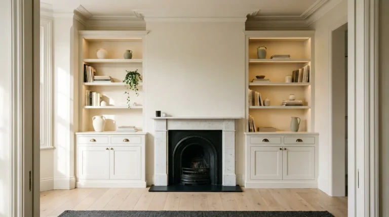
The media wall that reads most architecturally is one where the TV disappears into a floor-to-ceiling built-in cabinetry structure rather than sitting in front of a wall. Full-height cabinetry — flanking the TV on both sides and extending to the ceiling — frames the screen as one element within a larger composition rather than as the destination the entire wall was built to serve.
The TV zone sits at a naturally centered position within the structure, with closed lower cabinets for media equipment and storage, open display shelving on either side at mid-height, and closed upper sections that use the full wall height for storage. This approach hides the most cables, provides the most storage, and produces the most resolved visual result. It is also the most permanent and the most expensive, which makes it worth planning carefully — full-height built-ins are not a project to reverse cheaply.
2. Use a Recessed Niche to Set the TV Flush With the Wall Surface

Recessing the television into the wall — framing a cavity in the wall structure so the screen sits flush rather than projecting forward — produces a finished quality that surface-mounted TVs rarely achieve. The screen becomes part of the wall plane rather than an object attached to it, which is the detail that distinguishes purpose-built media walls from a TV hung on a bracket and called a feature.
The recess also creates a natural frame around the screen — visible in the depth shadow between the TV face and the surrounding wall — that makes the television look more like a framed artwork and less like an appliance. A recessed niche requires stud wall construction planned around the TV’s depth, which is typically 2 to 4 inches for current flat screens. In existing homes, this usually means building a false wall in front of the original to create the cavity depth needed.
3. Mount a Floating TV Unit Below a Bare, Minimal Wall for a Clean Look

Not every media wall needs cabinetry, paneling, or a fireplace. A floating TV unit — a wall-mounted console with no legs that appears to hover above the floor — combined with a TV mounted directly on the wall above and nothing else creates a deliberately spare composition where the quality of the unit itself is the design statement.
This approach works best when the console material justifies the restraint: smoked oak with visible grain, a lacquered finish with a specific color, or a material contrast between the wall and the unit surface. The wall behind the TV can be painted a different tone than the surrounding walls, creating a subtle backdrop panel without committing to full paneling. Cable management matters more here than in any other media wall approach — a single visible cable undermines the entire composition, so in-wall routing or a raceway painted to match the wall is essential rather than optional.
4. Set the TV at the Correct Height for Seated Viewing Before Anything Else

The most consistently regretted decision in media wall projects is mounting the television too high. The ideal position for a TV used primarily from a seated position places the center of the screen at approximately seated eye level — roughly 42 to 48 inches from the floor for most standard sofa and armchair heights. At this height the viewer looks slightly downward at the screen, which is natural and comfortable; a screen mounted significantly higher than this forces the neck upward over the course of a full evening and becomes noticeably uncomfortable.
This matters enormously for media wall design because the TV height determines the heights of everything else: the console or storage unit below it, the flanking shelves that frame it, and any fireplace integrated below it. Establish seated eye level in your specific room before any other dimension is decided. Everything else on the wall should be planned around that fixed point rather than designed to look balanced and then adjusted to accommodate the TV.
5. Choose a TV Size That’s Proportional to the Wall Width

A television that’s too small for its wall and surrounding cabinetry reads as inadequate regardless of how well the rest of the media wall is designed; one that’s too large creates a screen-dominant composition that looks closer to a commercial installation than a residential one. The proportional relationship between TV width and the total wall or media unit width is the governing dimension.
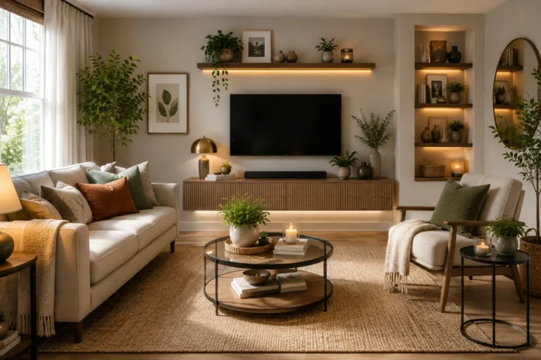
A useful starting point: the TV should occupy roughly 40 to 60 percent of the total width of the media wall composition, including any flanking shelves or cabinets. This gives enough of the wall to the non-screen elements that the composition reads as a wall feature with a TV in it rather than a wall-sized television with some shelves added. In practice, this means that a media wall spanning 8 feet of wall width suits a TV in the 65- to 75-inch range; a media wall spanning 5 to 6 feet suits a 55- to 65-inch screen. Plan around the actual wall dimensions rather than the maximum screen size that fits.
6. Use a Dark Backdrop Panel Directly Behind the TV to Frame the Screen

One of the more restrained but effective media wall approaches involves treating only the wall area immediately behind and around the television differently — painting it a significantly deeper tone than the surrounding walls, applying a panel of stone-look porcelain tile, or adding a section of dark stained wood veneer — while leaving the flanking walls in their original finish.
This creates a visual frame for the screen without committing to a full wall treatment, and it’s particularly effective in rooms where the media wall is one feature among several rather than the room’s sole focal point. The size of the backdrop panel matters: it should be large enough to extend clearly beyond the TV’s perimeter on all sides — typically 12 to 18 inches of margin around the screen — so the panel reads as a deliberate architectural element rather than a gap in the wall treatment.
7. Flank the TV With Asymmetric Shelving for a Curated, Collected Look

Symmetrical shelving flanking a central TV is a natural and legible composition, but it reads as expected — the design solution that most media walls default to. Asymmetric shelving, where the shelving zones on either side of the TV differ in depth, width, number of shelves, or the combination of open and closed storage, produces a more considered result that reads as specifically designed for this room rather than generically applied.
Possible asymmetric arrangements: open shelving on the left, a tall closed cabinet on the right; deep shelving on one side for oversized items, narrow display shelving on the other; a full column of shelves on one side and a single wide shelf with a closed lower section on the other. The asymmetry works when the visual weight of both sides of the TV is balanced even though the forms differ — which is a more exacting design challenge than symmetry but produces a result that looks more deliberately designed.
8. Include Closed Lower Storage for Media Equipment and Cables

The most important functional decision in a media wall is whether the storage below the TV can actually accommodate the real equipment that needs to live there: gaming consoles, streaming boxes, soundbars, routers, cable boxes, spare remotes, and the power strips that all of these connect to. Closed cabinet doors with internal ventilation are the standard solution — they hide the equipment visually while allowing the heat that consoles and AV equipment generate to dissipate without the hardware overheating.
Ventilation is not optional. Equipment stored in sealed cabinets without adequate airflow runs hot, which shortens its lifespan and in some configurations poses a safety concern. Slatted cabinet backs, ventilation channels at the cabinet top or sides, or purpose-built media cabinet units with managed airflow all address this. Before finalizing the storage design, inventory every device that needs cabinet space, note its dimensions, and confirm the cabinet interior can hold the real equipment rather than an optimistic estimate.
9. Add a Soundbar Shelf or Recess Below the TV for Audio Integration

Soundbars are the most commonly ignored element in media wall planning and the most visible afterthought when they haven’t been accommodated. A soundbar placed in front of a floating console, balanced on the TV stand’s edge, or sitting on a shelf it doesn’t quite fit reads as an addition the original design didn’t anticipate.
A purpose-built soundbar shelf — recessed slightly into the wall surface or mounted as a slim floating shelf at the exact width of the soundbar — integrates the audio hardware as cleanly as the TV. The shelf depth should match the soundbar’s footprint, and the recess or shelf position should place the soundbar centered below the TV with consistent spacing between the two. This is a detail worth planning at the design stage that costs very little and significantly improves the finished appearance of the wall.
10. Apply Fluted or Ribbed Wood Panels for Texture Without Pattern

Fluted wood paneling — vertical panels with rounded or flat grooves creating a regular ribbed surface — is one of the most widely used media wall treatments of recent years and for clear reasons. The ribbed texture creates linear shadow lines that add depth to the wall surface without introducing pattern or color that competes with the TV. It reads as architectural detail at normal viewing distance and as refined material craft at close range.
Applied to the full media wall or as a backdrop panel directly behind the TV, fluted panels in natural oak, walnut, or painted MDF create a surface that photographs and reads in person as considerably more specific and designed than a flat painted wall. The panel scale matters: very fine fluting reads delicate and contemporary; wider, deeper grooves read more architectural and bold. The depth of the groove affects how dramatically the shadow lines appear at different times of day as the light angle changes.
11. Integrate a Fireplace Below the TV for a Combined Heat and Media Feature

The fireplace-below-TV combination is the most common premium media wall configuration, and it addresses the challenge of what to do with the lower portion of a wall that might otherwise be filled with a large console. An electric or gas fire built into the media wall structure below the screen creates a second focal point that the TV shares rather than competes with, and it means the wall serves the room year-round rather than only when something is being watched.
The proportion between fire and TV needs careful calibration. The fireplace opening should be noticeably narrower than the TV above — roughly 60 to 75 percent of the screen width — to preserve the TV’s visual dominance. A fireplace that’s wider than the television inverts the hierarchy and the fire becomes the primary feature rather than the wall. The spacing between the fireplace top and the TV bottom should accommodate any manufacturer heat-clearance requirements, which vary by fire type and should be confirmed before design is finalized.
12. Build a Stone or Porcelain Tile Surround Around a Fireplace Media Wall

The material used on a fireplace media wall determines its visual register more than any other single choice. Painted plasterboard around a fire reads minimal and contemporary. Stone-effect porcelain, real stacked stone, or large-format marble-look tile transforms the same structure into something that reads as an architectural focal point with material weight.
The tile or stone should extend beyond the immediate fireplace surround to the wider media wall — a stone panel that stops at the fireplace hearth while the surrounding cabinetry is in a different material creates a composite that reads as assembled rather than designed. Carrying the stone or tile material fully to the wall’s perimeter, or to a deliberate architectural break like the edge of built-in cabinetry, gives the material choice the scale it needs to read as a design decision rather than a fireplace accessory.
13. Paint the Entire Wall and Cabinetry in the Same Dark Tone for Drama

A media wall where every element — the built-in cabinetry, the surrounding wall sections, the alcove interiors, the shelving backs — is painted in the same deep tone creates a unified composition where the TV appears to float within a field of consistent color. This approach reads as architecturally confident and is particularly effective in living rooms where the media wall is large and the surrounding walls are pale, since the dark wall creates maximum contrast with the room as a whole.
Deep tones that work well for this application include inky navy, forest green, charcoal, and warm near-black. The finish on the cabinetry should be a slight step above the wall’s flat finish — satin or eggshell on the cabinet fronts, flat on the wall sections — so the two surfaces are distinguishable at close range while reading as unified from across the room. Objects displayed on shelves in this configuration become compositional focal points because the dark background makes everything in front of it visible and significant.
14. Use Limewash or Venetian Plaster as a Textured Backdrop Behind the TV

Where fluted wood paneling provides texture through surface geometry, limewash and Venetian plaster provide texture through material depth. Both finishes create a wall surface that shifts in tone as the light angle changes throughout the day — not dramatically, but in a way that prevents the wall from reading as flat. Applied to the section of wall behind the television, either finish creates a layered, organic backdrop that makes the TV look considered even when it’s switched off.
Limewash is more accessible and can be DIY-applied with practice; Venetian plaster typically requires a skilled plasterer for a truly polished result. Both work best in warm tones — a warm clay, a sandy terracotta, a muted ochre — that provide some separation from the surrounding wall color rather than a perfect match. The texture should be consistent across the panel and applied before the TV is mounted so the finish can be properly completed around the mounting hardware.
15. Install Shiplap or Board-and-Batten as a More Accessible Textured Treatment

For media walls that need surface texture without the cost of stone or the skill-requirement of plaster, painted shiplap or board-and-batten paneling provides a relatively accessible alternative. Horizontal shiplap creates shadow lines that add horizontal depth to the wall and reads as casual coastal or farmhouse in style; vertical board-and-batten is more traditionally architectural and works across more design styles.
Both require accurate installation to read well — gaps between boards that aren’t consistent, boards that aren’t level, or corners that don’t meet cleanly reveal the lower-cost material behind the treatment. Painted in a deep tone that provides genuine contrast with the room’s other walls, either treatment can read as significantly more considered than it costs to execute. Both also provide a surface that’s straightforward to repair and repaint in the future, which is an advantage over more permanent materials.
16. Keep the Media Wall Tone Consistent With the Room’s Palette Rather Than Contrasting It

The impulse when designing a media wall is often to make it dramatically different from the surrounding room — a dark wall against light walls, a bold material in an otherwise restrained interior. This can produce excellent results, but it requires the media wall to be strong enough to earn its visual dominance over the rest of the room rather than simply being heavier.
A subtler and often more livable approach uses the media wall as an intensified or more detailed version of the room’s existing palette rather than a departure from it. A warm white room with a media wall in a warm greige or soft caramel reads as a room where the focal wall has more depth than the others, which is architecturally natural. The media wall earns attention through material quality and composition rather than through tonal shock.
17. Add LED Strip Lighting Behind the TV to Reduce Glare and Add Atmosphere

Bias lighting — LED strips applied to the back of the television frame, casting a soft glow onto the wall directly behind the screen — is a functional detail that significantly affects viewing comfort in dimly lit rooms. Without it, the high contrast between a bright screen and a dark surrounding wall causes eye fatigue over the course of an evening’s viewing. The bias light softens that contrast and makes extended viewing noticeably more comfortable.
Visually, the soft halo of light around the television also creates the impression that the TV is glowing from within the wall rather than simply mounted on it. LED strips specifically designed for TV bias lighting are widely available, battery-powered or USB-connected through the TV’s USB port, and represent one of the simplest and most cost-effective media wall upgrades available. The color temperature of the strips should match or complement the room’s ambient lighting — warm white in warm-toned rooms, neutral white in cooler, more minimal spaces.
18. Incorporate Recessed Shelf Lighting to Illuminate Display Objects

Display shelving flanking a media wall can look dark and flat under normal overhead lighting conditions, particularly when the media wall itself has a deep tone or the room relies primarily on table lamps rather than ceiling fixtures. Recessed or puck lights inside the shelving — positioned at the top of each shelf bay to illuminate the objects below — solve this without requiring any visible fixture.
The lighting should be warm enough to complement the objects rather than bleaching them and discreet enough that the light source itself isn’t the visual subject. LED tape at the top of each shelf bay behind a small shadow gap is the cleanest installation; individual puck lights are more visible but easier to install without rewiring. The illuminated shelf bays create compositional depth at night when the rest of the wall is dark — the objects float in the light rather than disappearing into the surrounding structure.
19. Let the Adjacent Walls Stay Simple to Give the Media Wall Its Weight

A media wall designed with significant material investment and visual complexity needs the surrounding room to give it space to read. Adjacent walls that are heavily decorated — gallery walls, bold wallpaper, competing architectural detail — create a visual competition that dilutes the impact of the media wall and makes the room feel busy rather than composed.
Keeping the walls adjacent to the media wall simple — a single pale paint color, at most one piece of art or a single mirror — allows the media wall to be the clear focal point it was designed to be. The furniture in front of it should also be restrained enough to let the wall read clearly from the primary seating position: a sofa and coffee table that don’t rise above the wall’s visual center allow the full composition to register from across the room.
20. Design a Minimal Media Wall for Small Living Rooms

In a smaller living room, the instinct to build a dramatic, full-height media wall often works against the room’s proportions rather than improving them. A large-scale built-in structure in a compact room can make the space feel like a room that was installed inside a piece of furniture. A minimal approach — a floating console with a slim profile, the TV on a clean wall behind it, and open shelves rather than closed cabinetry — keeps the visual footprint manageable.
The floating console’s depth should be genuinely slim in a small room — around 12 to 16 inches — to maintain floor visibility and prevent the console from visually blocking the floor space. Wall color on the media wall can go a shade deeper than the surrounding walls without committing to a full dark accent, creating a visual backdrop for the TV without the visual weight of a heavily paneled feature wall.
21. Use a Modular System in Rental or Temporary Spaces

Built-in media walls require permanent structural changes — stud walls, recessed cavities, fixed cabinetry — that aren’t appropriate for rented homes or for homeowners who expect to reconfigure the room significantly in the near future. A well-chosen modular system — wall-mounted shelf components, a freestanding media unit with genuine material quality, and a bracket-mounted TV using a proper stud or wall anchor — can achieve a media wall effect without any permanent alteration to the building structure.
The material quality of the modular components determines whether the arrangement reads as a designed feature or a convenient temporary solution. A floating media unit in solid oak or powder-coated steel with well-integrated cable management can look entirely intentional. Bracket-mounted TVs on properly anchored wall mounts are also straightforward to relocate. The key difference from a built-in is that everything visible should be visually intentional, since the modular system has no surrounding structure to contextualize or conceal it.
22. Plan Every Cable Route Before the Build Begins, Not After

The single most consistent regret in media wall projects isn’t the material choice or the cabinet configuration — it’s cable management that wasn’t planned until after the structure was built. A media wall where the television power cable and HDMI leads are visible running down the wall to the console undermines the entire investment in the surrounding cabinetry and paneling. The cables become the thing you see first.
The reliable solution is simple but requires discipline: decide exactly where every cable will run, where every socket needs to be positioned, and whether any future devices might require additional routing before the first piece of plasterboard goes on. In-wall conduit — hollow channels running within the wall structure that cables can be threaded through — costs almost nothing during a build and makes future cable additions straightforward. Once the wall is closed up, adding a socket or running a new HDMI line becomes a much more disruptive undertaking.
Five Things to Decide Before You Build a Media Wall
Media wall projects go wrong at the planning stage more often than at the execution stage. Before committing to a design, these five decisions need answers.
TV height first, everything else second. The center of the screen at seated eye level — roughly 42 to 48 inches from the floor — is the fixed point that all other dimensions are built around. Don’t finalize a cabinet design until this is confirmed.
Storage inventory. List every device that needs to live in the media wall — console, streaming box, router, cable box, soundbar, power strips — and confirm the cabinet design can actually hold them with ventilation space. Design the storage around the real equipment, not a hopeful estimate.
Cable routes. Decide before construction exactly where every cable runs, every socket is positioned, and whether there’s a conduit for future additions. This cannot be effectively retrofitted.
Room proportion check. Photograph the wall at the scale of the room and overlay the proposed media wall dimensions. A structure that looks right in a showroom can overwhelm a modest living room. The wall width, ceiling height, and sofa distance from the wall all affect how the finished media wall reads.
Permanence. If there’s any chance you’ll be renting, moving, or reconfiguring the room significantly within five years, a modular or minimal approach protects that flexibility. Built-in media walls are difficult and expensive to change.
Final Thoughts
A media wall’s primary job is to make the television feel like part of the room rather than an interruption of it — and the ideas here serve that goal across a wide range of scales, budgets, and design directions. The minimal floating console and the full-height built-in with integrated fireplace are both valid answers; which one is right depends entirely on the room’s proportions, the household’s storage needs, and the permanence of the arrangement.
Start with the planning decisions — TV height, storage inventory, cable routes, and room scale — before moving to the visual ones. A media wall that’s been carefully planned and simply detailed will almost always outperform one that was visually ambitious but practically under-considered. The design can be refined from there, but the cable conduit cannot be added after the plasterboard is closed.
Save the ideas here that match your room’s scale and your practical situation, and return to this guide when you’re ready to build.