21 Built-In Living Room Cabinet Ideas You’ll Love
Built-ins are one of those living room decisions people put off because they feel permanent — and then, once they’re in, wonder why they waited. A well-designed set of built-in cabinets does something a sofa or rug simply can’t: it makes the room feel finished. Not decorated, but genuinely designed. That quality comes from the way built-ins give a room architectural purpose that was always slightly missing.
The decisions involved are more layered than they first appear. Floor-to-ceiling or lower? Flanking a fireplace or filling an entire wall? Open shelves, closed cabinets, or a combination of both? What color? What hardware? These aren’t interchangeable questions. The right answers depend on your room’s proportions, your actual storage needs, and what the space is supposed to do day to day.
These 21 built-in living room cabinet ideas move from foundational layout decisions through design details and finishing choices. Whether you’re working with a contractor, exploring a DIY approach, or looking to style built-ins you already have, reading in order will help you understand which decisions need to come before others.
1. Flank the Fireplace with Symmetrical Built-Ins
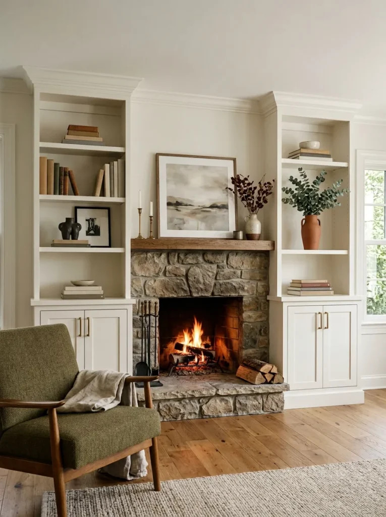
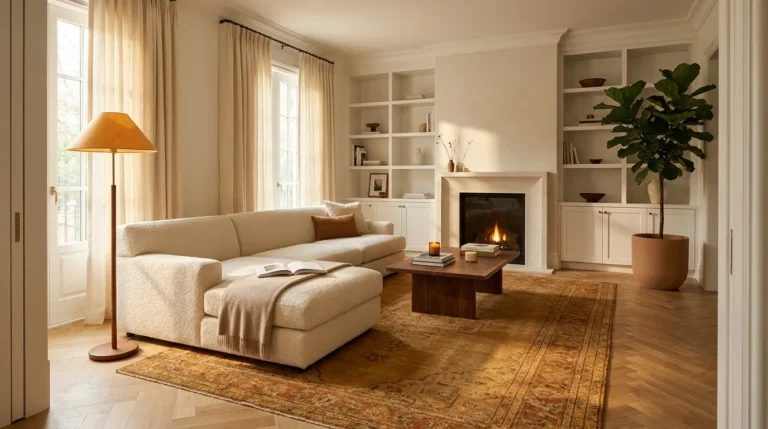
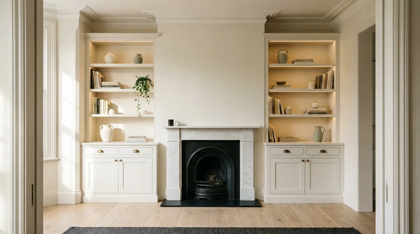
The fireplace flanker is the most time-tested built-in configuration in living room design, and its longevity comes down to structural logic: the fireplace already provides a natural focal point, and built-ins on either side give the room the balanced architectural framing that floating furniture alone can’t achieve. Done well, this arrangement makes the chimney breast look like it was always the room’s anchor rather than a functional afterthought.
Proportions matter significantly here. Flanking built-ins narrower than about 24 inches read as cramped beside a standard fireplace. Those that are too wide risk overwhelming the hearth they’re meant to support. A depth of 12 to 16 inches allows for genuine book and object storage while keeping the built-ins from projecting too far into the room. If the alcoves beside your fireplace are shallow, building the upper section as open shelves and the lower section as flush-front cabinets recovers visual coherence without requiring unusual depth.
2. Go Floor-to-Ceiling for Maximum Storage and Visual Impact
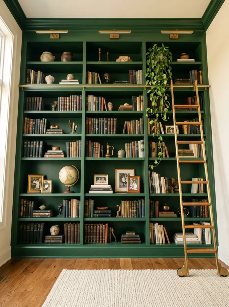
Floor-to-ceiling built-ins make a fundamentally different architectural statement than waist-height or mid-wall versions. They commit fully to the wall, treating it as a functional surface rather than a backdrop for furniture. In living rooms where storage is a genuine priority — books, media equipment, linens, games — this approach solves the problem permanently rather than managing it piece by piece.
The practical consideration is ceiling height. In rooms with standard 8-foot ceilings, floor-to-ceiling built-ins still work, but shelves above 72 inches become difficult to access without a step stool and are better used for seasonal storage, decorative objects, or books you don’t reach for often. In rooms with 9-foot or taller ceilings, the full height reads proportionally better and invites more deliberate use of every zone. A rolling library ladder, when the scale genuinely calls for it, is a practical solution — not just a decorative one.
3. Use Lower Cabinets with Open Shelves Above for Flexible Storage
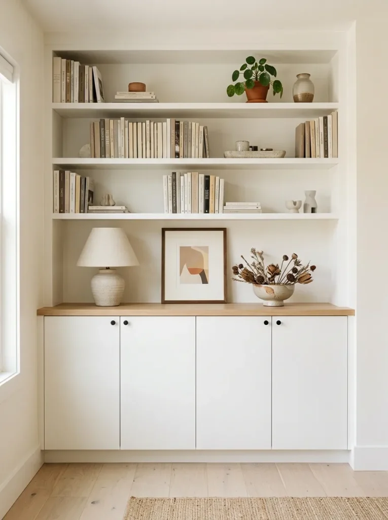
Not every built-in configuration needs to solve every storage problem at once. The combination most living rooms benefit from is a base of closed lower cabinets — concealing everyday clutter, media equipment, board games, extra blankets — with open shelving above for curated display. This gives you real control: messy things disappear behind doors, and only the things worth looking at remain visible.
The standard split point falls around 36 inches from the floor, which aligns roughly with counter height and creates a natural visual break. Above this line, shelves at 12-inch increments work for most book formats and standard decor objects. Below, cabinet depth can be slightly greater — up to 20 inches — to accommodate bulkier storage. The horizontal countertop surface between the upper and lower sections becomes a natural display zone for art objects, lamps, and plants, helping the built-ins read as furniture rather than utilitarian storage units.
4. Paint Built-Ins the Same Color as the Walls for Architectural Depth
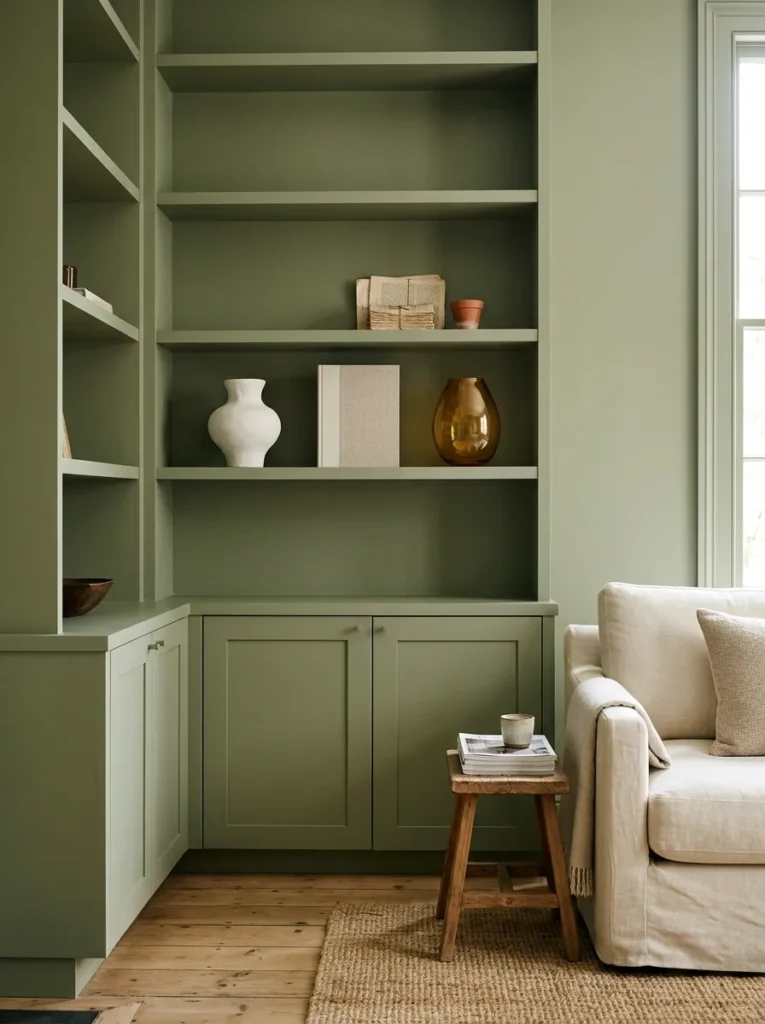
One of the most effective decisions you can make with built-in cabinetry isn’t a structural choice — it’s a paint choice. When built-ins share the exact wall color, including the cabinet backs and interior surfaces, the cabinetry blends into the architecture. The shelves and cabinets appear to recede, making the objects displayed on them the visual story rather than the structure holding them.
This approach also makes less expensive construction look more sophisticated. Basic MDF with simple profiles, painted the same warm white or sage green as the surrounding walls, reads as architecturally considered rather than budget-grade. Finish matters: use a satin or semi-gloss on the cabinetry itself — more durable and easier to wipe — and a flat or eggshell on the surrounding walls. The slight sheen difference means the built-ins catch light differently and define themselves subtly without relying on a color contrast to do the work.
5. Build Into an Alcove to Use Every Inch of an Awkward Recess
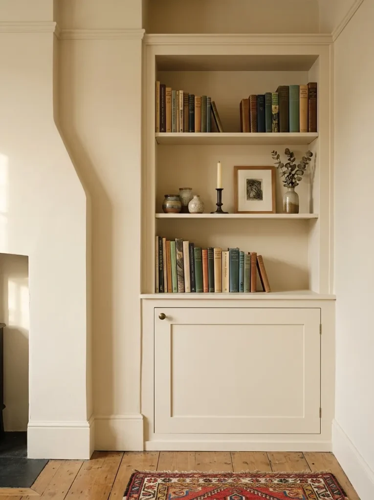
Most living rooms have at least one alcove — typically the recesses beside a chimney breast, but sometimes an awkward corner or a structural offset that makes furniture placement frustrating. Built-ins are the most practical resolution because they fill the recess completely, convert dead wall area into functional depth, and eliminate the visual awkwardness of a partially filled corner.
Alcove built-ins are often the most cost-effective custom option precisely because the walls do two sides of the framing work. If the alcove is narrow — under 18 inches deep — shallow shelves with a display-only function work well: books facing out, objects grouped at varying heights. If the depth reaches 20 inches or more, full cabinets with doors become practical. One important note before ordering: measure the alcove at multiple heights, not just at floor level. Older homes frequently have alcoves that are 1 to 2 inches narrower at the top than at the base, which affects what can be built in.
6. Add Glass-Front Cabinet Doors to Break Up Solid Panels
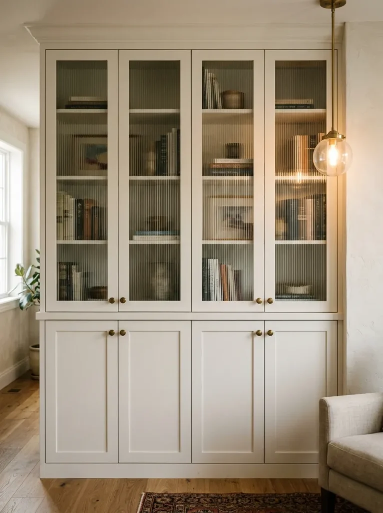
A wall of closed cabinet doors reads very differently from a combination of glass-fronted and solid panels. Glass-front doors introduce transparency that makes built-ins feel lighter and allow whatever’s stored inside to become part of the room’s visual interest. In practice, this means the contents behind glass doors need to be as deliberately curated as open shelving — mismatched objects, cluttered interiors, or randomly stacked items will read clearly through the glass and work against you.
The configuration that works best in most living rooms is solid lower cabinet doors, concealing the least photogenic storage, with glass-front upper doors. Ribbed or reeded glass — widely used in contemporary kitchen and bathroom cabinetry — provides softened transparency that obscures specific detail while hinting at form and color. It’s considerably more forgiving than clear glass and doesn’t require the same level of interior styling precision to look good throughout the day.
7. Illuminate the Interior with Recessed LED Strip Lights
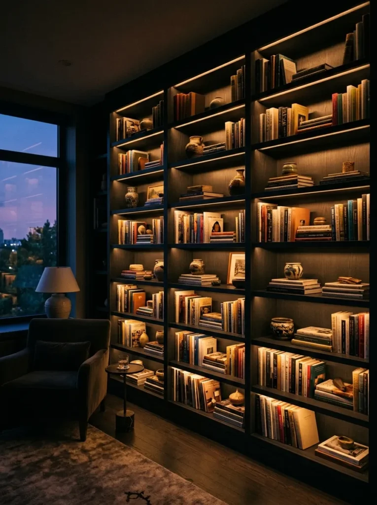
Shelf lighting is the single addition that most dramatically changes how built-ins look after dark, and it’s relatively straightforward to incorporate either at the construction stage or as a retrofit. LED strip lights mounted underneath each shelf, running the full depth from front to back, cast warm light downward onto the shelf below — illuminating objects from above in a way that creates visual depth and makes the built-ins feel integrated into the room’s overall lighting scheme rather than disappearing into the wall at night.
Color temperature makes a significant difference here. Strips in the 2700K to 3000K range produce warm, incandescent-quality light that suits living rooms. Anything cooler — 4000K and above — reads clinical and works against the warmth a living room is trying to achieve. Dimmer compatibility allows the shelf lighting to be stepped down for evening ambiance without going fully dark. Concealing the LED strip behind a small front lip, or inside a routed channel, prevents the light source from being directly visible from seated height and keeps the effect looking intentional rather than improvised.
8. Choose a Bold Color for the Cabinet Backs
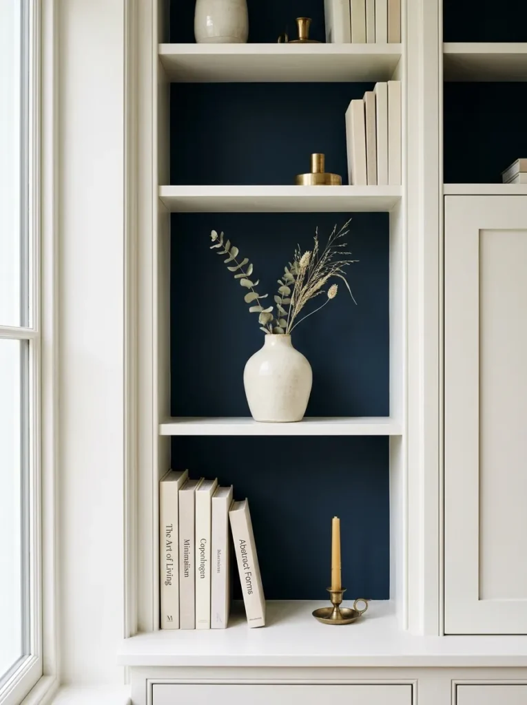
The interior back of a built-in cabinet is the most visually contained surface in the room, which makes it the lowest-risk place to introduce a bold color. A deep library green, an inky navy, a warm terracotta, or a rich charcoal on the back panels turns the shelving into a series of display cases — every object placed in front of the colored back becomes more visible and more deliberate-looking.
This works especially well when the cabinet faces and surrounding walls are in a neutral tone. The color punch comes from within the built-in and doesn’t commit the entire room to a bold palette decision. The back panel color can also reference other colors already present in the room — a rug, a throw, upholstery — without needing to match them exactly. Use a semi-gloss finish on the back panels: it reflects light inward, intensifies the color in a way flat paint doesn’t, and gives the interior its own distinct quality of depth.
9. Install a Built-In Media Console to Manage the TV and Wiring
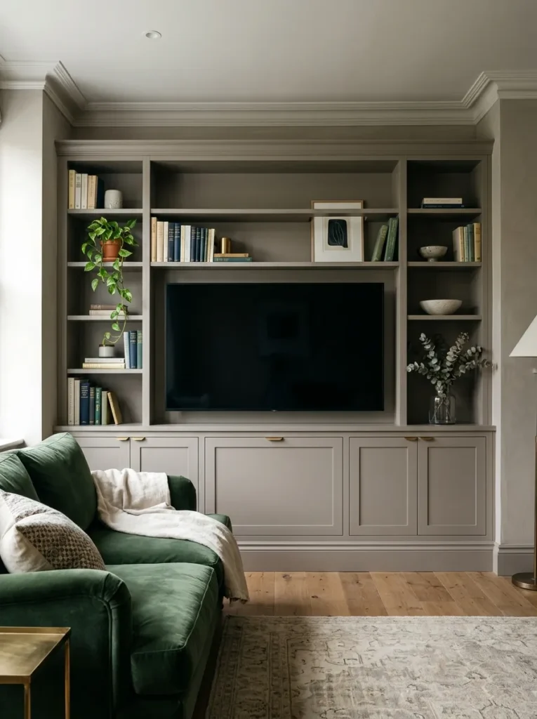
The television is the element most likely to undermine a well-designed living room, and built-ins offer the most convincing solution to the problem of where it goes and what surrounds it. Integrating the TV into a built-in unit — with dedicated cabinet space below for equipment, wire channels routed through the structure, and shelving on either side — resolves the visual chaos of a freestanding media console surrounded by exposed cables and stacked components.
The key planning decision: whether to center the television within the built-in or position it off-center. Centering works naturally when the built-in symmetrically flanks the TV. Off-center placement creates a more contemporary, asymmetrical composition — but it requires deliberate visual balance on the opposite side (a taller bookcase, a larger artwork grouping) to prevent the unit from reading as unfinished. Cable management is best built in during construction. A 2-inch conduit running from the TV mounting point to the equipment cabinet below handles future device changes without requiring any structural work later.
10. Use Asymmetrical Shelving for a More Modern, Custom Look
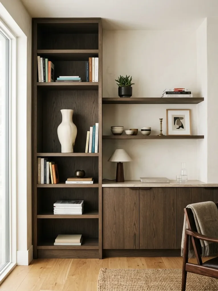
Symmetry is the natural default for built-ins, and it works — but it isn’t the only option. Asymmetrical configurations, where shelves sit at different heights, column widths vary, or open and closed sections are arranged without mirror logic, produce a built-in that reads as designed rather than installed. This suits contemporary and transitional interiors where the strict formality of perfectly matched flankers would sit at odds with the room’s overall aesthetic.
The challenge with asymmetry is that it requires more deliberate planning to avoid looking haphazard. A useful approach: establish the total footprint and overall height first, then divide the space into columns of different widths — for example, a wide central section flanked by narrower ones, or a tall bookcase section on one side with lower cabinets extending to the other. The asymmetry should appear to respond to something specific about the room: the television position, a window, a door — not simply an arbitrary arrangement of unequal parts.
11. Add Crown Molding and Base Molding to Make Built-Ins Look Custom
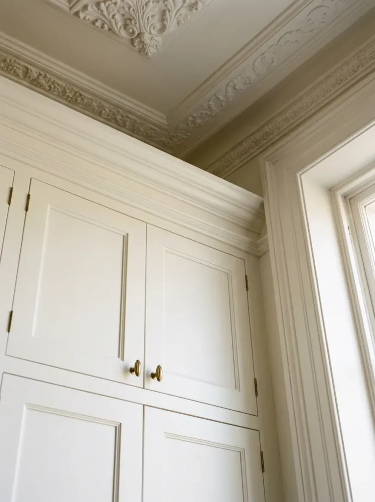
The difference between built-ins that look finished and built-ins that look like furniture pushed against a wall often comes down to two details: crown molding at the top and base molding at the bottom. Crown molding that runs continuously from the top of the built-in up into the ceiling cornice suggests the cabinetry was part of the original architecture. Base molding that matches the existing skirting board around the rest of the room creates the same architectural continuity at floor level.
This matters most in older homes with existing period detailing. A simple flat-panel built-in without molding will read as an addition in a room with elaborate cornices and baseboards. The reverse is also true — heavy traditional molding on built-ins in a very contemporary interior introduces a visual conflict that no styling choice can resolve. The molding profile should match or closely approximate the room’s existing details, not simply be whatever looks attractive in the lumber yard catalog.
12. Design Built-Ins Around a Doorway for a Seamless Wall
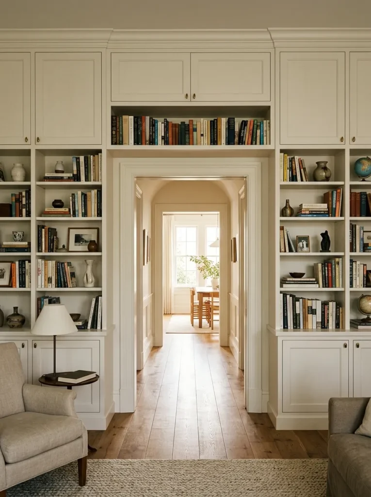
Most living rooms have at least one doorway that creates an awkward wall fragment beside it — not large enough for a sofa, not quite the right proportion for a standalone shelf unit. Building cabinetry around the doorway uses this space productively while making the door itself feel more architectural — a designed opening within a wall of cabinetry rather than a simple interruption punched through plaster.
The most common approach is a bookcase or shelving unit on one or both sides of the door frame, with a connecting overhead section that bridges across the top of the door. This works particularly well in living rooms where the door leads to a hallway or adjacent room rather than the outside, since the overhead section creates a threshold element that separates spaces without requiring a wall. The height of the overhead section should clear the door by at least a few inches for comfortable visual clearance. In rooms where the door height is lower than the ceiling, the space above the door naturally accommodates a display niche or closed storage cabinet.
13. Build a Window Seat with Hidden Storage Below
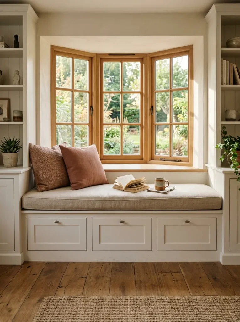
A built-in window seat brings together two things most living rooms benefit from — an established sitting spot with access to natural light and genuinely useful concealed storage beneath. The lift-top or drawer storage under a window seat handles seasonal items, extra throws, board games, and anything that needs to be accessible but not visible.
Seat height typically falls between 17 and 20 inches from the floor, which corresponds to comfortable sitting height. The seat depth should be at minimum 18 inches for a practical perch, with 20 to 24 inches preferred if the space allows — the difference between a decorative ledge and somewhere you’ll actually sit. A cushion at least 3 to 4 inches thick transforms it into a genuinely comfortable spot rather than an afterthought. When flanking built-in shelves are also planned on either side of the window seat, design the shelf height at a coordinating measurement to the seat so the three elements read as a single composed bay rather than separate pieces placed in proximity.
14. Incorporate a Home Office into Your Living Room Built-Ins
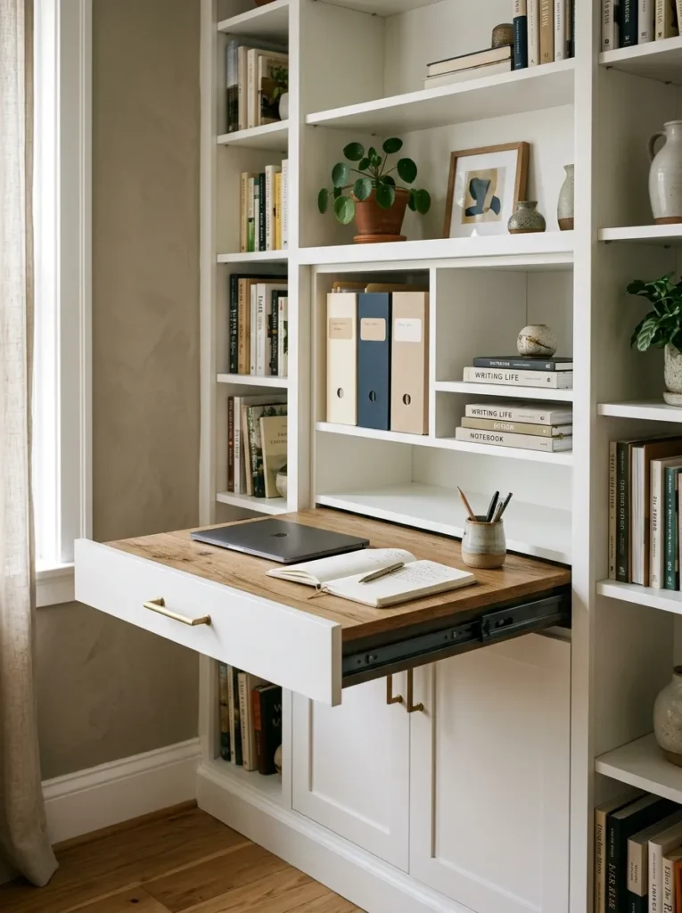
The integration of a small workspace into living room cabinetry has become one of the more practical built-in applications, particularly in apartments or homes without a dedicated study. A fold-down desk surface or a pull-out shelf at 28 to 30 inches from the floor — standard seated desk height — built into one section of an otherwise decorative cabinet wall creates a functional zone that disappears entirely when not in use.
The key to making this work is containment. When the desk is active, equipment and papers need somewhere logical to go — built-in cubbies and small drawers within the desk section provide that. Cabinet doors that close over the entire zone mean the workspace can be fully operational in the morning and completely invisible by the afternoon. Lighting is the most important detail to plan before construction: a built-in workspace needs its own task light, ideally hardwired, since a plug-in cord running down the side of the cabinetry immediately betrays the compartmentalization the built-in was designed to achieve.
15. Add a Built-In Bar or Beverage Station
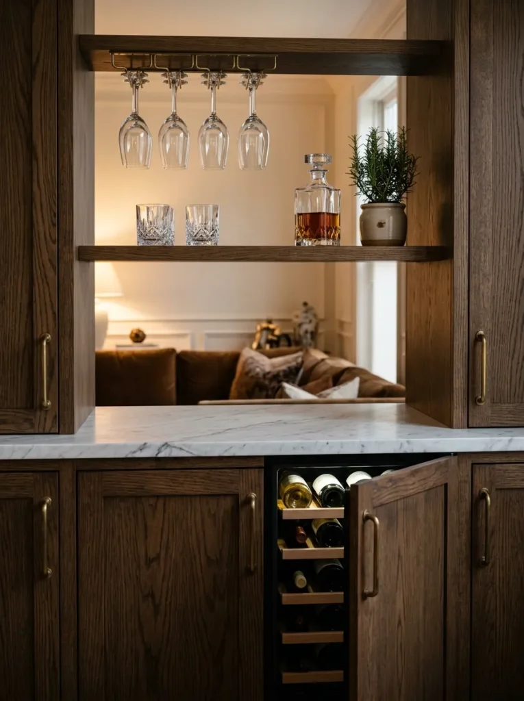
One section of a living room built-in can be designated as a bar or beverage station without committing the entire unit to that function. A lower cabinet section with interior wine storage or a small undercounter refrigerator, open shelving above for glassware and decanters, and a countertop surface at a comfortable service height — this is a self-contained zone that integrates cleanly into a larger cabinetry wall without reading as a separate piece of furniture.
The countertop material in a bar section can differ from the rest of the built-in: a piece of honed marble, soapstone, or butcher block at this section only adds material interest and signals the zone’s purpose without requiring a separate console. Glassware displayed on open shelves above a bar cabinet reads as intentional rather than stored — but the shelves need enough depth, at minimum 10 inches, to hold stemware without risk of tipping forward.
16. Build a Reading Nook into a Recessed Wall or Corner
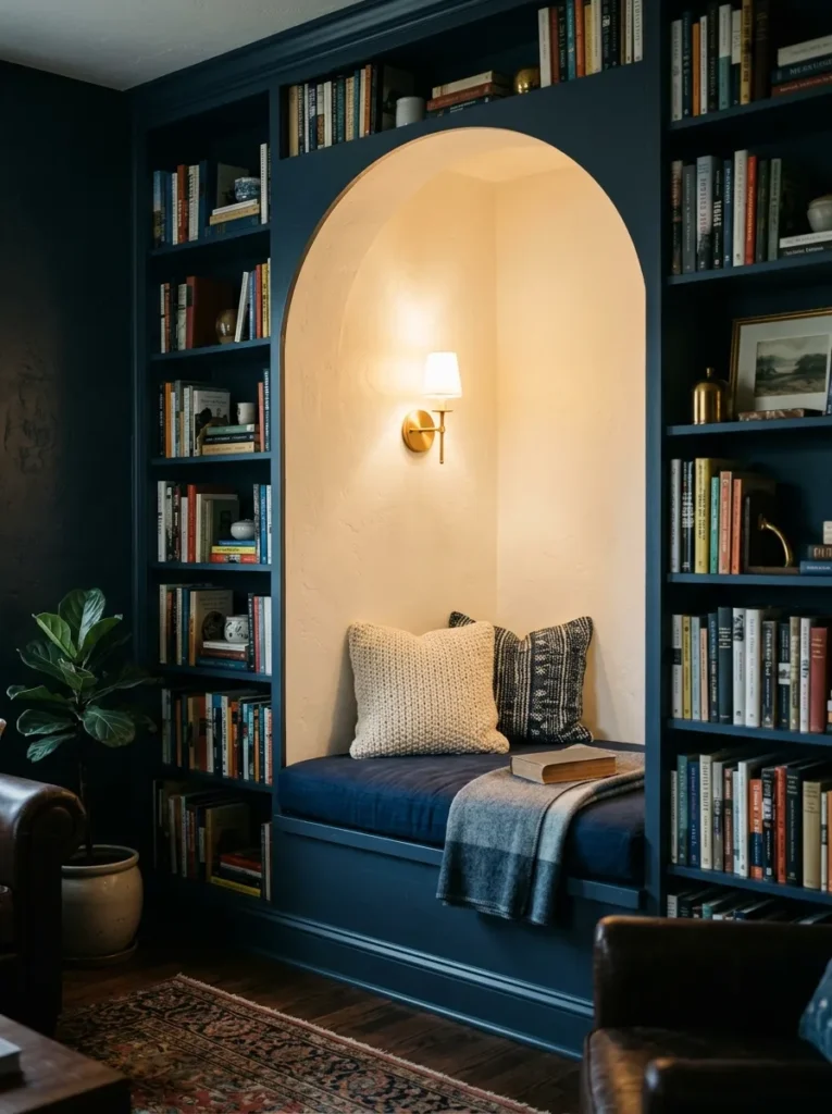
Where room architecture allows, a recessed reading nook built into a wall combines the comfort of a window seat with the intimacy of a defined space within a larger room. Unlike a window seat, a nook built into a wall can face any direction and doesn’t require a window to function — though positioning it near one obviously improves the experience.
The minimum practical width for a reading nook is around 36 inches — enough for one person to sit with legs extended to one side. At 48 to 60 inches, a second person or a fully stretched position becomes possible. Surrounding built-in bookshelves on both sides and above the nook opening makes it an architectural feature that also provides substantial storage. A small recessed light or a wall-mounted sconce inside the nook makes it usable after dark without requiring a lamp cord running down the wall or across the floor — both of which interrupt what should feel like a self-contained retreat.
17. Create a Full-Wall Statement with One Continuous Built-In
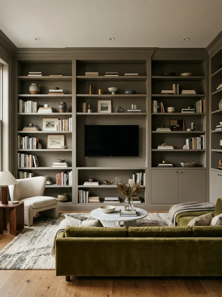
A single built-in running the full length of one living room wall — from corner to corner — makes a different kind of architectural statement than partial cabinetry. It treats the entire wall as a designed surface rather than a collection of individual elements. The visual coherence this creates can resolve a room that previously felt assembled rather than planned, particularly in open-plan spaces where a single strong wall composition anchors the living zone within the larger floor.
The practical requirement is consistent depth throughout. Full-wall built-ins that project inconsistently into the room — deeper in one section, shallower in another — read as improvised rather than designed. A standard depth of 14 to 16 inches throughout, stepping up to 18 to 20 inches for lower cabinet sections, gives the wall a unified surface reading. The design within that framework can vary significantly in its section divisions — varying open versus closed sections, tall versus short column heights — to create interest within the discipline of a continuous run.
18. Choose Hardware That Defines the Style
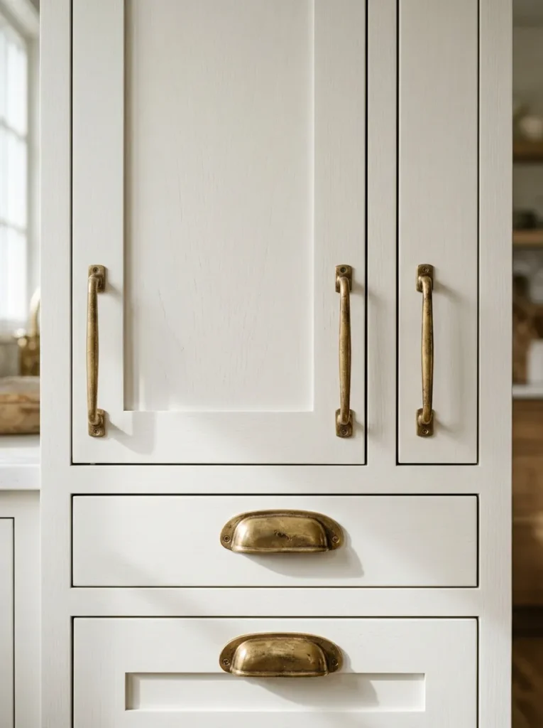
Cabinet hardware is a small decision with disproportionate visual impact. The right pull or knob finish reads as part of the room’s material language; the wrong one creates a subtle friction that doesn’t resolve itself no matter how well everything else is done. Aged brass pulls with a slightly irregular finish suit transitional, traditional, and warm contemporary rooms. Matte black reads cleanly in modern and industrial-adjacent schemes. Satin nickel and brushed gold occupy a middle ground that suits a wide range of transitional interiors.
Scale matters as much as finish. A 3-inch bar pull looks proportionate on a 15-inch drawer front. The same pull on a 6-inch drawer reads oversized and busy. Cup pulls and ring pulls reference a more antique or Shaker character. Simple round knobs read more contemporary. All hardware on a single built-in should share the same finish — mixing finishes within one unit introduces visual noise rather than the curated mixing that works in other parts of a room.
19. Mix Open and Closed Sections Based on What You Actually Own
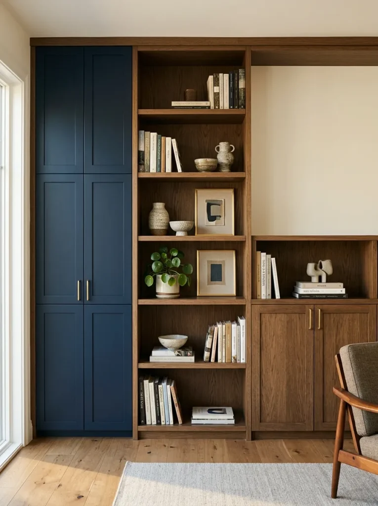
The ongoing tension in living room built-ins is between wanting everything visible and needing most things hidden. The practical resolution is intentional planning before construction: decide which sections will be open and which will be closed, and map out what will actually live in each zone before a single board is cut.
Open sections work best when they contain a limited number of objects with genuine breathing room between them. Closed sections handle the reality of everyday life — router cables, stacked remotes, extra batteries, board games, paperwork. A realistic self-assessment of how much genuinely display-worthy content you own prevents the common frustration of building generous open shelving and then filling it with items that would be better behind doors. When in doubt, build more closed storage than you think you need. Open shelves can always be added or kept deliberately sparse. Overcrowded built-ins are harder to fix after installation.
20. Fake Built-Ins with Freestanding Furniture and the Right Finishing Details
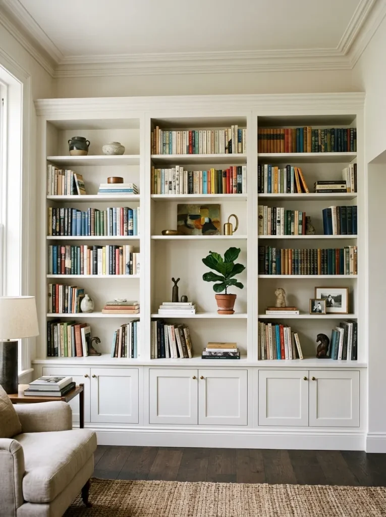
Custom built-in cabinetry is a significant financial commitment, and it isn’t always the right choice — particularly for renters or for homeowners who may want to reconfigure the room later. A convincing alternative is creating the visual impression of built-ins using freestanding furniture: IKEA BILLY or HEMNES bookcases with added crown molding and a paint color that matches the wall read almost indistinguishably from custom built-ins at a fraction of the cost.
The finishing details are what sell the effect. Caulk the gaps between units and between units and the wall. Add a continuous plinth board running across the bottoms of all units. Run crown molding across the tops without interruption. Paint everything — units and wall — the same color. From across a room, the visual signals of color continuity, consistent height, and architectural trim are all present. The result reads as built-in because built-ins are primarily a visual idea, not a construction method.
21. Style the Open Sections Using a Three-Zone Display System
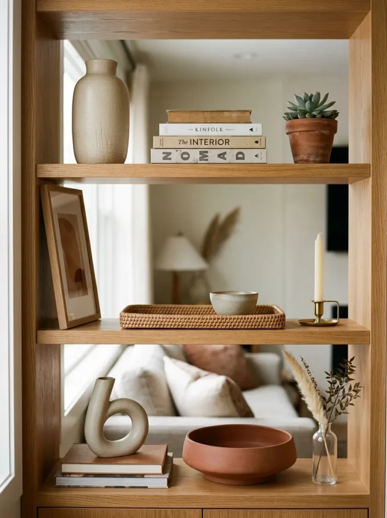
Even well-designed built-ins can read as visually chaotic if styling is approached without a structure. A reliable method for every shelf or open section: divide the space into three zones — a vertical anchor (something tall, like an upright stack of books, a slim vase, or a sculptural object), a horizontal layer (flat-stacked books, a tray, a low bowl), and a small accent (a plant cutting, a candle, one small decorative object). Not every shelf needs all three zones, but working through this logic for each section creates a rhythm that reads as considered rather than random.
The most common styling mistake is distributing similar-height objects evenly across every shelf. This produces a flat, undifferentiated impression where the eye has nowhere specific to land. Varying heights within each section — and varying the density between sections, with some shelves more populated and others deliberately sparse — creates the sense of accumulated curation rather than a staged display that was set once and never touched. The negative space is doing as much visual work as the objects.
Common Mistakes to Avoid
Building every section as open shelving. Open shelving requires constant maintenance — dust accumulates, objects get moved, styling falls apart with daily use. A built-in that’s predominantly open will demand regular restyling to look good. Closed lower cabinets are not a compromise; they’re the practical choice for anything you reach for regularly but don’t want on display.
Getting the depth wrong. Built-ins that are too shallow — under 10 inches — can’t accommodate standard books or meaningful objects and read as decorative ledges rather than cabinetry. Those that are too deep in the upper sections — over 16 inches — project too far into the room and make objects harder to see and reach. The sweet spot for upper shelving is 12 to 14 inches; lower cabinets can go to 18 to 20 inches.
Skipping the lighting plan. Built-ins designed without shelf lighting often look flat and underused after dark. Wiring for LED shelf lights during construction adds very little to the overall project cost. Retrofitting them afterward is considerably more disruptive. Make the decision before the walls close.
Choosing hardware as an afterthought. Hardware is often treated as a finishing detail when it should be part of the initial design conversation. The pull profile, scale, and finish affect how the entire built-in reads. Ordering hardware before construction allows the installer to size drawer fronts and cabinet doors around the chosen pull, rather than trying to match pulls to finished work.
Ignoring the room’s existing architectural lines. Built-ins that stop at a height noticeably inconsistent with the room’s window sill, chair rail, or door frame height create a visual conflict that no styling resolves. Whenever possible, align the top of lower cabinets with window sill height, and design upper shelving to relate to the door frame or ceiling cornice.
Final Thoughts
Built-in cabinetry rewards clarity of purpose above everything else. The rooms where built-ins look genuinely finished are the ones where someone made a clear decision about what the cabinetry was supposed to do before choosing what it would look like.
Start with that question: is this primarily about storage, display, housing a television, defining the room’s architecture, or some specific combination? The answer will guide almost every decision that follows — the proportion of open to closed sections, the depth, the height, the hardware, the finish, the color.
If budget is the primary constraint, the freestanding-with-finishing-details approach delivers most of the visual result at a fraction of custom construction cost. If you’re building from scratch, invest first in the decisions that are hardest to change: the lighting, the molding, the depth, and the paint color. Everything else can be adjusted as the room evolves.
Save the ideas here that match your room’s specific priorities and come back to this guide as your project takes shape.