22 Green Kitchen Ideas That Feel Fresh and Earthy
Green has done something interesting in kitchen design over the past few years. It moved from accent color to full commitment — cabinets, tiles, walls, islands — and somehow made it look natural rather than risky. The appeal makes sense. Green connects to organic materials in a way that navy or charcoal never quite manage, and it reads differently depending on how you use it: grounding in deeper tones, airy in lighter ones, sophisticated or rustic depending entirely on the finish.
But searching for “green kitchen ideas” returns a lot of images and very little guidance. Which green works for a north-facing kitchen? When does a green island work without making the room feel busy? What actually pairs well with warm oak versus cool white oak? This article covers 22 genuinely different directions — from full painted cabinet transformations to smaller-scale commitments — with enough context to help you figure out which ideas suit your specific space.
1. Sage Green Lower Cabinets with White Uppers
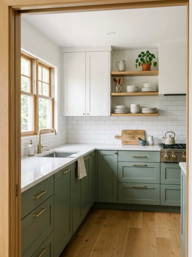
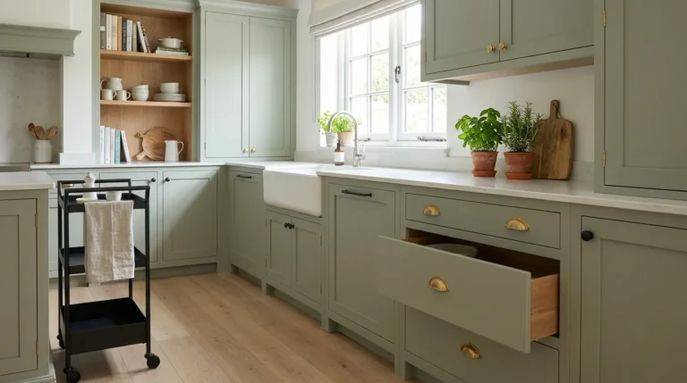
This is one of the most reliably successful green kitchen configurations precisely because it manages visual weight intelligently. Keeping the upper cabinets white or cream draws the eye upward and preserves the sense of height and light, while the sage lowers ground the room with quiet color. The break point matters: a standard two-tone split sits at the countertop line, but if you have open shelving above rather than upper cabinets, you get the same grounding effect with even more visual breathing room.
Sage specifically — those grey-green, slightly dusty tones — works well in kitchens that receive indirect or north-facing light because it doesn’t depend on warm sunlight to look good. Cleaner mid-greens can turn sallow in cool light, but sage holds its composure. Pair with brushed brass hardware for warmth, or matte black for a more restrained result.
2. Full Forest Green Cabinetry in a Compact Kitchen
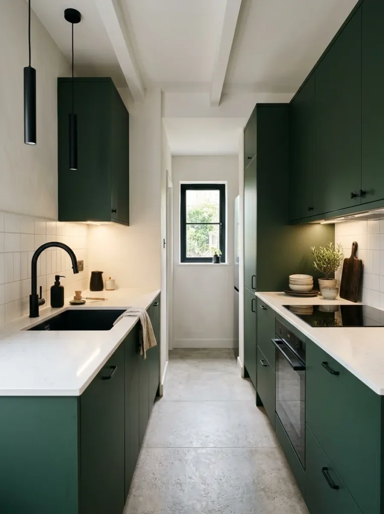
The instinct in small kitchens is always to go lighter, but forest green — a deep, slightly cool, high-pigment tone — can work surprisingly well in a compact space when the rest of the room is kept deliberately minimal. The logic is counterintuitive but sound: a small kitchen with pale cabinetry often just looks like a small pale kitchen. A small kitchen with bold dark cabinets, good lighting, and clean countertops looks intentional.
The conditions that make it work: under-cabinet lighting to prevent the lowers from feeling cave-like, light countertops (white marble, light quartz, or pale limestone), and hardware that’s cohesive rather than decorative. If you have limited natural light, supplement with warm pendant lighting rather than relying on overhead fixtures alone.
3. Olive Green Kitchen with Terracotta and Warm Wood
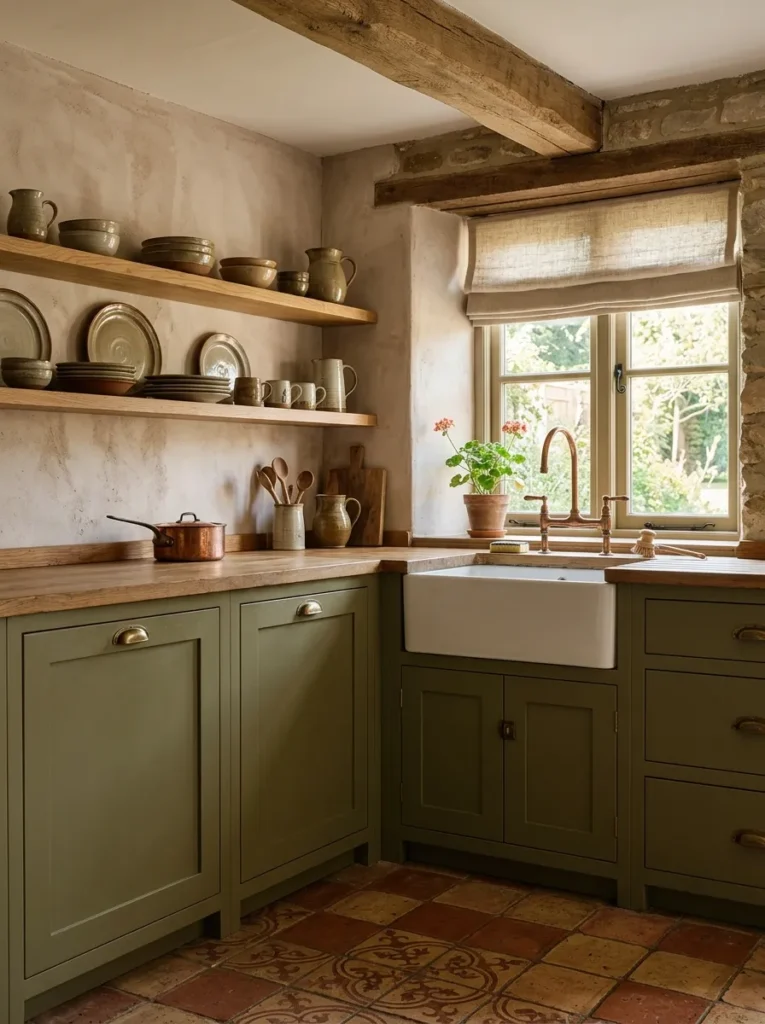
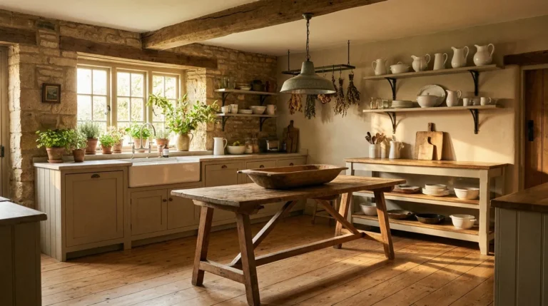
Olive green — the yellower, earthier cousin of sage — creates a specific visual register that pairs naturally with warm Mediterranean or rustic material palettes. Against terracotta floor tiles, natural linen roman blinds, or aged oak shelving, olive reads as earthy and lived-in rather than formal. It also has strong natural affinity with copper hardware and unlacquered brass, both of which develop patina over time and complement the organic quality of the green.
This combination tends to suit kitchens with some character already built in — stone floors, exposed ceiling beams, original brick — rather than very clean contemporary shells. If your kitchen is a white box with flat-front cabinets, the olive and terracotta palette may feel like a mismatch with the architecture. But layered into a kitchen with some texture and age, it looks genuinely cohesive.
4. Painted Green Island as the Sole Color Statement
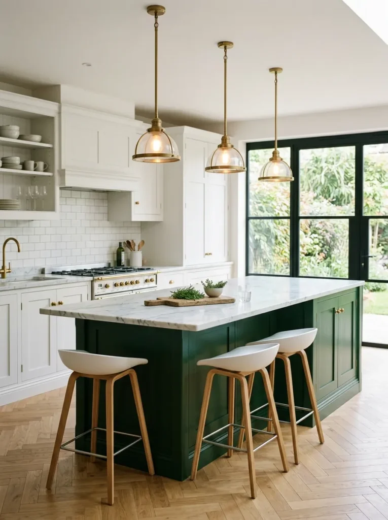
If painting all your cabinets green feels like too much commitment — or if you’re renting and working with what’s there — a painted island offers most of the visual impact at a fraction of the permanence. The island sits as a natural focal point in most open-plan kitchens, so even a single color statement there reads as intentional design rather than an afterthought.
The shade options here are actually broader than with full cabinetry, because the island is smaller and surrounded by other elements that can balance it. Bottle green, dusty teal-green, and even a muted chartreuse-leaning sage all work as island colors that wouldn’t necessarily work across an entire run of cabinets. Keep perimeter cabinets in a neutral — white, cream, or a warm grey — and let the island do the work.
5. Green Subway Tile Backsplash Behind a White Kitchen
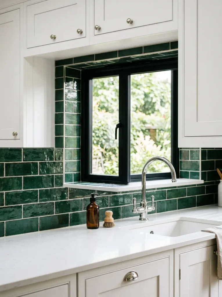
A green backsplash is the lowest-commitment path to a green kitchen and arguably the most Pinterest-friendly. A white or cream kitchen is a blank canvas, and a green subway tile — especially in a 3×6 or brick-laid format — introduces color, texture, and rhythm without requiring you to touch the cabinets at all.
The tile color choices are worth thinking through. A deep hunter green tile reads dramatically and works well in kitchens with black or dark metal fixtures. A sage or mint-toned subway reads lighter and more vintage — closer to the look of 1970s colour tiles that have come back into fashion. Handmade-style tiles with slight variation in glaze add depth that uniform machine tiles can’t match. If you’re installing over an existing backsplash, check that the substrate can handle the added tile weight before proceeding.
6. Dark Green Shaker Cabinets with Aged Brass Hardware
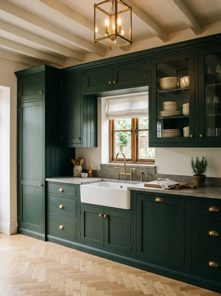
The dark green Shaker cabinet has become a kind of default for transitional kitchens — and with reason. The Shaker door profile is simple enough to suit contemporary spaces but has enough character to work in older homes. Dark green, particularly in tones like deep sage-grey or bottle green, plays off the traditional English country kitchen aesthetic without reading as costume.
Aged or unlacquered brass hardware is the natural pairing here because it introduces warmth without being shiny or contemporary. The combination — dark green paint, recessed Shaker doors, slightly warm brass handles — reads as considered and settled-in rather than recently renovated. On practical grounds, darker cabinets do show fingerprints and water marks more readily than pale ones, which is worth knowing before committing, particularly around the sink area.
7. Green Open Shelving Against a White or Limewash Wall
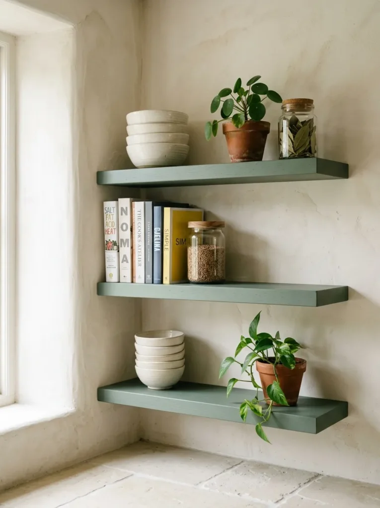
Painting open shelves green rather than keeping them natural wood or white creates a layered visual result that photographs well and pins well. The shelf itself becomes a design element rather than purely functional storage, and the items displayed on it — dishes, glasses, small plants, cookbooks — gain more visual definition against the green ground.
The specific green to use depends on the wall behind the shelves. Against a limewash wall in a warm white or pale clay, a sage or eucalyptus green reads gently and harmoniously. Against a brighter white, a more saturated green like emerald or deep forest creates more contrast and a more graphic result. Keep the shelves themselves uncluttered — green shelves with cluttered styling look chaotic; green shelves with composed styling look editorial.
8. Green and Cream Two-Tone Kitchen with a Classic Feel
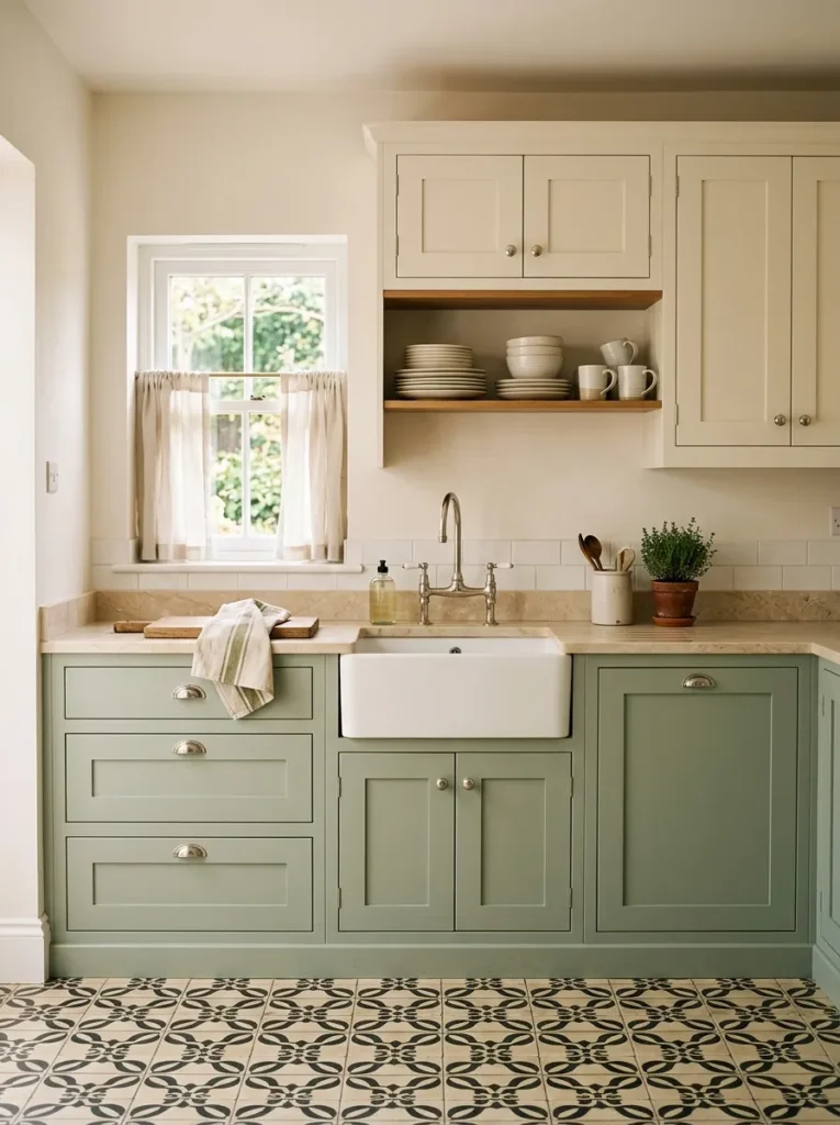
Two-tone kitchens can go wrong when the colors fight each other, but green and cream have an established, almost vintage relationship that tends to hold up. Cream uppers and green lowers — or, less commonly, green uppers paired with a very pale warm base — both read as traditional without being precious.
The cream matters. A stark white is a different thing entirely. True cream — especially on panelled cabinets — has yellow and pink undertones that warm the green rather than competing with it. This palette suits farmhouse kitchens, older period homes, and cottages more naturally than it suits minimalist or Scandinavian-leaning spaces, where the warmth of cream may feel slightly off-register.
9. Sage Green Paint on Kitchen Walls (Not Cabinets)
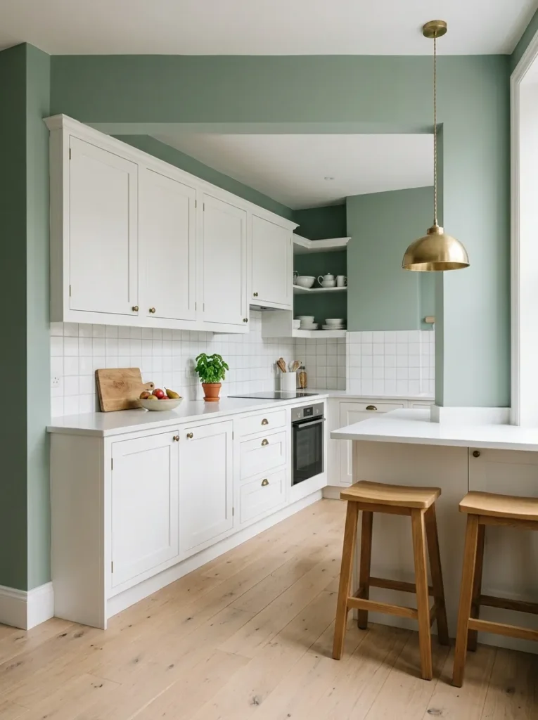
Painting the walls green rather than the cabinets is underused as a strategy. It offers a significant amount of visual color without requiring cabinet work, and it’s reversible — a meaningful consideration for renters or anyone uncertain about committing to a green kitchen long-term.
The approach works best in kitchens where the cabinets are a neutral that can recede: white, cream, raw wood, or light grey. When the walls are sage and the cabinets are cream or white, the green becomes the setting rather than the focal point — the kitchen feels like it’s sitting inside a colour rather than wearing it on its furniture. For rental-friendly implementation, choose a high-quality eggshell or satin finish that wipes clean easily around the cooking area.
10. Terracotta Floor Tiles with Green Cabinets
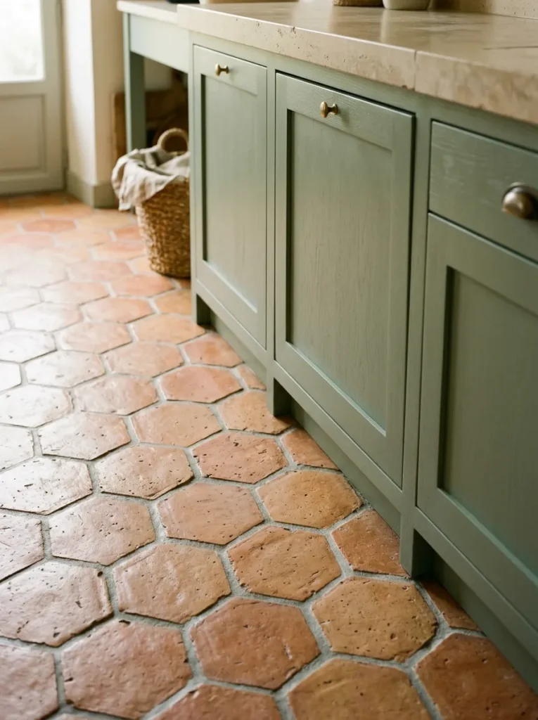
This combination is appearing more frequently in kitchen renovation content because it captures something genuinely new in the green kitchen conversation — the meeting of warm earth tones with cool organic green. Terracotta, whether original salvaged tiles or modern handmade-style reproduction tiles, brings warmth and texture underfoot that softens the formality of dark green cabinetry.
The tone of the green matters here. Olive and warm sage greens have enough yellow in them to harmonize naturally with terracotta’s orange-red. Cooler blue-greens or teal-adjacent greens create more tension, which can be intentional but requires more careful management through the rest of the palette. Natural or whitewashed walls keep the combination from becoming overwhelming.
11. Mint and Pale Green Kitchen for a Retro or Vintage Look
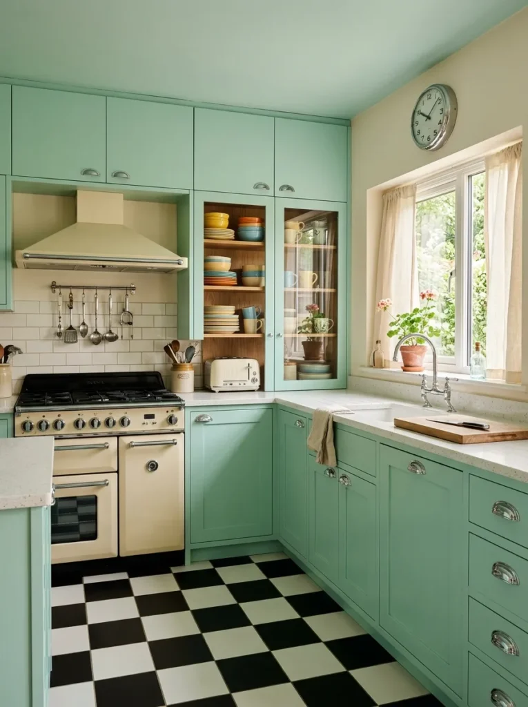
Mint and pale aqua-greens occupy a specific register that darker, earthier greens don’t: they read as playful, retro, and cheerful rather than grounded or serious. In a kitchen with vintage-inspired appliances — cream or coloured freestanding stoves, retro refrigerators — mint works naturally. In a very contemporary or minimalist kitchen, it can feel incongruous.
The vintage kitchen look benefits from supporting details that commit to the reference: chrome hardware rather than brass, penny round or checkerboard floor tile, open shelving with plain white dishes. A half-hearted version of this palette — mint cabinets with generic contemporary hardware — tends to look unresolved. If you’re going retro, go retro.
12. Green Kitchen with Raw or Limewash Plaster Walls
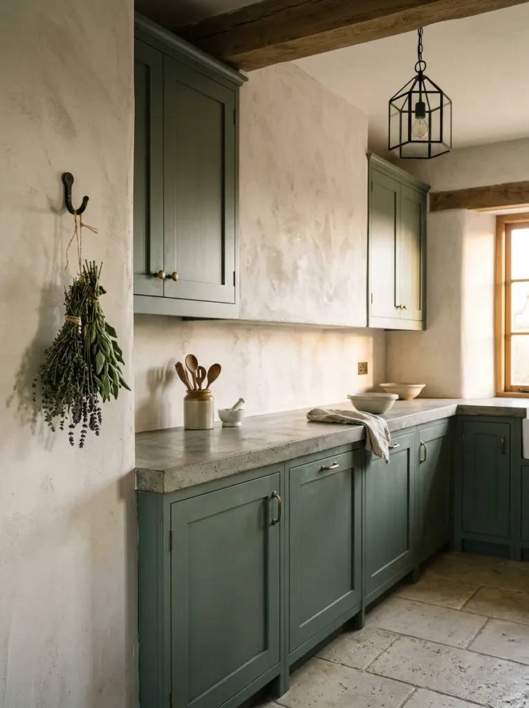
One of the reasons earthy greens feel so current is the company they keep: limewash, plaster, clay paint, raw concrete, and natural stone are all having a sustained moment in interior design, and they share a material sensibility with earthy greens that creates genuine affinity. Plaster or limewash walls in warm white or pale clay alongside green cabinets produces a space that looks as though the materials belong together, not as though they were chosen from a mood board.
The practical consideration here is wall surface. Limewash works on smooth plaster and some painted surfaces, but requires preparation and — depending on the product — may not be ideal in very high-humidity kitchen environments without a protective topcoat. It also marks more easily than standard emulsion, though many homeowners find this adds to the character rather than being a problem.
13. Green Zellige or Handmade Tiles for a Backsplash or Feature Wall
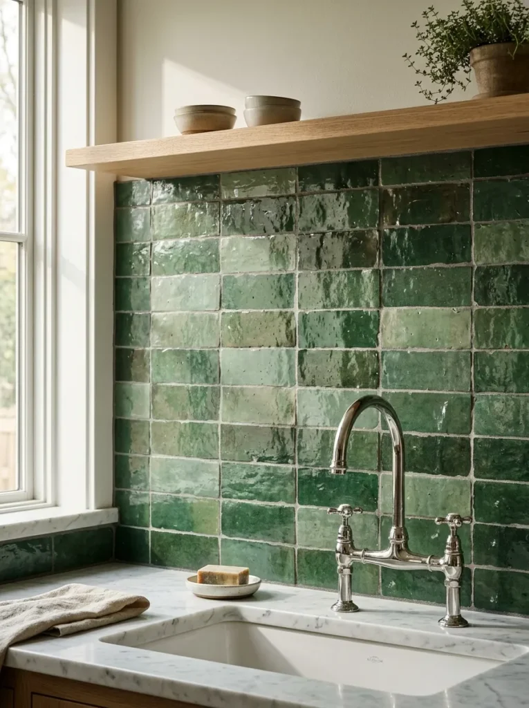
Zellige tiles — traditional Moroccan handcrafted ceramic tiles with slight irregularity in shape, glaze, and color — have moved into mainstream interior design because they capture exactly what machine-made tile can’t: variation, depth, and a slightly imperfect surface that catches light differently across the day. In green tones, zellige or handmade-style tiles read as rich and textured in a way that solid-color subway tile simply doesn’t.
They cost more than standard tile and require an experienced installer because the irregular format demands more attention during installation. But as a feature wall behind a range or as a full backsplash, they provide a level of visual complexity that makes a relatively simple kitchen feel much more considered. The variation in green tones within a single tile — from deeper to lighter — means the color shifts as the light changes, which photographs beautifully.
14. Green and Black Kitchen for a Graphic, Modern Look
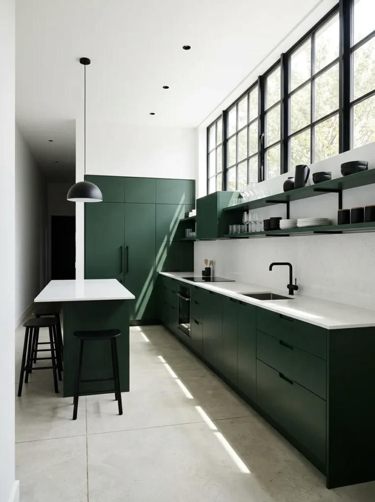
Pairing deep green cabinets with matte black fixtures, hardware, and fittings produces one of the more dramatic directions in the green kitchen landscape. Where green-and-brass reads as warm and traditional, green-and-black is cooler, more graphic, and more contemporary. It suits flat-panel or handle-less cabinet styles better than Shaker profiles, and it works best in kitchens with strong natural light — otherwise the combination can feel heavy.
The practical implication of an all-dark palette: countertop choice matters significantly. Light countertops — white quartz, marble, or pale limestone — provide necessary visual relief. All-dark worktops in an all-dark kitchen require the lighting design to work much harder to prevent the space from reading as oppressive.
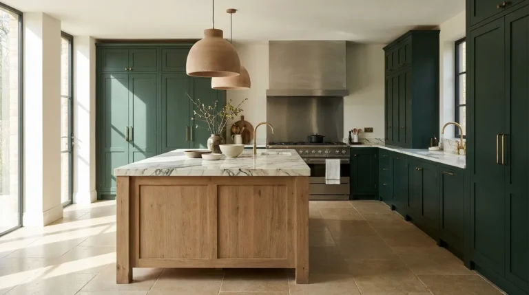
15. Green Painted Kitchen Island with Marble Top
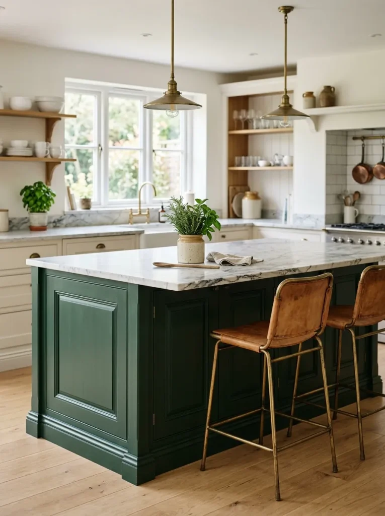
This is a specific combination worth separating from the general “painted island” idea because the green-and-marble pairing has a particular quality. White or grey-veined marble brings coolness and pattern to a green island that grounds it without competing. The veining provides movement; the green base provides richness. Together, they read as far more expensive than either element suggests individually.
The green tones that pair best with white marble: bottle green, deep sage, and darker eucalyptus tones. Very light or very yellow greens can make marble look slightly dingy by comparison. For homeowners concerned about real marble maintenance, a honed or bookmatched quartz with natural veining achieves a similar result with more forgiving daily care.
16. Green Kitchen with Rattan, Wicker, or Woven Details
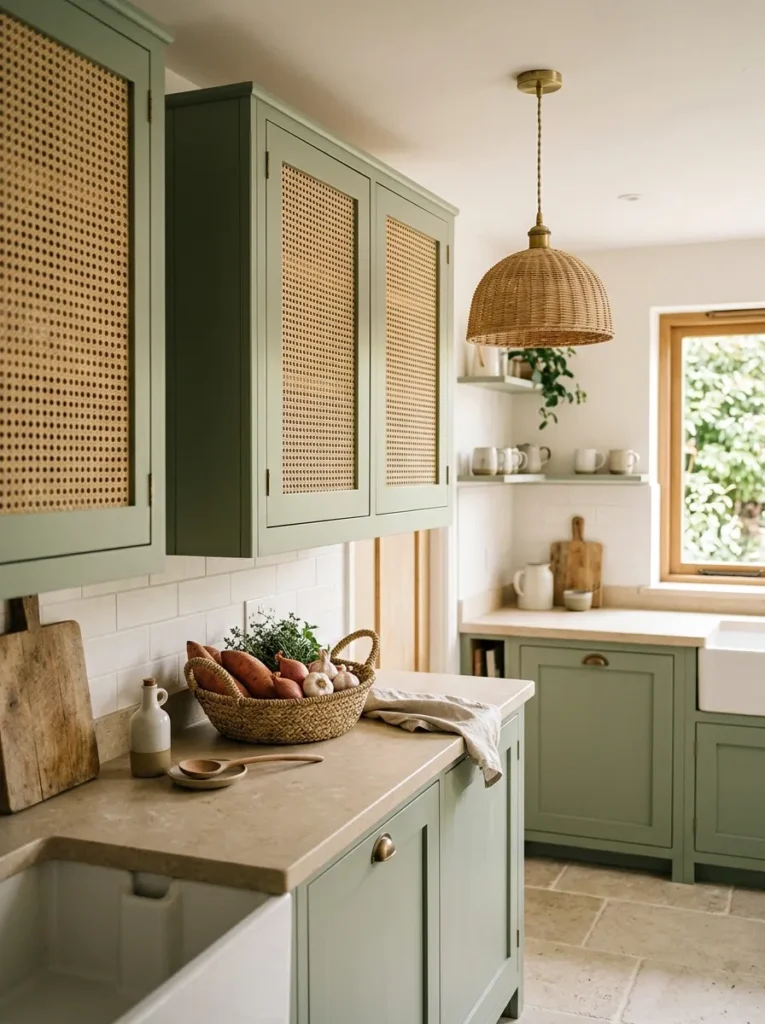
Natural woven materials — rattan cabinet inserts, wicker pendant shades, woven baskets for open storage — bring a relaxed, organic texture to green kitchens that complements earthy tones without the formality of wood or stone. A sage or olive kitchen with rattan pendant lighting over an island, for example, looks casual and liveable rather than designed.
The practical application most relevant to kitchens: rattan-fronted cabinet inserts. These work on upper cabinets to introduce texture while keeping contents partially hidden. They’re a detail that’s more interesting than solid-fronted cabinets and less demanding than open shelves. The weave style varies significantly — tight woven rattan reads more refined, open weave reads more coastal or bohemian. Choose accordingly.
17. Dark Green Velvet or Linen Bar Stools at a Green Island
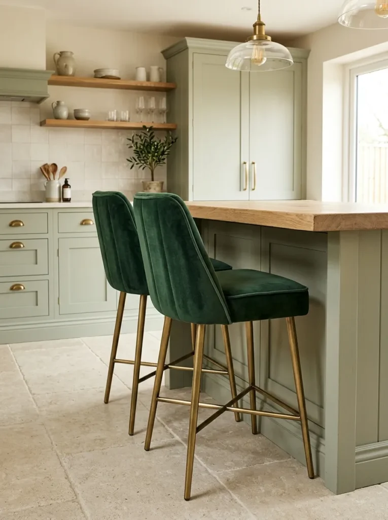
Bar stool upholstery is a surprisingly significant decision in kitchens with islands, because the stools occupy a lot of visual real estate and they sit at mid-height — directly in the eyeline. Against a green island, upholstered stools in complementary tones — deep forest velvet, olive linen, or even a warm terracotta for contrast — elevate the scheme considerably compared to the ubiquitous backless metal stool.
The upholstery choice is also a useful opportunity to introduce a second texture. A matte-painted green island with velvet seating introduces a material contrast that reads as layered. Linen stools alongside a heavily grained oak top do something similar. The one practical consideration: upholstered stools require more maintenance in a kitchen environment. Performance fabrics or removable/washable covers are worth specifying for a working kitchen.
18. Green Kitchen with Exposed Brick or Stone Wall
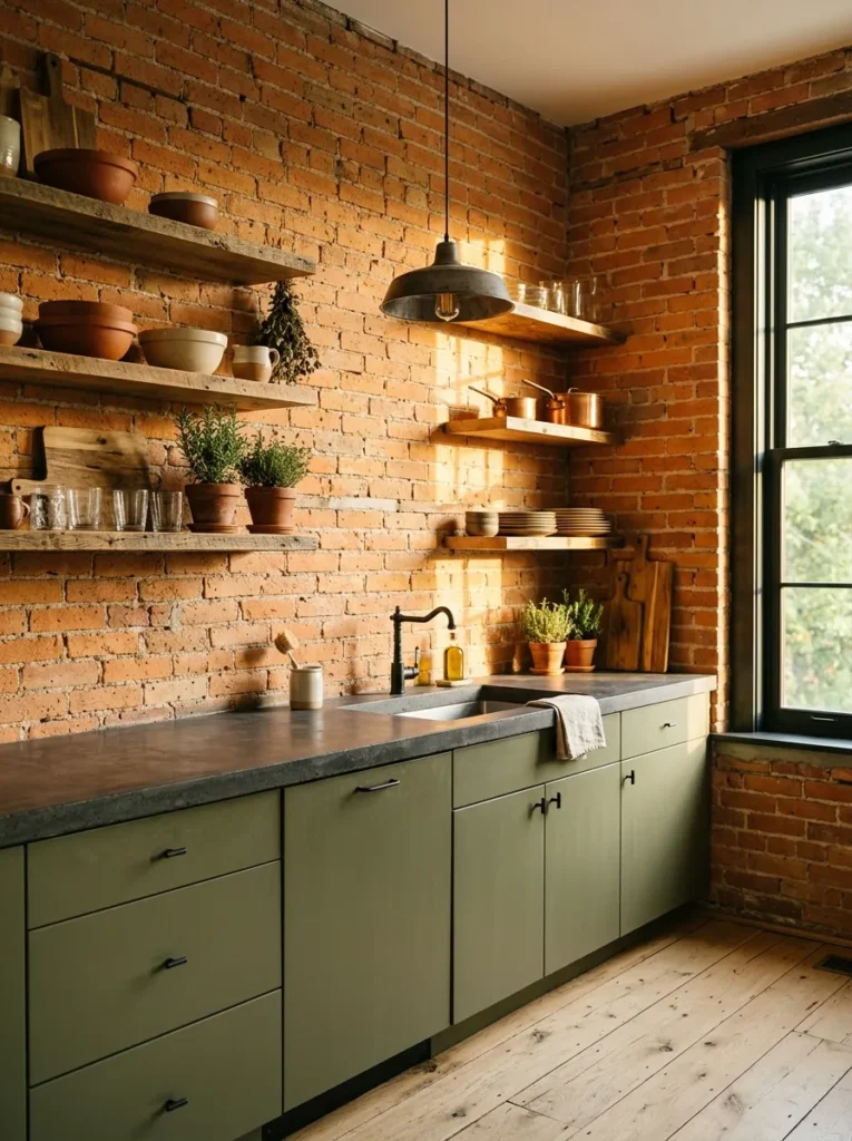
An exposed brick or stone wall adjacent to green cabinetry creates the kind of tension between materials that makes a kitchen feel genuinely characterful. The brick’s warm orange-red undertones set against green produce a complementary relationship — they’re on opposite sides of the color wheel — without being jarring. The key is that the green should be earthy rather than saturated: an olive or warm sage reads naturally alongside brick; a vivid emerald creates more friction.
For kitchens where original brick is behind plaster, this requires investigation before opening walls — structural implications and waterproofing around a kitchen sink area both need professional assessment. Where the brick is accessible and in good condition, sealing it with a matte or satin finish keeps it manageable and reduces dust.
19. Green Cabinets with Unlacquered Brass Fixtures That Develop Patina
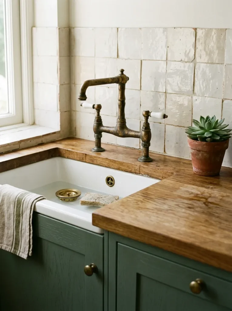
This is a detail-level idea but one that meaningfully affects how a green kitchen ages. Unlacquered brass — unlike lacquered polished brass or brushed brass — develops a natural patina over time, gradually shifting from bright gold to deeper, more antique-looking tones. Against dark green or sage cabinets, this aging process creates a kitchen that looks more settled and less newly renovated as the years pass.
It’s not for everyone. Unlacquered brass requires periodic cleaning if you want to slow the patina process, or deliberate neglect if you want it to develop naturally. But for homeowners who want a kitchen that feels layered with age rather than showroom-fresh, this hardware choice — combined with green paint — creates a result that’s difficult to achieve with polished or powder-coated alternatives.
20. Sage Green Paint on a Kitchen Ceiling
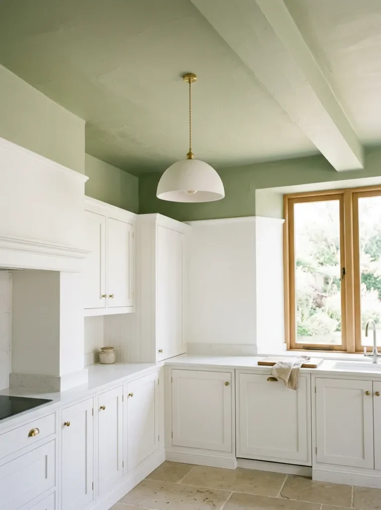
Painting the kitchen ceiling in a pale sage — leaving the walls and cabinets lighter — is an underused technique that creates a cocooning quality without the heaviness of dark paint. The ceiling reads as a soft color wash rather than a bold statement, particularly in rooms with reasonable ceiling height. The green draws the eye upward and creates a sense that the room continues above eye level, which can make even modestly sized kitchens feel more spatially generous.
The practical note: this works best in rooms where the ceiling is in good condition and doesn’t have too many interruptions (ductwork, beams, light fixtures) that would break up the painted surface. In open-plan kitchens that flow into a dining or living area, a painted ceiling on just the kitchen zone can also serve as an informal way to define the kitchen area without a physical partition.
21. Green Kitchen with Concrete Countertops
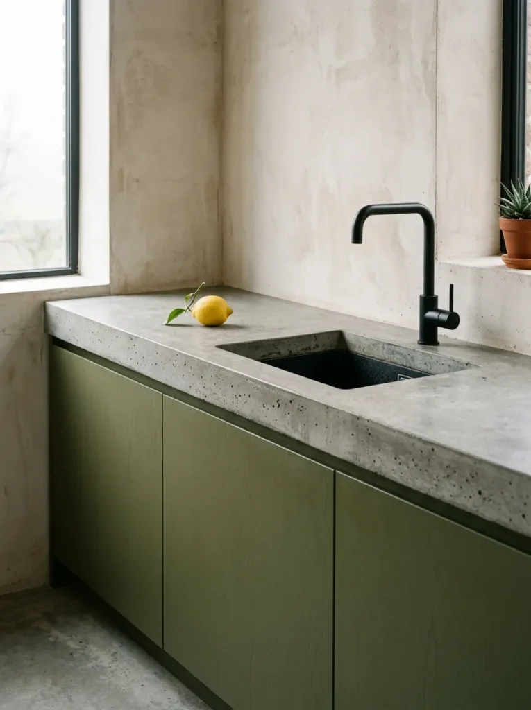
Concrete worktops in raw grey or pale stone tones are an interesting pairing with green cabinetry because they share a material sensibility — both feel handmade, slightly imperfect, and connected to natural processes rather than factory production. Against deep forest green or olive cabinets, concrete countertops read cooler and more architectural than warm stone, which creates a specific kind of modern-rustic combination.
Concrete requires sealing and periodic maintenance. It can chip and stain without proper care, and it tends to show water marks on unsealed surfaces. The authentic look comes with authentic maintenance requirements — which is fine for homeowners who understand that and prefer material honesty over low-maintenance perfection, but worth knowing before choosing it primarily for aesthetics.
22. Green Banquette or Breakfast Nook Connected to the Kitchen
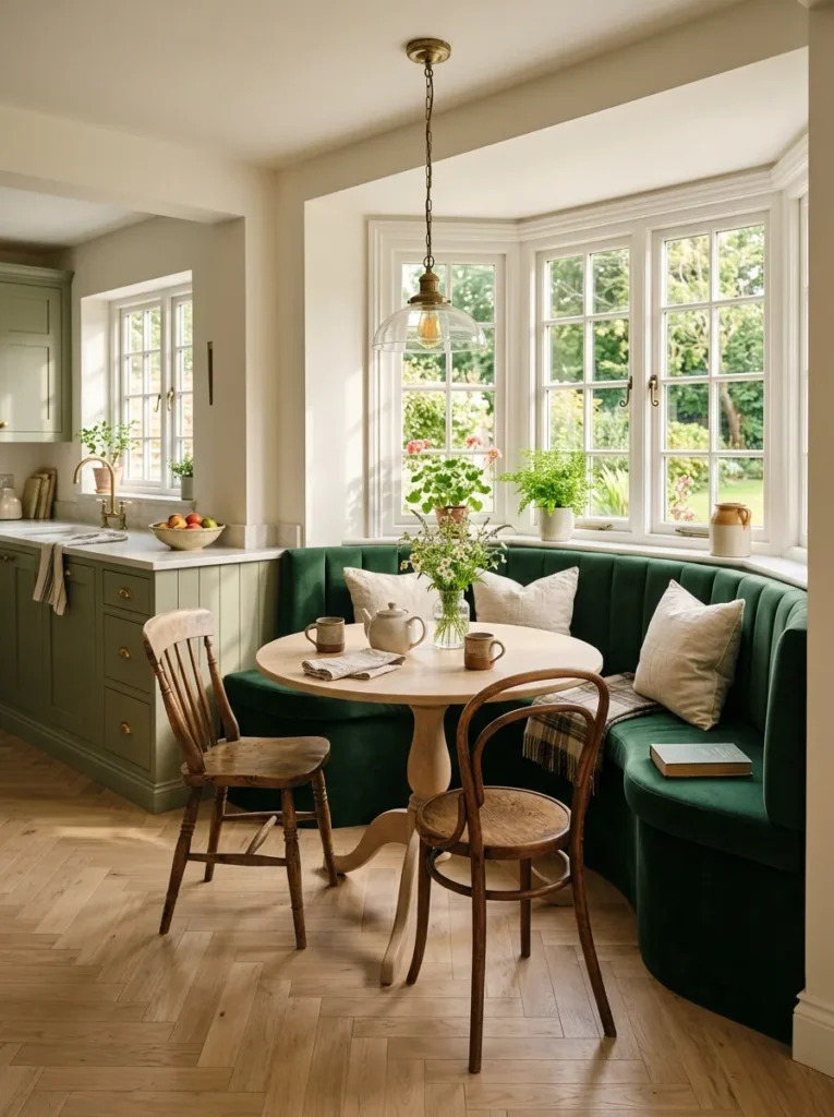
Where the kitchen opens to a dining or eating area, a built-in banquette or breakfast nook upholstered in deep green creates a connection between the kitchen’s green palette and the adjacent space without requiring the dining room to be all green. A forest green or bottle green banquette with a simple wood table and neutral cushions reads as a considered extension of the kitchen design rather than a matching set.
This idea suits kitchens in older homes with bay windows or alcoves where a built-in bench is architecturally natural. In more open-plan contemporary layouts, a freestanding curved bench in green acts similarly without the commitment of built-in carpentry. The green upholstery performs best in performance velvet or a tight-weave fabric that resists food marks — this is a working dining space, not a living room.
How to Choose the Right Green for Your Kitchen
The hardest part of using green in a kitchen isn’t committing to the color — it’s choosing the right tone. Here’s how to approach it without overcomplicating the decision:
Start with your light direction. North-facing kitchens receive cool, indirect light all day. In these rooms, warmer greens — sage with grey undertones, olive, warm eucalyptus — tend to look more alive than cool blue-greens, which can read grey and flat. South-facing kitchens have more latitude; even mid-tone greens will read with reasonable saturation.
Consider what you’re keeping. If your countertops or flooring are staying, the green needs to work with those fixed elements. A warm honey oak floor calls for a green with warm undertones — olive or warm sage. Cool grey stone tiles give you more flexibility but generally suit cooler greens better.
Think about finish as much as shade. The same green in eggshell versus satin versus lacquered high-gloss produces very different visual results. Eggshell and matte finishes read softer and more textural — better for earthy, organic aesthetics. Higher sheens read more formal and cleaner, and they’re more forgiving to wipe down in a working kitchen.
Test with large samples. A paint chip is essentially useless for predicting how a color looks across full cabinetry. Get sample pots and apply a minimum A4-sheet-sized patch directly on the surface you’re painting, in the actual light conditions of your kitchen. Check it morning, midday, and evening before committing.
Final Thoughts
Green kitchens reward specificity more than most color directions. The difference between an olive that looks sophisticated and one that reads dated often comes down to a single decision — the hardware finish, the countertop material, whether the upper cabinets match or contrast. Before selecting a shade, it’s worth mapping out those adjacent decisions first. Getting the green right while leaving everything else unresolved often means starting again anyway.
If you’re working out where to begin, start with the element that’s hardest to change. For most kitchens, that’s the cabinetry. Choosing the green for the cabinets first — and testing it properly against your fixed floors and countertops — gives you a foundation to build everything else from. Once you have your green anchored, the hardware, backsplash, and styling choices tend to become clearer.
Not all 22 ideas here need to coexist. In fact, the best green kitchens usually commit to two or three of these ideas rather than combining everything. Save the ideas that feel most like your space, shortlist the ones that address your specific room’s limitations, and start from there.