18 Dining Room Decorating Mistakes to Avoid
Most dining room decorating problems don’t announce themselves clearly. A room can feel wrong — slightly off, harder to sit in than it should be, less resolved than it appears in the photograph you were inspired by — without any obvious single cause. The issues are usually cumulative: a rug that’s slightly too small, a pendant hung slightly too high, chairs that are slightly too uncomfortable for long meals. None catastrophic individually, but together they produce a room that never quite works the way it should.
This guide identifies the 18 most common dining room decorating mistakes — the ones that appear most consistently in real homes and that have a measurable impact on how the room looks, functions, and feels. Each mistake includes a specific correction: not the vague advice to “choose something more proportionate” but the actual measurements, the real material choices, and the practical decisions that fix the problem correctly.
Understanding what goes wrong in a dining room is the fastest route to understanding what a well-decorated dining room actually requires. Many of the most impressive dining rooms aren’t the result of expensive furniture or rare materials — they’re the result of decisions made without the mistakes that undermine so many others.
1. The Rug Is Too Small for the Table

The single most common dining room mistake — and the one most immediately visible to anyone with a trained eye — is an undersized rug. A dining room rug that fits only beneath the table’s legs, with chairs sliding off the rug edge every time someone pulls back from the table, reads as an afterthought rather than a considered decision.
The correct sizing principle: the rug should extend at least 24 to 30 inches beyond the table on all sides where chairs are present, so that chair legs remain fully on the rug even when pulled out. For a standard 36-inch-wide dining table, that means the rug needs to be at least 84 inches (7 feet) wide. For a 72-inch-long table, the rug should be at least 120 to 132 inches (10 to 11 feet) long.
The correction: measure the table, add the chair clearance, and work backward to the rug size. If the correctly sized rug feels expensive, choose a less expensive material in the right size rather than a premium material in the wrong size. A proportionate jute rug reads better than a beautiful wool rug that’s 18 inches too small.
2. The Pendant Light Is Hung Too High

A pendant light or chandelier hung too high above the dining table loses its functional and visual connection to the table below. It provides ambient room lighting rather than the focused, intimate illumination that a properly positioned dining light creates — and from outside the room, it reads as a fixture positioned for ceiling aesthetics rather than for the dining experience.
The standard: the bottom of the pendant or chandelier should hang 30 to 36 inches above the tabletop for a standard 30-inch dining table. At this height, the light creates a cone of illumination that covers the table surface and the food on it. Lower than 30 inches starts to feel oppressive; higher than 36 inches loses the intimate connection to the table.
In rooms with higher ceilings, the pendant can hang at the higher end of this range without losing effectiveness. The calculation is always from the tabletop, not from the floor or ceiling — adjust the cord or chain length to achieve the correct table-to-fixture distance regardless of ceiling height.
3. Only One Light Source in the Room

A dining room lit by a single overhead fixture — even a beautiful one — reads as flat and has no capacity to change in atmosphere between a midday casual lunch and an evening dinner party. The overhead light provides the same quality of illumination at all times, in all conditions, which prevents the room from feeling genuinely hospitable in the evening.
The fix is adding at least two supplementary light sources: a dimmer on the overhead pendant (which should be the first upgrade in any dining room), plus one of the following — a sideboard lamp, wall sconces, or candles on the table as a deliberate third layer. With three layers of light at different heights and different intensities, the room can feel completely different at 7pm than at noon.
A dimmer switch is the specific, undervalued correction here. A pendant on a dimmer switch, turned down to 30 to 40 percent during an evening meal and supplemented by candlelight, creates an atmosphere that no fixed-intensity overhead light can replicate regardless of its quality or beauty.
4. The Dining Table Is Too Large for the Room

A dining table that consumes most of the available floor plan — leaving inadequate circulation space on all sides — creates a room that’s uncomfortable to use and difficult to seat guests at gracefully. Pulling out a chair and seating oneself should be achievable without touching the wall or the adjacent furniture; a chair pulled back 18 to 20 inches from the table needs at least 36 to 42 inches of total clearance from table to wall for comfortable movement.
The minimum clearances: 36 inches between the table edge and the nearest wall or furniture on sides where chairs are present, 42 to 48 inches on sides where people regularly pass through the space. These clearances allow chair pullout and standing without requiring lateral maneuvering that makes seating and unseating feel like an obstacle course.
The correction: measure the room, subtract the minimum clearances from all sides, and confirm the maximum possible table footprint. If the table you want is larger than the space allows, a round table typically seats the same number as a rectangular equivalent in a smaller footprint, because its absence of corners requires less circulation clearance at the ends.
5. Buying a Matching Dining Room Set

A fully matched dining room set — table, chairs, sideboard, and buffet all from the same collection in the same finish — is the decorating decision that most reliably produces a room that reads as furnished rather than designed. The uniformity signals that everything was chosen at once from a single source, which removes the sense of accumulated consideration that makes a room feel genuinely personal.
The alternative: choose the table and the seating separately, with a shared element between them (the same wood tone, the same material family, the same hardware finish) but enough variation in form or material to read as eclectic rather than catalogued. A solid wood table with upholstered chairs in the same tonal family reads as far more considered than six identical wood chairs around an identically finished table.
This doesn’t mean every piece should be different. Consistent chairs around the table is a sound approach — but chairs sourced separately from the table, with a material or color relationship rather than a matching finish, create a more resolved dining room than a purchase from a single set.
6. Chairs That Are Comfortable for Dining But Not for Lingering

A dining chair that’s comfortable for 20 minutes of eating but genuinely uncomfortable after 40 minutes of conversation is a choice that shapes every meal at the table. Chairs with inadequate seat padding, a back that doesn’t support the lumbar region, or a seat height that’s ergonomically wrong for the table create a room where guests begin shifting uncomfortably as soon as the main course is finished.
The comfort parameters: seat height should leave 10 to 12 inches of clearance between the seat and the underside of the table apron. The seat depth should be 16 to 18 inches for adults. The back should provide support at the lumbar region, either through contouring, upholstery, or appropriate back angle. A chair that’s beautiful but fails on any of these three measures is a chair that will make guests want to leave rather than stay.
The correction: test dining chairs by sitting in them for longer than the showroom allows. Sit for 10 minutes in the position you’d occupy at a meal — not perched on the edge but settled in — before committing. The chair’s suitability for lingering is as important as its suitability for eating.
7. A Centerpiece That Blocks Sightlines Across the Table
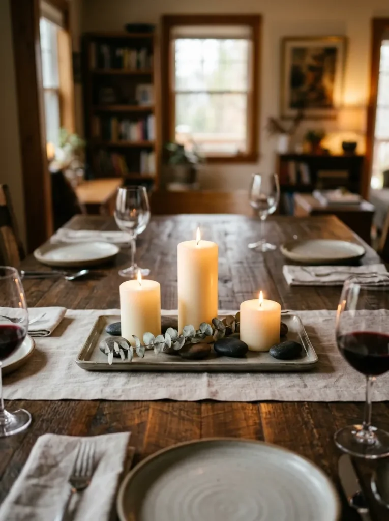
A table centerpiece that rises above 12 inches in height obstructs the sightlines between seated guests on opposite sides of the table. This is not a minor aesthetic inconvenience — it actively disrupts the social dynamic of the meal by requiring guests to lean sideways to see and speak to people across the table.
The 12-inch rule applies to the full arrangement at its tallest point. A centerpiece can include taller elements (a candle, a stem) if those elements are narrow enough that guests can see between or around them — a single taper candle at 18 inches is navigable; a wide floral arrangement at 18 inches is not.
The specific correction: measure the height of any centerpiece before placing it at a dinner table and test the sightline from a seated position. If the centerpiece blocks the view of the guest directly opposite, reduce its height or replace the arrangement with a lower configuration — a spread of votives, a low ceramic bowl, or a tray with flat elements at varying but low heights.
8. Ignoring the Acoustics of the Room

Hard surfaces — a wood or tile floor, bare plaster walls, a glass table, uncurtained windows — create echo and reverberation in a dining room that makes conversation noticeably more difficult as the number of guests increases. A dining room that sounds good with two people at the table can become uncomfortably loud with eight.
The correction is material and textile addition: a large rug (which the room should have for proportional reasons anyway), curtains or drapes on the windows, upholstered chair seats or backs, a fabric art piece or tapestry on one wall. Each of these absorbs sound rather than reflecting it, reducing the room’s reverberation time and making conversation at full table capacity genuinely comfortable.
In rooms that are difficult to modify (open-plan spaces with high ceilings and hard floors), the acoustic mitigation has limits — but the rug, the curtains, and the upholstered seating are achievable in almost any room and make a measurable difference.
9. Not Considering the View from the Doorway

The dining room is typically approached through a doorway, and the view from that doorway is the room’s first impression — for residents and guests alike. A dining room that looks resolved, composed, and purposeful from the doorway reads as designed. One that reads as a table with chairs placed around it, surrounded by unresolved furniture arrangements, reads as assembled.
The specific check: stand in the doorway and assess what the eye lands on first, second, and third. It should land on the pendant light (or focal lighting element), then on the table and its setting, then on the sideboard or the artwork on the far wall. If the eye lands on the backs of mismatched chairs, on a table that’s too large for the frame the doorway creates, or on bare walls with no resolution, those are the specific elements to address.
This is a simple diagnostic tool that most decorating guides skip entirely: look at the room from its entry point before making any purchasing or arrangement decisions, and use that sightline to prioritize what needs attention.
10. Curtains That Don’t Reach the Floor

Short curtains in a dining room — panels that end at the sill, at chair height, or at any point above the floor — read as curtains that were cut incorrectly or purchased in the wrong size rather than a deliberate stylistic choice. The proportion reads as unfinished, particularly in a room with high ceilings or large windows.
The correction: dining room curtains should fall to within half an inch of the floor (for a tailored, precise appearance) or pool 1 to 3 inches on the floor (for a relaxed, gathered appearance). Either length is correct; anything between the two — hovering 2, 4, or 6 inches above the floor — reads as a measurement error.
The rod mounting position amplifies this effect. A rod mounted just above the window frame creates curtains that read as window-scaled rather than room-scaled. A rod mounted 4 to 6 inches below the ceiling creates curtains that read as architectural — they frame the entire wall rather than only the window.
11. A Sideboard or Buffet That’s the Wrong Height
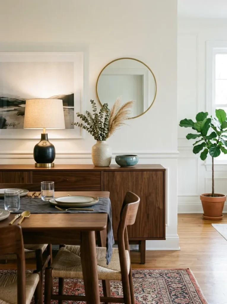
A sideboard or buffet chosen for its visual appeal without confirming its height relative to the dining table creates a functional mismatch: a piece that’s too low makes serving from it uncomfortable (requiring bending), and a piece that’s too tall creates an awkward visual step between the table surface and the serving surface.
The standard: a dining sideboard should be within 2 to 4 inches of the dining table height — at 30 to 36 inches from the floor. Within this range, serving items can be transferred from sideboard to table without spilling, and the visual relationship between the two pieces reads as coordinated rather than arbitrarily selected.
In practice, this means measuring the dining table height before purchasing a sideboard, and confirming the sideboard’s height before purchase. A sideboard that photographs beautifully but is 24 inches high (designed as a living room console) creates a functional problem that’s worth identifying before rather than after installation.
12. Too Many Decorative Elements Competing Simultaneously

A dining room where every surface has a competing decorative statement — an elaborate chandelier, a gallery wall, a patterned rug, a printed tablecloth, a detailed sideboard with many objects on it, and a bold wallpaper — creates visual noise rather than visual richness. The room reads as busy because no element has the space to be noticed.
The editing principle: a dining room benefits from one or two strong decisions and several quiet supporting ones. A dramatic chandelier works when the walls are calm. A bold wallpaper works when the furniture is simple and the lighting is minimal. A patterned rug works when the walls are neutral and the tabletop is clear. The competition between multiple strong decisions is what creates the sense of a room that’s trying too hard.
The correction: identify the room’s single strongest visual element and allow everything else to support it rather than compete with it. If the chandelier is the statement, let the walls, the rug, and the furniture be quiet. If the wallpaper is the statement, let the fixture and the furniture recede.
13. Artwork Hung Too High on the Dining Room Wall

Artwork in a dining room — above the sideboard, on the wall behind the table, or on any dining room wall — is almost universally hung too high. The standard instruction to hang art at eye level is typically interpreted as eye level when standing, which places the center of the artwork at 57 to 60 inches from the floor. In a dining room, where guests are often seated, art should be hung at eye level when seated — closer to 48 to 52 inches from the floor to the center of the piece.
Above a sideboard, the artwork should be positioned so its bottom edge is 6 to 8 inches above the sideboard surface. This creates the visual connection between the sideboard and the art that makes the arrangement read as a composed unit rather than two separate elements that happen to share a wall.
The check: sit at the dining table and look at the artwork. If it requires tilting your head upward to see the piece comfortably, it’s hung too high. Lower it.
14. Neglecting the Dining Room’s Lighting After Dark

A dining room evaluated only in daylight can appear well-decorated and proportionate. The same room after dark — under whatever artificial lighting exists, and without supplementary light sources — often reads completely differently. The pendant that looked beautiful under natural light may cast unflattering shadows at face height when it’s the only light in the room.
The test: assess the dining room deliberately at the time of day and under the lighting conditions in which it’s actually used for meals. If dinner is served at 7pm, walk into the dining room at 7pm under its existing lighting and evaluate it honestly. The shadows, the warmth of the light, the visibility of the food on the table, and the atmosphere of the room under artificial light are what matter most — not how it looks on a sunny afternoon.
The correction most often required: a dimmer on the overhead light, warmer-temperature bulbs (2700K rather than 3000K or higher), and at least one supplementary light source (sconces, a sideboard lamp, or candlelight) that adds warmth at a lower height than the ceiling fixture.
15. Using a Centerpiece That Requires Daily Maintenance to Look Good

A centerpiece that requires fresh flowers replaced twice a week, candles melted down and replaced after every meal, and fruit that needs to be checked for spoilage every few days creates a perpetual maintenance burden that most households don’t sustain. Within two weeks, the centerpiece that looked beautiful on the first day has become a half-empty vase with wilting flowers that nobody replaced and a bowl of fruit with one soft orange at the bottom.
The correction: choose a centerpiece approach that looks as good in week three as it does on day one. Dried botanicals, ceramics, a sculptural object, a collection of candlesticks with unlit pillar candles, a low bowl with seasonal objects — any of these can remain in place indefinitely without attention.
Fresh flowers, seasonal fruit, and live plants can supplement a permanent base centerpiece rather than being the centerpiece themselves. The base holds; the seasonal addition comes and goes when it’s at its best rather than being maintained past its peak.
16. Choosing a Dining Table That Can’t Expand for Guests

A fixed-size dining table chosen for the room’s everyday appearance — typically a round or oval table for two to four people — creates a seating problem whenever the household needs to seat more guests than the table accommodates. Adding folding tables beside or attached to the fixed table creates an arrangement that reads as improvised; moving the meal to another room is inconvenient.
The correction for households that regularly entertain more guests than the everyday table seats: an extendable dining table. Most extendable tables add one or two leaves that increase the seating capacity by 30 to 50 percent, and the best designs are nearly undetectable in their extended position — the grain matches, the apron is continuous, and the extension mechanism is invisible.
The trade-off: extended tables with leaves added look proportionate in the larger configuration but may look sparse in the everyday smaller configuration without a well-sized centerpiece to anchor the table visually. A centerpiece that scales with the table — several elements that can be spread or consolidated — helps address this.
17. Insufficient Storage in the Dining Room
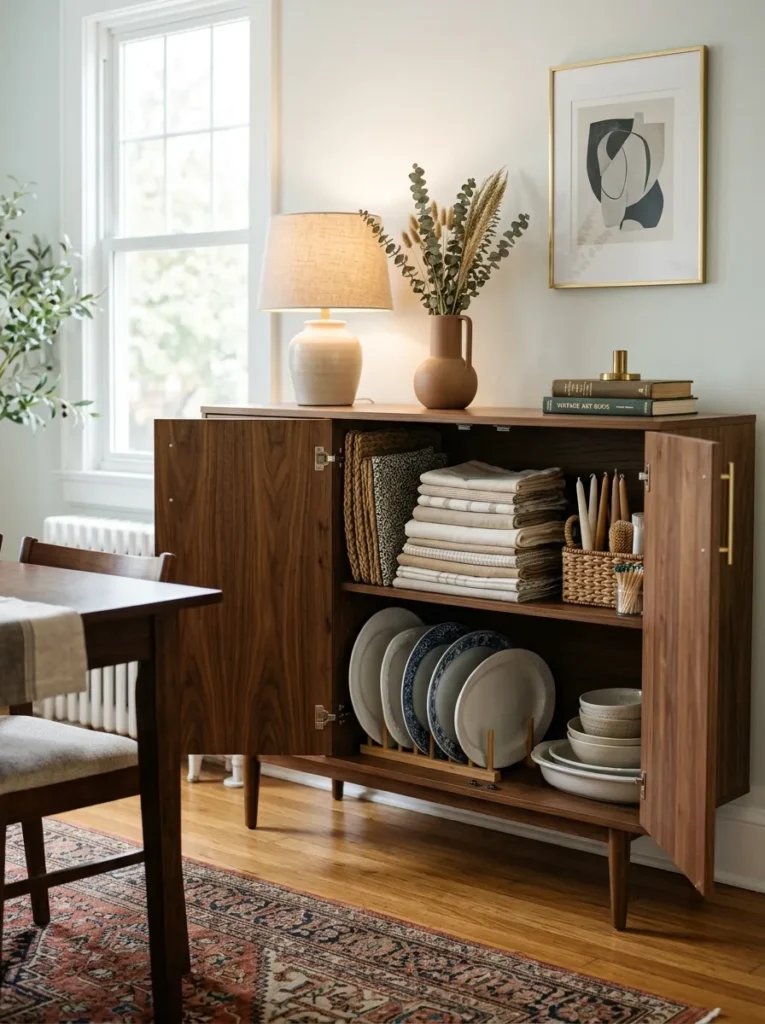
A dining room without adequate storage for table linens, extra placemats, candles, serving pieces, and occasional-use items tends to accumulate these items on the sideboard surface and on the dining table itself — which undermines every decorating decision in the room. The sideboard becomes a holding area rather than a display surface; the table retains objects that should be cleared.
The correction: identify specifically what needs to be stored in or near the dining room before choosing a sideboard or buffet. The piece should have enough interior capacity for the table linens, the candle collection, the serving platters, and the seasonal centerpiece elements — with the surface reserved for display rather than storage overflow.
A sideboard with good interior organization (adjustable shelves for varying-height serving pieces, a drawer for linens and placemats, a shelf for candles and objects) resolves the storage problem without requiring a second piece of furniture. The storage capacity should be planned, not discovered after purchase.
18. Treating the Dining Room as a Formal Room That’s Rarely Used

A dining room decorated to look impressive but never genuinely used — sealed off from daily life for special occasions that happen four times a year — represents a significant allocation of space, budget, and effort to a room that provides almost no daily value. The furniture sits unused; the room reads as a display rather than a room.
The correction is conceptual rather than decorative: the dining room should be decorated for how it will actually be used most often, not for how it looks in isolation. A family that eats dinner together most nights at the dining table should have a room that’s comfortable for daily use — with lighting appropriate for a weeknight dinner, chairs comfortable for lingering, and an atmosphere that makes sitting there pleasant rather than formal.
This might mean accepting some visual informality — a room that reads as lived-in rather than pristine — in exchange for a room the household actually inhabits. A dining room used every day, slightly imperfect, is more valuable to the household than one that’s perfect and empty.
How to Diagnose What’s Wrong with Your Dining Room
Before making any corrections, use this sequence to identify which of these mistakes are present in your specific room.
First: stand in the doorway. Assess the room from its primary sightline. What reads as wrong from this position is the highest priority to fix.
Second: sit at the table. Assess the pendant height from a seated position. Assess the centerpiece sightlines. Assess the chair comfort. Assess the artwork height. Problems that are only visible from a seated position are often overlooked from a standing assessment.
Third: evaluate the room at night. Turn on the existing lighting and assess the room honestly under the conditions in which it’s actually used for dinner. The problems visible only under artificial light are frequently the most impactful on the dining experience.
Fourth: measure everything. Rug size relative to the table and chairs, table size relative to circulation clearances, pendant height from tabletop, chair seat height relative to table apron. Many dining room mistakes are measurement errors that would have been identified at the planning stage with the right numbers.
Final Thoughts
The dining room mistakes that appear most often share a common root: decisions made without measuring, without testing, or without evaluating the room under the conditions in which it’s actually used. A rug purchased by eye rather than by tape measure is almost always too small. A pendant hung at a “looks good” height rather than a measured height is almost always too high. A chair chosen in a showroom for 30 seconds is almost always insufficiently tested for the 90-minute meals it will actually be used for.
The corrections in this guide are not complicated. Most of them involve measuring something, editing something, or making a deliberate choice that was previously made by default. The dining room that results from these corrections — one that seats guests comfortably, looks resolved from the doorway, sounds comfortable at full capacity, and reads as considered in every layer of its lighting — is genuinely achievable in every room and at every budget level.
Save the specific corrections that apply to your room, and return to the diagnostic section when you’re ready to assess which mistakes are present and which to prioritize.