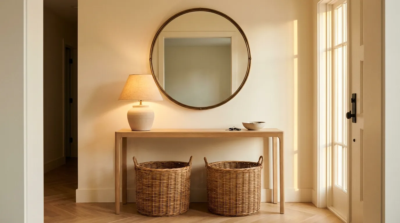
22 Console Table Decor Ideas That Elevate Your Entry
The entryway console table is one of the hardest surfaces to get right. It’s narrow, usually against a wall, and has to do two things simultaneously: look intentional enough that it reads as the house’s first design statement, and function well enough that it doesn’t collect mail, sunglasses, and dead batteries. Most styling advice skips the tension between those two demands entirely.
These 22 console table decor ideas work through the full range — from the wall above the table to the floor beneath it, from minimal one-object vignettes to layered arrangements with storage and light. Each idea includes enough context about proportion, placement, and trade-offs that you can make an honest judgment about whether it suits your space. A narrow apartment foyer and a generous suburban entry hall need different approaches, and the article treats them differently.
Read straight through or jump to the ideas that match your current setup.
1. Anchor the Wall With One Large Mirror Sized to the Table
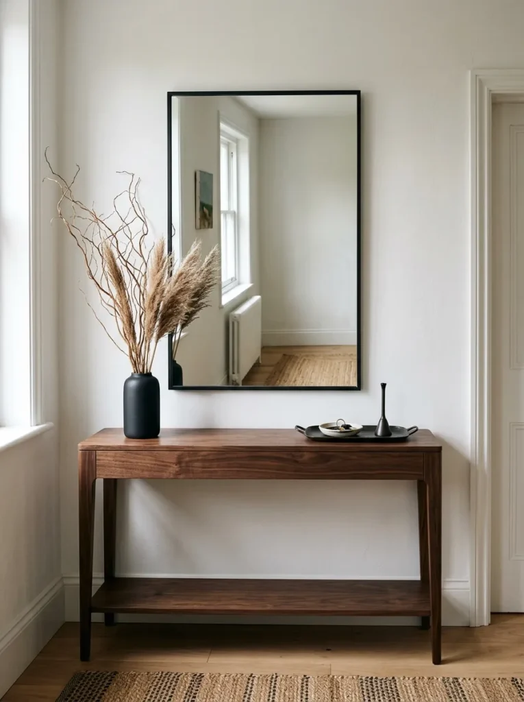
The mirror-above-console combination is the most common entry approach for a reason: it creates an instant vertical anchor, bounces available light toward the door, and gives people somewhere to check their appearance on the way out. What makes or breaks it is scale.
The mirror’s width should be roughly 75 to 90 percent of the console’s width. A narrow mirror above a wide table looks afterthought; a mirror wider than the table top unbalances the wall. In a tight hallway or small foyer, lean the mirror against the wall rather than hanging it — this softens the formality and shaves a few inches of visual depth off the wall. Frame choice matters as much as size: a simple thin iron frame suits contemporary consoles, while an ornate gilt or tarnished gold frame reads well against wood-heavy traditional pieces.
2. Style the Surface in Three Heights, Not Two
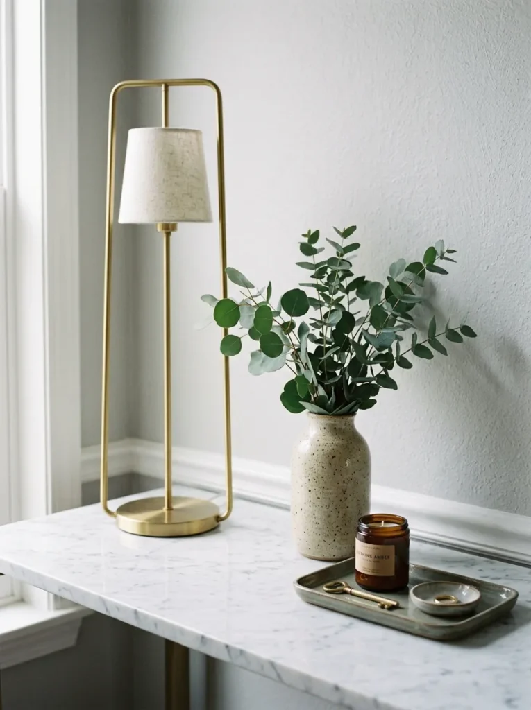
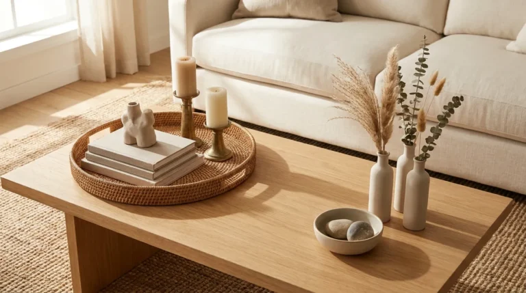
The instinct is to pair something tall (a lamp or vase) with something short (a tray or bowl) and call the table styled. The result usually looks like two objects placed rather than a composition built. Adding a third mid-height element — a stack of two or three books with a small object on top, a medium-height ceramic, a framed photo — creates the visual rhythm that makes a tabletop look considered rather than assembled.
The three-height principle works because the eye moves naturally through a graduated sequence. Tall element at one end or toward the back, mid-height in the center or slightly offset, low element at the opposite end or front edge. The elements don’t need to form a strict staircase — some overlap and variation looks more natural — but the overall impression should read as having a top, a middle, and a base rather than a flat line.
3. Treat the Console and Wall as a Single Vertical Composition
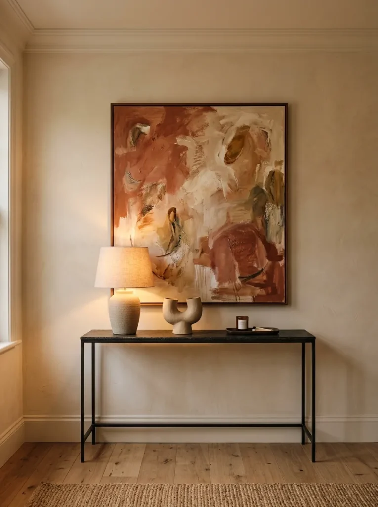
One of the most consistent gaps in entry styling: the table and the wall above it are treated as separate decisions, then combined at the end with predictably awkward results. The more useful approach is to plan them as one composition from the floor up — what’s on the wall determines the scale and weight of what goes on the table, and vice versa.
If the wall piece is bold — a large painting, a wide mirror, an oversized clock — the tabletop can stay simple: one lamp and one or two grounded objects. If the wall is bare or carries only a small piece, the table has to work harder and benefits from more layering. The vertical line from the lowest table object to the highest wall element should feel like it belongs together, not like two separate rooms stacked on top of each other.
4. Use a Statement Lamp as the Dominant Tabletop Object
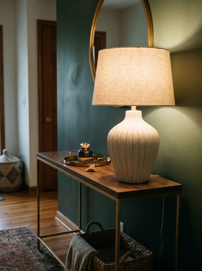
In a foyer with limited natural light, a table lamp on the console accomplishes more than any purely decorative object: it creates a warm light source at the exact height where it reads well from the front door, it defines the console as the room’s visual center, and it gives the arrangement a clear anchor. The lamp is the tall element; everything else is secondary.
Scale matters here more than style. A lamp that’s too short disappears against the wall; one that’s too tall crowds the mirror or artwork above. A rough guide: the bottom of the lampshade should sit roughly at eye level when standing — around 60 to 65 inches from the floor including the table height. Lamps with sculptural or interesting bases work particularly well in entries where the table itself is simple, since the base becomes the decorative focal point.
5. Skip the Lamp Entirely for a Clean Architectural Look
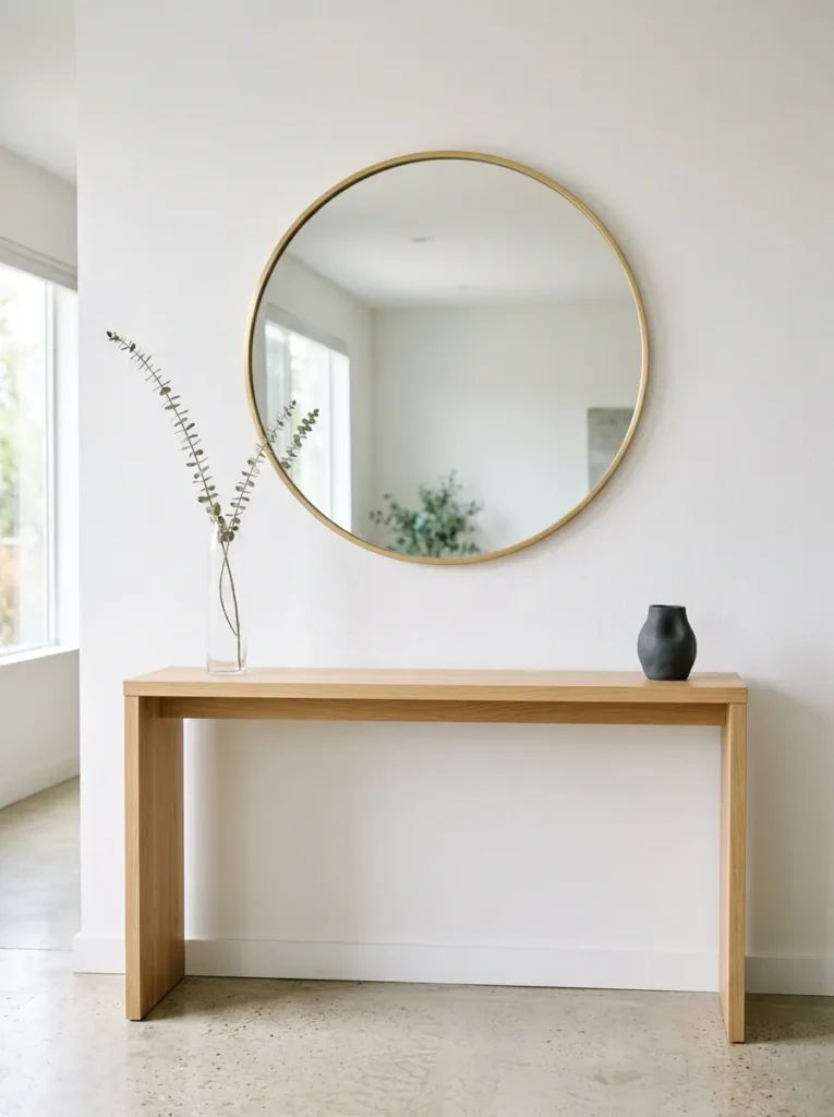
Not every entryway console needs a lamp. In a bright foyer with natural light from sidelights, a transom, or a nearby window, a lamp can read as an unnecessary addition that crowds the surface. Some of the most resolved entry consoles have no lamp at all — just a mirror, one or two objects of different heights, and a tray.
This approach works best when the wall piece is strong enough to carry the vertical composition on its own. If the mirror or artwork does the heavy lifting above, the table can hold a curated arrangement of three or four objects that relate to each other in material or tone without needing the lamp to anchor the height. It also suits narrow consoles — anything under 14 inches deep — where a lamp base risks taking up a meaningful portion of the usable surface.
6. Layer Artwork Behind the Lamp Instead of Centering Art Above
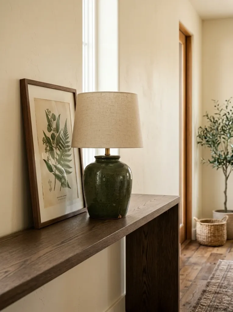
Most entry console arrangements follow the same formula: art or mirror centered on the wall, lamp to one side, decorative objects to the other. This works reliably, but it produces a predictable result. An alternative that reads as more considered: place a leaned or hung medium-format artwork directly behind and slightly overlapping the lamp, so the art and lamp form one visual unit rather than competing separately for attention.
This works because it layers the vertical composition more densely in one section and leaves the rest of the table breathing. A dark-framed print or small painting propped against the wall behind a sculptural lamp base creates depth at a single point — the depth makes that section of the table look intentional and specific rather than generically styled.
7. Put Practical Storage Beneath the Table, Not on Top of It
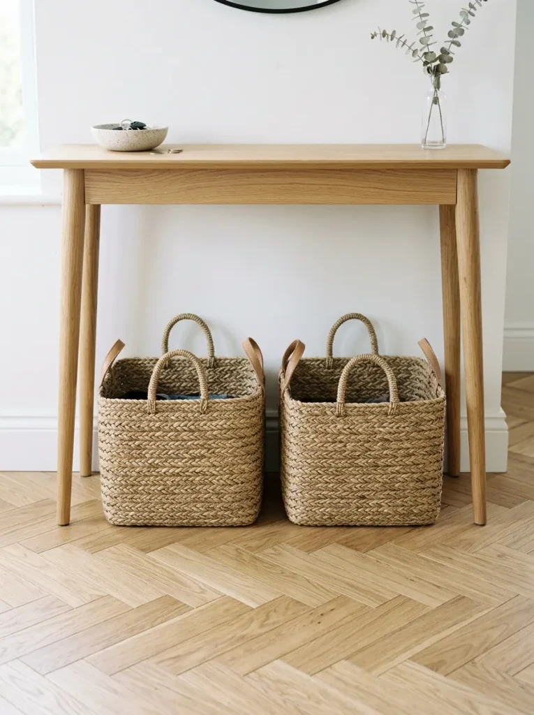
Entry tables carry a functional burden that no other console in the house does: keys, mail, bags, dog leashes, charging cables. The mistake is trying to solve that storage problem on the tabletop — with bowls, trays, and organizers that collectively crowd the surface and make it look like an office supply drawer exploded.
Better solution: move the storage below. Baskets, boxes, or bins under the table solve the functional problem without compromising the visual surface. Two matching baskets in rattan, seagrass, or linen can hold everyday essentials while reading as a deliberate styling choice at floor level. The tabletop then needs only one catchall — a single tray or bowl for the things you need immediately (keys, wallet) — rather than becoming the primary organizational zone.
8. Choose a Console With Open Legs to Preserve Visual Floor Space
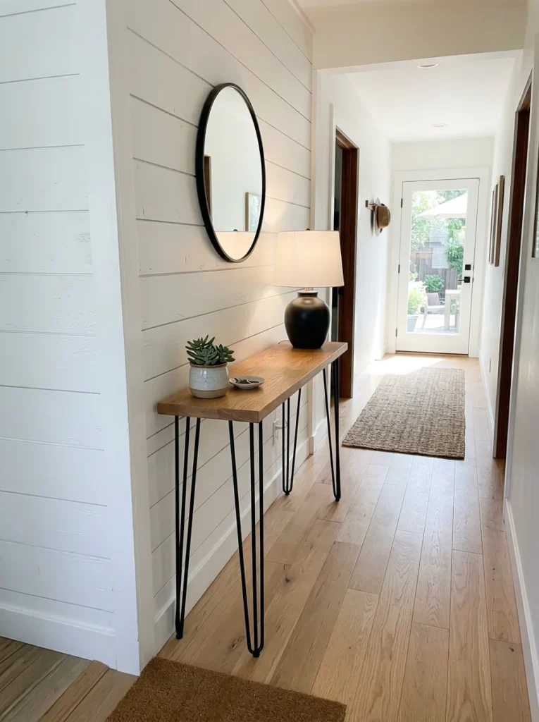
Table choice affects styling options significantly. A console with a solid base, cabinet doors, or drawers extending to the floor closes off the lower visual zone entirely. An open-leg console — four tapered legs, a hairpin or pipe frame, an X-stretcher base — keeps the floor visible, which makes a narrow entry feel less blocked.
In hallways under about 5 feet wide, this distinction matters considerably. An open-leg console creates the impression that the floor continues beneath the table rather than stopping at a solid wall of furniture. The space beneath can hold one or two baskets or remain empty — both options look cleaner than a solid base console crammed into the same footprint.
9. Hang Wall Sconces Instead of Using a Table Lamp
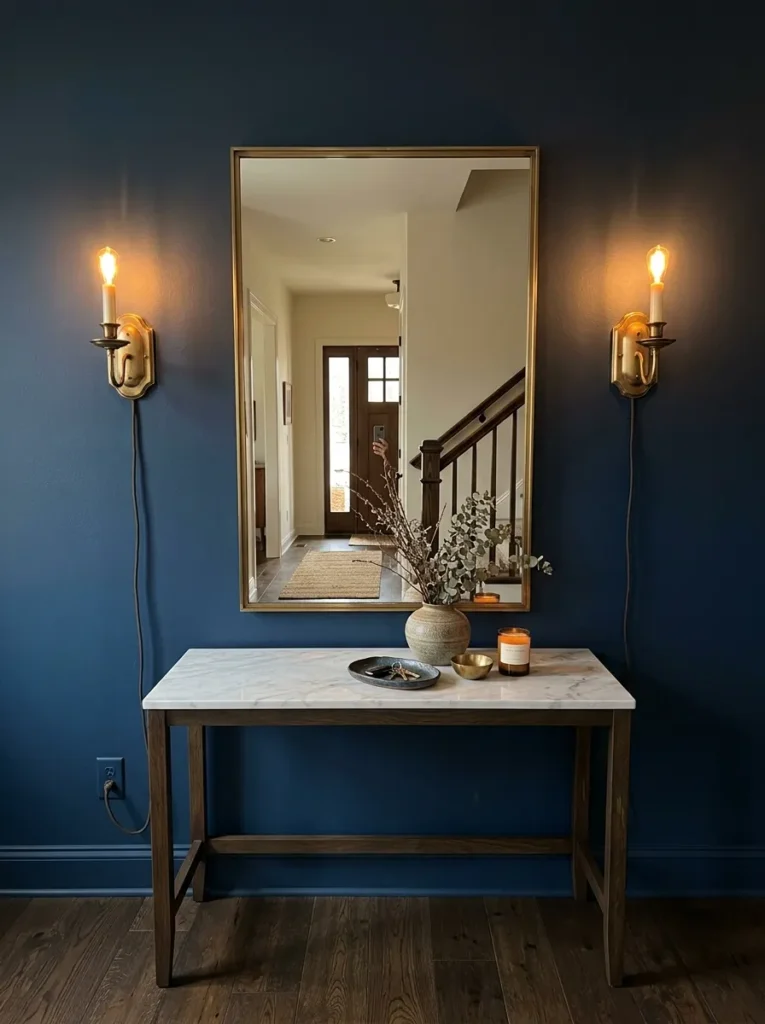
Wall sconces flanking a mirror or artwork above a console accomplish what a table lamp can’t: they put light on the wall rather than on the table, which illuminates the face more flattering for the inevitable mirror-check on the way out the door. It’s the same logic behind vanity sconces in bathrooms.
The placement principle for entry sconces: centered on the wall at the same height as the upper portion of the mirror frame, roughly equal distance between the mirror edge and the wall’s edge. Plug-in sconces with a cord cover kit are the practical choice for renters or anyone who doesn’t want electrical work — the cord runs vertically down the wall inside a painted channel that reads cleanly from a normal viewing distance.
10. Create a Mini Gallery Wall That Ends at the Console’s Edge
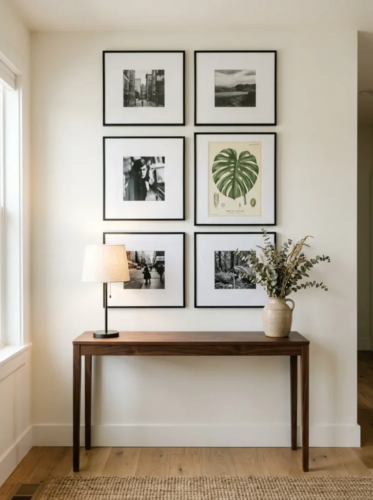
A gallery wall above the console is an alternative to the single-large-piece approach — and it suits entries where the available wall width is narrower than what a substantial single piece would require, or where the occupant’s collection of smaller prints and photos is part of what the entry should communicate.
The critical constraint: the gallery wall should not extend significantly wider than the console below. When a collection of frames spreads three feet wide above a two-foot console, the table looks too small rather than the gallery too large. Keep the outermost frames roughly aligned with the console’s ends, or narrower. A unified frame finish — all black, all natural wood, all white — maintains coherence when the art inside varies significantly.
11. Use a Single Oversized Object as the Sole Tabletop Element
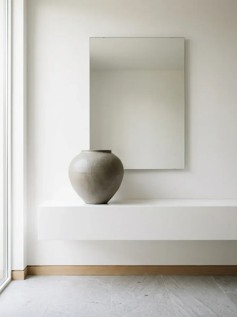
The arrangement that most people overlook: one object, full stop. A single large ceramic vessel, a substantial sculptural piece, or one large architectural branch in a weighty pot — placed off-center on the console and paired with a strong mirror or art above — can look more resolved than a carefully balanced four-element arrangement.
This works particularly well when the console itself has visual interest: interesting legs, a distinctive material, an unusual finish. Over-decorating a beautiful console table buries the piece. Restraint reads as confidence. The object should be genuinely large — something that occupies roughly one-quarter to one-third of the table’s visual length — not a small item placed alone on a long surface, which reads as an arrangement that isn’t finished yet.
12. Bring in Organic Material for Texture at Eye Level
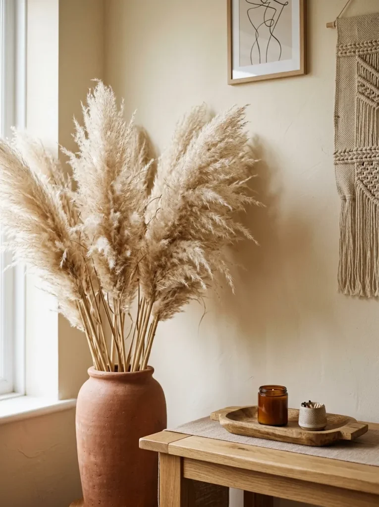
Fresh flowers and greenery appear in almost every piece of entry console advice, usually as a throwaway suggestion. What’s worth understanding is where organic material does its actual work: at the height and texture that keeps a hard-edged entry surface from feeling cold. Concrete, lacquer, iron, marble, painted wood — most console materials are rigid and smooth. A branch, stem, or trailing plant introduces something that moves and catches light differently.
What to choose depends on maintenance tolerance. A single stem in a bud vase works if you’re comfortable replacing it. A sculptural dried arrangement — pampas, dried eucalyptus, dried oak branches — lasts months without attention and develops patina over time. A potted plant needs light to survive; most narrow entries don’t provide enough, so fake or dried is genuinely more practical in most cases, not a compromise.
13. Style Around a Piece of Art Rather Than a Mirror
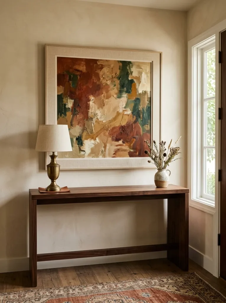
The mirror-above-console is so common it reads as default. A confident alternative: a single piece of art hung where the mirror would normally go, at a scale that relates to the console below. This communicates personality from the first step inside and gives the entry a distinct identity that a mirror, however beautiful, rarely achieves on its own.
The sizing principle is the same as for mirrors: the art should be wide enough to feel deliberate rather than incidental — roughly two-thirds to three-quarters of the console’s width at minimum. Abstract work with strong color or a clear focal point reads best at entry distances; detailed representational work can be harder to appreciate in a brief hallway moment. A bold graphic or muted earthy landscape both work at different tonal registers.
14. Use Baskets Below the Table for Both Storage and Visual Grounding
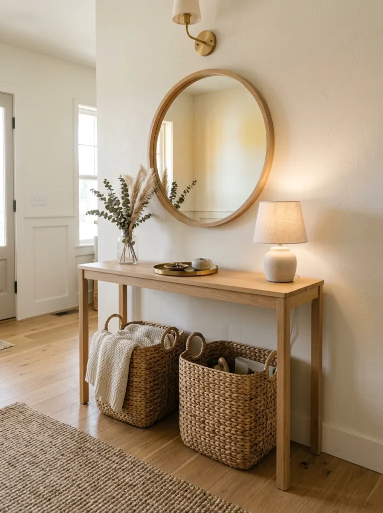
A console table with nothing beneath it can look like furniture that’s been left floating. Two matching baskets placed symmetrically at floor level under the table solve this in one move: they provide genuine storage for everyday items and give the lower visual zone the grounding weight it needs.
The basket size should be proportional to the table’s height from floor to shelf or underside. Oversized baskets crammed under a low table look forced; small baskets under a tall console disappear. Natural materials — rattan, seagrass, water hyacinth, linen-lined wire — work across most entry styles. Avoid plastic bins or fabric organizers that read more like a laundry room than an entry. Two matching baskets read as intentional; three or more in a row can start to look like retail display.
15. Run a Table Runner or Linen Cloth Across the Surface
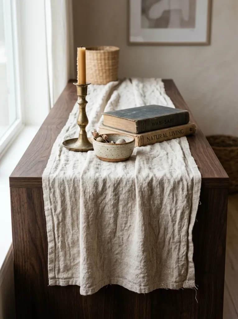
A table runner is one of the most effective ways to add material warmth to a console surface that reads as too hard or too flat — and it’s genuinely easy to change seasonally. A length of linen, a narrow strip of handwoven cotton, or a length of velvet or wool draped loosely (not stretched flat) across most of the table’s length adds a layer of texture that’s visible even when the tabletop isn’t being actively looked at.
The runner should not cover the entire surface — leaving the console material visible at both ends preserves the table’s own character. It should be narrow enough that the runner reads as an accent rather than a tablecloth. Natural, undyed linen reads well in almost any entry style; a printed or embroidered runner suits more eclectic or layered arrangements.
16. Lean Art Against the Wall Rather Than Hanging It
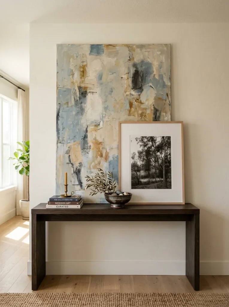
Leaned art — a frame or canvas propped directly on the console against the wall — reads as more relaxed and intentional than hung art in some entry styles, particularly those trending toward collected, lived-in, or loosely bohemian aesthetics. It’s also the easiest way to try a piece before committing to holes in the wall.
For this to work rather than just look unfinished, the leaned piece needs to be genuinely large — at minimum filling two-thirds of the console’s height from surface to ceiling, ideally taller. A small frame propped against a wall looks forgotten rather than styled. The bottom of the frame can rest directly on the console surface or on a low stack of books that raises it slightly for visual adjustment. A second smaller object leaned in front of the large frame adds layering depth.
17. Introduce a Clock as a Functional Focal Point
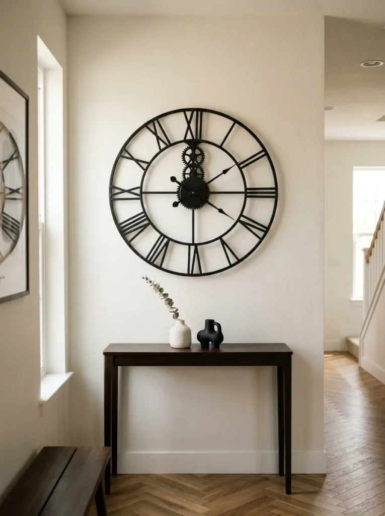
A wall clock above or on a console table works in entry halls the same way it works in dining rooms: there’s a natural logic between functional objects and transitional spaces where you’re always about to leave or just arriving. A large clock reads as architectural detail; a small one reads as an accessory that wasn’t enough to fill the wall.
For the console context: a clock mounted on the wall above reads better than a clock placed on the tabletop, which gives it the scale to function as the primary wall anchor rather than competing with other surface objects. Metal or iron open-face clocks read well in industrial or contemporary entries; painted wood or ceramic-faced clocks suit cottage or eclectic styles. The console below can be kept minimal — the clock is doing the visual work.
18. Let the Console Table Itself Be the Focal Point
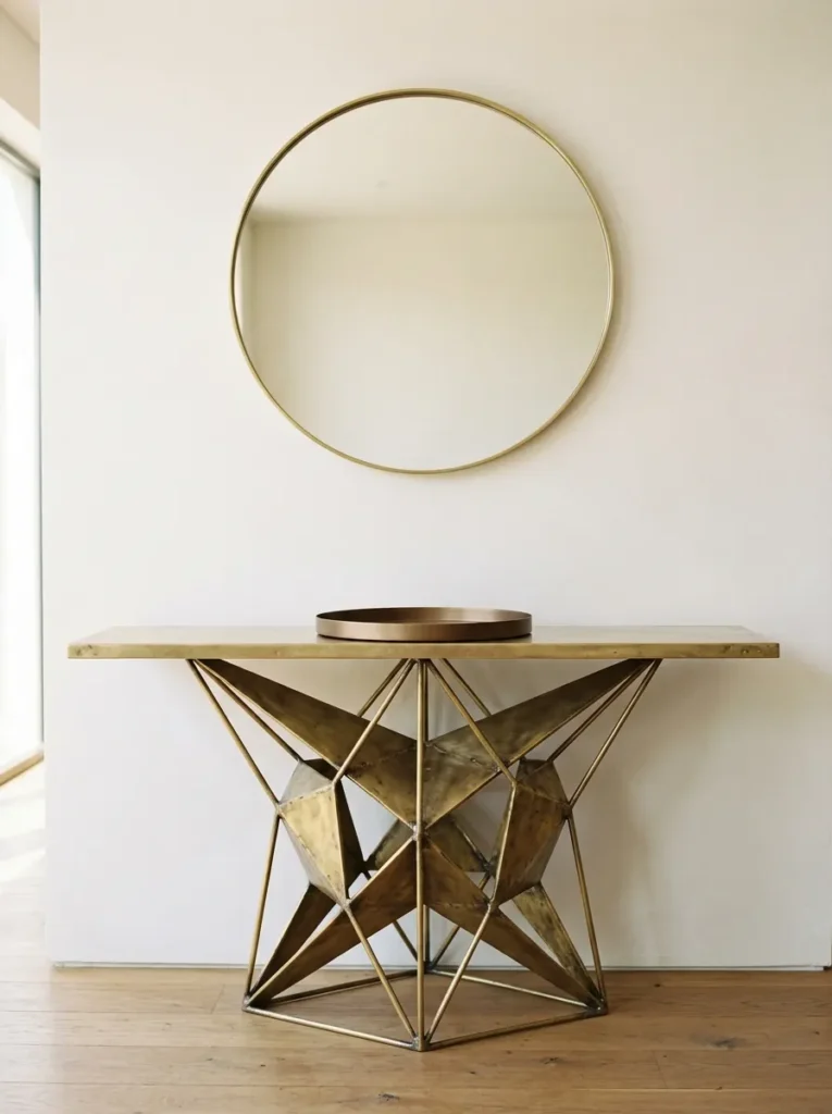
Styling advice assumes the console surface needs decoration, but a distinctive enough console table — one with an unusual base, a striking material, exceptional joinery, or a bold finish — can be the entry’s focal point with almost no styling at all. An unlacquered brass console, a heavily veined marble top, or a console with an architectural sculptural base doesn’t need a lamp, five objects, and a runner to make an impression.
In these cases, over-styling is the actual mistake. One single low object on the surface — a simple tray, one ceramic — and one strong piece on the wall is enough. The space beneath can stay empty to keep the table’s legs visible and legible. If you’ve purchased a piece specifically for its design quality, respect it enough to let it show.
19. Use Matching Objects on Either Side for a Symmetrical Entry
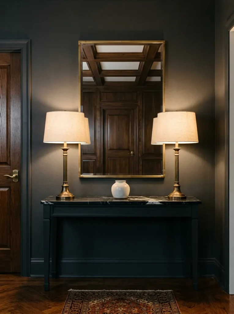
Symmetry in entries is a traditional compositional approach that still produces one of the cleanest-reading results: two identical or closely matched lamps, two matching ceramic vases, or two identical potted plants placed equidistant from center on either side of a mirror or artwork. The visual effect is formal without being cold, and it makes the entry feel like a deliberate architectural moment rather than a styled shelf.
This works best in entries where the console is the primary feature of an otherwise simple space. Symmetry in a room with competing visual elements can feel over-controlled; in a clean-lined entry hallway with little else on the walls, it provides structure that grounds the space. The two elements don’t have to be literally identical — two similar ceramic heights in different but related glazes reads as considered symmetry rather than mass production.
20. Style for the Season With One Changeable Element
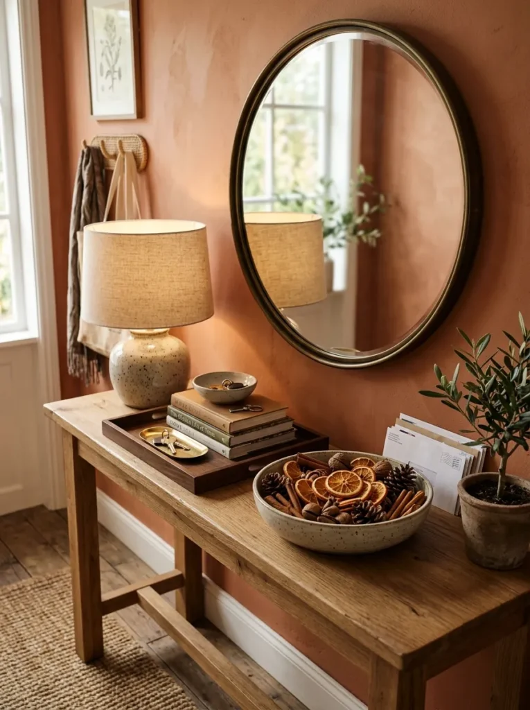
The lowest-commitment way to refresh an entry arrangement without restyling everything: designate one position on the console — typically the space next to or in front of the lamp — as the changeable seasonal element, and keep everything else fixed. This approach suits people who find their styled console looks good initially but feels stale after a few months.
What the seasonal element might be: a vase with branches (bare in winter, flowering in spring, eucalyptus in fall), a grouped candle arrangement for the colder months, a shallow bowl of seasonal fruit, or a single decorative object that relates to the time of year. The key is restraint — one changeable piece rather than a full seasonal overhaul that requires buying and storing multiple collections.
21. Paint or Wallpaper the Wall Section Behind the Console
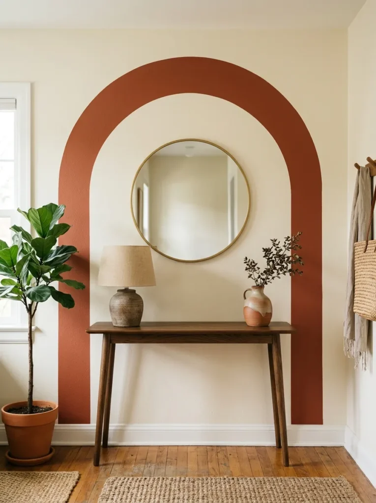
The wall behind a console table is a discrete, manageable area — bounded by the console below and typically by a ceiling line above — which makes it one of the lower-commitment places to experiment with a bold paint color, a painted arch, or a section of wallpaper. Rather than treating the entry as a full room paint decision, treat this specific wall zone as the canvas.
A painted arch centered behind the console — the arch outline painted in a contrasting color or deeper tone, with the console table sitting inside the arch visually — is one of the more distinctive entry treatments available without structural work. It creates an architectural frame where none existed. Alternatively, a rectangle of peel-and-stick wallpaper in a tight geometric or small-scale botanical pattern applied only to the wall section directly above and around the console creates a picture-frame effect that transforms a flat surface into a composed moment.
22. Treat the Under-Table Floor Zone as a Styled Vignette
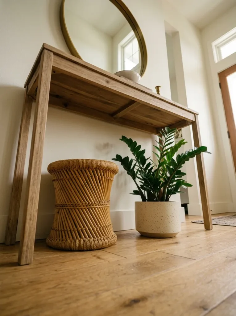
Most console table styling stops at the table’s lower shelf or underside. The floor below — particularly when the console has open legs and visible floor space — is the final zone of the composition, and leaving it completely bare can undercut the rest of the arrangement.
Options that work: two baskets (addressed in idea 14), a low stool that can serve as extra seating for putting on shoes, a small plant or sculptural object on a low riser, or a pair of simple objects symmetrically placed inside the legs. The floor zone is lower-commitment than the table surface in one specific way: objects there can be removed entirely without disturbing the primary arrangement. Start with nothing and see whether the empty floor reads as deliberate negative space or an unfinished composition — the answer depends on the table’s leg height and the overall composition above.
How to Style a Console Table Without Overcrowding It
Every piece of advice about console tables eventually returns to the same problem: the surface looks empty, so things get added, and things keep getting added until the table looks cluttered. The following principles stop that cycle.
Start with the wall, not the table. The wall anchor — mirror, art, clock, or sconces — determines how much work the tabletop has to do. A strong wall piece means a quieter surface. A bare wall means the table has to compensate, which leads to overcrowding.
Remove before adding. When a console looks off, the instinct is to add something. Usually the right move is to remove one item. An arrangement that’s one piece too many looks significantly more deliberate when that piece is pulled.
The table depth matters more than people expect. A console under 12 inches deep limits how much you can layer front-to-back. Don’t fight the depth — style for the actual surface rather than trying to replicate arrangements designed for wider pieces. One object at the front edge and one at the back creates a layering impression on a shallow table without overcrowding.
Test the arrangement at entry distance, not up close. Step back to the front door or the point where someone would first see the console and evaluate it from there. Small objects that read as carefully composed from two feet away are invisible from ten.
Final Thoughts
A well-styled console table gives the entry — and by extension, the whole house — a clear first impression rather than a provisional one. The ideas here span everything from a single curated object to fully layered arrangements with lighting, storage, and seasonal rotation, because different spaces and different lives require different amounts.
If you’re starting from scratch, resolve the wall first. The single decision that most reliably improves a console setup isn’t the objects on the surface — it’s getting the scale and placement of whatever goes on the wall above them right. From there, the tabletop usually needs far less than expected.
Browse through these console table decor ideas, save the ones that suit your specific entry’s proportions and light, and return to this guide as your space evolves. A good entry arrangement rarely stays identical year-round, and it shouldn’t have to.