23 Buffet Cabinet Styling Ideas You’ll Want to Copy
A buffet cabinet is one of the most versatile pieces of furniture in any home — and consistently one of the most under-styled. The top surface sits at a useful visual height, wide enough to create a real moment in the room, but it often ends up with a few random objects that landed there and never moved. The result is a piece of furniture that disappears into the background when it could be one of the most considered spots in the space.
Good buffet cabinet styling isn’t about filling every inch. It’s about understanding how scale, layering, and negative space work together to create something that looks intentional rather than assembled. The ideas here cover a range of rooms, moods, and budgets — from dining rooms and living rooms to entryways and home offices. Some are simple enough to implement this afternoon. Others require a small investment in art or lighting. All of them are worth saving for reference.
1. Anchor the Surface With One Large-Scale Object First
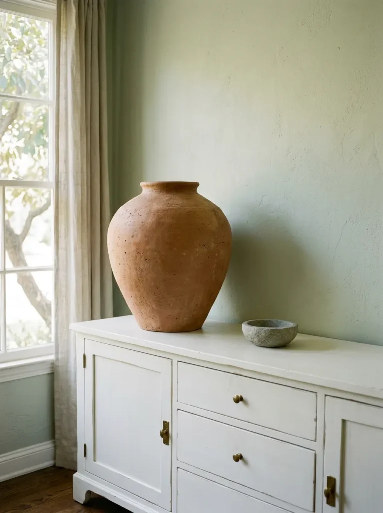
The most common buffet styling mistake is starting with small objects and trying to build up from there. Small objects on a wide surface look scattered regardless of how carefully they’re arranged. Instead, begin with one large-scale anchor — a tall vase, a substantial ceramic sculpture, a stack of large art books, or an oversized lantern — and build everything else around it.
The anchor object should be proportionate to the buffet’s width. As a general principle, a piece that’s at least one-quarter to one-third the height of the space above the buffet (whether open wall or mirror) reads with authority. Once the anchor is placed, typically off-center, the remaining objects fill the visual gaps rather than compete for attention. This single decision changes the composition from random to resolved.
2. Hang a Mirror Above to Double the Room and the Styling
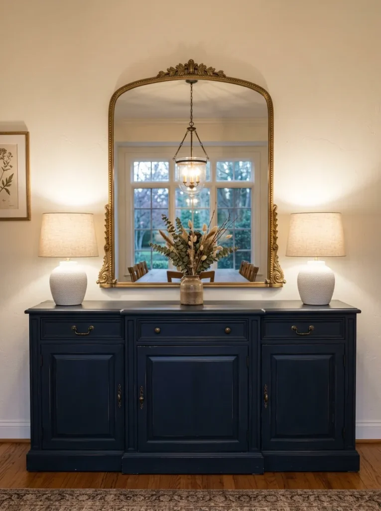
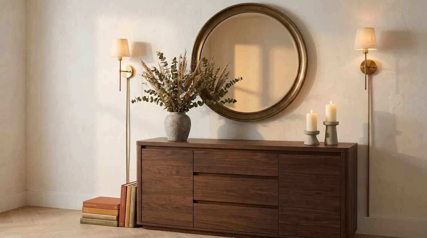
A mirror hung directly above a buffet cabinet is one of the most consistently effective combinations in home decor — and not just because it makes the room feel larger. The mirror also reflects the styled surface below, which means the vignette is visible from multiple angles and the buffet reads as a composed unit rather than an isolated piece of furniture.
Scale matters significantly here. A mirror that’s too small above a wide buffet looks tentative. The mirror width should ideally be roughly half to two-thirds the width of the buffet, and it should be hung close enough to the surface (not floating high on the wall) that the two pieces read as related. A mirror with a warm-toned frame — aged brass, antique gold, warm wood — integrates more naturally with most dining room palettes than a cool chrome or stark white frame.
3. Layer Art Behind Objects Rather Than Hanging It Separately
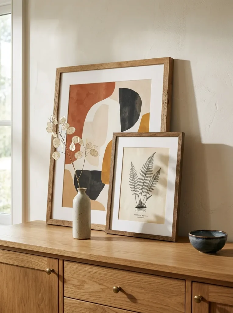
Instead of hanging art above the buffet in the conventional sense, leaning a large framed print or canvas directly on the buffet surface and layering smaller objects in front of it creates a more relaxed, collected composition. This approach has the practical advantage of being entirely renter-friendly and easy to update seasonally without putting new holes in the wall.
The leaned art piece functions as a backdrop for the vignette rather than a separate wall moment. Choose art that’s large enough to be visible above and around whatever objects sit in front of it — if the frame disappears completely behind the objects, it loses its purpose. A second smaller framed piece leaned slightly in front of and overlapping the first adds depth without requiring additional wall hardware.
4. Use a Table Lamp (or Two) to Add Height and Warm Light
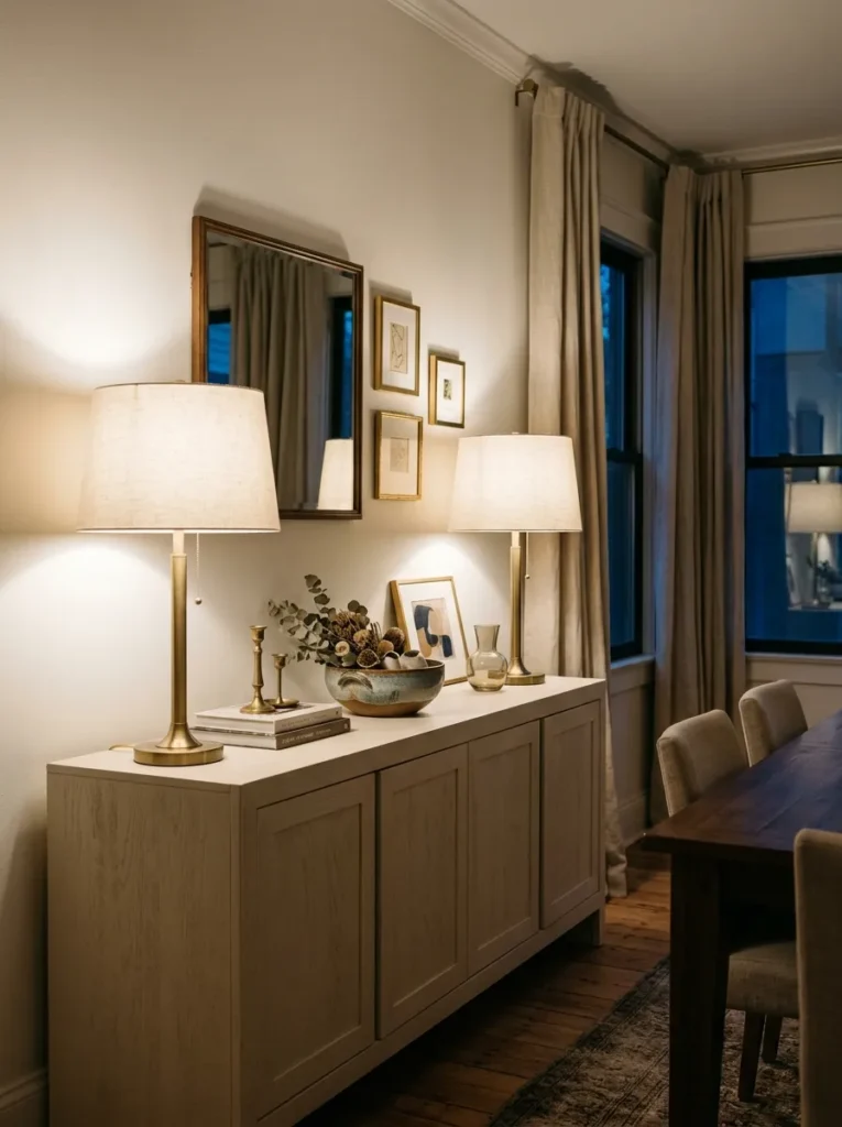
Buffet cabinets are typically positioned against a wall in a dining room or living room where overhead lighting casts flat, unflattering light at meal times. A table lamp placed on the buffet serves two functions simultaneously: it adds vertical height to the composition and provides a warm secondary light source that changes the mood of the room in the evening.
Symmetrical lamps on either end of a wide buffet create a formal, balanced look that suits traditional and transitional dining rooms. A single lamp placed at one end of the surface reads more contemporary and casual. The lamp shade material affects the quality of light: a linen or cotton shade diffuses a warm glow; a glass or metal shade produces more directional light. Whatever the choice, the lamp cord management is worth thinking through before committing to placement — an unsightly cord running across the cabinet surface undermines the rest of the styling.
5. Create a Tonal Still Life Using Objects in the Same Color Family
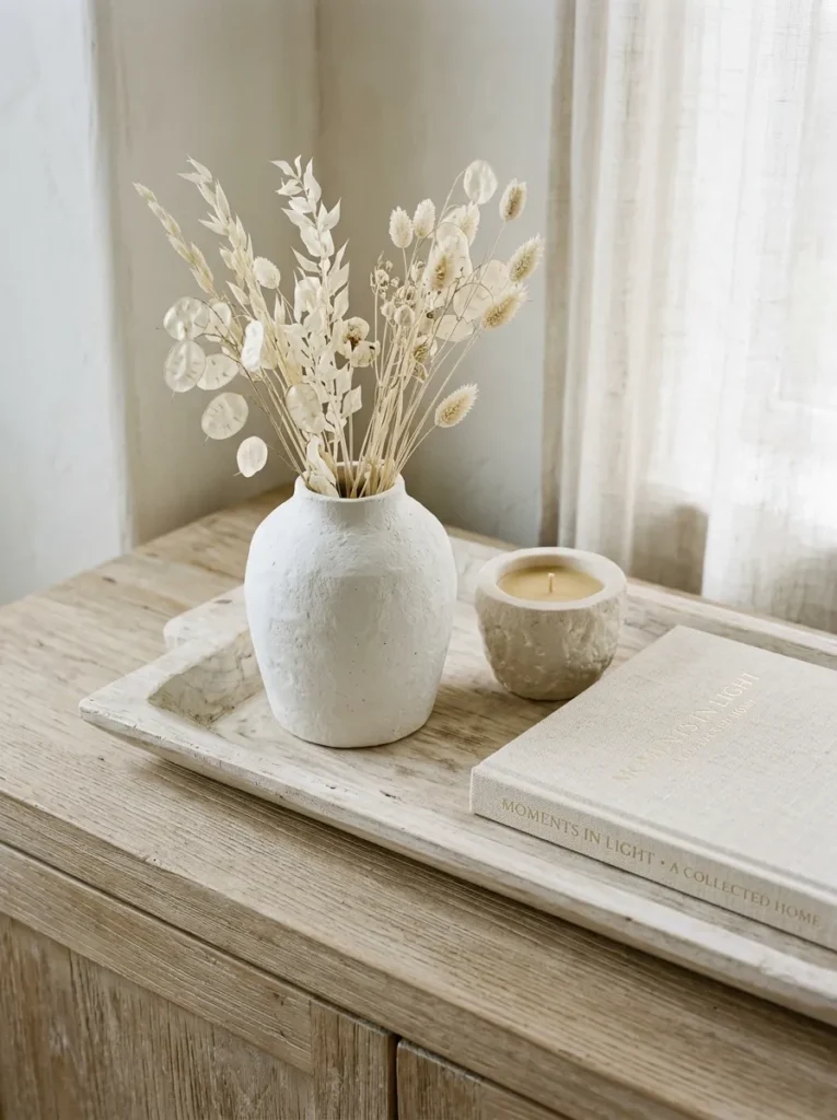
Rather than mixing multiple colors across the buffet surface, limit the palette to a single color family and vary texture and form instead. A collection of objects in warm whites and creams — a matte ceramic vase, a bleached wooden tray, a linen-bound book, a stone candle vessel — creates a cohesive still life that reads as curated rather than collected by accident.
This approach works in any color direction: all warm neutrals, all earthy terracotta and rust tones, all deep greens, or all monochromatic blues. The visual interest comes from the contrast between materials (rough against smooth, tall against low, matte against gloss) rather than from color variety. It’s also one of the most forgiving styling approaches for beginners because the limited palette makes it difficult to create obvious clashes.
6. Style in Odd Numbers and Vary the Heights
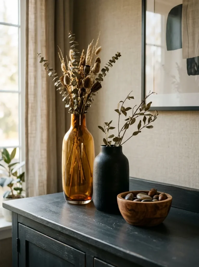
The interior design principle of grouping objects in odd numbers (three, five, or seven) exists for a practical visual reason: even-numbered groupings tend to split into pairs and look symmetrical, while odd numbers create natural visual movement. On a buffet surface, a trio of objects at clearly different heights — tall, medium, and low — creates a composition the eye can travel through rather than land on flatly.
The height variation is more important than the odd-number rule. Two objects at the same height sit side-by-side inertly. Three objects at meaningfully different heights create a small skyline. The tallest object typically goes at the back and slightly off-center; medium-height objects beside and in front; the lowest object (a candle, a small tray, a low bowl) at the front to anchor the composition at the surface level.
7. Incorporate a Tray to Define the Styling Zone
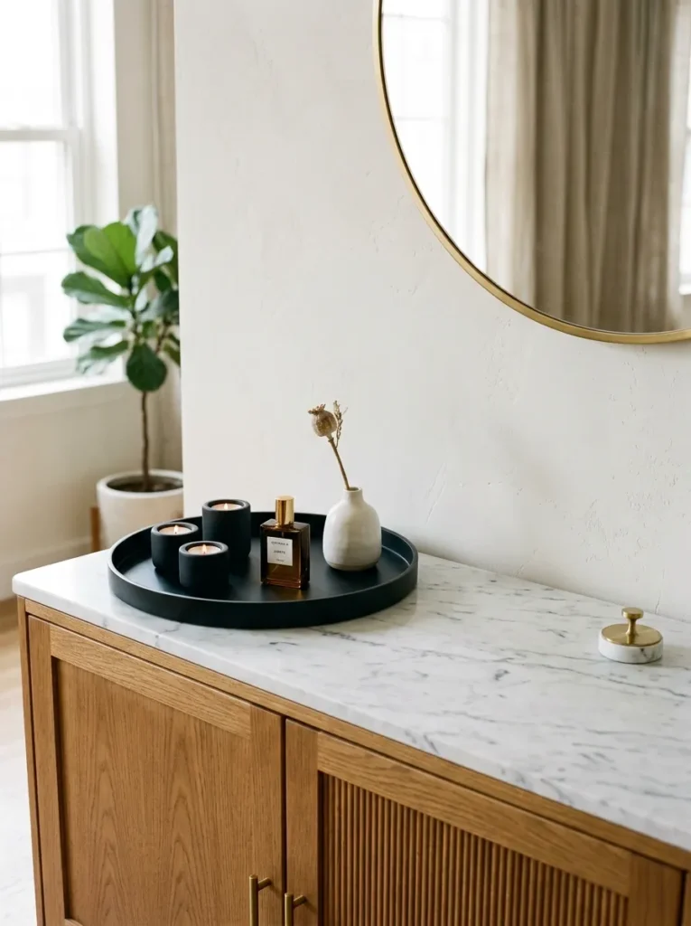
A tray on a buffet surface does something visually useful: it defines a boundary. Objects placed inside a tray read as a deliberate collection; the same objects placed directly on the surface without a boundary can look random. The tray also makes the arrangement easier to move when the buffet surface needs to function for serving food.
The tray should be proportionate to the section of surface it occupies, not so large that it covers the whole top or so small that it looks like an afterthought. Round lacquer trays work in contemporary rooms; rectangular rattan trays suit natural and bohemian styling; mirrored or gilded trays add a formal note suitable for traditional dining rooms. Whatever is placed inside the tray should relate to one another — a scented candle, a small bud vase, and a decorative object reads as intentional; a TV remote, a candle, and a mail stack does not.
8. Hang Artwork in a Grid or Gallery Format Above
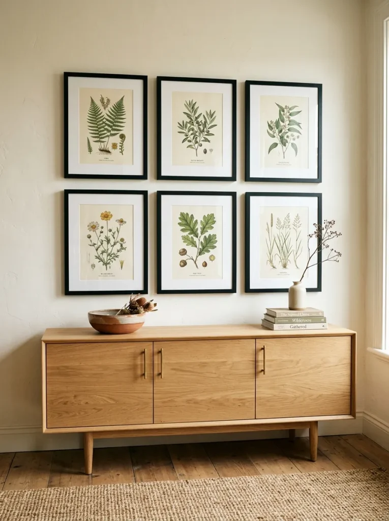
For buffets with substantial wall space above them — particularly in dining rooms with high ceilings — a curated grid of smaller framed prints reads more strongly than either one oversized piece or a scattered salon-style arrangement. A 2×2 or 2×3 grid of matching frames in a consistent color or finish creates a composed visual block that sits comfortably above the buffet without the scale challenges of finding a single very large work.
The spacing between frames matters: tight spacing (5–8 cm between frames) makes the grid read as one unified piece; wider spacing makes each print read more independently. For most dining room buffets, tight spacing works better because it creates a single focal moment rather than multiple competing ones. All frames should be the same style and ideally the same size for the grid to read cleanly.
9. Style Seasonally Using the Buffet as a Changing Display
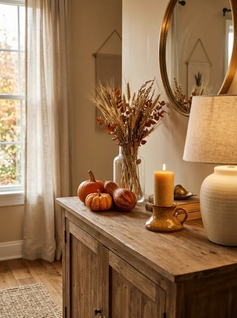
The buffet cabinet is one of the easiest pieces of furniture in the home to re-style seasonally without any permanent changes. The wide surface and prominent position — usually visible from the dining table or entry — make it the natural place for seasonal vignettes: pumpkins and amber glass in fall, evergreen and candle arrangements in winter, fresh stems and ceramic birds in spring.
The key to seasonal styling that doesn’t look themed is restraint. One or two seasonal elements introduced into an existing neutral arrangement is more effective than a complete overhaul into holiday territory. A fall buffet might simply mean swapping the vase for one holding dried wheat stems and adding a small cluster of gourds beside the lamp — the rest of the composition stays. This keeps the buffet looking styled rather than decorated.
10. Use Books Horizontally as Risers and Visual Weight
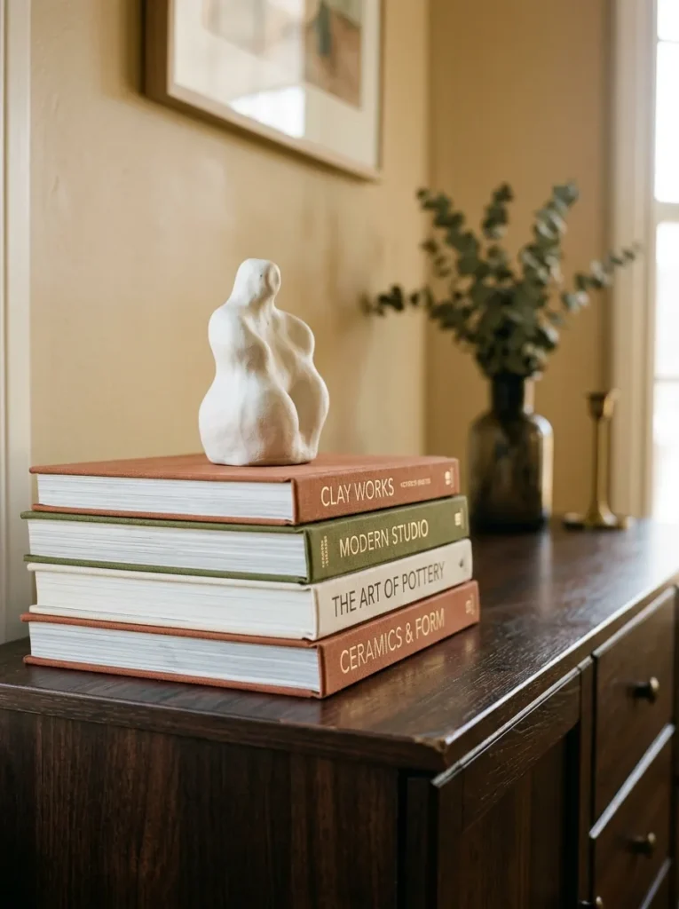
A stack of three to five large-format books laid flat on a buffet surface serves two purposes: it creates a platform that lifts other objects to a better height, and it adds visual weight and substance at the base level of a composition. Coffee table books and art books in coordinating cover colors are the most effective choice — a stack of spines in warm terracotta, cream, and olive reads as part of the composition rather than incidental storage.
Position the stack slightly off-center and use it as the base for a small object — a ceramic figurine, a trailing plant, a stone sphere — that benefits from the additional height. Books on their own, without anything placed on or beside them, can read as unfinished. Books as a base for something else read as a considered styling decision.
11. Add a Plant or Dried Botanical for Organic Movement
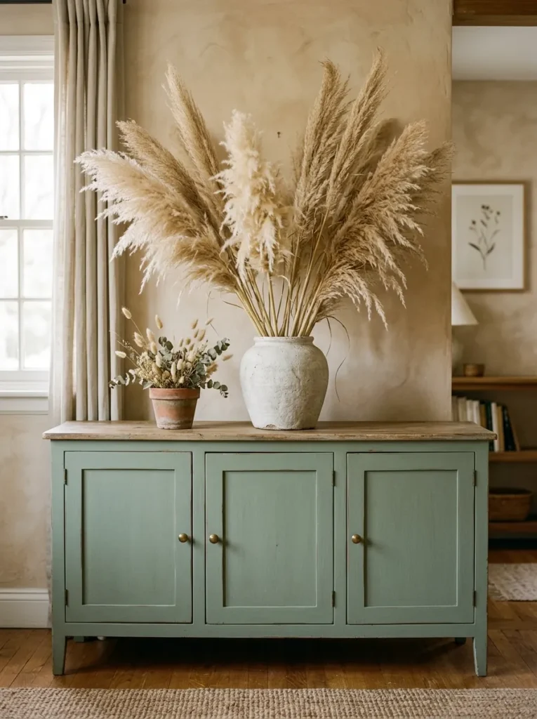
A plant on a buffet cabinet introduces the one element that most styled surfaces lack: movement. A trailing pothos or ivy hanging over the front edge of the surface, a tall olive branch arrangement in a ceramic vase, or a cluster of dried pampas grass bring organic shape that no ceramic or candle can replicate.
The choice between live and dried plants is partly practical. Buffet cabinets in rooms without strong natural light — many dining rooms — don’t support most live plants well. Dried botanicals require no maintenance and maintain their shape indefinitely. A single large dried stem in a tall narrow vase reads as deliberately minimal; a fuller dried arrangement in an oversized vessel creates a statement that anchors a long buffet surface without needing anything else around it.
12. Introduce Candlelight for Atmosphere and Visual Rhythm
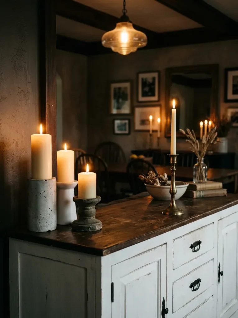
Candles on a buffet cabinet serve a styling function that goes beyond scent or flame. Their vertical form adds height, their repetition creates rhythm when multiples are used, and their warm glow in the evening changes the entire character of the dining room. A cluster of three pillar candles at different heights grouped on one end of the buffet is a simple but consistently effective arrangement.
Taper candles in candlesticks are the more formal option and suit traditional dining rooms and holiday table settings. Pillar candles in concrete, stone, or ceramic holders read more contemporary. Battery-operated taper or pillar candles are a practical alternative for households where open flame isn’t desirable — the quality of flameless candles with a flickering function has improved substantially and they’re convincing at conversational distance.
13. Style a Buffet in the Entryway as a Functional Focal Point
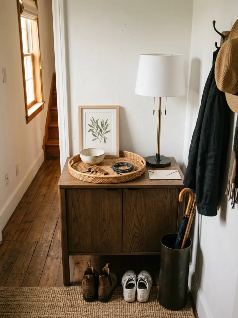
A buffet cabinet used in an entryway rather than a dining room requires a different styling balance: the surface needs to accommodate daily functional objects (keys, mail, a small tray for pocket contents) while still looking composed. The mistake most people make is letting the functional objects take over the surface entirely, leaving no room for anything that makes the entry feel like a considered space.
The solution is to corral functional objects into a single tray or bowl — everything drops into that one defined zone — and dedicate the remainder of the surface to styled elements: a tall lamp, a piece of leaned art, a vase with seasonal stems. The tray acts as a visual boundary that prevents the functional objects from visually contaminating the rest of the composition.
14. Place Objects at Different Depths, Not Just Different Heights
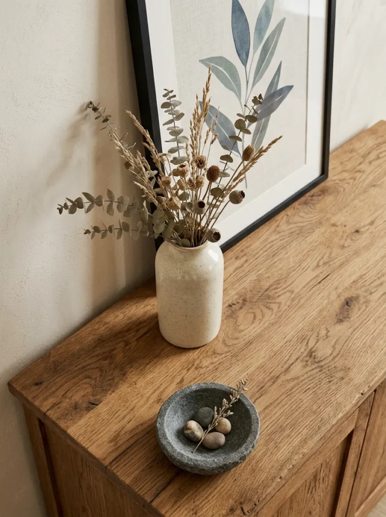
Most buffet styling advice focuses on varying height, but varying depth — how far forward or back on the surface objects sit — adds a dimension that height variation alone cannot. An object at the back of the surface, one in the middle, and one near the front edge create a composition with genuine three-dimensionality rather than a flat arrangement pushed against the wall.
In practice: lean art at the back, place a tall vase or lamp in front of and slightly overlapping the art, then place a small low object at the very front edge of the surface. This front-to-back layering creates visual depth even in a photograph, which is partly why this kind of arrangement reads so well on Pinterest. It simulates the way objects in a real room occupy space rather than sitting in a line.
15. Use a Sculptural Object as the Focal Point Instead of Flowers
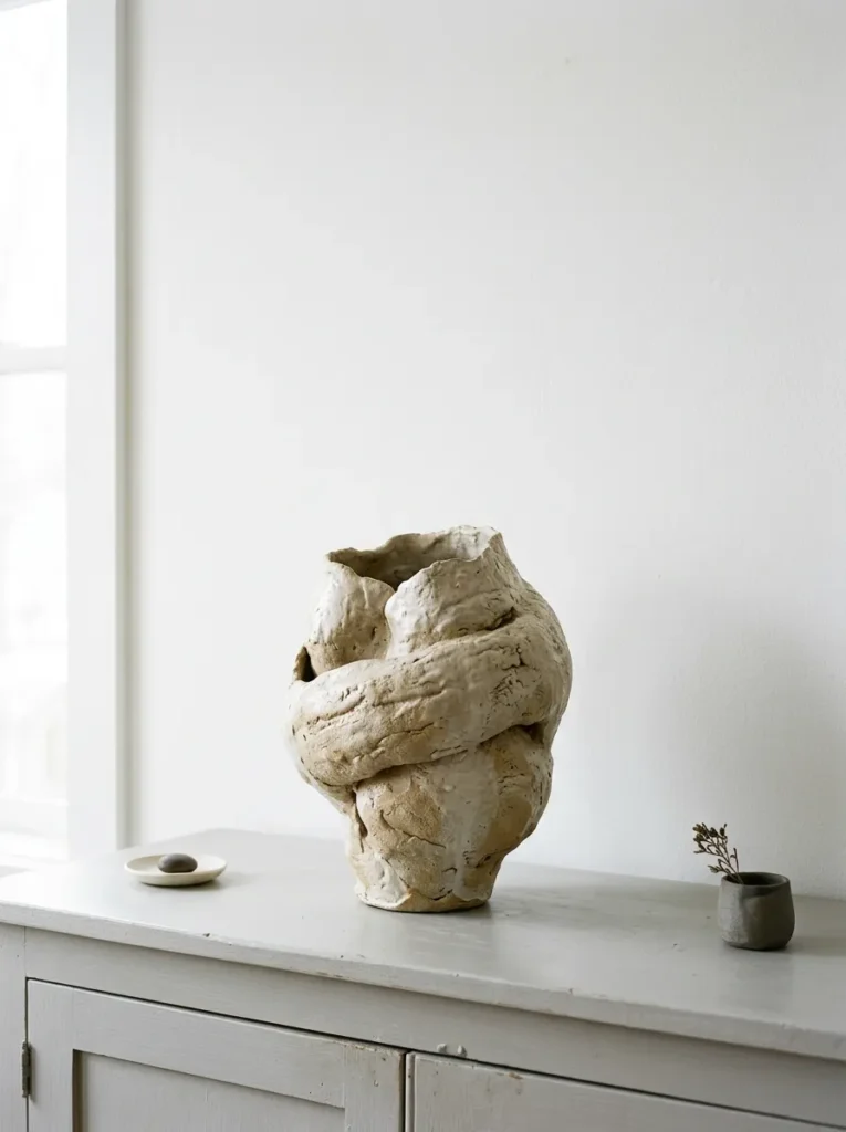
Fresh flowers are a default for buffet styling and they work — but they’re also the obvious choice, and they require constant replacement. A sculptural object with strong visual presence can do the same anchoring work with no maintenance and more visual longevity. Options that photograph particularly well: a large ceramic vessel with an irregular or hand-thrown form, an abstract stone or resin sculpture, a woven basket at substantial scale, or an architectural object like a plaster column section used decoratively.
The key quality in a sculptural anchor is that it reads from across the room — not just up close. Objects with strong silhouettes and interesting surface textures work better than objects whose detail is only visible when standing directly in front of them.
16. Style One End Heavily and Leave the Other Relatively Empty
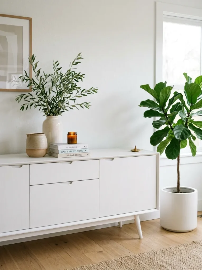
Asymmetric buffet styling — concentrating most of the visual interest at one end and leaving the other end with very few or no objects — creates a composition that feels deliberately modern and avoids the crowded, symmetrical look of traditional buffet arrangements. The open side provides visual breathing room that makes the styled side read with more impact.
This approach works particularly well on longer buffets (five feet or more) where there’s enough surface width to make the asymmetry feel intentional rather than unfinished. A floor plant positioned beside the buffet at the empty end can bridge the gap between the styled surface and the open floor space without cluttering the cabinet top.
17. Frame the Buffet With Wall Sconces Instead of Table Lamps
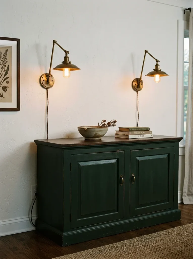
Wall sconces flanking a buffet cabinet create a more architectural, intentional look than table lamps and free the cabinet surface entirely from lamp footprint. The sconces provide the same warm light layering as table lamps but integrate with the wall, which reads as a more permanent, designed installation.
Plug-in sconces are a renter-friendly alternative to hardwired fixtures — the cord can be managed with a slim channel along the wall or hidden behind the buffet if the outlet is conveniently located. Aged brass, matte black, and unlacquered brass are the most versatile finish choices for dining room contexts. The sconces should be mounted at a height where they’re clearly above the buffet surface (ideally above most objects on the surface) and roughly symmetrical on either side of the cabinet width.
18. Create a Bar Station on One Half of the Buffet Surface
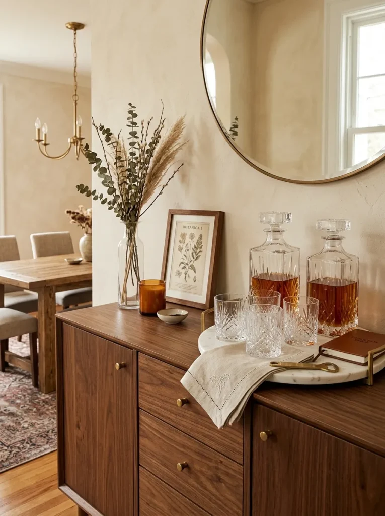
A buffet cabinet with a bar station on one end is one of the most practical dual-use styling approaches for dining rooms and open-plan living spaces. A small tray holding two decanters, four matching glasses, and a linen cocktail napkin occupies one side of the surface while the other half remains available for decorative styling. The bar station reads as intentional and hospitality-minded rather than cluttered.
The visual cohesion of a bar station depends on the glassware and decanters reading as a collection — matching or clearly coordinated pieces rather than an assortment of whatever’s available. A round tray in lacquer, marble, or slate defines the zone. This styling approach is particularly useful for buffets that sit near the dining table where the bar function is genuinely convenient during meals.
19. Bring In Texture Through Natural Materials
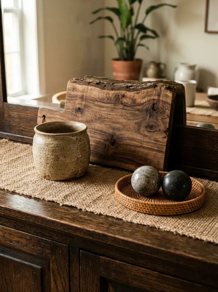
A buffet styled entirely in smooth, reflective surfaces — glass, lacquer, polished stone — reads as visually cold regardless of the color palette. Introducing at least one natural material with visible texture — a woven rattan tray, a raw-edge wooden board, a hand-thrown ceramic with an uneven glaze, a linen table runner — changes the surface from showroom to lived-in.
In a dining room context, a linen or cotton table runner laid across the buffet surface (not necessarily covering the full length) provides a textile layer that grounds the composition and provides a base for objects placed on top of it. This works particularly well on wooden buffets where the runner adds color or texture contrast without covering the furniture surface entirely.
20. Repeat One Material or Finish Across Multiple Objects
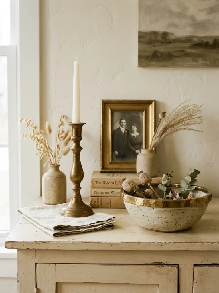
Visual cohesion in a buffet vignette comes partly from repetition — the same material, finish, or color appearing in at least two or three of the objects on the surface. Aged brass appearing in the lamp base, a small picture frame, and a candle holder ties those objects together without making the surface look matchy-matchy. The repetition creates a thread the eye can follow.
This principle is most useful when the objects on a buffet were sourced at different times from different places and don’t naturally relate. Choosing two or three pieces that share a finish — even if their forms are entirely different — pulls the composition into coherence. It’s the difference between a curated vignette and a surface that looks like it accumulated gradually.
21. Style a Dark Buffet Cabinet With High-Contrast Light Objects
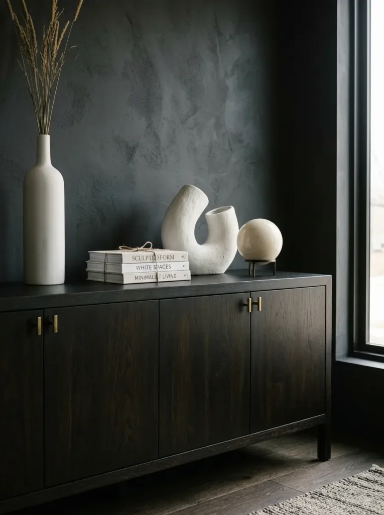
Dark-finished buffet cabinets — walnut, ebonized oak, deep navy or forest green painted wood — benefit from objects that contrast with the cabinet rather than blend into it. A collection of pale ceramic objects, white marble accessories, or cream-toned candles on a dark surface creates a strong visual contrast that reads from across the room and photographs with dramatic clarity.
The counter-intuitive mistake is placing dark objects on a dark cabinet — everything disappears into a single tonal mass and the styling is invisible at any distance. Light objects, natural textures (bleached linen, pale rattan), and any metallic that catches light (brass, gold, silver) all read with force against a dark cabinet ground.
22. Use a Single Large Piece of Art as the Entire Statement
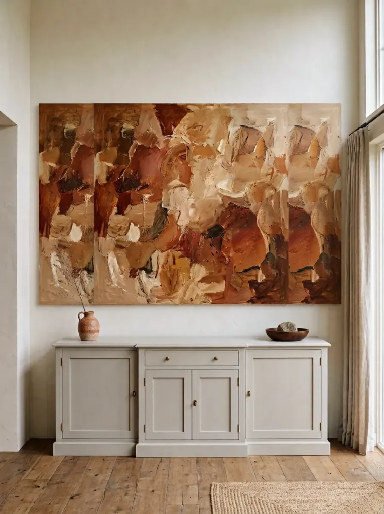
Sometimes the strongest buffet styling is the most minimal: one large-format art piece hung above or leaned against the wall behind the buffet, with the surface itself holding very little or nothing at all. This approach treats the buffet and wall as a single visual unit and lets the art carry the moment entirely.
For this to work, the art needs to be genuinely large — not a medium print that looks undersized above a wide cabinet. The buffet surface with minimal objects (perhaps a single small object on each end, nothing in the center) draws the eye upward to the art rather than across the clutter on the surface. This styling direction suits contemporary, minimalist, and Japandi-influenced interiors where restraint is the point.
23. Rotate the Styling Every Few Months to Keep It Feeling Intentional
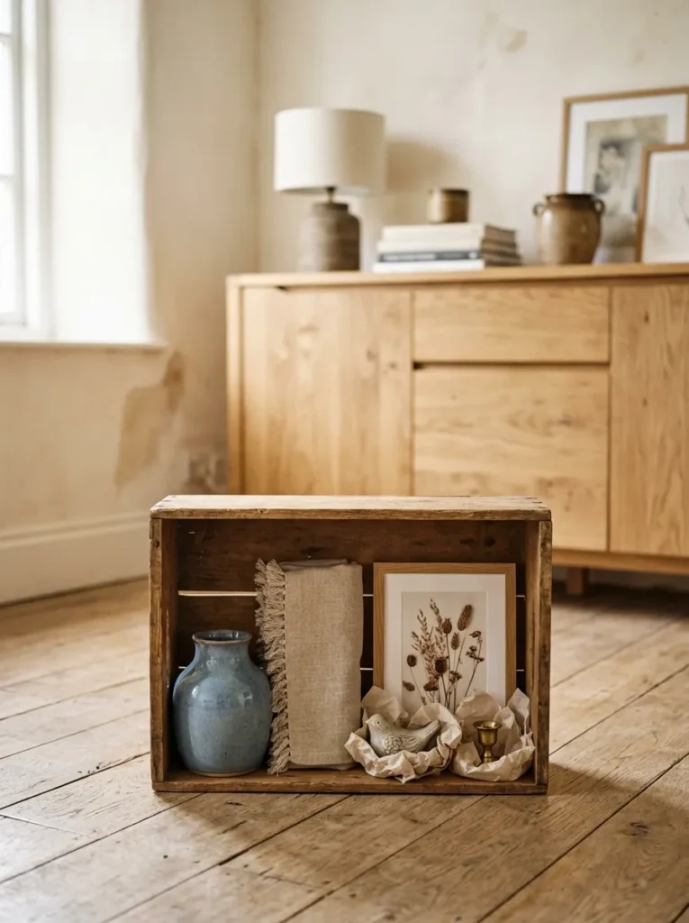
The most beautifully styled buffet cabinet will eventually stop being noticed — by you and by anyone who visits regularly. Objects that stay in exactly the same position for months begin to fade into the background. A simple rotation — swapping the position of two objects, replacing one vase with a different form, introducing one new seasonal element — resets the visual freshness without requiring a complete restyle.
This isn’t about constant change for its own sake. It’s about maintaining the intentional quality that makes good styling feel like a choice rather than furniture that got covered in stuff. Keeping a small box with a few rotational objects — a spare candle, a backup vase, a seasonal print — makes this easy to do without shopping every season.
How to Approach Buffet Styling: Decisions to Make Before You Start
Settle the function first. A buffet that needs to serve food, hold bar items, or catch daily keys requires a different approach than one that’s purely decorative. The functional zone should be defined and contained before any styling begins — otherwise the function eventually swallows the styling.
Match the scale to the cabinet width. For a narrow buffet (under 48 inches), one or two substantial objects and open space reads better than a fully populated surface. For a wide buffet (60 inches or more), a composition with multiple elements at varied heights is needed to fill the surface without looking sparse.
Decide on the primary vertical element. Art, mirror, or open wall — this decision shapes everything placed on the surface below it. Art or mirror typically requires objects that complement rather than compete; open wall calls for taller objects on the surface itself to fill the vertical space.
Edit more than you add. The first instinct when styling a buffet is to add objects until it feels full. The more useful practice is to start with more than you think you need, then remove objects one at a time until the composition feels resolved. Most well-styled surfaces have fewer objects than you’d expect.
Final Thoughts
The buffet cabinet is one of the few pieces of furniture in a home where the styling is as much of the design as the piece itself. A well-chosen cabinet with careless styling disappears; an ordinary cabinet styled with thought and proportion becomes a genuine room moment.
Start with scale — get the anchor object and the vertical element right before worrying about the small details. From there, the additions are about layering texture, adding light, and creating depth. Not every idea here belongs in the same room or on the same buffet, and that’s the point. A few of these done well will serve you far better than all of them done at once.
Save the ideas that match your room’s mood and come back to this guide when the seasons change or the surface starts feeling stale.